Overlay Particle Documentation
# Overlay Package contents
| Files | Description |
|---|---|
| jloverlay.yaml | Contains the Overlay particle settings. |
| jloverlay.html.twig | The Twig file to pull information, settings. |
Installation Installing the particle on your website is a really simple process. You can refer to the document here to know more.
Requirements Overlay requires Uikit 3 for Gantry 5 Atom to be installed and enabled in your theme layout settings.
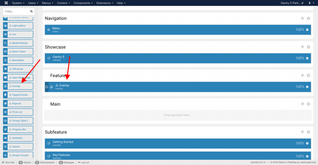
Go to Template/Theme Settings > select the Layout to add Overlay particle (i.e: Home) -> Layout tab -> Drag and drop the Overlay Particle from Particles panel (left corner) to the section you want to display the Overlay.
Settings
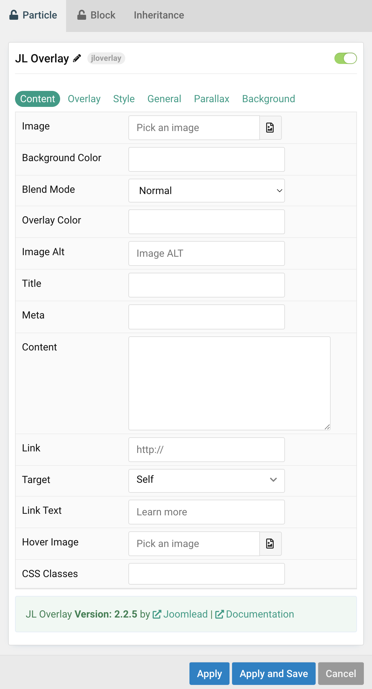
| Settings | Description |
|---|---|
| Image | An image field with an image picker. |
| Background Color | Use the background color in combination with blend modes. |
| Blend Mode | Determine how the image will blend with the background color. |
| Overlay Color | Set an additional transparent overlay to soften the image. |
| Image ALT | Enter the image’s alt attribute. |
| Title | Customize the Title. |
| Meta | Customize the Meta. |
| Content | Customize the content. |
| Link | Enter the image’s link if needed. |
| Target | Target browser window when item is clicked. |
| Link Text | Specify the button label. |
| Hover Image | Select an optional image that appears on hover. |
| CSS Classes | CSS class name for the particle. |
Overlay Tab
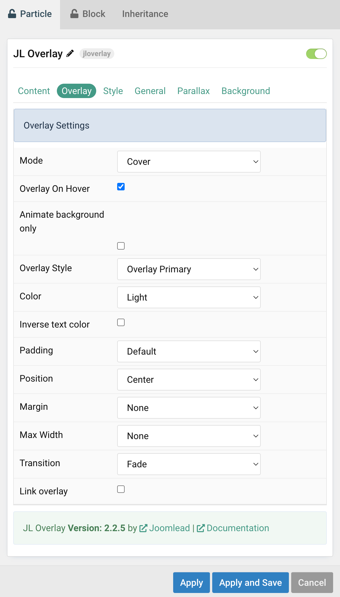
| Settings | Description |
|---|---|
| Mode | When using cover mode, you need to set the text color manually. |
| Overlay on hover | Display content overlay on hover. |
| Animate background only | Animate background only on hover. |
| Overlay Style | Select the style for the overlay. |
| Color | Set light or dark color mode for text, buttons and controls. |
| Inverse text color | Inverse the text color on hover. |
| Padding | Set the padding between the overlay and its content. |
| Position | Select the overlay or content position. |
| Margin | Apply a margin between the overlay and the image container if the overlay style is Selected. |
| Max Width | Set the maximum content width. |
| Transition | Select a transition for the overlay when it appears on hover (support 15 transition effects). |
| Link overlay | Link the whole overlay if a link exists. |
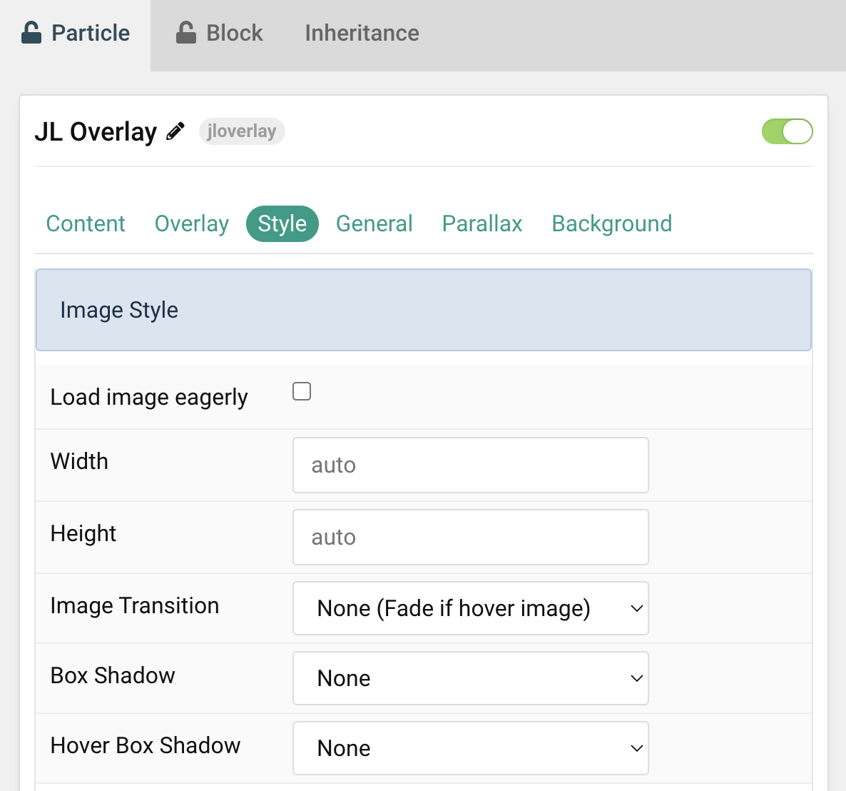
Tab Style
Image Settings Common settings for images.
| Settings | Description |
|---|---|
| Load image eagerly | By default, images are loaded lazy. Enable eager loading for images in the initial viewport. |
| Width | Enter the image’s width. |
| Height | Enter the image’s height. |
| Image Transition | Select an image transition. If the hover image is set, the transition takes place between the two images. If None is selected, the hover image fades in. |
| Box Shadow | Select the image’s box shadow size. |
| Hover Box Shadow | Select the image’s box shadow size on hover. |
Title Settings Common settings for title.
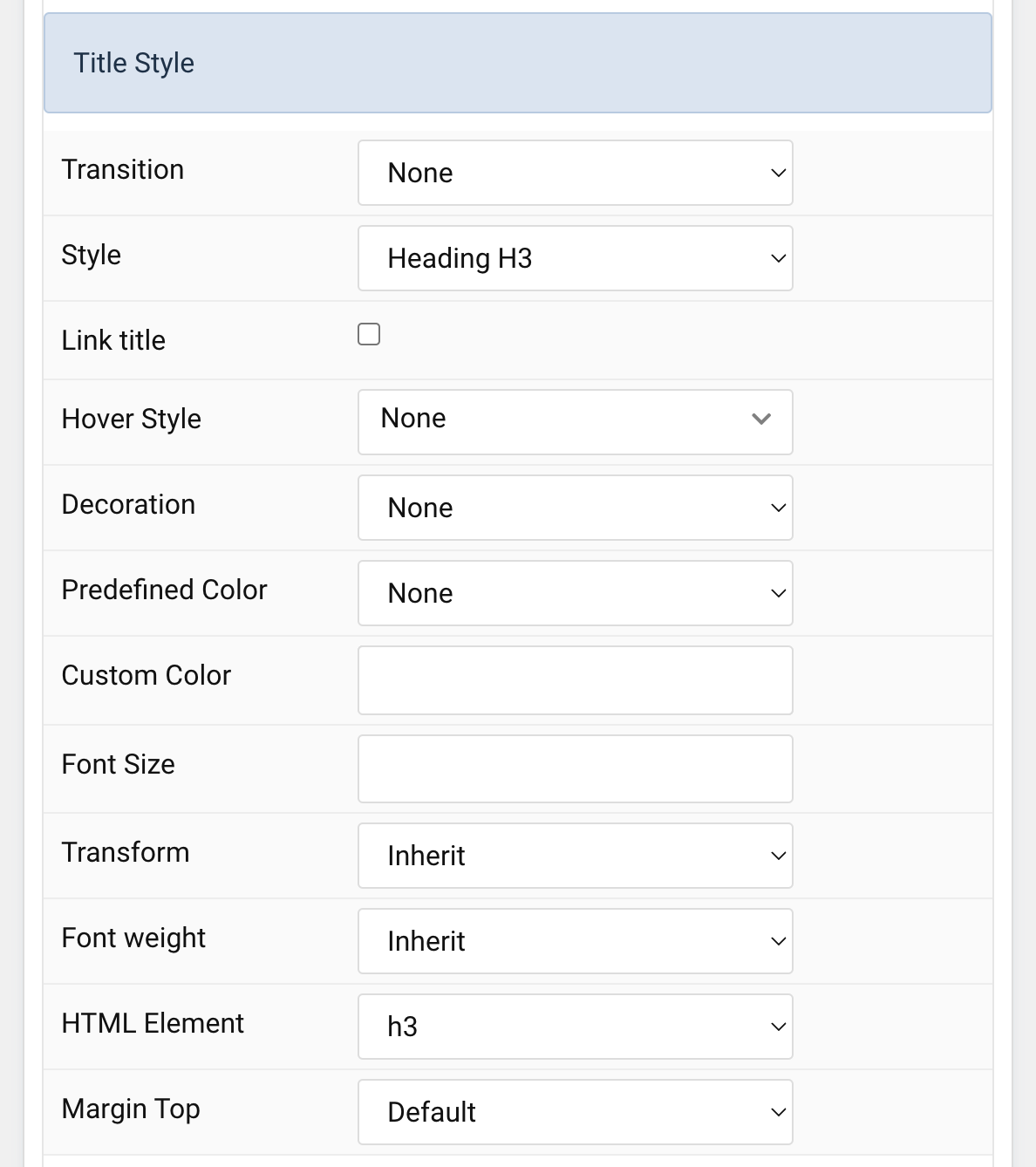
| Settings | Description |
|---|---|
| Transition | Select a transition for the title when the overlay appears on hover. |
| Style | Heading styles differ in font-size but may also come with a predefined color, size and font. |
| Link title | Link the title if a link exists. |
| Hover Style | Set the hover style for a linked title. Enable link title to use this option. |
| Decoration | Decorate the headline with a divider, bullet or a line that is vertically centered to the heading. |
| Predefined Color | Select a predefined text color. |
| Custom Color | Customize the title color instead using predefined title color mode. You need to set the predefined color to None to use the customize color option. |
| Font Size | Customize the title text font size. |
| Transform | The following options will transform text into uppercased, capitalized or lowercased characters. |
| Font weight | Add one of the following classes to modify the font weight of your text. |
| HTML Element | Choose one of the elements to fit your semantic structure. |
| Margin Top | Set the top margin. |
Meta Settings Common settings for meta.
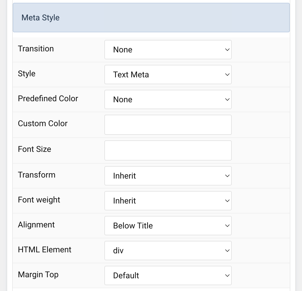
| Settings | Description |
|---|---|
| Transition | Select a transition for the meta text when the overlay appears on hover. |
| Style | Select a predefined meta text style, including color, size and font-family. |
| Predefined Color | Select the predefined meta color. |
| Custom Color | Customize the meta color. Set Predefined Color for Meta to None before using this feature. |
| Font Size | Customize the title text font size. |
| Transform | The following options will transform text into uppercased, capitalized or lowercased characters. |
| Alignment | Align the meta text above/below the title or below the content. |
| Margin Top | Set the top margin. |
Content Settings Common settings for content.
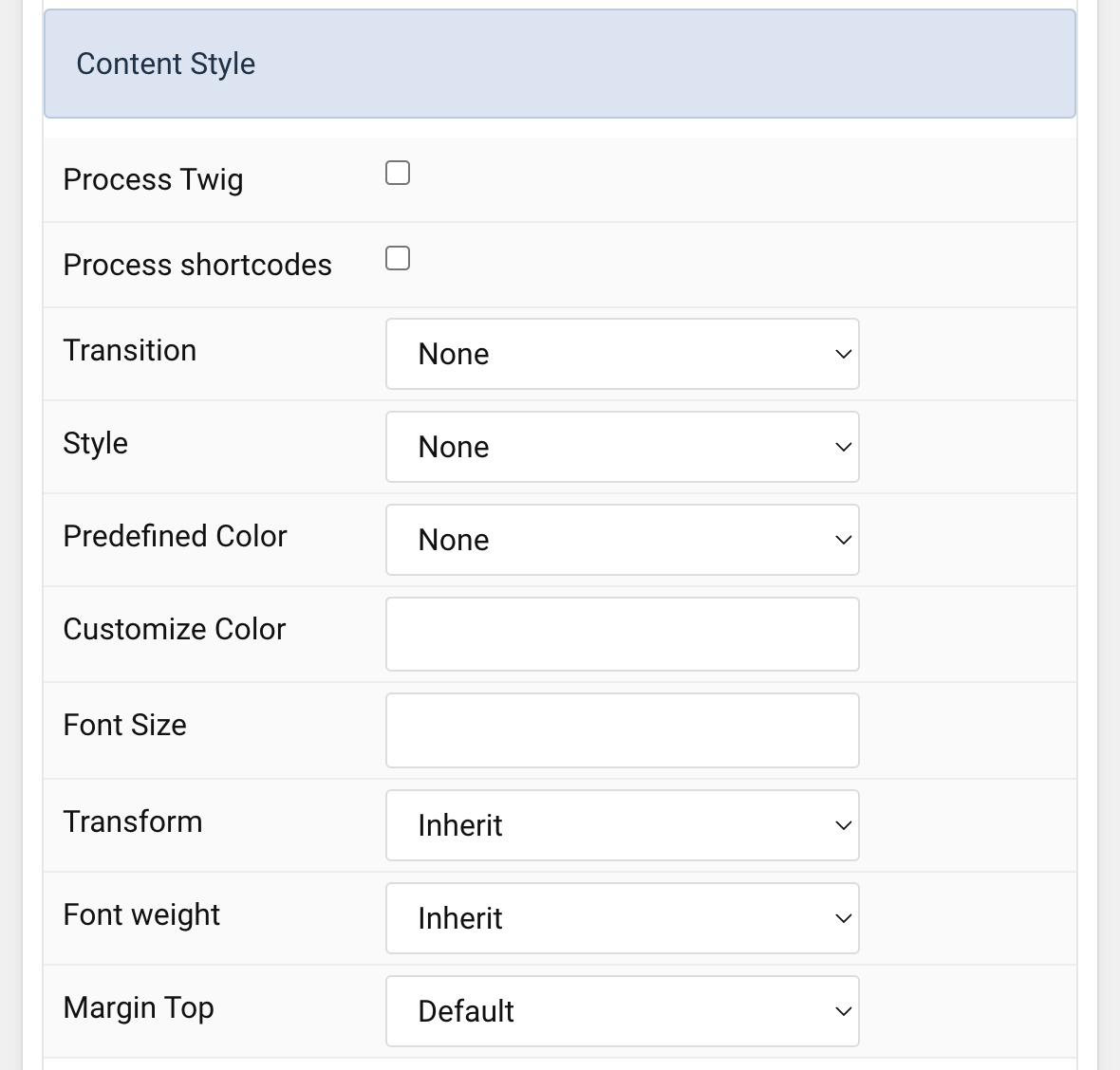
| Settings | Description |
|---|---|
| Process Twig | Enable Twig template processing in the content. Twig will be processed before shortcodes. |
| Process shortcodes | Enable shortcode processing / filtering in the content. This useful when you want to load the Joomla module or WordPress shortcode inside the card content, example you can add a Joomla shortcode inside the card content like {loadmoduleid your_moduleId}, then just enable the Process shortcodes feature and done. This solution similar to How do you put a module inside an article? |
| Transition | Select a transition for the content when the overlay appears on hover. |
| Style | Select a predefined text style, including color, size and font-family. |
| Predefined Color | Select the predefined meta color. |
| Content Color | Customize the content color instead using predefined text color. You need to set the predefined color to None to use the customize color option. |
| Font Size | Customize the content text font size. |
| Transform | The following options will transform text into uppercased, capitalized or lowercased characters. |
| Font weight | Add one of the following classes to modify the font weight of your text. |
| Margin Top | Set the top margin. |
Link Settings Common settings for Link.
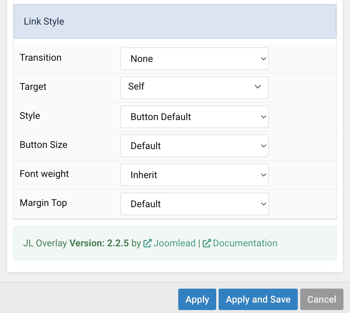
| Settings | Description |
|---|---|
| Transition | Select a transition for the link when the overlay appears on hover. |
| Target | Target browser window when item is clicked. |
| Style | Set the button style. |
| Button Size | Set the button size. |
| Font weight | Add one of the following classes to modify the font weight of your text. |
| Margin Top | Set the top margin. |
General, Parallax and Parallax Background tab
Please take a look the documentation here for more detail about these tabs settings

Comments