Description List Documentation
# Description List Package contents
| Files | Description |
|---|---|
| jldescription.yaml | Contains the Description particle settings. |
| jldescription.html.twig | The Twig file to pull information, settings. |
Installation Installing the particle on your website is a really simple process. You can refer to the document here to know more.
Requirements Description list requires Uikit 3 for Gantry 5 Atom to be installed and enabled in your theme layout settings.
Go to Template/Theme Settings > select the Layout to add Description List particle (i.e: Home) -> Layout tab -> Drag and drop the Description List Particle from Particles panel (left corner) to the section you want to display the Description List.
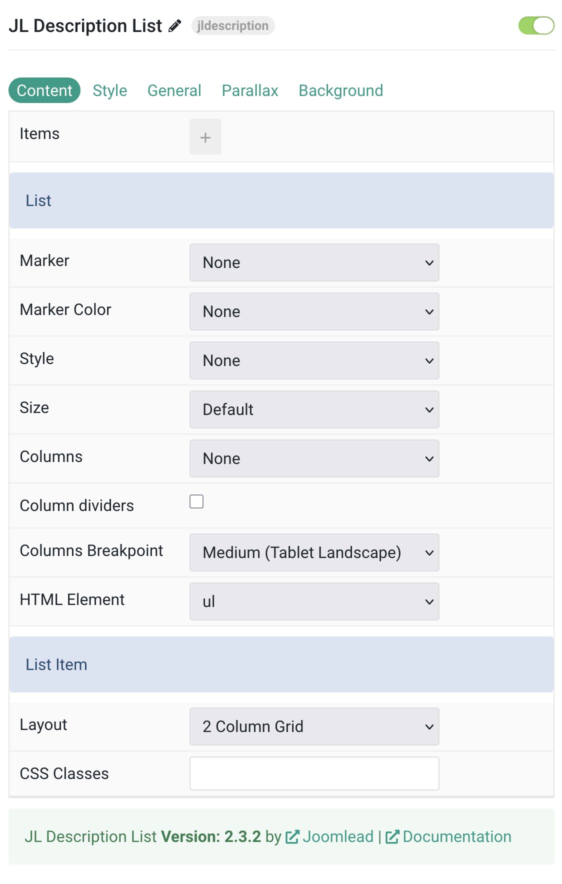
Content Settings
| Settings | Description |
|---|---|
| Items | Create each item to appear in the content row. Collection list with customizable fields for title, meta, description, link, and target. |
| List Settings | Common settings for configuring list appearance and behavior. |
| Marker | Select the marker of the list items (None, Disc, Circle, Square, Decimal, Hyphen, Image Bullet). |
| Marker Color | Select the color of the list markers (None, Muted, Emphasis, Primary, Secondary). This option doesn’t apply if Image Bullet is selected. |
| Style | Select the list style (None, Divider, Striped). |
| Size | Define the padding between items (Default, Large, None). |
| Columns | Set the number of list columns (None, Halves, Thirds, Quarters, Fifths, Sixths). |
| Column Dividers | Show a divider between list columns. |
| Columns Breakpoint | Set the device width from which the list columns should apply (Always, Small, Medium, Large, X-Large). |
| HTML Element | Choose between an ordered (ol) and unordered (ul) list to fit your semantic structure. |
| List Item | Settings specific to individual list items layout and appearance. |
| Layout | Define the layout of the title, meta and content (2 Column Grid, 2 Column Grid Meta only, Stacked). |
| CSS Classes | CSS class name for the particle. |
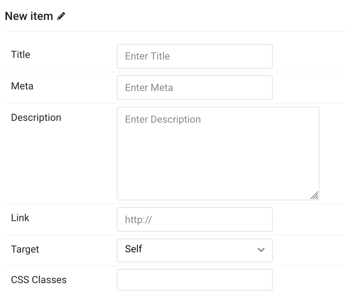
Items Click Items field to enable it, then you can add new items to the collection using the plus + icon
| Settings | Description |
|---|---|
| Title | Customize the Title for each item. |
| Meta | Customize the Meta information for each item. |
| Description | Customize the description content for each item. |
| Link | Specify the link URL for each item. |
| Target | Open the link in a same or new window (_self or _blank). |
| Item CSS Classes | Specify the CSS class name for individual items. |
Style Tab
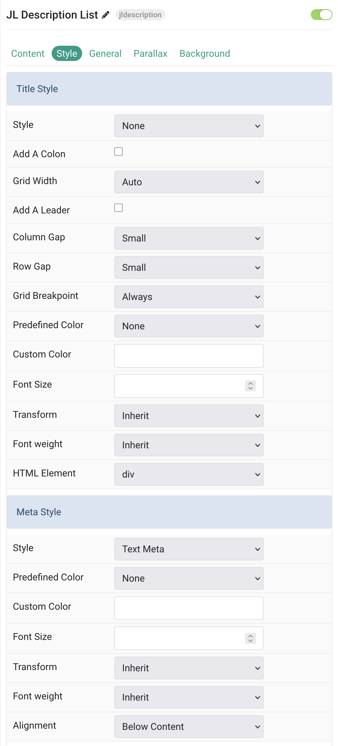
Title/Meta Common settings for Title and Meta style
| Settings | Description |
|---|---|
| Title Style | Settings for customizing the appearance and layout of titles. |
| Style | Select the title style and add an optional colon at the end of the title. |
| Add A Colon | Add a colon at the end of the title. |
| Grid Width | Define the width of the title within the grid. This option won’t have any effect if the Layout assign to Stacked mode. |
| Add A Leader | This option won’t have any effect unless Layout assigned to 2 Column Grid (Meta only) and Width assigned to Expand. |
| Column Gap | Set the size of the gap between the grid columns. |
| Row Gap | Set the size of the gap between the grid rows. |
| Grid Breakpoint | Set the breakpoint from which grid items will stack. |
| Predefined Color | Select the text color. If the Background option is selected, styles that don’t apply a background image use the primary color instead. |
| Custom Color | Customize the title color instead using predefined title color mode. You need to set the predefined color to None before using the color customization. |
| Font Size | Customize the title text font size. |
| Transform | The following options will transform text into uppercased, capitalized or lowercased characters. |
| Font Weight | Add one of the following classes to modify the font weight of your text. |
| HTML Element | Choose one of the elements to fit your semantic structure. |
| Meta Style | Settings for customizing the appearance of meta information. |
| Meta Style | Select a predefined meta text style, including color, size and font-family. |
| Meta Predefined Color | Select the predefined meta color. |
| Meta Custom Color | Customize the meta color. You need to set the predefined color to None before using the color customization. |
| Meta Font Size | Customize the meta text font size. |
| Meta Transform | The following options will transform text into uppercased, capitalized or lowercased characters. |
| Meta Font Weight | Add one of the following classes to modify the font weight of your text. |
| Meta Alignment | Align the meta text above or below the title. This option won’t have any effect IF the Layout assign to 2 Column Grid (Meta only) mode. |
| Settings | Description |
|---|---|
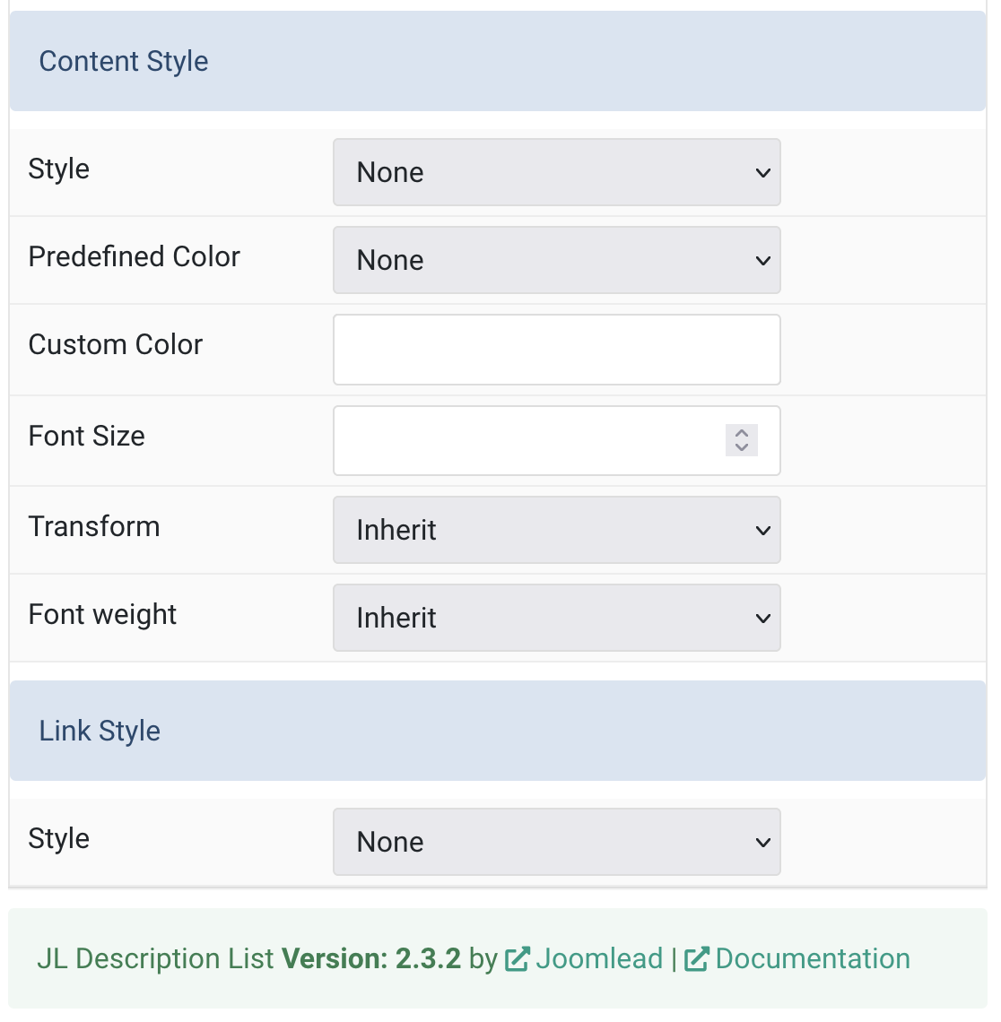
| Content Style | Settings for customizing the appearance of content text. |
| Content Style | Select a predefined meta text style, including color, size and font-family. |
| Content Predefined Color | Select the text color. If the Background option is selected, styles that don’t apply a background image use the primary color instead. |
| Content Custom Color | Customize the content color instead using predefined text color. You need to set the predefined color to None before using the color customization. |
| Content Font Size | Customize the content text font size. |
| Content Transform | The following options will transform text into uppercased, capitalized or lowercased characters. |
| Content Font Weight | Add one of the following classes to modify the font weight of your text. |
| Link Style | Settings for customizing the appearance of links. |
| Link Style | This option doesn’t apply unless a URL has been added to the item. Only the item’s content will be linked. |
General, Parallax and Parallax Background tab
Please take a look the documentation here for more detail about these tabs settings

Comments