Preloader Atom
Create a simple preloader on the screen while the rest of the page’s content is still loading. See how Preloader can be designed beautifully on Demo Page.
# Preloader Package contents
| Files | Description |
|---|---|
| jlpreloader.yaml | Contains the Preloader particle settings. |
| jlpreloader.html.twig | The Twig file to pull information, settings. |
| topbar.min.js | The topbar js library. |
Installation Installing the particle on your website is a really simple process. You can refer to the document here to know more.
Requirements Preloader atom requires Uikit 3 for Gantry 5 Atom to be installed and enabled in your theme layout settings.
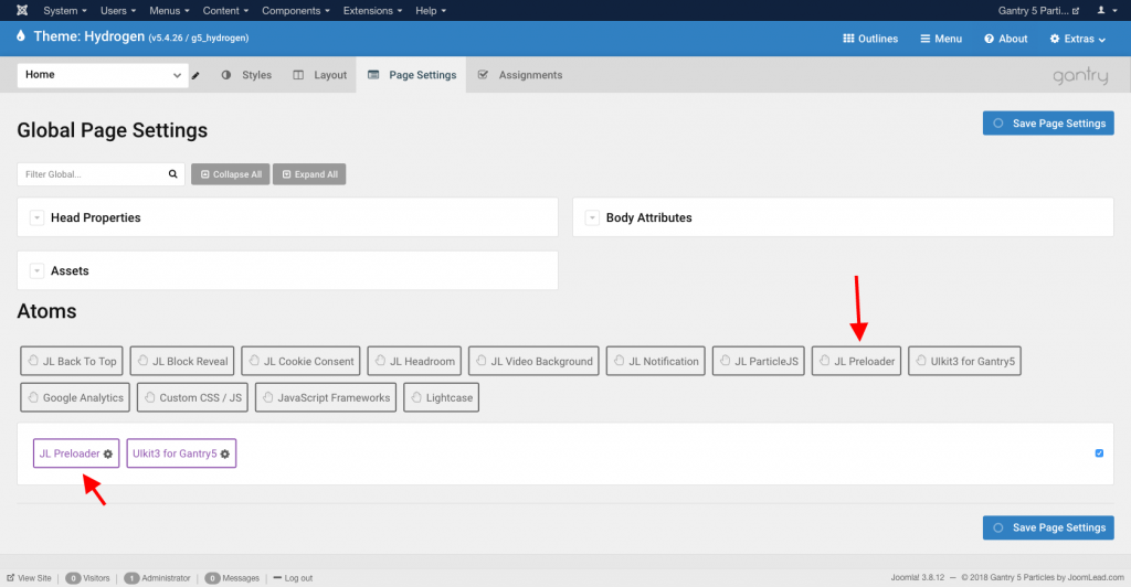
After you upload and implement this atom, go to your Template/Theme Settings > select the Layout to add Preloader (i.e: Home) -> Page Settings -> Enable the Preloader Atom
Settings
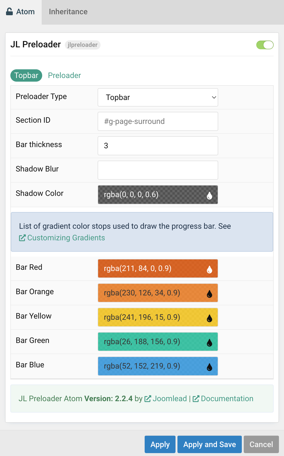
Note Starting from 2.2.4, preloader added new topbar animation that helps you create a beautiful Site-wide progress indicator.
| Setting | Description |
|---|---|
| Preloader type | Select the preloader type animation |
| Section ID | Enter your unique Section id for creating topbar progress indicator |
| Bar thickness | The progress bar thickness. |
| Shadow Color | Customize the topbar shadow Color. |
| Bar Red/Orange/Yeallow/Green/Blue | Customize the topbar gradient color stops used to draw the progress bar. See Customizing Gradients |
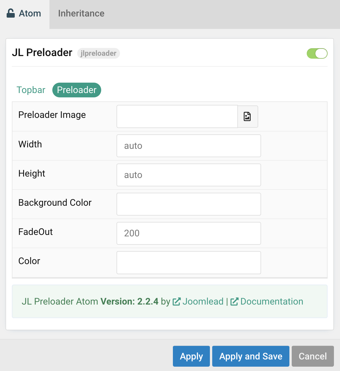
Preloader animation
| Setting | Description |
|---|---|
| Preloader Image | Select desired image for preloader icon, default using Spinner icon from Uikit. |
| Width | Enter the image’s width. |
| Height | Enter the image’s height. |
| Background Color | Customize the background color for body on load. |
| FadeOut | Changing the visibility of elements on the page with a fading effect. |
| Color | Customize the color for icon on load.(Use this option for spinner icon only) |

Comments