Timeline Joomla/WordPress Particle
-
# Timeline Joomla Package contents
Files Description jltimelinejoomla.yaml Contains the Timeline Joomla particle settings. jltimelinejoomla.html.twig The Twig file to pull information, settings. timeline.min.css / timeline-rtl.min.css Contains the Timeline CSS and a right-to-left version. Note Timeline, Joomla/Wordpress/Grav uses the same timeline css file, so you just need to copy the css files once.
-
# Timeline WordPress Package contents
Files Description jltimelinewordpress.yaml Contains the Timeline WordPress particle settings. jltimelinewordpress.html.twig The Twig file to pull information, settings. timeline.min.css / timeline-rtl.min.css Contains the Timeline CSS and a right-to-left version. Note Timeline, Joomla/Wordpress/Grav uses the same timeline css file, so you just need to copy the css files once.
-
# Timeline Grav Package contents
Files Description jltimelinegrav.yaml Contains the Timeline Grav particle settings. jltimelinegrav.html.twig The Twig file to pull information, settings. timeline.min.css / timeline-rtl.min.css Contains the Timeline CSS and a right-to-left version. Note Timeline, Joomla/Wordpress/Grav uses the same timeline css file, so you just need to copy the css files once.
Installation Installing the particle on your website is a really simple process. You can refer to the document here to know more.
Requirements Timeline Joomla/Wordpress/Grav require Uikit 3 for Gantry 5 Atom to be installed and enabled in your theme layout settings.
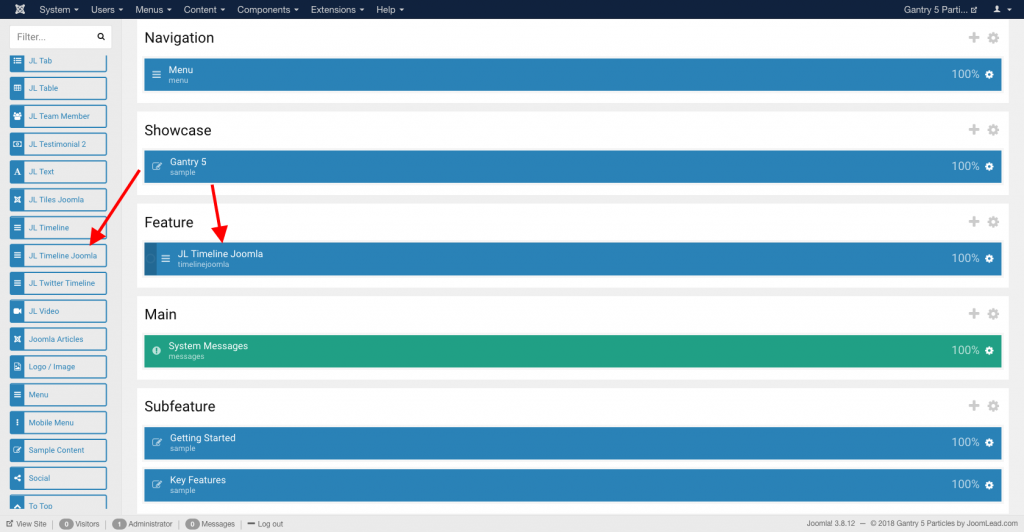
Go to Template/Theme Settings > select the Layout to add Timeline Joomla Particle (i.e: Home) -> Layout tab -> Drag and drop the Timeline Joomla Particle from Particles panel (left corner) to the section you want to display the text.
Settings
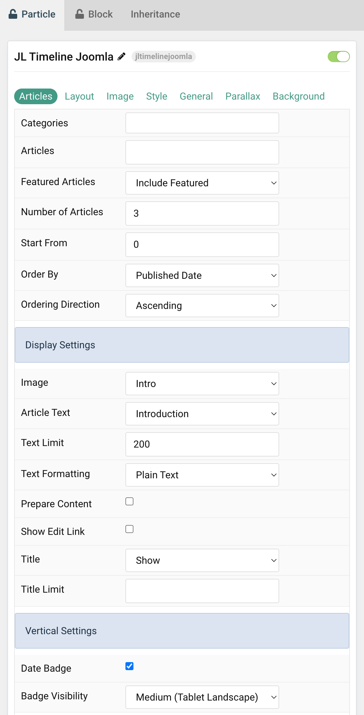
Tab Articles
| Settings | Description |
|---|---|
| Categories | Select the categories the articles should be taken from. |
| Articles | Enter the Joomla articles that should be shown. It should be a list of article IDs separated with a comma (i.e. 1,2,3,4,5). |
| Featured Articles | Select how Featured articles should be filtered. |
| Number of Articles | Enter the maximum number of articles to display. |
| Start From | Enter offset specifying the first article to return. The default is ‘0’ (the first article). |
| Order By | Select how the articles should be ordered by. |
| Ordering Direction | Select the direction the articles should be ordered by. |
| Display Settings | Common settings for Display |
| Image | Select if and what image of the article should be shown. |
| Article Text | Select if and how the article text should be shown. |
| Text Limit | Type in the number of characters the article text should be limited to. |
| Text Formatting | Select the formatting you want to use to display the article text. |
| Prepare Content | Enable shortcode processing / filtering in the content. This useful when you want to load the Joomla module or WordPress shortcode inside the card content, example you can add a Joomla shortcode inside the card content like {loadmoduleid your_moduleId}, then just enable the Process shortcodes feature and done. This solution similar to How do you put a module inside an article? |
| Show Edit Link | Display a link to the article edit form |
| Title | Select if the article title should be shown. |
| Title Limit | Enter the maximum number of characters the article title should be limited to. |
| Vertical Settings | Common settings for Vertical layout |
| Date Badge | Show or hide the Timeline Date badge on mobile/tablet devices. |
| Badge Visibility | Set the breakpoint from which date badge items will stack.. |
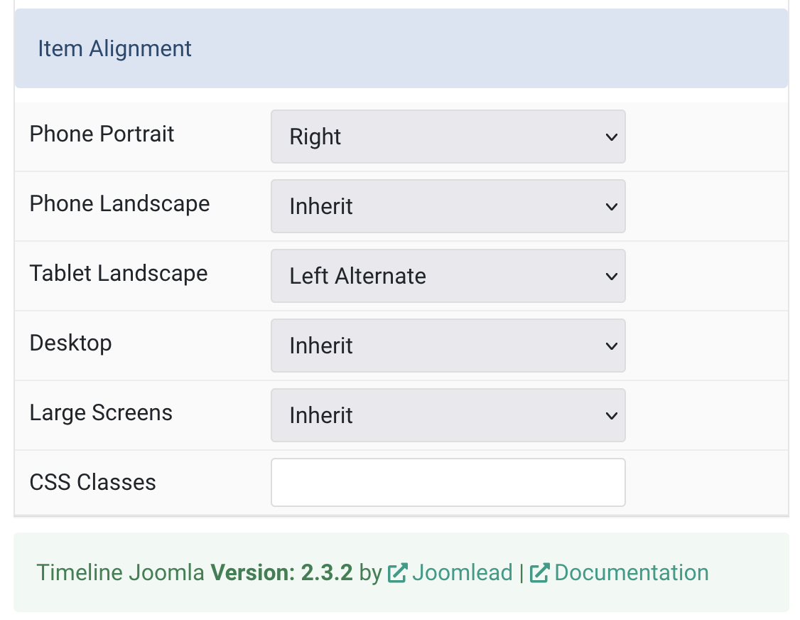
| Item Alignment | Set item alignment on different devices |
| Item Alignment Settings | Common settings for item alignment layout. |
| Phone Portrait | Set the alignment of timeline items for each breakpoint. Inherit refers to the number of items on the next smaller screen size. |
| Phone Landscape | |
| Tablet Landscape | |
| Desktop | |
| Large Screens | |
| CSS Classes | CSS class name for the particle. |
| Tag Attributes | Extra Tag attributes. |
Tab Layout
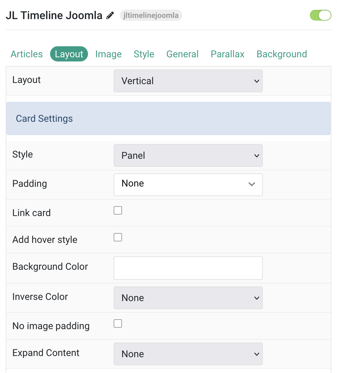
| Settings | Description |
|---|---|
| Layout | Choose between Vertical or Horizontal layout |
| Vertical Settings | Common settings for Timeline Style |
| Style | Select one of the boxed Card, Tile styles or a blank Panel. |
| Padding | Set the padding for the Card styles. |
| Link card | Link the whole card if a link exists. |
| Add hover style | Add a hover style to the card link. |
| Background Color | Customize the card background color if empty card is set. |
| Inverse Color | Set light or dark color mode for text, buttons and controls. |
| No image padding | Top, left or right aligned images can be attached to the card’s edge. If the image is aligned to the left or right, it will also extend to cover the whole space. This option won’t have any effect IF the Style is set to Panel or Image Alignment is set to Between. |
| Expand Content | Expand the height of the content to fill the available space in the panel and push the link to the bottom. |
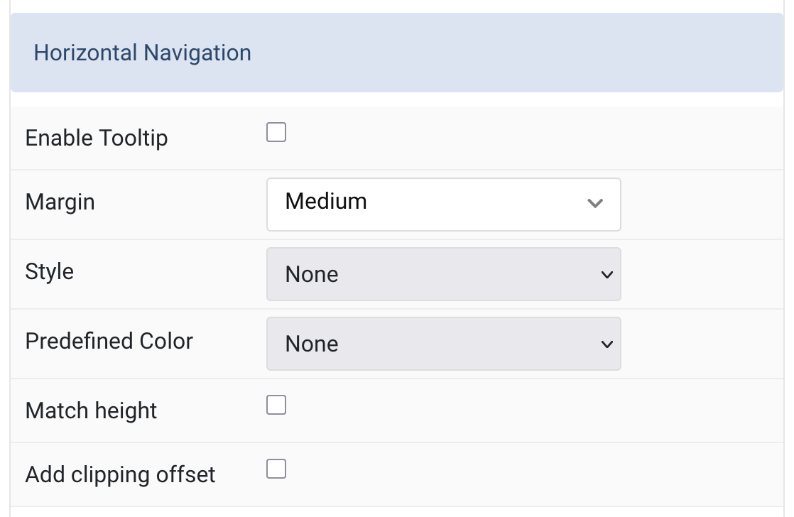
Horizontal Navigation Common settings for Horizontal layout style
| Settings | Description |
|---|---|
| Enable Tooltip | Show tooltip title on hover. |
| Margin | Set the vertical margin. |
| Style | Title styles differ in font-size but may also come with a predefined color, size and font. |
| Predefined Color | Select the predefined title text color. If the Background option is selected, styles that don’t apply a background image use the primary color instead. |
| Match height | Match the card height |
| Add clipping offset | Since the slider effect needs a clipping container, box shadows of content items are also clipped. Check this option to widen the container to prevent box-shadows from clipping. |
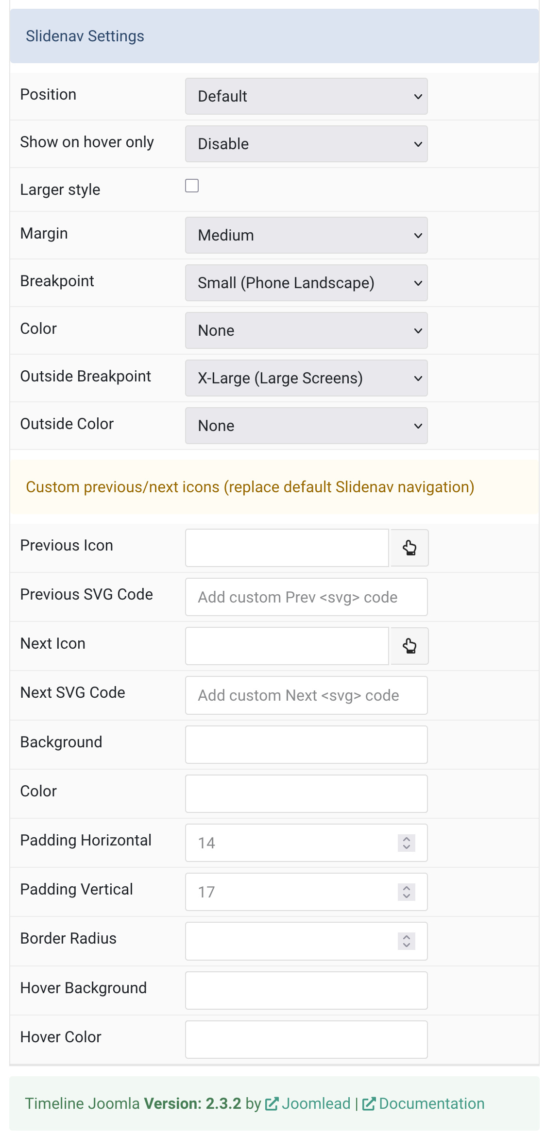
Slidenav Settings Common settings for Slidenav Settings
| Settings | Description |
|---|---|
| Positions | Select the position of the slidenav. |
| Show on hover only | Show the slide nav on hover only. |
| Larger style | To increase the size of the slidenav icons. |
| Margin | Apply a margin between the slidenav and the slider container. |
| Breakpoint | Display the slidenav only on this device width and larger. |
| Color | Set light or dark color mode. |
| Outside Breakpoint | Display the slidenav only outside on this device width and larger. Otherwise it will be displayed inside. |
| Outside Color | Set light or dark color if the slidenav is outside of the slider. |
Tab Image
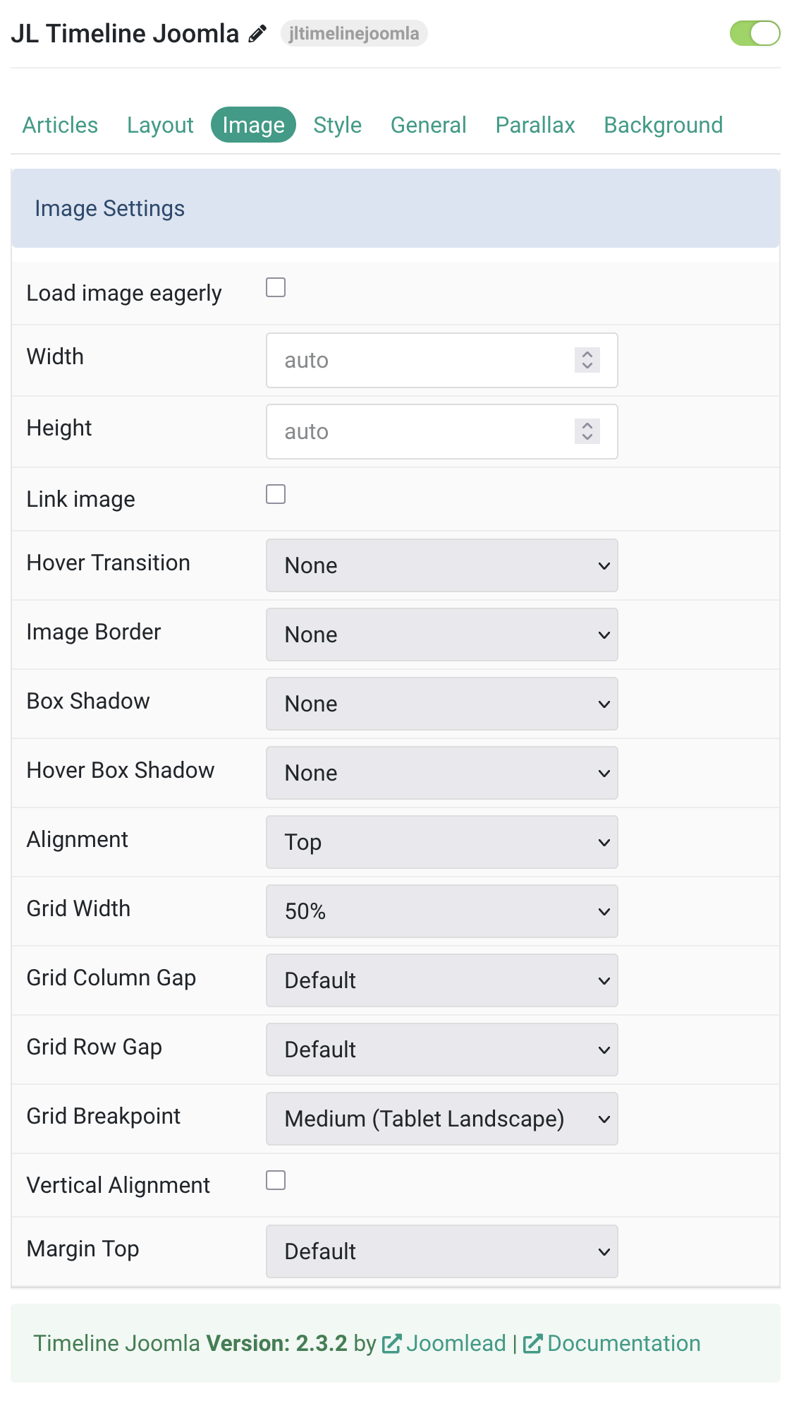
Image Settings Common settings for Image Style
| Settings | Description |
|---|---|
| Load image eagerly | By default, images are loaded lazy. Enable eager loading for images in the initial viewport. |
| Width | Enter the image’s width. |
| Height | Enter the image’s height. |
| Image Border | Select the image’s border style. This option won’t have any effect if Align image without padding is enabled. |
| Box Shadow | Select the image’s box shadow size. This option won’t have any effect unless the Card Style is set to Panel. |
| Hover Box Shadow | Select the image’s box shadow size on hover. This option won’t have any effect unless the Card Style is set to Panel. |
| Link image | Link the image if a link exists. |
| Hover Transition | Set the hover transition for a linked image. |
| Alignment | Align the image to the top,left, right or place it between the title and the content. |
| Grid Width | Define the width of the image within the grid. Choose between percent and fixed widths or expand columns to the width of their content. This option won’t have any effect unless Image Alignment is set to Left or Right. |
| Grid Column Gap | Set the size of the gap between the image and the content. This option won’t have any effect unless Image Alignment is set to Left or Right. |
| Grid Row Gap | Set the size of the gap if the grid items stack. This option won’t have any effect unless Image Alignment is set to Left or Right. |
| Grid Breakpoint | Set the breakpoint from which grid cells will stack. This option won’t have any effect unless Image Alignment is set to Left or Right. |
| Vertical Alignment | Vertically center grid cells. This option won’t have any effect unless Image Alignment is set to Left or Right. |
| Margin Top | Set the top margin. This option won’t have any effect unless Image Alignment is set to Bottom or Between. |
Tab Style
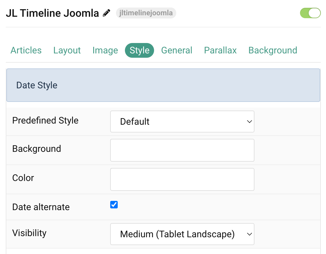
Date Style Settings Common settings for Date Style
| Settings | Description |
|---|---|
| Predefined Style | Highlight parts of your timeline date. |
| Background | Customize the date background color. You need to set the Predefined color to None before using the color customization. |
| Color | Customize the date color text. |
| Date alternate | Show or hide the Timeline Date alternate when using Left/Right alternate mode. |
| Visibility | Display the date alternate effect only on this device width and larger. |
Style Settings Common settings for Timeline line, border
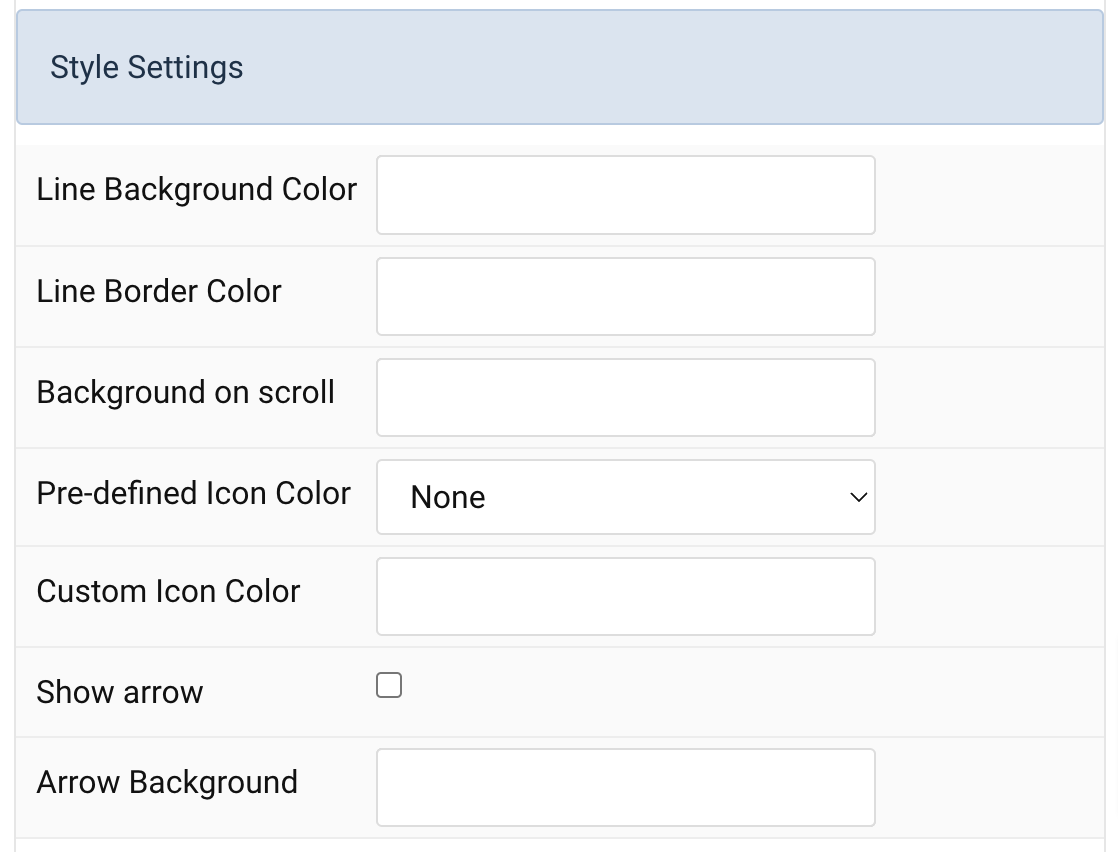
| Settings | Description |
|---|---|
| Line Background Color | Customize the line background color. |
| Line Border Color | Customize the line border color. |
| Background on scroll | Customize the line background color on scroll. |
| Pre-defined Icon Color | Select the text color. If the Background option is selected, styles that don’t apply a background image use the primary color instead. |
| Custom Icon Color | Customize the Icon Color. |
| Show arrow | Show arrow for timeline items. |
| Arrow Background | Customize the arrow background color. |
Title Settings Common settings for Title Style
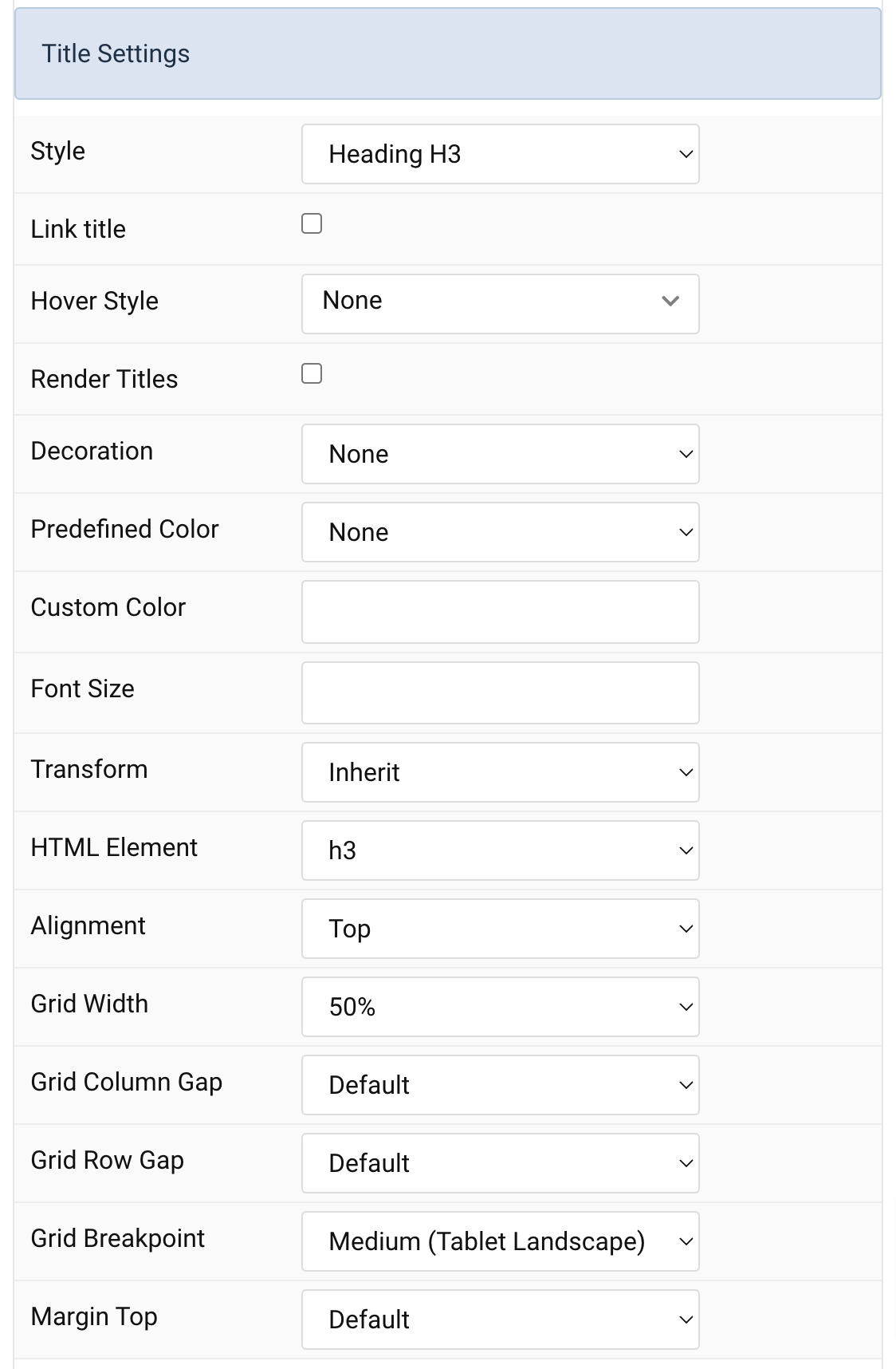
| Settings | Description |
|---|---|
| Style | Heading styles differ in font-size but may also come with a predefined color, size and font. |
| Link title | Link the title if a link exists. |
| Hover Style | Set the hover style for a linked title. Enable link title to use this option. |
| Render Titles | Renders the link title |
| Decoration | Decorate the headline with a divider, bullet or a line that is vertically centered to the heading. |
| Predefined Color | Select a predefined text color. |
| Custom Color | Customize the title color instead using predefined title color mode. You need to set the predefined color to None to use the customize color option. |
| Font Size | Customize the title text font size. |
| Transform | The following options will transform text into uppercased, capitalized or lowercased characters. |
| HTML Element | Choose one of the elements to fit your semantic structure. |
| Alignment | Align the title to the top or left in regards to the content. |
| Grid Width | Define the width of the title within the grid. Choose between percent and fixed widths or expand columns to the width of their content. |
| Grid Column Gap | Set the size of the gap between the image and the content. |
| Grid Row Gap | Set the size of the gap if the grid items stack. |
| Grid Breakpoint | Set the breakpoint from which grid cells will stack. |
| Margin Top | Set the top margin. |
Meta Settings Common settings for Meta
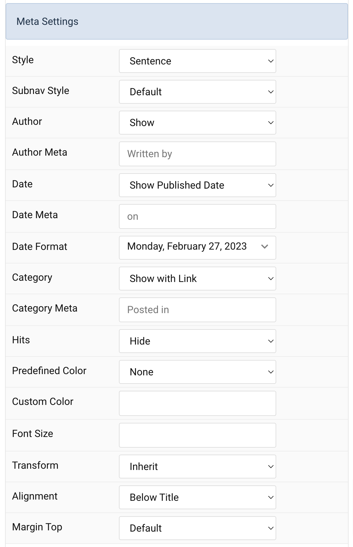
| Settings | Description |
|---|---|
| Style | Display the meta text in a sentence or a horizontal list. |
| Subnav Style | Select the subnav style for Meta List Style. |
| Author | Select if the article author should be shown. |
| Author Meta | Translate or replace the Author meta text for Sentence Style. Default: Written by |
| Date | Select if the article date should be shown. |
| Date Format | Select preferred date format. Leave empty not to display a date. |
| Date Meta | Translate or replace the Date meta text for Sentence Style. Default: on |
| Category | Select if and how the article category should be shown. |
| Category Meta | Translate or replace the Category meta text for Sentence Style. Default: Posted in |
| Hits | Select if the article hits should be shown. |
| Predefined Color | Select the predefined meta color. |
| Custom Color | Customize the meta color. Set Predefined Color for Meta to None before using this feature. |
| Font Size | Customize the title text font size. |
| Transform | The following options will transform text into uppercased, capitalized or lowercased characters. |
| Alignment | Align the meta text above/below the title or below the content. |
| Margin Top | Set the top margin. |
Content Settings Common settings for Content Style
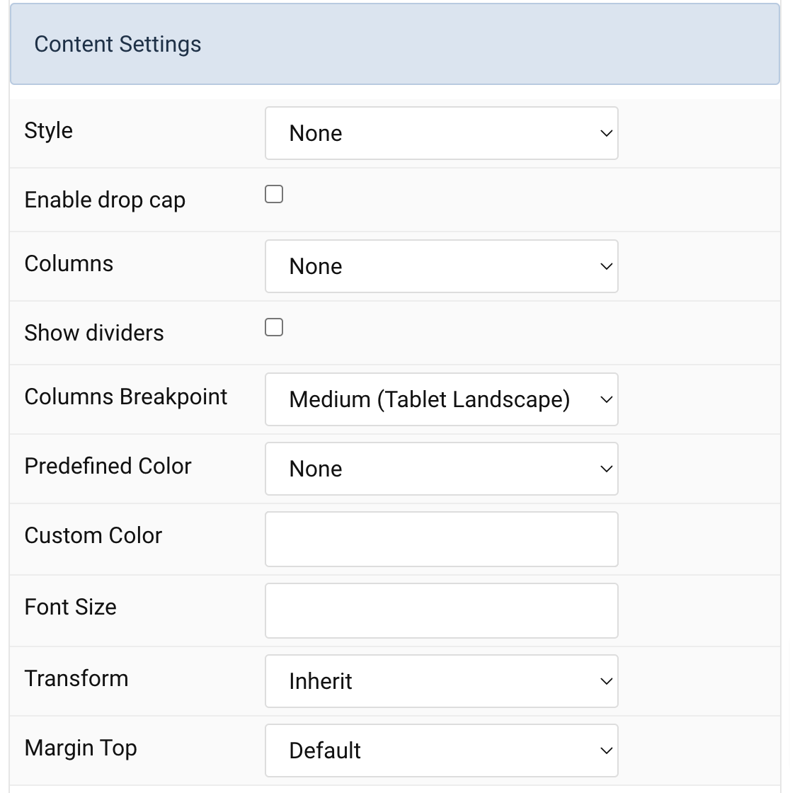
| Settings | Description |
|---|---|
| Style | Select a predefined text style, including color, size and font-family. |
| Enable drop cap | Display the first letter of the paragraph as a large initial. |
| Columns | Set the number of list columns. |
| Show dividers | Show a divider between list columns. |
| Columns Breakpoint | Set the device width from which the list columns should apply. |
| Predefined Color | Select the predefined meta color. |
| Custom Color | Customize the content color instead using predefined text color. |
| Font Size | Customize the content text font size. |
| Transform | The following options will transform text into uppercased, capitalized or lowercased characters. |
| Margin Top | Set the top margin. |
Link Settings Common settings for Link Style
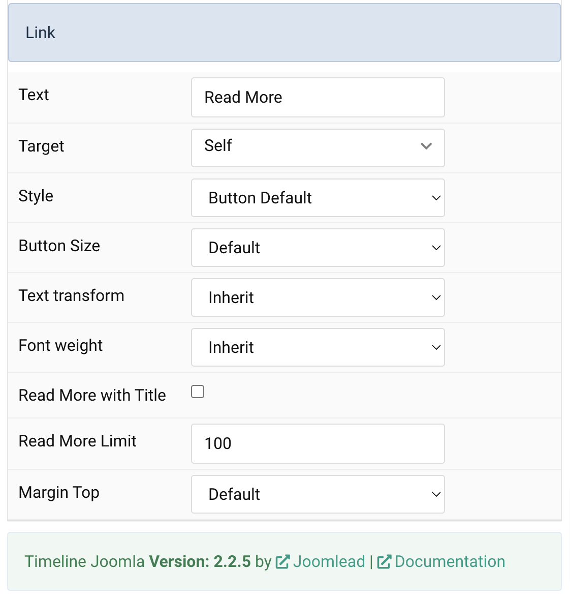
| Settings | Description |
|---|---|
| Text | Specify the button label. |
| Target | Open the link in a same or new window. |
| Style | Set the button style. |
| Button Size | Set the button size. |
| Text transform | The following options will transform text into uppercased, capitalized or lowercased characters. |
| Font weight | Add one of the following classes to modify the font weight of your text. |
| Read More with Title | Add the title to read more button. |
| Read More Limit | Type in the number of characters the readmore text should be limited to(characters). |
| Margin Top | Set the top margin. |
General, Parallax and Parallax Background tab
Please take a look the documentation here for more detail about these tabs settings

Comments