Call To Action Particle
# Call To Action Package contents
| Files | Description |
|---|---|
| jlcalltoaction.yaml | Contains the Call To Action particle settings. |
| jlcalltoaction.html.twig | The Twig file to pull information, settings. |
Installation Installing the particle on your website is a really simple process. You can refer to the document here to know more.
Requirements Call To Action requires Uikit 3 for Gantry 5 Atom to be installed and enabled in your theme layout settings.
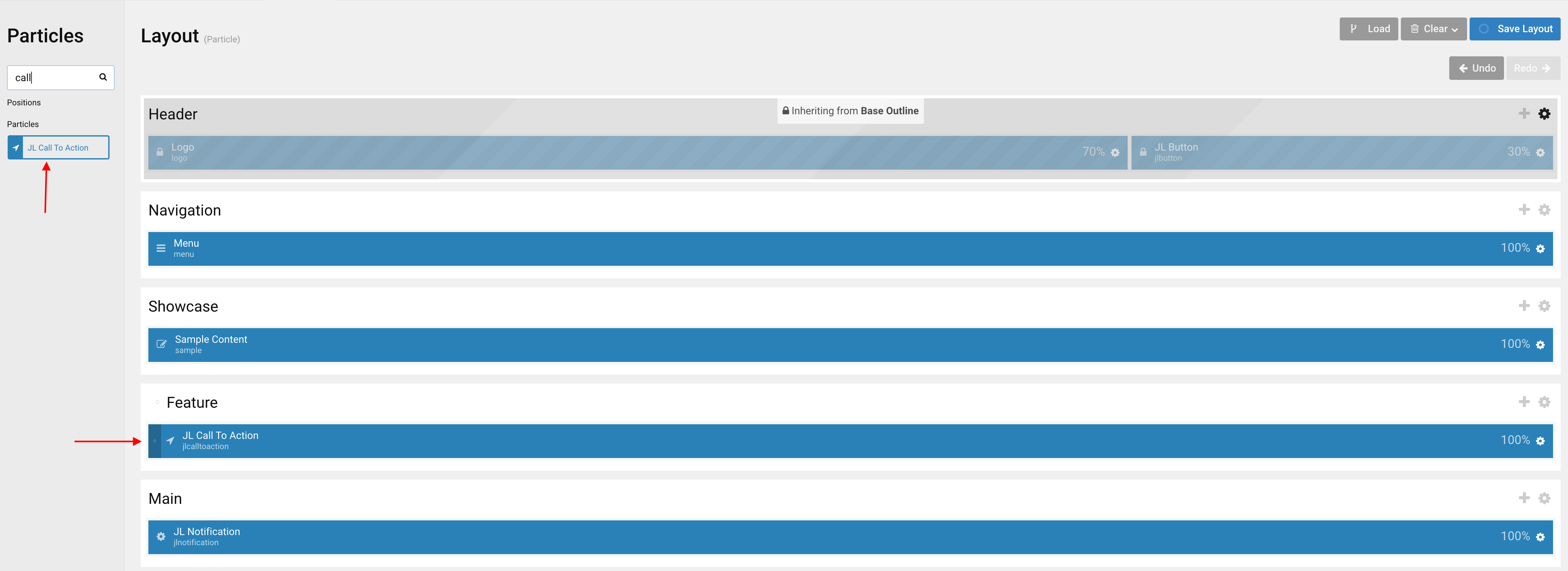
Go to Template/Theme Settings > select the Layout to add Call To Action particle (i.e: Home) -> Layout tab -> Drag and drop the Call To Action Particle from Particles panel (left corner) to the section you want to display the particle.
Settings
| Settings | Description |
|---|---|
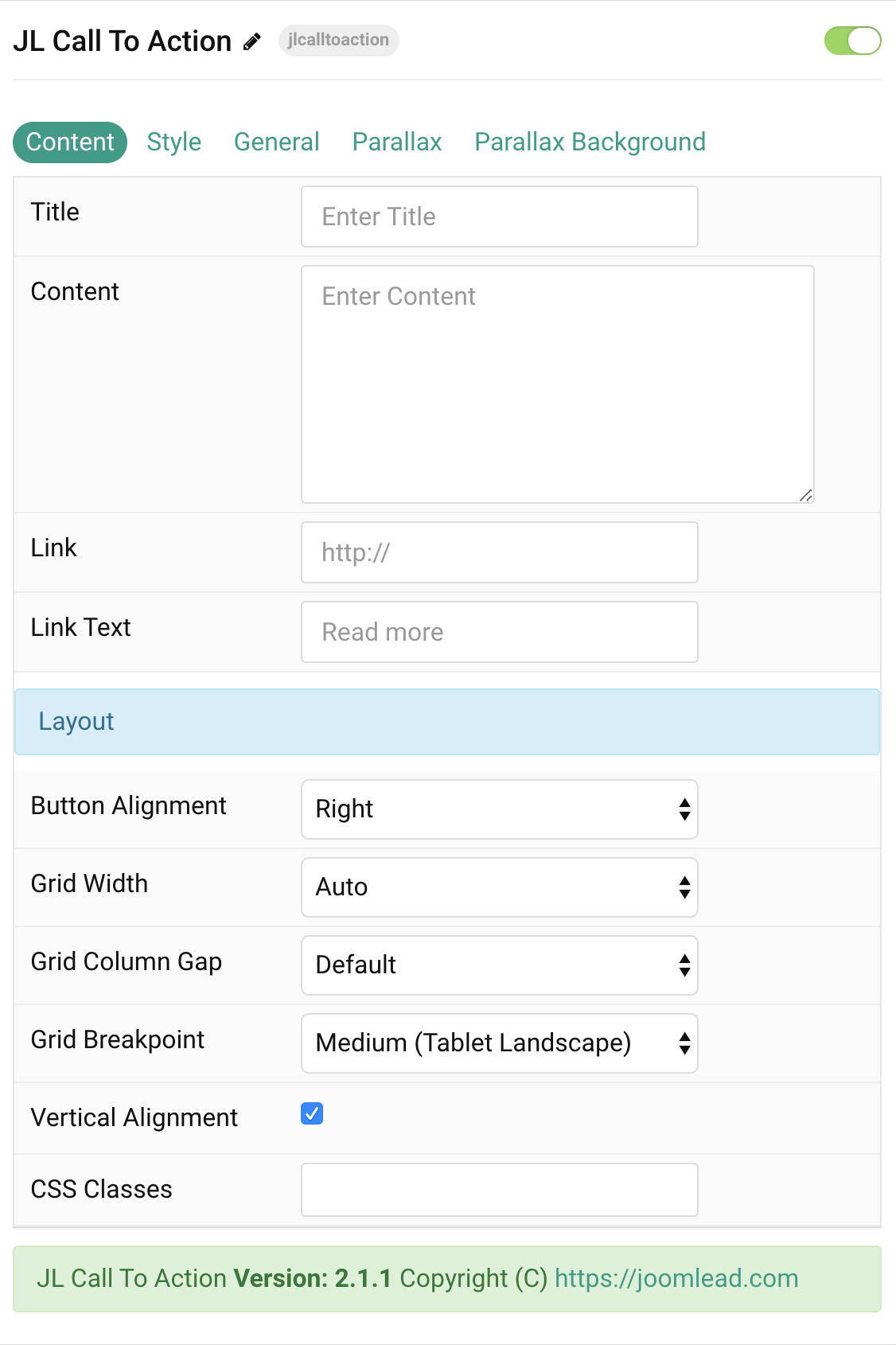
| Title | Customize the title text |
| Content | Customize the content. |
| Link | Specify the button link. Scroll smoothly added automatically to internal link that contains a URL fragment to add the smooth scrolling behavior. |
| Link Text | Specify the button label. |
| Layout Settings | Common settings for Button Layout |
| Button Alignment | Align the button to the top, left, right or place it between the title and the content. |
| Grid Width | Define the width of the button within the grid. Choose between percent and fixed widths or expand
columns to the width of their content. This option won’t have any effect unless Button Alignment is set to Left or Right |
| Grid Column Gap | Set the size of the gap between the button and the content. This option won’t have any effect unless Button Alignment is set to Left or Right |
| Grid Breakpoint | Set the breakpoint from which grid cells will stack. This option won’t have any effect unless Button Alignment is set to Left or Right |
| Vertical Alignment | Vertically center grid cells. This option won’t have any effect unless Button Alignment is set to Left or Right |
| CSS Classes | CSS class name for the particle. |
Style Tab
| Settings | Description |
|---|---|
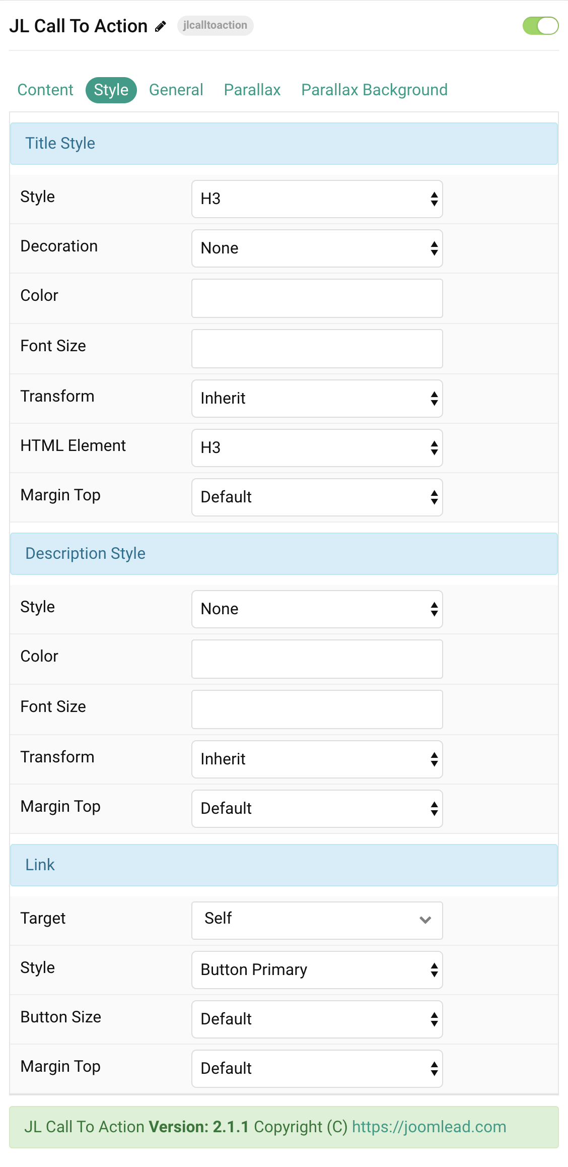
| Title Style Settings | Common settings for Title Style |
| Style | Heading styles differ in font-size but may also come with a predefined color, size and font. |
| Decoration | Decorate the headline with a divider, bullet or a line that is vertically centered to the heading. |
| Color | Customize the title color. |
| Font Size | Customize the title text font size. |
| Transform | The following options will transform text into uppercased, capitalized or lowercased characters. |
| HTML Element | Choose one of the elements to fit your semantic structure. |
| Margin Top | Set the top margin. Note that the margin will only apply if the content field immediately follows another content field. |
| Description Settings | Common settings for Description |
| Style | Select a predefined description text style, including color, size and font-family. |
| Color | Customize the description color. |
| Font Size | Customize the description text font size. |
| Transform | The following options will transform text into uppercased, capitalized or lowercased characters. |
| Margin Top | Set the top margin. Note that the margin will only apply if the content field immediately follows another content field. |
| Link Settings | Common settings for Link |
| Target | Target browser window when item is clicked. |
| Style | Set the button style. |
| Button Size | Set the button size. |
| Margin Top | Set the top margin. Note that the margin will only apply if the content field immediately follows
another content field. This option won’t have any effect unless Button Alignment is set to Bottom or Between |
General, Parallax and Parallax Background tab
Please take a look the documentation here for more detail about these tabs settings

Comments