Carousel Joomla Particle
# Carousel Joomla Package contents
| Files | Description |
|---|---|
| jlcarouseljoomla.yaml | Contains the Carousel Joomla particle settings. |
| jlcarouseljoomla.html.twig | The Twig file to pull information, settings. |
Installation Installing the particle on your website is a really simple process. You can refer to the document here to know more.
Requirements Carousel requires Uikit 3 for Gantry 5 Atom to be installed and enabled in your theme layout settings.
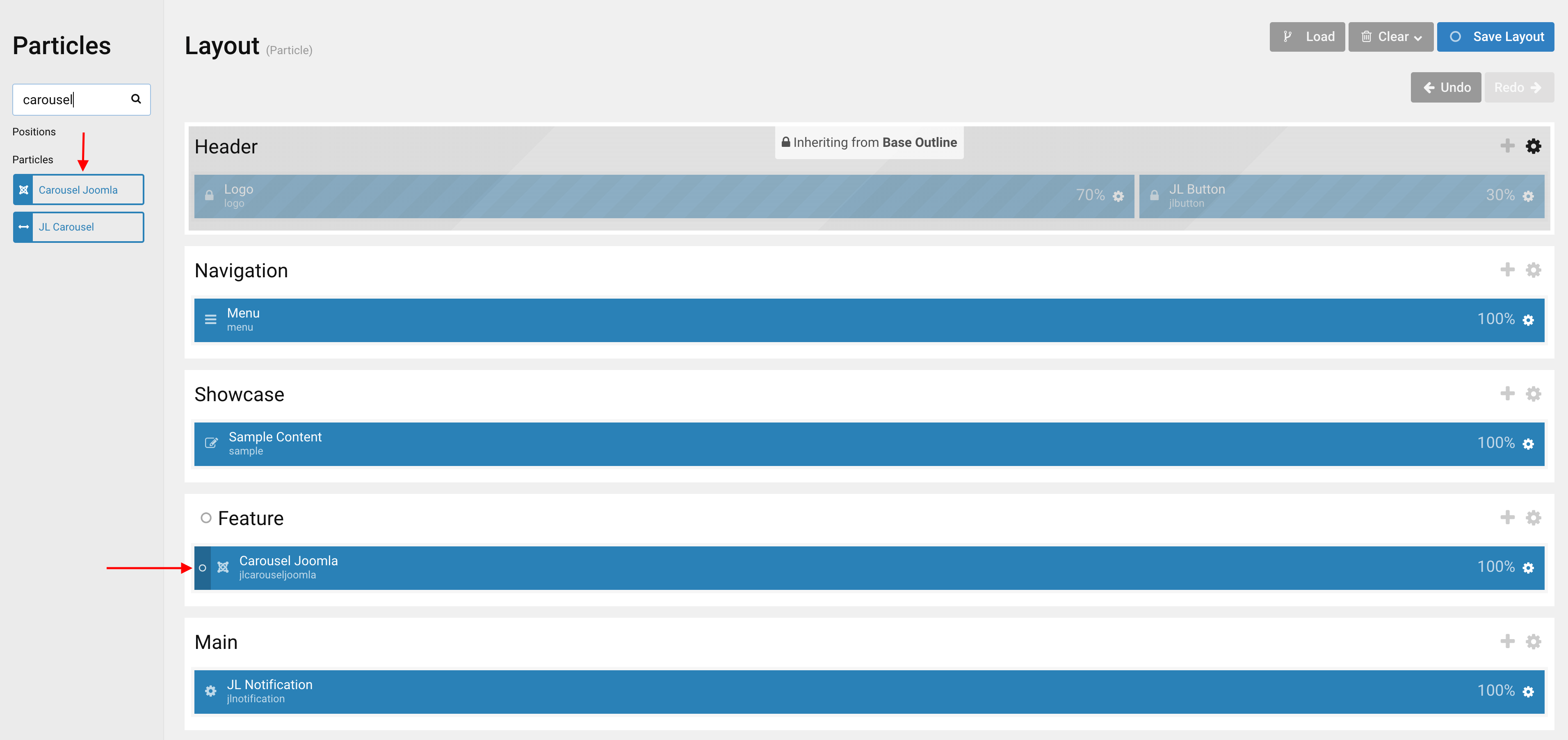
Go to Template/Theme Settings > select the Layout to add Carousel Joomla particle (i.e: Home) -> Layout tab -> Drag and drop the Carousel Joomla Particle from Particles panel (left corner) to the section you want to display the particle.
Settings
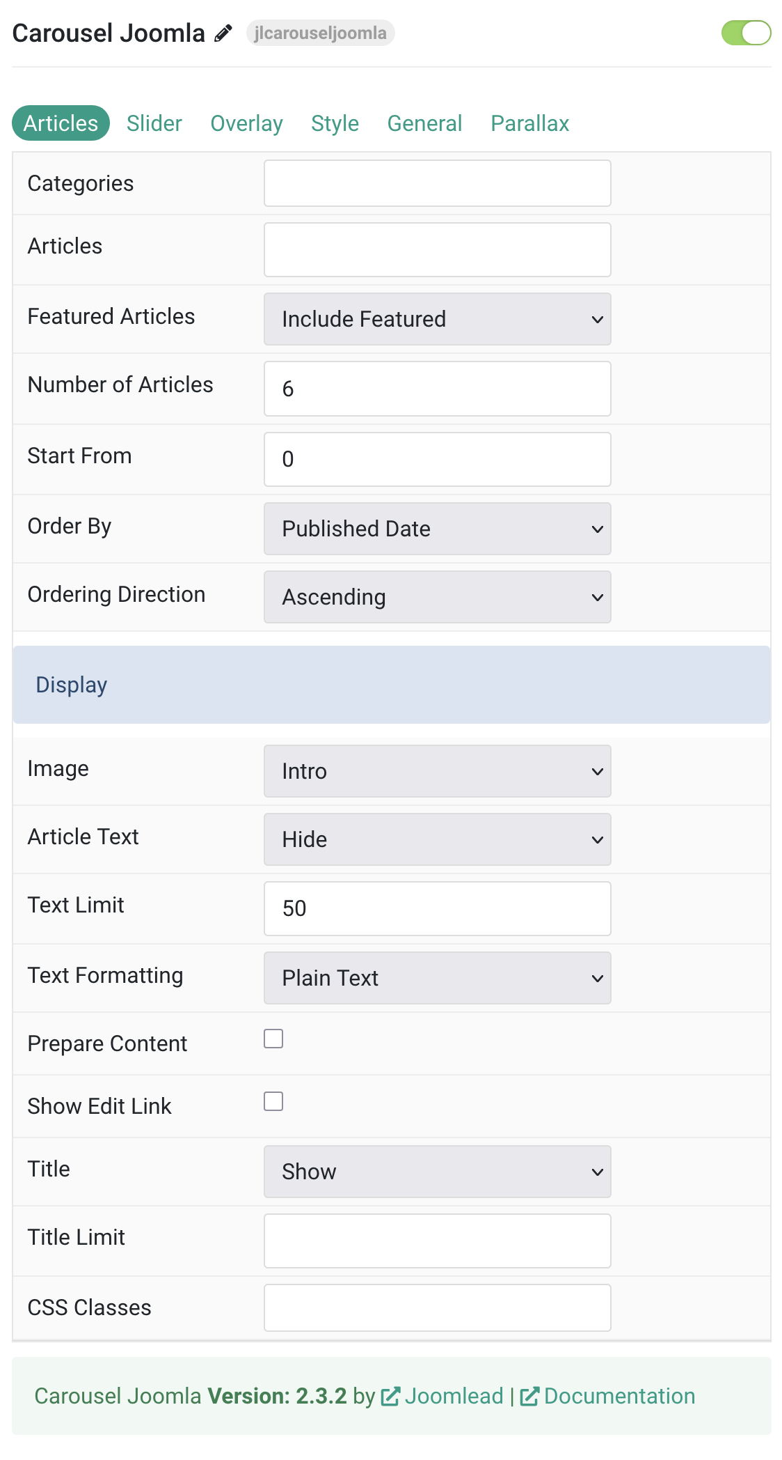
Articles Tab
| Settings | Description |
|---|---|
| Categories | Select the categories the articles should be taken from. |
| Articles | Enter the Joomla articles that should be shown. It should be a list of article IDs separated with a comma (i.e. 1,2,3,4,5). |
| Featured Articles | Select how Featured articles should be filtered. |
| Number of Articles | Enter the maximum number of articles to display. |
| Start From | Enter offset specifying the first article to return. The default is ‘0’ (the first article). |
| Order By | Select how the articles should be ordered by. |
| Ordering Direction | Select the direction the articles should be ordered by. |
| Display Style Settings | Common settings for Display Style |
| Image | Select if and what image of the article should be shown. |
| Article Text | Select if and how the article text should be shown. |
| Text Limit | Type in the number of characters the article text should be limited to. |
| Text Formatting | Select the formatting you want to use to display the article text. |
| Prepare Content | Use Joomla Content Plugins |
| Show Edit Link | Display a link to the article edit form |
| Title | Select if the article title should be shown. |
| Title Limit | Enter the maximum number of characters the article title should be limited to. |
| CSS Classes | CSS class name for the particle. |
Tab Slider
Layout Common settings for Carousel Layout. The Height and Min Height are not available for Auto Item Width mode.
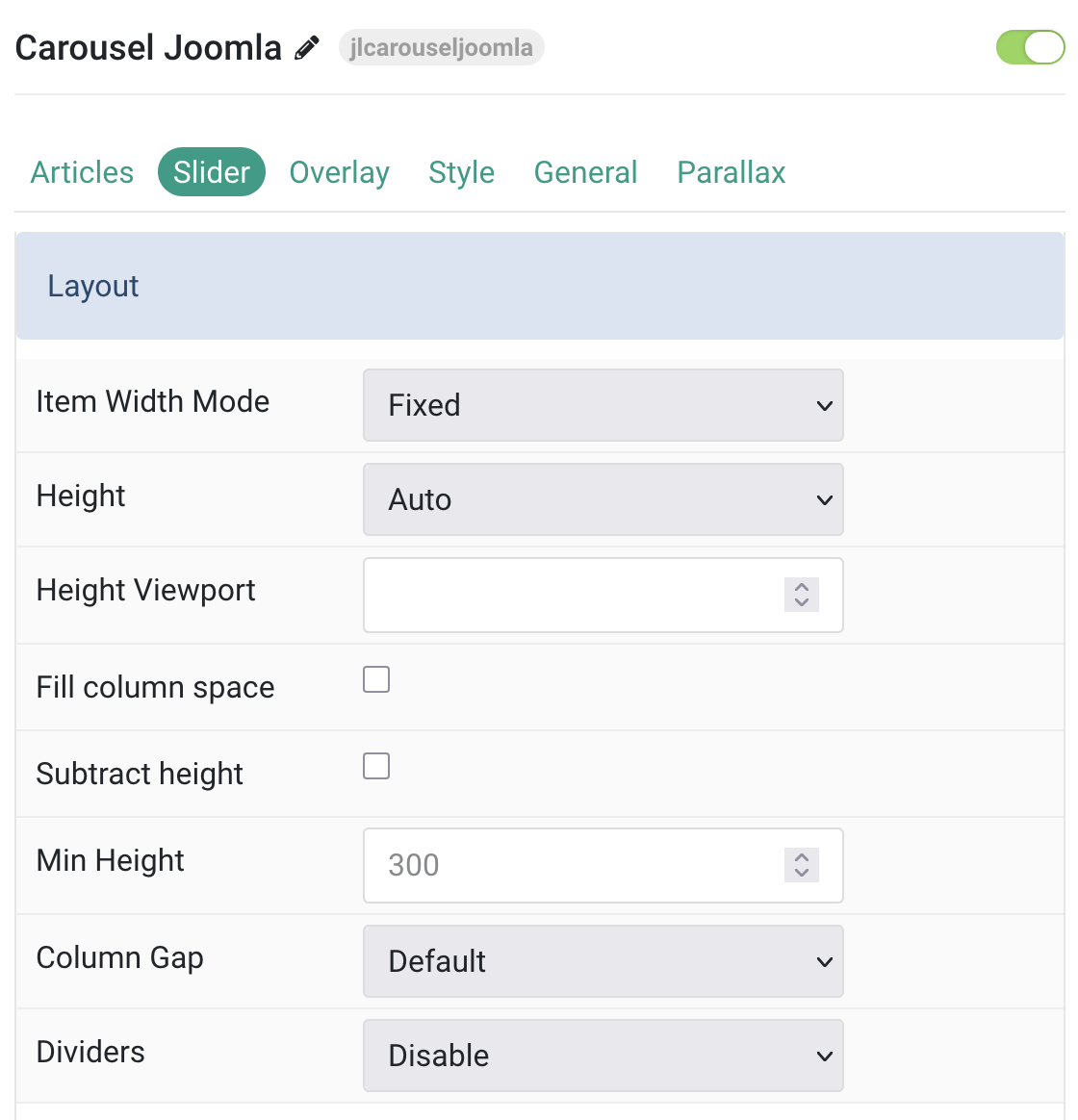
| Settings | Description |
|---|---|
| Item Width Mode | Define whether the width of the slider items is fixed or automatically expanded by its content widths. |
| Height | The height will adapt automatically based on its content. Alternatively, the height can adapt to the height of viewport. |
| Height Viewport | Use an optional minimum height (0-100%) to prevent the slideshow from becoming smaller than its content. |
| Fill column space | Expand the slider to fill available column space. |
| Subtract height | Reduce the calculated height by specified amount. |
| Min Height | Set minimum height (200-800px) to prevent content clipping on small devices. |
| Column Gap | Set the size of the gap between the grid columns. |
| Dividers | Display dividers between grid cells. |
Item Width Common settings for Columns – Set Item Width Mode to FIXED to use these settings.
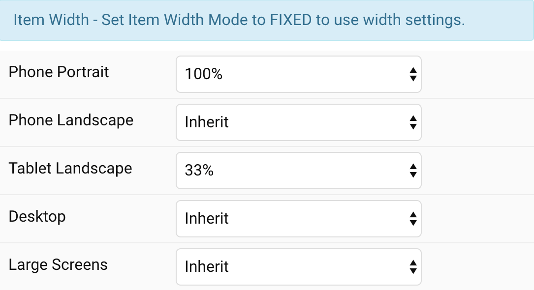
| Settings | Description |
|---|---|
| Phone Portrait | Set the item width for each breakpoint. Inherit refers to the item width of the next smaller screen size. |
| Phone Landscape | |
| Tablet Landscape | |
| Desktop | |
| Large Screens |
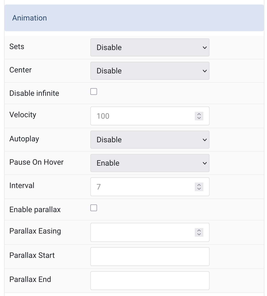
Animation Common settings for Slider Animation.
| Setting | Description |
|---|---|
| Animation | |
| Sets | Slide all visible items at once by grouping them into sets. The number of items per set depends on the defined item width.
Example: |
| Center | Center the active slide within the slider view. |
| Disable Infinite | Disable continuous scrolling and loop back to start after the last item. |
| Velocity | Set animation speed in pixels per millisecond.
Minimum: |
| Autoplay | Automatically advance slider items without user interaction. |
| Pause On Hover | Temporarily pause autoplay while the user hovers over the slider. |
| Interval | Set autoplay delay between slides in seconds.
Range: |
| Parallax | |
| Enable Parallax | Enable stepless parallax animation based on scroll position. |
| Parallax Easing | Set easing intensity for parallax animation.
|
| Parallax Start | Animation starts when the element enters the viewport. Accepts offsets like 100px, 50vh, or 50vh + 50%. |
| Parallax End | Animation ends when the element leaves the viewport. Accepts the same offsets as Start. |
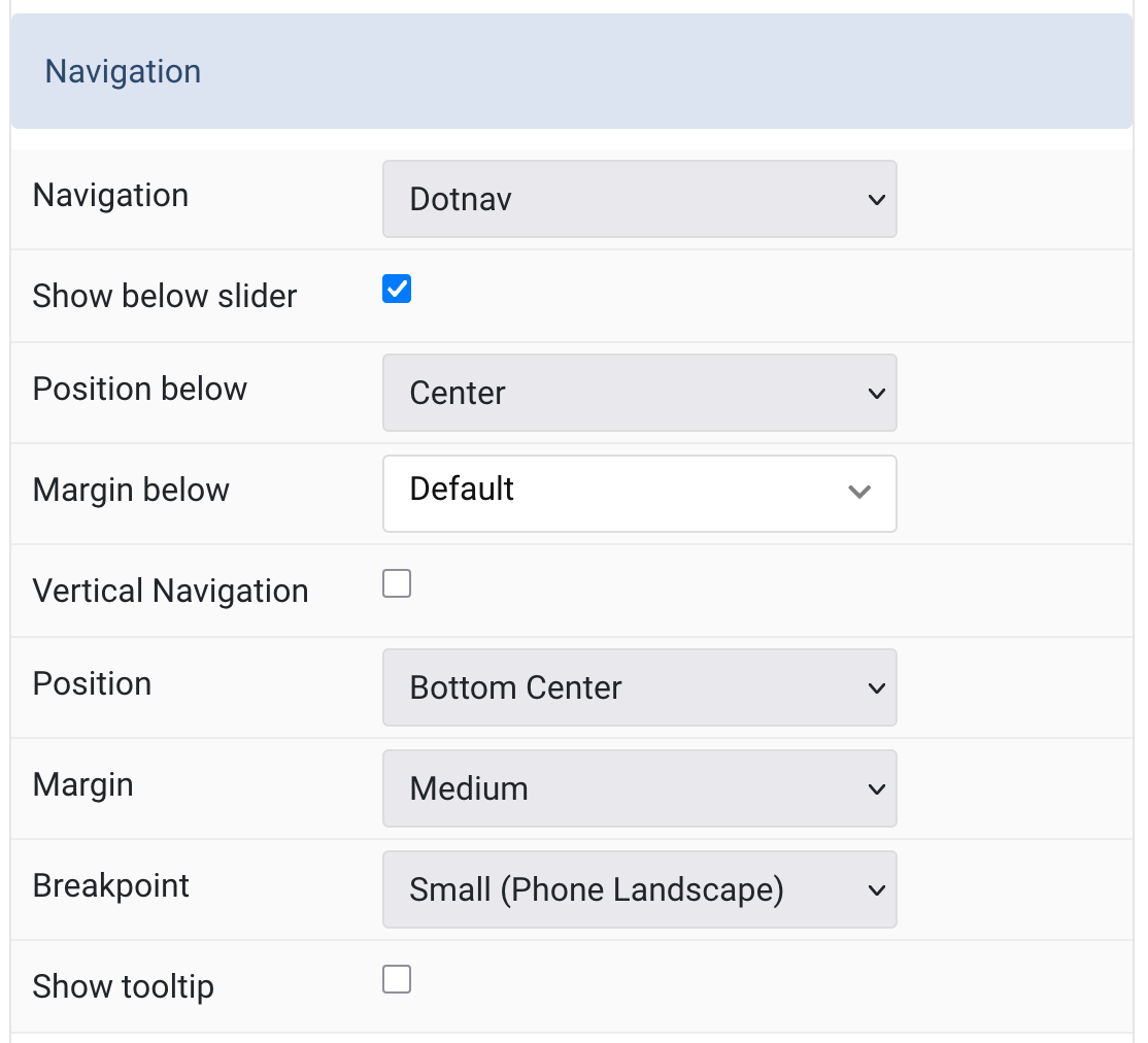
Navigation Common settings for Slider Navigation.
| Settings | Description |
|---|---|
| Navigation | Select the navigation type.
Dotnav or None |
| Show Below Slider | Display navigation underneath the slider area. |
| Position Below | Align the navigation dots below the slider |
| Margin Below | Set vertical margin under navigation |
| Vertical Navigation | Enable vertical layout for navigation dots. |
| Position | Position navigation inside the slider if not shown below |
| Margin (Positioned) | Set margin between navigation and slider when placed inside |
| Breakpoint | Display navigation only at and above this device width |
| Show Tooltip | Show image ALT tag as a tooltip on hover over navigation items. |
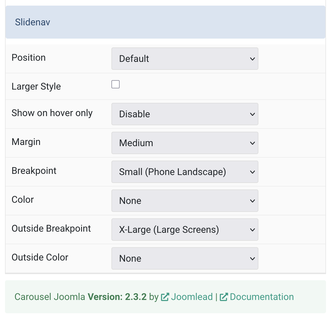
Slidenav Common settings for Slider Slidenav.
| Settings | Description |
|---|---|
| Position | Choose slidenav position |
| Larger Style | Increase the size of the slidenav arrows for better visibility. |
| Show on Hover Only | Display slidenav arrows only when hovering over the slider. |
| Margin | Set spacing between the slidenav and the slider |
| Breakpoint | Show slidenav only on and above the selected screen size |
| Color | Choose light or dark styling for slidenav icons:
|
| Outside Breakpoint | Only display slidenav outside slider at and above the selected width |
| Outside Color | Set light or dark style when slidenav is shown outside the slider |
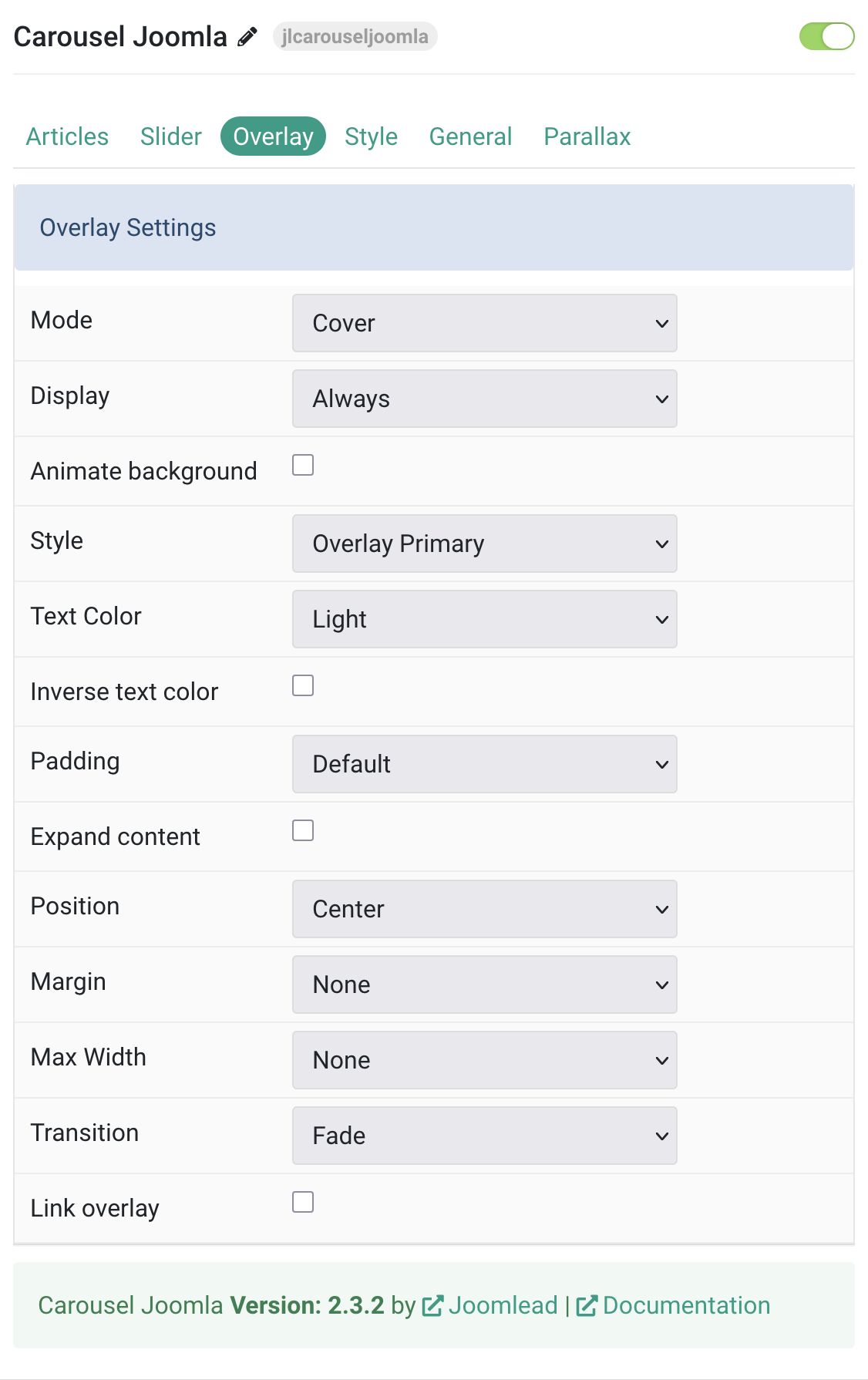
Tab Overlay
| Settings | Description |
|---|---|
| Mode | Choose between cover or caption overlay mode. Cover mode requires manual text color setting. |
| Display | Control when the overlay is shown: always, on hover, or when the slide becomes active. |
| Animate Background | Animate only the background portion of the overlay on hover. |
| Style | Select a visual style for the overlay background and text. |
| Text Color | Choose light or dark color mode for text, buttons, and controls inside the overlay. |
| Inverse Text Color | Invert the text color when the overlay is hovered. |
| Padding | Adjust the spacing between the overlay edges and its content. |
| Expand Content | Force the overlay content to stretch vertically, pushing links to the bottom. |
| Position | Select the alignment or placement of overlay content within its container. |
| Margin | Add margin between the overlay and the image, if a style is selected. |
| Max Width | Limit the maximum width of the overlay content. |
| Transition | Choose a transition effect for the overlay when it appears on hover. |
| Link Overlay | Make the entire overlay area clickable if a link is provided. |
Tab Style
Image Common settings for Image
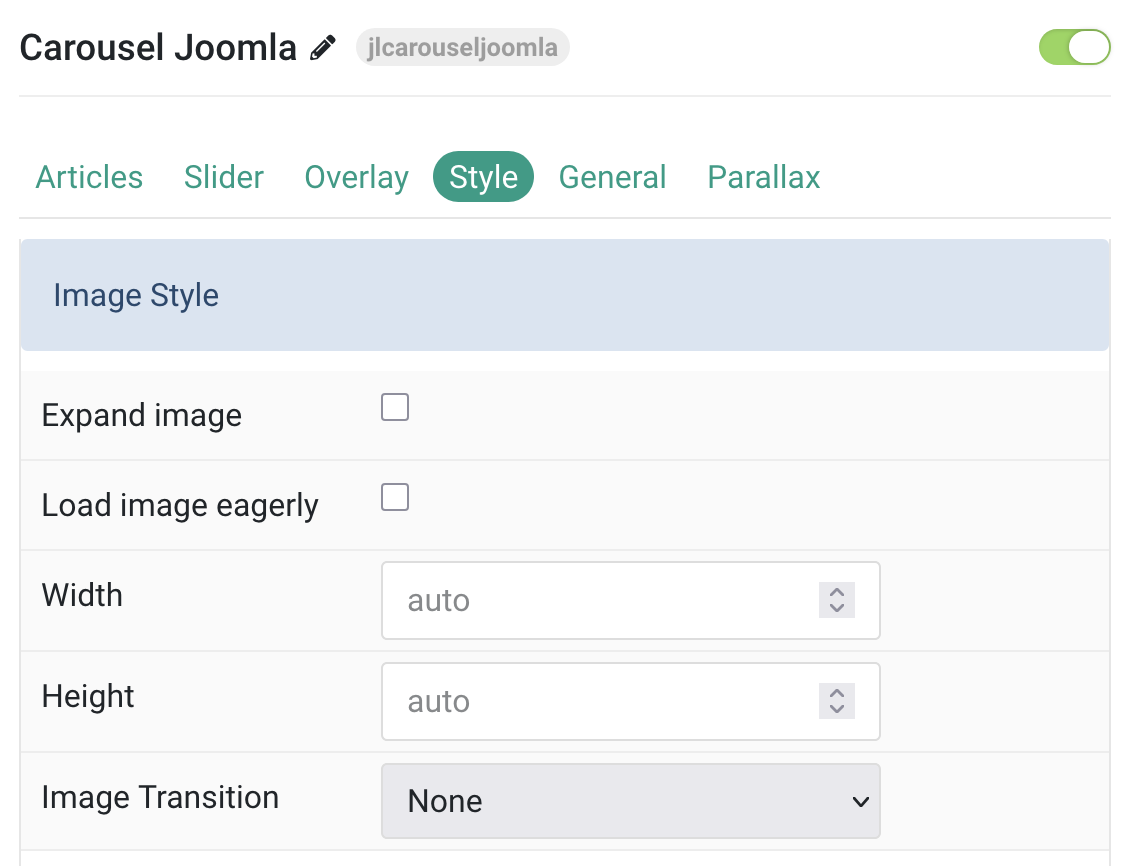
| Settings | Description |
|---|---|
| Expand Image | Expand the image to fill the available vertical space in the item. |
| Load Image Eagerly | Load the image immediately if it’s in the initial viewport instead of lazy loading. |
| Width | Set a custom width for the image. |
| Height | Set a custom height for the image. |
| Image Transition | Choose an animation effect for the image. |
Title Settings Common settings for title.
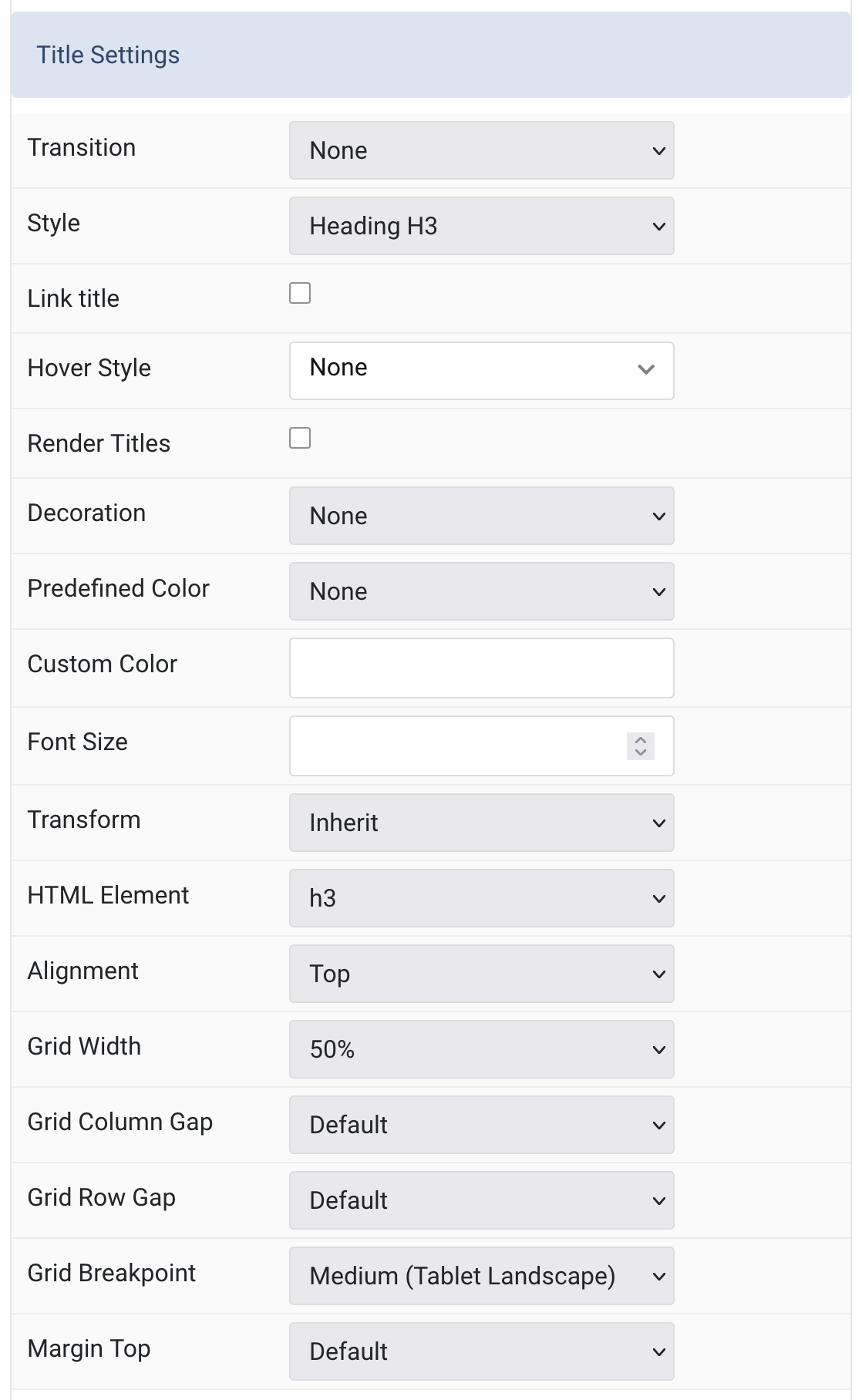
| Settings | Description |
|---|---|
| Title Transition | Choose how the title animates when the overlay appears on hover. |
| Style | Select the style for the heading, which may include font size, weight, or color variations. |
| Link Title | Make the title a clickable link if a link is present. |
| Hover Style | Define the hover behavior for linked titles. Requires ‘Link Title’ to be enabled. |
| Render Titles | Enable rendering of menu item tooltips for better accessibility. |
| Decoration | Add decorative elements to the heading like dividers or bullets. |
| Predefined Color | Apply a predefined color scheme to the title. ‘Background’ falls back to primary if unsupported. |
| Custom Color | Manually set the title’s color using a color picker. |
| Font Size | Set a custom font size for the title text. |
| Transform | Apply text transformations like uppercase or capitalize. |
| HTML Element | Select the HTML tag for the title to fit semantic structure. |
| Alignment | Align the title at the top or to the left of its content block. |
| Grid Width | Specify how wide the title area should be within the layout grid. |
| Grid Column Gap | Adjust the space between the image and title/content within the grid. |
| Grid Row Gap | Define vertical spacing when grid items stack. |
| Grid Breakpoint | Set the screen size where the grid starts stacking elements. |
| Margin Top | Add spacing above the title if it follows another content field. |
Meta Settings Common settings for Meta
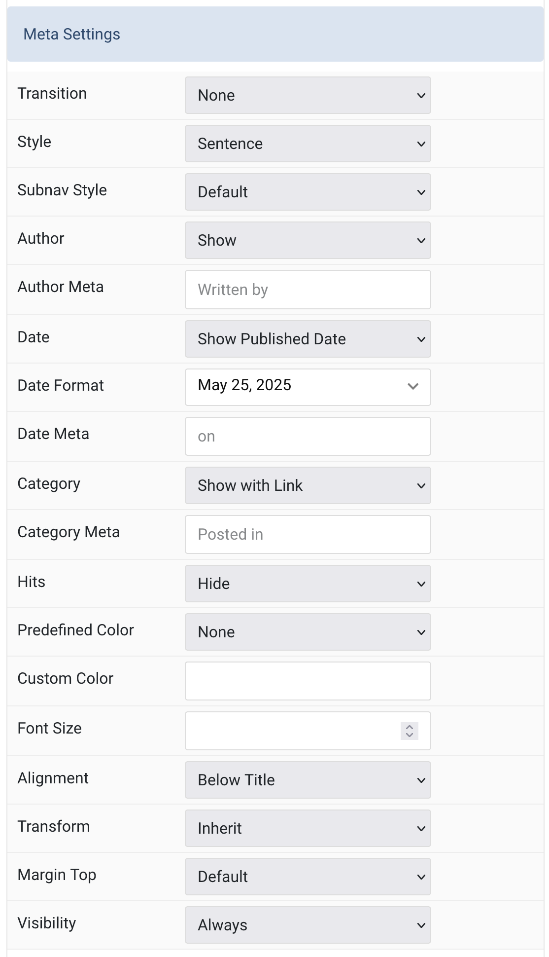
| Settings | Description |
|---|---|
| Transition | Select a transition for the meta when the overlay appears on hover. |
| Style | Display the meta text in a sentence or a horizontal list. |
| Subnav Style | Select the subnav style for Meta List Style. |
| Author | Select if the article author should be shown. |
| Author Meta | Translate or replace the Author meta text for Sentence Style. Default: Written by |
| Date | Select if the article date should be shown. |
| Date Format | Select preferred date format. Leave empty not to display a date. |
| Date Meta | Translate or replace the Date meta text for Sentence Style. Default: on |
| Category | Select if and how the article category should be shown. |
| Category Meta | Translate or replace the Category meta text for Sentence Style. Default: Posted in |
| Hits | Select if the article hits should be shown. |
| Predefined Color | Select the predefined meta color. |
| Custom Color | Customize the meta color. Set Predefined Color for Meta to None before using this feature. |
| Font Size | Customize the meta text font size. |
| Transform | The following options will transform text into uppercased, capitalized or lowercased characters. |
| Alignment | Align the meta text above/below the title or below the content. |
| Margin Top | Set the top margin. Note that the margin will only apply if the content field immediately follows another content field. |
| Visibility | Display the element only on this device width and larger. |
Content Settings Common settings for content.
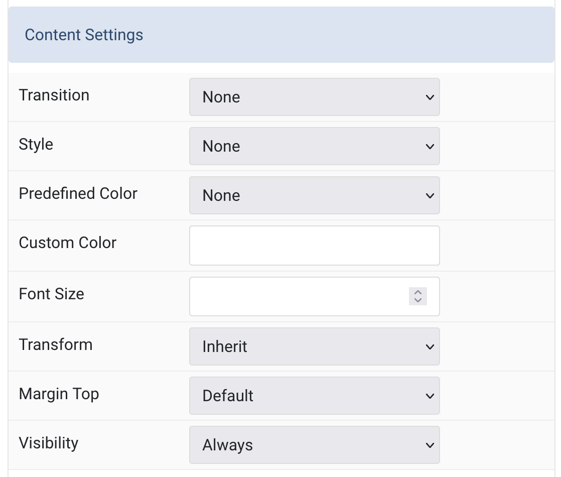
| Settings | Description |
|---|---|
| Transition | Select a transition for the content when the overlay appears on hover. |
| Style | Select a predefined text style, including color, size and font-family. |
| Predefined Color | Select the text color. |
| Custom Color | Customize the content color instead of using predefined text color. |
| Font Size | Customize the content text font size. |
| Transform | The following options will transform text into uppercased, capitalized or lowercased characters. |
| Margin Top | Set the top margin. Note that the margin will only apply if the content field immediately follows another content field. |
| Visibility | Display the element only on this device width and larger. |
Link Settings Common settings for link.
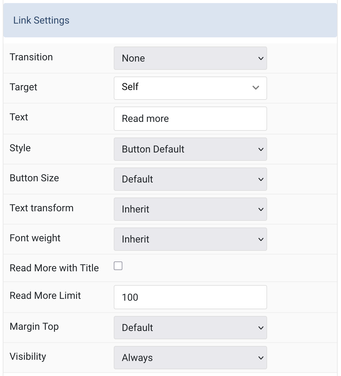
| Settings | Description |
|---|---|
| Transition | Select a transition for the link when the overlay appears on hover. |
| Target | Open the link in the same or a new window. |
| Text | Specify the button label. Default: Read more |
| Style | Set the button style. |
| Button Size | Set the button size. |
| Text transform | The following options will transform text into uppercased, capitalized or lowercased characters. |
| Font weight | Add one of the following classes to modify the font weight of your text. |
| Read More with Title | Show “Read More” with the article title. (Checkbox option) |
| Read More Limit | Type the number of characters the readmore text should be limited to. Default: 100 |
| Margin Top | Set the top margin. Applies only if the content field immediately follows another content field. |
| Visibility | Display the element only on this device width and larger. |
Slidenav Style Common style settings for Slidenav.
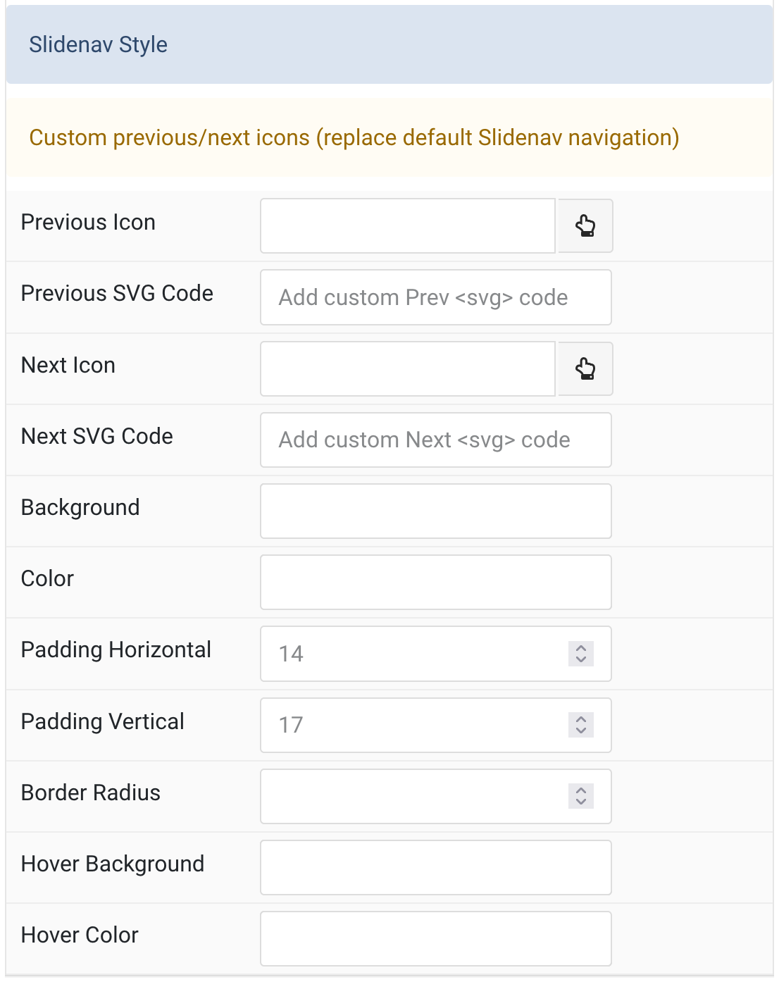
| Settings | Description |
|---|---|
| Previous Icon | Custom icon for the previous navigation button. |
| Previous SVG Code | Your SVG code that will be added inline to the site. Placeholder: Add custom Prev <svg> code |
| Next Icon | Custom icon for the next navigation button. |
| Next SVG Code | Your SVG code that will be added inline to the site. Placeholder: Add custom Next <svg> code |
| Background | Set the background color for the slidenav. |
| Color | Set the color for the slidenav icons. |
| Padding Horizontal | Set the horizontal padding. Placeholder: 14 |
| Padding Vertical | Set the vertical padding. Placeholder: 17 |
| Border Radius | Set the border radius for the slidenav buttons. |
| Hover Background | Set the background color on hover. |
| Hover Color | Set the icon color on hover. |
General, Parallax and Parallax Background tab
Please take a look the documentation here for more detail about these tabs settings

Comments