Carousel Particle Documentation
# Carousel Package contents
| Files | Description |
|---|---|
| jlcarousel.yaml | Contains the Carousel particle settings. |
| jlcarousel.html.twig | The Twig file to pull information, settings. |
Installation Installing the particle on your website is a really simple process. You can refer to the document here to know more.
Requirements Carousel requires Uikit 3 for Gantry 5 Atom to be installed and enabled in your theme layout settings.
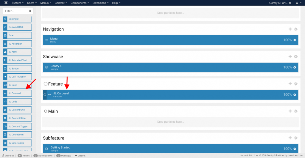
Go to Template/Theme Settings > select the Layout to add Carousel particle (i.e: Home) -> Layout tab -> Drag and drop the Carousel Particle from Particles panel (left corner) to the section you want to display the particle.
Settings overview
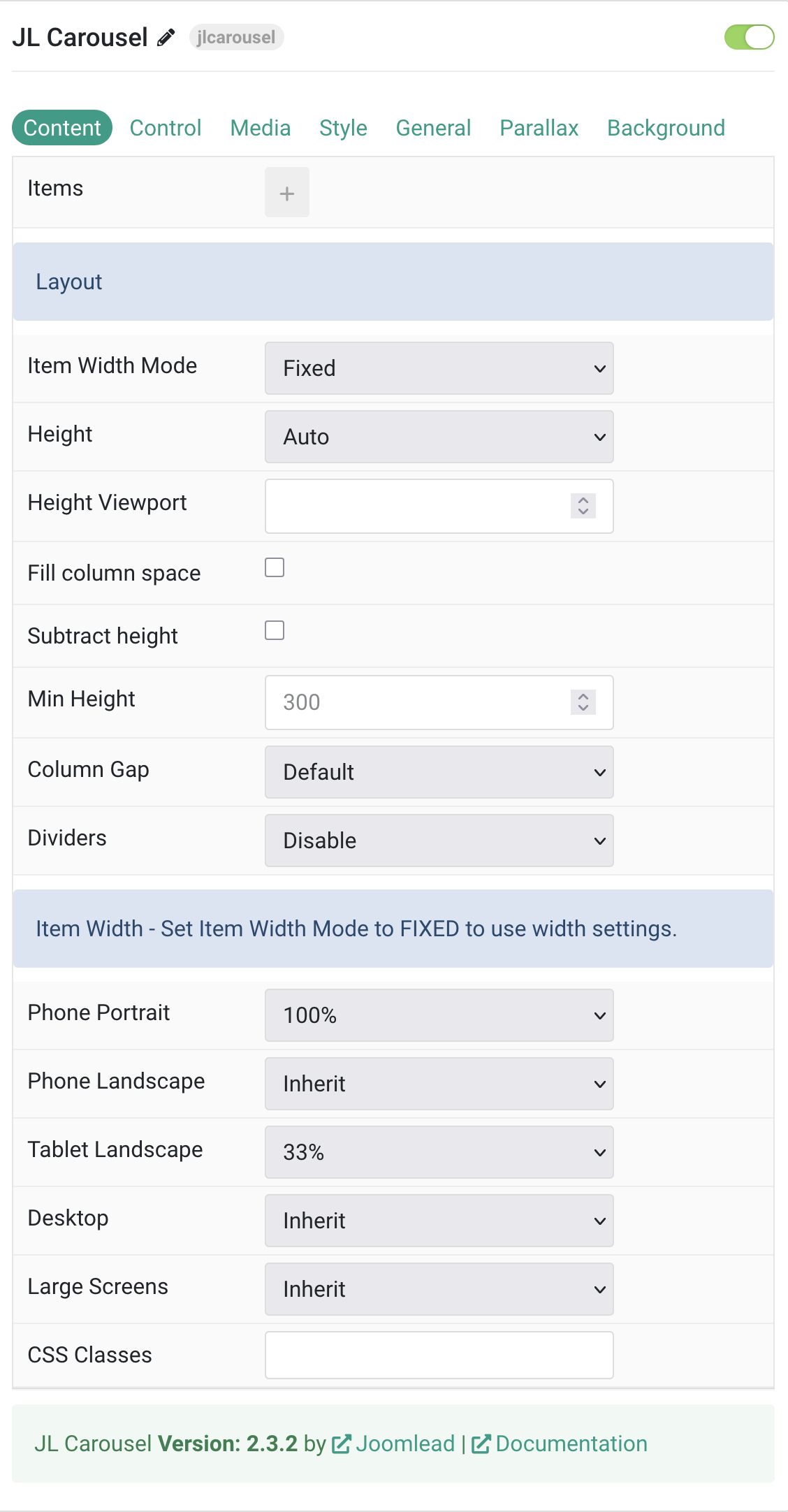
Tab Content
Items You can add new items to the collection using the plus + icon
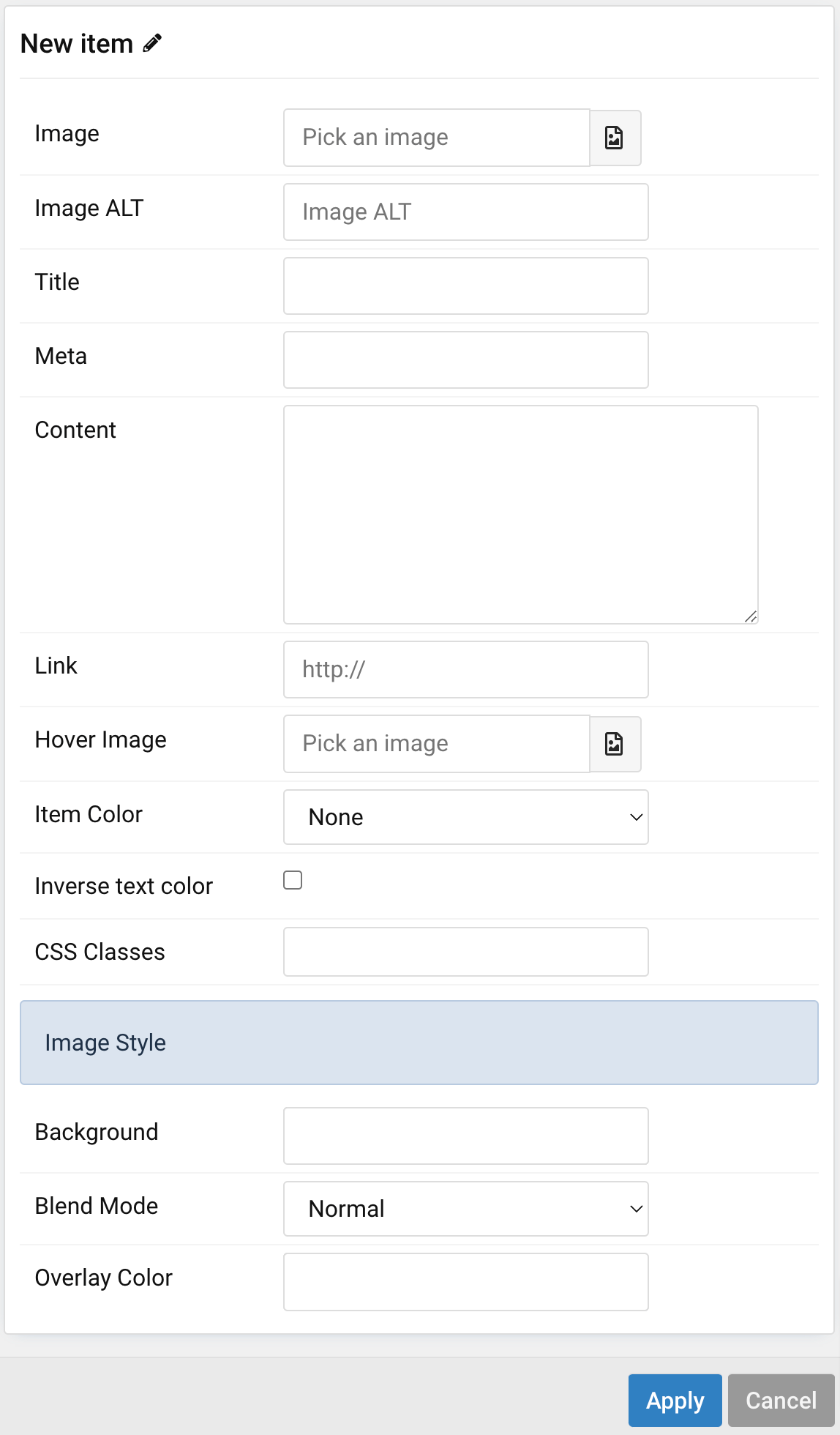
| Settings | Description |
|---|---|
| Image | An image field with an image picker |
| Image ALT | Enter the image’s alt attribute. |
| Title | Customize the Title |
| Meta | Customize the Meta. |
| Content | Customize the content. |
| Link | Specify the link for button. Scroll smoothly added automatically to internal link that contains a URL fragment to add the smooth scrolling behavior. |
| Hover Image | Select an optional image that appears on hover. |
| Item Color | Set light or dark color mode for text, buttons and controls. |
| Inverse text color | Inverse the text color on hover. |
| CSS Classes | Specify the CSS class name for item. |
| Image Style | Custom style for special image item |
| Background | Use the background color in combination with blend modes. |
| Blend mode | Determine how the image will blend with the background color. |
| Overlay Color | Set an additional transparent overlay to soften the image. |
Layout Common settings for Carousel Layout. The Height and Min Height are not available for Auto Item Width mode.
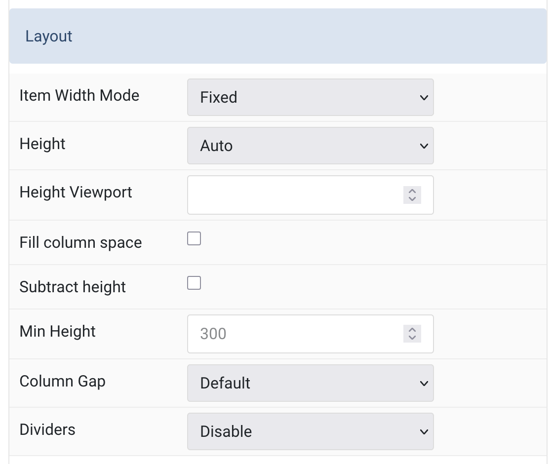
| Settings | Description |
|---|---|
| Item Width Mode | Define whether the width of slider items is fixed or automatically expanded based on their content width. The height settings and item width settings below only work in FIXED mode. |
| Height | The height will adapt automatically based on its content. Alternatively, the height can adapt to the height of the view port. This option won’t have any effect unless FIXED Item Width Mode is selected. Note: Make sure, no height is set in the section settings when using on of the viewport options. |
| Height Viewport | Use an optional minimum height to prevent the slideshow from becoming smaller than its content on small devices. (min 200, max 800). |
| Fill column space | Expand element height to fill available column space. |
| Subtract height | Subtract height offset from viewport height. |
| Min Height | Set the minimum height. This is useful if the content is too large on small devices. |
| Column Gap | Set the size of the gap between the grid columns. |
| Dividers | Show a divider between grid columns. |
Item Width Common settings for Columns – Set Item Width Mode to FIXED to use these settings.
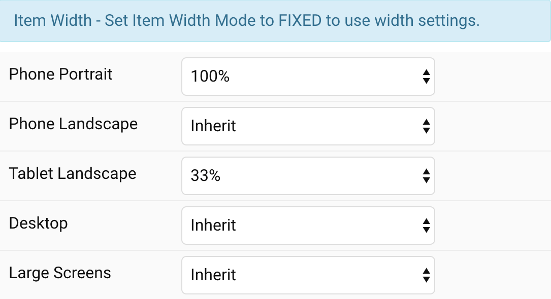
| Settings | Description |
|---|---|
| Phone Portrait | Set the item width for each breakpoint. Inherit refers to the item width of the next smaller screen size. |
| Phone Landscape | |
| Tablet Landscape | |
| Desktop | |
| Large Screens |
Tab Control
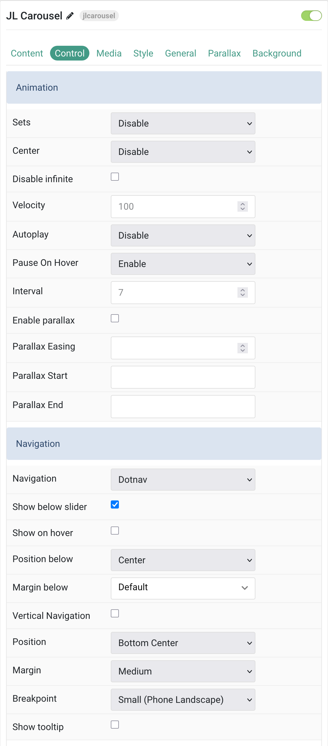
Animation Common settings for Slider Animation.
| Settings | Description |
|---|---|
| Sets | Slide all visible items at once. Group items into sets. The number of items within a set depends on the defined item width, e.g. 33% means that each set contains 3 items. |
| Center | Center the active slide. |
| Disable infinite | Disable infinite scrolling between items. |
| Velocity | Set the velocity in pixels per millisecond. Minimum: 20, Maximum: 300. |
| Autoplay | Enable autoplay for carousel items. |
| Pause On Hover | Pause autoplay on hover. |
| Interval | Set the autoplay interval in seconds. Minimum: 5, Maximum: 15. |
| Enable parallax | Add a stepless parallax animation based on the scroll position. |
| Parallax Easing | Set the animation easing. Zero transitions at an even speed, a negative value starts off quickly while a positive value starts off slowly. Range: -2 to 2. |
| Parallax Start | The animation starts when the element enters the viewport. Optionally, set a start and end offset, e.g. 100px, 50vh or 50vh + 50%. Percent relates to the target’s height. |
| Parallax End | The animation ends when the element leaves the viewport. Optionally, set a start and end offset, e.g. 100px, 50vh or 50vh + 50%. Percent relates to the target’s height. |
Navigation Settings for controlling carousel navigation appearance and behavior.
| Settings | Description |
|---|---|
| Navigation | Select the navigation type. Choose between Dotnav or None. |
| Show below slider | Display navigation below the slider area. |
| Show on hover | Show navigation only on hover. |
| Position below | Align the navigation’s items when positioned below. Options: Left, Center, Right. |
| Margin below | Set the vertical margin when navigation is below slider. |
| Vertical Navigation | Display navigation in vertical orientation. |
| Position | Select the position of the navigation (if ‘Show below slider’ is not selected). Available positions include Top Left, Top Right, Center Left, Center Right, Bottom Left, Bottom Center, Bottom Right. |
| Margin | Apply a margin between the navigation and slider container. |
| Breakpoint | Display the navigation only on this device width and larger. Options: Always, Small (Phone Landscape), Medium (Tablet Landscape), Large (Desktop), X-Large (Large Screens). |
| Show tooltip | Display Image ALT as tooltip when hovering. |
Slidenav Common settings for Slider Slidenav.
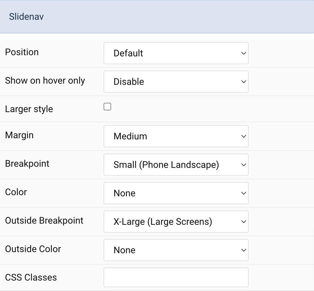
| Settings | Description |
|---|---|
| Position | Select the position of the slidenav. |
| Show On Hover | Show the slidenav on hover only. |
| Larger style | To increase the size of the slidenav icons. |
| Margin | Apply a margin between the slidenav and the slider container. |
| Breakpoint | Display the slidenav only on this device width and larger. |
| Color | Set light or dark color mode. |
| Outside Breakpoint | Display the slidenav only outside on this device width and larger. Otherwise it will be displayed inside. |
| Outside Color | Set light or dark color if the slidenav is outside of the slider. |
| CSS Classes | CSS class name for the particle. |
Media Tab
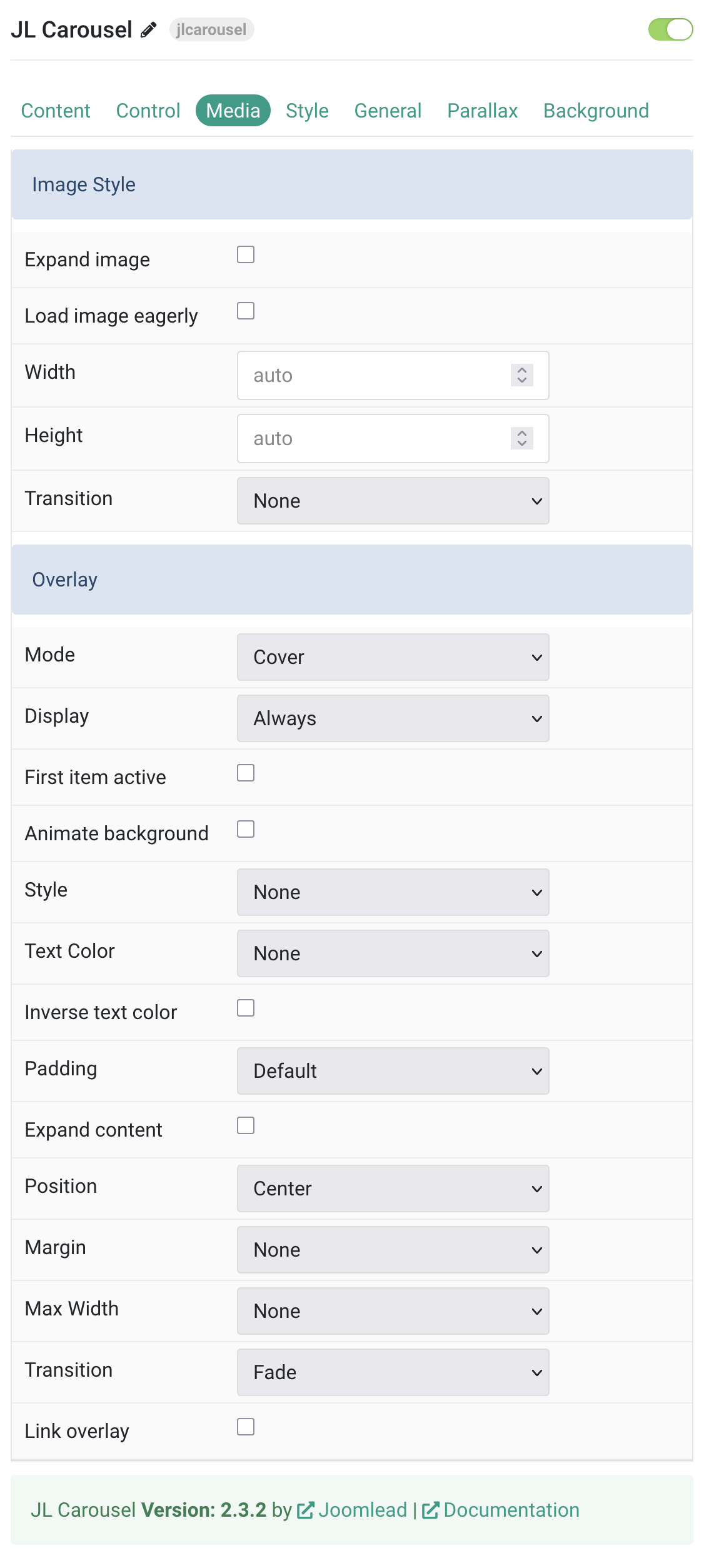
Image Style Settings for controlling image appearance and behavior.
| Settings | Description |
|---|---|
| Expand image | Expand the height of the image to fill the available space in the item. |
| Load image eagerly | By default, images are loaded lazy. Enable eager loading for images in the initial viewport. |
| Width | Set the width of the image. |
| Height | Set the height of the image. |
| Transition | Select an image transition. |
Overlay Settings for controlling overlay appearance, behavior, and positioning.
| Settings | Description |
|---|---|
| Mode | When using cover mode, you need to set the text color manually. |
| Display | Show the overlay only on hover or when the slide becomes active. |
| First item active | Make only first item active. |
| Animate background | Animate the background only on hover. |
| Style | Select the style for the overlay. |
| Text Color | Set light or dark color mode for text, buttons and controls. |
| Inverse text color | Inverse the text color on hover. |
| Padding | Set the padding between the overlay and its content. |
| Expand content | Expand the height of the content to fill the available space in the overlay and push the link to the bottom. |
| Position | Select the overlay or content position. |
| Margin | Apply a margin between the overlay and the image container IF the overlay style is Selected. |
| Max Width | Set the maximum content width. |
| Transition | Select a transition for the overlay when it appears on hover. |
| Link overlay | Link the whole overlay if a link exists. |
Tab Style
Title Settings Common settings for title.
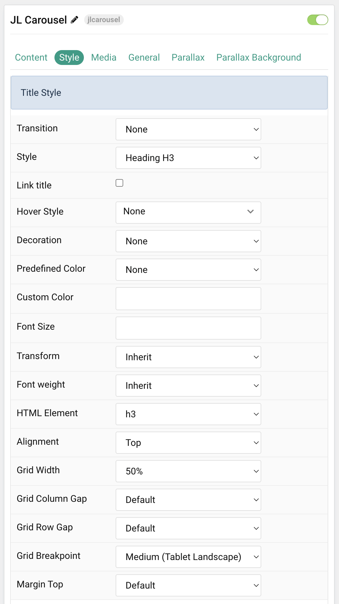
| Settings | Description |
|---|---|
| Transition | Select a transition for the title when the overlay appears on hover. |
| Style | Heading styles differ in font-size but may also come with a predefined color, size and font. |
| Link title | Link the title if a link exists. |
| Hover Style | Set the hover style for a linked title. Enable link title to use this option. |
| Decoration | Decorate the headline with a divider, bullet or a line that is vertically centered to the heading. |
| Predefined Color | Select a predefined text color. |
| Custom Color | Customize the title color instead using predefined title color mode. You need to set the predefined color to None to use the customize color option. |
| Font Size | Customize the title text font size. |
| Transform | The following options will transform text into uppercased, capitalized or lowercased characters. |
| Font weight | Add one of the following classes to modify the font weight of your text. |
| HTML Element | Choose one of the elements to fit your semantic structure. |
| Alignment | Align the title to the top or left in regards to the content. |
| Grid Width | Define the width of the title within the grid. Choose between percent and fixed widths or expand columns to the width of their content. |
| Grid Column Gap | Set the size of the gap between the image and the content. |
| Grid Row Gap | Set the size of the gap if the grid items stack. |
| Grid Breakpoint | Set the breakpoint from which grid cells will stack. |
| Margin Top | Set the top margin. Note that the margin will only apply if the content field immediately follows another content field. |
Meta Settings Common settings for meta.
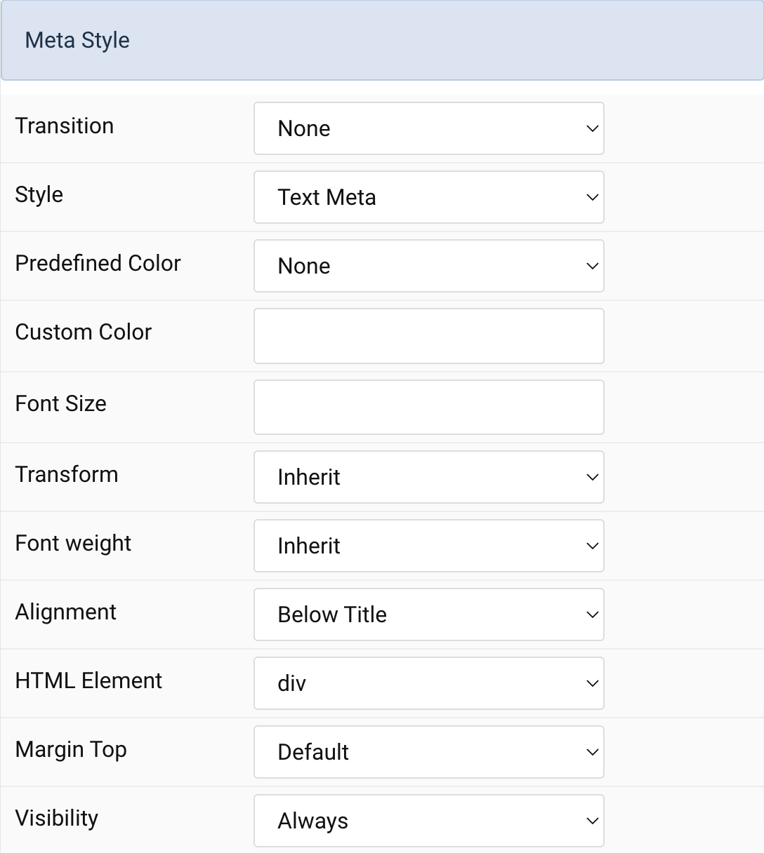
| Settings | Description |
|---|---|
| Transition | Select a transition for the meta when the overlay appears on hover. |
| Style | Select a predefined meta text style, including color, size and font-family. |
| Predefined Color | Select the predefined meta color. |
| Custom Color | Customize the meta color. Set Predefined Color for Meta to None before using this feature. |
| Font Size | Customize the title text font size. |
| Transform | The following options will transform text into uppercased, capitalized or lowercased characters. |
| Font weight | Add one of the following classes to modify the font weight of your text. |
| HTML Element | Choose one of the elements to fit your semantic structure. |
| Alignment | Align the meta text above/below the title or below the content. |
| Margin Top | Set the top margin. Note that the margin will only apply if the content field immediately follows another content field. |
Content Settings Common settings for content.
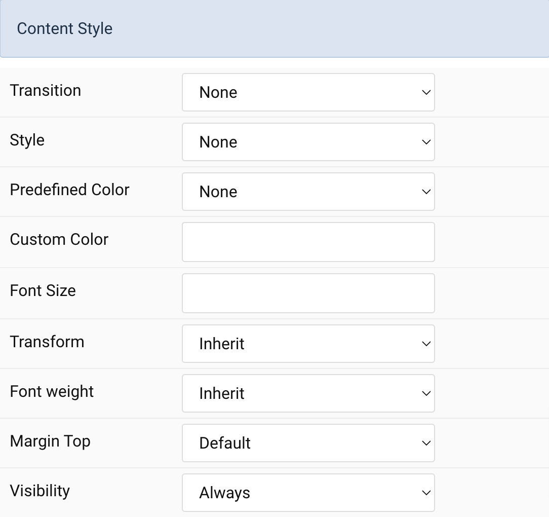
| Settings | Description |
|---|---|
| Transition | Select a transition for the content when the overlay appears on hover. |
| Style | Select a predefined text style, including color, size and font-family. |
| Predefined Color | Select the predefined meta color. |
| Custom Color | Customize the content color instead using predefined text color. You need to set the predefined color to None to use the customize color option. |
| Font Size | Customize the content text font size. |
| Transform | The following options will transform text into uppercased, capitalized or lowercased characters. |
| Font weight | Add one of the following classes to modify the font weight of your text. |
| Visibility | Display the content only on this device width and larger. |
| Margin Top | Set the top margin. Note that the margin will only apply if the content field immediately follows another content field. |
Link Settings Common settings for link.
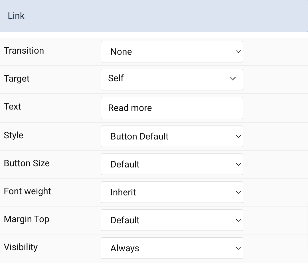
| Settings | Description |
|---|---|
| Transition | Select a transition for the link when the overlay appears on hover. |
| Target | Target browser window when item is clicked. |
| Text | Specify the button label. |
| Style | Set the button style. |
| Button Size | Set the button size. |
| Font weight | Add one of the following classes to modify the font weight of your text. |
| Margin Top | Set the top margin. Note that the margin will only apply if the content field immediately follows another content field. |
| Visibility | Display the content only on this device width and larger. |
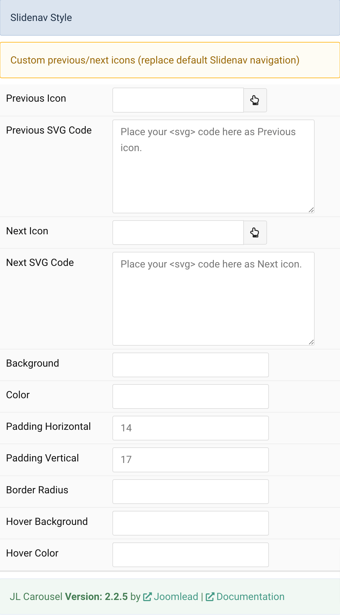
Custom Slidenav Icons Custom previous/next icons (replace default Slidenav navigation)
| Settings | Description |
|---|---|
| Previous Icon | An icon picker to choose custom Previous icon |
| Next Icon | An icon picker to create choose custom Next icon |
| Settings | Description |
|---|---|
| Width | Set the width of the image. |
| Height | Set the height of the image. |
| Transition | Select an image transition. |
Overlay Common settings for Overlay
| Settings | Description |
|---|---|
| Mode | When using cover mode, you need to set the text color manually. |
| Overlay on hover | Display content overlay on hover. |
| Animate background only | Animate background only on hover. |
| Style | Select the style for the overlay. |
| Text Color | Set light or dark color mode for text, buttons and controls. |
| Inverse text color | Inverse the text color on hover. |
| Padding | Set the padding between the overlay and its content. |
| Position | Select the overlay or content position. |
| Margin | Apply a margin between the overlay and the image container if the Overlay Style is Selected. |
| Max Width | Set the maximum content width. |
| Overlay Transition | Select a transition for the overlay when it appears on hover. |
| Link | Link the whole overlay if a link exists. |
General, Parallax and Parallax Background tab
Please take a look the documentation here for more detail about these tabs settings

Comments