Data Tables Particle Documentation
# Data Tables Package contents
| Files | Description |
|---|---|
| jldatatables.yaml | Contains the Data Tables particle settings. |
| jldatatables.html.twig | The Twig file to pull information, settings. |
| jquery.dataTables.min.css | Contains the Data Tables CSS |
| jquery.dataTables.min.js /dataTables.uikit.min.js | Contains the Data Tables JavaScript |
Installation Installing the particle on your website is a really simple process. You can refer to the document here to know more.
Requirements Data tables particle requires Uikit 3 for Gantry 5 Atom to be installed and enabled in your theme layout settings.
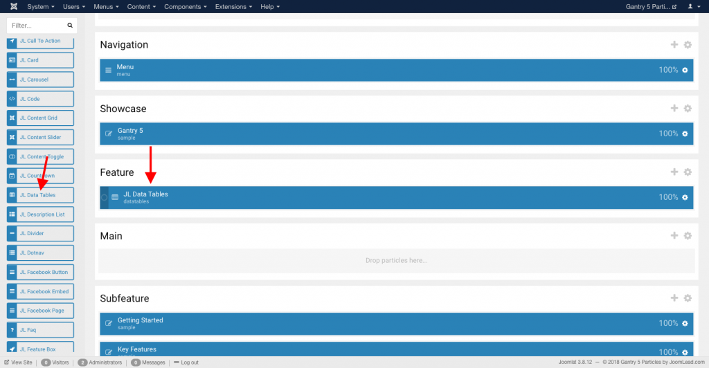
Go to Template/Theme Settings > select the Layout to add Data Tables particle (i.e: Home) -> Layout tab -> Drag and drop the Data Tables Particle from Particles panel (left corner) to the section you want to display Data Tables.
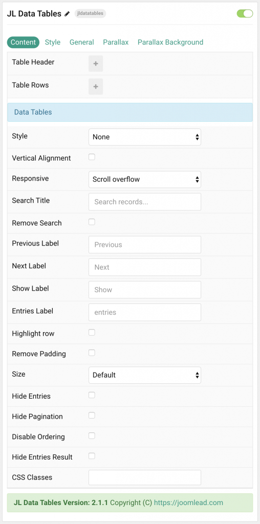
Settings
| Settings | Description |
|---|---|
| Table Header | List Table Header items. You can add new items to the collection using the plus + icon |
| Table Rows | List rows to appear in the table content. You can add new items to the collection using the plus + icon |
| Data Tables Settings | Common settings for data tables |
| Style | Select the table style. |
| Vertical Alignment | Vertically center table cells. |
| Responsive | Stack columns on small devices or enable overflow scroll for the container. |
| Search Title | Customize the placeholder text for search. |
| Search Title | Customize the placeholder text for search. |
| Remove Search | Use this option if you wish to remove the search function |
| Previous Label | Customize the Previous label for Pagination. |
| Next Label | Customize the Next label for Pagination. |
| Show label | Customize the Show label. |
| Entries Label | Customize the entries label. |
| Highlight row | Highlight the hovered row |
| Remove Padding | Remove left and right table padding. |
| Size | Define the padding between table rows. |
| Hide Entries | Disable entries function |
| Hide Pagination | Disable pagination |
| Disable Ordering | Disable ordering for table |
| Hide Entries Result | Hide entries result for data tables |
| CSS Classes | CSS class name for the particle. |
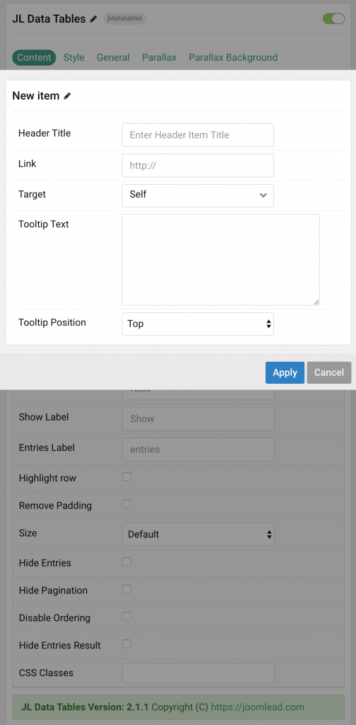
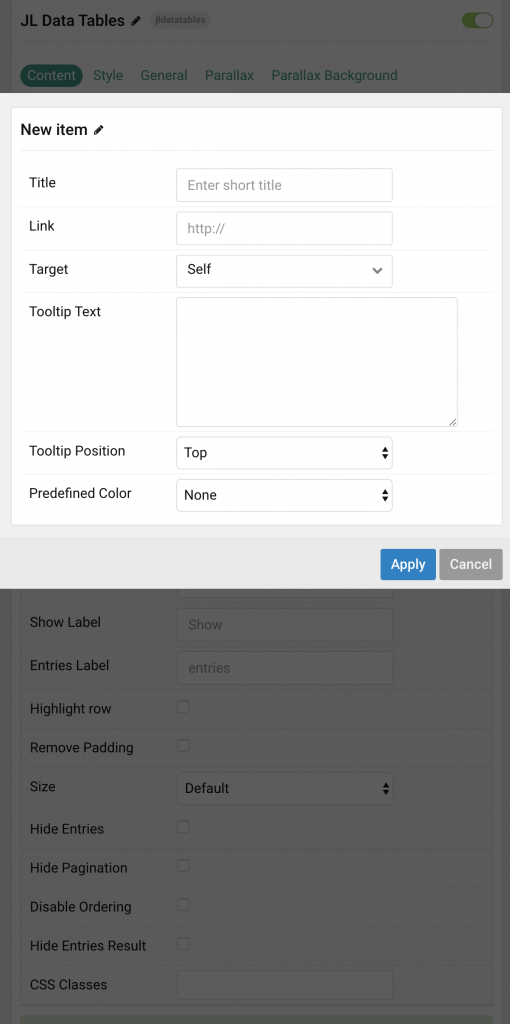
Table Header Click Items field to enable it, then you can add new table header to the collection using the plus + icon
| Settings | Description |
|---|---|
| Header Title | Enter the header item title |
| Link | Specify the header link. |
| Target | Target browser window when item is clicked. |
| Tooltip Text | Create a nice looking tooltip on hover header title. |
| Tooltip Position | Choose one of these options to adjust the tooltip’s alignment. |
Table Rows Click row field to enable it, then you can add new row and columns to the collection using the plus + icon
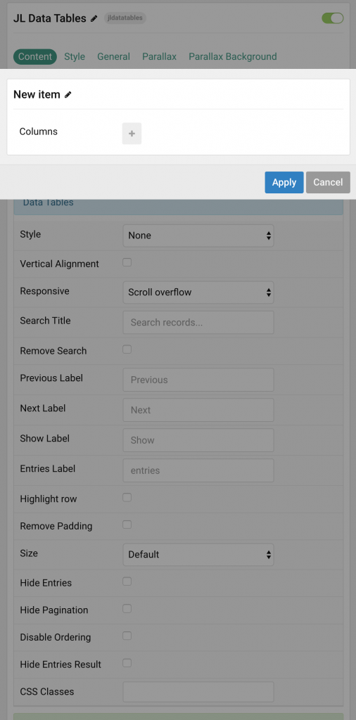
Click + icon to add new columns
| Settings | Description |
|---|---|
| Title | Customize the title. |
| Link | Specify the text link. |
| Target | Target browser window when item is clicked. |
| Tooltip Text | Create a nice looking tooltip on hover header title. |
| Tooltip Position | Choose one of these options to adjust the tooltip’s alignment. |
| Predefined Title Color | Select the text color. If the Background option is selected, styles that don’t apply a background image use the primary color instead. |
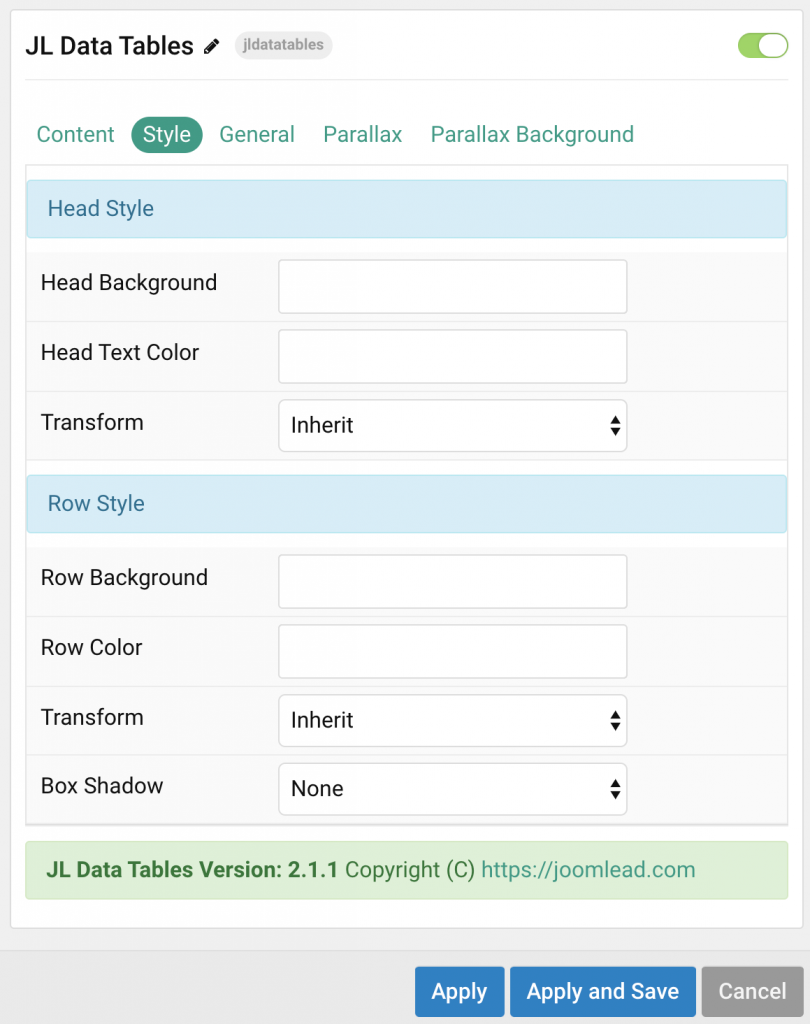
Style Tab
Below is the screenshot that shows how to customize the color for Data Tables.
| Settings | Description |
|---|---|
| Head Style Settings | Common settings for Head Style |
| Head Background | Customize the head background color instead using default background color. |
| Head Text Color | Customize the row content color instead using default color. |
| Transform | The following options will transform text into uppercased, capitalized or lowercased characters. |
| Row Style | Common settings for Row Style |
| Row Background | Customize the row background color instead using default background color. |
| Row Color | Customize the row content color instead using default color. |
| Transform | The following options will transform text into uppercased, capitalized or lowercased characters. |
| Box Shadow | Select the table’s box shadow size. |
General, Parallax and Parallax Background tab
Please take a look the documentation here for more detail about these tabs settings
Video Overview
How to add data to data tables. Including header titles, columns, cells and customizing the color

Comments