Filter Gallery Particle
# Filter Gallery Package contents
| Files | Description |
|---|---|
| jlfiltergallery.yaml | Contains the Filter Gallery particle settings. |
| jlfiltergallery.html.twig | The Twig file to pull information, settings. |
Installation Installing the particle on your website is a really simple process. You can refer to the document here to know more.
Requirements Filter Gallery requires Uikit 3 for Gantry 5 Atom to be installed and enabled in your theme layout settings.
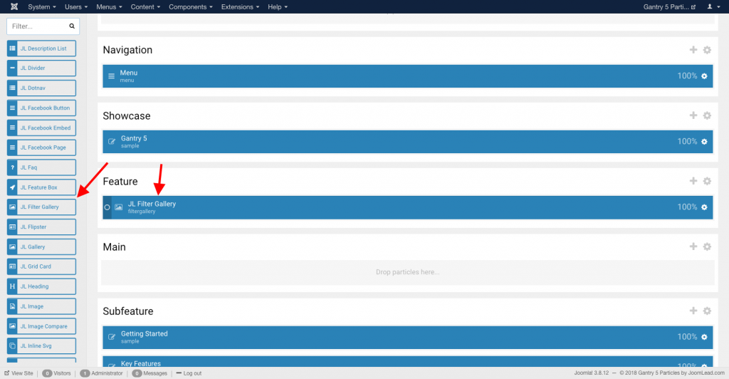
Go to Template/Theme Settings > select the Layout to add Filter Gallery particle (i.e: Home) -> Layout tab -> Drag and drop the Filter Gallery Particle from Particles panel (left corner) to the section you want to display the Filter Gallery.
Settings
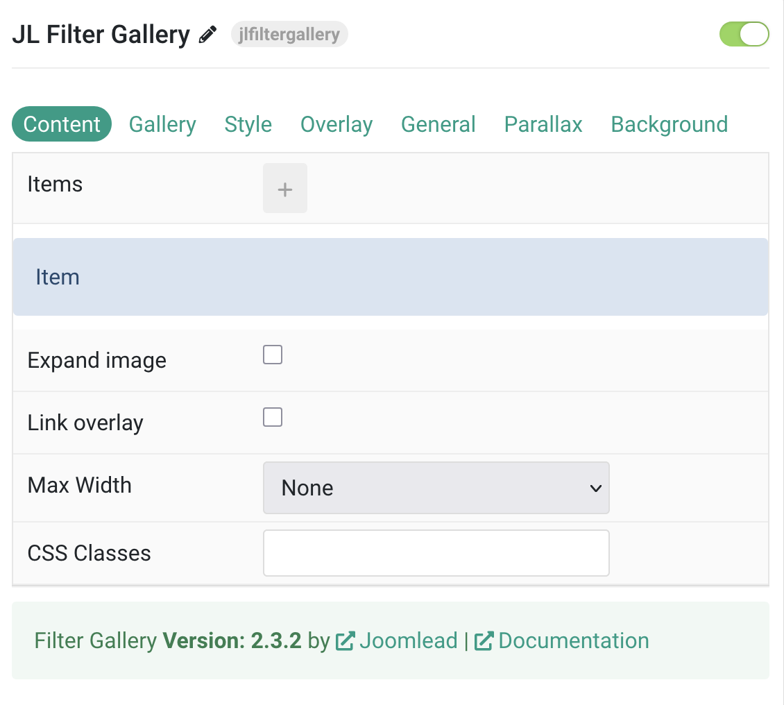
Content Tab – Items
| Settings | Description |
|---|---|
| Items | List Gallery items to display. You can add new items to the collection using the plus + icon |
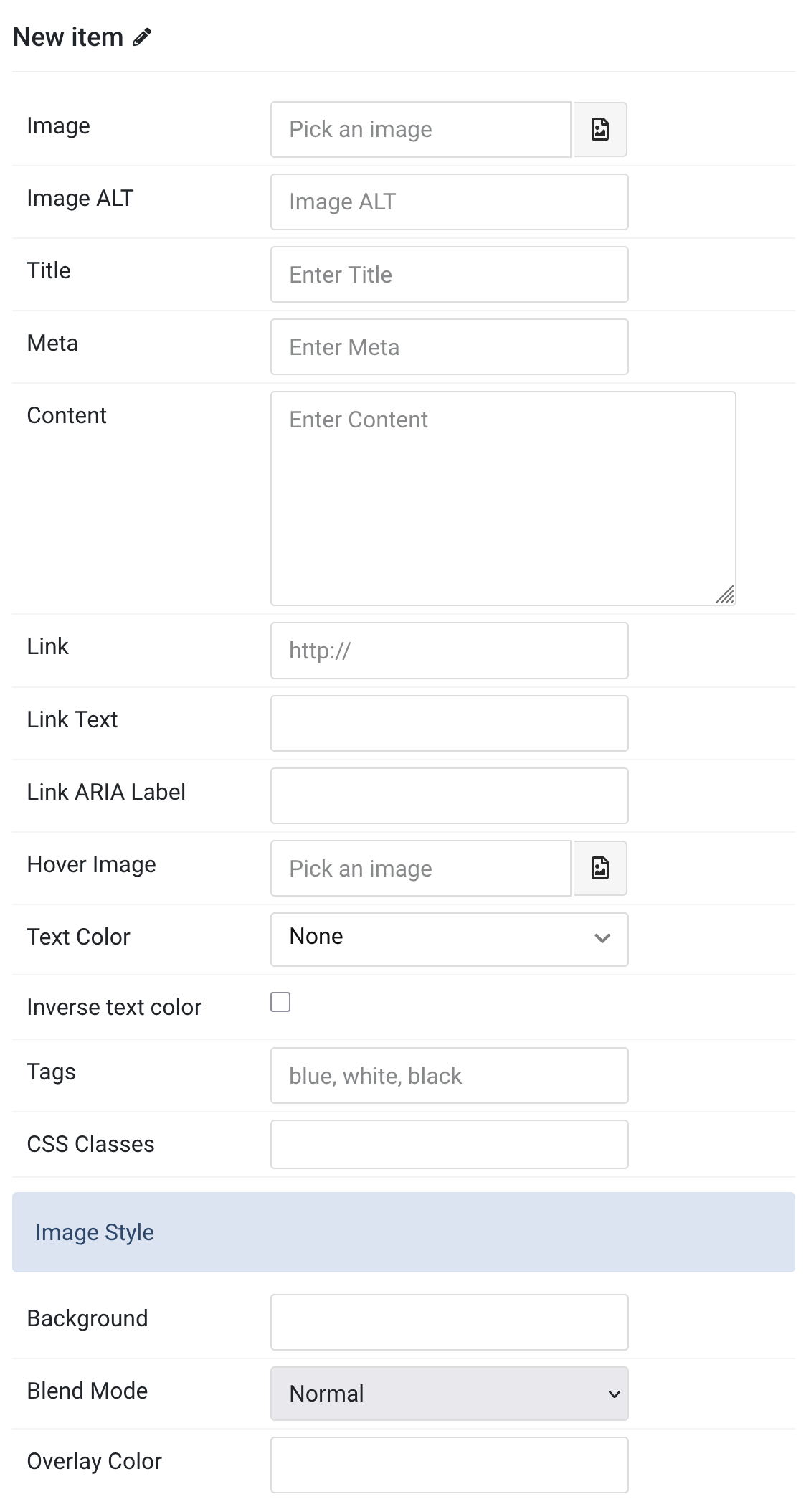
Items You can add new items to the collection using the plus + icon
| Settings | Description |
|---|---|
| Content Items | |
| Image | An image field with an image picker. |
| Image ALT | Enter the image’s alt attribute. |
| Title | Customize the Title. |
| Meta | Customize the Meta. |
| Content | Customize the content. |
| Link | Specify the image link. |
| Link Text | Set a different link text for this item. |
| Link ARIA Label | Set a different link ARIA label for this item. |
| Hover Image | Select an optional image that appears on hover. |
| Text Color | Set light or dark color mode for text, buttons and controls. |
| Inverse text color | Inverse the text color on hover. |
| Tags | Enter a comma-separated list of tags, for example, blue, white, black. |
| CSS Classes | Specify the CSS class name for item. |
| Image Style | |
| Background | Use the background color in combination with blend modes. |
| Blend Mode | Determine how the image will blend with the background color. |
| Overlay Color | Set an additional transparent overlay to soften the image. |
Gallery Item Common settings for gallery particle
| Settings | Description |
|---|---|
| Item Settings | |
| Expand image | Expand the height of the image to fill the available space in the item. |
| Link overlay | Link the whole overlay if a link exists. |
| Max Width | Set the maximum width. |
| CSS Classes | CSS class name for the particle. |
Tab Gallery
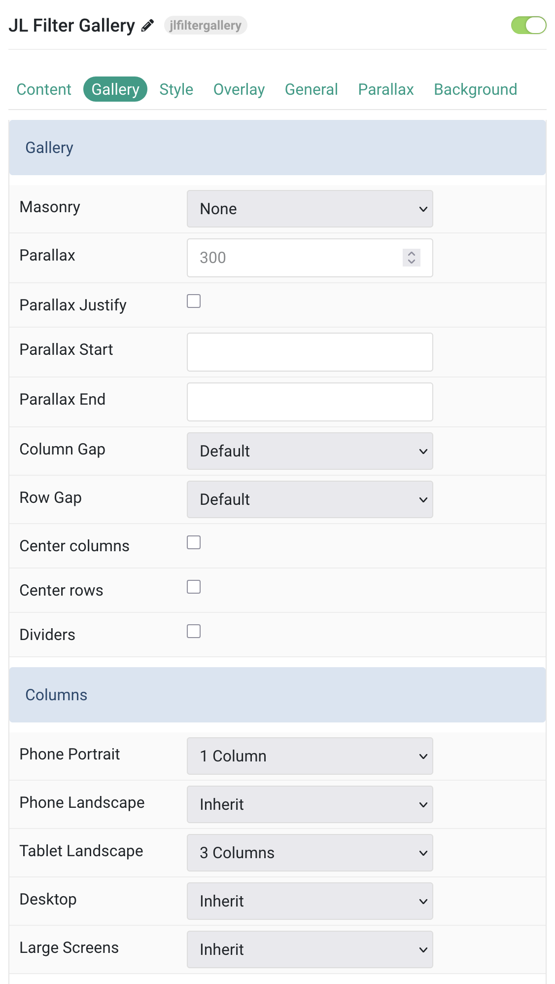
Gallery Settings Common settings for gallery and column layout
| Settings | Description |
|---|---|
| Gallery | |
| Masonry | Choose a masonry layout algorithm: Pack or Next. |
| Parallax | Set a vertical parallax offset (in pixels). Columns scroll at different speeds. |
| Parallax Justify | Align parallax columns to the bottom. |
| Parallax Start | Define the offset where animation begins (e.g. 100px, 50vh, 50vh + 50%). |
| Parallax End | Define the offset where animation ends. Accepts same formats as start. |
| Column Gap | Set the spacing between grid columns. |
| Row Gap | Set the spacing between grid rows. |
| Dividers | Show dividers between grid items. |
| Center columns | Horizontally center columns within the grid. |
| Center rows | Vertically center rows within the grid. |
| Columns | |
| Phone Portrait | Number of columns for phone portrait. Inherit uses the next smaller size. |
| Phone Landscape | Number of columns for phone landscape. Inherit uses the next smaller size. |
| Tablet Landscape | Number of columns for tablets. Inherit uses the next smaller size. |
| Desktop | Number of columns for desktops. Inherit uses the next smaller size. |
| Large Screens | Number of columns for large screens. Inherit uses the next smaller size. |
Filter Settings Common settings for filter
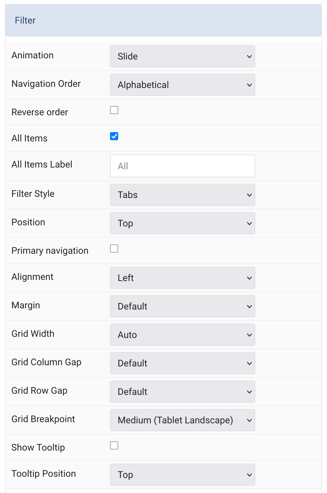
| Settings | Description |
|---|---|
| Filter | |
| Animation | Select an animation that will be applied to the content items when filtering between them. |
| Navigation Order | Order the filter navigation alphabetically or by defining the order manually. |
| Reverse order | Reverse the order of filter items. |
| All Items | Show filter control for all items. |
| All Items Label | Replace the All label tag. |
| Filter Style | Select the filter navigation style. The pill and divider styles are only available for horizontal Subnavs. |
| Position | Position the filter navigation at the top, left or right. A larger style can be applied to left and right navigations. |
| Primary navigation | The Primary navigation is not available for Tab filter style and Top filter position. |
| Alignment | Align the filter controls. The Alignment styles are only available for TOP filter position. |
| Margin | Set vertical margin. The Margin styles are only available for TOP filter position. |
| Grid Width | Define the width of the filter navigation. Choose between percent and fixed widths or expand columns to the width of their content. |
| Grid Column Gap | Set the size of the gap between between the filter navigation and the content. |
| Grid Row Gap | Set the size of the gap if the grid items stack. |
| Grid Breakpoint | Set the breakpoint from which the filter navigation and grid will stack. |
| Show Tooltip | Show the number of tags as tooltip. |
| Tooltip Position | Choose one of these options to adjust the tooltip’s alignment. |
Lightbox Settings Enable/Disable lightbox control.
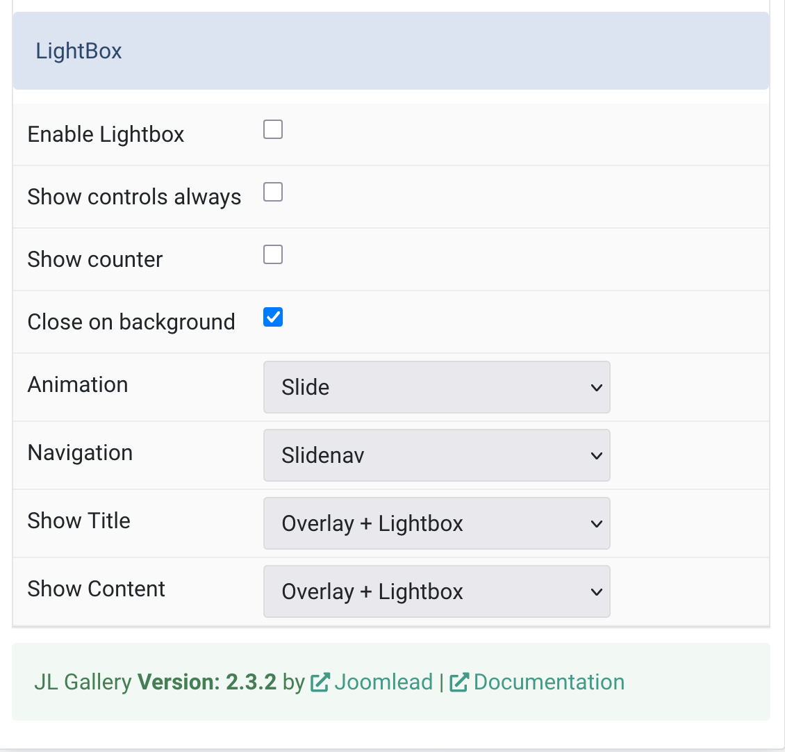
| Settings | Description |
|---|---|
| LightBox | |
| Enable Lightbox | Activate a responsive lightbox gallery with images. |
| Show controls always | Always display navigation controls inside the lightbox. |
| Show counter | Display the slide counter in the lightbox. |
| Close on background | Allow closing the lightbox by clicking the background. |
| Animation | Choose the transition between slides (e.g. fade, scale). |
| Navigation | Select a navigation style: Slidenav, Dotnav, or Thumbnav. |
| Show Title | Display the item title in the overlay, lightbox, or both. |
| Show Content | Display the content in the overlay, lightbox, or both. |
Tab Style
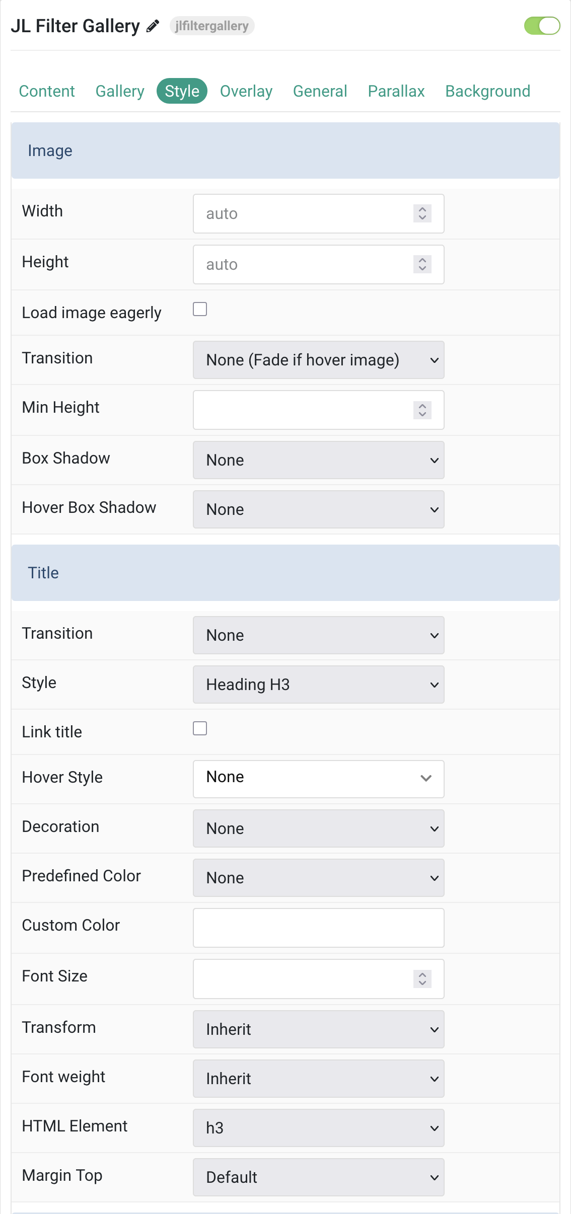
Image & Title Common settings for images and title style.
| Settings | Description |
|---|---|
| Image | |
| Width | Set the width of the image. |
| Height | Set the height of the image. |
| Load image eagerly | Enable eager loading for images in the initial viewport. By default, images are lazy-loaded. |
| Transition | Select a hover transition for the overlay. |
| Min Height | Prevent images from becoming smaller than the content on small devices using a minimum height. |
| Box Shadow | Select the image’s box shadow size. |
| Hover Box Shadow | Select the image’s box shadow size on hover. |
| Title | |
| Transition | Select a transition for the title when the overlay appears on hover. |
| Style | Choose a title style that modifies font size, weight, or color. |
| Link title | Link the title if a link exists. |
| Hover Style | Set a hover style for a linked title (requires enabling “Link title”). |
| Decoration | Add a divider, bullet, or line to the title for visual emphasis. |
| Predefined Color | Select a predefined title color. If background is selected, it defaults to primary unless a background image is present. |
| Custom Color | Customize the title color. Set predefined color to “None” before using this. |
| Font Size | Customize the font size of the title text. |
| Transform | Apply uppercase, capitalize, or lowercase transformation to title text. |
| Font weight | Select font weight for the title text. |
| HTML Element | Choose the HTML tag for the title (e.g., h1–h6, div). |
| Margin Top | Set the top margin. Only applies if content follows another field. |
Meta & Content Common style settings for meta and title.
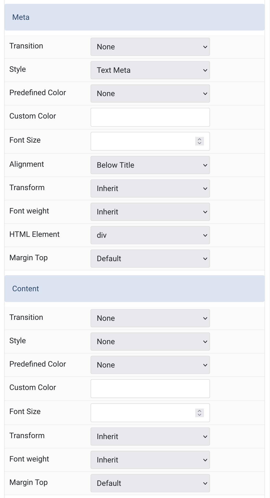
| Settings | Description |
|---|---|
| Meta | |
| Transition | Select a transition for the meta when the overlay appears on hover. |
| Style | Select a predefined meta text style, including color, size and font-family. |
| Predefined Color | Select a predefined color for meta text. |
| Custom Color | Customize the meta color. Set predefined color to “None” first. |
| Font Size | Customize the font size of the meta text. |
| Alignment | Position meta text above title, below title, or below all content. |
| Transform | Apply uppercase, capitalize, or lowercase transformation to meta text. |
| Font weight | Select font weight for meta text. |
| HTML Element | Choose the HTML tag for the meta text (e.g., h1–h6, div). |
| Margin Top | Set the top margin for the meta text if it follows another content field. |
| Content | |
| Transition | Select a transition for the content when the overlay appears on hover. |
| Style | Select a predefined content text style including color, size, and font. |
| Predefined Color | Select a predefined color for content text. |
| Custom Color | Customize the content color. Set predefined color to “None” before using this. |
| Font Size | Customize the font size of the content text. |
| Transform | Apply uppercase, capitalize, or lowercase transformation to content text. |
| Font weight | Select font weight for the content text. |
| Margin Top | Set the top margin for content if it follows another content field. |
Link Settings Common settings for link.
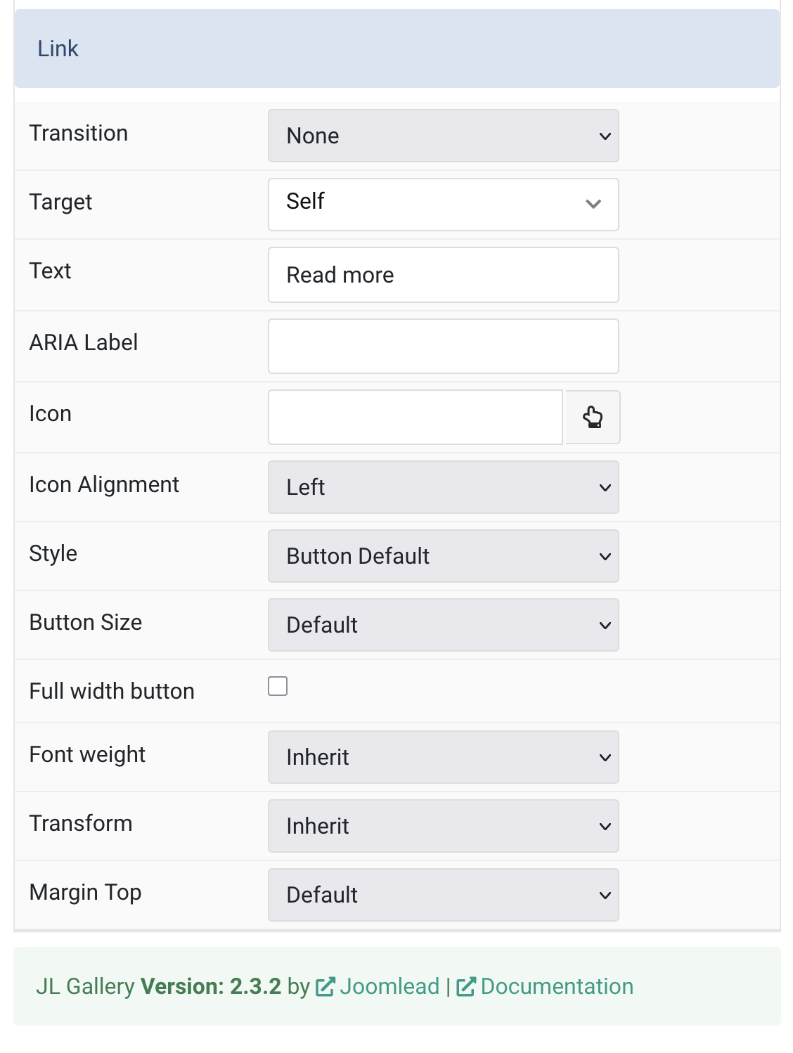
| Settings | Description |
|---|---|
| Link | |
| Transition | Select a transition for the link when the overlay appears on hover. |
| Target | Open the link in a same or new window. This feature no longer working if you use Lightbox feature. |
| Text | Specify the button label. |
| ARIA Label | Enter a descriptive text label to make it accessible if the link has no visible text. |
| Icon | Pick an optional Font Awesome icon. |
| Icon Alignment | Choose the icon position. |
| Style | Set the button style. |
| Button Size | Set the button size. |
| Full width button | Make the button span the full width. |
| Font weight | Add one of the following classes to modify the font weight of your text. |
| Transform | The following options will transform text into uppercased, capitalized or lowercased characters. |
| Margin Top | Set the top margin. Note that the margin will only apply if the content field immediately follows another content field. |
Overlay Tab
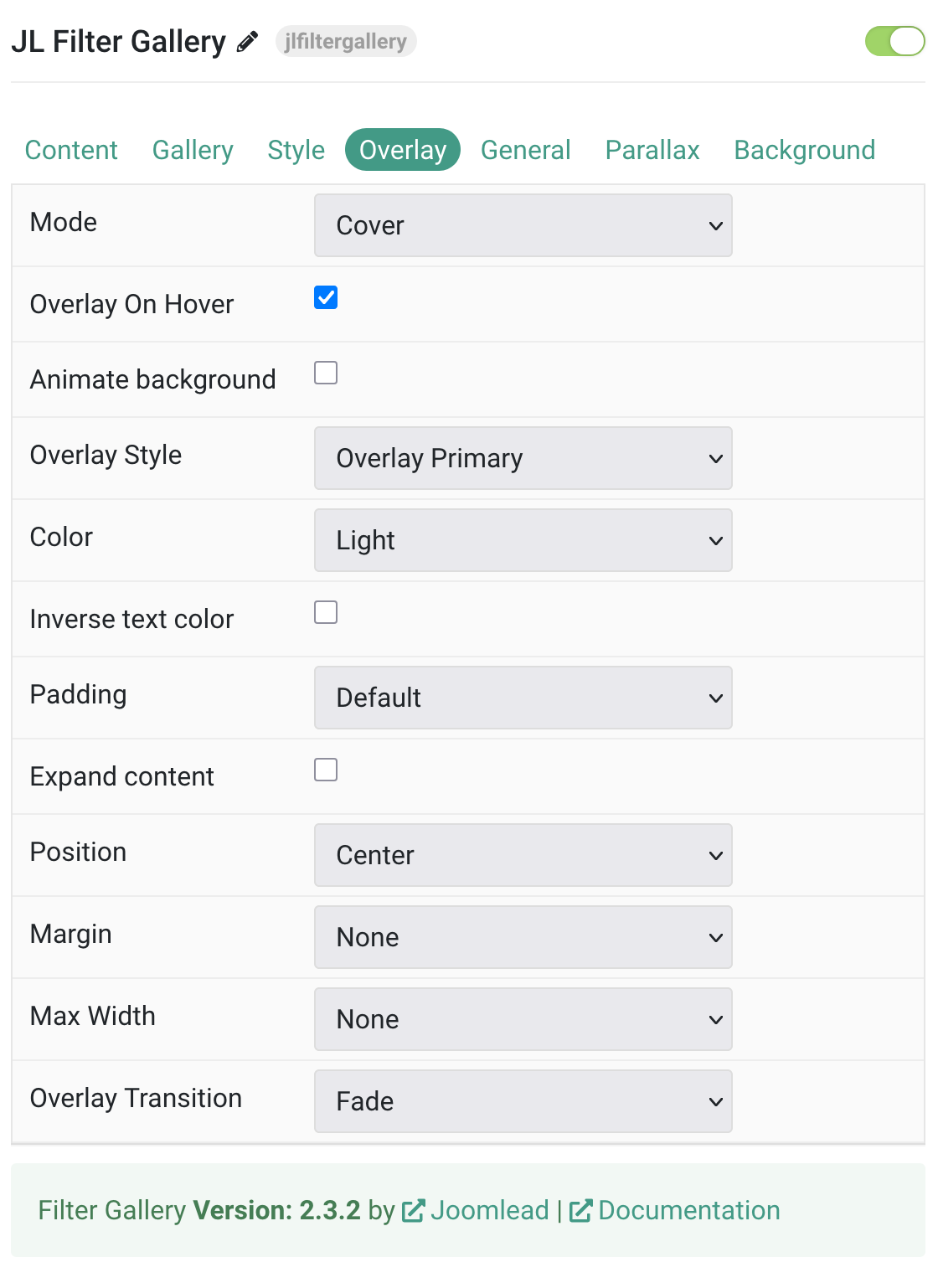
| Settings | Description |
|---|---|
| Overlay | |
| Mode | When using cover mode, you need to set the text color manually. |
| Overlay On Hover | Display content overlay on hover. |
| Animate background | Animate the background only on hover. |
| Style | Select the style for the overlay. |
| Text Color | Set light or dark color mode for text, buttons and controls. |
| Inverse text color | Inverse the text color on hover. |
| Padding | Set the padding between the overlay and its content. |
| Expand content | Expand the height of the content to fill the available space in the overlay and push the link to the bottom. |
| Position | Select the overlay or content position. |
| Margin | Apply a margin between the overlay and the image container IF the overlay style is Selected. |
| Max Width | Set the maximum content width. |
| Overlay Transition | Select a transition for the overlay when it appears on hover. |
General, Parallax and Parallax Background tab
Please take a look the documentation here for more detail about these tabs settings

Comments