Flipster Particle Documentation
# Flipster Package contents
| Files | Description |
|---|---|
| jlflipster.yaml | Contains the Flipster particle settings. |
| jlflipster.html.twig | The Twig file to pull information, settings. |
| jquery.flipster.min.css | Contains the Flipster CSS. |
| jquery.flipster.min.js | Contains the Flipster JavaScript. |
Installation Installing the particle on your website is a really simple process. You can refer to the document here to know more.
Requirements Flipster requires Uikit 3 for Gantry 5 Atom to be installed and enabled in your theme layout settings.
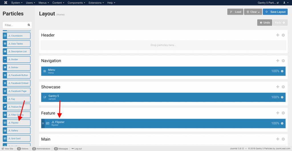
Go to Template/Theme Settings > select the Layout to add Flipster particle (i.e: Home) -> Layout tab -> Drag and drop the Flipster Particle from Particles panel (left corner) to the section you want to display the Flipster.
Settings
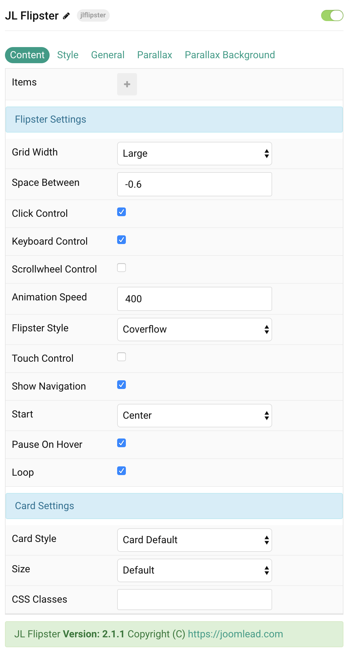
| Settings | Description |
|---|---|
| Items | List Flipster items to show. You can add new items to the collection using the plus + icon |
Items You can add new items to the collection using the plus + icon
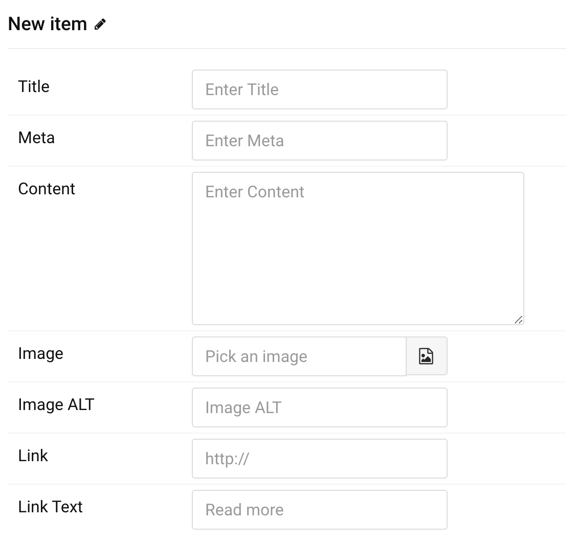
| Settings | Description |
|---|---|
| Title | Enter the item title |
| Meta | Enter the item meta |
| Content | Customize the content. |
| Image | An image field with an image picker. |
| Image ALT | Enter the image’s alt attribute. |
| Link | Specify the button link. |
| Link Text | Specify the button label. |
Flipster Settings Common style settings for Flipster
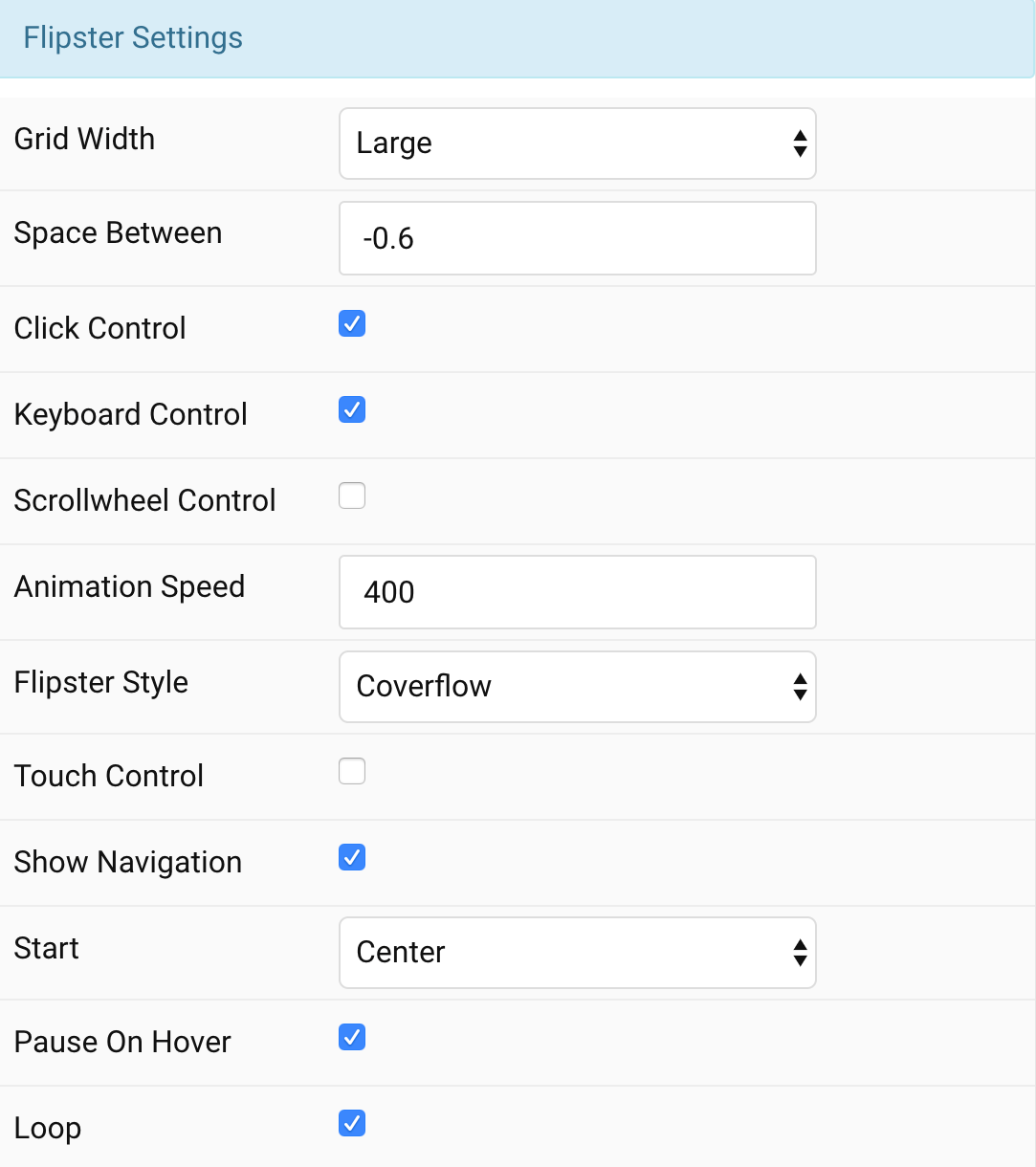
| Settings | Description |
|---|---|
| Grid Width | Set the item width. |
| Space Between | Space between items relative to each item’s width. 0 for no spacing, negative values (default -0.6) to overlap |
| Click control | Clicking an item switches to that item. |
| Keyboard control | Enable keyboard left/right arrow navigation. |
| Scrollwheel control | Enable mousewheel/trackpad navigation; up/left = previous, down/right = next |
| Animation speed | Speed of the fade in animation after items have been setup. |
| Flipster Style | Select Flipster style. |
| Touch control | Enable swipe navigation for touch devices |
| Show navigation | If true, Flipster will insert Previous / Next buttons with SVG arrows |
| Start | Zero based index of the starting item, or use ‘center’ to start in the middle. |
| Pause on hover | If true, autoplay advancement will pause when Flipster is hovered. |
| Loop | Loop around when the start or end is reached. |
Card Settings Common style settings for Card.
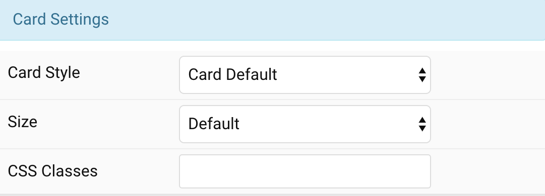
| Settings | Description |
|---|---|
| Card style | Select one of the boxed card styles or a blank panel. |
| Card size | Define the card’s size by selecting the padding between the card and its content. |
| CSS Classes | CSS class name for the particle. |
Tab Style
Title Settings Common settings for Title Style
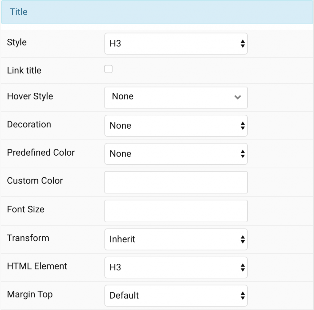
| Settings | Description |
|---|---|
| Style | Heading styles differ in font-size but may also come with a predefined color, size and font. |
| Link title | Link the title if a link exists. |
| Hover Style | Set the hover style for a linked title. Enable link title to use this option. |
| Decoration | Decorate the headline with a divider, bullet or a line that is vertically centered to the heading. |
| Predefined Color | Select a predefined text color. |
| Custom Color | Customize the title color instead using predefined title color mode. You need to set the predefined color to None to use the customize color option. |
| Font Size | Customize the title text font size. |
| Transform | The following options will transform text into uppercased, capitalized or lowercased characters. |
| HTML Element | Choose one of the elements to fit your semantic structure. |
| Margin Top | Set the top margin. |
Meta Settings Common settings for Meta Style
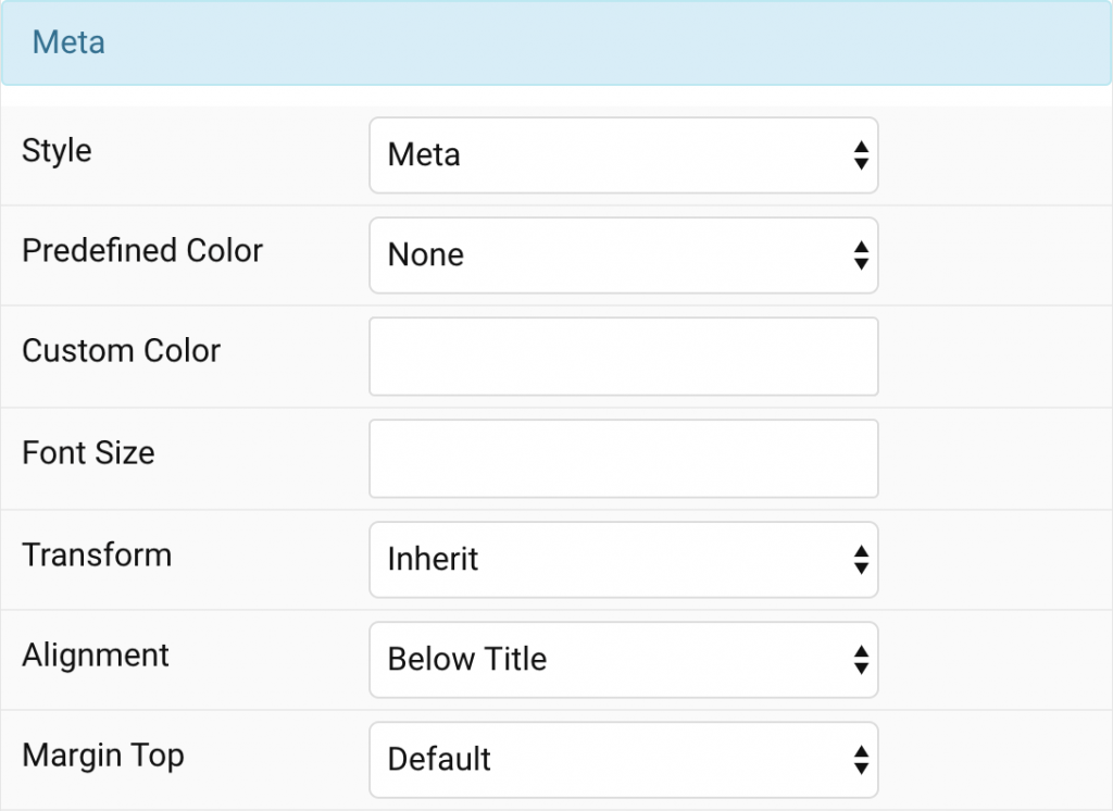
| Settings | Description |
|---|---|
| Style | Select a predefined meta text style, including color, size and font-family. |
| Predefined Color | Select the predefined meta color. |
| Custom Color | Customize the meta color. Set Predefined Color for Meta to None before using this feature. |
| Font Size | Customize the title text font size. |
| Transform | The following options will transform text into uppercased, capitalized or lowercased characters. |
| Alignment | Align the meta text. |
| Margin Top | Set the top margin. |
Content Settings Common settings for Content Style
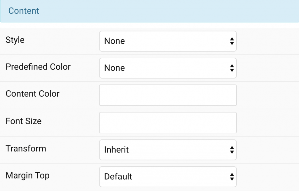
| Settings | Description |
|---|---|
| Style | Select a predefined text style, including color, size and font-family. |
| Predefined Color | Select the predefined meta color. |
| Content Color | Customize the content color instead using predefined text color. You need to set the predefined color to None to use the customize color option. |
| Font Size | Customize the content text font size. |
| Transform | The following options will transform text into uppercased, capitalized or lowercased characters. |
| Margin Top | Set the top margin. |
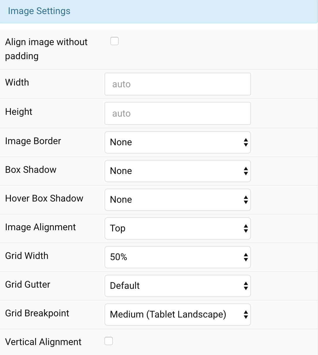
Image Settings Common settings for Image Style
| Settings | Description |
|---|---|
| Align image without padding | Top, left or right aligned images can be attached to the card’s edge. If the image is aligned to the left or right, it will also extend to cover the whole space. This option won’t have any effect if Card Style assigned to None or Image Alignment Between is selected. |
| Width | Enter the image’s width. |
| Height | Enter the image’s height. |
| Image Border | Select the image’s border style. This option won’t have any effect if Align image without padding is enabled. |
| Box Shadow | Select the image’s box shadow size. This option won’t have any effect unless None Card Style is enabled. |
| Hover Box Shadow | Select the image’s box shadow size on hover. This option won’t have any effect unless None Card Style is enabled. |
| Link image | Link the image if a link exists. |
| Hover Transition | Set the hover transition for a linked image. |
| Hover Box Shadow | Select the image’s box shadow size on hover. This option won’t have any effect unless None Card Style is enabled. |
| Image Alignment | Align the image to the top,left, right or place it between the title and the content. |
| Grid Width | Define the width of the image within the grid. Choose between percent and fixed widths or expand columns to the width of their content. This option won’t have any effect unless Left/Right Image Alignment are enabled. |
| Grid Column Gap | Set the size of the gap between the image and the content. This option won’t have any effect unless Left/Right Image Alignment are enabled. |
| Grid Row Gap | Set the size of the gap if the grid items stack. This option won’t have any effect unless Left/Right Image Alignment are enabled. |
| Grid Breakpoint | Set the breakpoint from which grid cells will stack. This option won’t have any effect unless Left/Right Image Alignment are enabled. |
| Vertical Alignment | Vertically center grid cells. This option won’t have any effect unless Left/Right Image Alignment are enabled. |
| Margin Top | Set the top margin. Set the top margin. This option won’t have any effect unless Bottom and Between are enabled for Image Alignment. |
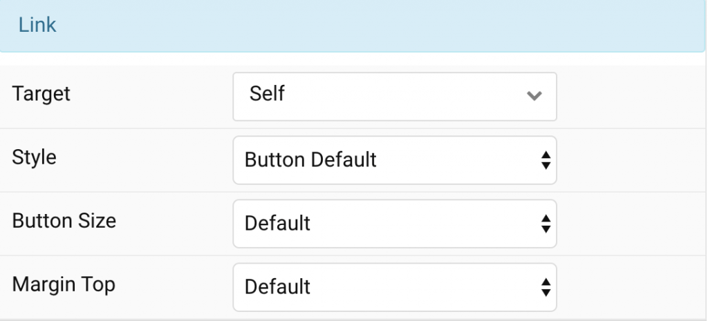
Link Settings Common settings for Link Style
| Settings | Description |
|---|---|
| Target | Target browser window when item is clicked. |
| Style | Set the button style. |
| Button Size | Set the button size. |
| Margin Top | Set the top margin. |
General, Parallax and Parallax Background tab
Please take a look the documentation here for more detail about these tabs settings

Comments