Image Particle Documentation
The Image particle adds an image with an optional link to your layout. By default, the link opens in a window. Alternatively, it can open in a modal. Demo Page.
# Image Package contents
| Files | Description |
|---|---|
| jlimage.yaml | Contains the Image particle settings. |
| jlimage.html.twig | The Twig file to pull information, settings. |
Installation Installing the particle on your website is a really simple process. You can refer to the document here to know more.
Requirements Image particle requires Uikit 3 for Gantry 5 Atom to be installed and enabled in your theme layout settings.
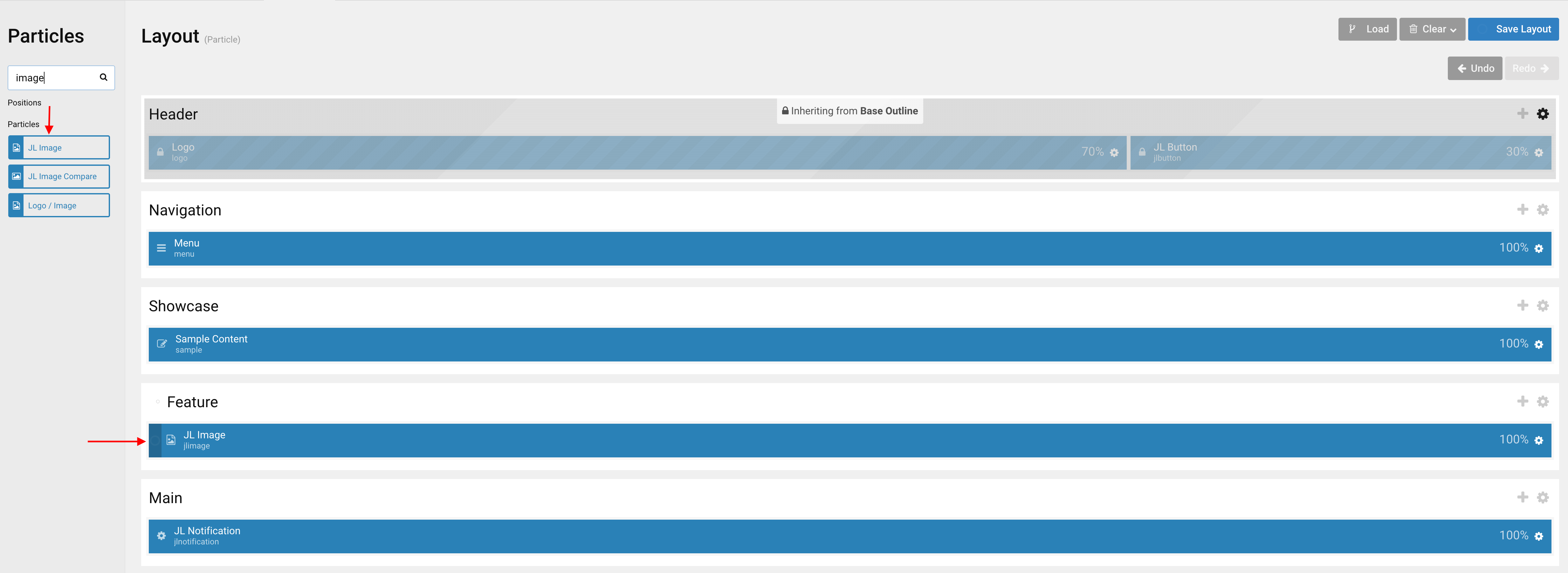
Go to Template/Theme Settings > select the Layout to add Image particle (i.e: Home) -> Layout tab -> Drag and drop the Image Particle from Particles panel (left corner) to the section you want to display the particle.
Settings
| Settings | Description |
|---|---|
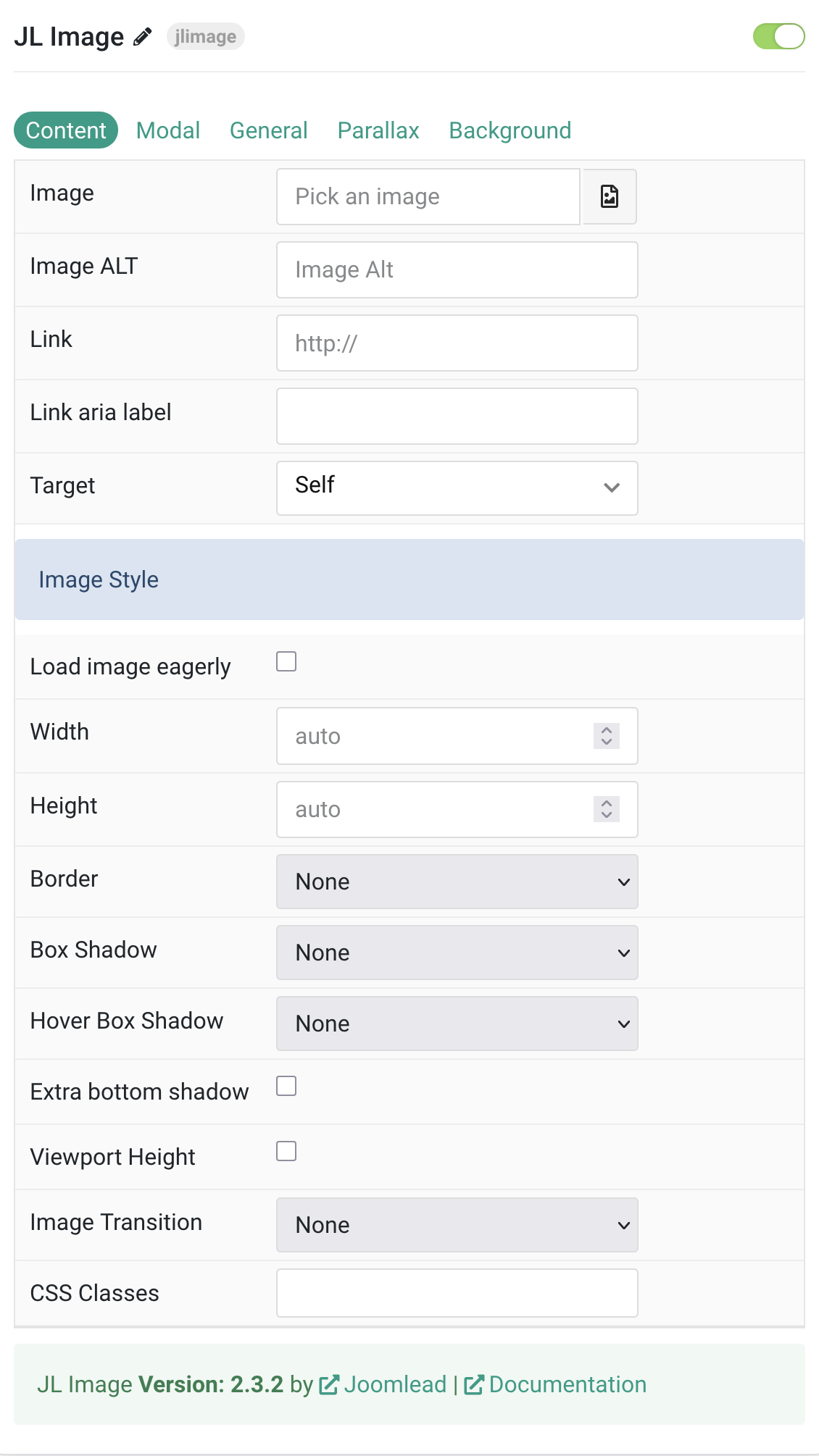
| Content Tab | |
| Image | An image field with an image picker. |
| Image ALT | Enter the image’s alt attribute. |
| Link | Enter the image’s link if needed. |
| Link aria label | Enter a descriptive text label to make it accessible if the link has no visible text. |
| Target | Open the link in a same or new window. |
| Image Style | |
| Load image eagerly | By default, images are loaded lazy. Enable eager loading for images in the initial viewport. |
| Width | Set the width of the image. Minimum value: 0. |
| Height | Set the height of the image. Minimum value: 0. |
| Border | Select the image’s border style. |
| Box Shadow | Select the image’s box shadow size. |
| Hover Box Shadow | Select the image’s box shadow size on hover if linked image. |
| Extra bottom shadow | Add an extra shadow effect at the bottom of the image. |
| Viewport Height | Force the height to one viewport. The image will cover the element’s content box. |
| Image Transition | Select an image transition if the Link is set. |
| CSS Classes | CSS class name for the particle. |
Tab Modal
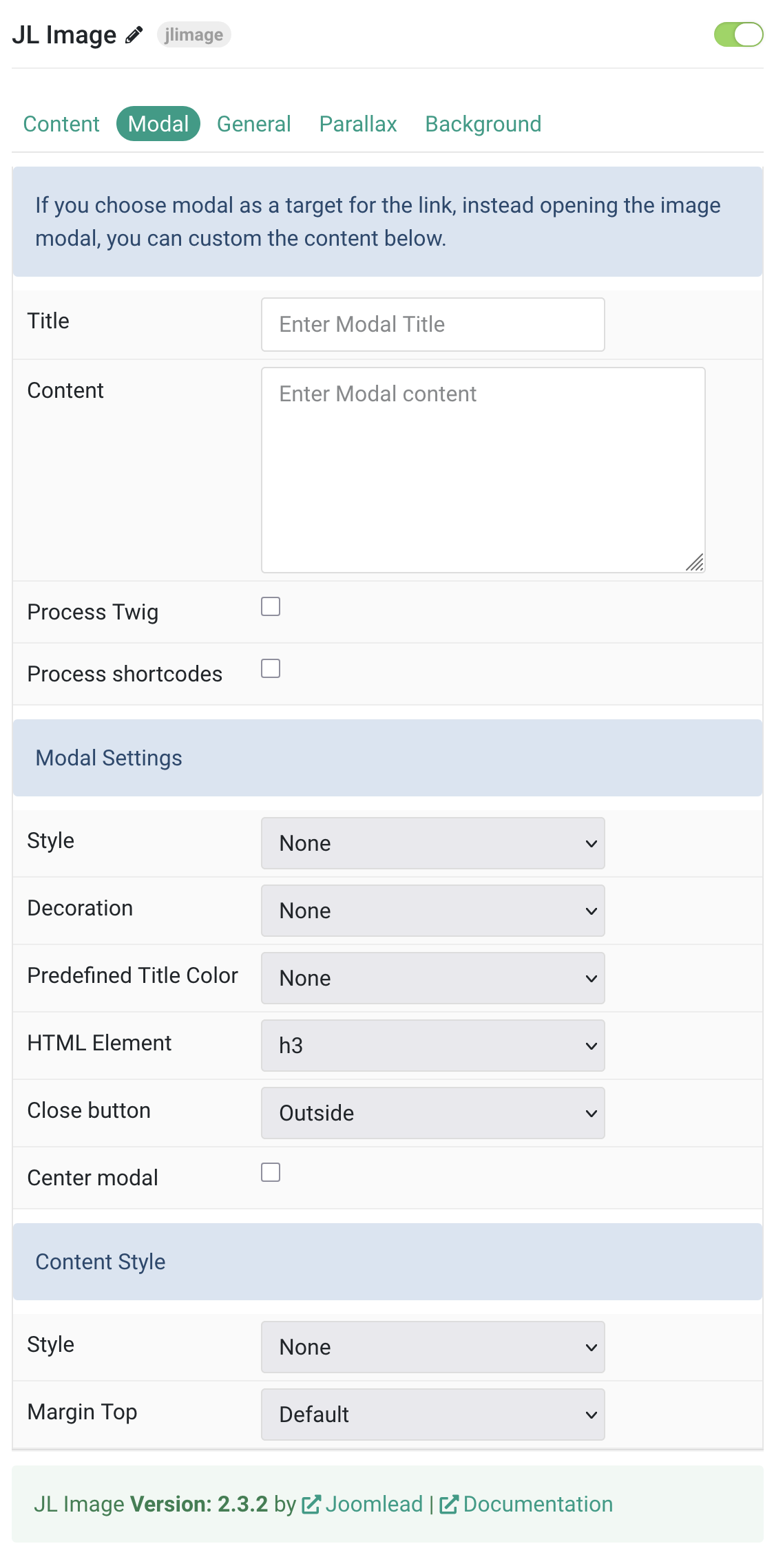
| Settings | Description |
|---|---|
| Modal Settings | |
| Style | Title styles differ in font-size but may also come with a predefined color, size and font. |
| Decoration | Decorate the headline with a divider, bullet or a line that is vertically centered to the heading. |
| Predefined Title Color | Select the text color. If the Background option is selected, styles that don’t apply a background image use the primary color instead. |
| HTML Element | Choose one of the elements to fit your semantic structure. Options: h1 through h6, div. |
| Close button | To create a close button for modal. |
| Center modal | To vertically center the modal dialog. |
| Content Style | |
| Style | Select a predefined meta text style, including color, size and font-family. |
| Margin Top | Set the top margin. Note that the margin will only apply if the content field immediately follows another content field. |
General, Parallax and Parallax Background tab
Please take a look the documentation here for more detail about these tabs settings

Comments