JL Popup Atom Documentation
Create modal dialogs with different styles and transitions. See how Popup can be designed beautifully on Demo Page.
# Popup Package contents
| Files | Description |
|---|---|
| jlpopup.yaml | Contains the Popup particle settings. |
| jlpopup.html.twig | The Twig file to pull information, settings. |
| js.cookie.min.js | Contains the JavaScript to handle the cookie. |
Installation Installing the particle on your website is a really simple process. You can refer to the document here to know more.
Requirements Alert particle requires Uikit 3 for Gantry 5 Atom to be installed and enabled in your theme layout settings.
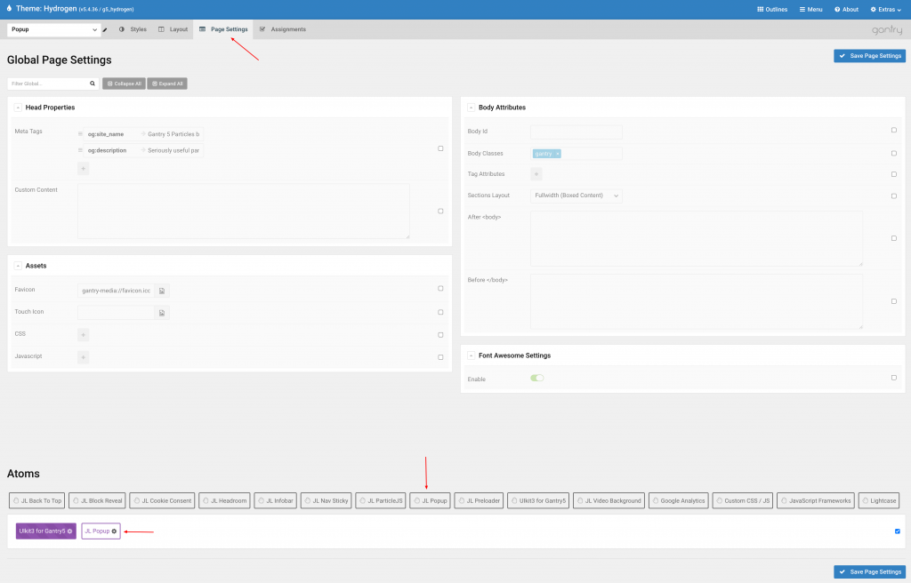
Go to Template/Theme Settings > select the Layout to add Popup atom (i.e: Home) -> Page Settings tab -> Drag and drop the JL Popup from Atom list to the settings block to display the atom on page load. Learn more about Gantry 5 atom here http://docs.gantry.org/gantry5/configure/page-settings#atoms
Settings
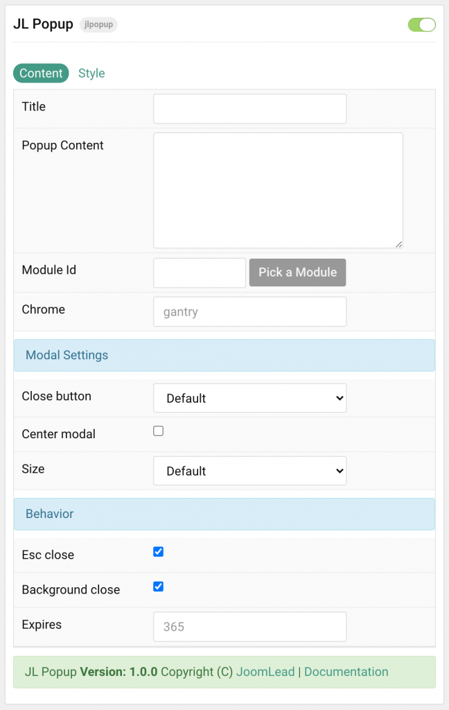
| Settings | Description |
|---|---|
| Title | Customize the title. |
| Popup Content | Customize the popup content. |
| Module ID | Pick a Joomla module or WordPress widget to load inside Modal. |
| Chrome | Module chrome. |
| Modal Settings | Common settings for Modal |
| Close Button | Enable or disable close button of alert. |
| Center modal | To vertically center the modal dialog. |
| Size | Select the modal size. |
| Behavior | Common settings for Modal Behavior |
| Esc close | Close the modal when the Esc key is pressed. |
| Background close | Close the modal when the background is clicked. |
| Expires Date | Appearance duration after click close button. Set this field to empty value to remove the timeout duration(always show the popup on page load). |
Style Tab
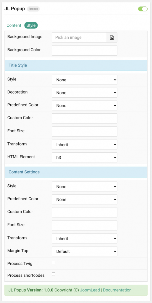
| Settings | Description |
|---|---|
| Background Color | Customize the modal background color. |
| Background Image | Using background image with Modal Full Split option. Set the Size to Split to use this option. |
| Title | Common settings for Title Style |
| Style | Title styles differ in font-size but may also come with a predefined color, size and font. |
| Decoration | Decorate the headline with a divider, bullet or a line that is vertically centered to the heading. |
| Predefined Color | Select the title text color. If the Background option is selected, styles that don’t apply a background image use the primary color instead. |
| Custom Color | Customize the title color instead using predefined title color mode. You need to set the predefined color to None before using the color customization. |
| Font size | Customize the title text font size. |
| Transform | The following options will transform text into uppercased, capitalized or lowercased characters. |
| HTML Element | Choose one of the elements to fit your semantic structure. |
| Content Settings | Common settings for Content |
| Style | Select a predefined content text style, including color, size and font-family. |
| Predefined Color | Select the content text color. If the Background option is selected, styles that don’t apply a background image use the primary color instead. |
| Custom Color | Customize the content color instead using predefined text color. You need to set the predefined color to None to use the customize color option. |
| Font size | Customize the content text font size. |
| Transform | The following options will transform text into uppercased, capitalized or lowercased characters. |
| Margin Top | Set the top margin. Note that the margin will only apply if the content field immediately follows another content field. |
| Process Twig | Enable Twig template processing in the content. Twig will be processed before shortcodes. |
| Process shortcodes | Enable shortcode processing / filtering in the content. |

Comments