Joomla Content Grid Particle
-
# Content Grid Joomla Package contents
Files Description jlcontentgrid.yaml Contains the Content Grid Joomla particle settings. jlcontentgrid.html.twig The Twig file to pull information, settings. -
# Content Grid WordPress Package contents
Files Description jlcontentgridwp.yaml Contains the Content Grid WordPress particle settings. jlcontentgridwp.html.twig The Twig file to pull information, settings. -
# Content Grid Grav Package contents
Files Description jlcontentgridgrav.yaml Contains the Content Grid Grav particle settings. jlcontentgridgrav.html.twig The Twig file to pull information, settings.
Installation Installing the particle on your website is a really simple process. You can refer to the document here to know more.
Requirements Content Grid requires Uikit 3 for Gantry 5 Atom to be installed and enabled in your theme layout settings.
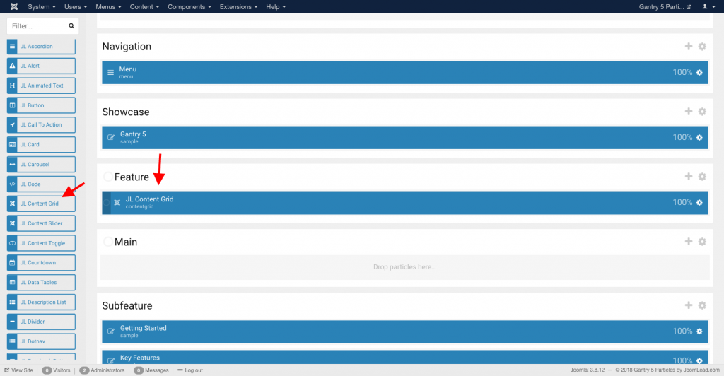
Go to Template/Theme Settings > select the Layout to add Joomla Content Grid particle (i.e: Home) -> Layout tab -> Drag and drop the Joomla Content Grid Particle from Particles panel (left corner) to the section you want to display the particle.
Settings
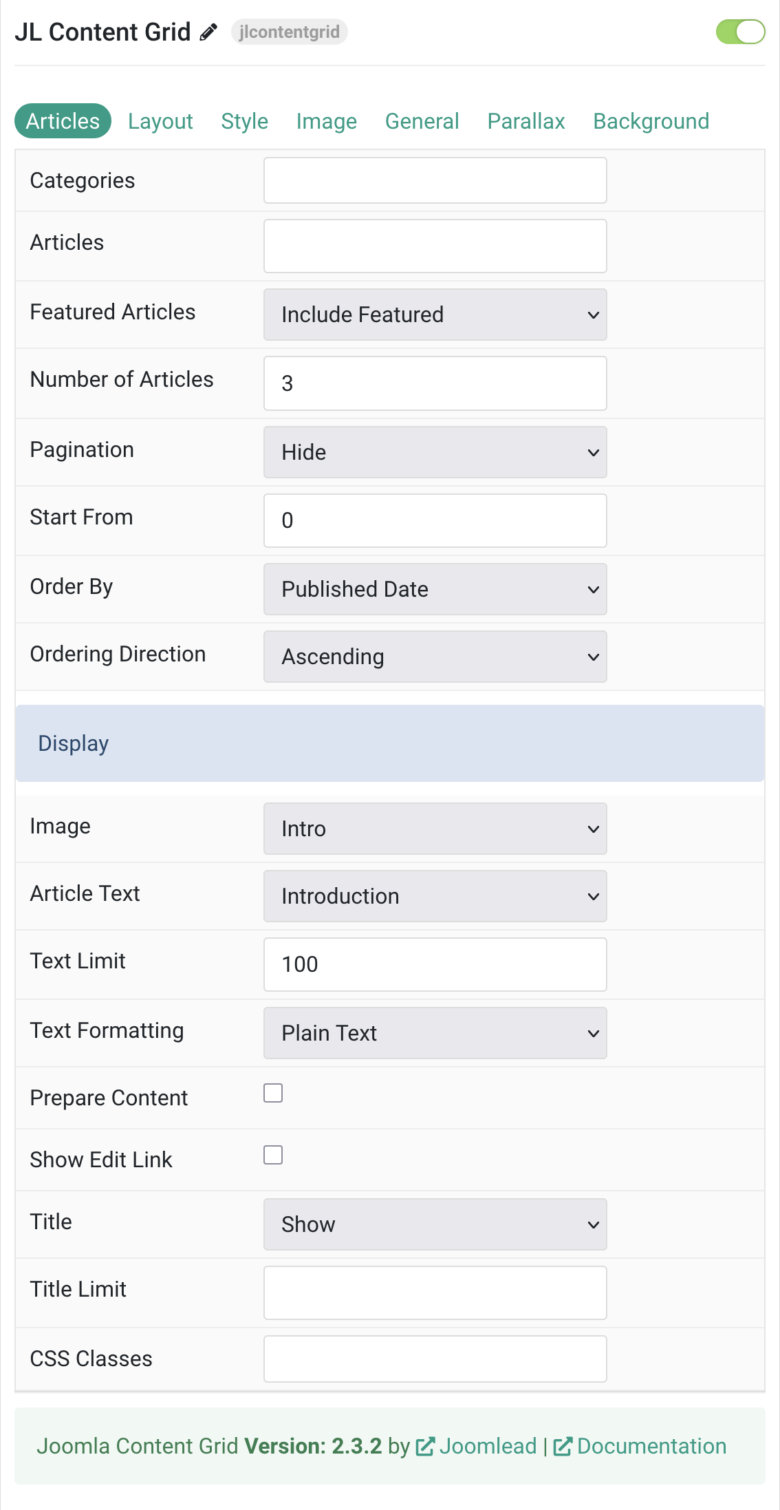
Articles Tab
| Settings | Description |
|---|---|
| Categories | Select the categories the articles should be taken from. |
| Articles | Enter the Joomla articles that should be shown. It should be a list of article IDs separated with a comma (i.e. 1,2,3,4,5). |
| Featured Articles | Select how Featured articles should be filtered. |
| Number of Articles | Enter the maximum number of articles to display. |
| Start From | Enter offset specifying the first article to return. The default is ‘0’ (the first article). |
| Order By | Select how the articles should be ordered by. |
| Ordering Direction | Select the direction the articles should be ordered by. |
| Display Style Settings | Common settings for Display Style |
| Image | Select if and what image of the article should be shown. |
| Article Text | Select if and how the article text should be shown. |
| Text Limit | Type in the number of characters the article text should be limited to. |
| Text Formatting | Select the formatting you want to use to display the article text. |
| Prepare Content | Use Joomla Content Plugins |
| Show Edit Link | Display a link to the article edit form |
| Title | Select if the article title should be shown. |
| Title Limit | Enter the maximum number of characters the article title should be limited to. |
| CSS Classes | CSS class name for the particle. |
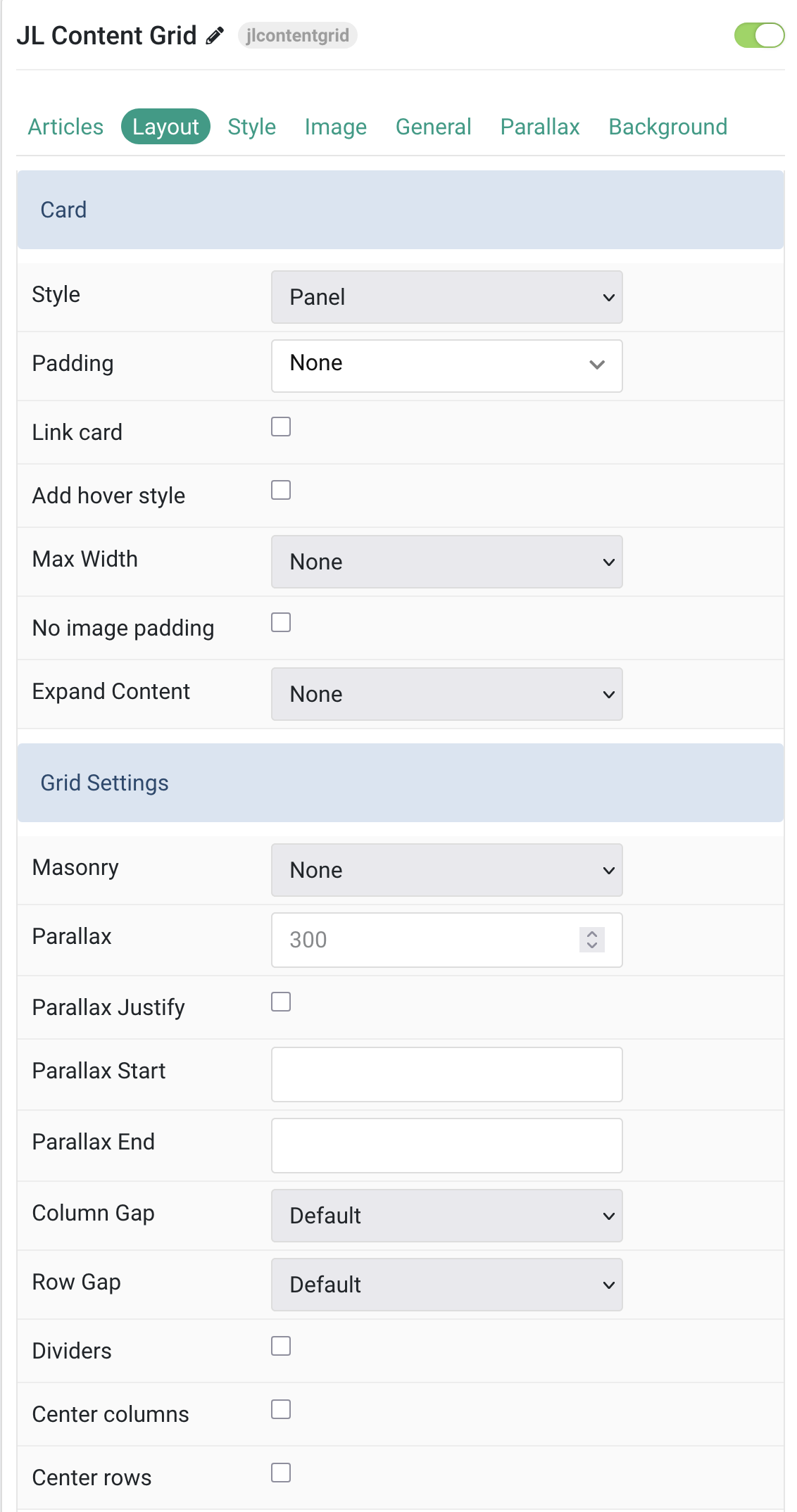
Layout Tab
| Settings | Description |
|---|---|
| Card | |
| Style | Select one of the boxed Card, Tile styles or a blank Panel. |
| Padding | Set the padding |
| Link card | Link the whole card if a link exists. |
| Add hover style | Add a hover style to the card link. |
| Max Width | Set the maximum width. |
| No image padding | Align image without padding. Top, left or right aligned images can be attached to the card’s edge. This option won’t have any effect IF the Style is set to Panel or Image Alignment is set to Between. |
| Expand Content | Expand the height of the content to fill the available space in the panel. |
| Grid Settings | |
| Masonry | Enable masonry layout(Pack or Next) on large screens and above. |
| Parallax | The parallax effect moves single grid columns at different speeds while scrolling. |
| Parallax Justify | Justify columns at the bottom. |
| Parallax Start | The animation starts when the element enters the viewport. Optionally, set a start offset, e.g., 100px, 50vh, or 50vh + 50%. Percent values relate to the element’s height. |
| Parallax End | The animation ends when the element leaves the viewport. |
| Column Gap | Set the size of the gap between the grid columns. |
| Row Gap | Set the size of the gap between the grid rows. |
| Dividers | Display dividers between grid cells. |
| Center columns | Center grid columns horizontally. |
| Center rows | Center grid rows vertically. |
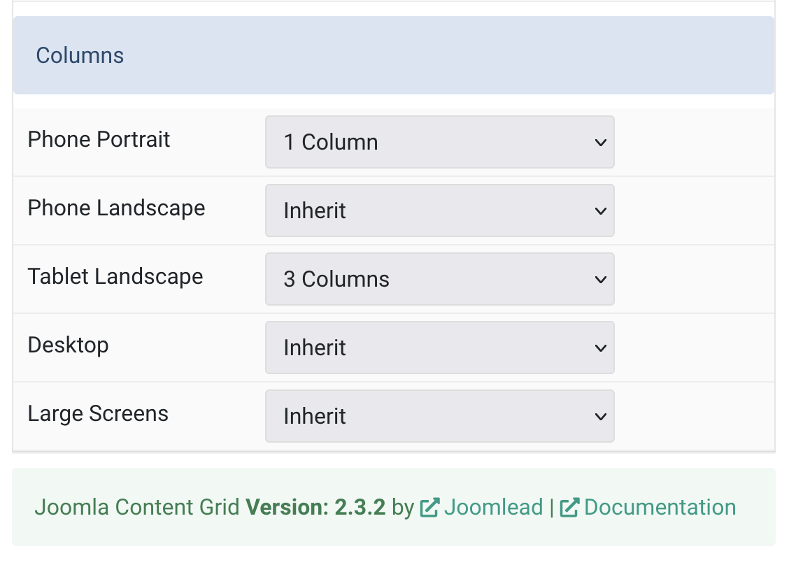
| Columns Settings | Columns control the Grid columns layout of your content. |
| Phone Portrait | Set the number of grid columns for each breakpoint. Inherit refers to the number of columns on the next smaller screen size. |
| Phone Landscape | |
| Tablet Landscape | |
| Desktop | |
| Large Screens | |
Style Tab
Title Settings Common settings for Title
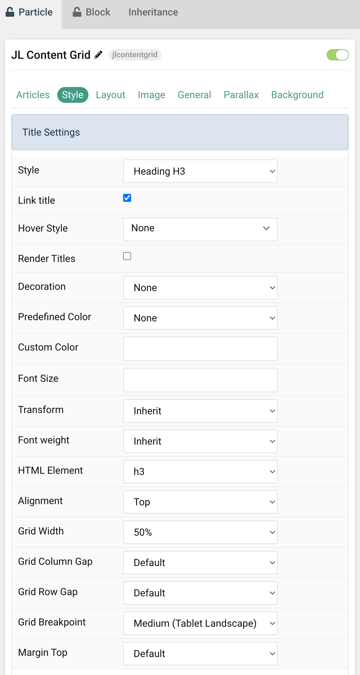
| Settings | Description |
|---|---|
| Style | Heading styles differ in font-size but may also come with a predefined color, size and font. |
| Link title | Link the title if a link exists. |
| Hover Style | Set the hover style for a linked title. Enable link title to use this option. |
| Render Titles | Renders the titles/tooltips of the Title Items for accessibility. |
| Decoration | Decorate the headline with a divider, bullet or a line that is vertically centered to the heading. |
| Predefined Color | Select the text color. If the Background option is selected, styles that don’t apply a background image use the primary color instead. |
| Custom Color | Customize the title color instead using predefined title color mode. You need to set the predefined color to None to use the customize color option. |
| Font Size | Customize the title text font size. |
| Transform | The following options will transform text into uppercased, capitalized or lowercased characters. |
| Font weight | Add one of the following classes to modify the font weight of your text. |
| HTML Element | Choose one of the elements to fit your semantic structure. |
| Alignment | Align the title to the top or left in regards to the content. |
| Grid Width | Define the width of the title within the grid. Choose between percent and fixed widths or expand columns to the width of their content. |
| Grid Column Gap | Set the size of the gap between the image and the content. |
| Grid Row Gap | Set the size of the gap if the grid items stack. |
| Grid Breakpoint | Set the breakpoint from which grid cells will stack. |
| Margin Top | Set the top margin. |
Meta Settings Common settings for Meta
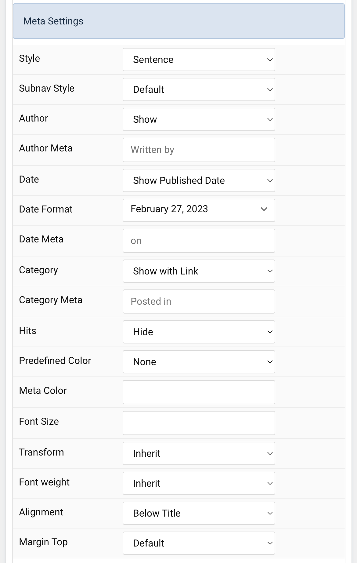
| Settings | Description |
|---|---|
| Style | Display the meta text in a sentence or a horizontal list. |
| Subnav Style | Select the subnav style for Meta List Style. |
| Author | Select if the article author should be shown. |
| Author Meta | Translate or replace the Author meta text for Sentence Style. Default: Written by |
| Date | Select if the article date should be shown. |
| Date Format | Select preferred date format. Leave empty not to display a date. |
| Date Meta | Translate or replace the Date meta text for Sentence Style. Default: on |
| Category | Select if and how the article category should be shown. |
| Category Meta | Translate or replace the Category meta text for Sentence Style. Default: Posted in |
| Hits | Select if the article hits should be shown. |
| Predefined Color | Select the predefined meta color. |
| Meta Color | Customize the meta color. Set Predefined Color for Meta to None before using this feature. |
| Font Size | Customize the title text font size. |
| Transform | The following options will transform text into uppercased, capitalized or lowercased characters. |
| Font weight | Add one of the following classes to modify the font weight of your text. |
| Alignment | Align the meta text above/below the title or below the content. |
| Margin Top | Set the top margin. Note that the margin will only apply if the content field immediately follows another content field. |
Content Settings Common settings for Content Style
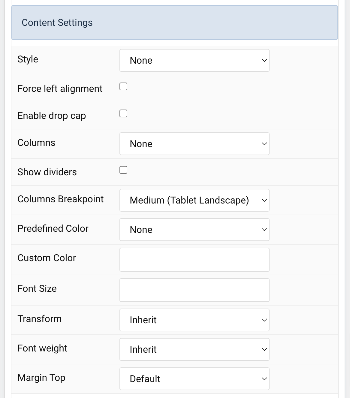
| Settings | Description |
|---|---|
| Style | Select a predefined text style, including color, size and font-family. |
| Force left alignment | Force left alignment for the content if the text center/text right is set via general tab. |
| Enable drop cap | Display the first letter of the paragraph as a large initial. |
| Columns | Set the number of list columns. |
| Show dividers | Show a divider between list columns. |
| Columns Breakpoint | Set the device width from which the list columns should apply. |
| Predefined Color | Select the predefined meta color. |
| Custom Color | Customize the content color instead using predefined text color. You need to set the predefined color to None to use the customize color option. |
| Font Size | Customize the content text font size. |
| Transform | The following options will transform text into uppercased, capitalized or lowercased characters. |
| Font weight | Add one of the following classes to modify the font weight of your text. |
| Margin Top | Set the top margin. Note that the margin will only apply if the content field immediately follows another content field. |
Link Settings Common settings for Link Style
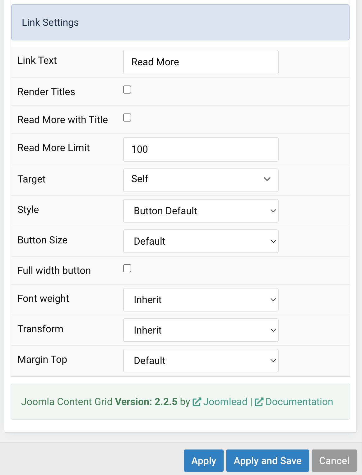
| Settings | Description |
|---|---|
| Link Text | Type in the label for the ‘Read More’ button. |
| Render Titles | Renders the titles/tooltips of the Button Items for accessibility. |
| Read More with Title | Renders the titles for the Button Items for accessibility. |
| Read More Limit | Type in the number of characters the readmore text should be limited to(characters). |
| Target | Target browser window when item is clicked. |
| Style | Set the button style. |
| Button Size | Set the button size. |
| Full width button | Set full width button. |
| Font weight | Add one of the following classes to modify the font weight of your text. |
| Transform | The following options will transform text into uppercased, capitalized or lowercased characters. |
| Margin Top | Set the top margin. Note that the margin will only apply if the content field immediately follows another content field. |
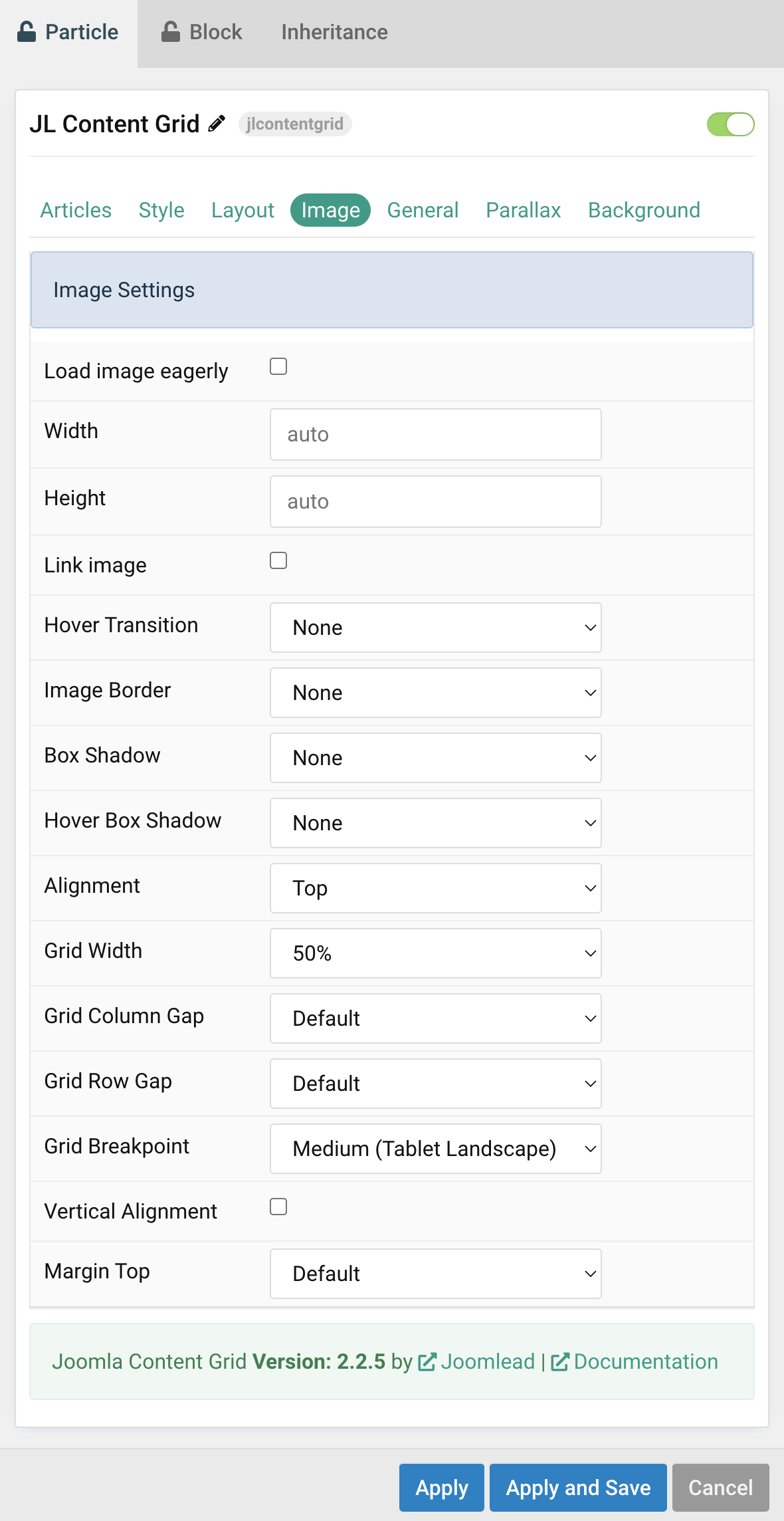
Image Settings Common settings for Image Style
| Settings | Description |
|---|---|
| Load image eagerly | By default, images are loaded lazy. Enable eager loading for images in the initial viewport. |
| Width | Enter the image’s width. |
| Height | Enter the image’s height. |
| Link image | Link the image if a link exists. |
| Hover Transition | Set the hover transition for a linked image. |
| Image Border | Select the image’s border style. This option won’t have any effect if Align image without padding is enabled. |
| Box Shadow | Select the image’s box shadow size. This option won’t have any effect unless the Card Style is set to Panel. |
| Hover Box Shadow | Select the image’s box shadow size on hover. This option won’t have any effect unless the Card Style is set to Panel. |
| Alignment | Align the image to the top,left, right or place it between the title and the content. |
| Grid Width | Define the width of the image within the grid. Choose between percent and fixed widths or expand columns to the width of their content. This option won’t have any effect unless Image Alignment is set to Left or Right. |
| Grid Column Gap | Set the size of the gap between the image and the content. This option won’t have any effect unless Image Alignment is set to Left or Right. |
| Grid Row Gap | Set the size of the gap if the grid items stack. This option won’t have any effect unless Image Alignment is set to Left or Right. |
| Grid Breakpoint | Set the breakpoint from which grid cells will stack. This option won’t have any effect unless Image Alignment is set to Left or Right. |
| Vertical Alignment | Vertically center grid cells. This option won’t have any effect unless Image Alignment is set to Left or Right. |
| Margin Top | Set the top margin. Note that the margin will only apply if the content field immediately follows another content field. This option won’t have any effect unless Image Alignment is set to Bottom or Between. |
General tab
Please take a look the documentation here for more detail about the tab settings

On the main menu, this said it was for wordpress. Now it says Joomla. I cannot find this Particle in my list of downloaded particles. There are other missing as well. the whole reason I purchased these particles in the first place.
Hi Damion,
Just unzip the package JoomLead-Gantry5-Particles and navigate to WordPress folder, here you can see all particles for WordPress version 🙂