Joomla/WordPress/Grav Content Slider
-
# Joomla Content Slider Package contents
Files Description jlcontentslider.yaml Contains the Content Slider particle settings. jlcontentslider.html.twig The Twig file to pull information, settings. -
# WordPress Content Slider Package contents
Files Description jlcontentsliderwp.yaml Contains the WordPress Content Slider particle settings. jlcontentsliderwp.html.twig The Twig file to pull information, settings. -
# Grav Content Slider Package contents
Files Description jlcontentslidergrav.yaml Contains the Grav Content Slider particle settings. jlcontentslidergrav.html.twig The Twig file to pull information, settings.
Installation Installing the particle on your website is a really simple process. You can refer to the document here to know more.
Requirements Content Slider particles (Joomla/Wordpress/Grav) require Uikit 3 for Gantry 5 Atom to be installed and enabled in your theme layout settings.
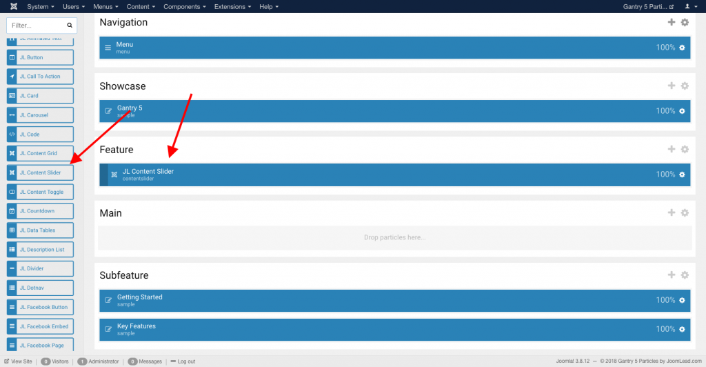
Go to Template/Theme Settings > select the Layout to add Joomla Content Slider particle (i.e: Home) -> Layout tab -> Drag and drop the Joomla Content Slider Particle from Particles panel (left corner) to the section you want to display the Joomla Content Slider.
Settings
| Settings | Description |
|---|---|
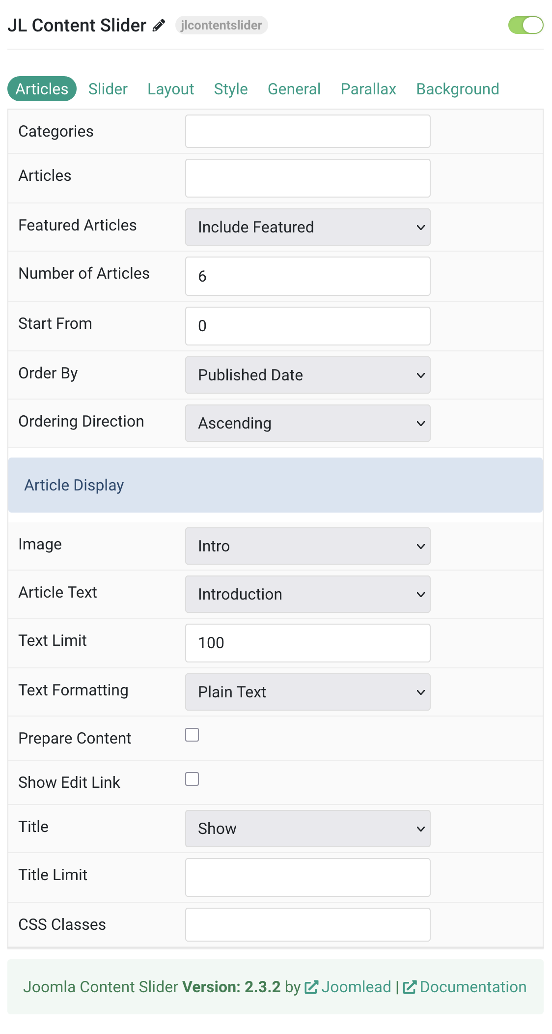
| Categories | Select the categories the articles should be taken from. |
| Articles | Enter the Joomla articles that should be shown. It should be a list of article IDs separated with a comma (i.e. 1,2,3,4,5). |
| Featured Articles | Select how Featured articles should be filtered. |
| Number of Articles | Enter the maximum number of articles to display. |
| Start From | Enter offset specifying the first article to return. The default is ‘0’ (the first article). |
| Order By | Select how the articles should be ordered by. |
| Ordering Direction | Select the direction the articles should be ordered by. |
| Article Display Settings | Common settings for Article Display |
| Image | Select if and what image of the article should be shown. |
| Article Text | Select if and how the article text should be shown. |
| Text Limit | Type in the number of characters the article text should be limited to. |
| Text Formatting | Select the formatting you want to use to display the article text. |
| Prepare Content | Enable shortcode processing / filtering in the content. This useful when you want to load the Joomla module or WordPress shortcode inside the card content, example you can add a Joomla shortcode inside the card content like {loadmoduleid your_moduleId}, then just enable the Process shortcodes feature and done. This solution similar to How do you put a module inside an article? |
| Show Edit Link | Display a link to the article edit form |
| Title | Select if the article title should be shown. |
| Title Limit | Enter the maximum number of characters the article title should be limited to. |
| CSS Classes | CSS class name for the particle. |
Slider Tab
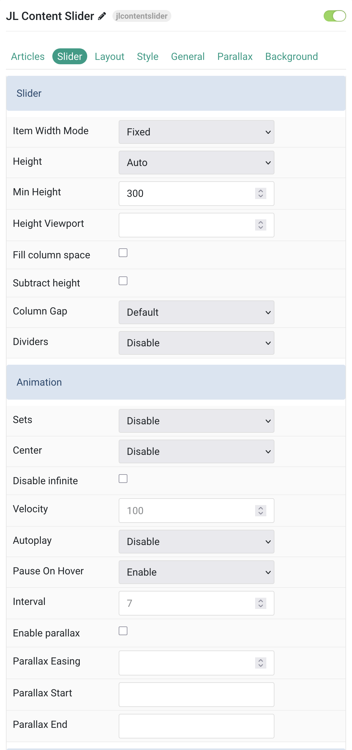
Slider settings Common settings for Slider.
| Settings | Description |
|---|---|
| Item Width Mode | Define whether the width of the slider items is fixed or automatically expanded by its content widths. |
| Height | The height will adapt automatically based on its content. Alternatively, the height can be adapt to the height of viewport. Note: Make sure, no height is set in the section settings when using one of the viewport options. |
| Min Height | Use an optional minimum height to prevent the slider from becoming smaller than its content on small devices. Min 200 – Max 800. |
| Height Viewport | Use an optional minimum height to prevent the slideshow from becoming smaller than its content on small devices. Min 0 Max 100 |
| Fill column space | Enable to fill available column space. |
| Subtract height | Enable to subtract height from viewport calculations. |
| Column Gap | Set the size of the gap between the grid columns. |
| Dividers | Display dividers between grid cells. |
| Slider Animation | Common settings for Slider Animation |
| Sets | Slide all visible items at once. Group items into sets. The number of items within a set depends on the defined item width, e.g. 33% means that each set contains 3 items. |
| Center | Center the active slide |
| Disable infinite | Disable infinite scrolling between items. |
| Velocity | Set the velocity in pixels per millisecond. Min 20, Max 300 |
| Autoplay | Enable autoplay for slider items. |
| Pause On Hover | Pause autoplay on hover. |
| Interval | Set the autoplay interval in seconds. Min 5 Max 15. |
| Enable parallax | Add a stepless parallax animation based on the scroll position. |
| Parallax Easing | Set the animation easing. Zero transitions at an even speed, a negative value starts off quickly while a positive value starts off slowly. |
| Slider Animation | Common settings for Slider Animation |
| Parallax Start | The animation starts when the element enters the viewport. Optionally, set a start and end offset, e.g. 100px, 50vh or 50vh + 50%. Percent relates to the target’s height. |
| Parallax End | The animation ends when the element leaves the viewport. Optionally, set a start and end offset, e.g. 100px, 50vh or 50vh + 50%. Percent relates to the target’s height. |
Item Width/Navigation/Slidenav Common settings for Item Width, Navigation and Slidenav.
| Settings | Description |
|---|---|
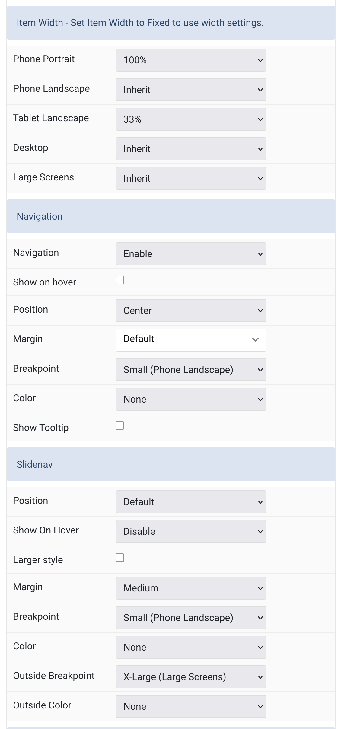
| Item Width Settings | Common settings for Columns. |
| Phone Portrait | Set the item width for each breakpoint. Inherit refers to the number of columns on the next smaller screen size. |
| Phone Landscape | |
| Tablet Landscape | |
| Desktop | |
| Large Screens | |
| Slider Navigation | Common settings for Slider Navigation. |
| Navigation | Select the navigation type. |
| Show on hover | Display navigation only when hovering over the slider. |
| Position | Align the navigation’s items. |
| Margin | Set the vertical margin. |
| Breakpoint | Display the navigation only on this device width and larger. |
| Color | Set light or dark color mode. |
| Show Tooltip | Display Title as tooltip when hovering. |
| Slidenav Settings | Common settings for Slidenav. |
| Slidenav Position | Select the position of the slidenav. |
| Slidenav Show On Hover | Show the slide nav on hover only. |
| Larger style | To increase the size of the slidenav icons. |
| Slidenav Margin | Apply a margin between the slidenav and the slider container. |
| Slidenav Breakpoint | Display the slidenav only on this device width and larger. |
| Slidenav Color | Set light or dark color mode. |
| Outside Breakpoint | Display the slidenav only outside on this device width and larger. Otherwise it will be displayed inside. |
| Outside Color | Set light or dark color if the slidenav is outside of the slider. |
| Previous Icon | Select icon for previous navigation button. |
| Previous SVG Code | Your SVG code that will be added inline to the site. |
| Next Icon | Select icon for next navigation button. |
| Next SVG Code | Your SVG code that will be added inline to the site. |
| Background | Set background color for slider items. |
| Color | Set text color for slider items. |
| Padding Horizontal | Set horizontal padding for slider items. |
| Padding Vertical | Set vertical padding for slider items. |
| Border Radius | Set border radius for slider items. |
| Hover Background | Set background color for slider items on hover. |
| Hover Color | Set text color for slider items on hover. |
Tab Layout
Item type Define the layout type within the slider. Choose between the Overlay or Card style for its content.
Note Height and Min Height options (Slider tab) are not supported for Card mode (Item Style)
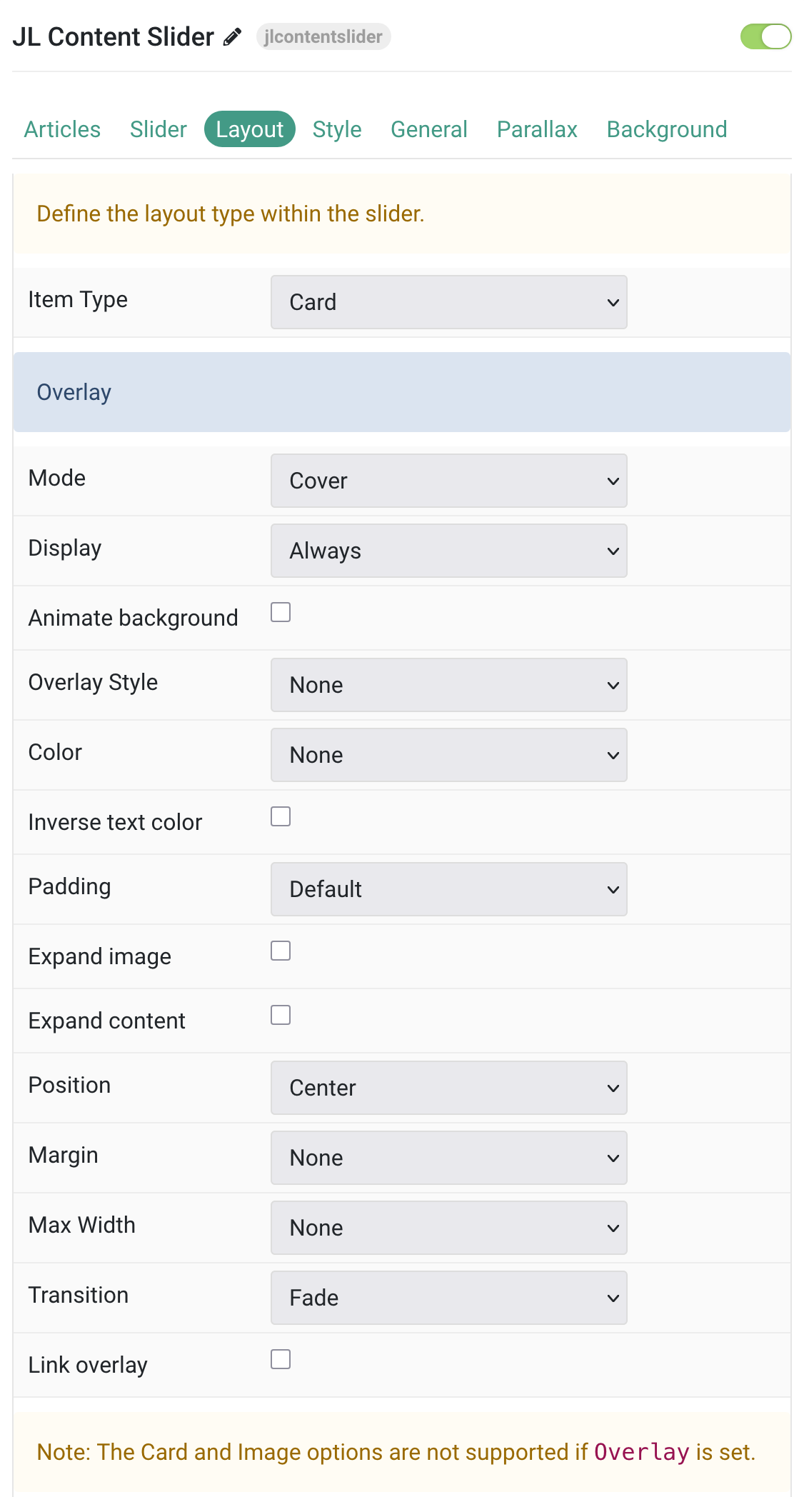
Overlay Common settings for Overlay
| Settings | Description |
|---|---|
| Layout | Define the layout type within the slider. |
| Overlay Settings | Configuration options for overlay style layouts. |
| Mode | When using cover mode, you need to set the text color manually. |
| Display | Show the overlay only on hover or when the slide becomes active. |
| Animate background | Animate the background only on hover. |
| Overlay Style | Select the style for the overlay. |
| Color | Set light or dark color mode for text, buttons and controls. |
| Inverse text color | Inverse the text color on hover. |
| Padding | Set the padding between the overlay and its content. |
| Expand image | Expand the height of the image to fill the available space in the item. |
| Expand content | Expand the height of the content to fill the available space in the overlay and push the link to the bottom. |
| Position | Select the overlay or content position. |
| Margin | Apply a margin between the overlay and the image container IF the overlay style is Selected. |
| Max Width | Set the maximum content width. |
| Transition | Select a transition for the overlay when it appears on hover. |
| Link overlay | Link the whole overlay if a link exists. |
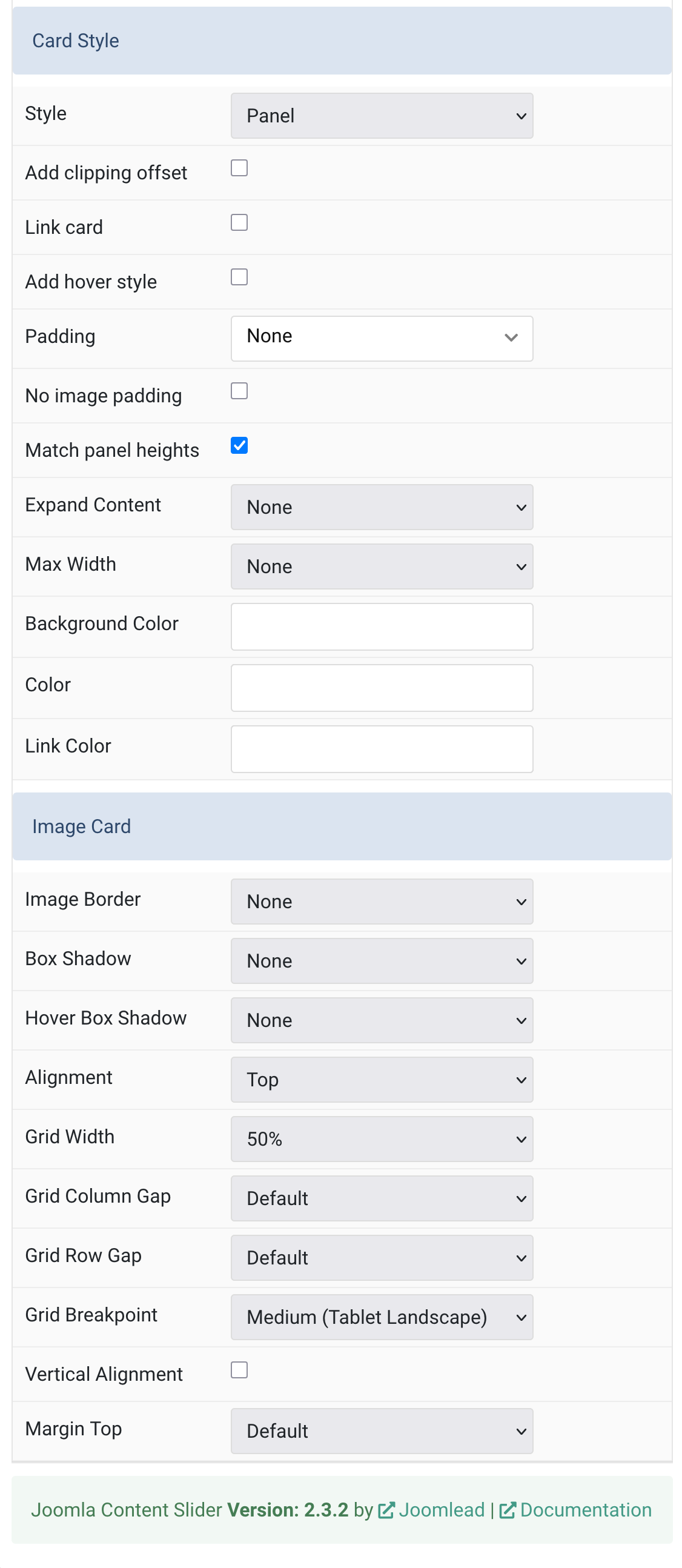
Card Style Common settings for Card
Note The Card and Image Card options are not supported if Overlay is set.
| Settings | Description |
|---|---|
| Card Style | Note: The Card and Image options are not supported if Overlay is set. |
| Style | Select one of the boxed card, tile styles or a blank panel. |
| Add clipping offset | Since the slider effect needs a clipping container, box shadows of content items are also clipped. Check this option to widen the container to prevent box-shadows from clipping. |
| Link card | Link the whole card if a link exists. |
| Add hover style | Add hover styling effects to the card. |
| Padding | Set the padding for the boxed card or tile styles. |
| No image padding | Top, left or right aligned images can be attached to the card’s edge. If the image is aligned to the left or right, it will also extend to cover the whole space. |
| Match panel heights | To match the height of the direct child of each cell. |
| Expand Content | Expand the height of the content to fill the available space in the panel and push the link to the bottom. |
| Max Width | Set the maximum width. |
| Background Color | Customize the card background color. |
| Color | Customize the card color. |
| Link Color | Customize the link hover color. |
| Image Card | Configuration options for image styling within cards. |
| Image Border | Select the image’s border style. |
| Box Shadow | Select the image’s box shadow size. |
| Hover Box Shadow | Select the image’s box shadow size on hover. |
| Alignment | Align the image to the top,left, right or place it between the title and the content. |
| Grid Width | Define the width of the image within the grid. |
| Grid Column Gap | Set the size of the gap between the image and the content. |
| Grid Row Gap | Set the size of the gap if the grid items stack. |
| Grid Breakpoint | Set the breakpoint from which grid cells will stack. |
| Vertical Alignment | Vertically center grid cells. |
| Margin Top | Set the top margin. Note that the margin will only apply if the content field immediately follows another content field. |
Tab Style
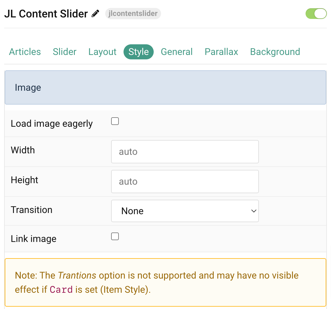
Image Common settings for Image
| Settings | Description |
|---|---|
| Load image eagerly | By default, images are loaded lazy. Enable eager loading for images in the initial viewport. |
| Width | Set the width of the image. |
| Height | Set the height of the image. |
| Image Transition | Select an image transition. |
| Link image | Link the image if a link exists. |
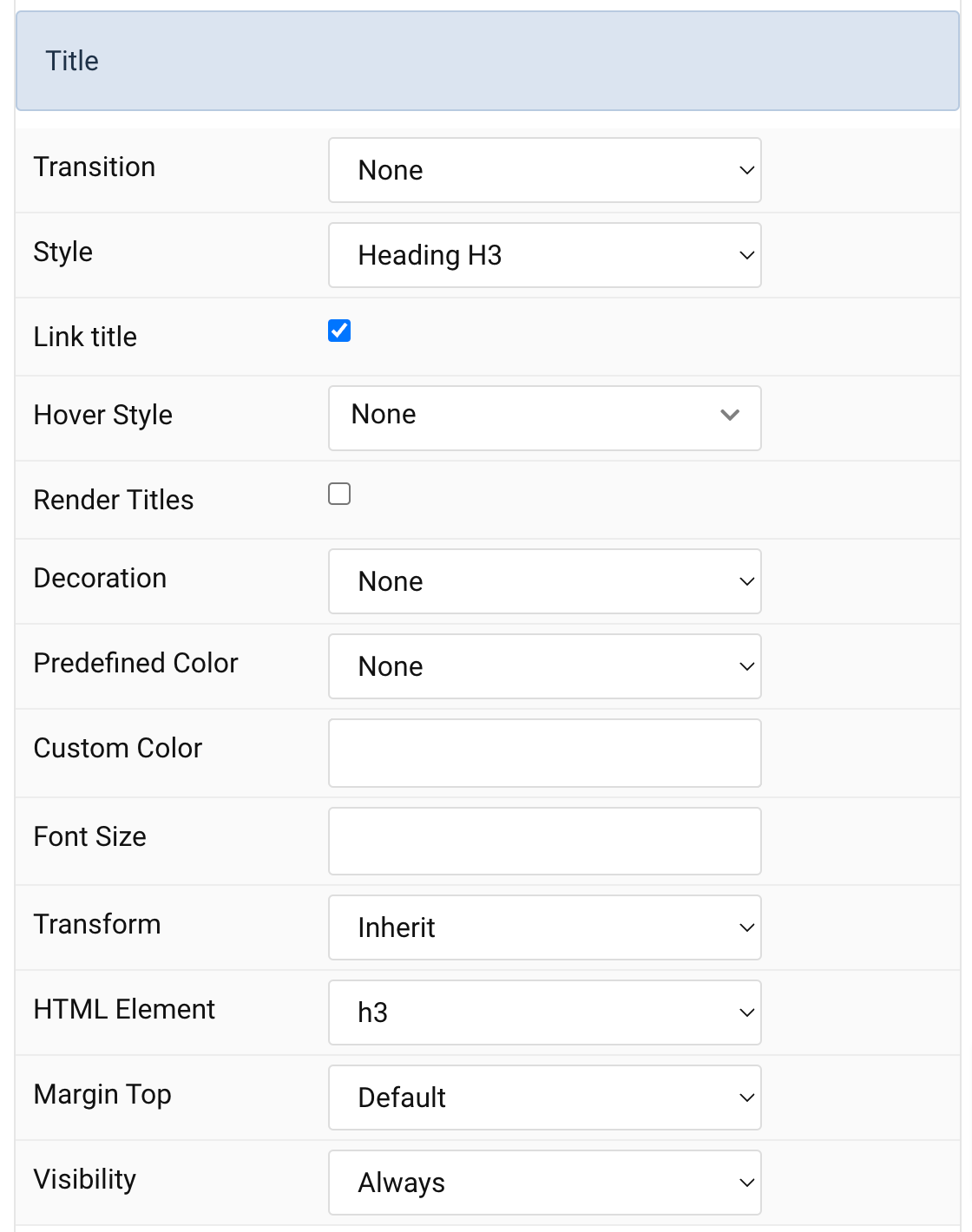
Title Settings Common settings for Title Style
| Settings | Description |
|---|---|
| Transition | Select a transition for the title when the overlay appears on hover. |
| Style | Heading styles differ in font-size but may also come with a predefined color, size and font. |
| Link title | Link the title if a link exists. |
| Hover Style | Set the hover style for a linked title. Enable link title to use this option. |
| Render Titles | Renders the titles/tooltips of the Title Items for accessibility. |
| Decoration | Decorate the headline with a divider, bullet or a line that is vertically centered to the heading. |
| Predefined Color | Select a predefined text color. |
| Custom Color | Customize the title color instead using predefined title color mode. You need to set the predefined color to None to use the customize color option. |
| Font Size | Customize the title text font size. |
| Transform | The following options will transform text into uppercased, capitalized or lowercased characters. |
| HTML Element | Choose one of the elements to fit your semantic structure. |
| Margin Top | Set the top margin. |
| Visibility | Display the title only on this device width and larger. |
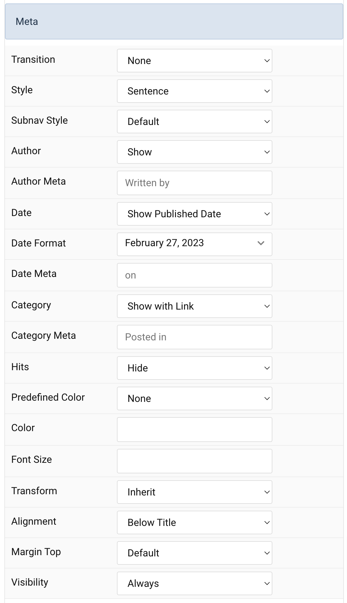
Meta Settings Common settings for Meta
| Settings | Description |
|---|---|
| Transition | Select a transition for the meta when the overlay appears on hover. |
| Style | Display the meta text in a sentence or a horizontal list. |
| Subnav Style | Select the subnav style for Meta List Style. |
| Author | Select if the article author should be shown. |
| Author Meta | Translate or replace the Author meta text for Sentence Style. Default: Written by |
| Date | Select if the article date should be shown. |
| Date Format | Select preferred date format. Leave empty not to display a date. |
| Date Meta | Translate or replace the Date meta text for Sentence Style. Default: on |
| Category | Select if and how the article category should be shown. |
| Category Meta | Translate or replace the Category meta text for Sentence Style. Default: Posted in |
| Hits | Select if the article hits should be shown. |
| Predefined Color | Select the predefined meta color. |
| Custom Color | Customize the meta color. Set Predefined Color for Meta to None before using this feature. |
| Font Size | Customize the title text font size. |
| Transform | The following options will transform text into uppercased, capitalized or lowercased characters. |
| Alignment | Align the meta text above/below the title or below the content. |
| Margin Top | Set the top margin. |
| Visibility | Display the title only on this device width and larger. |
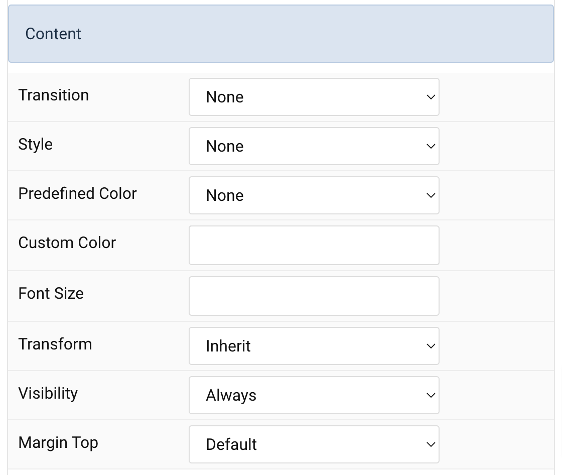
Content Settings Common settings for Content Style
| Settings | Description |
|---|---|
| Transition | Select a transition for the content when the overlay appears on hover. |
| Style | Select a predefined text style, including color, size and font-family. |
| Predefined Color | Select the predefined meta color. |
| Custom Color | Customize the content color instead using predefined text color. You need to set the predefined color to None to use the customize color option. |
| Font Size | Customize the content text font size. |
| Transform | The following options will transform text into uppercased, capitalized or lowercased characters. |
| Visibility | Display the title only on this device width and larger. |
| Margin Top | Set the top margin. |
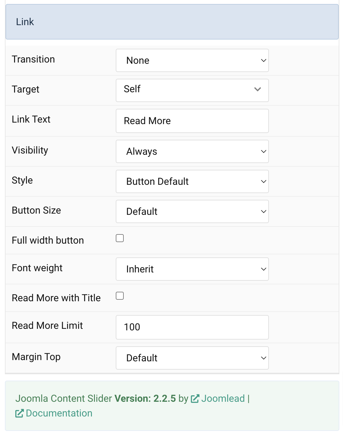
Link Settings Common settings for Link Style
| Settings | Description |
|---|---|
| Transition | Select a transition for the link when the overlay appears on hover. |
| Target | Target browser window when item is clicked. |
| Link Text | Type in the label for the ‘Read More’ button. |
| Visibility | Display the title only on this device width and larger. |
| Style | Set the button style. |
| Button Size | Set the button size. |
| Full width button | Set the fullwidth for button |
| Font weight | Add one of the following classes to modify the font weight of your text. |
| Read More with Title | Add the article title to read more button |
| Read More Limit | Type in the number of characters the readmore text should be limited to(characters). |
| Margin Top | Set the top margin. |
General tab
Please take a look the documentation here for more detail about the tab settings

Comments