List Particle Documentation
Easily create nice looking lists, which come in different styles. See how List can be designed beautifully on Demo Page.
# List Package contents
The Uikit3 for Gantry 5 atom contains the compiled CSS and JavaScript files, twig and yaml files, which is everything you need to get started.| Files | Description |
|---|---|
| jllist.yaml | Contains the List particle settings. |
| jllist.html.twig | The Twig file to pull information, settings. |
Installation Installing the particle on your website is a really simple process. You can refer to the document here to know more.
Requirements List requires Uikit 3 for Gantry 5 Atom to be installed and enabled in your theme layout settings.
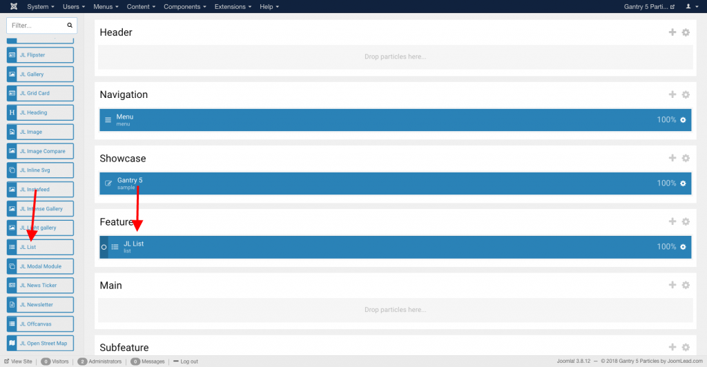
Go to Template/Theme Settings > select the Layout to add List particle (i.e: Home) -> Layout tab -> Drag and drop the List Particle from Particles panel (left corner) to the section you want to display the List.
Settings
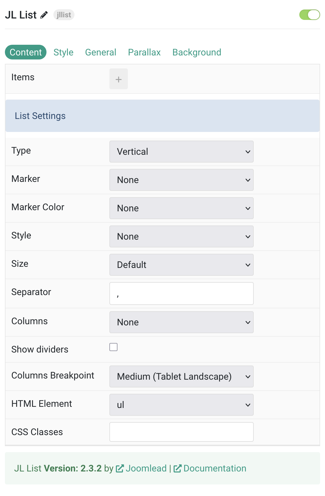
| Settings | Description |
|---|---|
| Items | List items to show. You can add new items to the collection using the plus + icon |
| List Settings | Common settings for List |
| Type | Choose between a vertical or horizontal list. |
| Marker | Select the marker of the list items. |
| Marker Color | Select the color of the list markers. This option doesn’t apply if Image Bullet is selected. |
| Style | Select the list style. |
| Size | Define the padding between items. |
| Separator | Set the separator between list items. Support Horizontal type only. |
| Columns | Set the number of list columns. |
| Show dividers | Show a divider between list columns. |
| Columns Breakpoint | Set the device width from which the list columns should apply. |
| HTML Element | Choose between an ordered and unordered list to fit your semantic structure. |
| CSS Classes | CSS class name for the particle. |
Items Click Items field to enable it, then you can add new items to the collection using the plus + icon
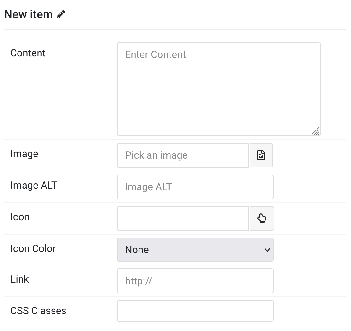
| Settings | Description |
|---|---|
| Content | Customize the list content |
| Image | An image field with an image picker. |
| Image ALT | Enter the image’s alt attribute. |
| Icon | Instead of using a custom image, you can click on the hand to pick an icon from the icon library. |
| Icon Color | Set the icon color. |
| Link | Specify the item link. |
| CSS Classes | Specify the CSS class name for item. |
Style Tab
Common settings for Content, Icon and Image List.
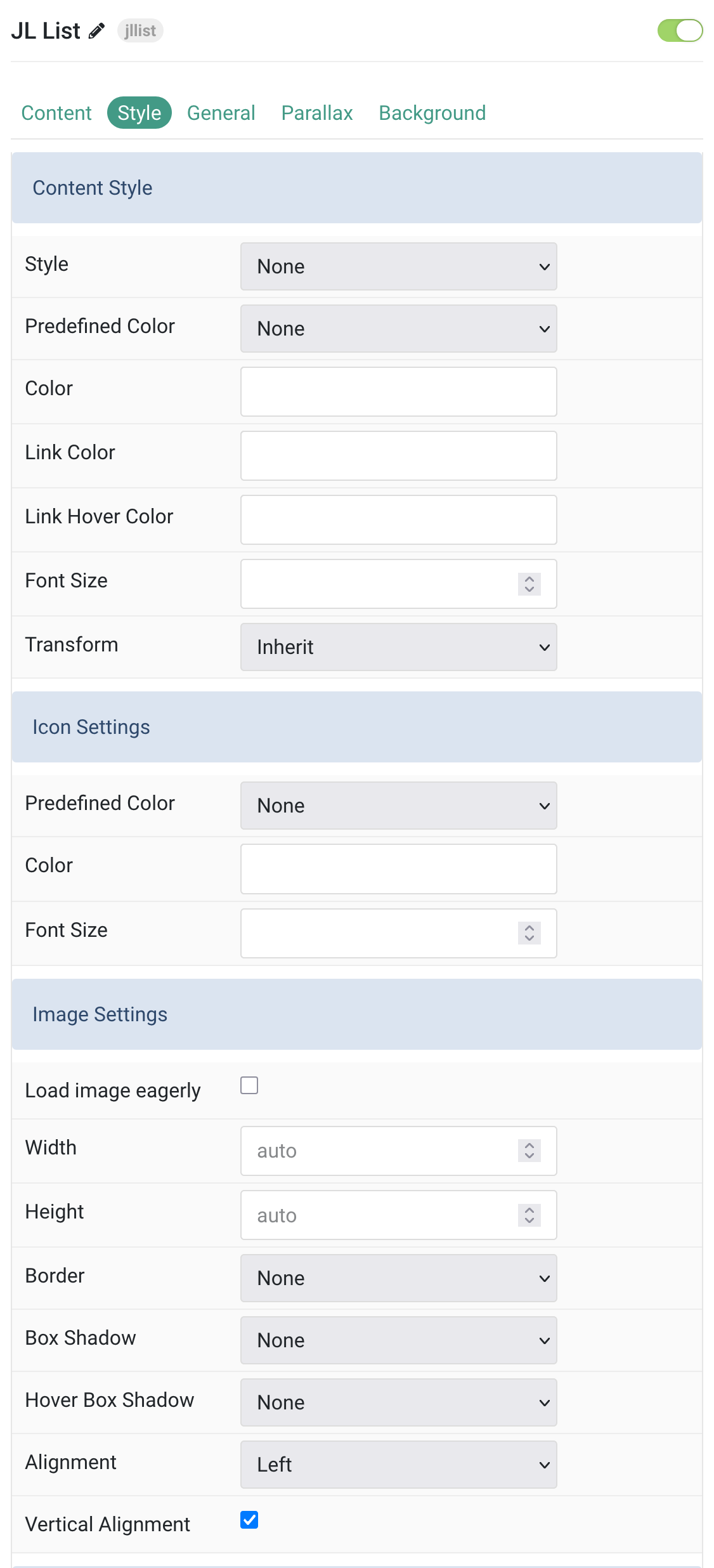
| Settings | Description |
|---|---|
| Content Style | |
| Style | Select a predefined text style, including color, size and font-family. |
| Predefined Color | Select a predefined text color. |
| Color | Customize the title color. |
| Link Color | Customize the link color. |
| Link Hover Color | Customize the link hover color. |
| Font Size | Customize the title text font size. |
| Transform | The following options will transform text into uppercased, capitalized or lowercased characters. |
| Icon Settings | |
| Predefined Color | Select a predefined text color. |
| Color | Customize the icon color. |
| Font Size | Customize the icon font size. |
| Image Settings | |
| Load image eagerly | By default, images are loaded lazy. Enable eager loading for images in the initial viewport. |
| Width | Set the width of the image. |
| Height | Set the height of the image. |
| Border | Select the image’s border style. |
| Box Shadow | Select the image’s box shadow size. |
| Hover Box Shadow | Select the image’s box shadow size on hover. |
| Alignment | Align the image to the left or right. |
| Vertical Alignment | Vertically center the image. |
Link Settings Common settings for Link.
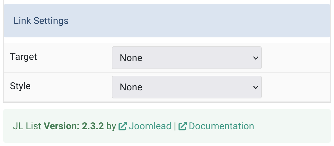
| Settings | Description |
|---|---|
| Target | Target browser window when item is clicked. |
| Style | This option doesn’t apply unless a URL has been added to the item. |
General, Parallax and Parallax Background tab
Please take a look the documentation here for more detail about these tabs settings

Comments