Menu Canvas Particle
Manage the way your menu is displayed with an offcanvas sidebar slides in from the left or right side of the page. Choose between Slide, Reveal and Push offcanvas animations. Optionally, you can display the offcanvas bar on the right or use the modal animation to display the menu in a modal. See Demo Page.
Installation Installing the particle on your website is a really simple process. You can refer to the document here to know more.
Requirements Menu Canvas particles require Uikit 3 for Gantry 5 Atom to be installed and enabled in your theme layout settings.
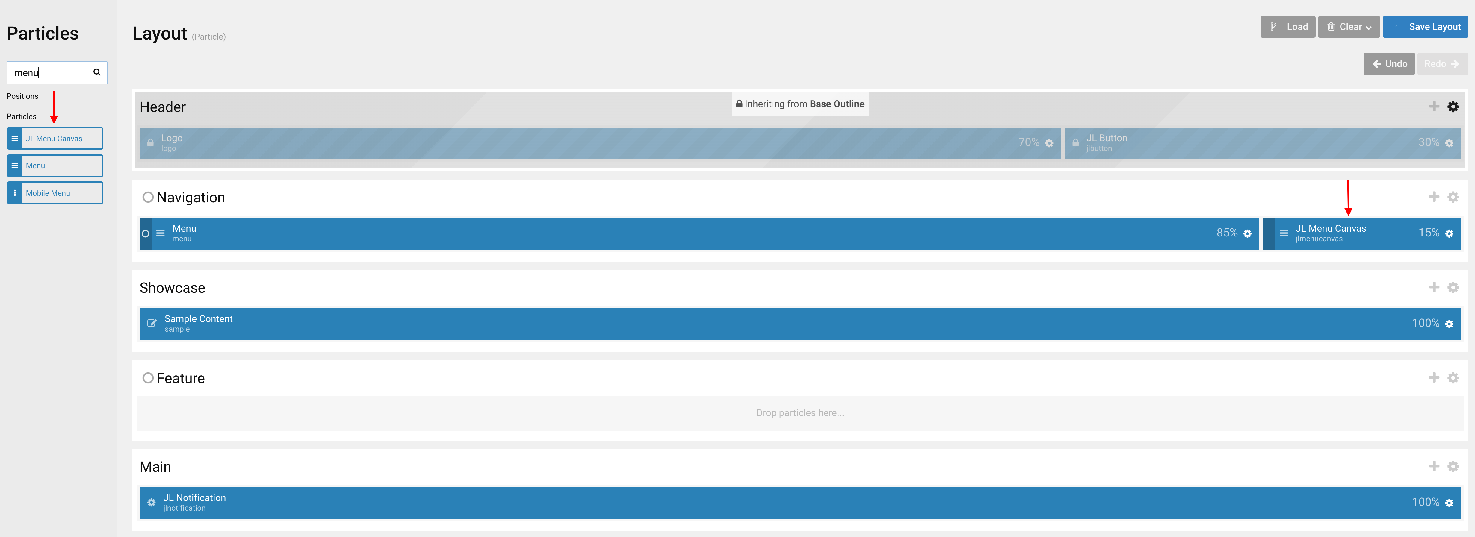
Go to Template/Theme Settings > select the Layout to add Menu Canvas particle (i.e: Home) -> Layout tab -> Drag and drop the Menu Canvas Particle from Particles panel (left corner) to the section you want to display the particle.
Settings
Logo Tab
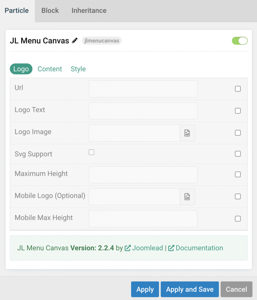
| Settings | Description |
|---|---|
| Url | Custom Url for the logo. Leave empty to go to home page. |
| Logo Text | Type in the Logo Text that will be used in case no Logo Image from your media library has been picked. |
| Logo Image | Upload your logo in the png, jpg or SVG file format for best quality on all screens. |
| Svg Support | Inject inline SVG images into the page markup and style them with CSS. Use this option if you use svg format. |
| Maximum Height | Set the logo height |
| Mobile Logo (Optional) | Select an alternative logo, which will be used on small devices. |
| Mobile Max Height | Set the Mobile logo height. |
Content Tab
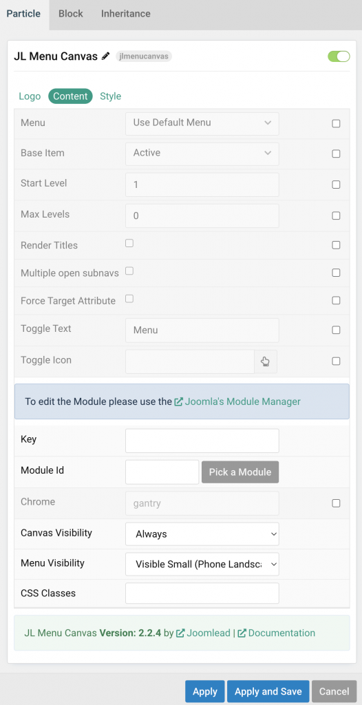
| Settings | Description |
|---|---|
| Menu | Select menu to be used with the particle. |
| Base Item | Select a menu item to always be used as the base for the menu display. |
| Start Level | Set the start level of the menu. |
| Max Levels | Set the maximum number of menu levels to display. |
| Render Titles | Renders the titles/tooltips of the Menu Items for accessibility. |
| Multiple open subnavs | To display multiple subnav menu items at the same time without one collapsing when the other one is opened. |
| Force Target Attribute | Adds target="_self" attribute to all menu links instead of omitting the default value. Fixes an issue with pinned tabs in Firefox where external links always open in a new tab. |
| Toggle Text | Show the text label Menu next to the hamburger icon. |
| Toggle Icon | Instead of using default toggle icon, you can click on the hand to pick a custom icon from the icon library. |
| Key | Load Joomla module position |
| Module Id | Pick a Joomla Module |
| Chrome | Module chrome. |
| Canvas Visibility | Display the offcanvas only on this device width and larger. |
| Menu Visibility | Display the main menu only on this device width and larger. |
| CSS Classes | CSS class name for the particle. |
Style Tab
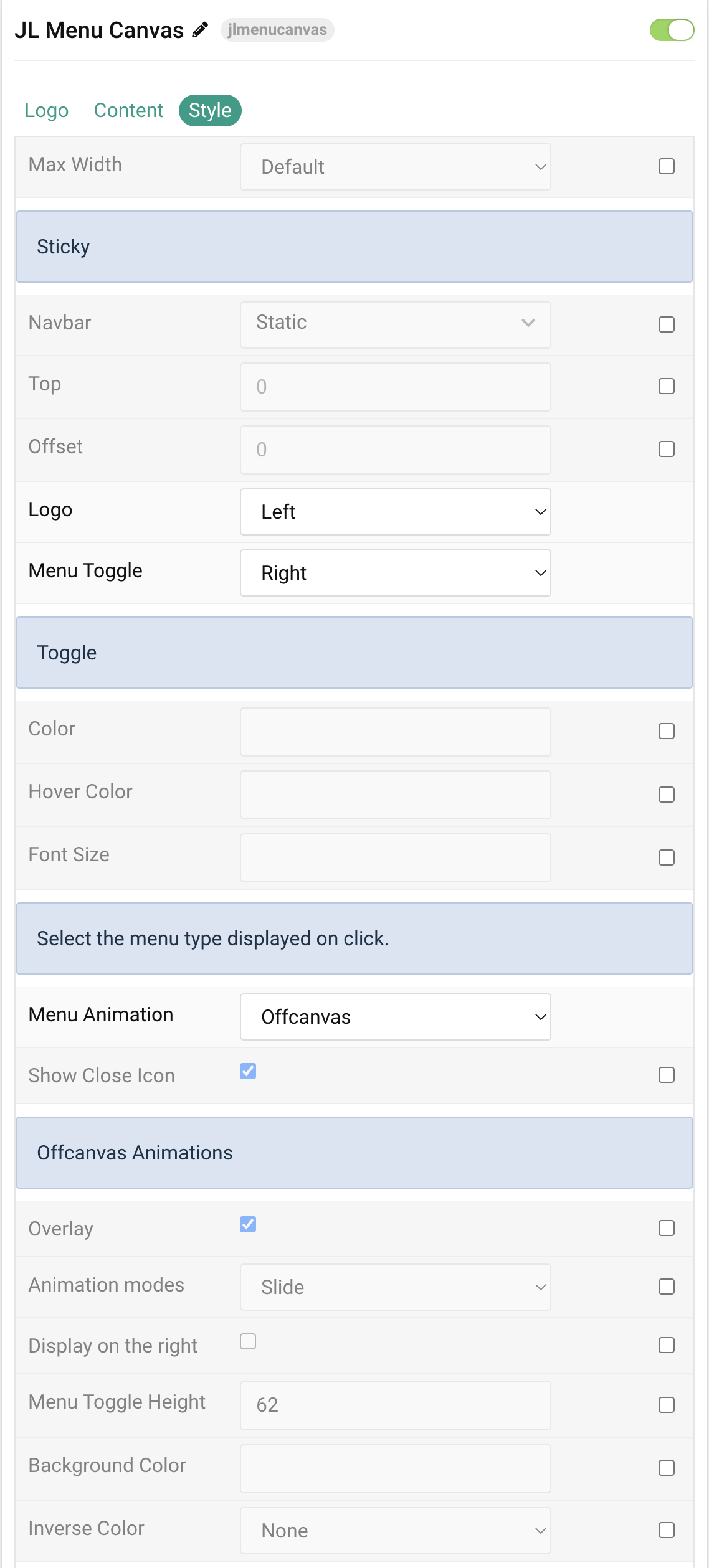
| Settings | Description |
|---|---|
| Max Width | Set the maximum content width. |
| Sticky | Common settings for Sticky animation. |
| Sticky | Let the navbar stick at the top of the viewport while scrolling or only when scrolling up. |
| Top | The top offset from where the element should be stick. |
| Offset | The offset the Sticky should be fixed to. |
| Logo | Select the alignment of the logo. |
| Menu Toggle | Select the alignment of the menu toggle icon. |
| Toggle Color | Customize the toggle color if needed. |
| Toggle Color Hover | Customize the toggle color on hover. |
| Font Size | Customize the toggle text font size. |
| Menu Behavior | Select the menu type displayed on click. |
| Menu Animation | There are two different menu animations to display the menu when toggled(Offcanvas and Modal). |
| Show Close Icon | Use this option to create a close button and enable its functionality. |
| Offcanvas Animation | Common settings for Offcanvas animation. |
| Overlay | Use this option to add an overlay, blanking out the page, |
| Animation modes | Choose between Slide, Reveal and Push offcanvas animations. |
| Display on the right | Use this option to display the offcanvas bar on the right. |
| Menu Toggle Height | Set the height of a Menu Toggle. |
| Background Color | Customize the background color for offcanvas bar. |
| Inverse Color | Set light or dark color mode for nav icon, buttons and controls. |
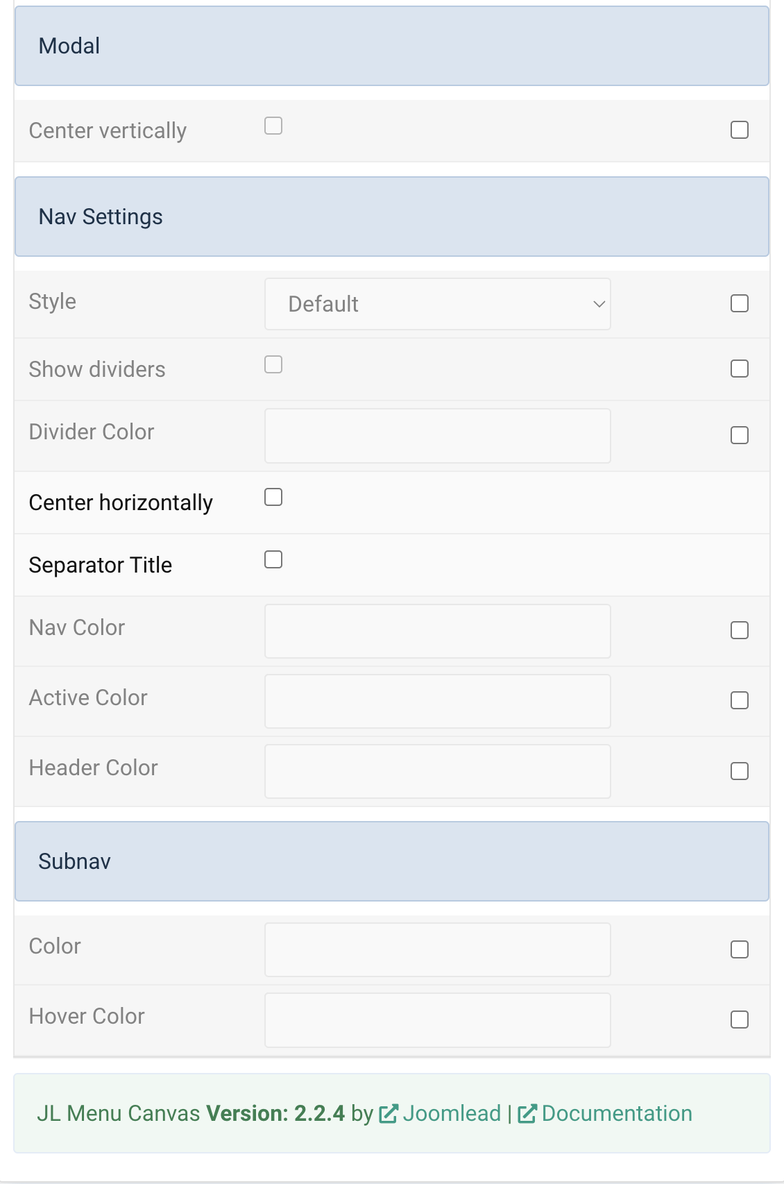
| Modal Animations | Use the modal animation to display the menu in a modal. |
| Center vertically | Center the menu and the content vertically. |
| Nav Settings | Common settings for Nav |
| Menu Style | Choose the Menu Style. |
| Style | Choose the Nav Menu Style. |
| Show dividers | Show divider between menu items |
| Dividers color | Customize the divider color for nav items. |
| Center horizontally | Center the nav menu items horizontally |
| Separator Title | Use this option to show a menu item title instead a divider. |
| Nav Color | Customize the nav item color if needed. |
| Active Color | Customize the nav item hover/active color if needed. |
| Header Color | Customize the Nav Header Color. |
| Subnav Settings | Color settings for Subnav |
| Color | Customize the subnav item color. |
| Hover Color | Customize the subnav item hover color. |
General, Parallax and Parallax Background tab
Please take a look the documentation here for more detail about these tabs settings

Just wanted to thank you for your wok on all of the JL Navbar, JL Canvas menu and Off Canvas Content. They especially lift Joomla sites to a much more professional looking level. This is an otherwise sadly neglected area for Joomla but is so important for the end user. They also make the site construction much more enjoyable.
Great work!
Especially like the Accordion effect, essential for e-commerce (I look forward to seeing it in JL Navbar) 😉