Modal Module/Widget Particle
# Modal Module Joomla Package contents
| Files | Description |
|---|---|
| jlmodalmodule.yaml | Contains the Modal Module particle settings. |
| jlmodalmodule.html.twig | The Twig file to pull information, settings. |
# Modal Widget WordPress Package contents
| Files | Description |
|---|---|
| jlmodalwidget.yaml | Contains the Modal Widget particle settings. |
| jlmodalwidget.html.twig | The Twig file to pull information, settings. |
Installation Installing the particle on your website is a really simple process. You can refer to the document here to know more.
Requirements Modal module and modal widget require Uikit 3 for Gantry 5 Atom to be installed and enabled in your theme layout settings.
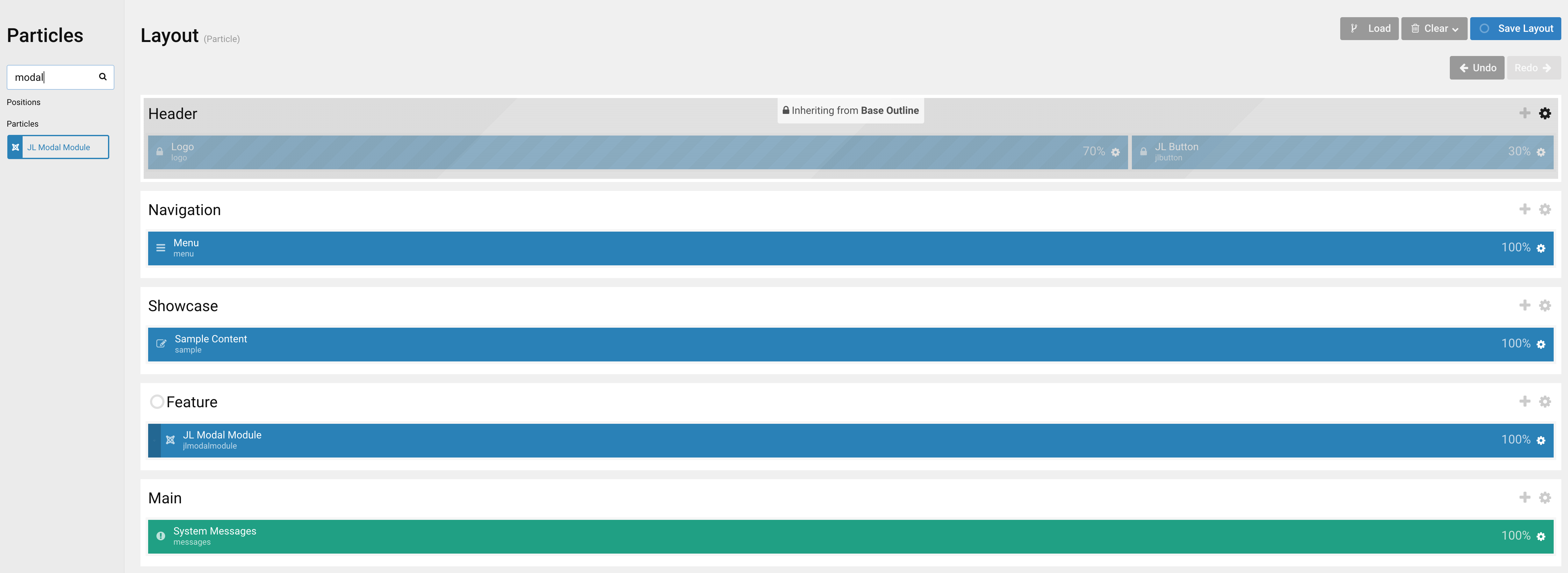
Go to Template/Theme Settings > select the Layout to add Modal Module particle (i.e: Home) -> Layout tab -> Drag and drop the Modal Module Particle from Particles panel (left corner) to the section you want to display the particle.
Settings
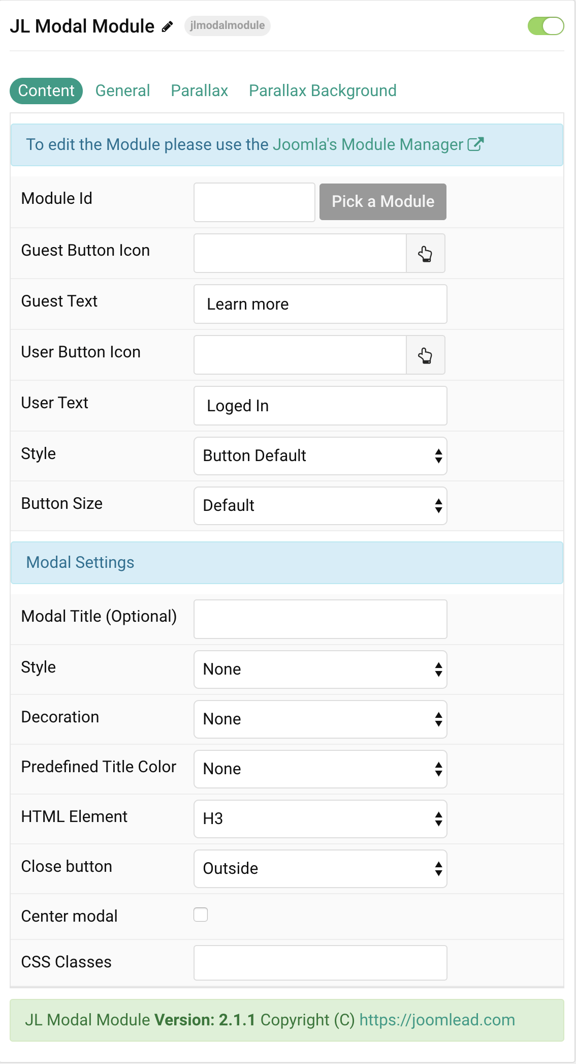
| Settings | Description |
|---|---|
| Module Id | Pick a Joomla Module or Wodpress Widget |
| Guest Button Icon | Choose the Button Icon for guest. |
| Guest Text | Specify the button text for guest. |
| User Button Icon | Choose the Button Icon for logged in user. |
| User Text | Specify the button text for logged in user. |
| Style | Set the button style. |
| Button Size | Set the button size. |
| Modal Settings | Common settings for Modal |
| Modal Title | Instead using defaul Joomla module title, you can use this title as custom Modal title. |
| Style | Title styles differ in font-size but may also come with a predefined color, size and font. |
| Decoration | Decorate the title with a divider, bullet or a line that is vertically centered to the heading. |
| Predefined Color | Select a predefined text color. |
| HTML Element | Choose one of the elements to fit your semantic structure. |
| Close button | To create a close button for modal. |
| Center Modal | To vertically center the modal dialog. |
| Layout | Choose between default, container width or full modal. Default: Default modal width Container: Expand the modal dialog to the default Container width. Full: To create a modal, that fills the entire page |
| Full Modal Image | Add a modal background image to can create a nice, split fullscreen modal. |
| CSS Classes | CSS class name for the particle. |
General, Parallax and Parallax Background tab
Please take a look the documentation here for more detail about these tabs settings

Comments