Overlay Particle Documentation
Create an image overlay, which comes in different styles. Give user the flexibility to display image with content. See how Overlay can be designed beautifully on Demo Page.
# Overlay Package contents
| Files | Description |
|---|---|
| jloverlay.yaml | Contains the Overlay particle settings. |
| jloverlay.html.twig | The Twig file to pull information, settings. |
Installation Installing the particle on your website is a really simple process. You can refer to the document here to know more.
Requirements Overlay requires Uikit 3 for Gantry 5 Atom to be installed and enabled in your theme layout settings.
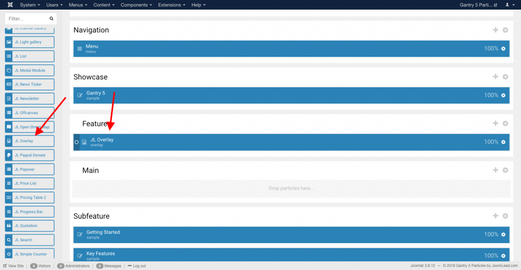
Go to Template/Theme Settings > select the Layout to add Overlay particle (i.e: Home) -> Layout tab -> Drag and drop the Overlay Particle from Particles panel (left corner) to the section you want to display the Overlay.
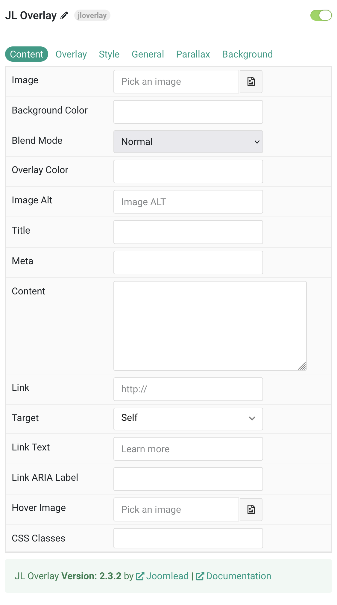
Settings
| Settings | Description |
|---|---|
| Image | An image field with an image picker. |
| Background Color | Use the background color in combination with blend modes. |
| Blend Mode | Determine how the image will blend with the background color. |
| Overlay Color | Set an additional transparent overlay to soften the image. |
| Image Alt | Enter the image’s alt attribute. |
| Title | Customize the Title. |
| Meta | Customize the Meta. |
| Content | Customize the content. |
| Link | Enter the image’s link if needed. |
| Target | Target browser window when item is clicked. |
| Link Text | Specify the button label. |
| Link ARIA Label | Enter a descriptive text label to make it accessible if the link has no visible text. |
| Hover Image | Select an optional image that appears on hover. |
| CSS Classes | CSS class name for the particle. |
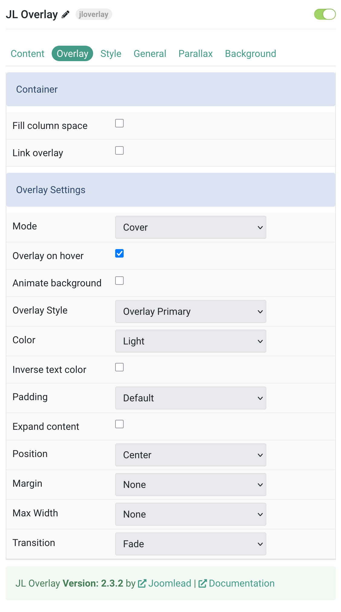
Overlay Tab
| Settings | Description |
|---|---|
| Container | |
| Fill column space | Fll the available space in the overlay. |
| Link overlay | Link the whole overlay if a link exists. |
| Overlay Settings | |
| Mode | When using cover mode, you need to set the text color manually. |
| Overlay on hover | Display overlay on hover |
| Animate background | Animate background only |
| Overlay Style | Select the style for the overlay. |
| Color | Set light or dark color mode for text, buttons and controls. |
| Inverse text color | Inverse the text color on hover. |
| Padding | Set the padding between the overlay and its content. |
| Expand content | Expand the height of the content to fill the available space in the overlay and push the link to the bottom. |
| Position | Select the overlay or content position. |
| Margin | Apply a margin between the overlay and the image container. |
| Max Width | Set the maximum content width. |
| Transition | Select a transition for the overlay when it appears on hover. |
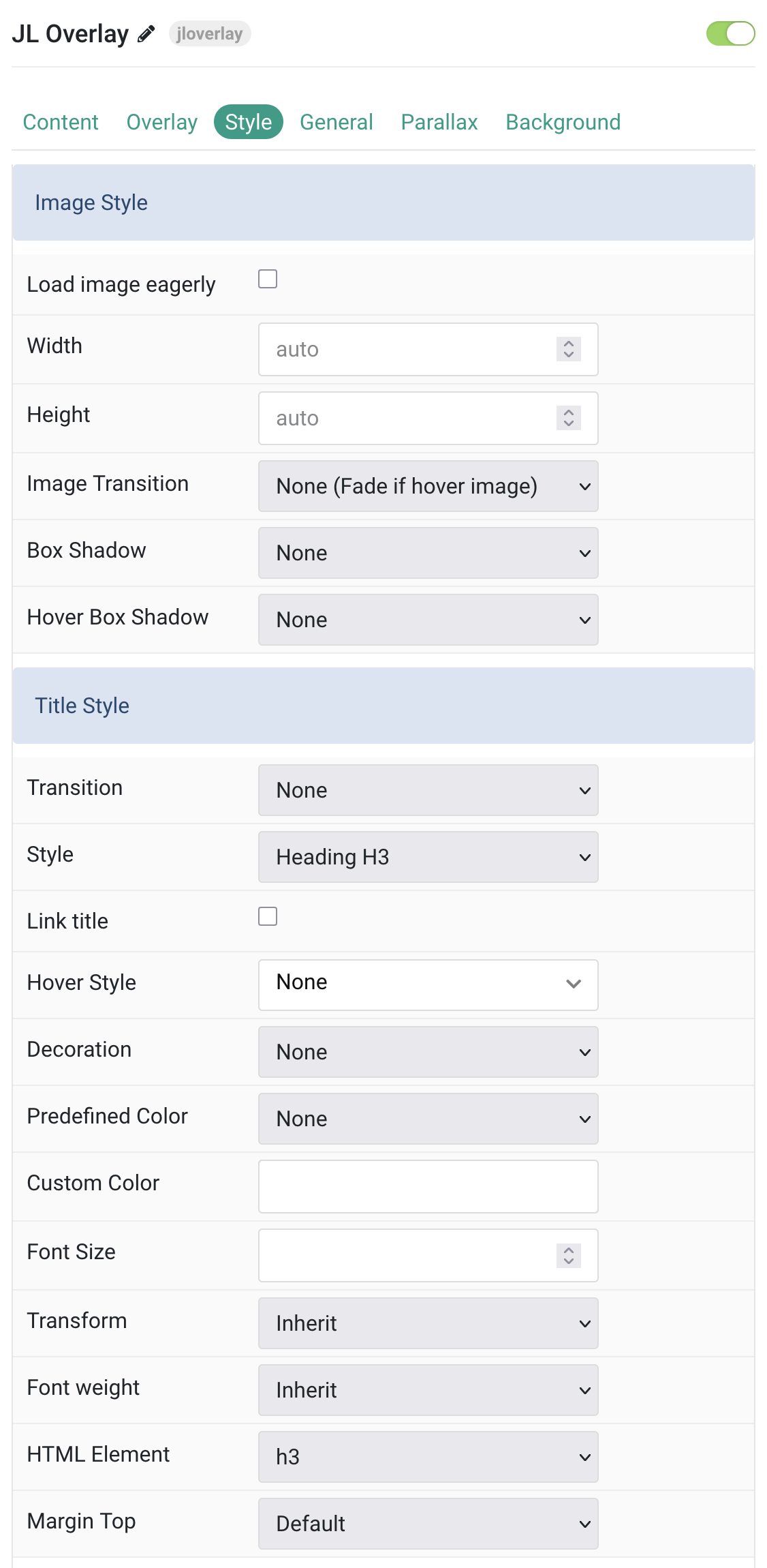
Tab Style
Image Settings Common settings for images.
| Settings | Description |
|---|---|
| Image Style | |
| Load image eagerly | By default, images are loaded lazy. Enable eager loading for images in the initial viewport. |
| Width | Set the width of the image. |
| Height | Set the height of the image. |
| Image Transition | Select an image transition. If the hover image is set, the transition takes place between the two images. If None is selected, the hover image fades in. |
| Box Shadow | Select the image’s box shadow size. |
| Hover Box Shadow | Select the image’s box shadow size on hover. |
| Title Style | |
| Transition | Select a transition for the title when the overlay appears on hover. |
| Style | Title styles differ in font-size but may also come with a predefined color, size and font. |
| Link title | Link the title if a link exists. |
| Hover Style | Set the hover style for a linked title. Enable link title to use this option. |
| Decoration | Decorate the headline with a divider, bullet or a line that is vertically centered to the heading. |
| Predefined Color | Select the text color. If the Background option is selected, styles that don’t apply a background image use the primary color instead. |
| Custom Color | Customize the title color instead using predefined title color mode. |
| Font Size | Customize the title text font size. |
| Transform | The following options will transform text into uppercased, capitalized or lowercased characters. |
| Font weight | Add one of the following classes to modify the font weight of your text. |
| HTML Element | Choose one of the elements to fit your semantic structure. |
| Margin Top | Set the top margin. Note that the margin will only apply if the content field immediately follows another content field. |
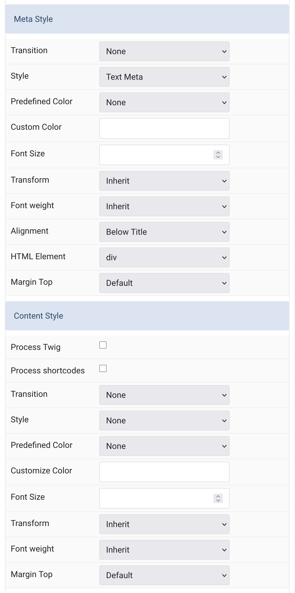
Meta/Content Common settings for title and meta style.
| Settings | Description |
|---|---|
| Meta Style | |
| Transition | Select a transition for the meta text when the overlay appears on hover. |
| Style | Select a predefined meta text style, including color, size and font-family. |
| Predefined Color | Select the predefined meta color. |
| Custom Color | Customize the meta color. You need to set the Predefined Color to None before using the color customization. |
| Font Size | Customize the meta text font size. |
| Transform | The following options will transform text into uppercased, capitalized or lowercased characters. |
| Font weight | Add one of the following classes to modify the font weight of your text. |
| Alignment | Align the meta text. |
| HTML Element | Choose one of the elements to fit your semantic structure. |
| Margin Top | Set the top margin. Note that the margin will only apply if the content field immediately follows another content field. |
| Content Style | |
| Process Twig | Enable Twig template processing in the content. Twig will be processed before shortcodes. |
| Process shortcodes | Enable shortcode processing / filtering in the content. |
| Transition | Select a transition for the content when the overlay appears on hover. |
| Style | Select a predefined content style. |
| Predefined Color | Select the text color. If the Background option is selected, styles that don’t apply a background image use the primary color instead. |
| Customize Color | Customize the content color instead using predefined text color. You need to set the Predefined Color to None before using the color customization. |
| Font Size | Customize the content text font size. |
| Transform | The following options will transform text into uppercased, capitalized or lowercased characters. |
| Font weight | Add one of the following classes to modify the font weight of your text. |
| Margin Top | Set the top margin. Note that the margin will only apply if the content field immediately follows another content field. |
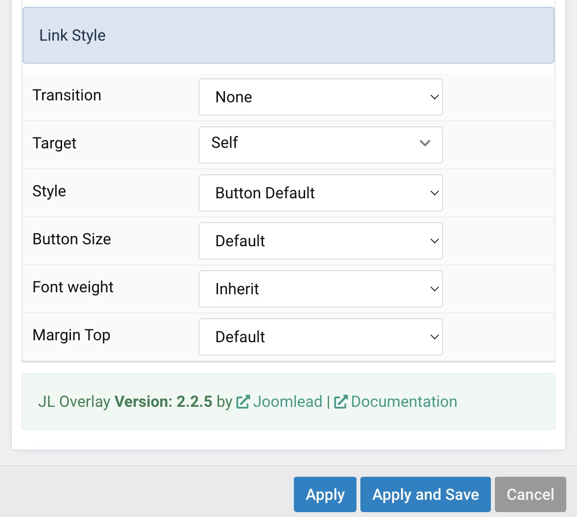
Link Settings Common settings for Link.
| Settings | Description |
|---|---|
| Transition | Select a transition for the link when the overlay appears on hover. |
| Target | Target browser window when item is clicked. |
| Style | Set the button style. |
| Button Size | Set the button size. |
| Font weight | Add one of the following classes to modify the font weight of your text. |
| Margin Top | Set the top margin. |
General, Parallax and Parallax Background tab
Please take a look the documentation here for more detail about these tabs settings

Comments