Pricing Table 2 Documentation
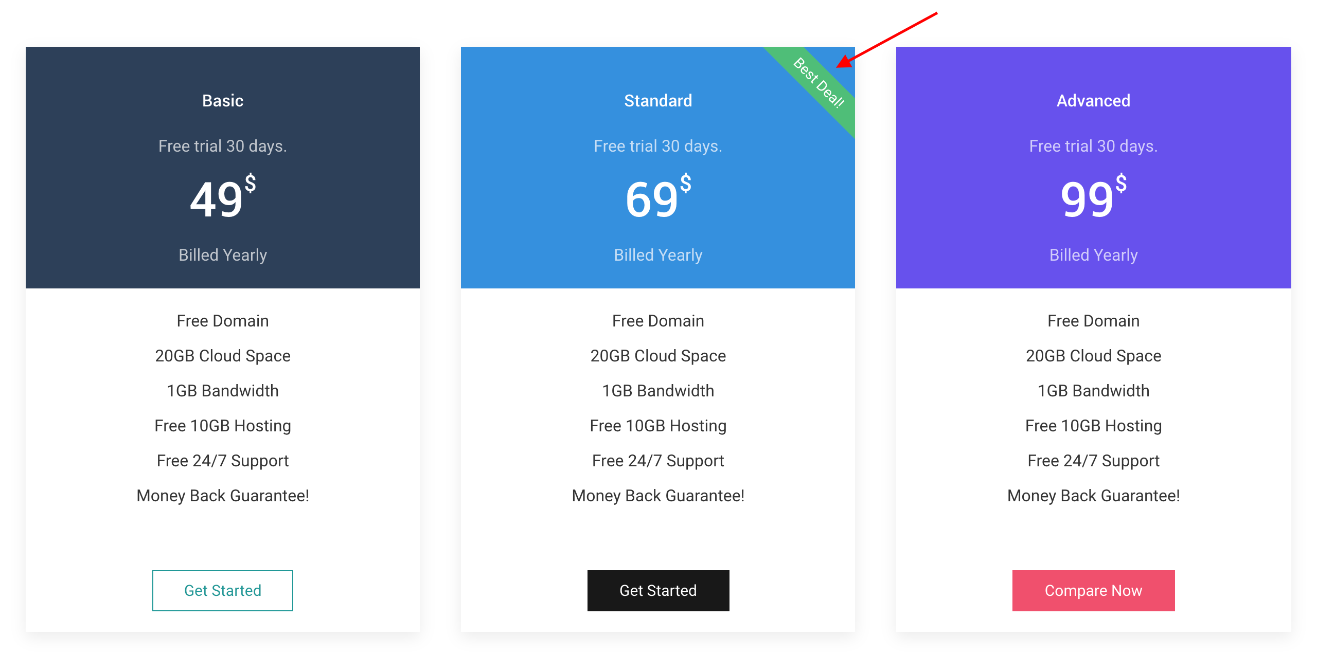
# Pricing Table Package contents
| Files | Description |
|---|---|
| jlpricingtable2.yaml | Contains the Pricing Table particle settings. |
| jlpricingtable2.html.twig | The Twig file to pull information, settings. |
Installation Installing the particle on your website is a really simple process. You can refer to the document here to know more.
Requirements Pricing Table requires Uikit 3 for Gantry 5 Atom to be installed and enabled in your theme layout settings.
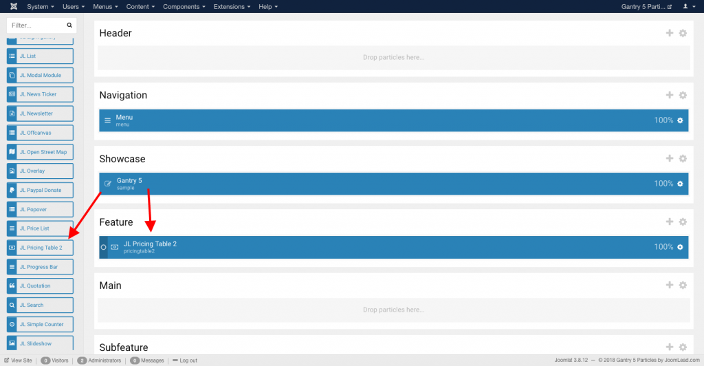
Go to Template/Theme Settings > select the Layout to add Pricing Table particle (i.e: Home) -> Layout tab -> Drag and drop the Pricing Table Particle from Particles panel (left corner) to the section you want to display the Pricing Table.
Settings
Content Tab – Items
| Settings | Description |
|---|---|
| Items | List Pricing tabale items to display. You can add new items to the collection using the plus + icon |
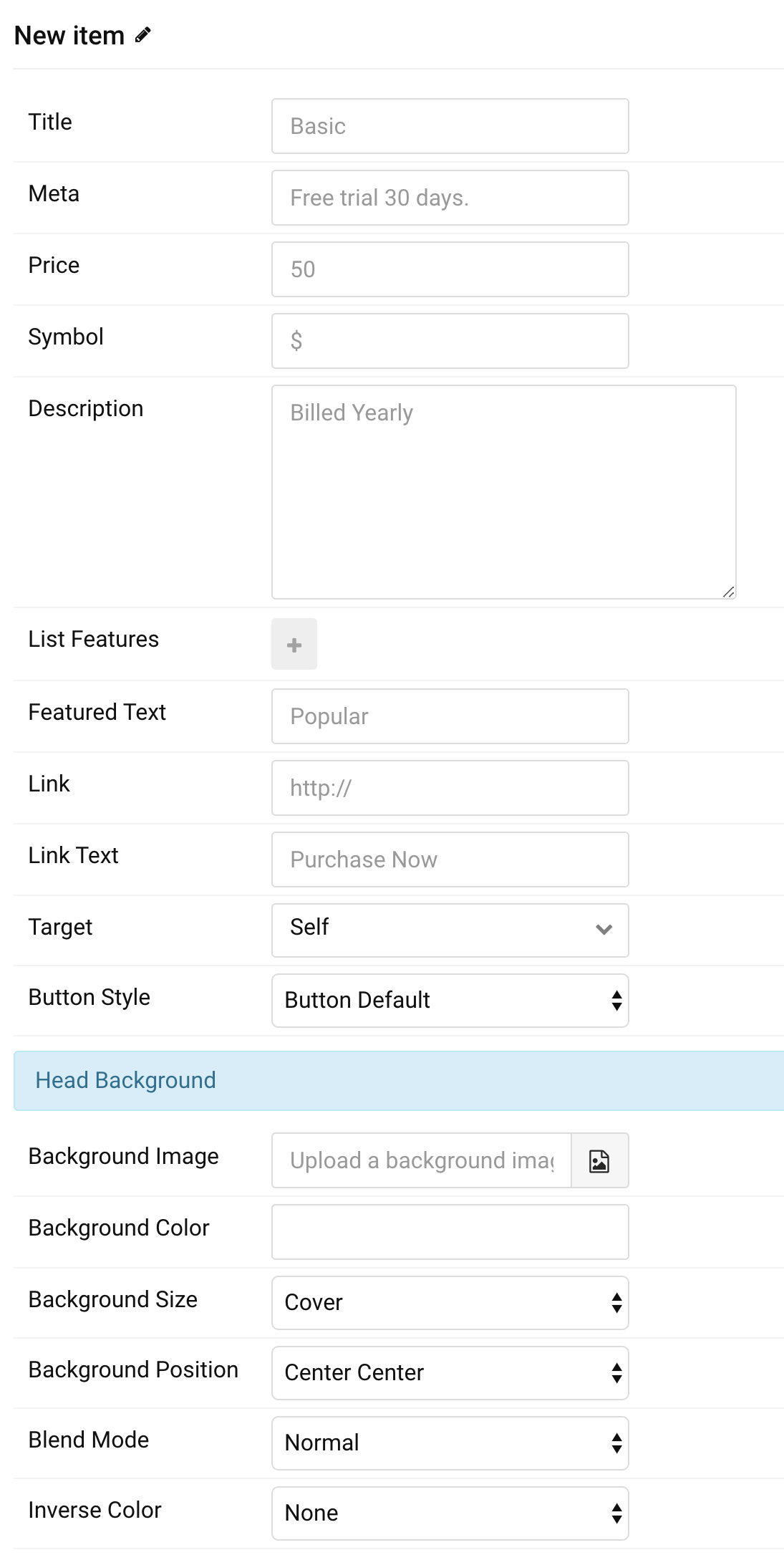
Items You can add new items to the collection using the plus + icon
| Settings | Description |
|---|---|
| Title | Customize the Title. |
| Meta | Customize the description for title (optional). |
| Price | Customize the price. |
| Symbol | Customize the price symbol. |
| Description | Customize the description for price (optional). |
| List Features | Create the feature list for pricing table you wish to portray. |
| Featured Text | Enter the Featured label for the table. |
| Link | Specify the link for button. Note: Scroll smoothly added automatically to internal link that contains a URL fragment to add the smooth scrolling behavior. |
| Link Text | Enter the text for the link. |
| Target | Open the link in a same or new window. |
| Button style | Set the button style. |
| Head Background Settings | Customize background style for head pricing table. |
| Background Image | An image field with an image picker. |
| Background Color | Select the background color. |
| Background Size | Determine whether the image will fit the section dimensions by clipping it or by filling the empty areas with the background color. |
| Background Position | Set the initial background position, relative to the section layer. |
| Blend Mode | Determine how the image will blend with the background color. |
| Inverse Color | Inverse the color for light or dark backgrounds. |
| Background Settings | Customize background style for pricing table column |
| Background Color | Select the body background color. |
| Inverse Color | Inverse the color for light or dark backgrounds. |
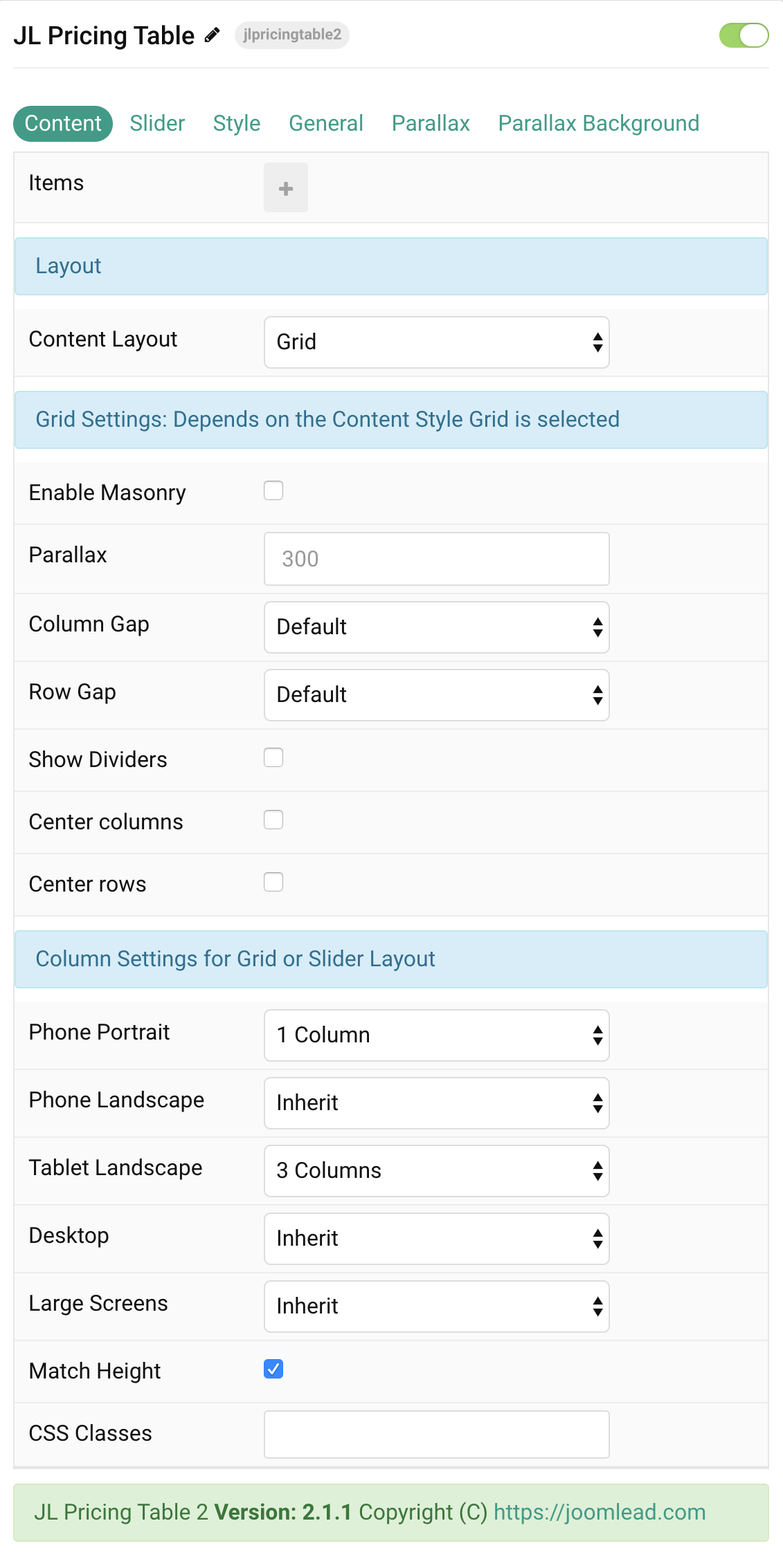
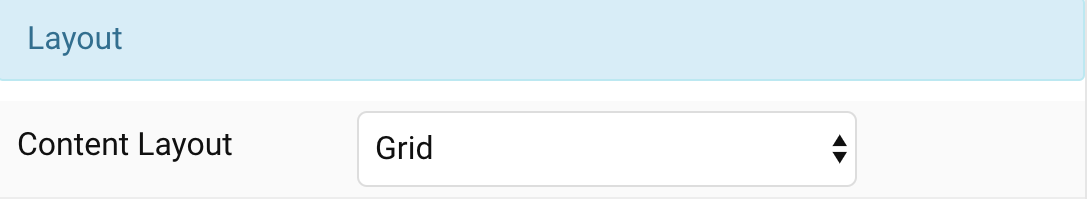
Layout Settings Common settings for Content Layout, You can choose Grid or Slider to present the pricing table columns
| Settings | Description |
|---|---|
| Content Layout | Present the content with slider or grid mode. |
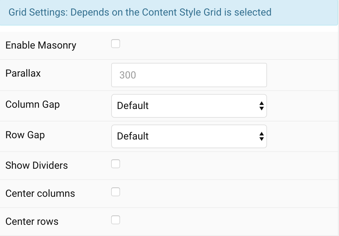
Grid Settings Common settings for grid layout, These options won’t have any effect unless Grid is enabled for Content Layout.
| Settings | Description |
|---|---|
| Enable Masonry | The masonry effect creates a layout free of gaps even if grid cells have different heights. |
| Parallax | The parallax effect moves single grid columns at different speeds while scrolling. Define the vertical parallax offset in pixels. |
| Column Gap | Set the size of the gap between the grid columns. |
| Row Gap | Set the size of the gap between the grid rows. |
| Show Dividers | Display dividers between grid cells. |
| Center columns | Use this option to center the grid cell columns. |
| Center rows | Use this option to center the grid row columns. |
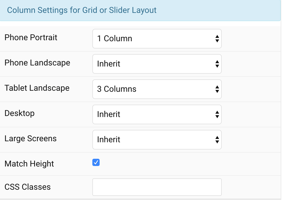
Column settings Choose the columns on each devices for slider or grid content style.
| Settings | Description |
|---|---|
| Phone Portrait | Set the number of grid columns for each breakpoint. Inherit refers to the number of columns on the next smaller screen size. |
| Phone Landscape | |
| Tablet Landscape | |
| Desktop | |
| Large Screens | |
| Match Height | To match the height of the direct child of each cell. |
| CSS Classes | CSS class name for the particle. |
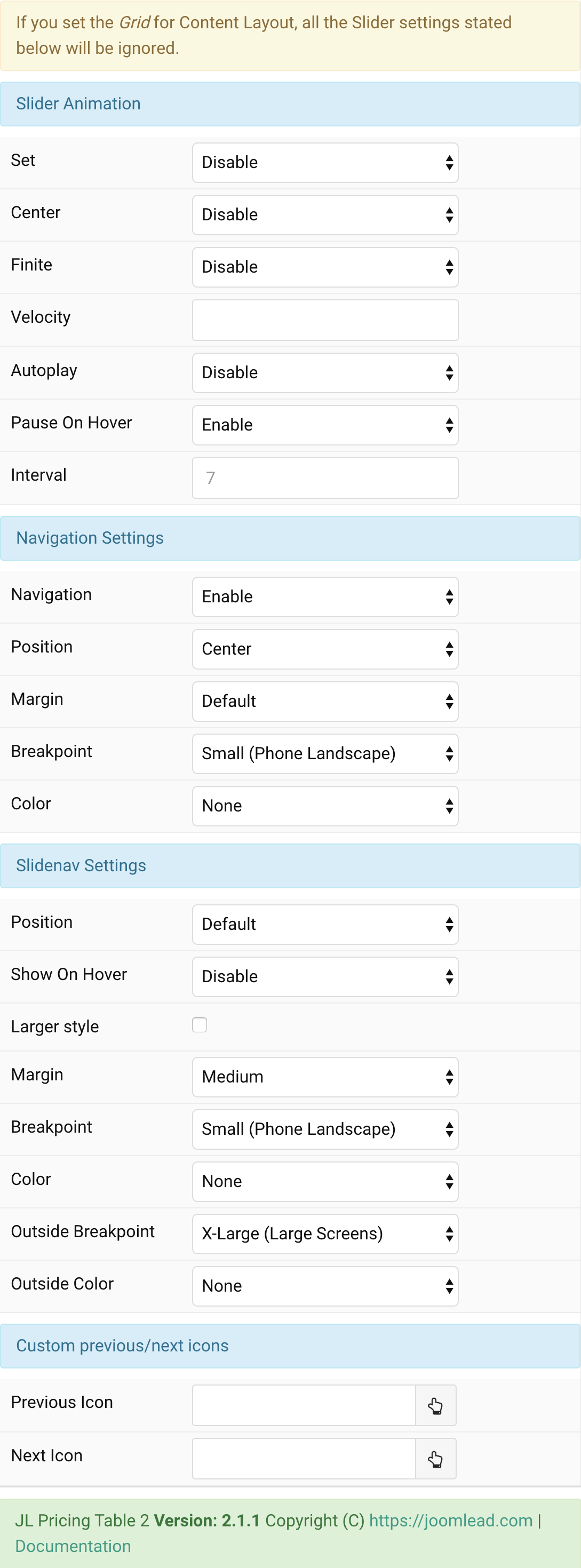
Tab Slider
| Settings | Description |
|---|---|
| Set | Slide all visible items at once. Group items into sets. The number of items within a set depends on the defined item width, e.g. 33% means that each set contains 3 items. |
| Center | Center the active slide. |
| Finite | Disable infinite scrolling |
| Velocity | Set the velocity in pixels per millisecond. Min 20, Max 300 |
| Autoplay | Enable autoplay for slider items. |
| Pause On Hover | Pause autoplay on hover. |
| Interval | Set the autoplay interval in seconds. Min 5 Max 15. |
| Navigation Settings | Common settings for Slider Navigation |
| Navigation | Select the navigation type. |
| Position | Align the navigation’s items. |
| Margin | Set the vertical margin. |
| Breakpoint | Display the navigation only on this device width and larger. |
| Color | Set light or dark color mode. |
| Slidenav Settings | Common settings for Slidenav |
| Position | Select the position of the slidenav. |
| Show On Hover | Show on hover only. |
| Larger style | To increase the size of the slidenav icons. |
| Margin | Apply a margin between the slidenav and the slider container. |
| Breakpoint | Display the slidenav only on this device width and larger. |
| Color | Set light or dark color mode. |
| Outside Breakpoint | Display the slidenav only outside on this device width and larger. Otherwise it will be displayed inside. |
| Outside Color | Set light or dark color if the slidenav is outside of the slider. |
| Custom Slidenav Icons | Custom previous/next icons (replace default Slidenav navigation) |
| Previous Icon | An icon picker to choose custom Previous icon |
| Next Icon | An icon picker to create choose custom Next icon |
Tab Style
Here you can customize any pricing table element like Head, Body, Padding, and so on
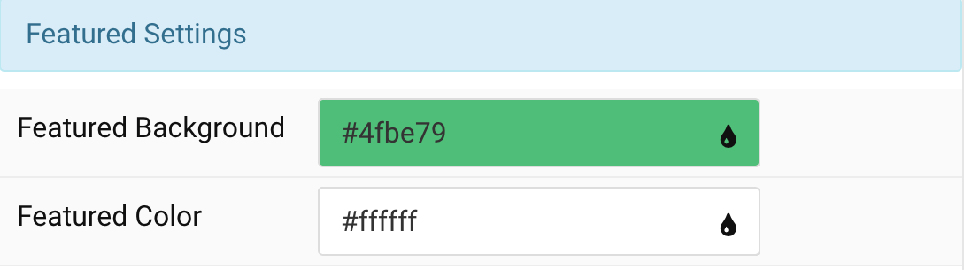
Featured Settings Customize the background and color for featured text
| Settings | Description |
|---|---|
| Featured Background | Select the background color for featured text. |
| Featured Color | Select the color for featured text. |
Title Settings Common settings for Title Style
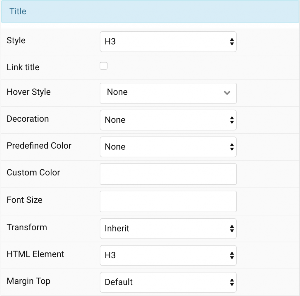
| Settings | Description |
|---|---|
| Style | Heading styles differ in font-size but may also come with a predefined color, size and font. |
| Link title | Link the title if a link exists. |
| Hover Style | Set the hover style for a linked title. Enable link title to use this option. |
| Decoration | Decorate the headline with a divider, bullet or a line that is vertically centered to the heading. |
| Predefined Color | Select a predefined text color. |
| Custom Color | Customize the title color instead using predefined title color mode. You need to set the predefined color to None to use the customize color option. |
| Font Size | Customize the title text font size. |
| Transform | The following options will transform text into uppercased, capitalized or lowercased characters. |
| HTML Element | Choose one of the elements to fit your semantic structure. |
| Margin Top | Set the top margin. Note that the margin will only apply if the content field immediately follows another content field. |
Header Settings Common settings for Header Style
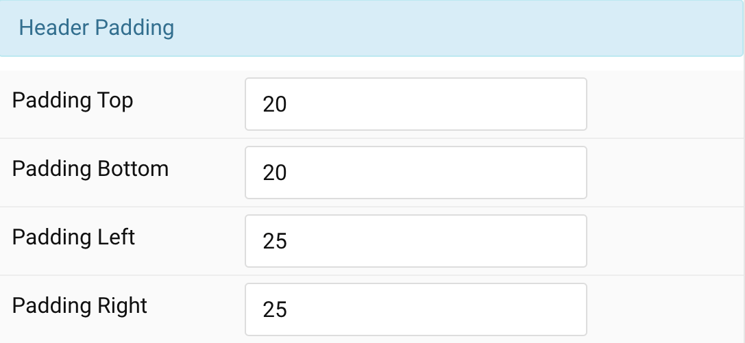
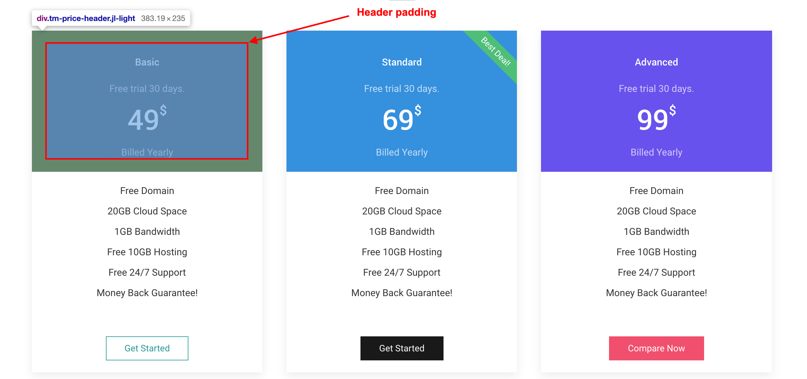
| Settings | Description |
|---|---|
| Padding Top | Set the top, bottom, left, right padding value to add spacing between header container and their content. |
| Padding Bottom | |
| Padding Left | |
| Padding Right |
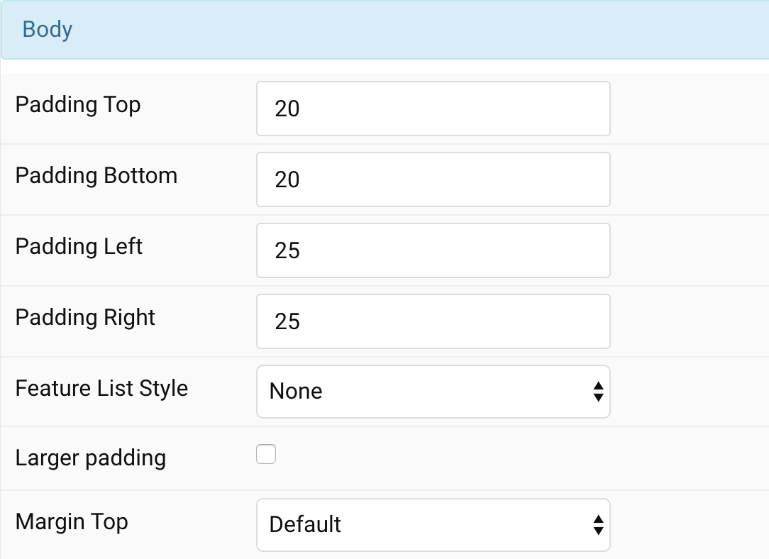
Body Settings Common settings for Body Style
| Settings | Description |
|---|---|
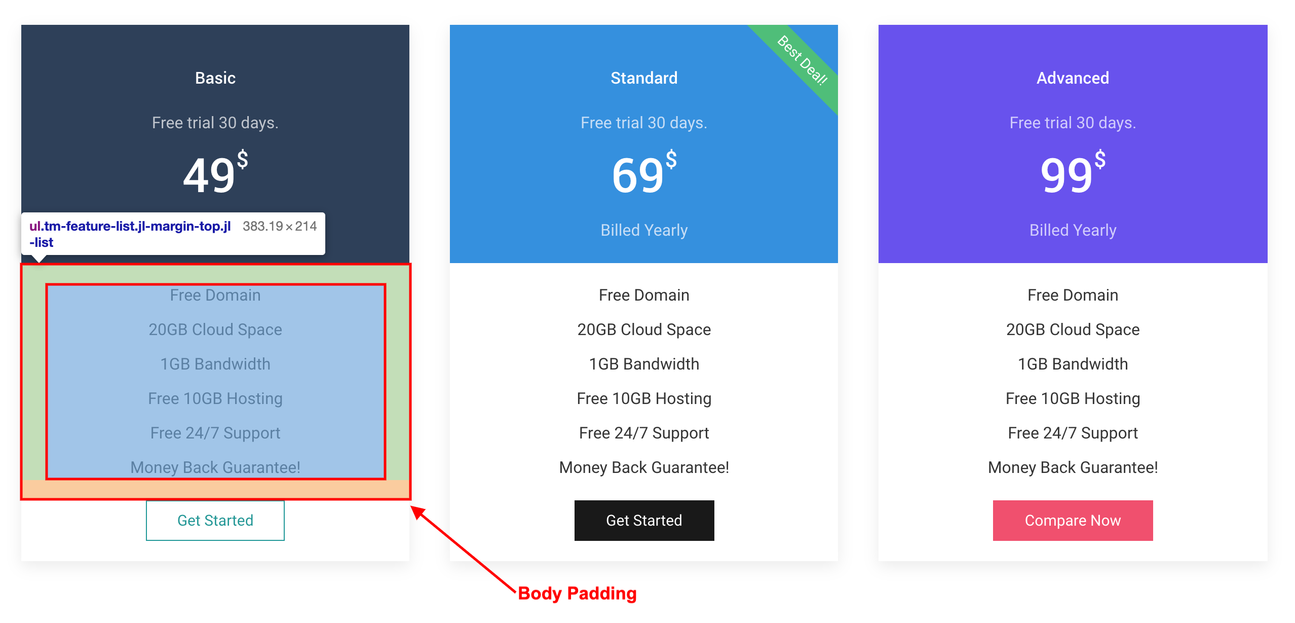
| Padding Top | Set the padding Top/Bottom/Left/Right value to add spacing between header container and their content |
| Padding Bottom | |
| Padding Left | |
| Padding Right | |
| Feature List Style | Select the list style and add larger padding between items. |
| Larger padding | Use this option to increase the padding between list items. |
| Margin Top | Set the top margin. Note that the margin will only apply if the content field immediately follows another content field. |
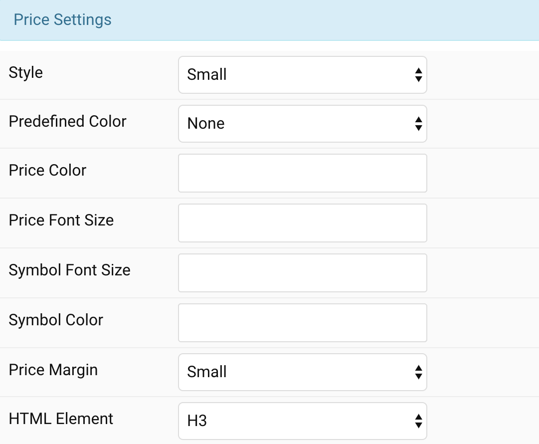
Pricing Settings Common settings for Pricing
| Settings | Description |
|---|---|
| Style | Heading styles differ in font-size but may also come with a predefined color, size and font. |
| Predefined Color | Select a predefined text color. |
| Price Color | Customize the Price color instead using predefined title color mode. You need to set the predefined color to None to use the customize color option. |
| Price Font Size | Customize the Price text font size. |
| Symbol Font Size | Customize the Symbol text font size. |
| Symbol Color | Customize the symbol color. |
| Price Margin | Set the vertical margin. |
| HTML Element | Choose one of the elements to fit your semantic structure. |
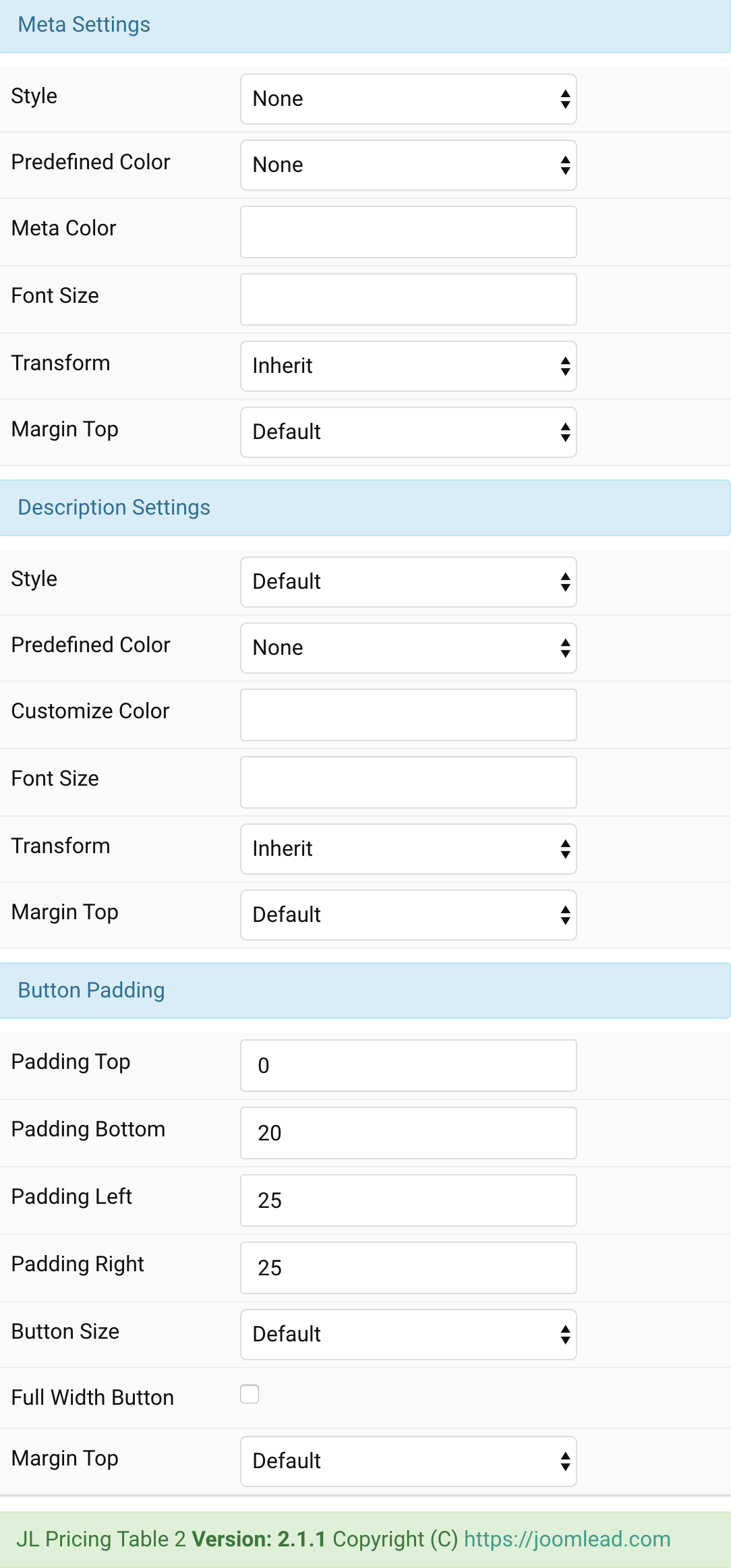
Meta/Description/Button Settings Common settings for Meta/Description/Button
General, Parallax and Parallax Background tab
Please take a look the documentation here for more detail about these tabs settings

Comments