Popover Particle Documentation
# Popover Package contents
| Files | Description |
|---|---|
| jlpopover.yaml | Contains the Popover particle settings. |
| jlpopover.html.twig | The Twig file to pull information, settings. |
Installation Installing the particle on your website is a really simple process. You can refer to the document here to know more.
Requirements Popover requires Uikit 3 for Gantry 5 Atom to be installed and enabled in your theme layout settings.
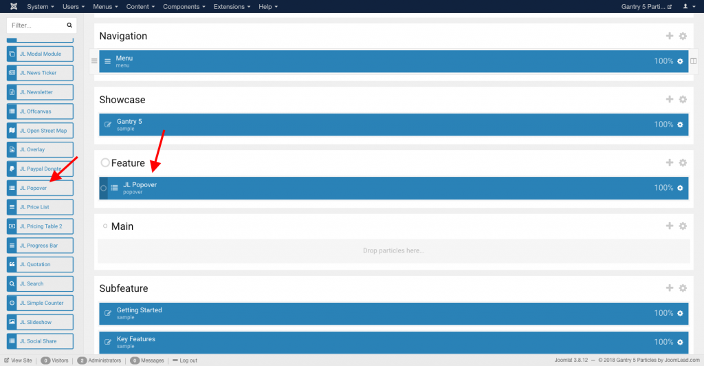
Go to Template/Theme Settings > select the Layout to add Popover particle (i.e: Home) -> Layout tab -> Drag and drop the Popover Particle from Particles panel (left corner) to the section you want to display the Popover.
Settings
| Settings | Description |
|---|---|
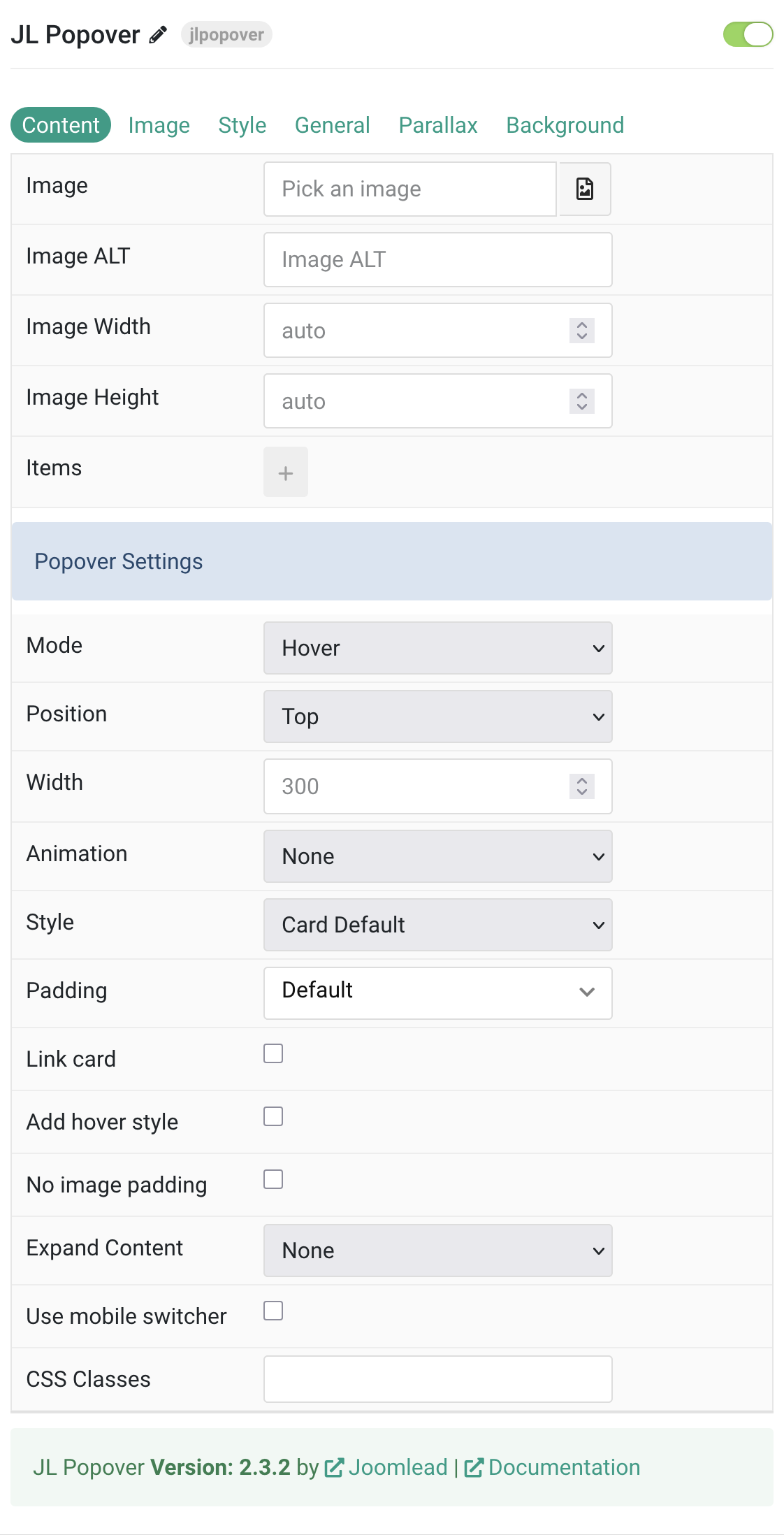
| Image | An image field with an image picker. |
| Image ALT | Enter the image’s alt attribute. |
| Image Width | Enter the popover image’s width. |
| Image Height | Enter the popover image’s height. |
| Items | List marker items on image. You can add new items to the collection using the plus + icon. Here the tutorial using Using particle collections. |
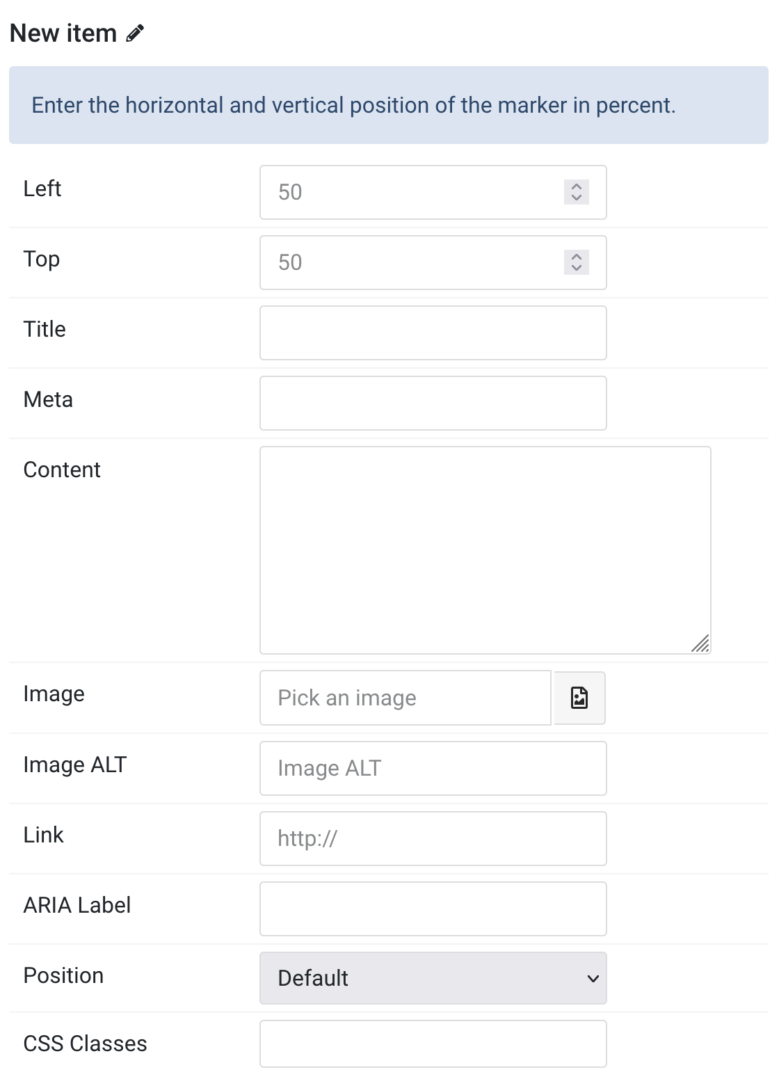
Items Click Items field to enable it, then you can add new items to the
collection using the plus + icon
| Settings | Description |
|---|---|
| Left | Horizontal position of the marker (0-100%) |
| Top | Vertical position of the marker (0-100%) |
| Title | Customize the Title |
| Meta | Customize the Meta |
| Content | Customize the content |
| Image | An image field with an image picker |
| Image ALT | Enter the image’s alt attribute |
| Link Settings | |
| Link | Specify the link for button |
| ARIA Label | Set a different link ARIA label for this item |
| Advanced Settings | |
| Position | Select a different position for this item |
| CSS Classes | Specify the CSS class name for item |
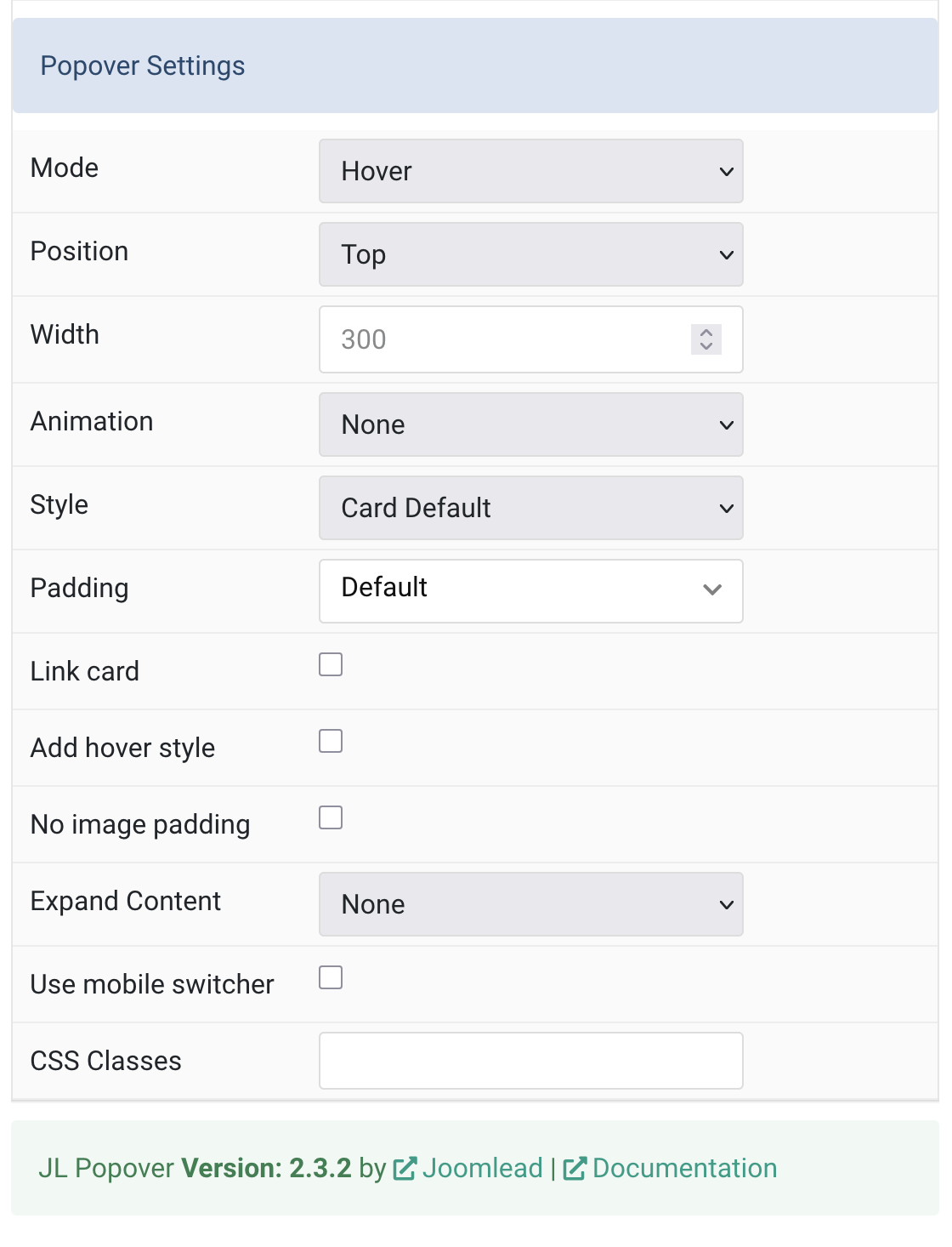
Popover Settings Common settings for Popover
| Settings | Description |
|---|---|
| Mode | Display the popover on click or hover |
| Position | Select the popover’s alignment to its marker |
| Width | Enter a width for the popover in pixels |
| Animation | Select animation on hover/click (fade, scale, slide options) |
| Style | Select boxed card or tile styles |
| Padding | Set padding for card/tile styles |
| Link card | Link the whole card if a link exists |
| Add hover style | |
| No image padding | Attach images to card edge without padding |
| Expand Content | Fill available space and push links to bottom |
| Use mobile switcher | |
| CSS Classes | CSS class name for the particle |
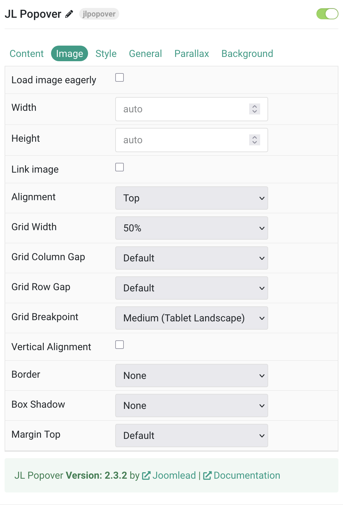
Image
| Settings | Description |
|---|---|
| Load image eagerly | Override default lazy loading behavior |
| Width | Set image width in pixels. |
| Height | Set image height in pixels. |
| Link image | Make image clickable if URL exists |
| Alignment | Position image (top, bottom, left, right, between) |
| Grid Width | Set image width within grid (percentage or fixed) |
| Grid Column Gap | Space between image and content |
| Grid Row Gap | Vertical spacing when stacked |
| Grid Breakpoint | Screen size when layout changes |
| Vertical Alignment | Center-align grid cells |
| Border | Image border style (none, circle, rounded, pill) |
| Box Shadow | Add shadow effect (none to xlarge) |
| Margin Top | Top spacing (works with bottom/between alignment) |
Style Tab
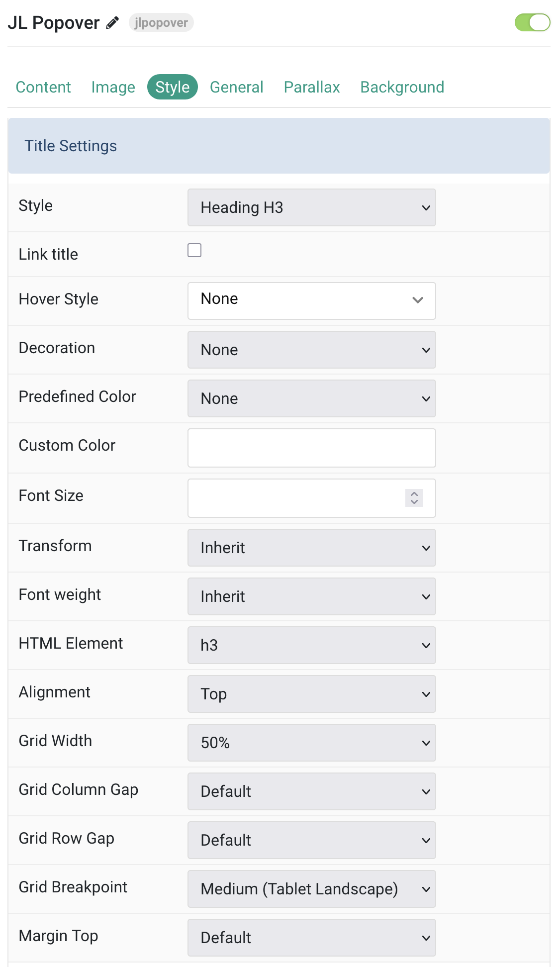
Title Common style settings for Title
| Settings | Description |
|---|---|
| Title Settings | Configuration options for title styling and appearance. |
| Style | Title styles differ in font-size but may also come with a predefined color, size and font. |
| Link Title | Link the title if a link exists. |
| Hover Style | Set the hover style for a linked title. Enable link title to use this option. |
| Decoration | Decorate the headline with a divider, bullet or a line that is vertically centered to the heading. |
| Predefined Color | Select the title text color. If the Background option is selected, styles that don’t apply a background image use the primary color instead. |
| Custom Color | Customize the title color instead using predefined title color mode. |
| Font Size | Customize the title text font size. |
| Transform | The following options will transform text into uppercased, capitalized or lowercased characters. |
| Font Weight | Add one of the following classes to modify the font weight of your text. |
| HTML Element | Choose one of the elements to fit your semantic structure. |
| Alignment | Align the title to the top or left in regards to the content. |
| Grid Width | Define the width of the title within the grid. Choose between percent and fixed widths or expand columns to the width of their content. |
| Grid Column Gap | Set the size of the gap between the image and the content. |
| Grid Row Gap | Set the size of the gap if the grid items stack. |
| Grid Breakpoint | Set the breakpoint from which grid cells will stack. |
| Margin Top | Set the top margin. Note that the margin will only apply if the content field immediately follows another content field. |
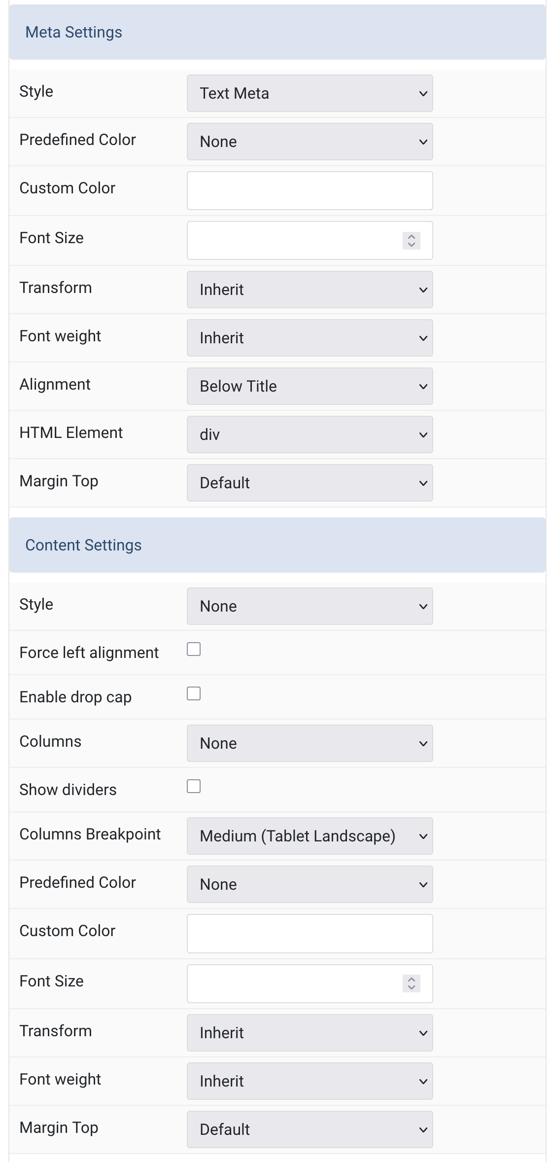
Meta/Content Settings Common style settings for Meta and Content
| Settings | Description |
|---|---|
| Meta Settings | Configuration options for meta text styling and positioning. |
| Style | Select a predefined meta text style, including color, size and font-family. |
| Predefined Color | Select the content text color. If the Background option is selected, styles that don’t apply a background image use the primary color instead. |
| Custom Color | Customize the meta color. |
| Font Size | Customize the meta text font size. |
| Transform | The following options will transform text into uppercased, capitalized or lowercased characters. |
| Font Weight | Add one of the following classes to modify the font weight of your text. |
| Alignment | Align the meta text. |
| HTML Element | Choose one of the elements to fit your semantic structure. |
| Margin Top | Set the top margin. Note that the margin will only apply if the content field immediately follows another content field. |
| Content Settings | Configuration options for main content styling and layout. |
| Style | Select a predefined meta text style, including color, size and font-family. |
| Force Left Alignment | Enable to force left alignment of content text. |
| Enable Drop Cap | Display the first letter of the paragraph as a large initial. |
| Columns | Set the number of list columns. |
| Show Dividers | Show a divider between list columns. |
| Columns Breakpoint | Set the device width from which the list columns should apply. |
| Predefined Color | Select the content text color. If the Background option is selected, styles that don’t apply a background image use the primary color instead. |
| Custom Color | Customize the content color instead using predefined text color. |
| Font Size | Customize the content text font size. |
| Transform | The following options will transform text into uppercased, capitalized or lowercased characters. |
| Font Weight | Add one of the following classes to modify the font weight of your text. |
| Margin Top | Set the top margin. Note that the margin will only apply if the content field immediately follows another content field. |
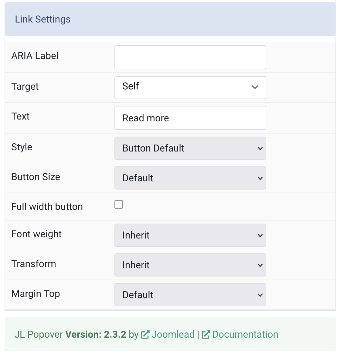
Link Settings Common style settings for Link
| Settings | Description |
|---|---|
| Link Settings | Configuration options for links and buttons styling. |
| ARIA Label | Enter a descriptive text label to make it accessible if the link has no visible text. |
| Target | Open the link in a same or new window. |
| Text | Specify the button text. |
| Style | Set the button style. |
| Button Size | Set the button size. |
| Full Width Button | Enable to make the button span the full width of its container. |
| Font Weight | Add one of the following classes to modify the font weight of your text. |
| Transform | The following options will transform text into uppercased, capitalized or lowercased characters. |
| Margin Top | Set the top margin. Note that the margin will only apply if the content field immediately follows another content field. |
General, Parallax and Parallax Background tab
Please take a look the documentation here for more detail about these tabs settings

Comments