Simple Counter Particle Documentation
Animated Counter Particle is a Gantry5 particle which is highly customizable, very easy to use and have 06 styles animation effect support to make your counter and website look attractive.
# Simple Counter Package contents
| Files | Description |
|---|---|
| jlsimplecounter.yaml | Contains the Simple Counter particle settings. |
| jlsimplecounter.html.twig | The Twig file to pull information, settings. |
| jquery.appear.js / jquery.countTo.js | Contains the Simple Counter JavaScript libraries. |
Installation Installing the particle on your website is a really simple process. You can refer to the document here to know more.
Requirements Simple counter requires Uikit 3 for Gantry 5 Atom to be installed and enabled in your theme layout settings.
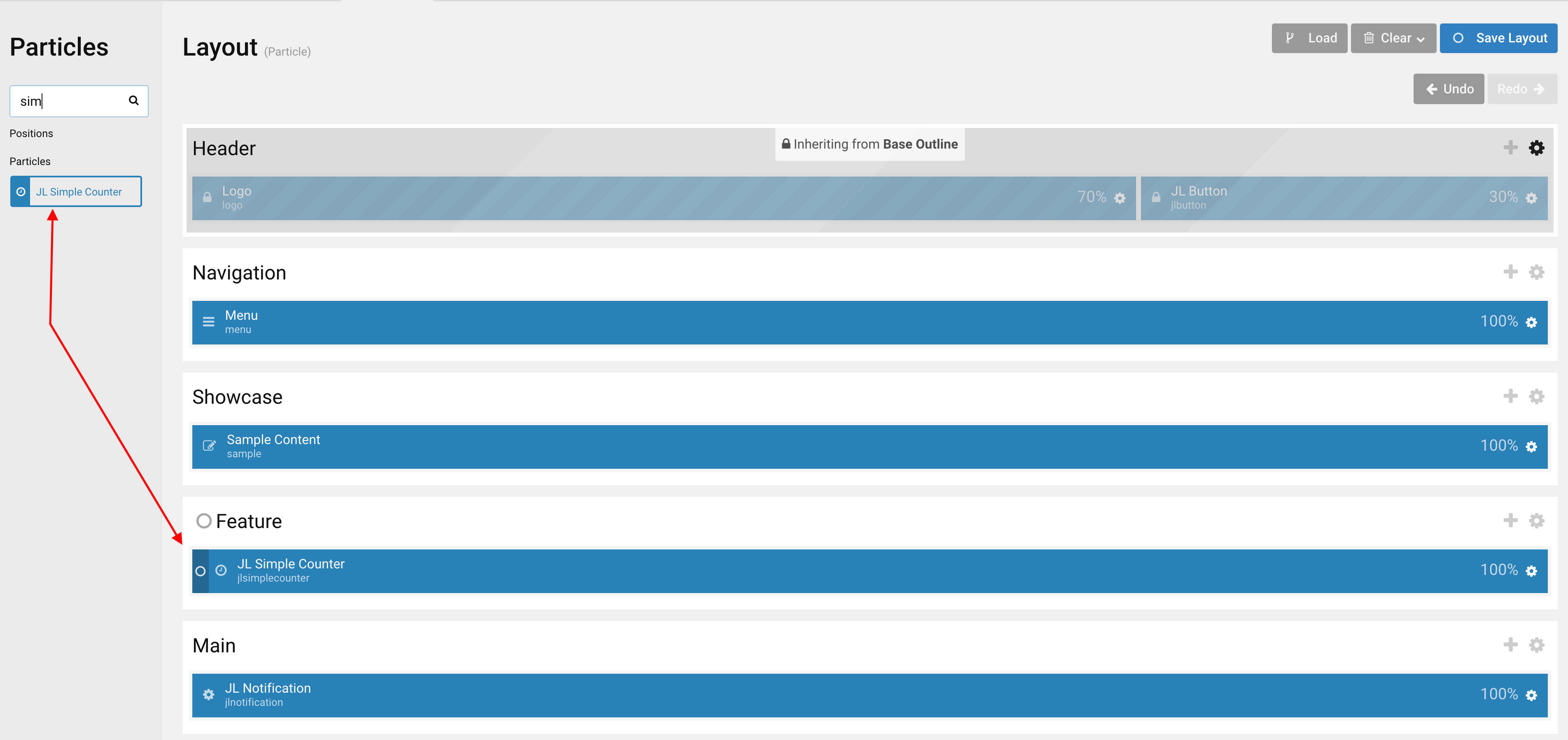
Go to Template/Theme Settings > select the Layout to add Simple Counter particle (i.e: Home) -> Layout tab -> Drag and drop the Simple Counter Particle from Particles panel (left corner) to the section you want to display the Simple Counter.
Settings
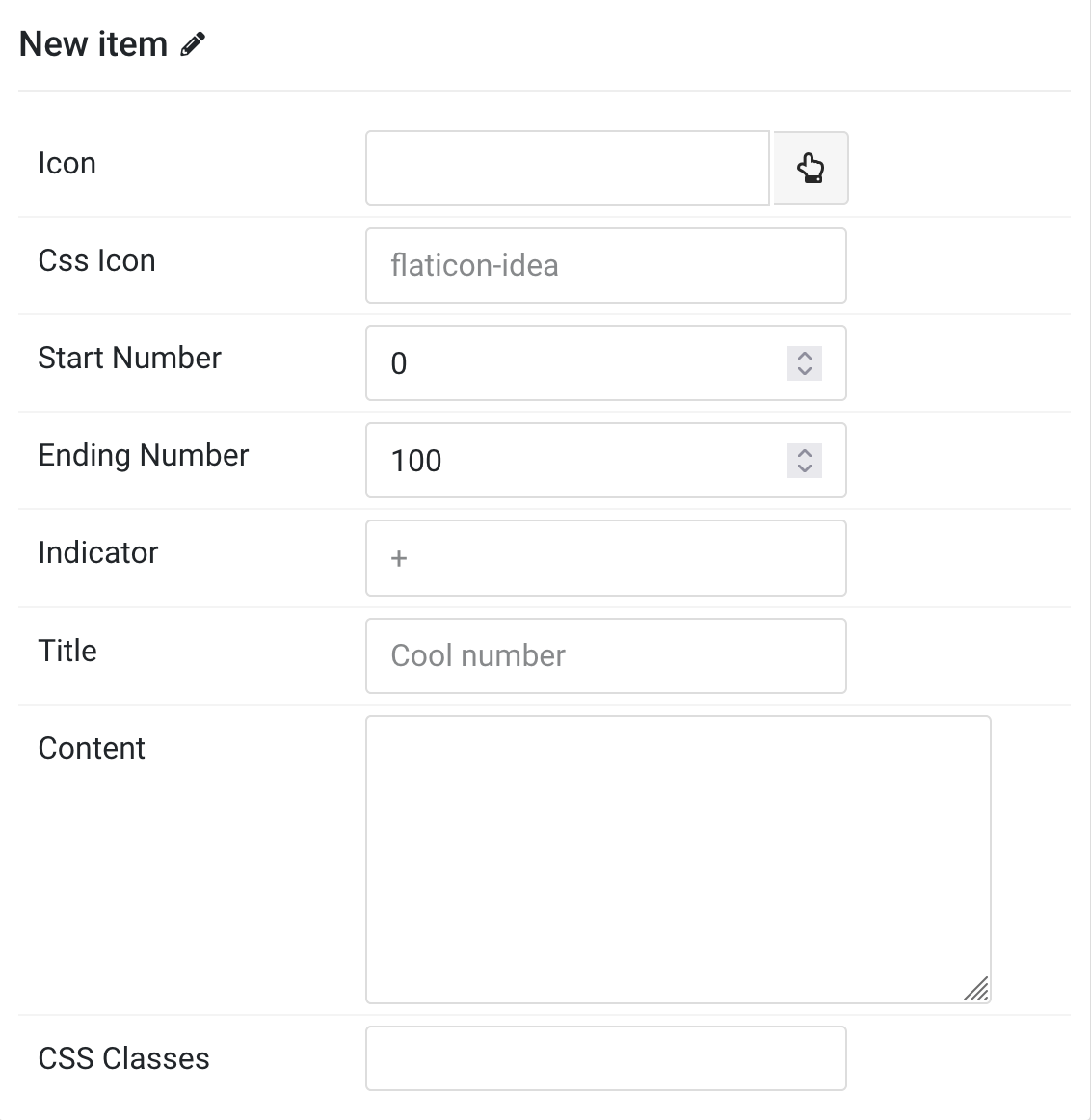
Items You can add new items to the collection using the plus + icon
| Item Setting | Description |
|---|---|
| Icon | Choose the icon using icon picker. |
| Css Icon | Add an optional css icon font name. |
| Start Number | The number to start counting from. |
| Ending Number | The number to stop counting at. |
| Indicator | Extra characters for number. |
| Title | Customize the title of counter. |
| Content | Insert the counter description. |
| CSS Classes | Specify the CSS class name for item. |
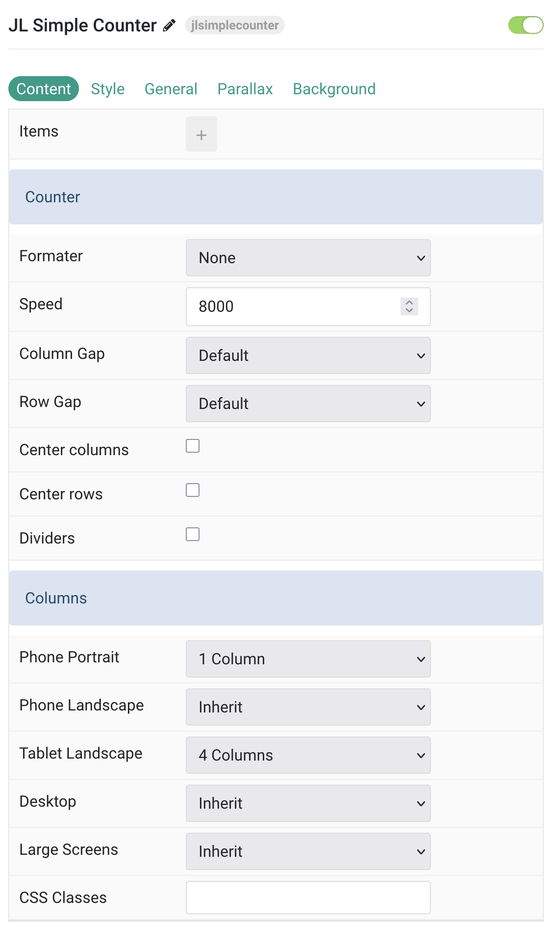
Counter Common settings for Counter
| Settings | Description |
|---|---|
| Formater | Enable the counter format |
| Speed | The number of milliseconds it should take to finish counting, i.e: 8000 |
| Column Gap | the size of the gap between the grid columns. |
| Row Gap | Set the size of the gap between the grid rows. |
| Center columns | Use this option to center the grid cell columns. |
| Center rows | Use this option to center the grid row columns. |
| Dividers | Display dividers between grid cells. |
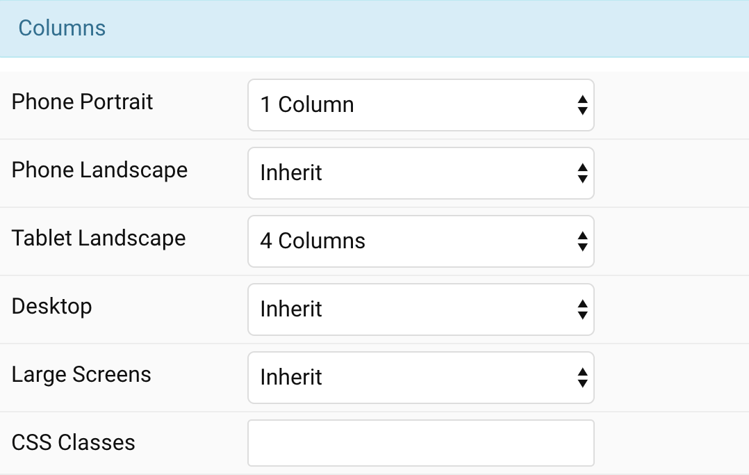
Columns Common settings for Columns
| Settings | Description |
|---|---|
| Phone Portrait | Set the number of grid columns for each breakpoint. Inherit refers to the number of columns on the next smaller screen size. |
| Phone Landscape | |
| Tablet Landscape | |
| Desktop | |
| Large Screens | |
| CSS Classes | CSS class name for the particle. |
Tab Style
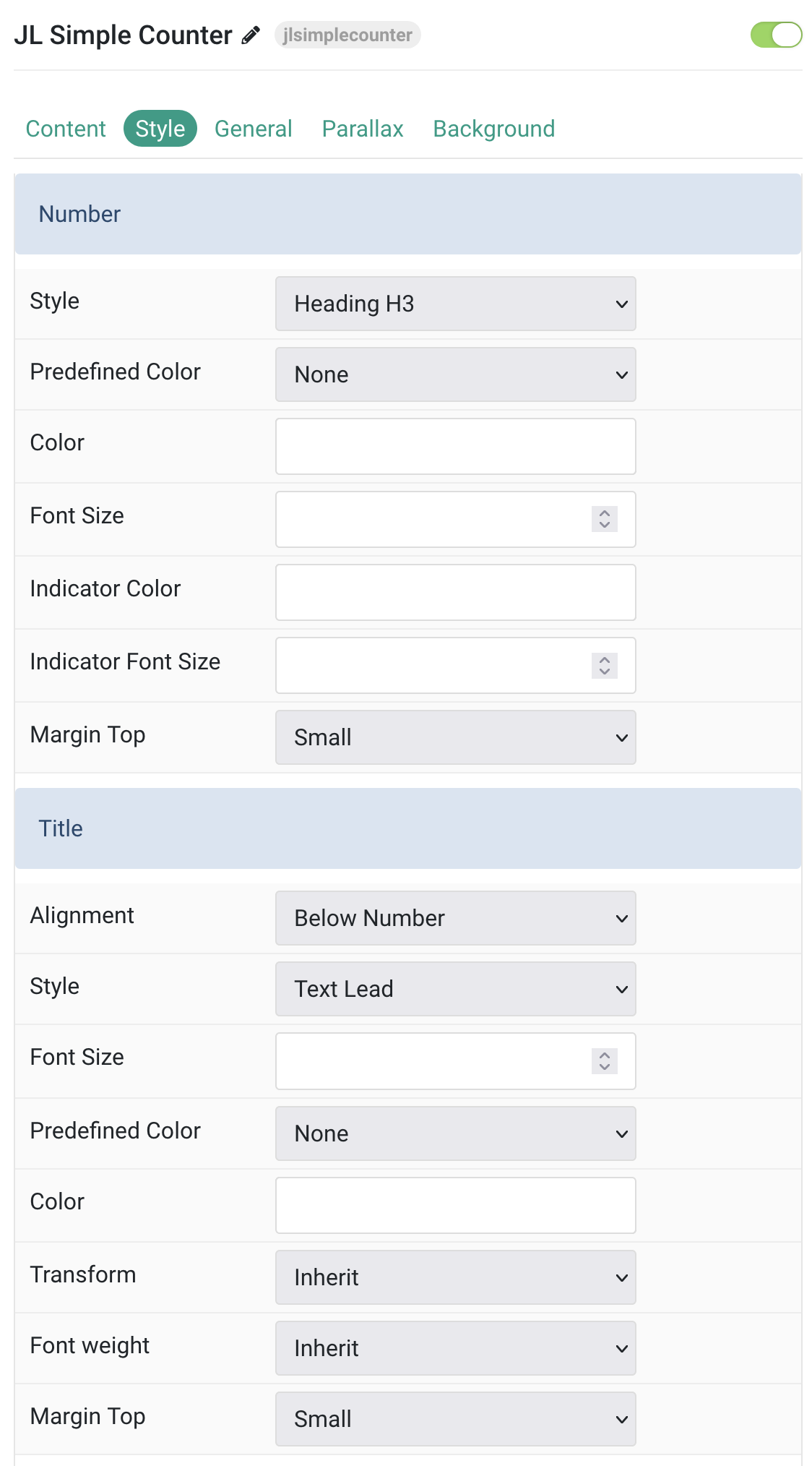
| Item Setting | Description |
|---|---|
| Number Style Settings | Common settings for Number |
| Style | Number styles differ in font-size but may also come with a predefined color, size and font. |
| Predefined Color | Select a predefined text color. |
| Color | Customize the number color. |
| Font Size | Customize the number font size |
| Indicator Color | Customize the extra character color. |
| Indicator Font Size | Customize the indicator text font size. |
| Margin Top | Set the top margin. Note that the margin will only apply if the content field immediately follows another content field. |
| Title Style Settings | Common settings for Title |
| Alignment | Align the title to the top or bottom in regards to the content. |
| Style | Title styles differ in font-size but may also come with a predefined color, size and font. |
| Font Size | Customize the title text font size. |
| Predefined Color | Select a predefined text color. |
| Color | Customize the title color. |
| Transform | The following options will transform text into uppercased, capitalized or lowercased characters. |
| Font Weight | Add one of the following classes to modify the font weight of your text. |
| Margin Top | Set the top margin. Note that the margin will only apply if the content field immediately follows another content field. |
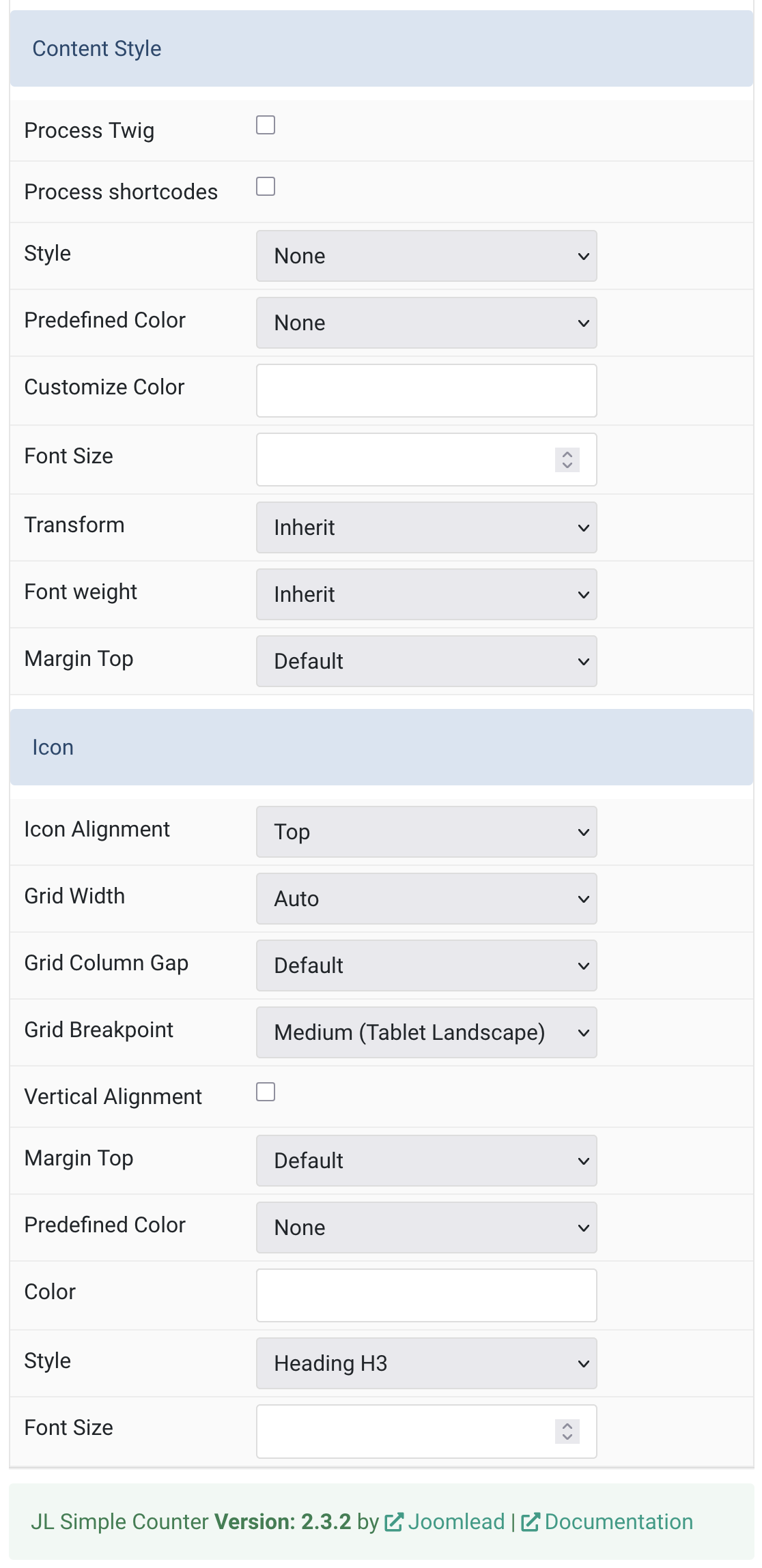
| Item Setting | Description |
|---|---|
| Content Style Settings | Common settings for Content |
| Process Twig | Enable Twig template processing in the content. Twig will be processed before shortcodes. |
| Process Shortcodes | Enable shortcode processing / filtering in the content. |
| Style | Select a predefined meta text style, including color, size and font-family. |
| Predefined Color | Select a predefined text color. |
| Customize Color | Customize the content color. Set the Predefined color to default before using this color customization mode. |
| Font Size | Customize the content text font size. |
| Transform | The following options will transform text into uppercased, capitalized or lowercased characters. |
| Font Weight | Add one of the following classes to modify the font weight of your text. |
| Margin Top | Set the top margin. Note that the margin will only apply if the content field immediately follows another content field. |
| Icon Settings | Common settings for Icon |
| Icon Alignment | Align the image to the top,left, right or place it between the icon and the content. |
| Grid Width | Define the width of the icon within the grid. Choose between percent and fixed widths or expands columns to the width of their content. |
| Grid Column Gap | Set the size of the gap between the icon and the content. |
| Grid Breakpoint | Set the breakpoint from which grid cells will stack. |
| Vertical Alignment | Vertically center grid cells. |
| Margin Top | Set the top margin. Note that the margin will only apply if the content field immediately follows another content field. |
| Predefined Color | Select a predefined text color. |
| Color | Customize the icon color. |
| Style | Title styles differ in font-size but may also come with a predefined color, size and font. |
| Font Size | Customize the icon font size |

Comments