Slideshow Particle
# Slideshow Package contents
| Files | Description |
|---|---|
| jlslideshow.yaml | Contains the Slideshow particle settings. |
| jlslideshow.html.twig | The Twig file to pull information, settings. |
Installation Installing the particle on your website is a really simple process. You can refer to the document here to know more.
Requirements Slideshow requires Uikit 3 for Gantry 5 Atom to be installed and enabled in your theme layout settings.
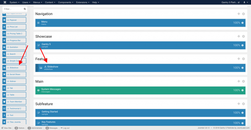
Go to Template/Theme Settings > select the Layout to add Slideshow particle (i.e: Home) -> Layout tab -> Drag and drop the Slideshow Particle from Particles panel (left corner) to the section you want to display the slideshow.
Settings
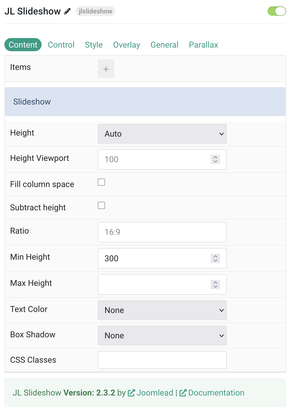
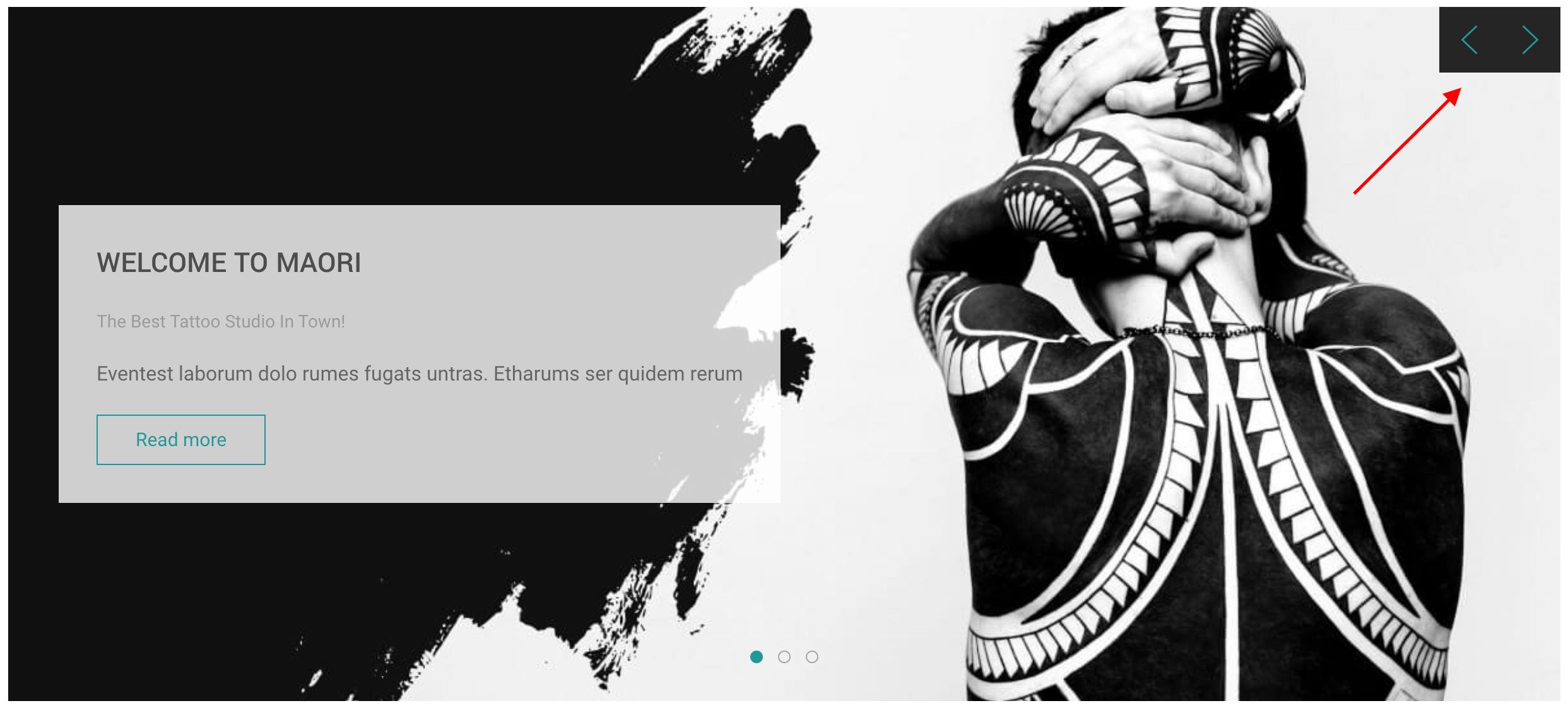
Content Tab – Items
| Settings | Description |
|---|---|
| Items | List Slideshow items to display. You can add new items to the collection using the plus + icon |
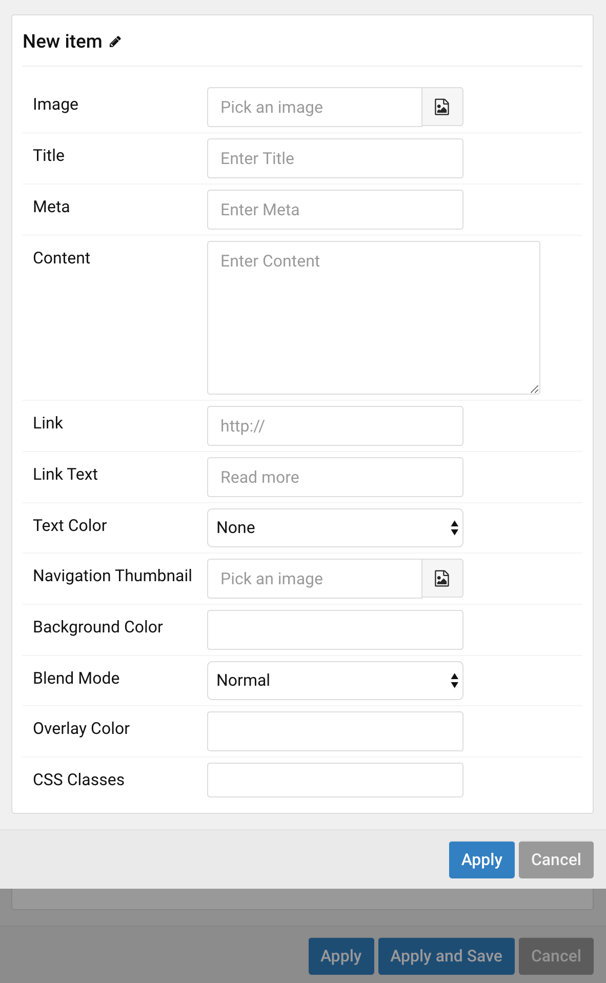
Items You can add new items to the collection using the plus + icon
| Settings | Description |
|---|---|
| Image | An image field with an image picker. |
| Title | Customize the Title. |
| Meta | Customize the Meta. |
| Content | Customize the content. |
| Link | Enter the image’s link if needed. |
| Link Text | Set a different link text for this item. |
| Text Color | Set a different text color for slideshow item. This option won’t have any effect If Overlay Style is enabled. |
| Navigation Thumbnail | This option is only used if the thumbnail navigation is set. |
| Background Color | Use the background color in combination with blend modes. |
| Blend Mode | Determine how the image will blend with the background color. This option won’t have any effect If Background Color is not set. |
| Overlay Color | Set an additional transparent overlay to soften the image. |
| CSS Classes | Specify the CSS class name for item. |
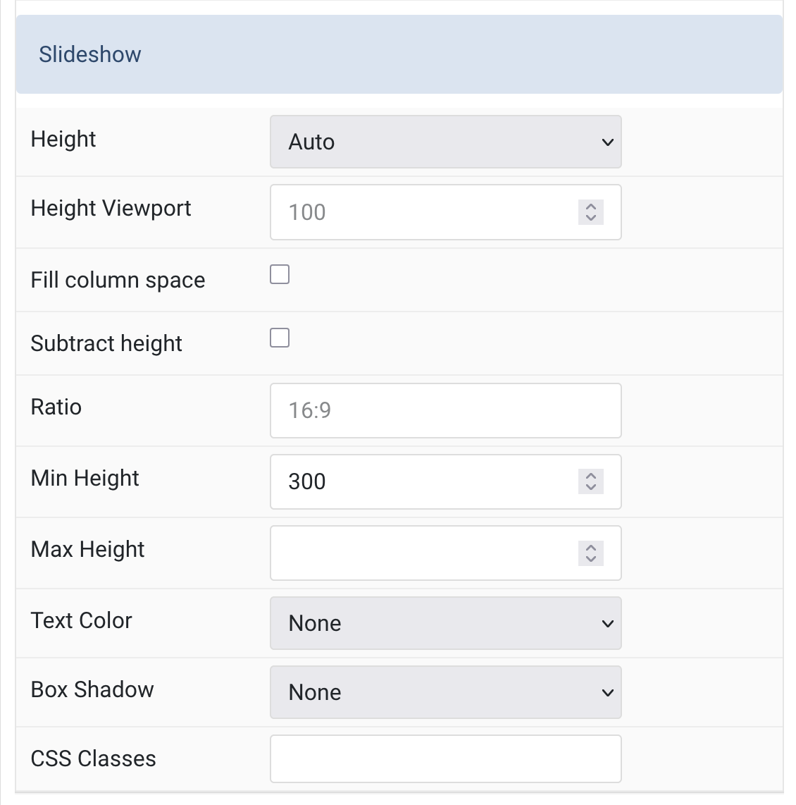
Slideshow Settings Common setting for Slideshow.
| Slideshow | |
| Height | The slideshow always takes up full width and the height adapts automatically based on the defined ratio. Alternatively, it can adapt to the content height or viewport. Make sure no height is set in the section settings when using a viewport option. |
| Height Viewport |
Sets a minimum height to prevent the slideshow from becoming smaller than its content on small devices. Min 200 – Max 800 |
| Fill Column Space | Expands the slideshow to fill the available column height. |
| Subtract Height | Subtracts the height of preceding elements (e.g., header) from the viewport height. |
| Ratio | Sets a ratio. It’s recommended to match the ratio of the background image. Enter width and height like 1600:900. |
| Min Height |
Sets an optional minimum height to prevent the slideshow from shrinking too much on smaller screens. Min 200 – Max 800 |
| Max Height | Sets the maximum height. Min 500 – Max 1600. |
| Text Color | Sets the text, button, and control color mode. Choose between Light and Dark. |
| Box Shadow | Selects the box shadow size for the slideshow image. |
| CSS Classes | Adds custom CSS class names to the slideshow particle. |
Tab Control
Animation Settings Common settings for Slideshow Animation
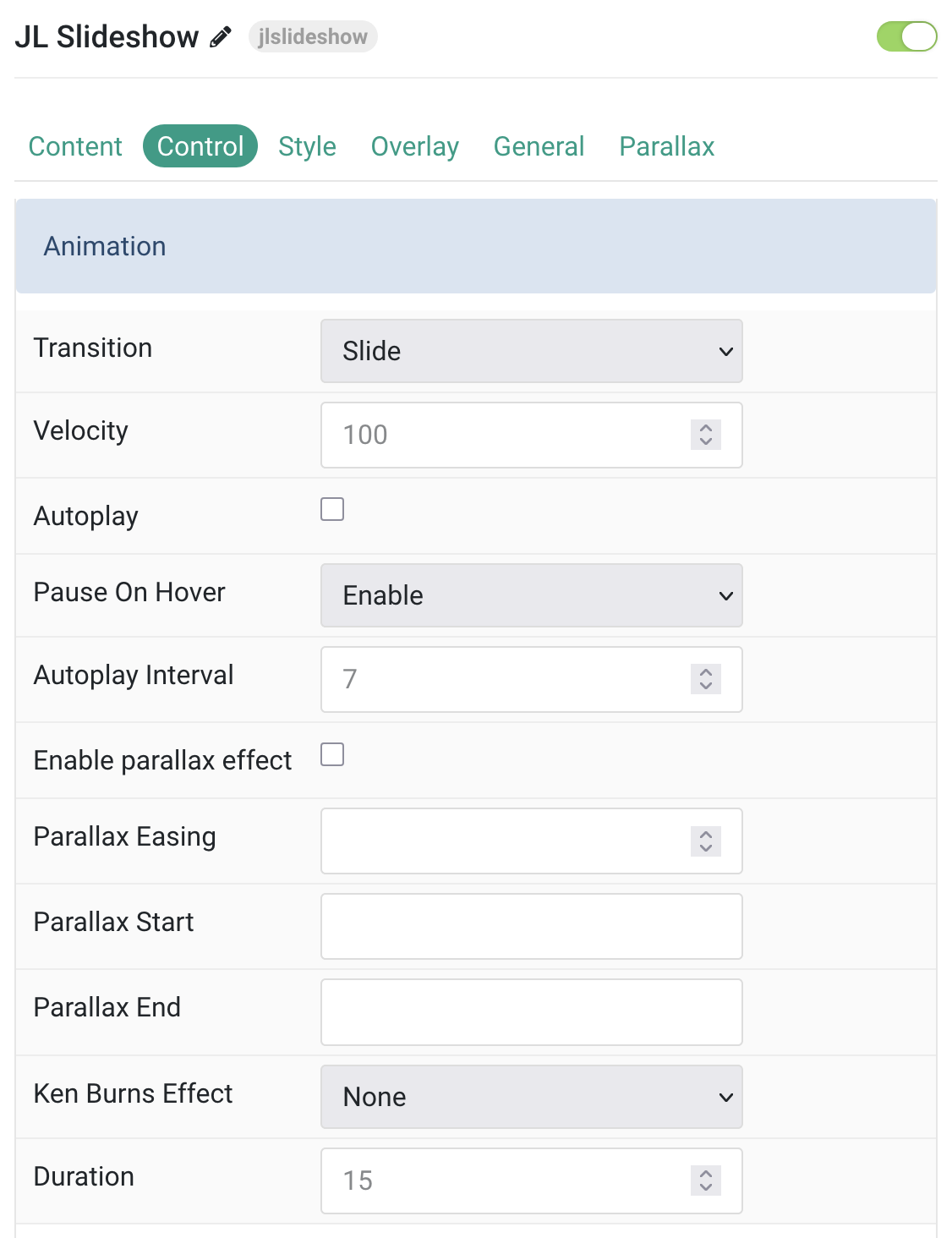
| Animation | |
| Transition | Select the transition effect between two slides. |
| Velocity | Set the velocity in pixels per millisecond. Min 20, Max 300. |
| Autoplay | Enable autoplay for slideshow items. |
| Pause On Hover | Pause autoplay when the mouse hovers over the slideshow. |
| Autoplay Interval | Set the autoplay interval in seconds. Min 5, Max 15. |
| Enable Parallax Effect | Add a stepless parallax animation based on the scroll position. |
| Parallax Easing |
Set the animation easing: Zero transitions at an even speed, Negative values start quickly, Positive values start slowly. Range: -2 to 2. |
| Parallax Start |
The animation starts when the element enters the viewport. Optionally, set start offsets such as 100px, 50vh, or 50vh + 50%.Percent values relate to the target’s height. |
| Parallax End |
The animation ends when the element leaves the viewport. Optionally, set end offsets such as 100px, 50vh, or 50vh + 50%.Percent values relate to the target’s height. |
| Ken Burns Effect | Select the transformation origin for the Ken Burns animation. |
| Duration |
Set the duration of the Ken Burns effect in seconds. Min 10, Max 30. |
Navigation Settings Common settings for Slideshow Navigation
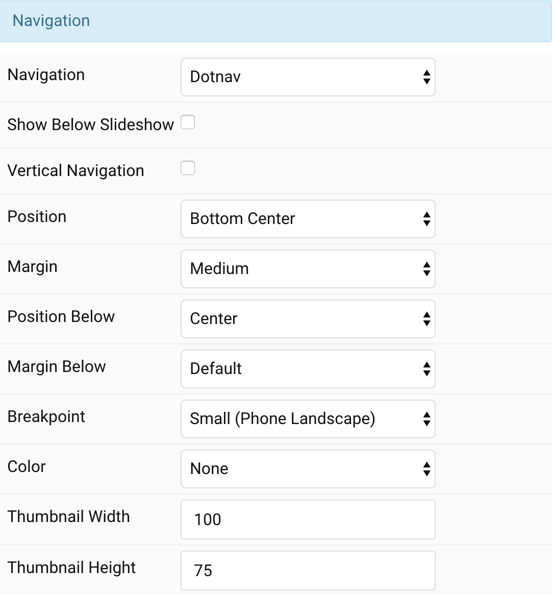
| Settings | Description |
|---|---|
| Navigation | Select the navigation type. |
| Show Below Slideshow | Display the navigation below slideshow. |
| Vertical navigation | Vertical navigation items |
| Position | Select the position of the navigation if the navigation is NOT below the slideshow. |
| Margin | Apply a margin between the navigation and the slideshow container. |
| Show below slideshow | Display the navigation below slideshow |
| Position Below | Align the navigation’s items if the navigation is below the slideshow. |
| Margin Below | Apply a margin between the navigation and the slideshow container if the navigation is below the slideshow. |
| Breakpoint | Display the navigation only on this device width and larger. |
| Color | Set light or dark color if the navigation is below the slideshow. |
| Thumbnail Width | Enter the image’s width if the navigation is Thumbnav. |
| Thumbnail Height | Enter the image’s height if the navigation is Thumbnav. |
Slidenav Settings Defines a navigation with previous and next buttons to flip through slideshows.
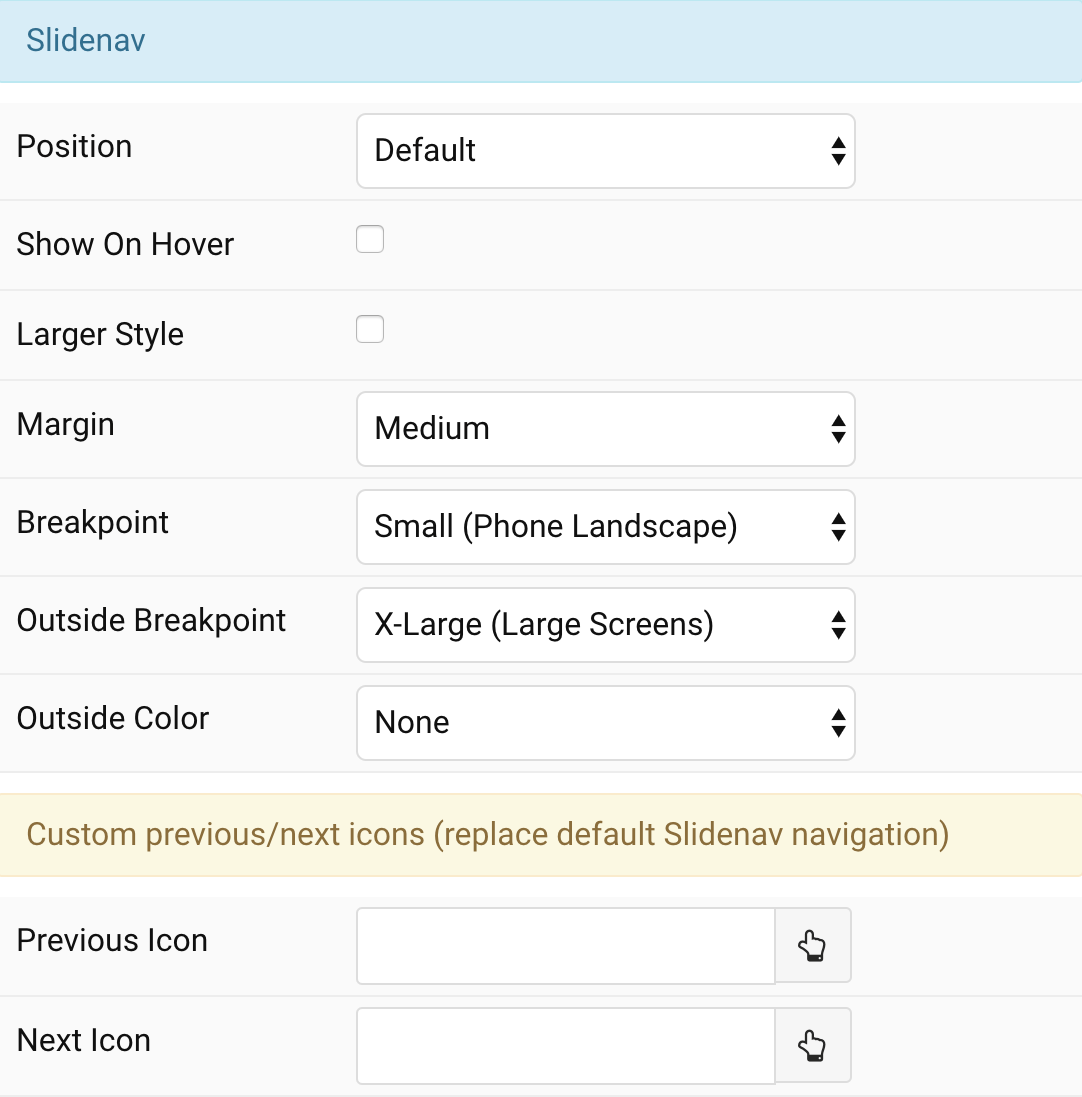
| Settings | Description |
|---|---|
| Position | Select the position of the slidenav. |
| Show On Hover | Show the slide nav on hover only. |
| Larger Style | To increase the size of the slidenav icons. |
| Margin | Apply a margin between the slidenav and the slideshow container. |
| Breakpoint | Display the slidenav only on this device width and larger. |
| Outside Breakpoint | Display the slidenav only outside on this device width and larger. Otherwise it will be displayed inside. |
| Outside Color | Set light or dark color if the slidenav is outside of the slideshow. |
| Previous Icon | Custom Previous icons using icon Picker |
| Next Icon | Custom Next icons using icon Picker |
Style Tab
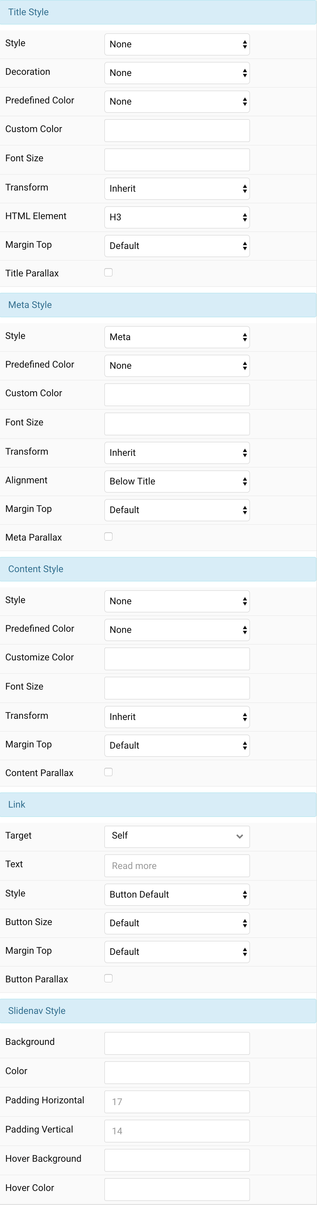
Title Settings Common settings for Title Style
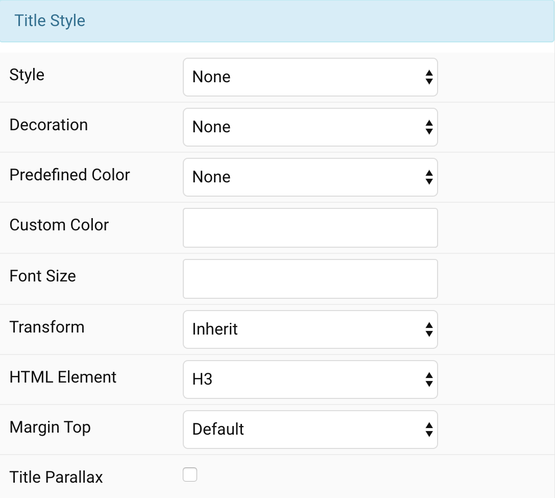
| Settings | Description |
|---|---|
| Style | Heading styles differ in font-size but may also come with a predefined color, size and font. |
| Link title | Link the title if a link exists. |
| Hover Style | Set the hover style for a linked title. Enable link title to use this option. |
| Decoration | Decorate the headline with a divider, bullet or a line that is vertically centered to the heading. |
| Predefined Color | Select a predefined text color. |
| Custom Color | Customize the title color instead using predefined title color mode. You need to set the predefined color to None to use the customize color option. |
| Font Size | Customize the title text font size. |
| Transform | The following options will transform text into uppercased, capitalized or lowercased characters. |
| HTML Element | Choose one of the elements to fit your semantic structure. |
| Margin Top | Set the top margin. Note that the margin will only apply if the content field immediately follows another content field. |
| Title Parallax | Add a parallax effect for Title. This option won’t have any effect unless the Parallax animation for Overlay is selected. |
Meta Settings Common settings for Meta Style
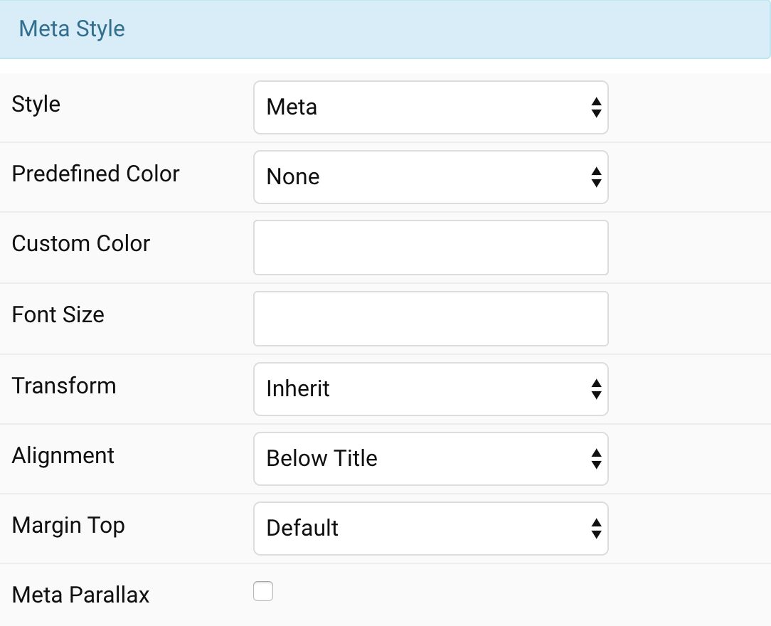
| Settings | Description |
|---|---|
| Style | Select a predefined meta text style, including color, size and font-family. |
| Predefined Color | Select the predefined meta color. |
| Custom Color | Customize the meta color. Set Predefined Color for Meta to None before using this feature. |
| Font Size | Customize the title text font size. |
| Transform | The following options will transform text into uppercased, capitalized or lowercased characters. |
| Alignment | Align the meta text above/below the title or below the content. |
| Margin Top | Set the top margin. Note that the margin will only apply if the content field immediately follows another content field. |
| Meta Parallax | Add a parallax effect for Meta. This option won’t have any effect unless the Parallax animation for Overlay is selected. |
Content Settings Common settings for Content Style
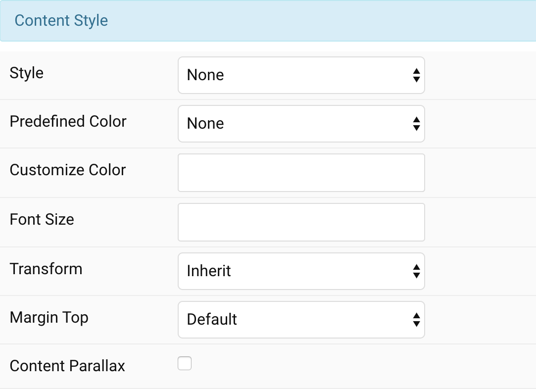
| Settings | Description |
|---|---|
| Style | Select a predefined text style, including color, size and font-family. |
| Predefined Color | Select the predefined meta color. |
| Content Color | Customize the content color instead using predefined text color. You need to set the predefined color to None to use the customize color option. |
| Font Size | Customize the content text font size. |
| Transform | The following options will transform text into uppercased, capitalized or lowercased characters. |
| Margin Top | Set the top margin. Note that the margin will only apply if the content field immediately follows another content field. |
| Content Parallax | Add a parallax effect for Content. This option won’t have any effect unless the Parallax animation for Overlay is selected. |
Link Settings Common settings for Link Style
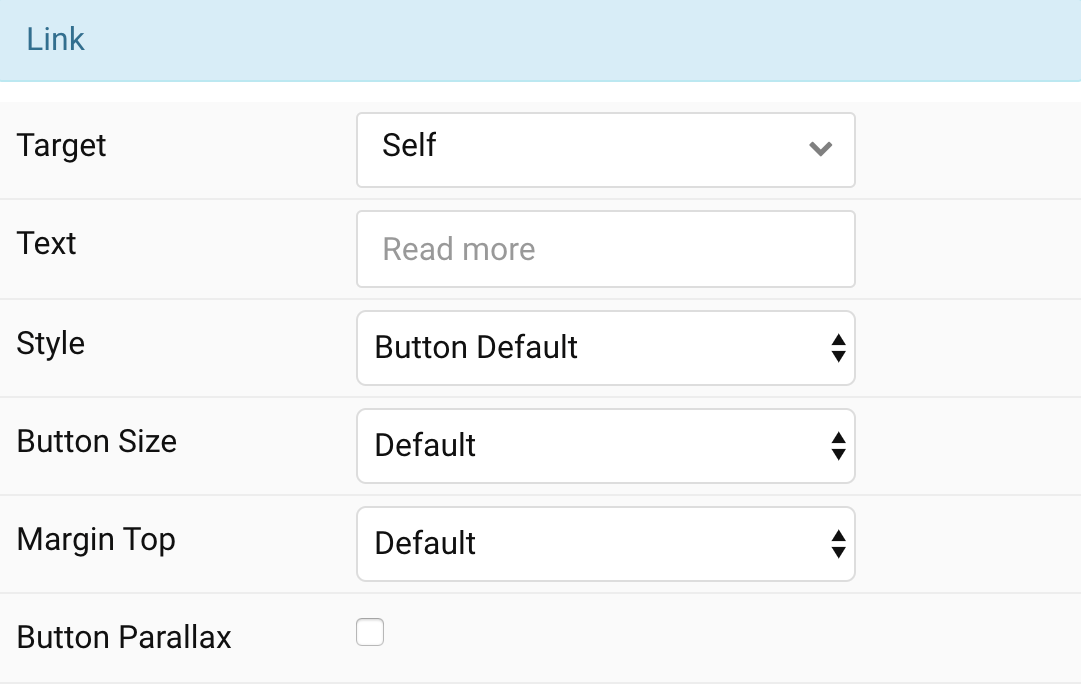
| Settings | Description |
|---|---|
| Target | Target browser window when item is clicked. |
| Text | Enter the text for the link. |
| Style | Set the button style. |
| Button Size | Set the button size. |
| Margin Top | Set the top margin. Note that the margin will only apply if the content field immediately follows another content field. |
| Button Parallax | Add a parallax effect for Link. This option won’t have any effect unless the Parallax animation for Overlay is selected. |
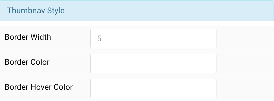
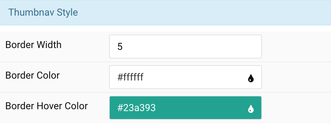
Thumbnav Style Customize the border color for Thumbnav. You need to set the Navigation type to Thumbnav to use these features.

| Settings | Description |
|---|---|
| Border Width | Customize border width color, i.e: 5. |
| Border Color | Customize the thumbnav Border Color. |
| Border Hover Color | Customize the Border Hover Color on hover/click. |
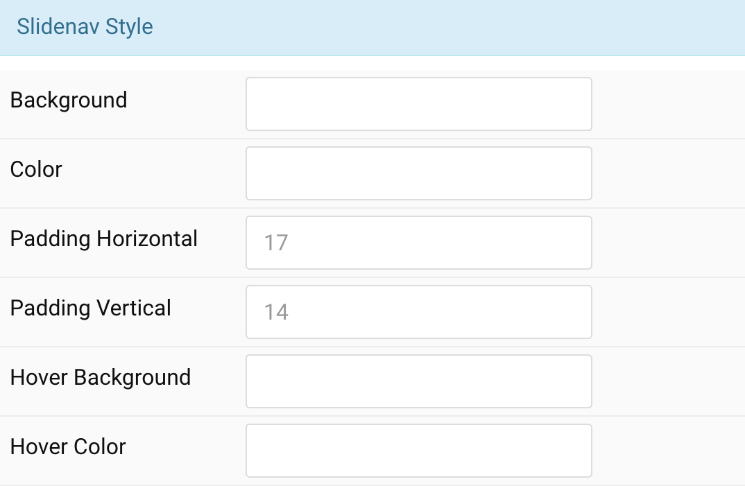
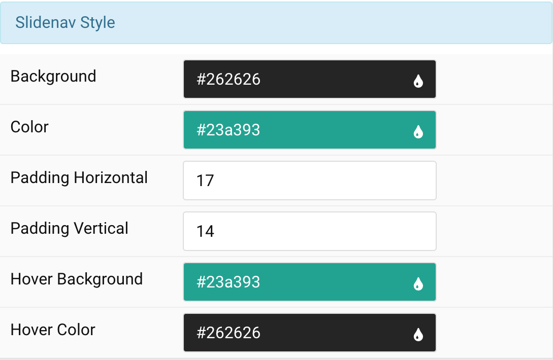
Slidenav Style Settings Customize the color for Slidenav Style
| Settings | Description |
|---|---|
| Background | Customize slidenav background color. |
| Color | Customize the slidenav color |
| Padding Horizontal | Customize the horiozontal padding for slidenav button icon. |
| Padding Vertical | Customize the vertical padding for slidenav button icon. |
| Hover Background | Customize the hover background color. |
| Hover Color | Customize the hover color for slidenav button (prev/next). |
Overlay tab
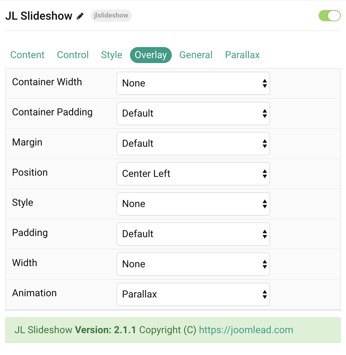
| Settings | Description |
|---|---|
| Overlay Container Width | Set the maximum content width. Note: The section may already have a maximum width, which you cannot exceed. |
| Overlay Container Padding | Set the vertical container padding to position the overlay. |
| Overlay Margin | Apply a margin between the overlay and the slideshow container. This option won’t have any effect if Container Width is enabled. |
| Overlay Position | Set the content position. |
| Overlay Style | Select the style for the overlay. |
| Overlay Padding | Set the padding between the overlay and its content. This option won’t have any effect unless Overlay Style is enabled. |
| Expand content | Expand the height of the content to fill the available space in the overlay and push the link to the bottom. |
| Overlay Width | Set a fixed width. |
| Overlay Animation | Choose between a parallax depending on the scroll position or an animation, which is applied once the slide is active. |
| Overlay Classes | CSS class name for the overlay style. |
Parallax Tab
| Settings | Description |
|---|---|
| Parallax Settings | Common settings for Title/Meta/Content and Link Parallax. |
| Horizontal Start / Horizontal End | Animate the horizontal position (translateX) in pixels. Min:-600 and Max:600 |
| Vertical Start / Vertical End | Animate the vertical position (translateY) in pixels. Min:-600 and Max:600 |
| Scale Start / Scale End | Animate the scaling. 100 means 100% scale, 200 means 200% scale, and 50 means 50% scale. Min 30 and Max:400 |
| Rotate Start / Rotate End | Animate the rotation clockwise in degrees. NOTE: Min 0 and Max 360 |
| Opacity Start / Opacity End | Animate the opacity. 100 means 100% opacity, 0 means 0% opacity and 50 means 50%. NOTE: Min 0 and Max 100 |
General, Parallax and Parallax Background tab
Please take a look the documentation here for more detail about these tabs settings

Comments