Table Particle Documentation
# Table Particle Package contents
| Files | Description |
|---|---|
| jltable.yaml | Contains the Table particle settings. |
| jltable.html.twig | The Twig file to pull information, settings. |
Installation Installing the particle on your website is a really simple process. You can refer to the document here to know more.
Requirements Table requires Uikit 3 for Gantry 5 Atom to be installed and enabled in your theme layout settings.
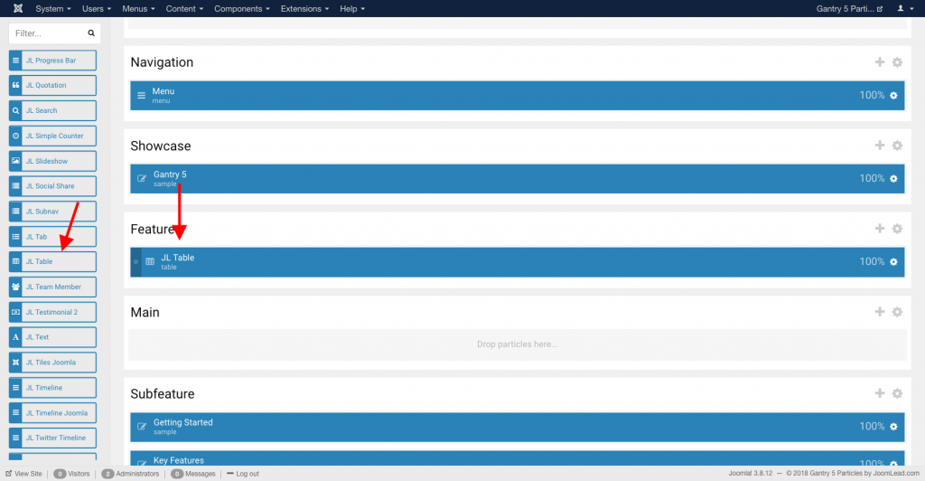
Go to Template/Theme Settings > select the Layout to add Table particle (i.e: Home) -> Layout tab -> Drag and drop the Table Particle from Particles panel (left corner) to the section you want to display the Table.
Settings
Tab Content
| Settings | Description |
|---|---|
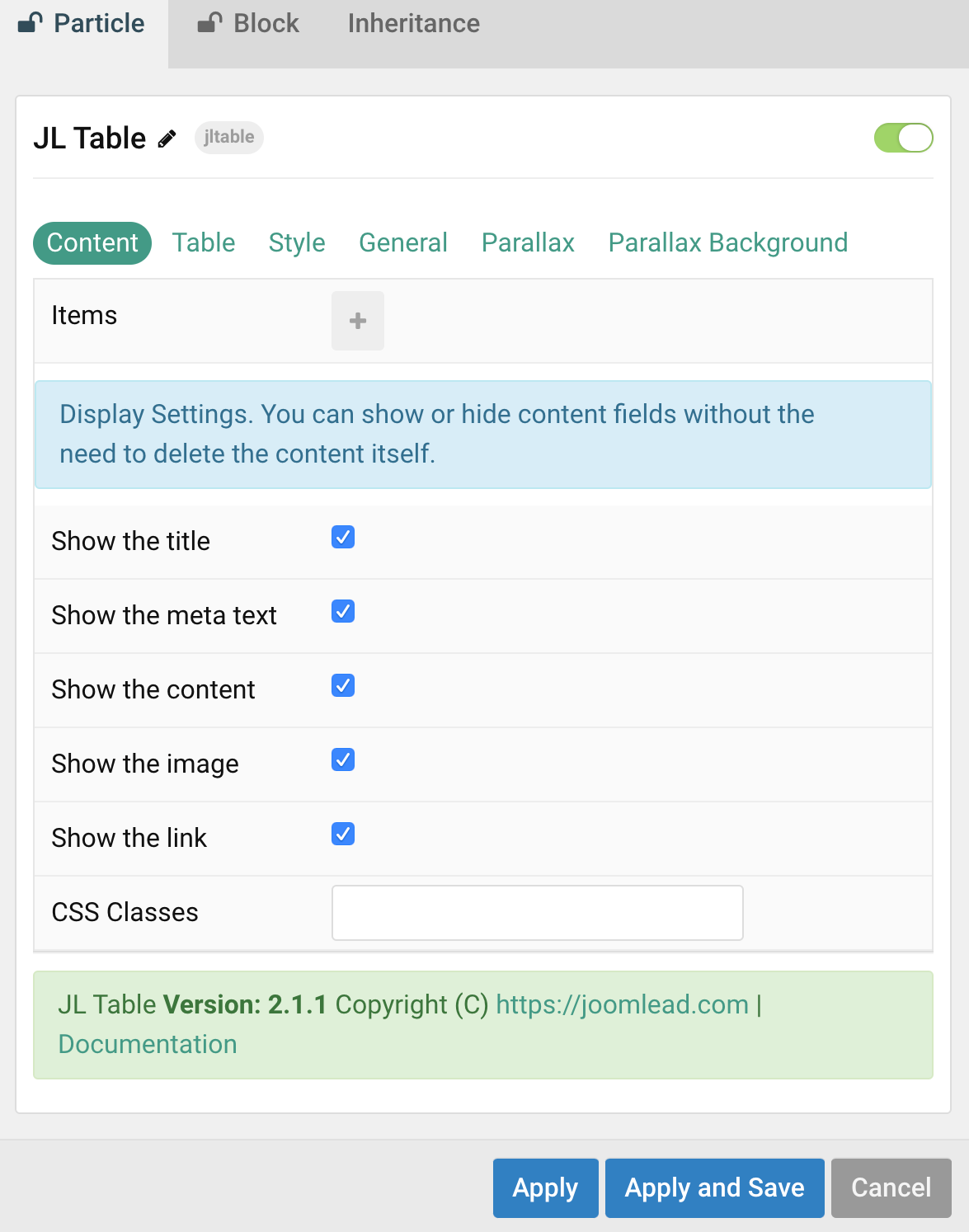
| Items | List table Row items. You can add new items to the collection using the plus + icon |
Items You can add new items to the collection using the plus + icon
| Settings | Description |
|---|---|
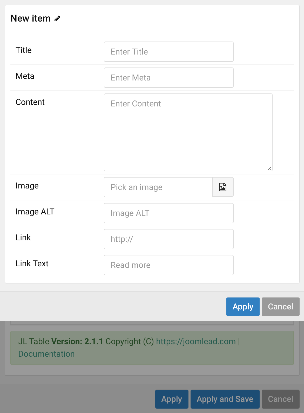
| Title | Customize the Title. |
| Meta | Customize the Meta. |
| Content | Customize the content. |
| Image | An image field with an image picker. |
| Image ALT | Enter the image’s alt attribute. |
| Link | Specify the button link. |
| Link text | Specify the button label. |
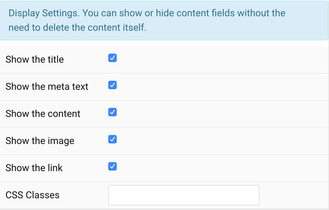
Display Settings You can show or hide content fields without the need to delete the content itself.
| Settings | Description |
|---|---|
| Show the title | You can show or hide content fields for title column, meta column, content, image or link column without the need to delete the content itself |
| Show the meta text | |
| Show the content | |
| Show the image | |
| Show the link | |
| CSS Classes | CSS class name for the particle |
Tab Table
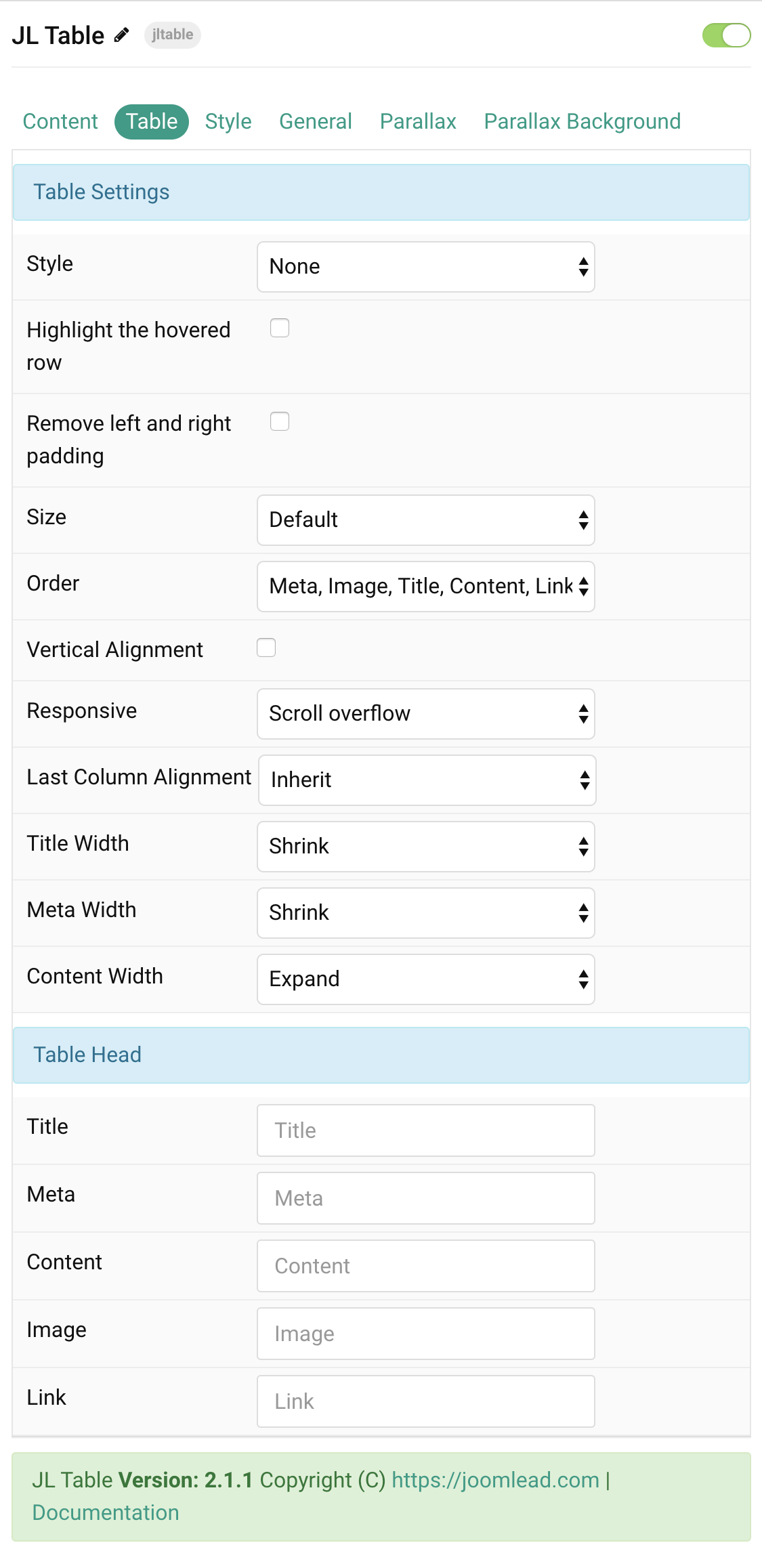
Table Settings Common style settings for Table
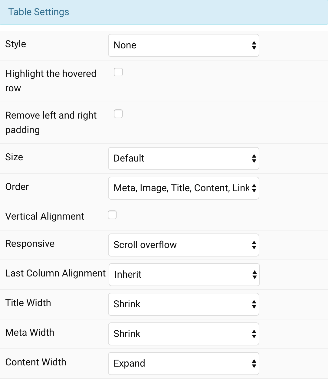
| Settings | Description |
|---|---|
| Style | Select the table style. |
| Highlight the hovered row | Highlight the row on hover. |
| Remove left and right padding | Remove left and right table padding. |
| Size | Define the padding between table rows. |
| Order | Define the order of the table cells. 1: Meta, Image, Title, Content, Link 2: Title, Image, Meta, Content, Link 3: Image, Title, Content, Meta, Link 4: Image, Title, Meta, Content, Link 5: Title, Meta, Content, Link, Image 6: Meta, Title, Content, Link, Image |
| Vertical Alignment | Vertically center table cells. |
| Responsive | Stack columns on small devices or enable overflow scroll for the container. |
| Last Column Alignment | Define the alignment of the last table column. |
| Title Width | Define the width of the title cell. |
| Meta Width | Define the width of the meta cell. |
| Content Width | Define the width of the content cell. |
Head Settings Label names for Table Head
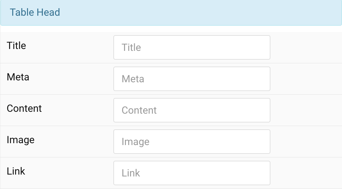
| Settings | Description |
|---|---|
| Title | Enter a table header text for title, meta, content, image or link column. |
| Meta | |
| Content | |
| Image | |
| Link |
Style Tab
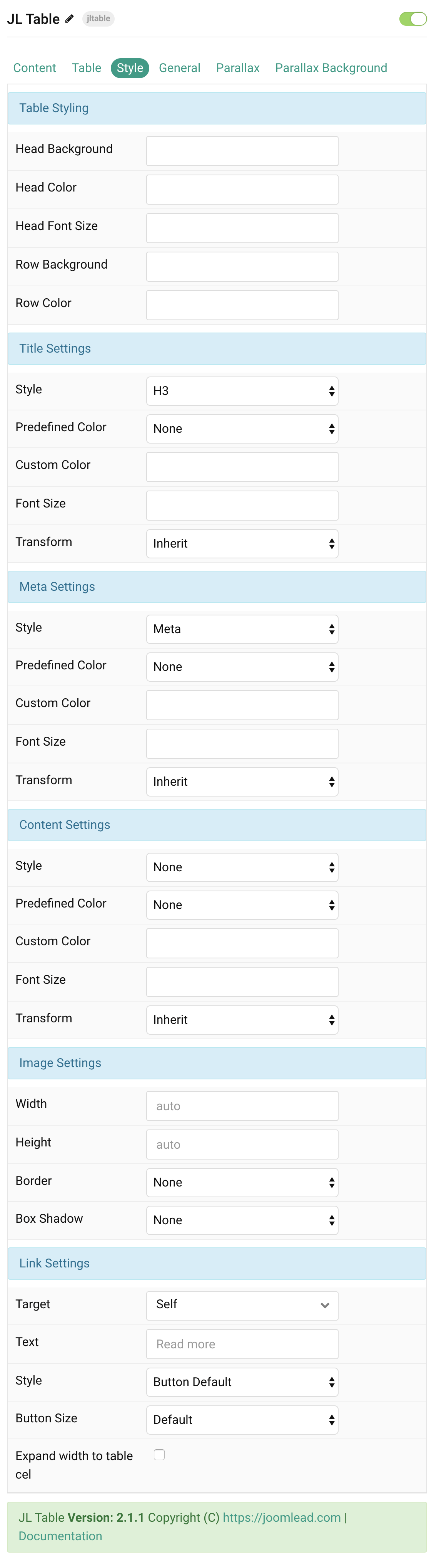
| Settings | Description |
|---|---|
| Table Style Settings | Common settings for Table Style |
| Head Background | Customize the head background color instead using default background color. |
| Head Color | Customize the table head color. |
| Head Font Size | Customize the table head text font size. |
| Row Background | Customize the row background color instead using default background color. |
| Row Color | Customize the row content color instead using default color. |
| Title Style Settings | Common settings for Title Style |
| Style | Heading styles differ in font-size but may also come with a predefined color, size and font. |
| Predefined Color | Select the text color. |
| Custom Color | Customize the title color instead using predefined title color mode. You need to set the predefined color to None to use the customize color option. |
| Font Size | Customize the title text font size. |
| Transform | The following options will transform text into uppercased, capitalized or lowercased characters. |
| Meta Style Settings | Common settings for Meta Style |
| Style | Select a predefined meta text style, including color, size and font-family. |
| Predefined Color | Select the predefined meta color. |
| Custom Color | Customize the meta color. Set Predefined Color for Meta to None before using this feature. |
| Font Size | Customize the title text font size. |
| Transform | The following options will transform text into uppercased, capitalized or lowercased characters. |
| Content Style Settings | Common settings for Content Style |
| Style | Select a predefined text style, including color, size and font-family. |
| Predefined Color | Select the predefined meta color. |
| Content Color | Customize the content color instead using predefined text color. You need to set the predefined color to None to use the customize color option. |
| Font Size | Customize the content text font size. |
| Transform | The following options will transform text into uppercased, capitalized or lowercased characters. |
| Image Style Settings | Common settings for Image Style |
| Width | Enter the image’s width. |
| Height | Enter the image’s height. |
| Border | Select the image’s border style. |
| Box Shadow | Select the image’s box shadow size. |
| Link Settings | Common settings for Link Style |
| Target | Target browser window when item is clicked. |
| Text | Enter the text for the link. |
| Style | Set the button style. |
| Button Size | Set the button size. |
| Expand width to table cell | Expand width to table cell for button. |
General, Parallax and Parallax Background tab
Please take a look the documentation here for more detail about these tabs settings

Comments