Team Member Particle
# Team Member Package contents
| Files | Description |
|---|---|
| jlmember.yaml | Contains the Team Member particle settings. |
| jlmember.html.twig | The Twig file to pull information, settings. |
Installation Installing the particle on your website is a really simple process. You can refer to the document here to know more.
Requirements Team member requires Uikit 3 for Gantry 5 Atom to be installed and enabled in your theme layout settings.
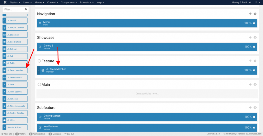
Go to Template/Theme Settings > select the Layout to add Team Member particle (i.e: Home) -> Layout tab -> Drag and drop the Team Member Particle from Particles panel (left corner) to the section you want to display the Team Member.
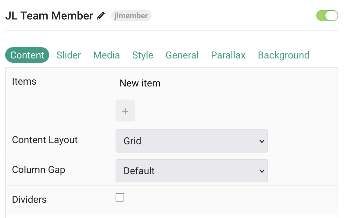
Settings
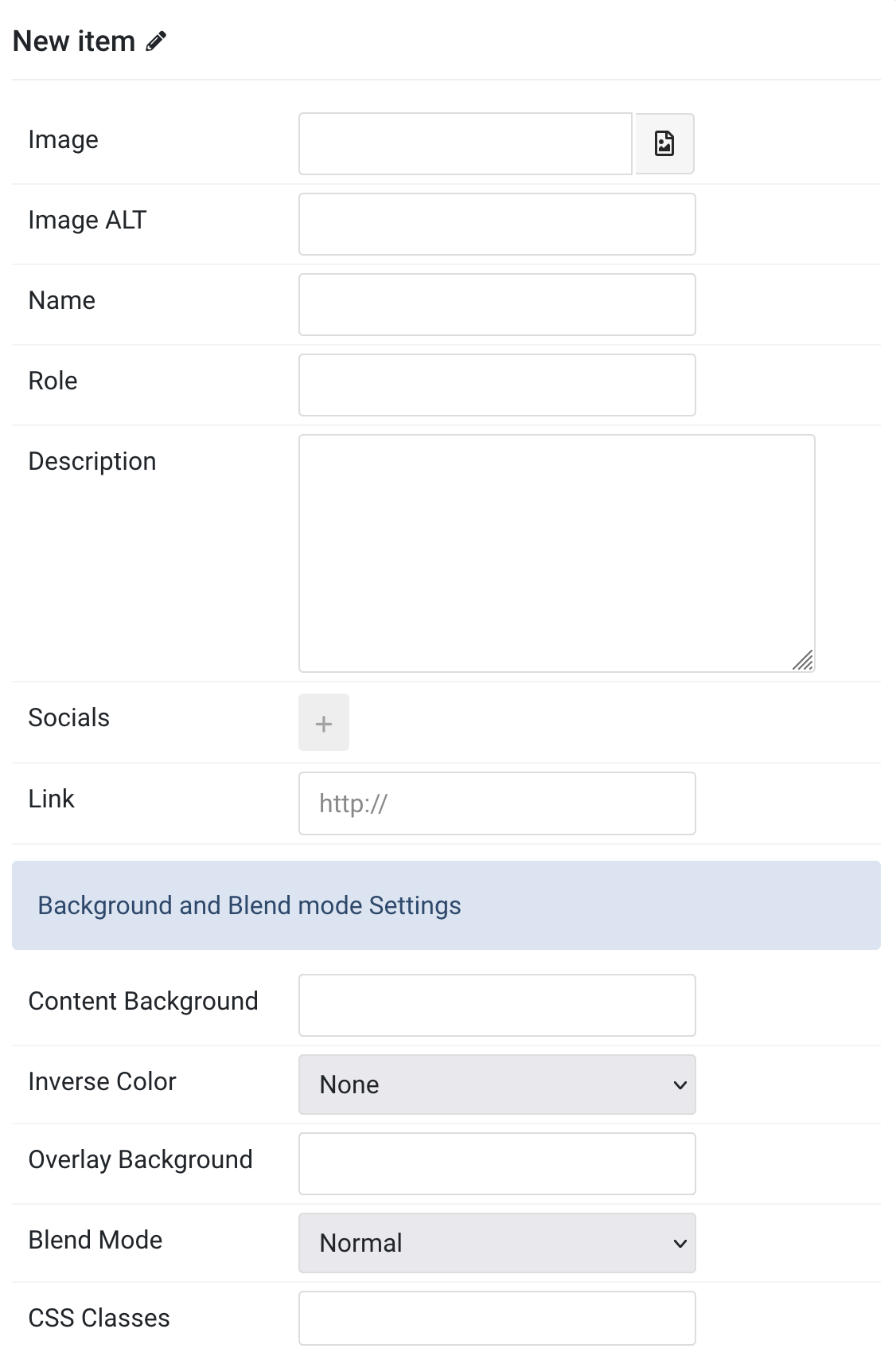
Items You can add new items to the collection using the plus + icon
| Settings | Description |
|---|---|
| Image | Select the image for member. |
| Image ALT | Enter the image’s alt attribute. |
| Name | Enter the name for member. |
| Role | Enter member role. |
| Description | Customize member description. |
| Socials | Create a list of sub-item link to socials or website. |
| Link | Specify the author link. |
| Background and Blend mode Settings | Common style settings for Background and Blend mode |
| Content Background | Select the background color for content |
| Inverse Color | Inverse the color for light or dark backgrounds. |
| Overlay Color | Set an additional transparent overlay to soften the image. |
| Blend Mode | Determine how the image will blend with the background color. |
| CSS Classes | Specify the CSS class name for item. |
| Settings | Description |
|---|---|
| Content Layout | Choose between Grid or Slider layout mode. |
| Column Gap | Spacing between grid columns: Small, Medium, Default, Large, None. |
| Dividers | Show dividers between grid cells. |
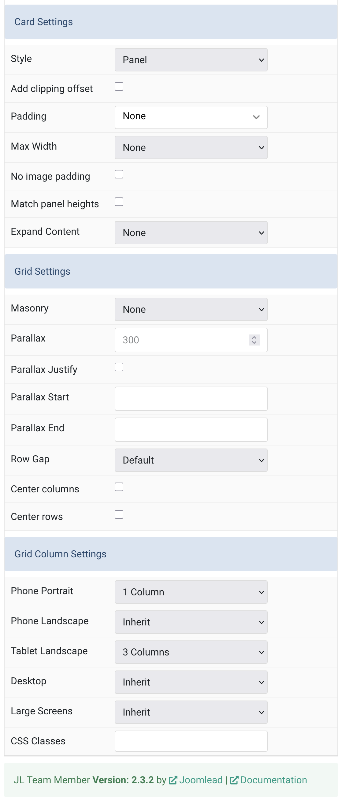
Card Settings Common style settings for Card.
| Settings | Description |
|---|---|
| Style | Select card or tile styles, or use a blank panel. |
| Padding | Set card padding: None, Small, Default, Large. |
| Max Width | Maximum card width: None to 2X-Large. |
| Add clipping offset | Enable to prevent card shadow clipping in slider layouts. |
| No image padding | Remove padding around images to align them to the card edge. |
| Expand Content | Stretch content/image to fill vertical space and push links down. |
Grid Settings Common settings for Grid layout
| Settings | Description |
|---|---|
| Masonry | Enable masonry layout: Pack or Next mode. |
| Parallax | Vertical parallax offset in pixels for scrolling effect (0–600). |
| Parallax Justify | Align parallax columns at the bottom. |
| Parallax Start | Set the scroll start offset (e.g., 100px, 50vh). |
| Parallax End | Set the scroll end offset (e.g., 300px, 100vh). |
| Row Gap | Spacing between grid rows: Small, Medium, Default, Large, None. |
| Center Columns | Center grid columns horizontally. |
| Center Rows | Center grid rows vertically. |
Grid Column Settings Choose the columns on each devices for grid content layout.
| Settings | Description |
|---|---|
| Phone Portrait | Set the number of grid columns for each breakpoint. Inherit refers to the number of columns on the next smaller screen size. |
| Phone Landscape | |
| Tablet Landscape | |
| Desktop | |
| Large Screens | |
| CSS Classes | CSS class name for the particle. |
Tab Slider
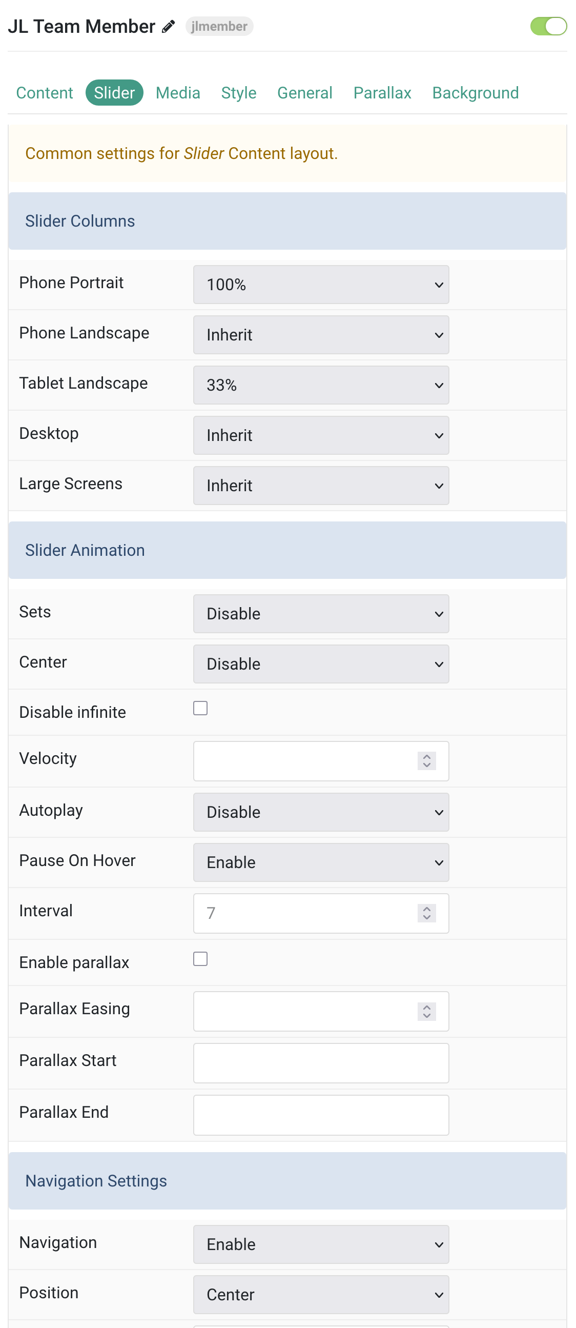
Slider Columns Choose the columns on each devices for slider content layout.
| Settings | Description |
|---|---|
| Phone Portrait | Set the number of grid columns for each breakpoint. Inherit refers to the number of columns on the next smaller screen size. |
| Phone Landscape | |
| Tablet Landscape | |
| Desktop | |
| Large Screens | |
| CSS Classes | CSS class name for the particle. |
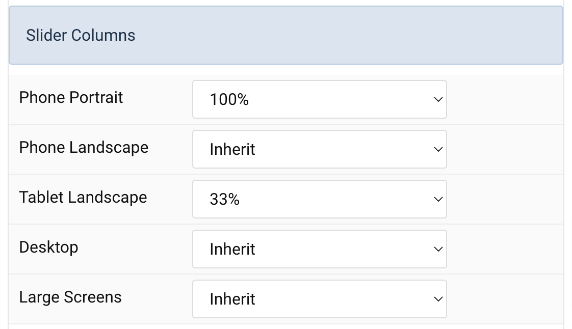
Slider Animation Common settings for Slider Animation.
| Settings | Description |
|---|---|
| Sets | Group and slide all visible items at once based on width (e.g., 3 items if width = 33%). |
| Center | Center the active slide within the slider viewport. |
| Disable Infinite | Turn off looping scroll; stops at last slide. |
| Velocity | Transition speed in px/ms (20–300). |
| Autoplay | Enable automatic progression of slides. |
| Pause on Hover | Pause autoplay while cursor is over the slider. |
| Interval | Autoplay interval in seconds (5–15); default placeholder is 7s. |
| Slider Parallax | Add parallax effect to your team slider |
| Enable Parallax | Add continuous parallax animation based on scroll position. |
| Parallax Easing | Adjust easing (-2 to 2): negative = fast start, positive = slow start. |
| Parallax Start | Define animation start offset (e.g., 100px, 50vh). |
| Parallax End | Define animation end offset (e.g., 100px, 50vh + 50%). |
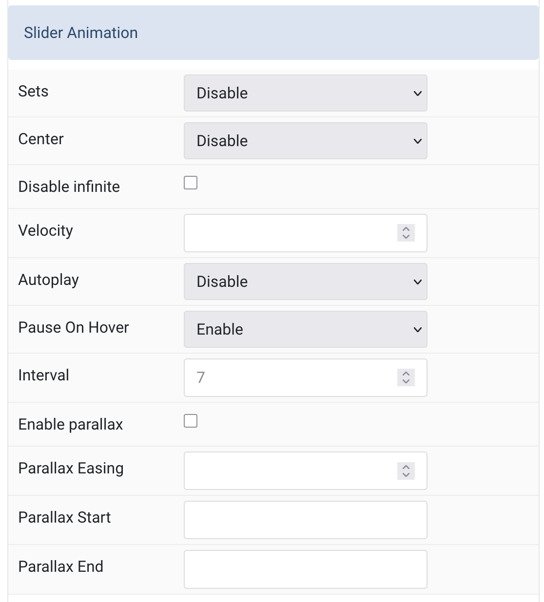
Navigation Settings Common settings for Slider Navigation.
| Settings | Description |
|---|
| Settings | Description |
|---|---|
| Navigation | Enable/Disable the slider navigation. |
| Position | Align the navigation’s items. |
| Margin | Set the vertical margin. |
| Breakpoint | Display the navigation only on this device width and larger. |
| Color | Set light or dark color mode. |
| Enable Tooltip | Show tooltip title on hover. |
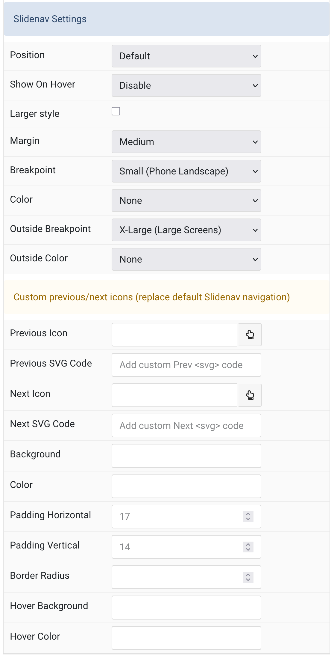
Slidenav Settings Common settings for Slider Slidenav.
| Settings | Description |
|---|
| Settings | Description |
|---|---|
| Position | Select the position of the slidenav. |
| Show On Hover | Show the slidenav on hover only. |
| Larger style | To increase the size of the slidenav icons. |
| Margin | Apply a margin between the slidenav and the slider container. |
| Breakpoint | Display the slidenav only on this device width and larger. |
| Color | Set light or dark color mode. |
| Outside Breakpoint | Display the slidenav only outside on this device width and larger. Otherwise it will be displayed inside. |
| Outside Color | Set light or dark color if the slidenav is outside of the slider. |
| Custom Slidenav Icons | Custom previous/next icons (replace default Slidenav navigation) |
| Previous Icon | An icon picker to choose custom Previous icon |
| Next Icon | An icon picker to create choose custom Next icon |
Tab Media
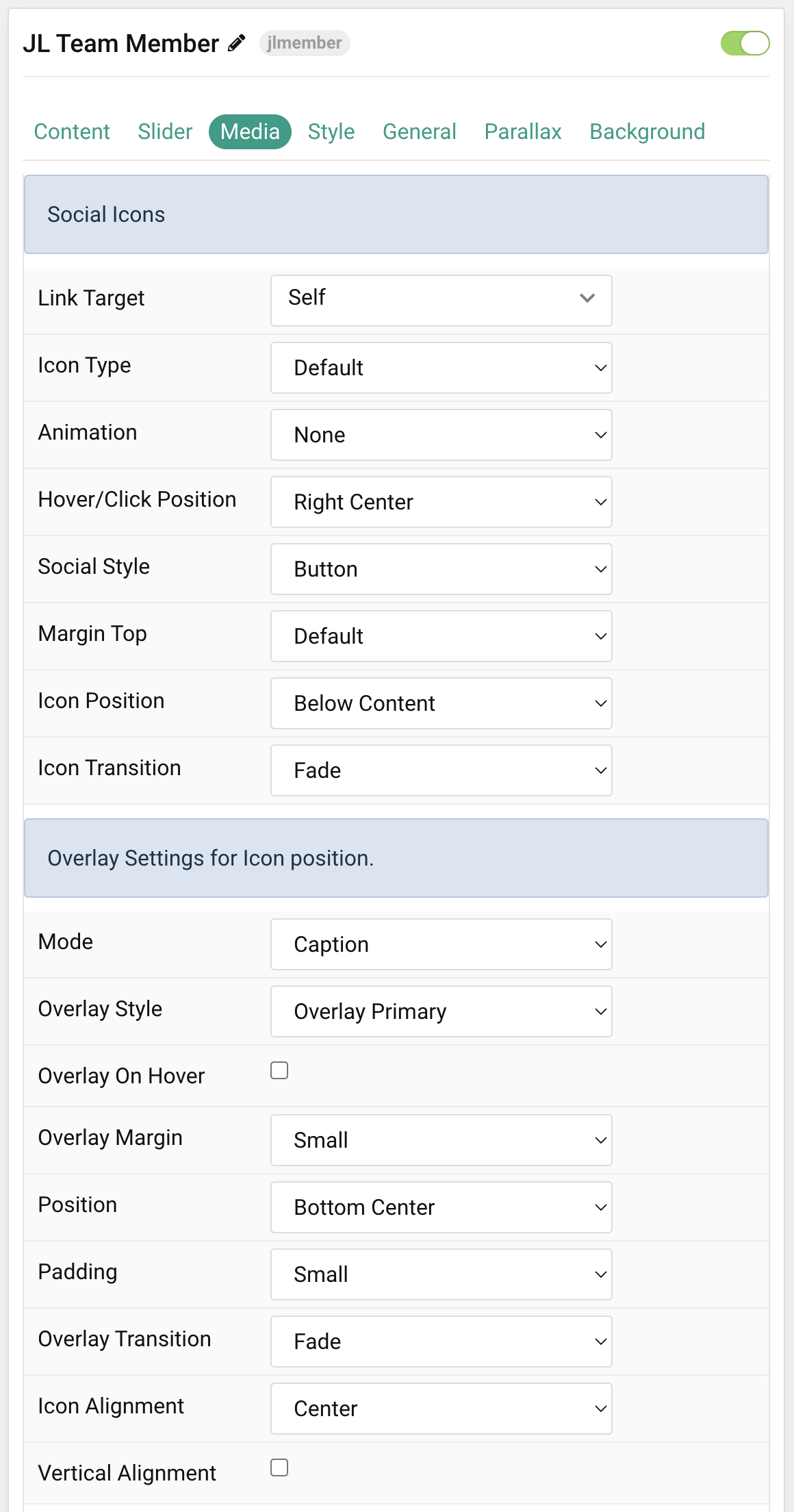
Social Icons Common settings for Social Icons.
| Settings | Description |
|---|---|
| Link Target | Open the link in a same or new window. |
| Icon Type | Define Icon type behavior. Please note the Show On Hover and Show On Click no longer working if Icon Position is set for Overlay mode. |
| Animation | Apply an animation for button share on hover/click (Depend Icon Type, Show on Hover/Click). |
| Hover/Click Position | Depend Icon Type Show on Hover/Click. |
| Social Style | Select the social style link type. |
| Margin Top | Set the top margin. Note that the margin will only apply if the content field immediately follows another content field. |
| Icon Position | Set the position of social icons, You can assign it to below the content description or use it as an overlay on image. |
| Icon Transition | Select a transition for the icon when it appears on hover. |
| Overlay Settings for Icon position. | Common style settings for Overlay |
| Mode | Choose the overlay cover or caption mode. When using cover mode, you need to set the text color manually. |
| Overlay Style | Select the style for the overlay if Overlay style is selected for Icon position. |
| Overlay On Hover | Display social icons overlay on hover. |
| Overlay Margin | Apply a margin between the overlay and the image container. |
| Position | Select the overlay or content position. |
| Padding | Set the padding between the overlay and its content. |
| Overlay Transition | Select a transition for the overlay when it appears on hover. |
| Icon Alignment | Center, left and right alignment the icons. |
| Vertical Alignment | Vertically center grid items. |
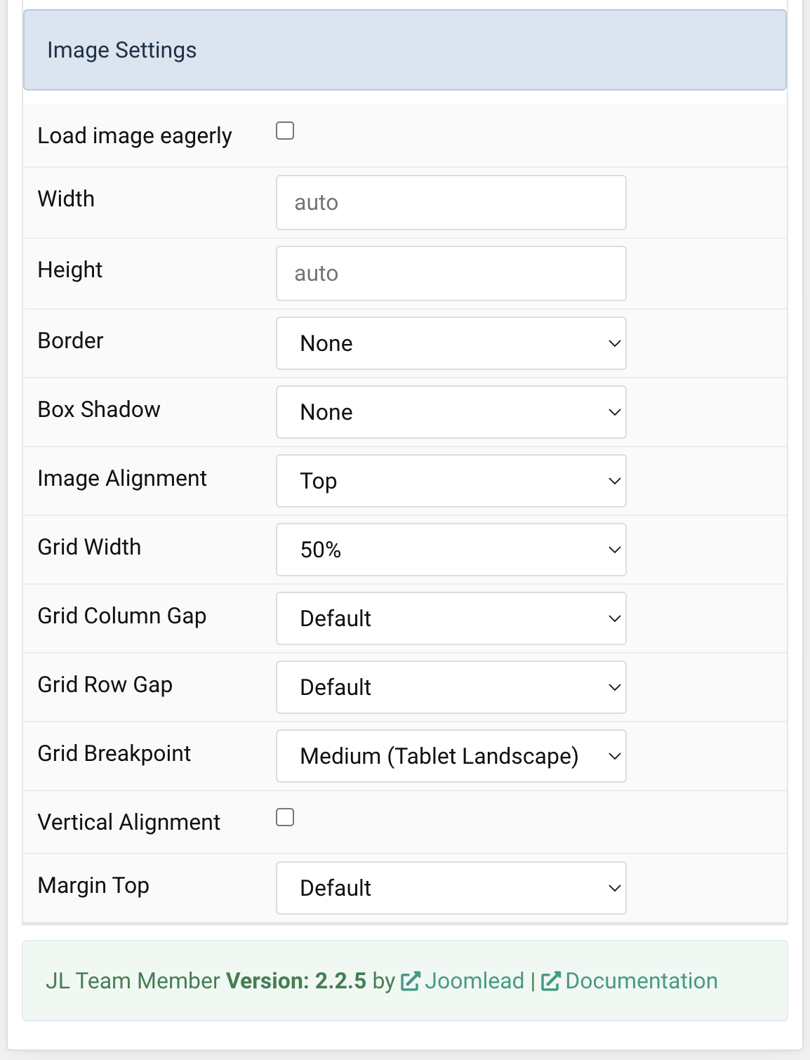
Image Settings Common settings for Image Style
| Settings | Description |
|---|---|
| Load image eagerly | By default, images are loaded lazy. Enable eager loading for images in the initial viewport. |
| Width | Set the width of the image. |
| Height | Set the height of the image. |
| Border | Select the image’s border style. This option won’t have any effect IF Align image without padding is set. |
| Box Shadow | Select the image’s box shadow size. This option won’t have any effect unless the Card Style is set to Panel. |
| Hover Box Shadow | Select the image’s box shadow size on hover. This option won’t have any effect unless the Card Style is set to Panel. |
| Hover Box Shadow | Select the image’s box shadow size on hover. This option won’t have any effect unless the Card Style is set to Panel. |
| Image Alignment | Align the image to the top,left, right or place it between the title and the content. |
| Grid Width | Define the width of the image within the grid. Choose between percent and fixed widths or expand columns to the width of their content. This option won’t have any effect unless Image Alignment is set to Left or Right. |
| Grid Column Gap | Set the size of the gap between the image and the content. This option won’t have any effect unless Image Alignment is set to Left or Right. |
| Grid Row Gap | Set the size of the gap if the grid items stack. This option won’t have any effect unless Image Alignment is set to Left or Right. |
| Grid Breakpoint | Set the breakpoint from which grid cells will stack. This option won’t have any effect unless Image Alignment is set to Left or Right. |
| Vertical Alignment | Vertically center grid cells. This option won’t have any effect unless Image Alignment is set to Left or Right. |
| Margin Top | Set the top margin. This option won’t have any effect unless Image Alignment is set to Bottom or Between. |
Tab Style
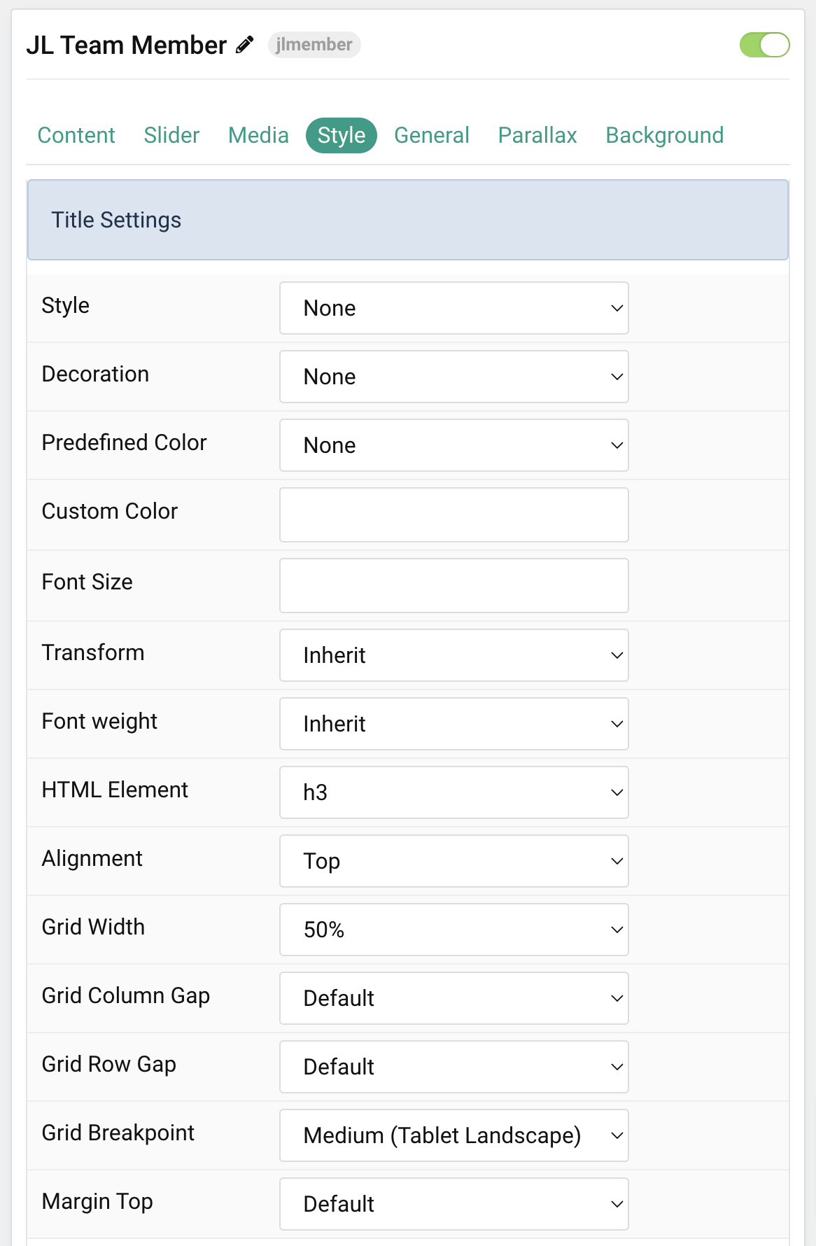
Title Settings Common settings for Title Style
| Settings | Description |
|---|---|
| Style | Heading styles differ in font-size but may also come with a predefined color, size and font. |
| Decoration | Decorate the headline with a divider, bullet or a line that is vertically centered to the heading. |
| Predefined Color | Select a predefined text color. |
| Custom Color | Customize the title color instead using predefined title color mode. You need to set the predefined color to None to use the customize color option. |
| Font Size | Customize the title text font size. |
| Transform | The following options will transform text into uppercased, capitalized or lowercased characters. |
| Font weight | Add one of the following classes to modify the font weight of your text. |
| HTML Element | Choose one of the elements to fit your semantic structure. |
| Alignment | Align the title to the top or left in regards to the content. |
| Grid Width | Define the width of the title within the grid. Choose between percent and fixed widths or expand columns to the width of their content. |
| Grid Column Gap | Set the size of the gap between the image and the content. |
| Grid Row Gap | Set the size of the gap if the grid items stack. |
| Grid Breakpoint | Set the breakpoint from which grid cells will stack. |
| Margin Top | Set the top margin. Note that the margin will only apply if the content field immediately follows another content field. |
Role Settings Common settings for Role Style
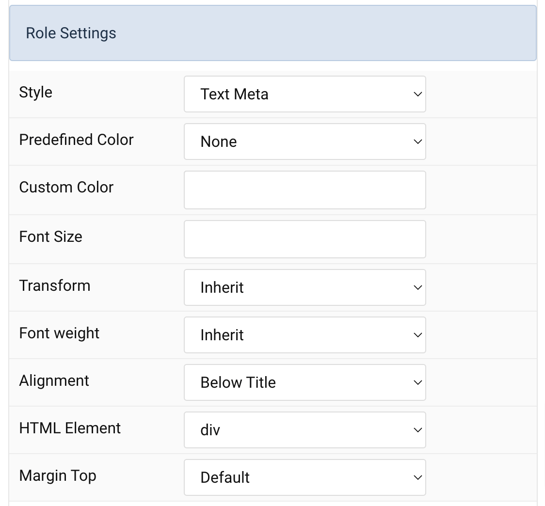
| Settings | Description |
|---|---|
| Style | Select a predefined meta text style, including color, size and font-family. |
| Predefined Color | Select the predefined meta color. |
| Custom Color | Customize the meta color. Set Predefined Color for Meta to None before using this feature. |
| Font Size | Customize the title text font size. |
| Transform | The following options will transform text into uppercased, capitalized or lowercased characters. |
| Font weight | Add one of the following classes to modify the font weight of your text. |
| HTML Element | Choose one of the elements to fit your semantic structure. |
| Alignment | Align the meta text above/below the title or below the content. |
| Margin Top | Set the top margin. Note that the margin will only apply if the content field immediately follows another content field. |
Content Settings Common settings for Content Style
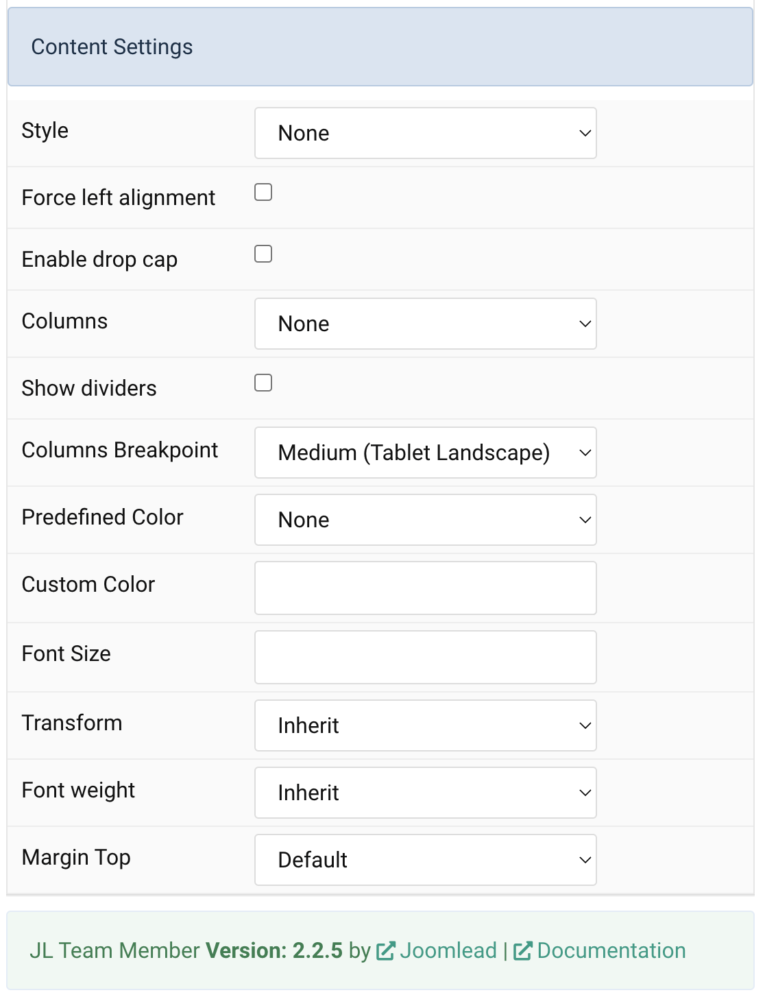
| Settings | Description |
|---|---|
| Style | Select a predefined text style, including color, size and font-family. |
| Force left alignment | Force left alignment for the content if the text center/text right is set via general tab. |
| Enable drop cap | Display the first letter of the paragraph as a large initial. |
| Columns | Set the number of list columns. |
| Show dividers | Show a divider between list columns. |
| Columns Breakpoint | Set the device width from which the list columns should apply. |
| Predefined Color | Select the predefined meta color. |
| Custom Color | Customize the content color instead using predefined text color. You need to set the predefined color to None to use the customize color option. |
| Font Size | Customize the content text font size. |
| Transform | The following options will transform text into uppercased, capitalized or lowercased characters. |
| Font weight | Add one of the following classes to modify the font weight of your text. |
| Margin Top | Set the top margin. Note that the margin will only apply if the content field immediately follows another content field. |
General, Parallax and Parallax Background tab
Please take a look the documentation here for more detail about these tabs settings

Comments