Testimonial Particle
# Testimonial Package contents
| Files | Description |
|---|---|
| jltestimonial2.yaml | Contains the Testimonial particle settings. |
| jltestimonial2.html.twig | The Twig file to pull information, settings. |
Installation Installing the particle on your website is a really simple process. You can refer to the document here to know more.
Requirements Testimonial requires Uikit 3 for Gantry 5 Atom to be installed and enabled in your theme layout settings.
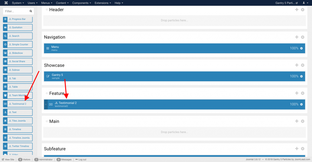
Go to Template/Theme Settings > select the Layout to add Testimonial particle (i.e: Home) -> Layout tab -> Drag and drop the Testimonial Particle from Particles panel (left corner) to the section you want to display the Testimonial.
Settings
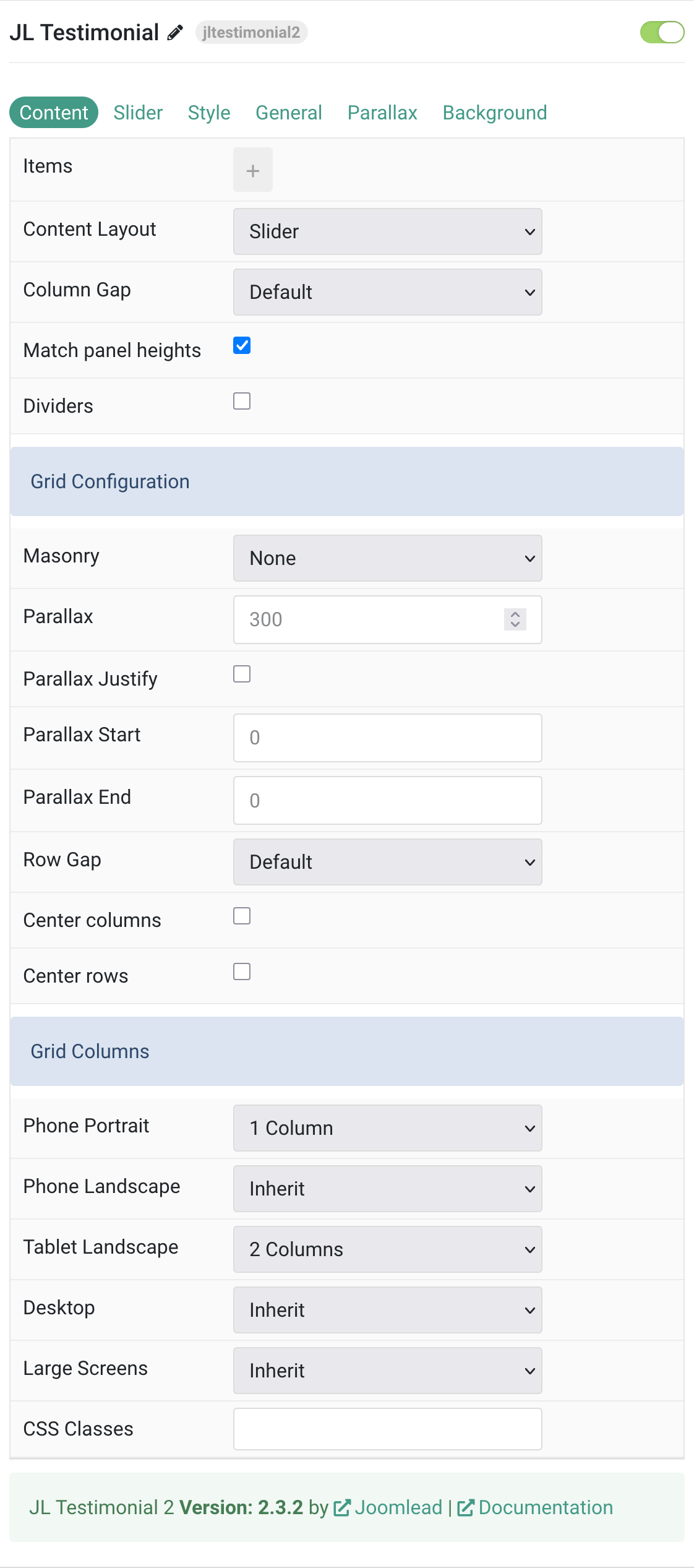
Content Tab – Items
| Settings | Description |
|---|---|
| Items Collection | Configuration for testimonial items and their properties. |
| Items | Create each testimonial item to display. |
| Layout Configuration | Settings for content presentation and layout options. |
| Content Layout | Present the content layout with Slider or Grid mode. |
| Column Gap | Set the size of the gap between the grid columns. |
| Match Panel Heights | Match the height of the direct child of each cell for uniform appearance. |
| Dividers | Display dividers between grid cells for visual separation. |
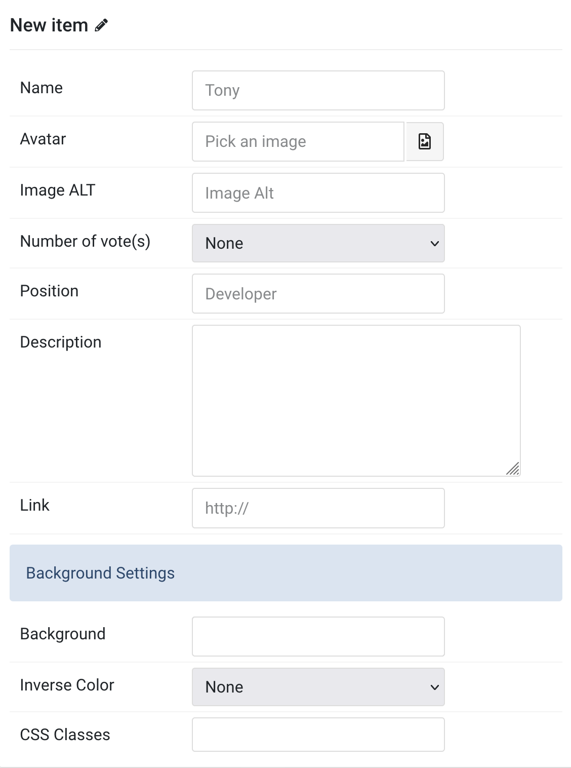
Items You can add new items to the collection using the plus + icon
| Settings | Description |
|---|---|
| Items Collection | Configuration for testimonial items and their properties. |
| Name | Customize the name for each testimonial item. |
| Avatar | An image field with an image picker for person’s photo. |
| Image ALT | Enter the image’s alt attribute for accessibility. |
| Number of Vote(s) | Set the rating score from 1 to 5 stars. |
| Position | Customize the meta information for the person (e.g., job title). |
| Description | Enter the main testimonial description content. |
| Link | Specify the link URL for the testimonial button. |
| Background Settings | Configuration for individual item background styling. |
| Background | Select the background color for each testimonial item. |
| Inverse Color | Inverse the color scheme for light or dark backgrounds. |
| CSS Classes | Specify custom CSS class names for individual items. |
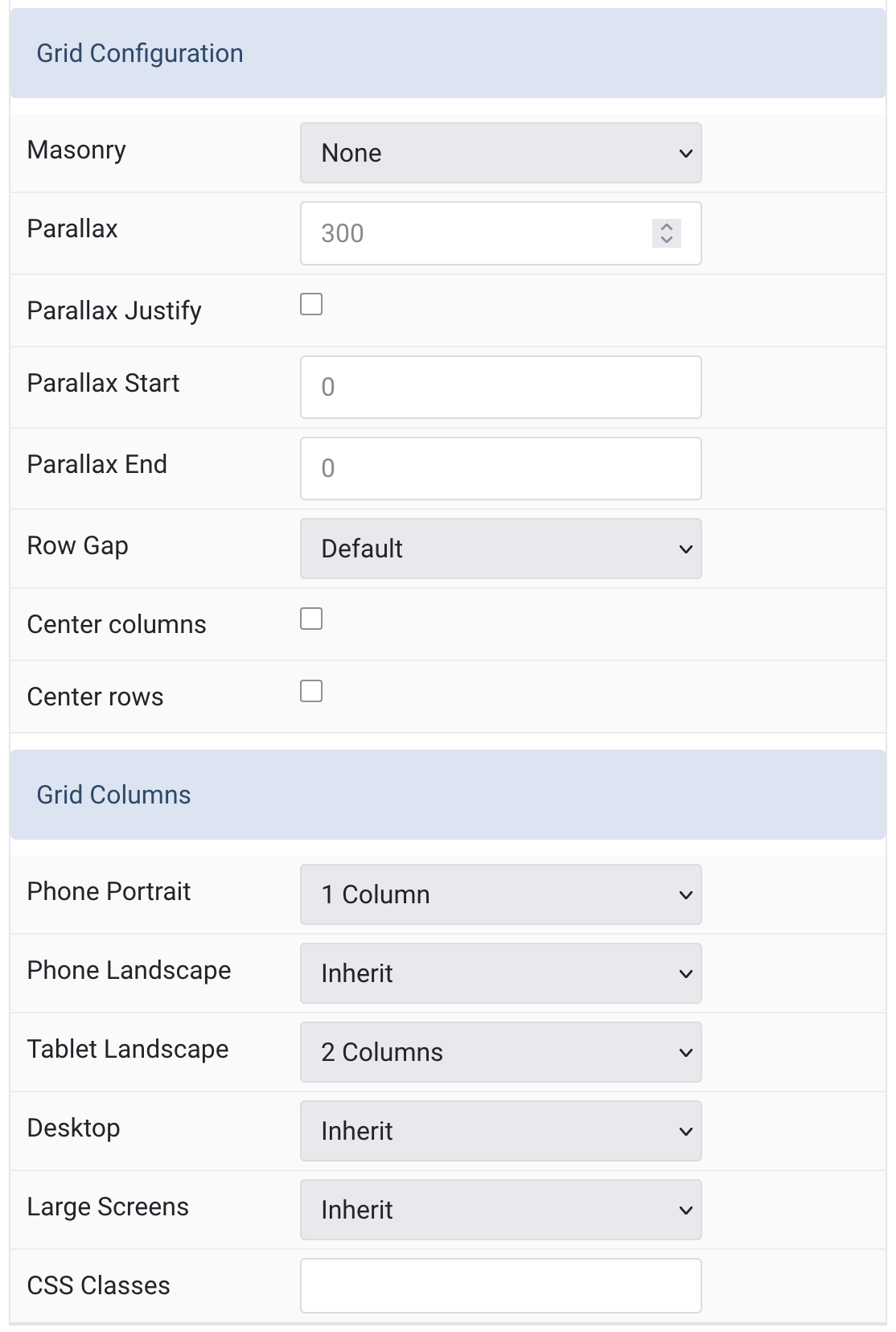
Grid/Columns Settings Common settings for Grid and Columns layout
| Settings | Description |
|---|---|
| Grid Configuration | Advanced grid layout and masonry settings. |
| Masonry | Enable masonry layout with Pack or Next positioning algorithm. |
| Parallax | The parallax effect moves single grid columns at different speeds while scrolling. Define the vertical parallax offset in pixels. Min: 0, Max: 600 |
| Parallax Justify | Enable parallax justify effect for enhanced visual appeal. |
| Parallax Start | Start offset for parallax effect. The value can be in vh, vw, % and px. |
| Parallax End | End offset for parallax effect. The value can be in vh, vw, % and px. |
| Row Gap | Set the size of the gap between the grid rows. |
| Center Columns | Center align the grid columns horizontally. |
| Center Rows | Center align the grid rows vertically. |
| Grid Columns | Responsive breakpoint settings for grid column layouts. |
| Phone Portrait | Set the number of grid columns for phone portrait view. Default: 1 Column |
| Phone Landscape | Set the number of grid columns for phone landscape view. Inherit refers to the number of columns on the next smaller screen size. |
| Tablet Landscape | Set the number of grid columns for tablet landscape view. Default: 2 Columns |
| Desktop | Set the number of grid columns for desktop view. Inherit refers to the number of columns on the next smaller screen size. |
| Large Screens | Set the number of grid columns for large desktop screens. Inherit refers to the number of columns on the next smaller screen size. |
| Additional Settings | Extra configuration options for customization. |
| CSS Classes | CSS class name for the particle or main container. |
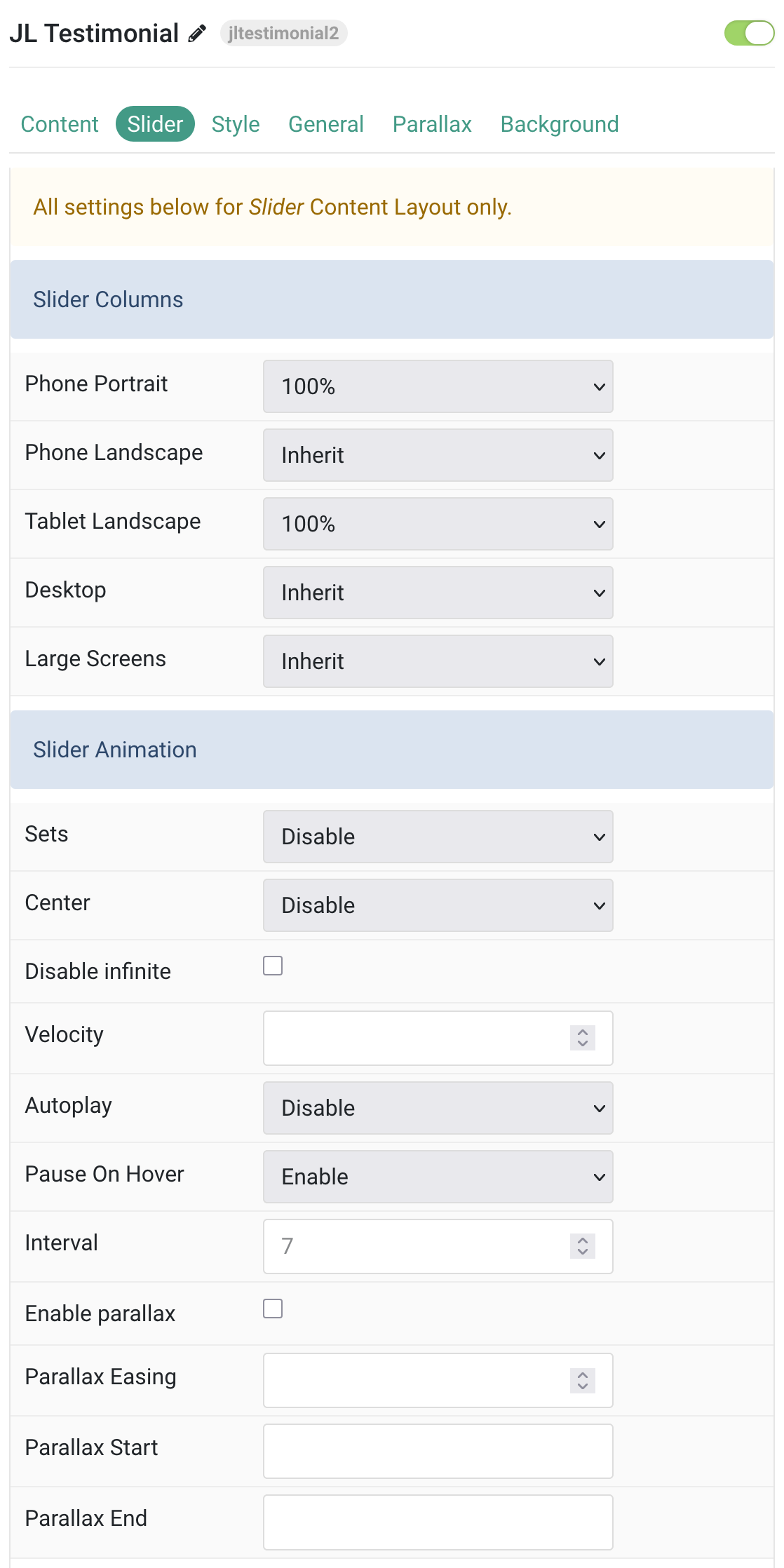
Tab Slider
All settings below are for Slider Content Layout only.
| Settings | Description |
|---|---|
| Slider Columns | Responsive width settings for slider items across different screen sizes. |
| Phone Portrait | Set the item width for phone portrait view. Default: 100% |
| Phone Landscape | Set the item width for phone landscape view. Inherit refers to the item width of the next smaller screen size. |
| Tablet Landscape | Set the item width for tablet landscape view. Default: 100% |
| Desktop | Set the item width for desktop view. Inherit refers to the item width of the next smaller screen size. |
| Large Screens | Set the item width for large desktop screens. Inherit refers to the item width of the next smaller screen size. |
| Slider Animation | Animation and movement settings for the slider functionality. |
| Sets | Slide all visible items at once. Group items into sets. The number of items within a set depends on the defined item width, e.g. 33% means that each set contains 3 items. |
| Center | Center the active slide for better visual focus. |
| Disable Infinite | Disable infinite scrolling between items. |
| Velocity | Set the velocity in pixels per millisecond. Min: 20, Max: 300 |
| Autoplay | Enable autoplay for carousel items. |
| Pause On Hover | Pause autoplay when user hovers over the slider. |
| Interval | Set the autoplay interval in seconds. Min: 5, Max: 15, Default: 7 |
| Enable Parallax | Add a stepless parallax animation based on the scroll position. |
| Parallax Easing | Set the animation easing. Zero transitions at an even speed, a negative value starts off quickly while a positive value starts off slowly. Range: -2 to 2 |
| Parallax Start | The animation starts when the element enters the viewport. Optionally, set a start and end offset, e.g. 100px, 50vh or 50vh + 50%. Percent relates to the target’s height. |
| Parallax End | The animation ends when the element leaves the viewport. Optionally, set a start and end offset, e.g. 100px, 50vh or 50vh + 50%. Percent relates to the target’s height. |
| Settings | Description |
|---|---|
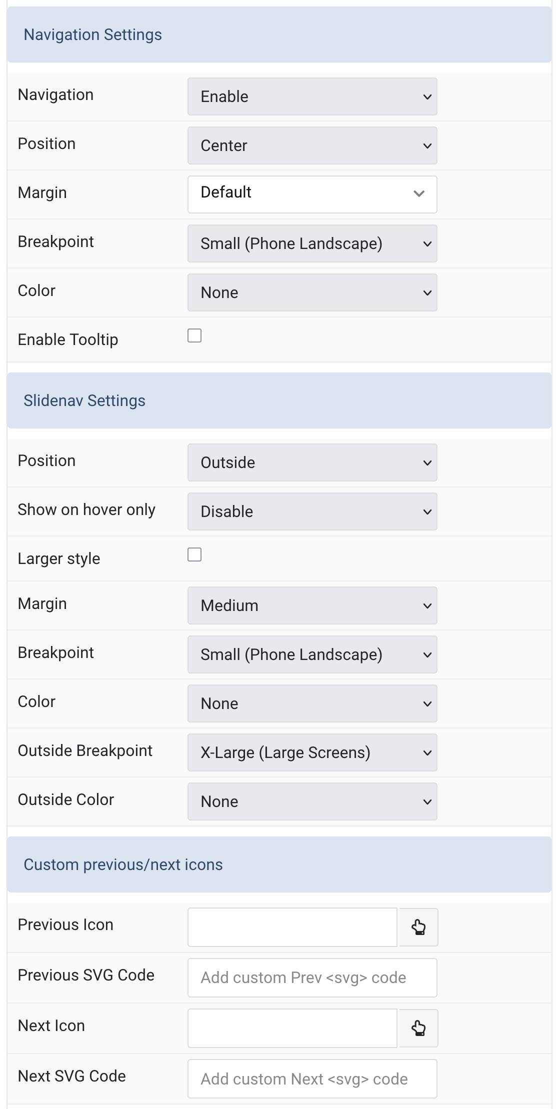
| Navigation Settings | Configuration for slider dot navigation and positioning. |
| Navigation | Enable or disable the dot navigation for the slider. |
| Position | Align the navigation’s items (Left, Center, Right). |
| Margin | Set the vertical margin spacing for navigation elements. |
| Breakpoint | Display the navigation only on this device width and larger. Default: Small (Phone Landscape) |
| Color | Set light or dark color mode for navigation elements. |
| Enable Tooltip | Show tooltip title on hover for navigation items. |
| Slidenav Settings | Configuration for previous/next arrow navigation controls. |
| Position | Select the position of the slidenav arrows (None, Default, Outside, Top Left, Top Right, Center Left, Center Right, Bottom Left, Bottom Center, Bottom Right). |
| Show on Hover Only | Display the slide navigation arrows only when hovering over the slider. |
| Larger Style | Increase the size of the slidenav icons for better visibility. |
| Margin | Apply margin spacing between the slidenav and the slider container. Default: Medium |
| Breakpoint | Display the slidenav only on this device width and larger. Default: Small (Phone Landscape) |
| Color | Set light or dark color mode for slidenav arrows. |
| Outside Breakpoint | Display the slidenav only outside on this device width and larger. Otherwise it will be displayed inside. Default: X-Large |
| Outside Color | Set light or dark color if the slidenav is positioned outside of the slider. |
| Custom Previous/Next Icons | Replace default slidenav navigation with custom icons. |
| Previous Icon | Select a custom icon for the previous navigation button. |
| Previous SVG Code | Add custom SVG code for the previous button that will be added inline to the site. |
| Next Icon | Select a custom icon for the next navigation button. |
| Next SVG Code | Add custom SVG code for the next button that will be added inline to the site. |
| Slidenav Style | Visual styling options for slidenav appearance and hover effects. |
| Background | Set the background color for slidenav buttons. |
| Color | Set the text/icon color for slidenav buttons. |
| Padding Horizontal | Set horizontal padding for slidenav buttons. Default: 14px |
| Padding Vertical | Set vertical padding for slidenav buttons. Default: 17px |
| Border Radius | Set the border radius for rounded corners on slidenav buttons. |
| Hover Background | Set the background color when hovering over slidenav buttons. |
| Hover Color | Set the text/icon color when hovering over slidenav buttons. |
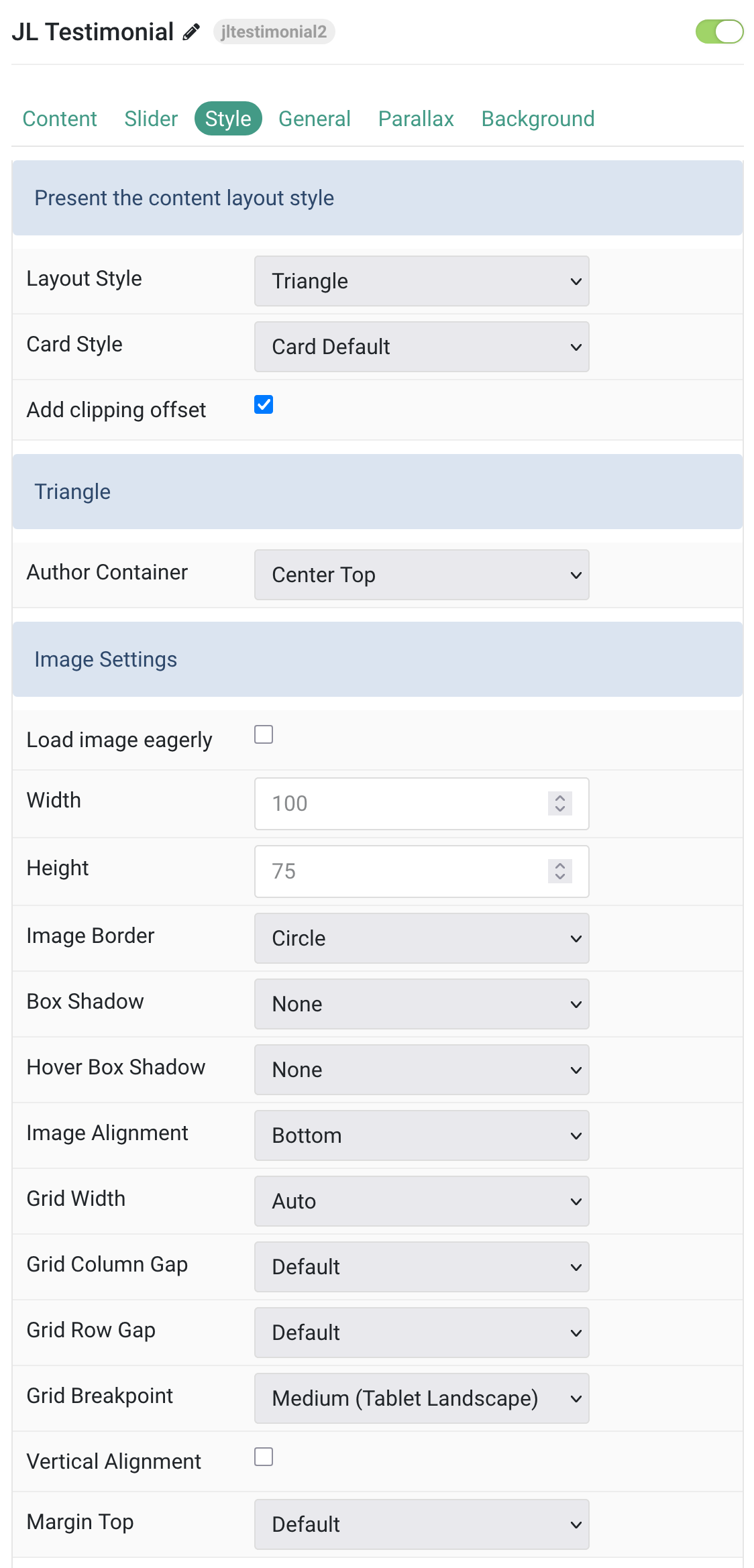
Tab Style
| Settings | Description |
|---|---|
| Layout Style | Select the layout presentation style for the content. |
| Card Style | Select one of the boxed card styles or a blank card. |
| Add clipping offset | Since the slider effect needs a clipping container, box shadows of content items are also clipped. Check this option to widen the container to prevent box-shadows from clipping. |
| Author Container | Select alignment for the author’s Container. |
| Load image eagerly | By default, images are loaded lazy. Enable eager loading for images in the initial viewport. |
| Width | Set the width of the image. |
| Height | Set the height of the image. |
| Image Border | Select the image’s border style. |
| Box Shadow | Select the image’s box shadow size. |
| Hover Box Shadow | Select the image’s box shadow size on hover. |
| Image Alignment | Align the image to the top, left, right or place it between the title and the content. |
| Grid Width | Define the width of the image within the grid. Choose between percent and fixed widths or expand columns to the width of their content. |
| Grid Column Gap | Set the size of the gap between the image and the content. |
| Grid Row Gap | Set the size of the gap if the grid items stack. |
| Grid Breakpoint | Set the breakpoint from which grid cells will stack. |
| Vertical Alignment | Vertically center grid cells. |
| Margin Top | Set the top margin. Note that the margin will only apply if the content field immediately follows another content field. |
| Vote Alignment | Select where to position the voting controls relative to other content elements. |
| Vote Margin Top | Set the top margin for voting controls. Note that the margin will only apply if the content field immediately follows another content field. |
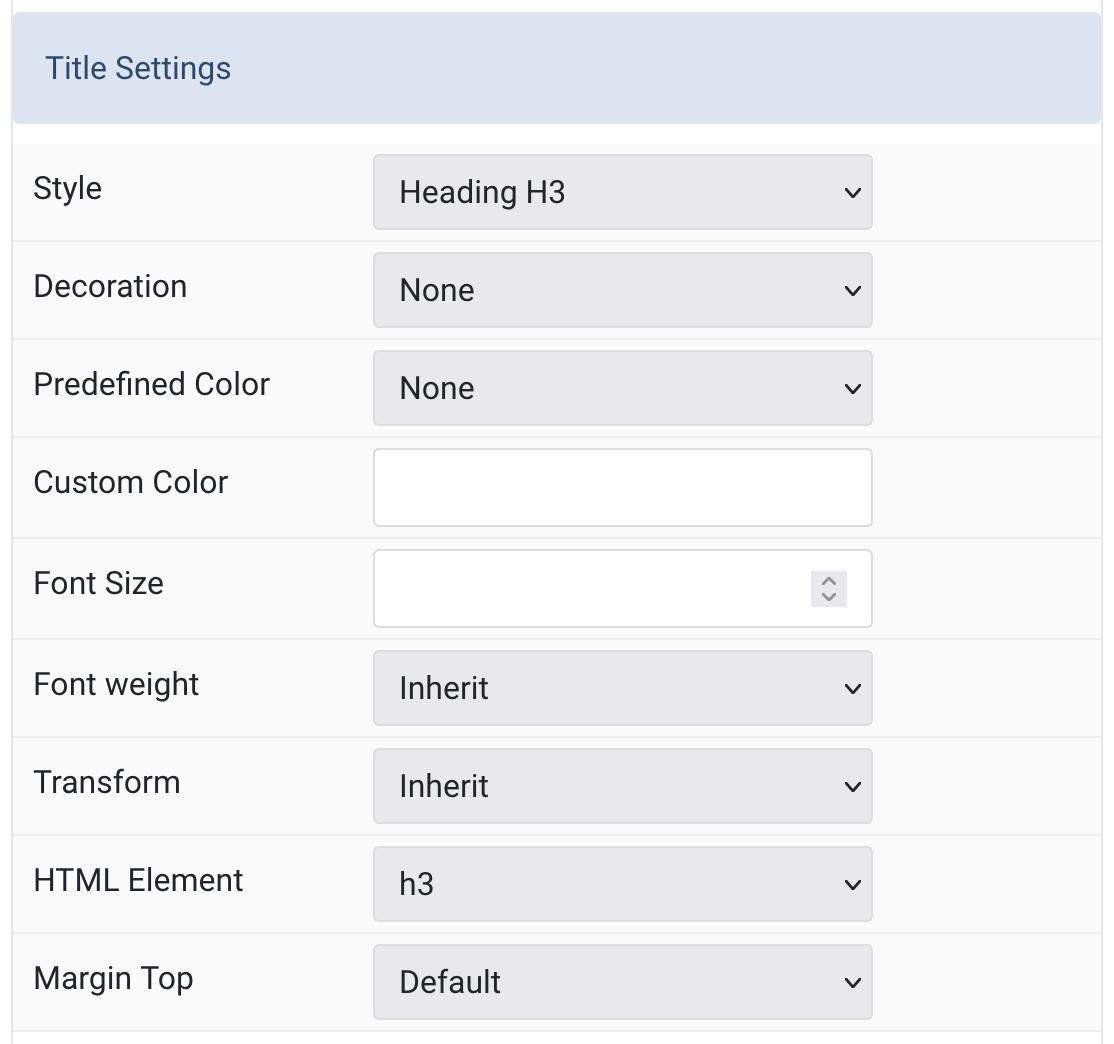
Title Settings Common settings for Title Style
| Settings | Description |
|---|---|
| Title Style | Title styles differ in font-size but may also come with a predefined color, size and font. |
| Title Decoration | Decorate the headline with a divider, bullet or a line that is vertically centered to the heading. |
| Title Predefined Color | Select the text color. If the Background option is selected, styles that don’t apply a background image use the primary color instead. |
| Title Custom Color | Customize the title color instead using predefined title color mode. Note: You need to set the predefined color to None to use the customize color option. |
| Title Font Size | Customize the title text font size. |
| Title Font Weight | Add one of the following classes to modify the font weight of your text. |
| Title Transform | The following options will transform text into uppercased, capitalized or lowercased characters. |
| Title HTML Element | Choose one of the elements to fit your semantic structure. |
| Title Margin Top | Set the top margin. Note that the margin will only apply if the content field immediately follows another content field. |
Meta Settings Common settings for Meta Style
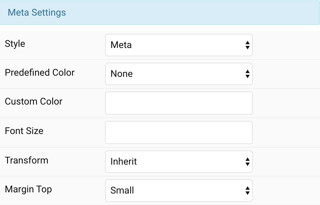
| Settings | Description |
|---|---|
| Meta Style | Select a predefined meta text style, including color, size and font-family. |
| Meta Predefined Color | Select the predefined meta color. |
| Meta Custom Color | Customize the meta color. You need to set the Predefined color to None before using the color customization. |
| Meta Font Size | Customize the meta text font size. |
| Meta Transform | The following options will transform text into uppercased, capitalized or lowercased characters. |
| Meta Margin Top | Set the top margin. Note that the margin will only apply if the content field immediately follows another content field. |
Content Settings Common settings for Content Style
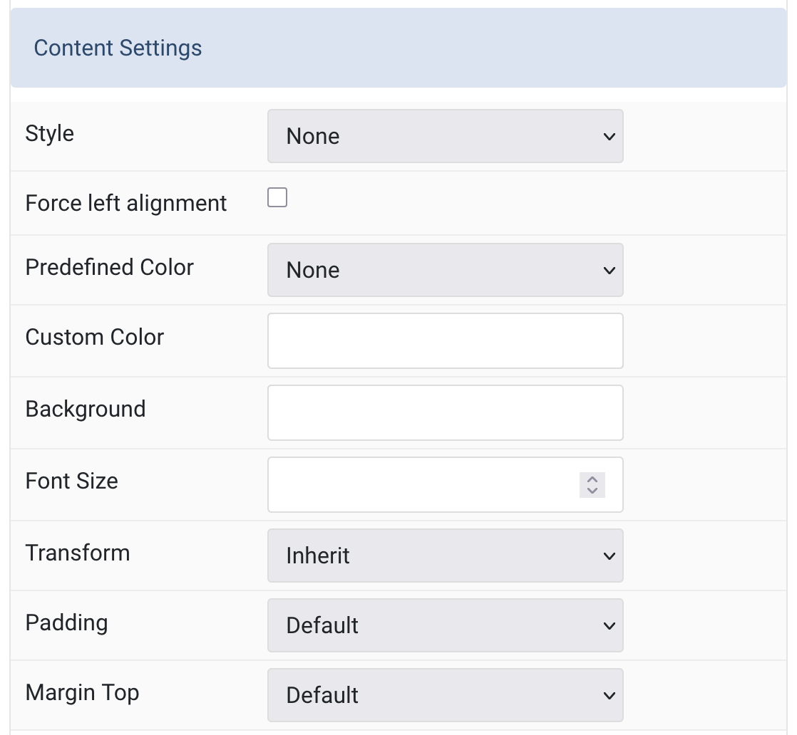
| Settings | Description |
|---|---|
| Content Style | Select a predefined content text style, including color, size and font-family. |
| Force left alignment | Force left alignment for content text. |
| Content Predefined Color | Select the text color. If the Background option is selected, styles that don’t apply a background image use the primary color instead. |
| Content Custom Color | Customize the description color instead using predefined text color. You need to set the Predefined color to None before using the color customization. |
| Content Background | Set custom background color for content. |
| Content Font Size | Customize the content text font size. |
| Content Transform | The following options will transform text into uppercased, capitalized or lowercased characters. |
| Content Padding | Set the padding for content. |
| Content Margin Top | Set the top margin. Note that the margin will only apply if the content field immediately follows another content field. |
Body/Link Settings Common settings for Body and Link Style
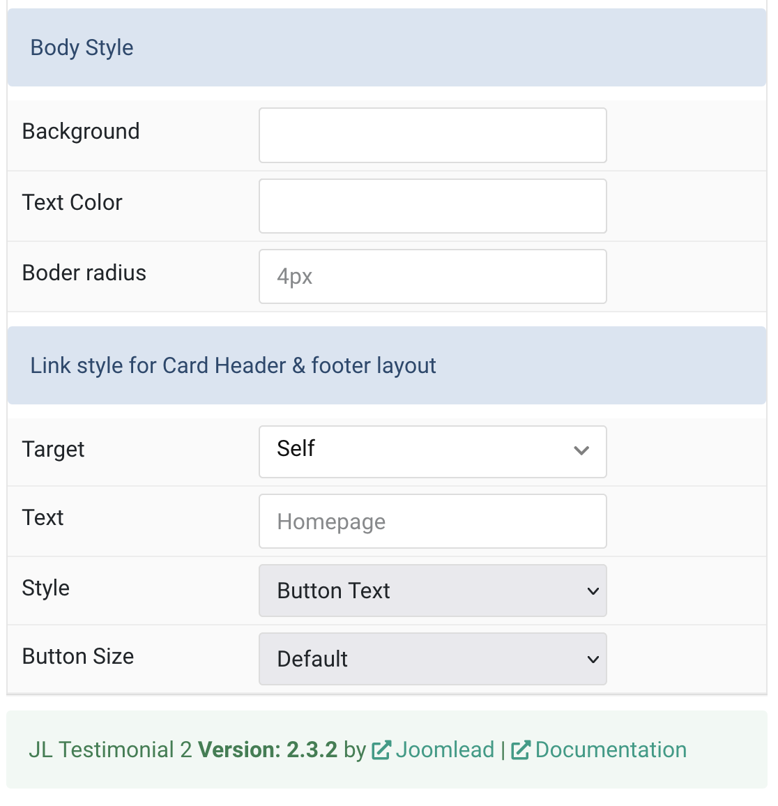
| Settings | Description |
|---|---|
| Body Background | Custom body background color. |
| Body Text Color | Custom text color. |
| Border Radius | Custom border radius in rem|em|px. |
| Link Target | Open the link in a same or new window. |
| Link Text | Specify the button label. |
| Link Style | Set the button style. |
| Button Size | Set the button size. |
General, Parallax and Parallax Background tab
Please take a look the documentation here for more detail about these tabs settings

Comments