
Instafeed Particle
# Instafeed Package contents
| Files | Description |
|---|---|
| jlinstafeed.yaml | Contains the Instafeed particle settings. |
| jlinstafeed.html.twig | The Twig template used to render the Instafeed layout and connector endpoint. |
| js/jlinstafeed.min.js | Native JavaScript controller used to load and render Instagram media. |
Installation Installing the particle on your website is a simple process. You can refer to the document here to know more.
Requirements Instafeed requires Uikit 3 for Gantry 5 Atom to be installed and enabled in your theme layout settings.
JL Connector
JL Connector handles the communication between your website and Instagram. The particle requests media from your local connector endpoint, while the Instagram credential remains on the server.
Install JL Connector
Joomla
- Download the JL Connector package for Joomla.
- Go to System → Install → Extensions.
- Upload and install the JL Connector package.
- Go to System → Plugins.
- Find JL Connector and enable it.
WordPress
- Download the JL Connector package for WordPress.
- Go to Plugins → Add New Plugin → Upload Plugin.
- Upload and install the JL Connector ZIP package.
- Activate the JL Connector plugin.
- Open the JL Connector settings.
Grav
- Install JL Connector as a Grav plugin.
- Enable JL Connector from Grav Admin.
- Make sure the Grav API plugin is installed and enabled.
- Open the JL Connector configuration.
Configure Instagram
| Setting | Description |
|---|---|
| Instagram Access Token | Enter the valid Instagram Access Token used by JL Connector to request media. |
| Cache | Use the connector’s server-side Instagram cache when available. Caching reduces repeated requests and can improve page performance. Newly published media may remain cached until the configured cache period expires. |
| Request Timeout | If available in your JL Connector version, this controls how long the server waits for the Instagram request to complete. |
Installation
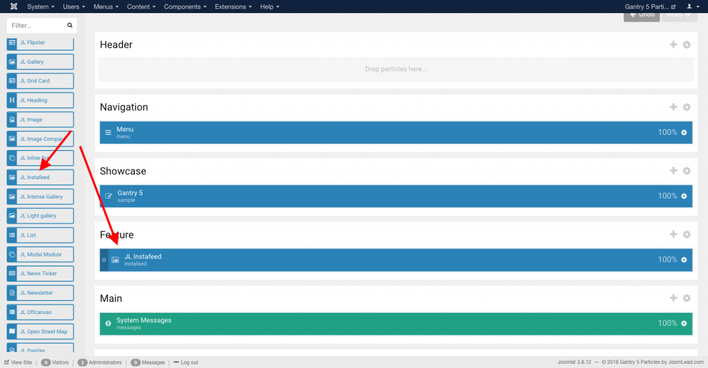
Go to Template/Theme Settings > select the Layout to add Instafeed (i.e: Home) -> Layout tab -> Drag and drop the Instafeed Particle from the Particles panel to the section where you want to display the feed.
Settings
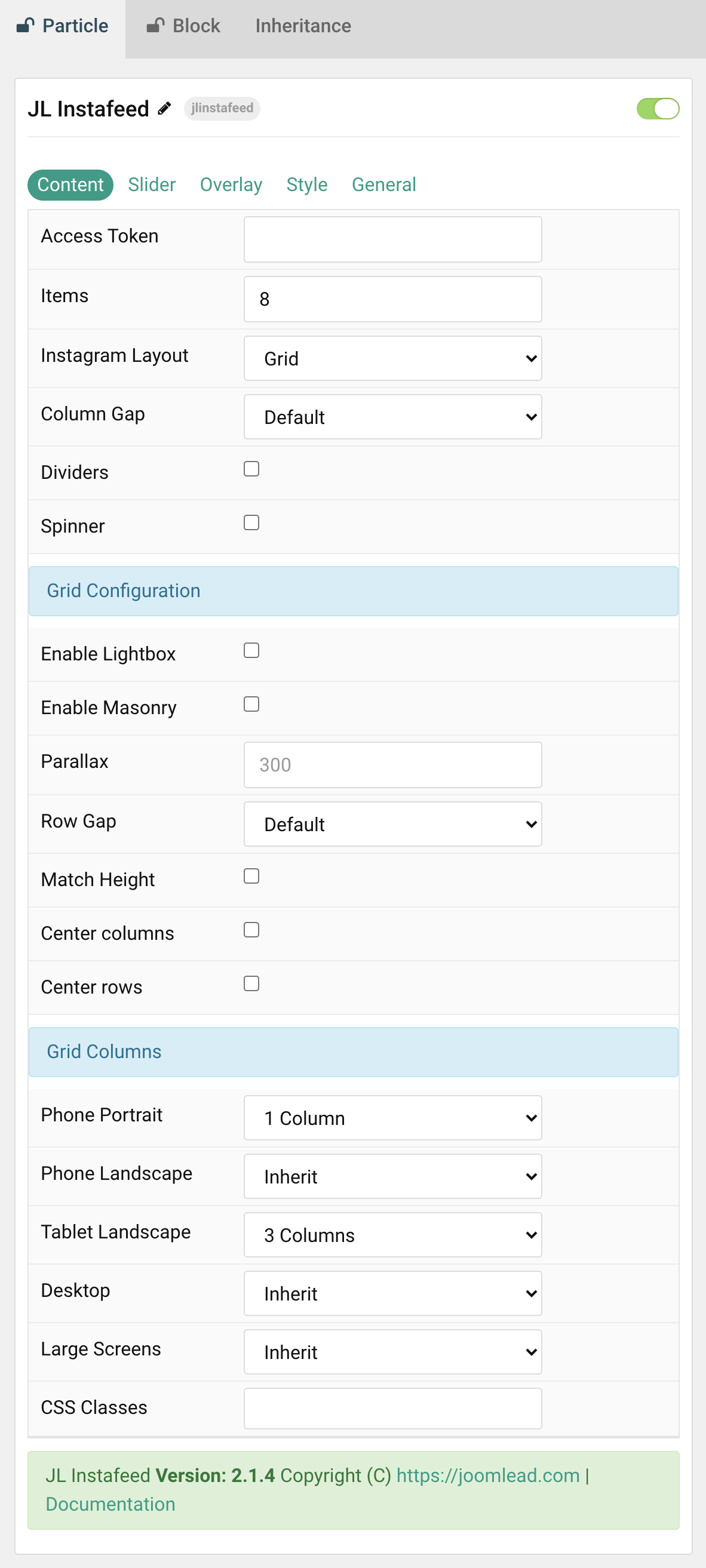
Content
| Setting | Description |
|---|---|
| Items | Set the number of Instagram media items to display. |
| Instagram Layout | Choose between Grid and Slider mode. |
| Column Gap | Set the size of the gap between grid or slider columns. |
| Dividers | Display dividers between grid cells or slider columns. |
| Spinner | Display an animated loading spinner while media is being fetched. |
Grid Configuration
| Setting | Description |
|---|---|
| Enable Lightbox | Open Instagram media in a responsive Lightbox gallery. |
| Enable Masonry | Create a masonry layout that reduces gaps between items with different heights. |
| Parallax | Move individual grid columns at different speeds while scrolling. The value defines the vertical offset in pixels. |
| Row Gap | Set the vertical gap between grid rows. |
| Match Height | Match the height of the direct child elements of each grid cell. |
| Center Columns | Center the grid columns. |
| Center Rows | Center the grid row content. |
Grid Columns
| Setting | Description |
|---|---|
| Phone Portrait | Set the number of grid columns for each breakpoint. Inherit uses the value from the next smaller screen size. |
| Phone Landscape | |
| Tablet Landscape | |
| Desktop | |
| Large Screens |
Slider Tab
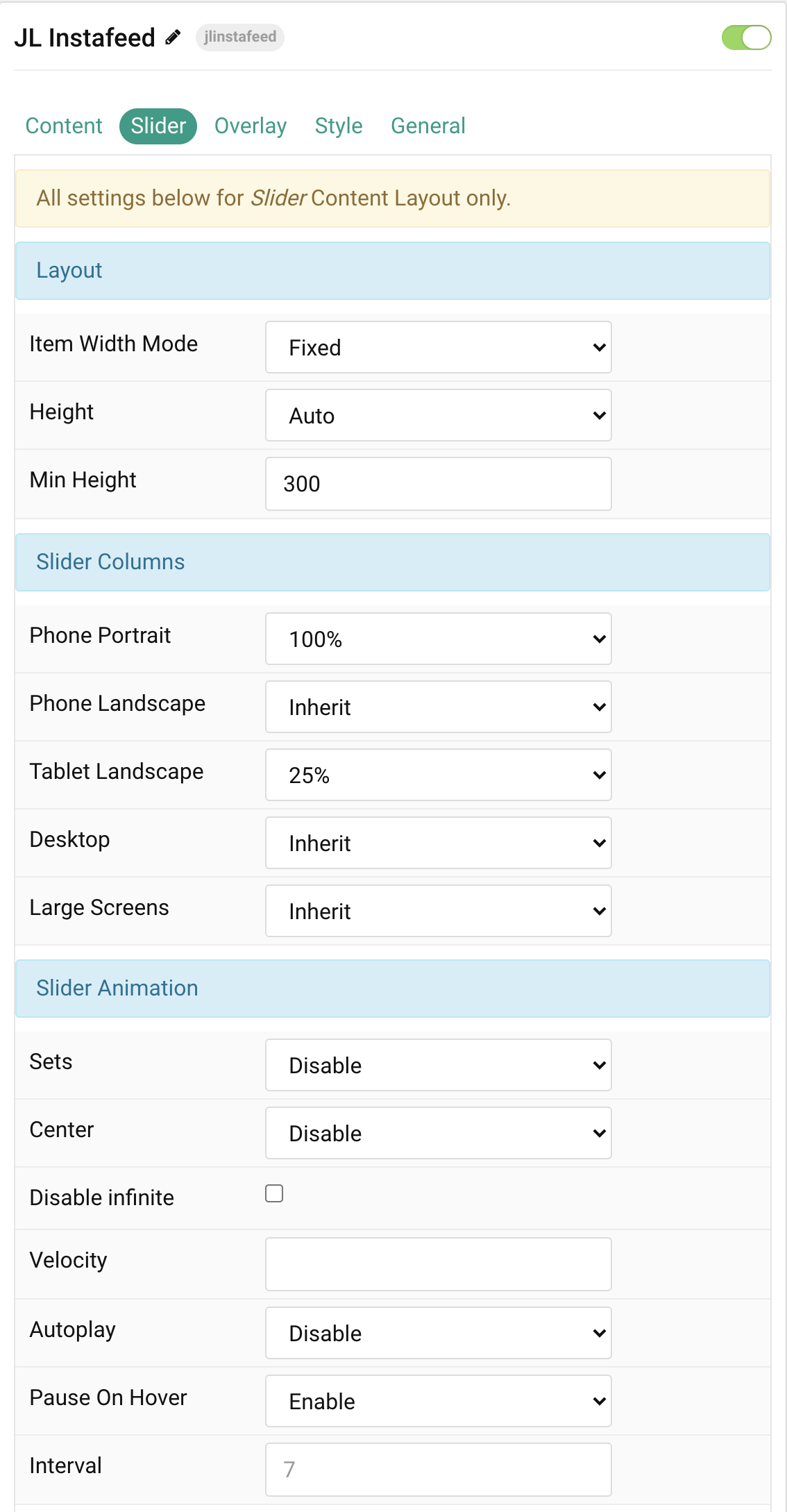
Layout The settings below apply to Slider mode only.
| Setting | Description |
|---|---|
| Item Width Mode | Define whether slider item widths are fixed or automatically determined by their content. Height and responsive Item Width settings do not apply to Auto mode. |
| Height | Let the slider height adapt to its content or use a viewport-based height. When using a viewport option, avoid setting a conflicting height on the section. |
| Min Height | Set an optional minimum height for the slider. This is useful on smaller devices. It applies when Fixed Item Width and a viewport-based Height are selected. |
Slider Columns
Set Item Width Mode to Fixed to use these responsive item width settings.
| Setting | Description |
|---|---|
| Phone Portrait | Set the item width for each breakpoint. Inherit uses the value from the next smaller screen size. |
| Phone Landscape | |
| Tablet Landscape | |
| Desktop | |
| Large Screens |
Slider Animation
| Setting | Description |
|---|---|
| Sets | Slide all visible items together. The number of items in a set depends on the defined item width. |
| Center | Center the active slide. |
| Disable Infinite | Disable infinite scrolling between items. |
| Velocity | Set slider movement velocity in pixels per millisecond. The available range is 20–300. |
| Autoplay | Enable automatic slider movement. |
| Pause On Hover | Pause autoplay while hovering over the slider. |
| Interval | Set the autoplay interval in seconds. The available range is 5–15 seconds. |
Navigation
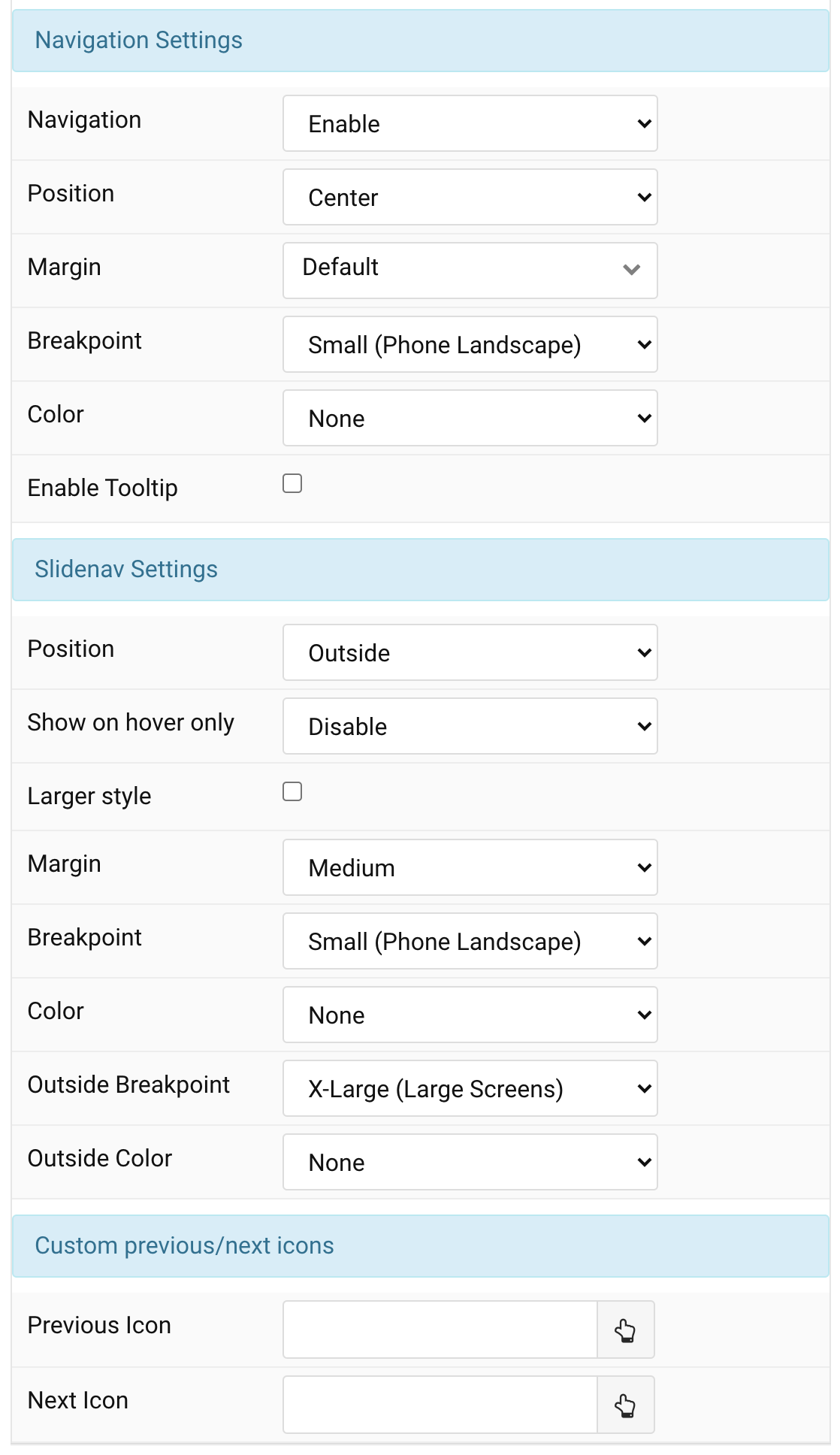
| Setting | Description |
|---|---|
| Navigation | Enable or disable slider dot navigation. |
| Position | Align navigation items to the left, center, or right. |
| Margin | Set the vertical margin between the slider and navigation. |
| Breakpoint | Display navigation from the selected device width and larger. |
| Color | Set the navigation color mode. |
| Enable Tooltip | Display the navigation tooltip on hover. |
Slidenav
| Setting | Description |
|---|---|
| Position | Select the Slidenav position. |
| Show on Hover Only | Show Slidenav controls only while hovering over the slider. |
| Larger Style | Increase the size of the Slidenav icons. |
| Margin | Set the margin between the Slidenav and slider container. |
| Breakpoint | Display Slidenav from the selected device width and larger. |
| Color | Set the normal Slidenav color mode. |
| Outside Breakpoint | Display Slidenav outside the slider from the selected device width and larger. Below that breakpoint it remains inside. |
| Outside Color | Set the color mode used when Slidenav is displayed outside the slider. |
| Previous Icon | Select a custom Previous icon. |
| Previous SVG Code | Add custom SVG markup for the Previous icon. |
| Next Icon | Select a custom Next icon. |
| Next SVG Code | Add custom SVG markup for the Next icon. |
Overlay Tab
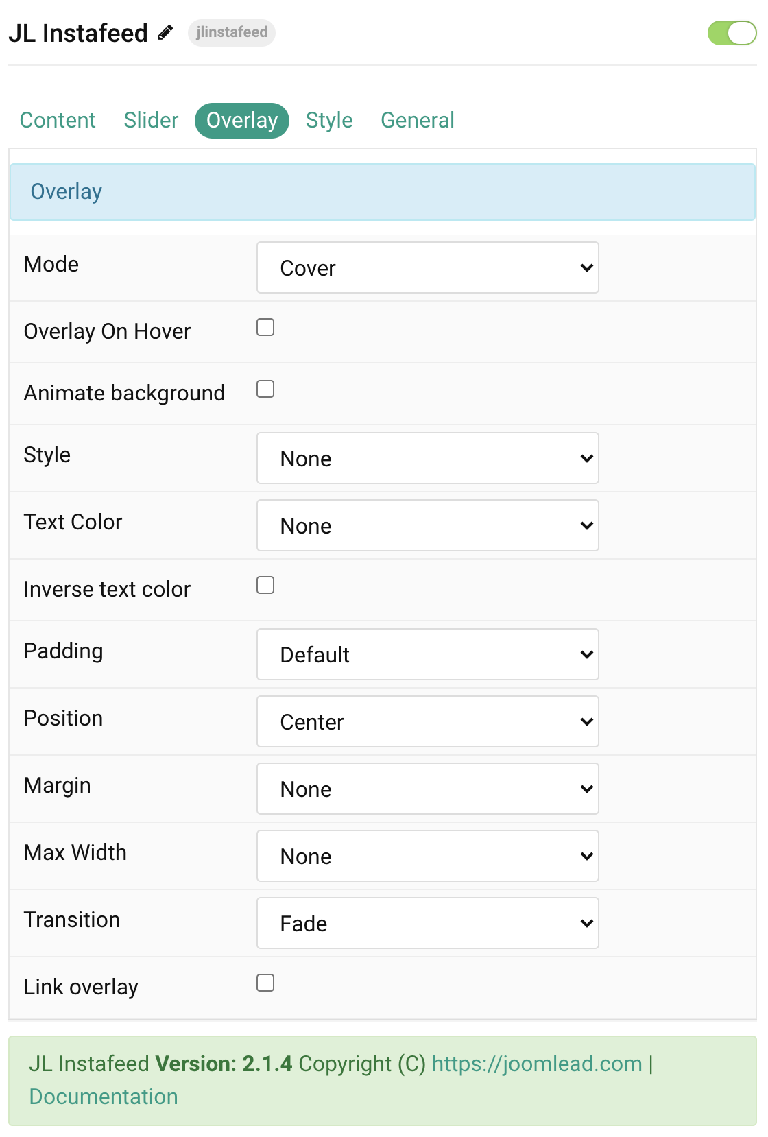
| Setting | Description |
|---|---|
| Mode | Choose Cover or Caption mode. Cover mode requires an appropriate text color. |
| Overlay On Hover | Display the content overlay only on hover. |
| Animate Background | Animate the overlay background on hover. |
| Style | Select the predefined overlay style. |
| Text Color | Set the light or dark text color mode. |
| Inverse Text Color | Inverse the text color on hover. |
| Padding | Set the padding between the overlay and its content. |
| Position | Select the overlay content position. |
| Margin | Apply a margin between the overlay and image container when supported by the selected overlay style. |
| Max Width | Set the maximum content width. |
| Transition | Select the transition used when the overlay appears. |
| Link Overlay | Make the whole overlay clickable when a valid media permalink exists. |
Style Tab
Image Settings Common settings for Instafeed images.
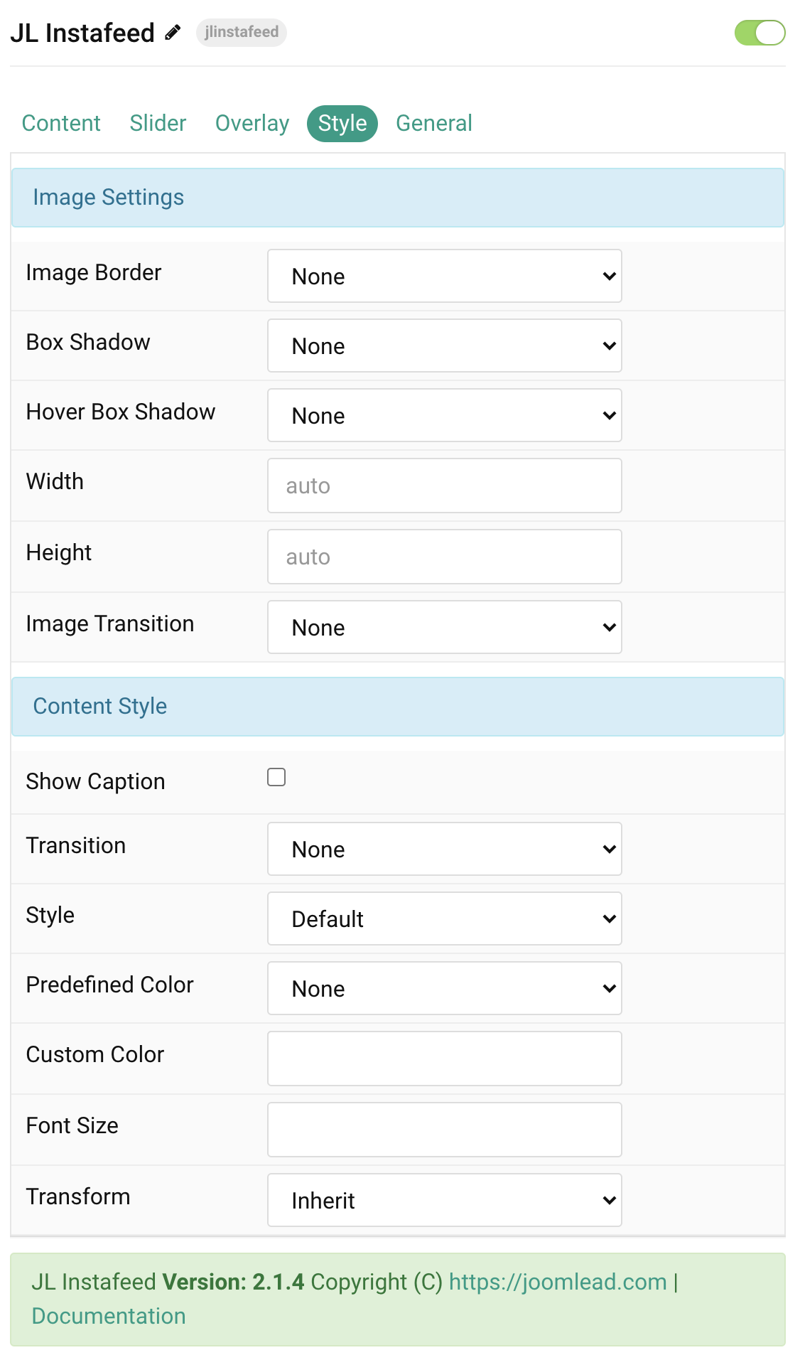
| Setting | Description |
|---|---|
| Load Image Eagerly | Load initial-viewport images eagerly. Images are lazy-loaded by default. |
| Image Border | Select the image border style. |
| Box Shadow | Select the default image shadow size. |
| Hover Box Shadow | Select the image shadow size on hover. |
| Width | Set an optional image width. |
| Height | Set an optional image height. |
| Image Transition | Select an image hover transition. |
Content Settings Common settings for captions and overlay content.
| Setting | Description |
|---|---|
| Show Caption | Display the Instagram caption in the overlay content. |
| Transition | Select the transition used when content appears. |
| Style | Select a predefined text style. |
| Predefined Color | Select a predefined text color. |
| Custom Color | Set a custom content color instead of the predefined color. |
| Font Size | Set a custom content font size. |
| Transform | Transform text to uppercase, capitalize, or lowercase. |
Slidenav Style
| Setting | Description |
|---|---|
| Background | Set the Slidenav background color. |
| Color | Set the Slidenav icon color. |
| Padding Horizontal | Set horizontal Slidenav padding. |
| Padding Vertical | Set vertical Slidenav padding. |
| Border Radius | Set the Slidenav border radius. |
| Hover Background | Set the Slidenav background color on hover. |
| Hover Color | Set the Slidenav icon color on hover. |
General, Parallax and Parallax Background tabs
Please take a look at the documentation here for more detail about these common settings.
Upgrade from Previous Versions
- Install and enable JL Connector for your platform.
- Configure your Instagram Access Token in JL Connector.
- Update JL Instafeed to the current version.
- Remove the old
instafeed.min.jsintegration if it was added manually. - Do not add the Instagram Access Token to the particle or frontend JavaScript.
- Keep your existing Grid, Slider, Overlay, Style, and General settings.
- Save the layout and test the feed on the frontend.
Performance
- Keep the Items value limited to the amount of media you actually need.
- Use JL Connector’s server-side Instagram cache when appropriate.
- Keep Load Image Eagerly disabled unless images are needed in the initial viewport.
- Avoid excessive animation or parallax on pages containing many feed items.
- Use responsive image dimensions where possible.
Using Multiple Instafeed Particles
You can place multiple Instafeed particles on the same page. Each particle can use different Grid/Slider, responsive column, Overlay, Style, Lightbox, and navigation settings while sharing the Instagram credential configured in JL Connector.
Troubleshooting
The feed does not display
- Make sure JL Instafeed is enabled.
- Make sure JL UIkit 3 Atom is enabled.
- Make sure JL Connector is installed and enabled.
- Check that a valid Instagram Access Token is configured in JL Connector.
- Confirm that the particle is placed in the correct Gantry Outline.
The particle loads but no media appears
- Check whether the Instagram Access Token has expired or been revoked.
- Make sure your server can make outbound HTTPS requests.
- Check security or firewall plugins if they block the local connector endpoint.
- Check the browser console for connector request errors.
New Instagram posts do not appear immediately
If Instagram caching is enabled in JL Connector, the feed can continue using the cached response until the configured cache period expires. Reduce the cache duration while testing if necessary.
Lightbox does not open
- Make sure Enable Lightbox is enabled.
- Make sure JL UIkit 3 Atom is loaded.
- Check that the returned media contains a usable media URL.
- Check for unrelated JavaScript errors that could prevent UI components from initializing.
Slider does not autoplay
- Make sure Instagram Layout is set to Slider.
- Make sure Autoplay is enabled.
- Make sure there are enough items for the slider to move.
- Review Sets, Center, and Disable Infinite if the current combination leaves no additional items to navigate.
Outside Slidenav is not visible
- Set Slidenav Position to Outside.
- Check the Outside Breakpoint.
- Make sure the parent section does not clip overflowing content.
- Check that the selected Slidenav color has sufficient contrast.

Comments