Instafeed Particle
# Instafeed Package contents
| Files | Description |
|---|---|
| jlinstafeed.yaml | Contains the Instafeed particle settings. |
| jlinstafeed.html.twig | The Twig file to pull information, settings. |
| instafeed.min.js | Contains the Instafeed JavaScript library. |
Installation Installing the particle on your website is a really simple process. You can refer to the document here to know more.
Requirements Instafeed requires Uikit 3 for Gantry 5 Atom to be installed and enabled in your theme layout settings.
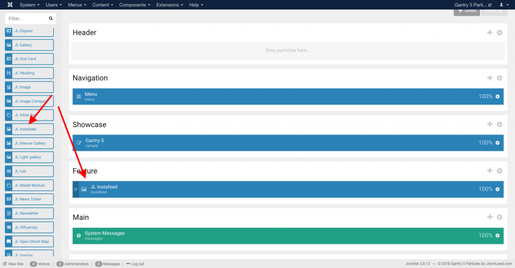
Go to Template/Theme Settings > select the Layout to add Animated Text particle (i.e: Home) -> Layout tab -> Drag and drop the Instafeed Particle from Particles panel (left corner) to the section you want to display Instafeed.
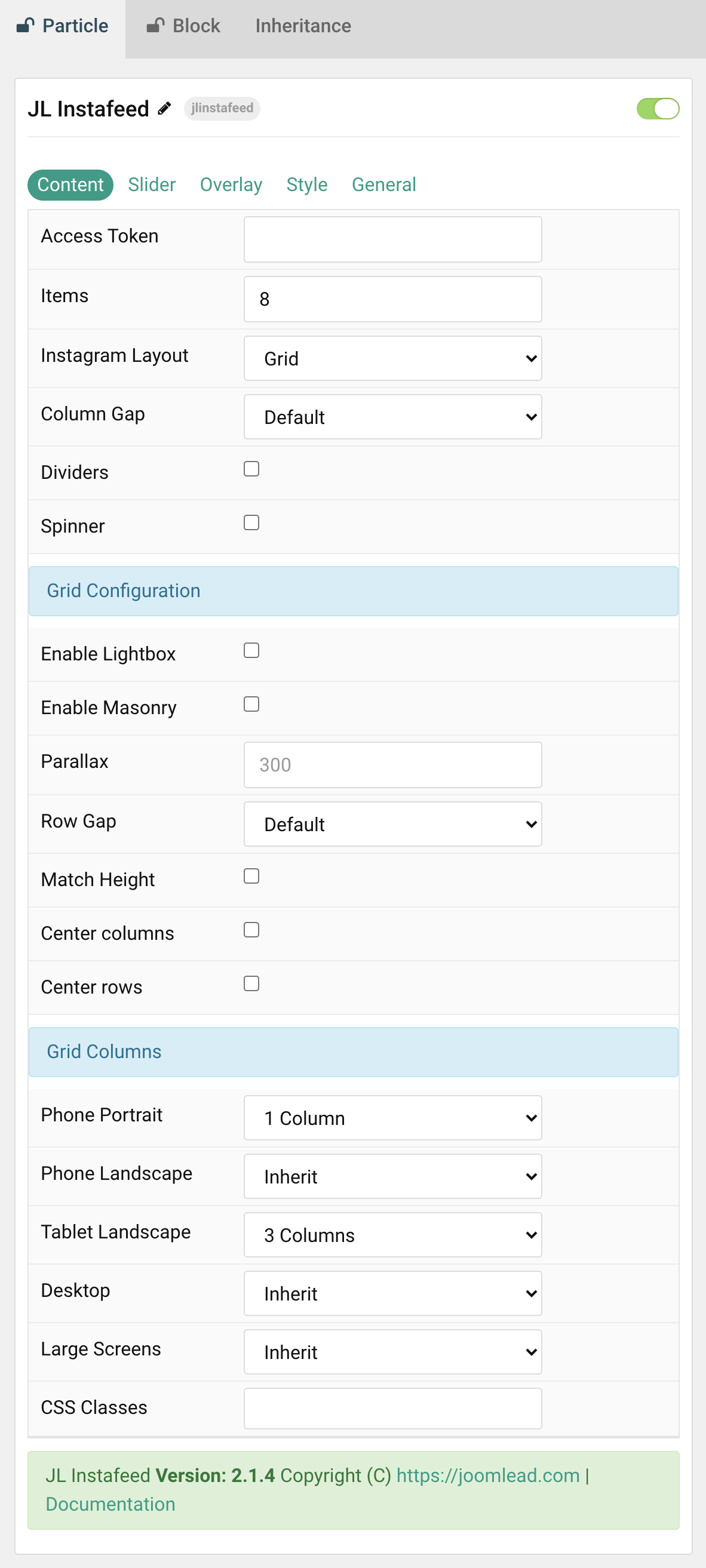
Settings
| Setting | Description |
|---|---|
| Access Token | Required. The Instagram access token using Instagram Basic Display API |
| Items | Number image items to show. |
| Instagram Layout | Present the Instagram layout with Grid or Slider mode. |
| Column Gap | Set the size of the gap between the grid/slider columns. |
| Dividers | Display dividers between grid cells or slider columns. |
| Spinner | Create an animated loading spinner while fetching images from Instagram. |
| Dividers | Display dividers between grid cells or slider columns. |
| Grid Configuration | Content layout for Instafeed |
| Enable Lightbox | Create a responsive lightbox gallery with images. |
| Enable Masonry | The masonry effect creates a layout free of gaps even if grid cells have different heights. |
| Parallax | The parallax effect moves single grid columns at different speeds while scrolling. |
| Row Gap | Set the size of the gap between the grid rows. |
| Match Height | To match the height of the direct child of each cell. |
| Center columns | Center the grid columns. |
| Center rows | Center the grid rows content. |
| Grid Columns | Common settings for Grid Columns Layout |
| Phone Portrait | Set the number of grid columns for each breakpoint. Inherit refers to the number of columns on the next smaller screen size. |
| Phone Landscape | |
| Tablet Landscape | |
| Desktop | |
| Large Screens | |
| CSS Classes | CSS class name for the particle. |
Tab Slider
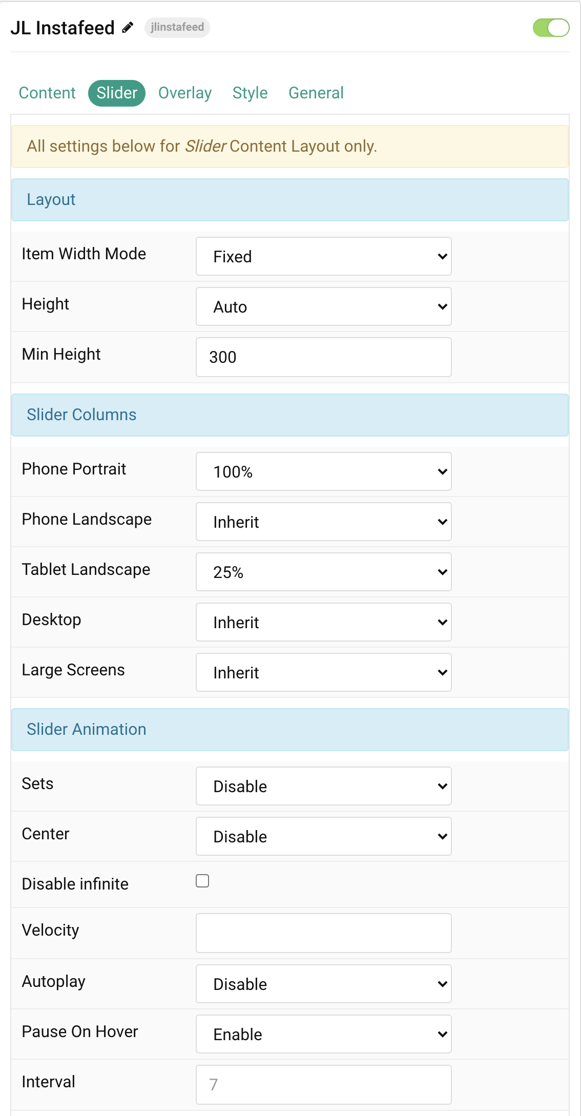
Layout All settings below for Instafeed Slider mode Layout only.
| Settings | Description |
|---|---|
| Item Width Mode | Define whether the width of the slider items is fixed or automatically expanded by its content widths. NOTE: The Height settings and Item Width columns are not working for the AUTO Item Width Mode. |
| Height | The height will adapt automatically based on its content. Alternatively, the height can adapt to the height of the view port. This option won’t have any effect unless FIXED Item Width Mode is selected. Note: Make sure, no height is set in the section settings when using on of the viewport options. |
| Min Height | Use an optional minimum height to prevent the slider from becoming smaller than its content on small devices. This option won’t have any effect unless FIXED Item Width Mode and Viewport Height are selected. |
Slider Columns Common settings for Columns – Set Item Width Mode to FIXED to use these settings.
| Settings | Description |
|---|---|
| Phone Portrait | Set the item width for each breakpoint. Inherit refers to the item width of the next smaller screen size. |
| Phone Landscape | |
| Tablet Landscape | |
| Desktop | |
| Large Screens |
Slider Animation Common settings for Slider Animation.
| Settings | Description |
|---|---|
| Set | Slide all visible items at once. Group items into sets. The number of items within a set depends on the defined item width, e.g. 33% means that each set contains 3 items. |
| Center | Center the active slide. |
| Disable infinite | Disable infinite scrolling between items. |
| Velocity | Set the velocity in pixels per millisecond. Min 20, Max 300 |
| Autoplay | Enable autoplay for slider items. |
| Pause On Hover | Pause autoplay on hover. |
| Interval | Set the autoplay interval in seconds. Min 5 Max 15. |
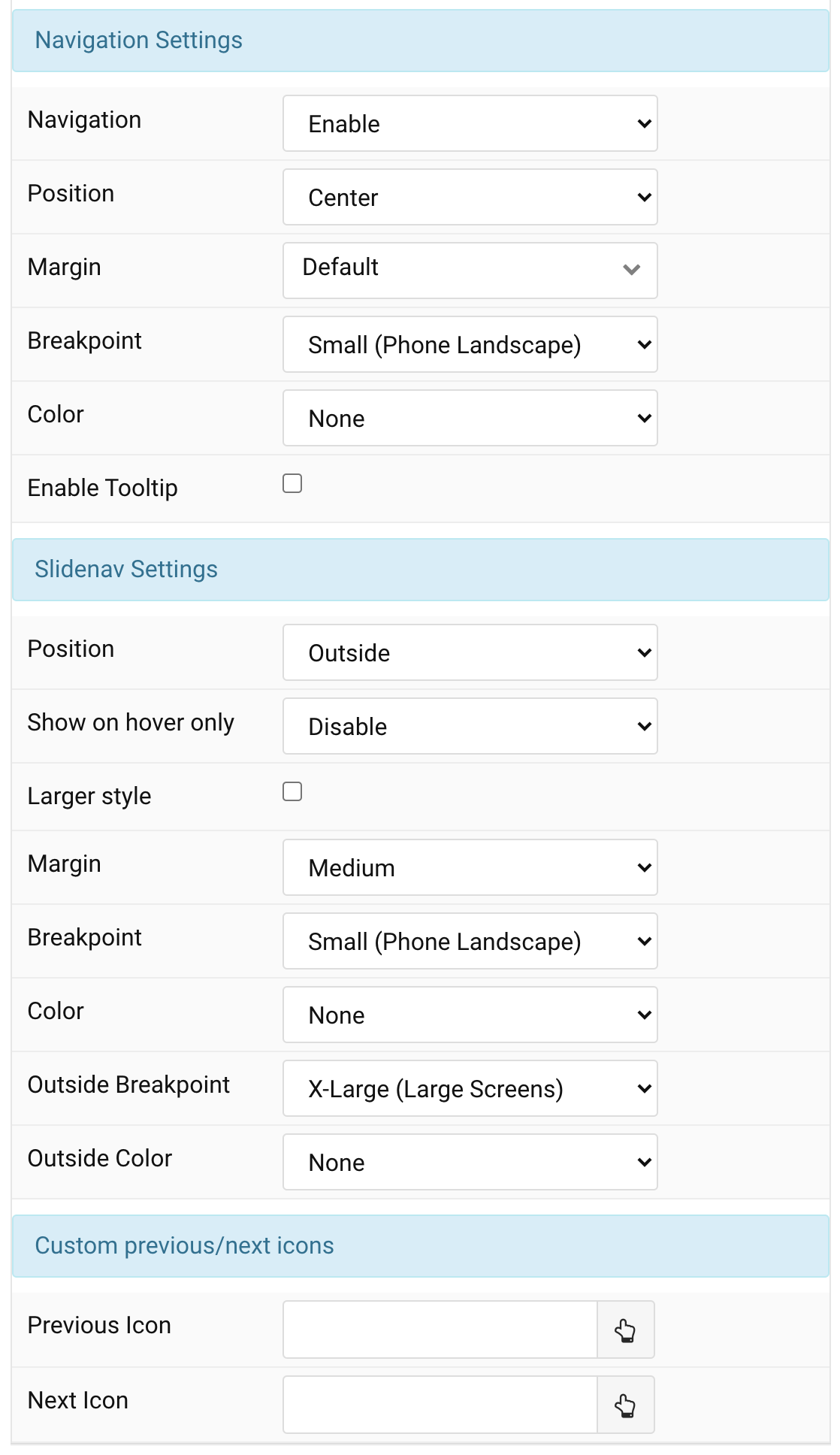
Navigation/Slidenav Common settings for Slider Navigation and Slidenav.
| Settings | Description |
|---|---|
| Navigation | Select the navigation type. |
| Position | Align the navigation’s items. |
| Margin | Set the vertical margin. |
| Breakpoint | Display the navigation only on this device width and larger. |
| Color | Set light or dark color mode. |
| Show Tooltip | Display Image ALT as tooltip when hovering. |
Slidenav Common settings for Slidenav.
| Settings | Description |
|---|---|
| Position | Select the position of the slidenav. |
| Show On Hover | Show the slidenav on hover only. |
| Larger style | To increase the size of the slidenav icons. |
| Margin | Apply a margin between the slidenav and the slider container. |
| Breakpoint | Display the slidenav only on this device width and larger. |
| Color | Set light or dark color mode. |
| Outside Breakpoint | Display the slidenav only outside on this device width and larger. Otherwise it will be displayed inside. |
| Outside Color | Set light or dark color if the slidenav is outside of the slider. |
| Custom Slidenav Icons | Custom previous/next icons (replace default Slidenav navigation) |
| Previous Icon | An icon picker to choose custom Previous icon |
| Next Icon | An icon picker to create choose custom Next icon |
| CSS Classes | CSS class name for the particle. |
Overlay Tab
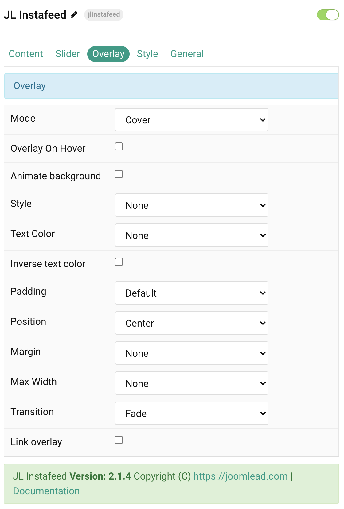
| Settings | Description |
|---|---|
| Mode | When using cover mode, you need to set the text color manually. |
| Overlay on hover | Display content overlay on hover. |
| Animate background | Animate background only on hover. |
| Style | Select the style for the overlay. |
| Text Color | Set light or dark color mode for text, buttons and controls (Cover mode) |
| Inverse text color | Inverse the text color on hover. |
| Padding | Set the padding between the overlay and its content. |
| Position | Select the overlay or content position. |
| Margin | Apply a margin between the overlay and the image container if the overlay style is Selected. |
| Max Width | Set the maximum content width. |
| Overlay Transition | Select a transition for the overlay when it appears on hover (support 15 transition effects). |
| Link overlay | Link the whole overlay if a link exists. |
Tab Style
Image Settings Common settings for images.
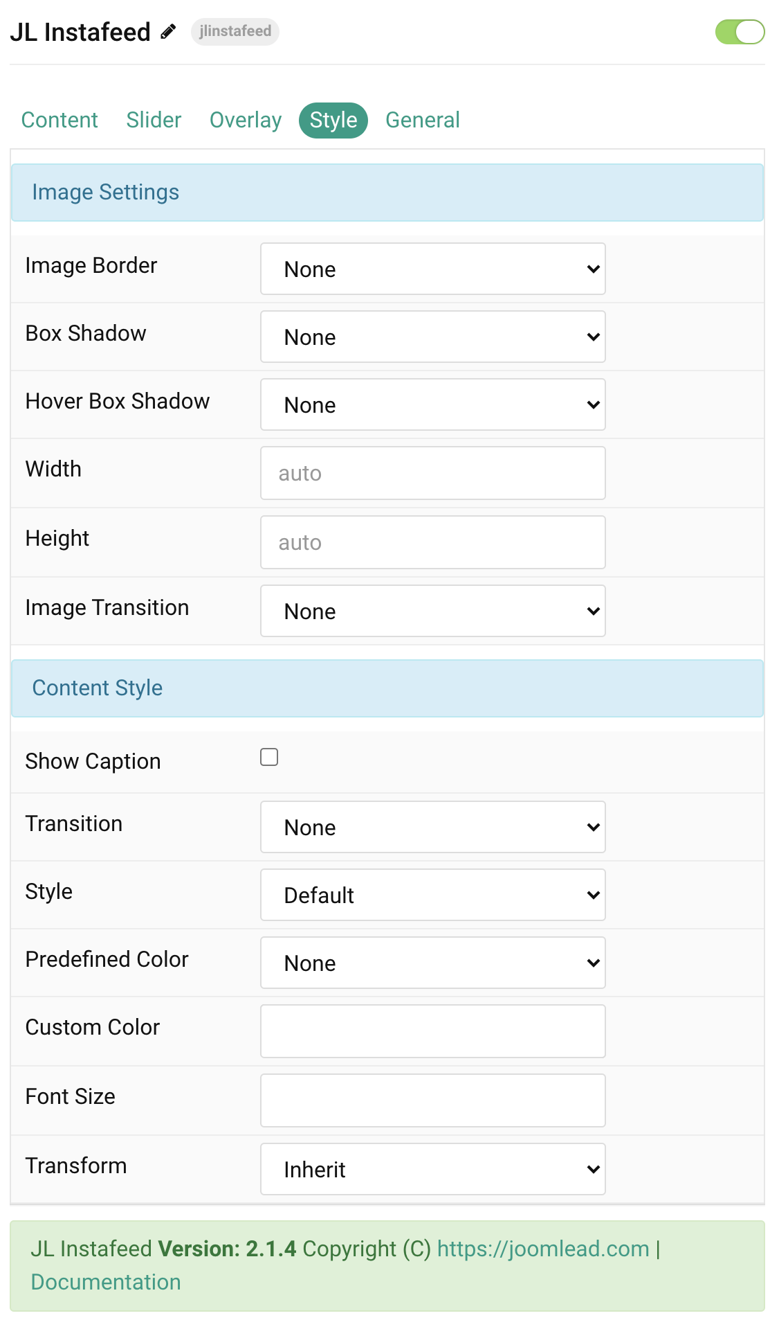
| Settings | Description |
|---|---|
| Image Border | Select the image’s border style. |
| Box Shadow | Select the image’s box shadow size. |
| Hover Box Shadow | Select the image’s box shadow size on hover. |
| Image Transition | Select an image transition. If the hover image is set, the transition takes place between the two images. If None is selected, the hover image fades in. |
| Width | Enter the image’s width. |
| Height | Enter the image’s height. |
Content Settings Common settings for content.
| Settings | Description |
|---|---|
| Show Caption | Show the Instagram Caption text on overlay hover mode. |
| Transition | Select a transition for the content when the overlay appears on hover. |
| Style | Select a predefined text style, including color, size and font-family. |
| Predefined Color | Select the predefined meta color. |
| Content Color | Customize the content color instead using predefined text color. You need to set the predefined color to None to use the customize color option. |
| Font Size | Customize the content text font size. |
| Transform | The following options will transform text into uppercased, capitalized or lowercased characters. |
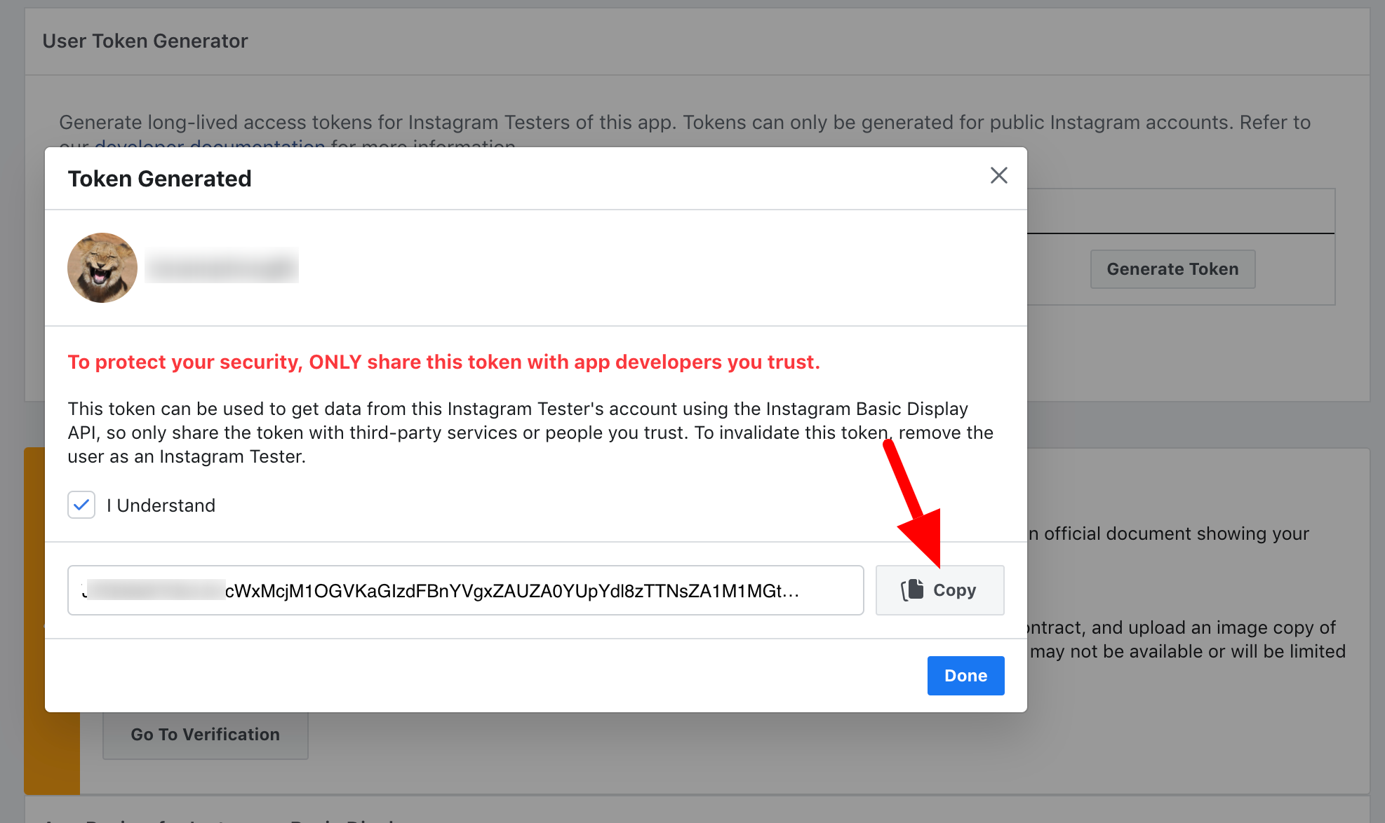
Instagram access token
Screenshots Example:
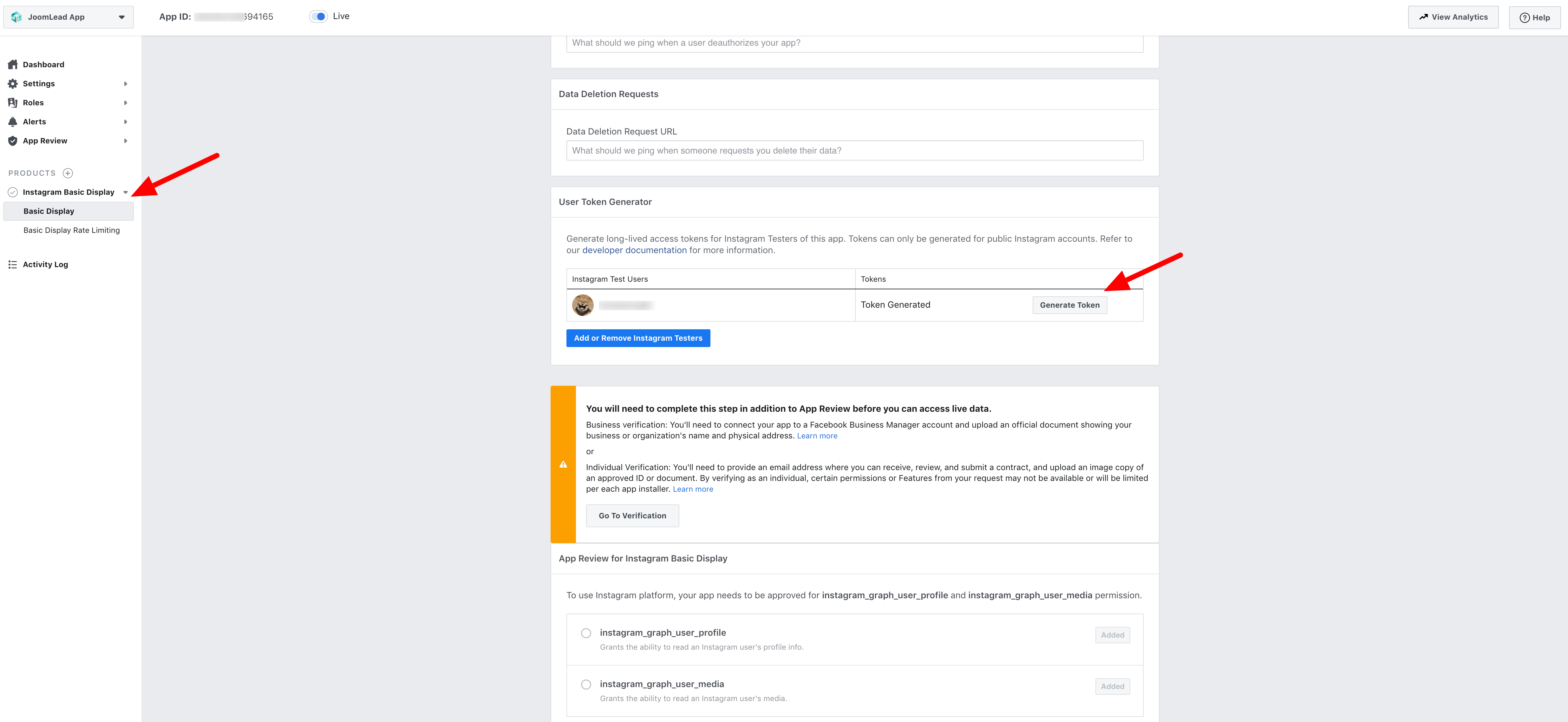
To authorize Instafeed to fetch your media you’ll need to create a Facebook app, and add your Instagram user account as a test user:
- Follow steps 1 – 3 here: Facebook Basic Display API guide
- Use the User Token Generator to create a starting access token.
There’re two ways to keep your Instagram Basic Display API token fresh
- – Using Instagram Token Agent, its FREE and require the Skill level
- – Using 3rd service like Instant-Tokens.Com
General, Parallax and Parallax Background tab
Please take a look the documentation here for more detail about these tabs settings
Last updated Nov 06 2020
Comments