Accordion Joomla/WordPress/Grav Particle
-
# Accordion Joomla Package contents
Files Description jlaccordionjoomla.yaml Contains the Accordion Joomla particle settings. jlaccordionjoomla.html.twig The Twig file to pull information, settings. -
# Accordion WordPress Package contents
Files Description jlaccordionwp.yaml Contains the Accordion Joomla particle settings. jlaccordionwp.html.twig The Twig file to pull information, settings. -
# Accordion Grav Package contents
Files Description jlaccordiongrav.yaml Contains the Accordion Joomla particle settings. jlaccordiongrav.html.twig The Twig file to pull information, settings.
Installation Installing the particle on your website is a really simple process. You can refer to the document here to know more.
Requirements Accordion Joomla/Wordpress/Grav particles require Uikit 3 for Gantry 5 Atom to be installed and enabled in your theme layout settings.
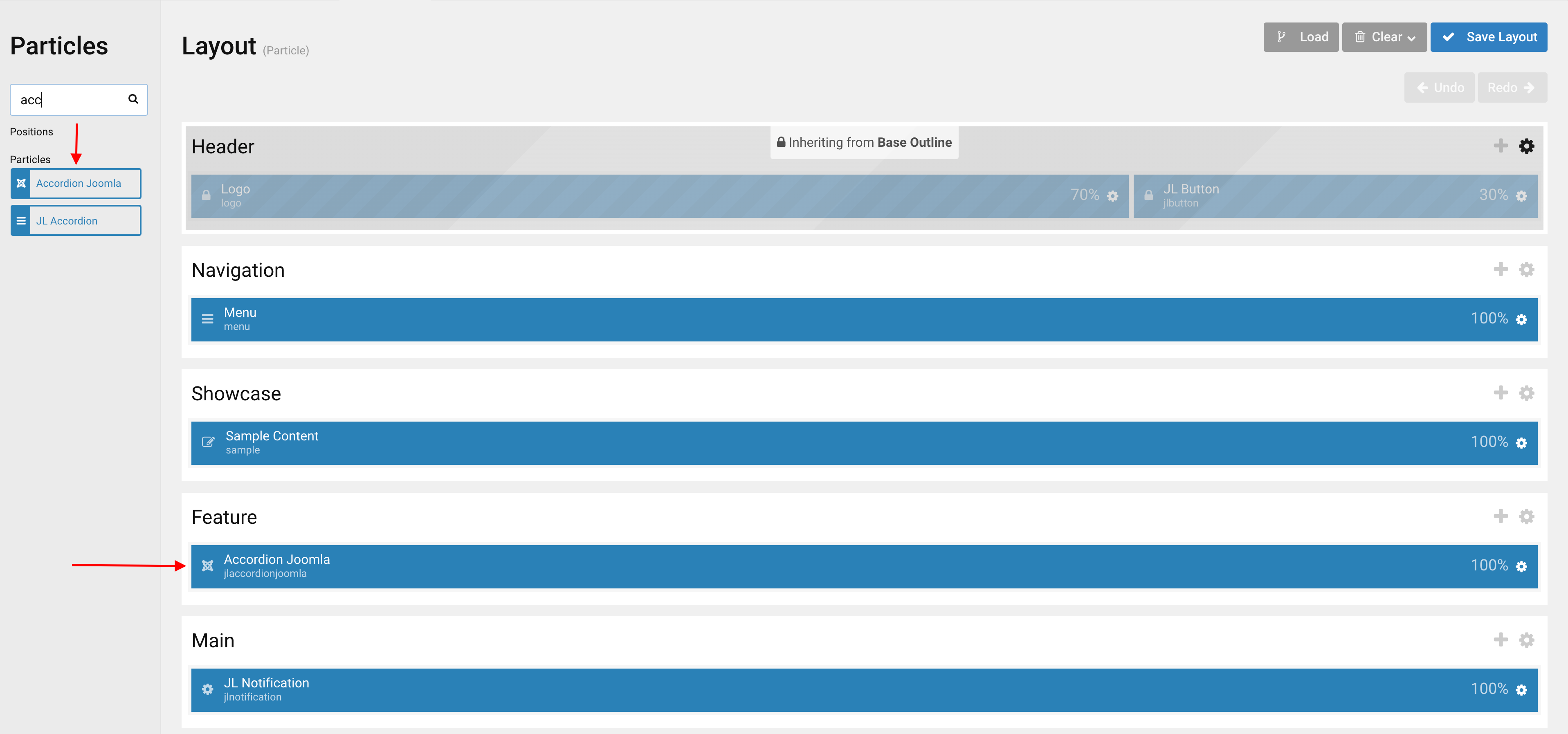
Go to Template/Theme Settings > select the Layout to add Accordion Joomla particle (i.e: Home) -> Layout tab -> Drag and drop the Accordion Joomla Particle from Particles panel (left corner) to the section you want to display the particle.
Settings
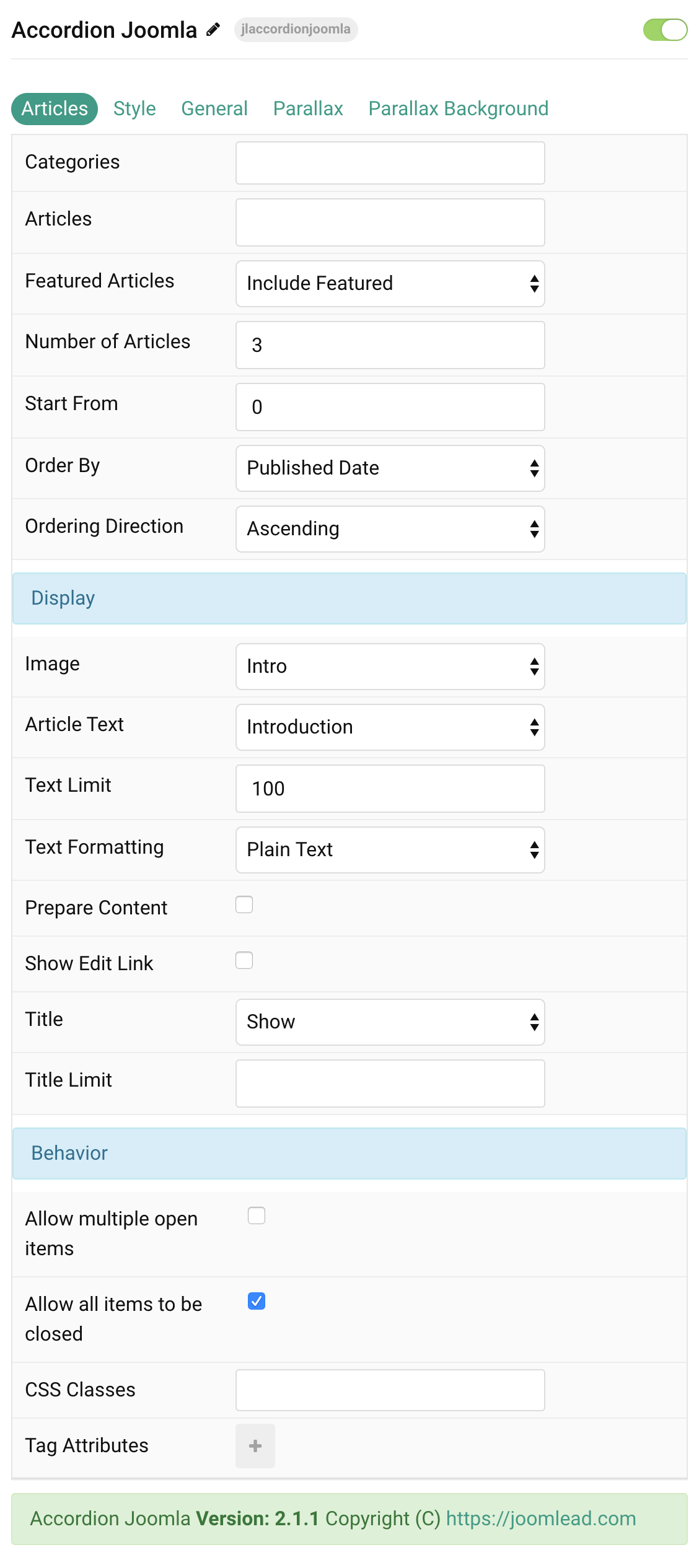
Articles Tab
| Settings | Description |
|---|---|
| Categories | Select the categories the articles should be taken from. |
| Articles | Enter the Joomla articles that should be shown. It should be a list of article IDs separated with a comma (i.e. 1,2,3,4,5). |
| Featured Articles | Select how Featured articles should be filtered. |
| Number of Articles | Enter the maximum number of articles to display. |
| Start From | Enter offset specifying the first article to return. The default is ‘0’ (the first article). |
| Order By | Select how the articles should be ordered by. |
| Ordering Direction | Select the direction the articles should be ordered by. |
| Display Style Settings | Common settings for Display Style |
| Image | Select if and what image of the article should be shown. |
| Article Text | Select if and how the article text should be shown. |
| Text Limit | Type in the number of characters the article text should be limited to. |
| Text Formatting | Select the formatting you want to use to display the article text. |
| Prepare Content | Use Joomla Content Plugins |
| Show Edit Link | Display a link to the article edit form |
| Title | Select if the article title should be shown. |
| Title Limit | Enter the maximum number of characters the article title should be limited to. |
| Accordion Behavior | Common settings for Accordion Behavior |
| Allow multiple open items | Allow multiple open items on click. |
| Allow all items to be closed | Allow all items to be closed on click. |
| CSS Classes | CSS class name for the particle. |
| Tag Attributes | Extra Tag attributes. See more info here. |
Tab Style
Title Settings Common settings for Title Style
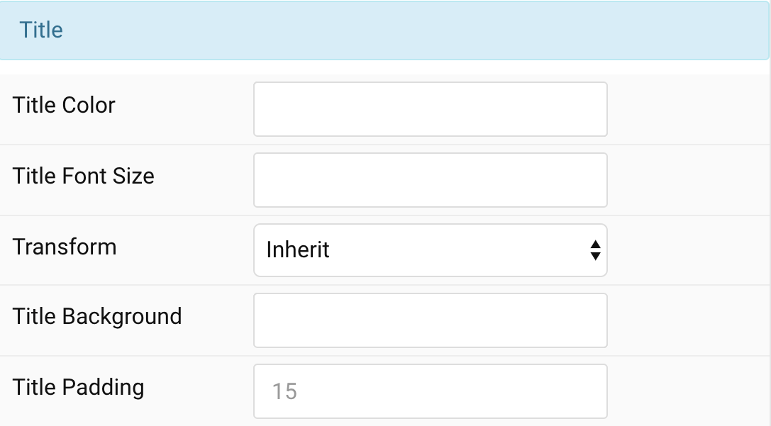
| Settings | Description |
|---|---|
| Title Color | Customize the title color. |
| Title Font Size | Customize the title text font size. |
| Transform | The following options will transform text into uppercased, capitalized or lowercased characters. |
| Title Background | Customize the title background color. |
| Padding | Customize the padding for title if background color is selected. |
Meta Settings Common settings for Meta
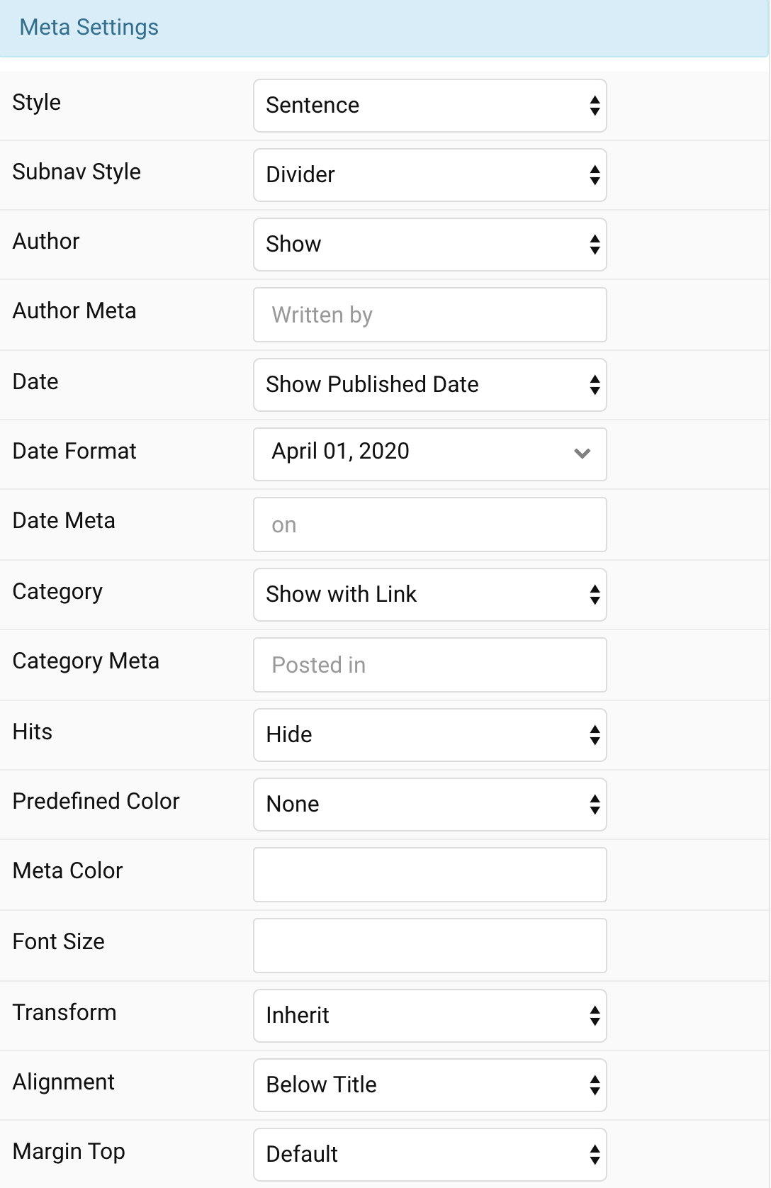
| Settings | Description |
|---|---|
| Style | Display the meta text in a sentence or a horizontal list. |
| Subnav Style | Select the subnav style for Meta List Style. |
| Author | Select if the article author should be shown. |
| Author Meta | Translate or replace the Author meta text for Sentence Style. Default: Written by |
| Date | Select if the article date should be shown. |
| Date Format | Select preferred date format. Leave empty not to display a date. |
| Date Meta | Translate or replace the Date meta text for Sentence Style. Default: on |
| Category | Select if and how the article category should be shown. |
| Category Meta | Translate or replace the Category meta text for Sentence Style. Default: Posted in |
| Hits | Select if the article hits should be shown. |
| Predefined Color | Select the predefined meta color. |
| Custom Color | Customize the meta color. Set Predefined Color for Meta to None before using this feature. |
| Font Size | Customize the title text font size. |
| Transform | The following options will transform text into uppercased, capitalized or lowercased characters. |
| Alignment | Align the meta text above/below the title or below the content. |
| Margin Top | Set the top margin. Note that the margin will only apply if the content field immediately follows another content field. |
Content Settings Common settings for Content Style
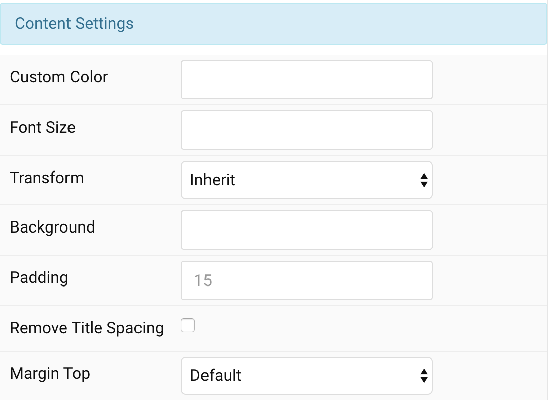
| Settings | Description |
|---|---|
| Custom Color | Customize the content color. |
| Font Size | Customize the content text font size. |
| Transform | The following options will transform text into uppercased, capitalized or lowercased characters. |
| Background | Customize the content background color. |
| Padding | Customize the padding for content. |
| Remove Title Spacing | Remove the title and content spacing. |
| Margin Top | Set the top margin. Note that the margin will only apply if the content field immediately follows another content field. |
Image Settings Common settings for Image Style
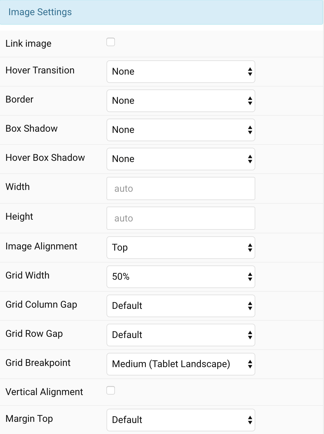
| Settings | Description |
|---|---|
| Link image | Link the image if a link exists. |
| Hover Transition | Set the hover transition for a linked image. |
| Border | Select the image’s border style. |
| Box Shadow | Select the image’s box shadow size. |
| Hover Box Shadow | Select the image’s box shadow size on hover. |
| Width | Enter the image’s width. |
| Height | Enter the image’s height. |
| Image Alignment | Align the image to the top,left, right or place it between the title and the content. |
| Grid Width | Define the width of the image within the grid. Choose between percent and fixed widths or expand columns to the width of their content. This option won’t have any effect unless Image Alignment is set to Left or Right. |
| Grid Column Gap | Set the size of the gap between the image and the content. This option won’t have any effect unless Image Alignment is set to Left or Right. |
| Grid Row Gap | Set the size of the gap if the grid items stack. This option won’t have any effect unless Image Alignment is set to Left or Right. |
| Grid Breakpoint | Set the breakpoint from which grid cells will stack. This option won’t have any effect unless Image Alignment is set to Left or Right. |
| Vertical Alignment | Vertically center grid cells. This option won’t have any effect unless Image Alignment is set to Left or Right. |
| Margin Top | Set the top margin. Note that the margin will only apply if the content field immediately follows another content field. This option won’t have any effect unless Image Alignment is set to Bottom or Between. |
Link Settings Common settings for Link Style
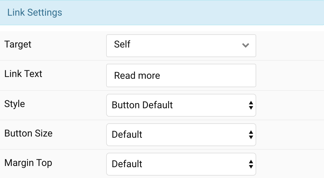
| Settings | Description |
|---|---|
| Target | Target browser window when item is clicked. |
| Link Text | Specify the button label. |
| Style | Set the button style. |
| Button Size | Set the button size. |
| Margin Top | Set the top margin. Note that the margin will only apply if the content field immediately follows another content field. |
General, Parallax and Parallax Background tab
Please take a look the documentation here for more detail about these tabs settings

Comments