Articles/Posts Gallery Documentation
-
# Articles Gallery Joomla Package contents
Files Description jlarticlegallery.yaml Contains the Articles Gallery Joomla particle settings. jlarticlegallery.html.twig The Twig file to pull information, settings. -
# Posts Gallery WordPress Package contents
Files Description jlpostgallerywp.yaml Contains the Posts Gallery WordPress particle settings. jlpostgallerywp.html.twig The Twig file to pull information, settings.
Installation Installing the particle on your website is a really simple process. You can refer to the document here to know more.
Requirements Article/Post Gallery require Uikit 3 for Gantry 5 Atom to be installed and enabled in your theme layout settings.
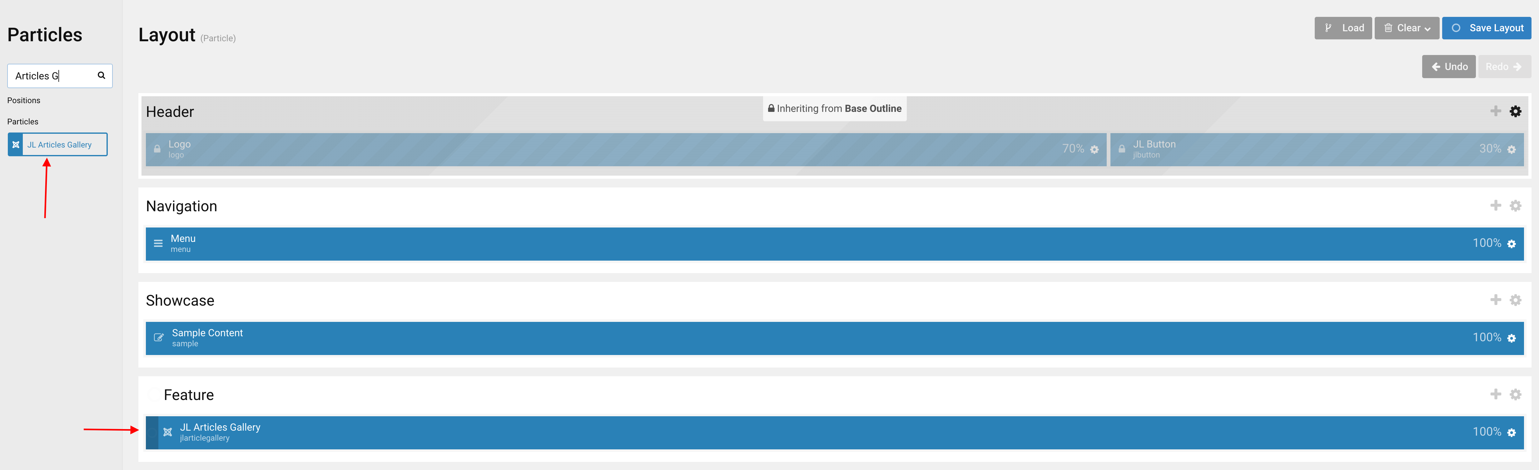
Go to Template/Theme Settings > select the Layout to add Articles Gallery particle (i.e: Home) -> Layout tab -> Drag and drop the Articles Gallery from Particles panel (left corner) to the section you want to display the particle.
Settings
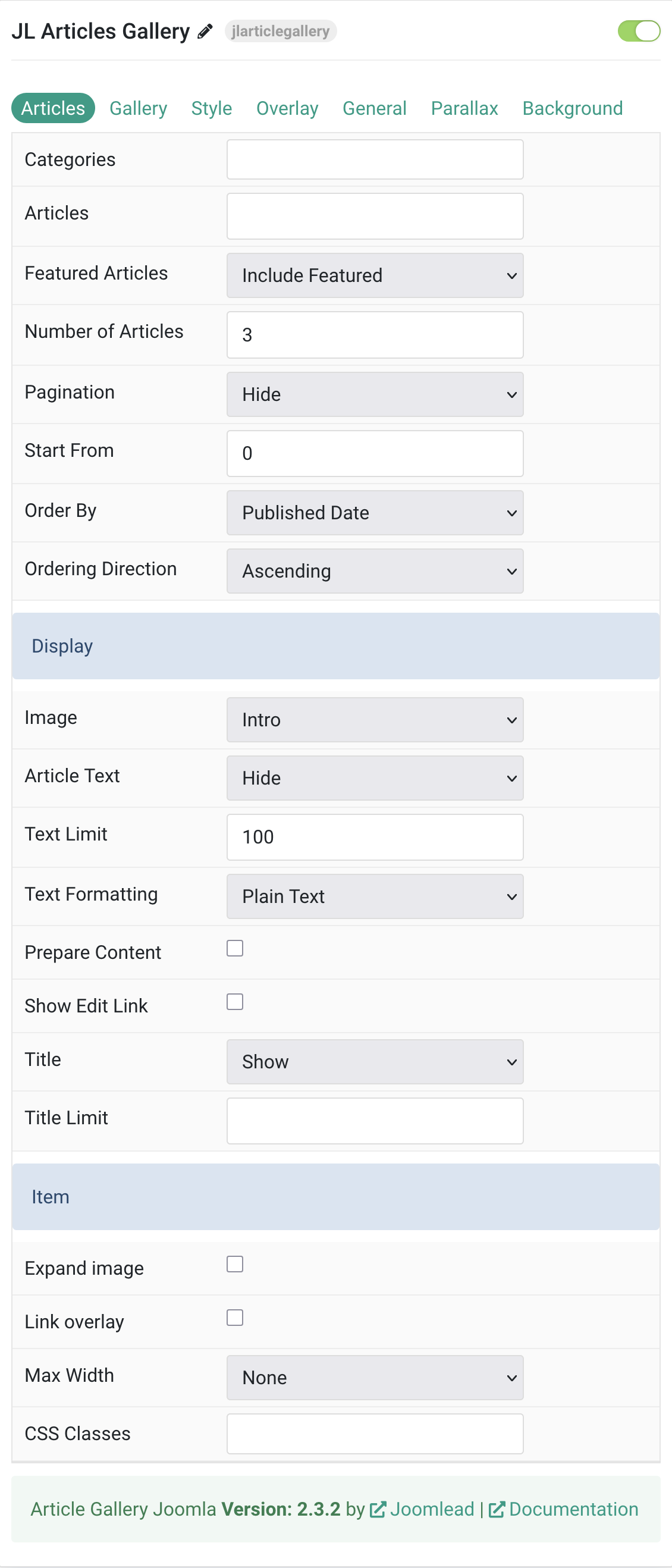
Articles Tab
| Settings | Description |
|---|---|
| Categories | Select the categories the articles should be taken from. |
| Articles | Enter the Joomla articles that should be shown. It should be a list of article IDs separated with a comma (i.e. 1,2,3,4,5). |
| Featured Articles | Select how Featured articles should be filtered. |
| Number of Articles | Enter the maximum number of articles to display. |
| Start From | Enter offset specifying the first article to return. The default is ‘0’ (the first article). |
| Order By | Select how the articles should be ordered by. |
| Ordering Direction | Select the direction the articles should be ordered by. |
| Display Style Settings | Common settings for Display Style |
| Image | Select if and what image of the article should be shown. |
| Article Text | Select if and how the article text should be shown. |
| Text Limit | Type in the number of characters the article text should be limited to. |
| Text Formatting | Select the formatting you want to use to display the article text. |
| Prepare Content | Use Joomla Content Plugins |
| Show Edit Link | Display a link to the article edit form |
| Title | Select if the article title should be shown. |
| Title Limit | Enter the maximum number of characters the article title should be limited to. |
Item Settings Common settings for Gallery item.
| Settings | Description |
|---|---|
| Expand image | Expand the height of the image to fill the available space in the item. |
| Link overlay | Link the whole overlay if a link exists. |
| Max Width | Set the maximum width. |
| CSS Classes | CSS class name for the particle. |
Tab Gallery
Gallery/Columns/Lightbox Common settings for Gallery and Columns Layout .
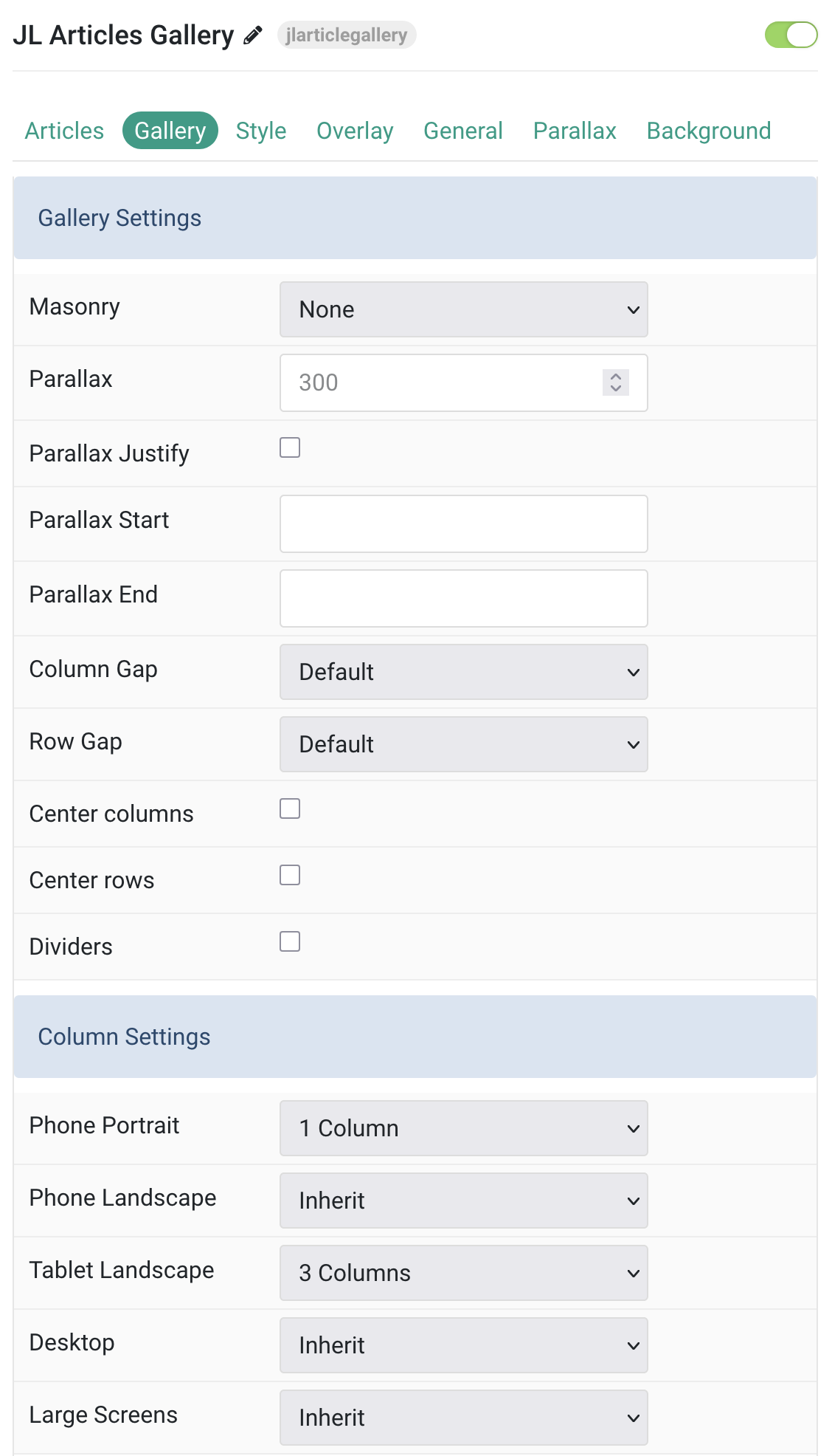
| Settings | Description |
|---|---|
| Gallery Settings | Common settings for Gallery Layout |
| Masonry | Configure masonry layout options for the gallery grid. |
| Parallax | The parallax effect moves single grid columns at different speeds while scrolling. Define the vertical parallax offset in pixels. |
| Parallax Justify | Enable justified alignment for parallax effect. |
| Parallax Start | The animation starts when the element enters the viewport. Optionally, set a start and end offset, e.g. 100px, 50vh or 50vh + 50%. Percent relates to the target’s height. |
| Parallax End | The animation ends when the element leaves the viewport. Optionally, set a start and end offset, e.g. 100px, 50vh or 50vh + 50%. Percent relates to the target’s height. |
| Column Gap | Set the size of the gap between the grid columns. |
| Row Gap | Set the size of the gap between the grid rows. |
| Center columns | Center align the grid columns. |
| Center rows | Center align the grid rows. |
| Dividers | Display dividers between grid cells. |
| Columns Settings | Columns control the Grid columns layout of your content. |
| Phone Portrait | Set the number of grid columns for each breakpoint. Inherit refers to the number of columns on the next smaller screen size. |
| Phone Landscape | |
| Tablet Landscape | |
| Desktop | |
| Large Screens |
Lightbox Settings Enable/Disable lightbox control.
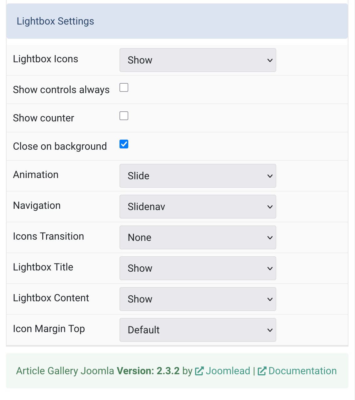
| Settings | Description |
|---|---|
| Lightbox Icons | Create a responsive lightbox gallery with images. |
| Show controls always | Always display lightbox navigation controls. |
| Show counter | Display image counter in lightbox. |
| Close on background | Close on background click |
| Animation | Select the transition between two slides. |
| Navigation | Select the navigation type. |
| Icons Transition | Select an icon transition. |
| Lightbox Title | Display the title as the lightbox caption. |
| Lightbox Content | Display the content as the lightbox caption. |
| Icon Margin Top | Set the top margin. Note that the margin will only apply if the content field immediately follows another content field. |
Tab Style
Image Settings Common settings for images.
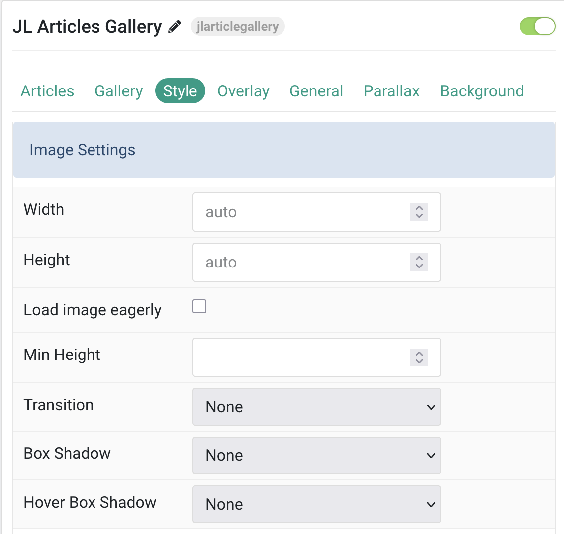
| Settings | Description |
|---|---|
| Width | Set the width of the image. |
| Height | Set the height of the image. |
| Load image eagerly | By default, images are loaded lazy. Enable eager loading for images in the initial viewport. |
| Min Height | Use an optional minimum height to prevent images from becoming smaller than the content on small devices. |
| Transition | Select an image transition. |
| Box Shadow | Select the image’s box shadow size. |
| Hover Box Shadow | Select the image’s box shadow size on hover. |
Title Settings Common settings for Title
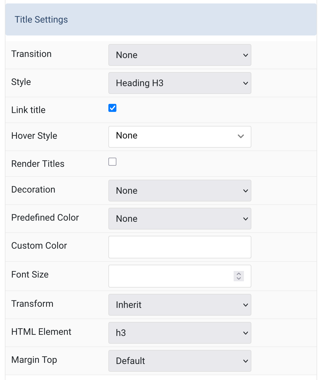
| Settings | Description |
|---|---|
| Title Transition | Select a transition for the title when the overlay appears on hover. |
| Title Style | Title styles differ in font-size but may also come with a predefined color, size and font. |
| Link title | Link the title if a link exists. |
| Hover Style | Set the hover style for a linked title. |
| Render Titles | Renders the titles/tooltips of the Menu Items for accessibility. |
| Decoration | Decorate the headline with a divider, bullet or a line that is vertically centered to the heading. |
| Predefined Color | Select the text color. If the Background option is selected, styles that don’t apply a background image use the primary color instead. |
| Custom Color | Customize the title color instead using predefined title color mode. You need to set the Predefined Color to None before using the color customization. |
| Font Size | Customize the title text font size |
| Transform | The following options will transform text into uppercased, capitalized or lowercased characters. |
| HTML Element | Choose one of the elements to fit your semantic structure. |
| Title Margin Top | Set the top margin. Note that the margin will only apply if the content field immediately follows another content field. |
Meta Settings Common settings for Meta
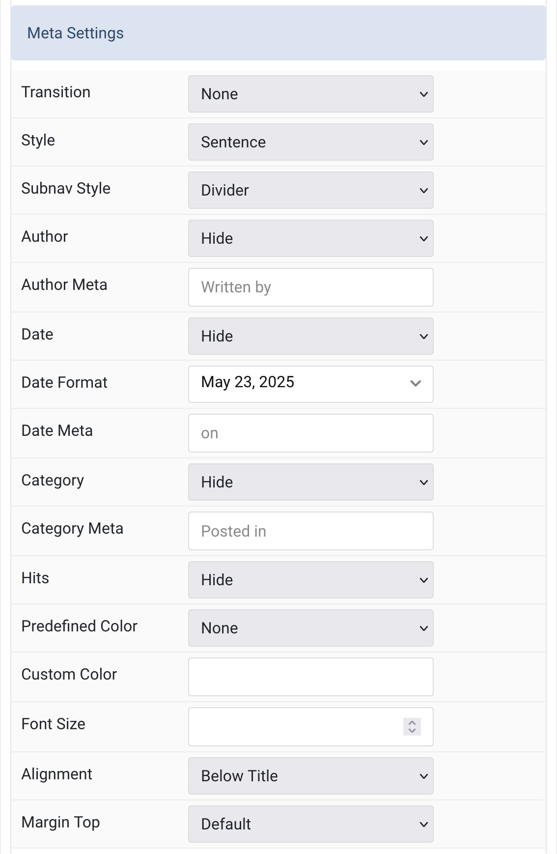
| Settings | Description |
|---|---|
| Meta Transition | Select a transition for the meta text when the overlay appears on hover. |
| Meta Style | Display the meta text in a sentence or a horizontal list. |
| Subnav Style | Select the subnav style for Meta List Style. |
| Author | Select if the article author should be shown. |
| Author Meta | Custom text label for the author field. |
| Date | Select if the article date should be shown. |
| Date Format | Select preferred date format. Leave empty not to display a date. |
| Date Meta | Custom text label for the date field. |
| Category | Select if and how the article category should be shown. |
| Category Meta | Custom text label for the category field. |
| Hits | Select if the article hits should be shown. |
| Meta Predefined Color | Select the predefined meta color. |
| Meta Custom Color | Customize the meta color. You need to set the Predefined Color to None before using the color customization. |
| Meta Font Size | Customize the meta text font size. |
| Meta Alignment | Align the meta text. |
| Meta Margin Top | Set the top margin. Note that the margin will only apply if the content field immediately follows another content field. |
Content Settings Common settings for Content Style
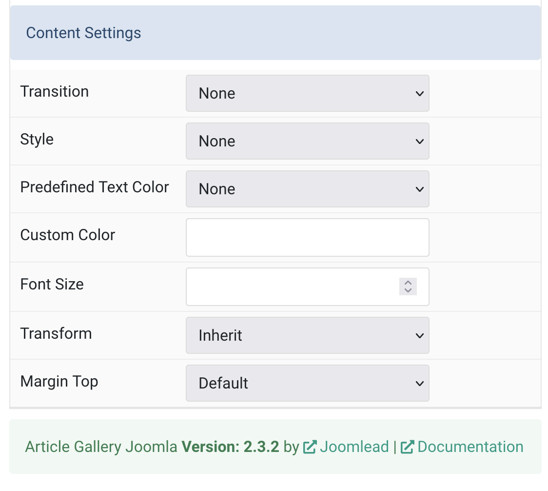
| Settings | Description |
|---|---|
| Content Transition | Select a transition for the content when the overlay appears on hover. |
| Content Style | Select a predefined meta text style, including color, size and font-family. |
| Predefined Text Color | Select the text color. If the Background option is selected, styles that don’t apply a background image use the primary color instead. |
| Content Custom Color | Customize the content color instead using predefined text color. |
| Content Font Size | Customize the content text font size. |
| Content Transform | The following options will transform text into uppercased, capitalized or lowercased characters. |
| Content Margin Top | Set the top margin. Note that the margin will only apply if the content field immediately follows another content field. |
Tab Overlay
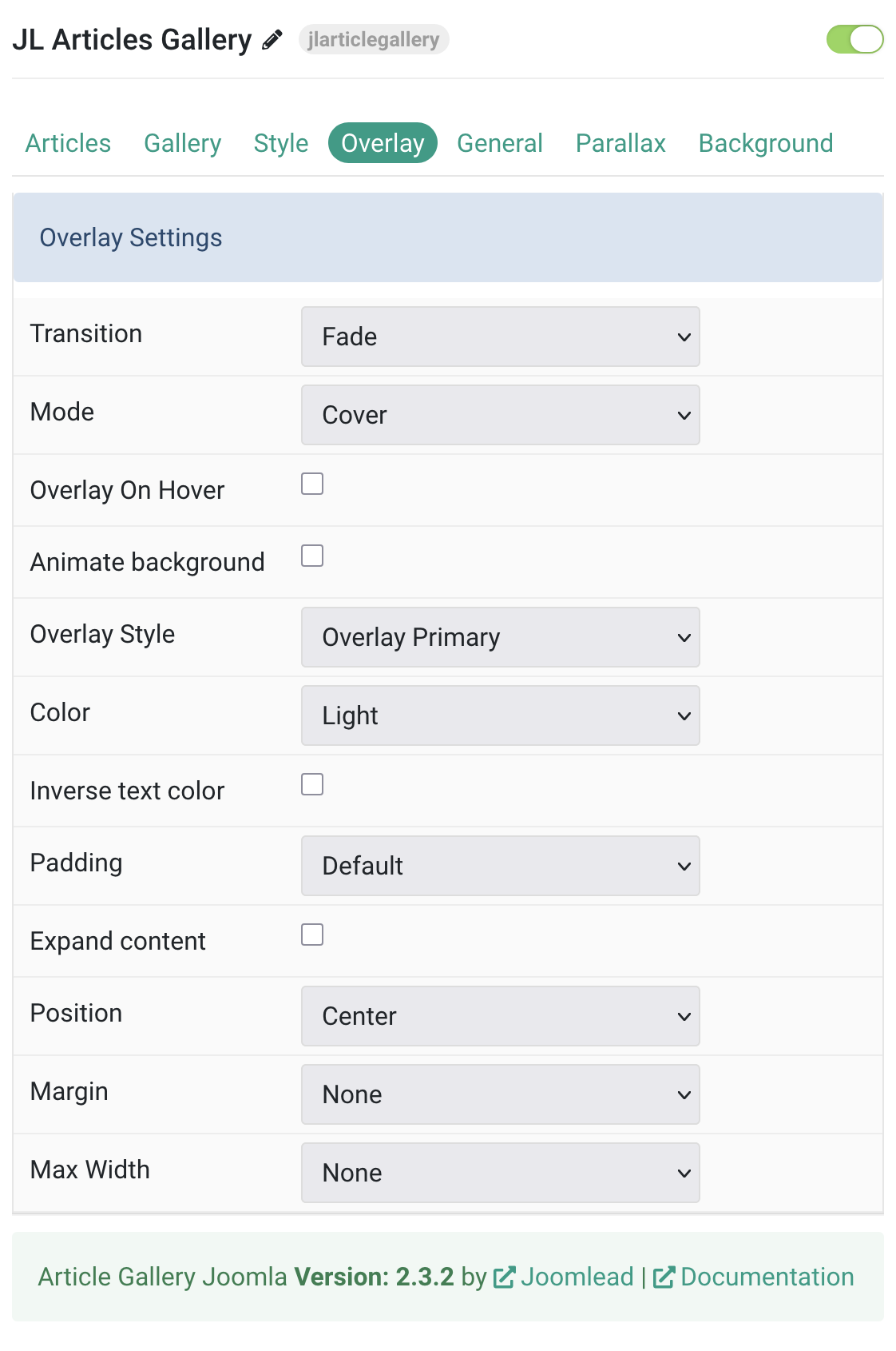
| Settings | Description |
|---|---|
| Overlay Settings | |
| Transition | Select a transition for the overlay when it appears on hover (fade, scale, slide options). |
| Mode | Choose between cover or caption overlay modes. |
| Overlay On Hover | Display content overlay on hover. |
| Animate background | Animate the background only on hover. |
| Overlay Style | Select the visual style for the overlay (default, primary, tile styles). |
| Color | Set light or dark color mode for text and controls. |
| Inverse text color | Reverse text colors on hover. |
| Padding | Set spacing between overlay and content (default, small, large, none). |
| Expand content | Fill available space in overlay and push links to bottom. |
| Position | Choose overlay positioning (top, bottom, center, etc.). |
| Margin | Set spacing between overlay and image container. |
| Max Width | Limit maximum overlay width (none to xlarge). |
General, Parallax and Parallax Background tab
Please take a look the documentation here for more detail about these tabs settings

Comments