Content Toggle Documentation
# Content Toggle Package contents
| Files | Description |
|---|---|
| jlcontenttoggle.yaml | Contains the Content Toggle particle settings. |
| jlcontenttoggle.html.twig | The Twig file to pull information, settings. |
Installation Installing the particle on your website is a really simple process. You can refer to the document here to know more.
Requirements Content Toggle requires Uikit 3 for Gantry 5 Atom to be installed and enabled in your theme layout settings.
Go to Template/Theme Settings > select the Layout to add Content Toggle particle (i.e: Home) -> Layout tab -> Drag and drop the Content Toggle Particle from Particles panel (left corner) to the section you want to display the particle.

Settings
| Settings | Description |
|---|---|
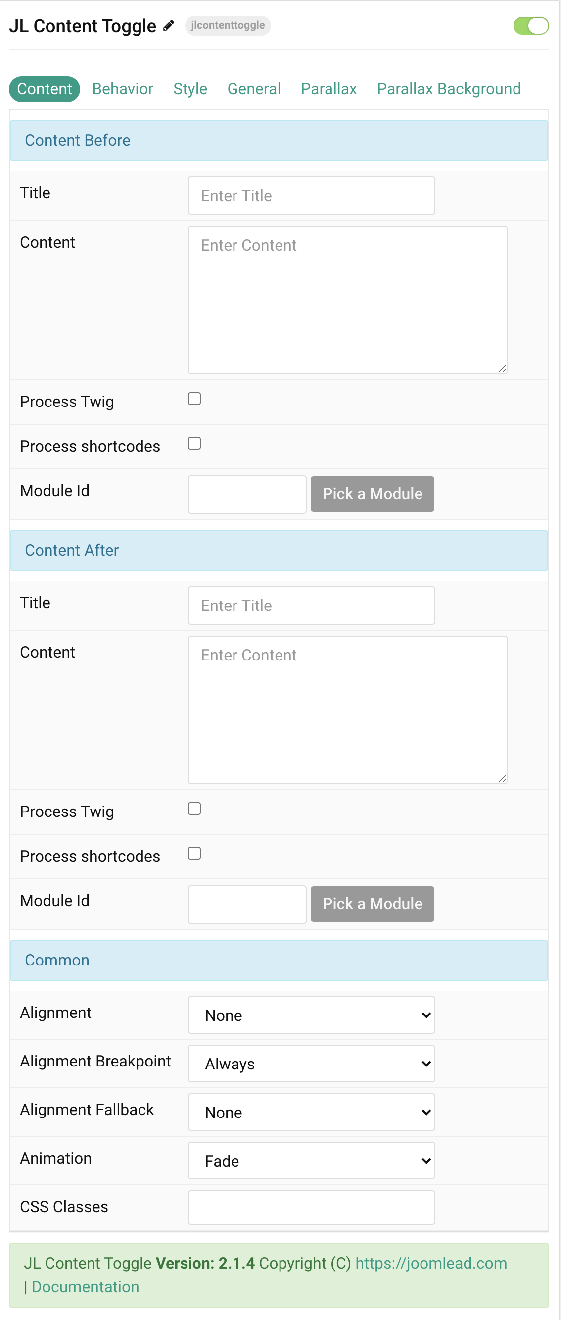
| Content Before | Common settings for Content before |
| Title | Customize the title. |
| Content | Customize the content. |
| Process Twig | Enable Twig template processing in the content before. Twig will be processed before shortcodes. |
| Process shortcodes | Enable shortcode processing / filtering in the content before. |
| Module ID | Instead using custom content, you can use this option to pick up a Joomla module and use it when toggling the content. |
| Content After | Common settings for Content After |
| Title | Customize the title after. |
| Content | Customize the content after. |
| Process Twig | Enable Twig template processing in the content after. Twig will be processed before shortcodes. |
| Process shortcodes | Enable shortcode processing / filtering in the content after. |
| Module ID | Instead using custom content, you can use this option to pick up a Joomla module and use it when toggling the content. |
| Common settings | Common settings for button |
| Alignment | Center, left and right alignment may depend on a breakpoint and require a fallback. |
| Alignment Breakpoint | Define the device width starting from which the alignment will apply. |
| Alignment Fallback | Define an alignment fallback for device widths below the breakpoint. |
| CSS Classes | CSS class name for the particle. |
Tab Behavior
| Settings | Description |
|---|---|
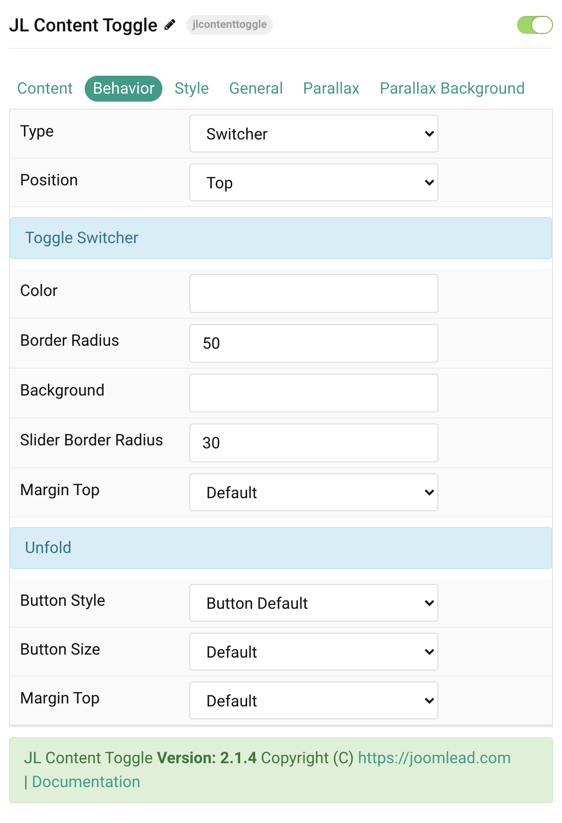
| Type | Select toggle type: Switcher or Unfold
Switcher mode: Dynamically transition through different contents using the tabbed navigation. Unfold mode: Hide big chunks of content and show them on demand to your users. |
| Toggle Switcher | Common settings for Toggle Switcher |
| Color | Customize the toggle color. |
| Border Radius | Customize the border radius for circle border in percent(%). |
| Background | Customize the toggle background color. |
| Slider Border Radius | Customize the border radius for slider in px. |
| Margin Top | Set the top margin. Note that the margin will only apply if the content field immediately follows another content field. |
| Unfold Settings | Common settings for Title Style |
| Button Style | Set the button style. |
| Button Size | Set the button size. |
| Margin Top | Select the margin top. |
Tab Style
| Settings | Description |
|---|---|
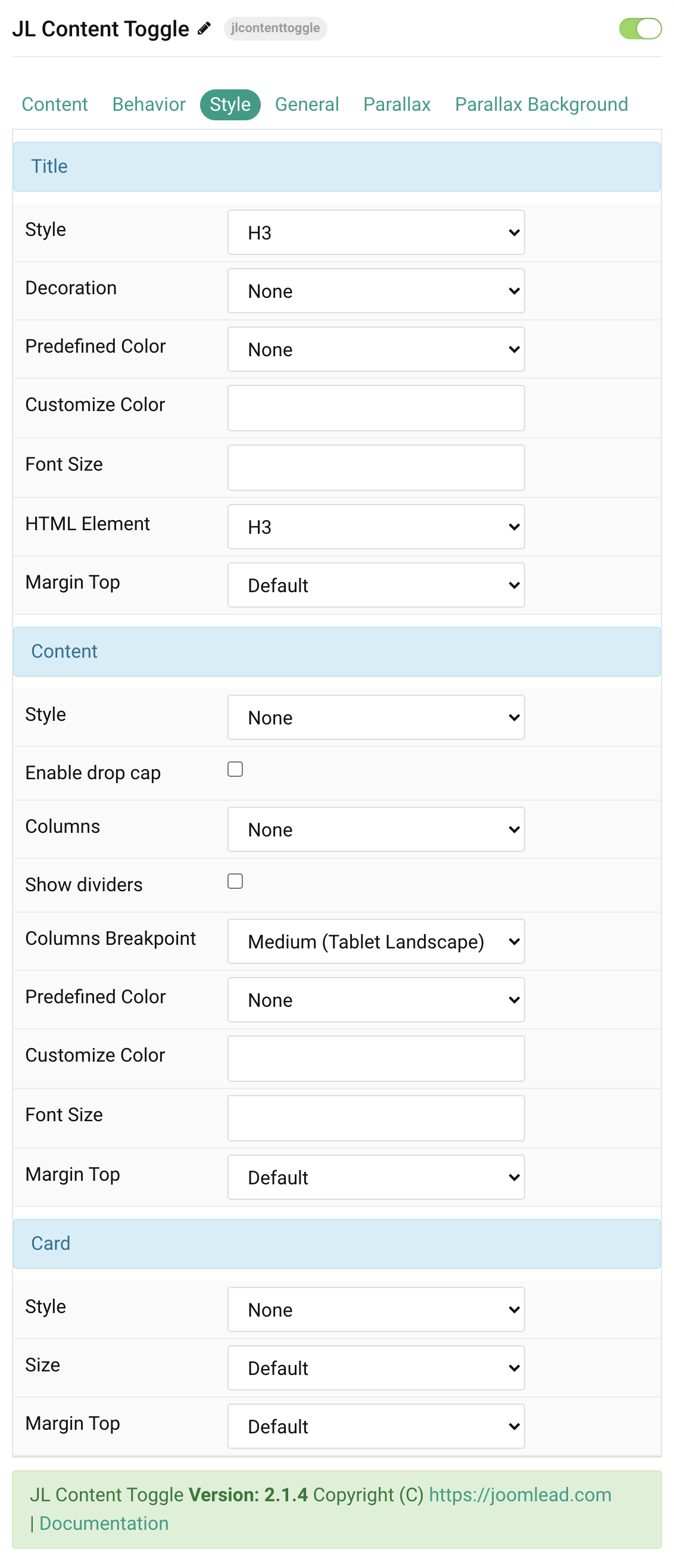
| Title Style Settings | Common settings for Title Style |
| Style | Heading styles differ in font-size but may also come with a predefined color, size and font. |
| Decoration | Decorate the headline with a divider, bullet or a line that is vertically centered to the heading. |
| Predefined Color | Select a predefined text color. |
| Custom Color | Customize the title color instead using predefined title color mode. You need to set the predefined color to None to use the customize color option. |
| Font Size | Customize the title text font size. |
| Transform | The following options will transform text into uppercased, capitalized or lowercased characters. |
| HTML Element | Choose one of the elements to fit your semantic structure. |
| Margin Top | Set the top margin. Note that the margin will only apply if the content field immediately follows another content field. |
| Content Settings | Common settings for Content. Please note: Dropcap, Columns, Show dividers and Columns Breakpoint options for the Custom Content ONLY. |
| Style | Select a predefined Content text style, including color, size and font-family. |
| Dropcap | Add dropcap for custom content |
| Columns | Set the number of list columns for custom content. |
| Show dividers | Show a divider between list columns. |
| Columns Breakpoint | Set the device width from which the list columns should apply. |
| Predefined Color | Select the text color. |
| Custom Color | Customize the content color. Set Predefined Color to None before using this feature. |
| Font Size | Customize the content text font size. |
| Margin Top | Set the top margin. Note that the margin will only apply if the content field immediately follows another content field. |
| Card Style Settings | Common settings for Card Style |
| Card | Select one of the boxed card styles or a blank card. |
| Size | Define the card’s size by selecting the padding between the card and its content. |
| Margin Top | Set the top margin. Note that the margin will only apply if the content field immediately follows another content field. |
Video
CSS Selector(CSS selector of the element(s) to toggle.) is added back from 2.1.8 version, please check this video to see how it works.
General, Parallax and Parallax Background tab
Please take a look the documentation here for more detail about these tabs settings

Comments