Divider Particle Documentation
Create dividers to separate content and apply different styles to them. See how Divider can be designed
beautifully on Demo Page.
# Divider Package contents
| Files | Description |
|---|---|
| jldivider.yaml | Contains the Divider particle settings. |
| jldivider.html.twig | The Twig file to pull information, settings. |
Installation Installing the particle on your website is a really simple process. You can refer to the document here to know more.
Requirements Divider requires Uikit 3 for Gantry 5 Atom to be installed and enabled in your theme layout settings.
Go to Template/Theme Settings > select the Layout to add Divider particle (i.e: Home) -> Layout tab -> Drag and drop the Divider Particle from Particles panel (left corner) to the section you want to display the Divider.
Settings

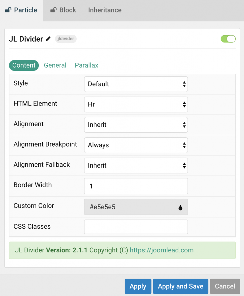
| Settings | Description |
|---|---|
| Style | Choose a divider style. |
| HTML Element | Choose the divider element to fit your semantic structure. Use the hr element for a thematic break and the div element for decorative reasons. |
| Alignment/Alignment Breakpoint/Alignment Fallback | Center, left and right alignment may depend on a breakpoint and require a fallback. These options won’t have any effect unlessSmall divider style is selected. |
| Border Width | Customize the border top width. |
| Border Color | Customize the divider color. |
| CSS Classes | CSS class name for the particle. |
General, Parallax and Parallax Background tab
Please take a look the documentation here for more detail about these tabs settings


Is there a way to change the thickness and color of the divider?
Hi there,
Border and color customization will be added in the next release 2.1.1 🙂
Thank you