Feature Box Particle Documentation
# Feature Box Package contents
| Files | Description |
|---|---|
| jlfeaturebox.yaml | Contains the Feature Box particle settings. |
| jlfeaturebox.html.twig | The Twig file to pull information, settings. |
Installation Installing the particle on your website is a really simple process. You can refer to the document here to know more.
Requirements Featurebox requires Uikit 3 for Gantry 5 Atom to be installed and enabled in your theme layout settings.
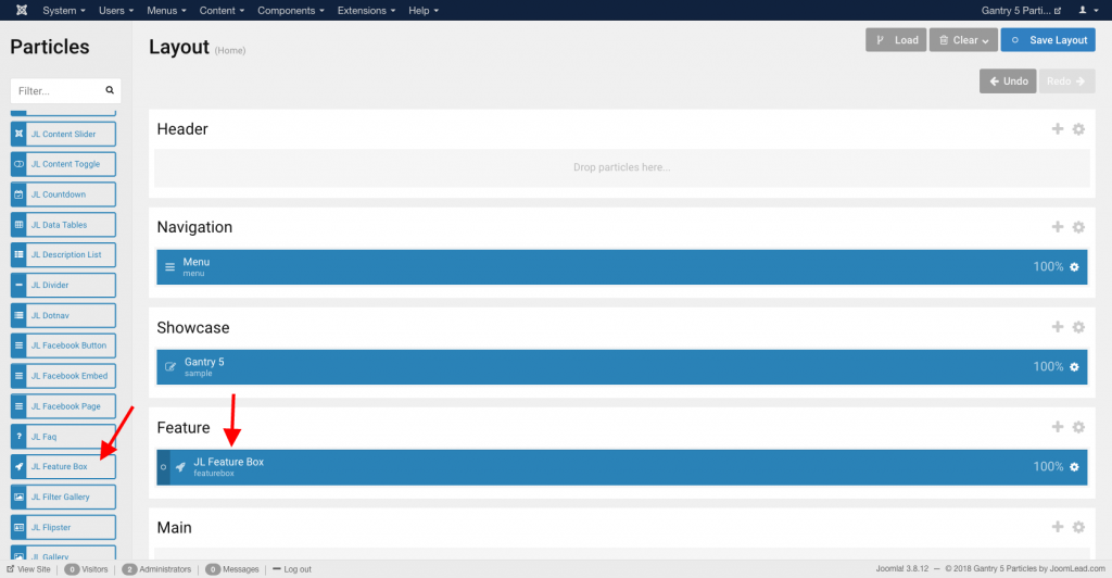
Go to Template/Theme Settings > select the Layout to add Feature Box particle (i.e: Home) -> Layout tab -> Drag and drop the Feature Box Particle from Particles panel (left corner) to the section you want to display the Feature Box.
Settings
| Settings | Description |
|---|---|
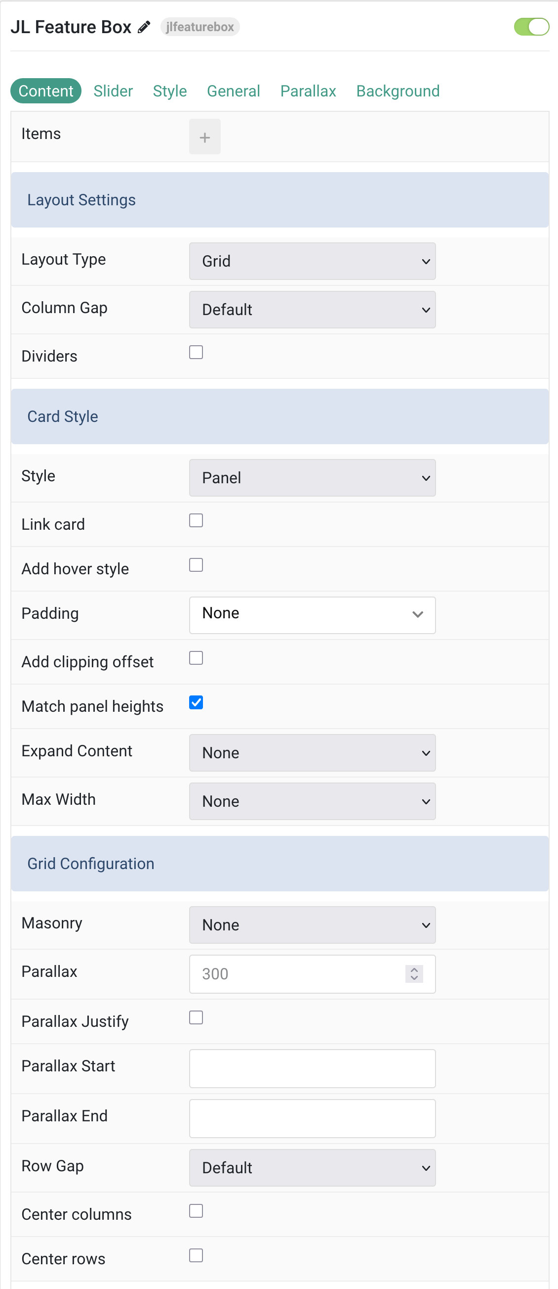
| Items | List Feature Box items. You can add new items to the collection using the plus + icon |
Items You can add new items to the collection using the plus + icon
| Settings | Description |
|---|---|
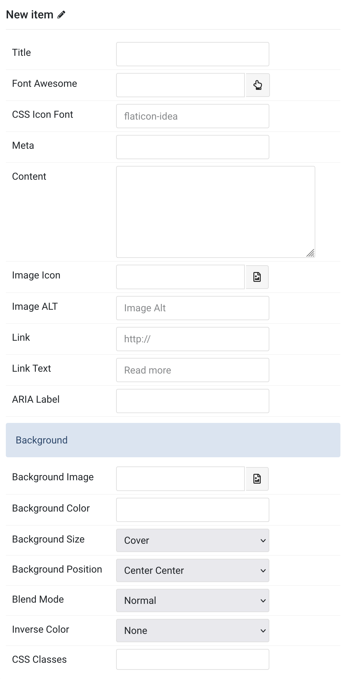
| Title | Customize the Title. |
| Font Awesome | Pick an optional Font Awesome icon. |
| CSS Icon Font | Add an optional icon font name. |
| Meta | Customize the Meta. |
| Content | Customize the content. |
| Image Icon | Select the image and use it as the icon. |
| Image ALT | Enter the image’s alt attribute. |
| Link | Specify the link for button. |
| Link Text | Enter the text for the link. |
| ARIA Label | Enter a descriptive text label to make it accessible if the link has no visible text. |
| Background Settings | Background |
| Background Image | An image field with an image picker. |
| Background Color | Select the background color. |
| Background Size | Determine whether the image will fit the section dimensions by clipping it or by filling the empty areas with the background color. |
| Background Position | Set the initial background position, relative to the section layer. |
| Blend Mode | Determine how the image will blend with the background color. |
| Inverse Color | Inverse the color for light or dark backgrounds. |
| CSS Classes | Specify the CSS class name for item. |
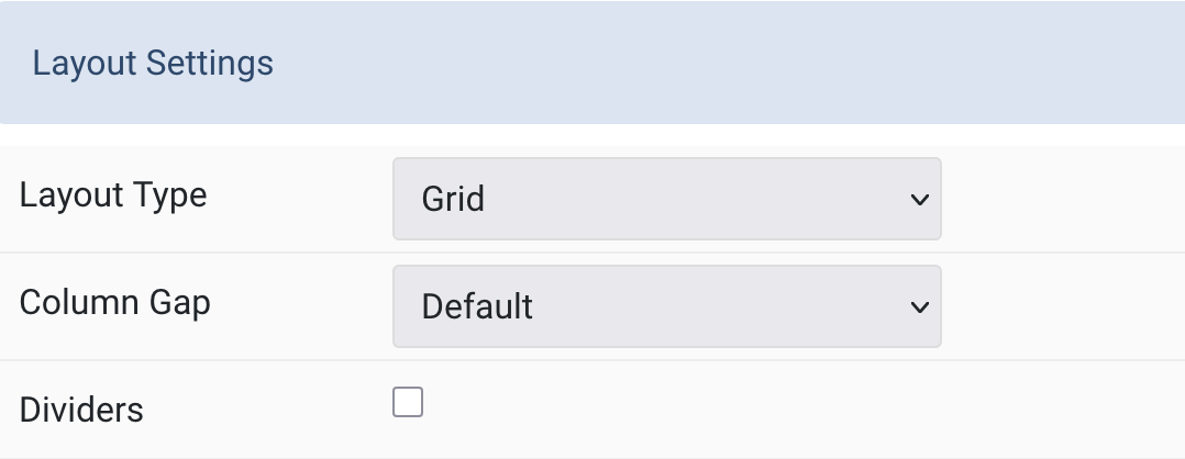
Layout Type Present the content layout with slider or grid mode.
| Settings | Description |
|---|---|
| Layout Type | Present the content with slider or grid mode. |
| Column Gap | Set the size of the gap between the grid columns. |
| Dividers | Display dividers between grid cells. |
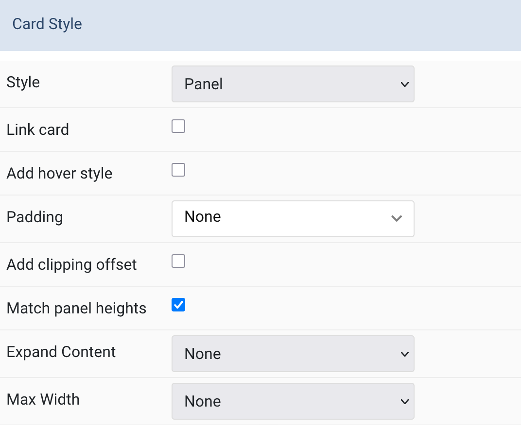
Card Style Common settings for Card.
| Settings | Description |
|---|---|
| Style | Select one of the boxed Card, Tile styles or a blank Panel. |
| Link card | Link the whole card if a link exists. Support Grid layout only. |
| Add hover style | Add a hover style to the card link. |
| Padding | Set the padding. |
| Add clipping offset | Since the slider effect needs a clipping container, box shadows of content items are also clipped. Check this option to widen the container to prevent box-shadows from clipping. |
| Match panel heights | To match the height of the direct child of each cell. |
| Expand Content | Expand the height of the content to fill the available space in the panel and push the link to the bottom. |
| Max Width | Set the maximum width. |
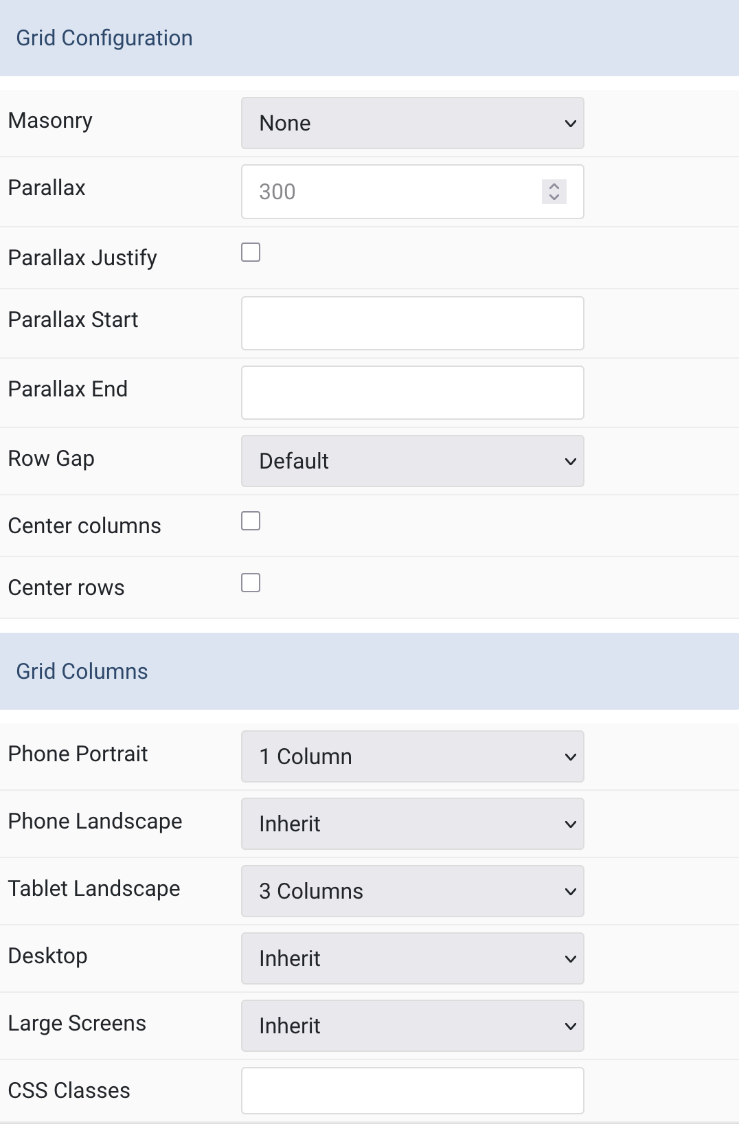
Grid Settings Common settings for Grid Layout and Grid Columns
| Settings | Description |
|---|---|
| Grid Configuration | Grid Configuration |
| Masonry | Enable masonry layout(Pack or Next) on large screens and above. |
| Parallax | The parallax effect moves single grid columns at different speeds while scrolling. Define the vertical parallax offset in pixels. |
| Parallax Justify | Justify columns at the bottom |
| Parallax Start | The animation starts when the element enters the viewport. Optionally, set a start and end offset, e.g. 100px, 50vh or 50vh + 50%. Percent relates to the target’s height. |
| Parallax End | The animation ends when the element leaves the viewport. Optionally, set a start and end offset, e.g. 100px, 50vh or 50vh + 50%. Percent relates to the target’s height. |
| Row Gap | Set the size of the gap between the grid rows. |
| Center columns | Center grid columns horizontally. |
| Center rows | Center grid rows vertically. |
| Grid Columns | Grid Columns |
| Phone Portrait | Set the number of grid columns for each breakpoint. Inherit refers to the number of columns on the next smaller screen size. |
| Phone Landscape | |
| Tablet Landscape | |
| Desktop | |
| Large Screens | |
| CSS Classes | CSS class name for the particle. |
Tab Slider
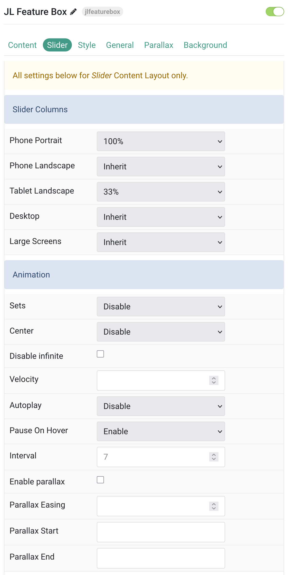
All settings below for Slider Content Layout only.
Columns/Animation Choose the Columns and Animation for Slider.
| Settings | Description |
|---|---|
| Slider Columns | |
| Phone Portrait | Set the number of Slider columns for each breakpoint. Inherit refers to the number of columns on the next smaller screen size. |
| Phone Landscape | |
| Tablet Landscape | |
| Desktop | |
| Large Screens | |
| Animation | |
| Sets | Slide all visible items at once. Group items into sets. The number of items within a set depends on the defined item width, e.g. 33% means that each set contains 3 items. |
| Center | Center the active slide |
| Disable infinite | Disable infinite scrolling between items. |
| Velocity | Set the velocity in pixels per millisecond. Min 20, Max 300 |
| Autoplay | Enable autoplay for carousel items. |
| Pause On Hover | Pause autoplay on hover. |
| Interval | Set the autoplay interval in seconds. Min 5 Max 15. |
| Enable parallax | Add a stepless parallax animation based on the scroll position. |
| Parallax Easing | Set the animation easing. Zero transitions at an even speed, a negative value starts off quickly while a positive value starts off slowly. |
| Parallax Start | The animation starts when the element enters the viewport. Optionally, set a start and end offset, e.g. 100px, 50vh or 50vh + 50%. Percent relates to the target’s height. |
| Parallax End | The animation ends when the element leaves the viewport. Optionally, set a start and end offset, e.g. 100px, 50vh or 50vh + 50%. Percent relates to the target’s height. |
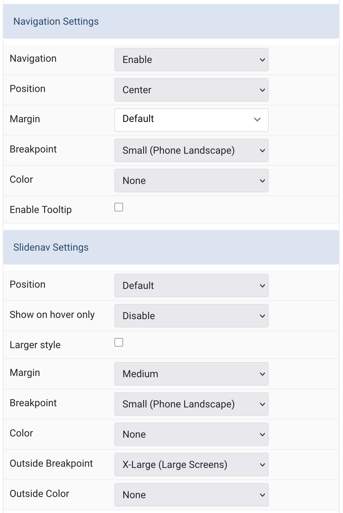
Navigation/Slidenav Common settings for Slider Navigation and Slidenav.
| Settings | Description |
|---|---|
| Navigation Settings | |
| Navigation | Select the navigation type. |
| Position | Align the navigation’s items. |
| Margin | Set the vertical margin. |
| Breakpoint | Display the navigation only on this device width and larger. |
| Color | Set light or dark color mode. |
| Enable Tooltip | Show tooltip title on hover. |
| Slidenav Settings | |
| Position | Select the position of the slidenav. |
| Show on hover only | Show the slide nav on hover only. |
| Larger style | To increase the size of the slidenav icons. |
| Margin | Apply a margin between the slidenav and the slider container. |
| Breakpoint | Display the slidenav only on this device width and larger. |
| Color | Set light or dark color mode. |
| Outside Breakpoint | Display the slidenav only outside on this device width and larger. Otherwise it will be displayed inside. |
| Outside Color | Set light or dark color if the slidenav is outside of the slider. |
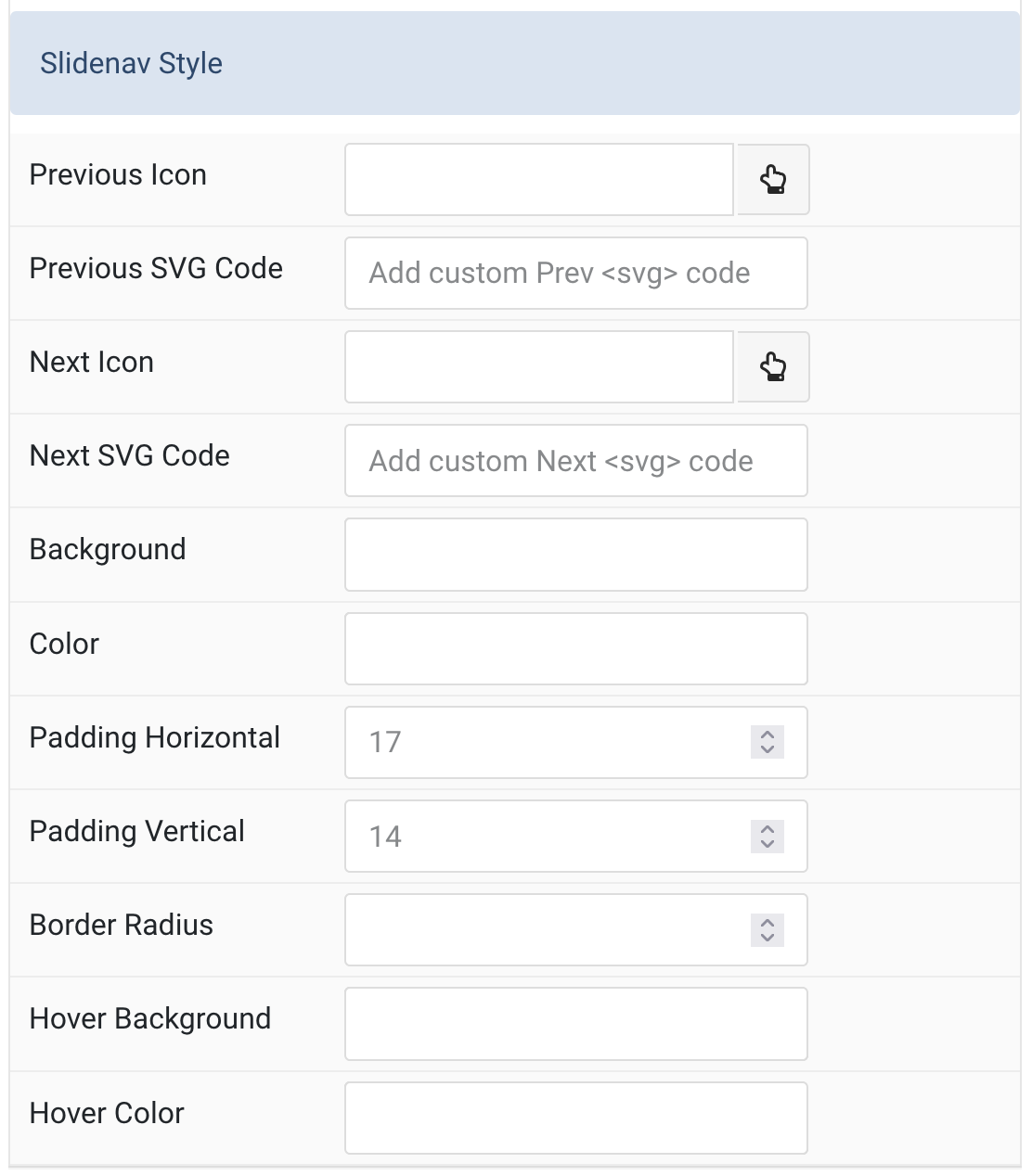
Slidenav Style Slidenav Style customization.
| Settings | Description |
|---|---|
| Previous Icon | Choose an icon for the “Previous” button. |
| Previous SVG Code | Custom inline SVG code for the “Previous” button. |
| Next Icon | Choose an icon for the “Next” button. |
| Next SVG Code | Custom inline SVG code for the “Next” button. |
| Background | Set the background color of the slidenav. |
| Color | Set the text/icon color of the slidenav. |
| Padding Horizontal | Set horizontal padding of the slidenav buttons. |
| Padding Vertical | Set vertical padding of the slidenav buttons. |
| Border Radius | Set the border radius of the slidenav buttons. |
| Hover Background | Set the background color on hover. |
| Hover Color | Set the text/icon color on hover. |
Tab Style
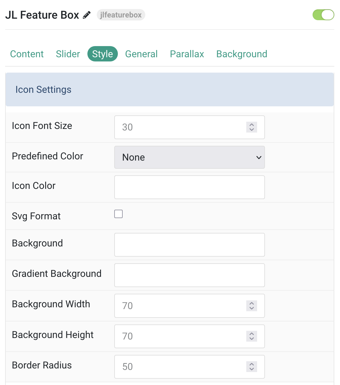
Icon Settings Common settings for Icon
| Settings | Description |
|---|---|
| Icon Font Size | Enter the icon font size. |
| Predefined Color | Select the predefined title text color. |
| Icon Color | Custom icon color. |
| Svg Format | Inject inline SVG images and style them with CSS. |
| Background | Custom icon background color. |
| Gradient Background | Custom linear gradient background color. |
| Background Width | Set the width of the icon background. |
| Background Height | Set the height of the icon background. |
| Border Radius | Set the border radius of the icon background. |
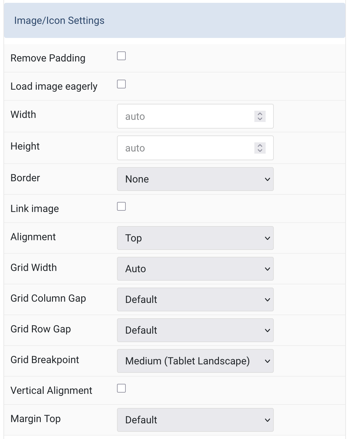
Image Settings Common settings for Image Style
| Settings | Description |
|---|---|
| Remove Padding | Attach the image to the card’s edge. |
| Load image eagerly | Enable eager loading for images in the initial viewport. |
| Width | Set the width of the image. |
| Height | Set the height of the image. |
| Border | Select the image’s border style. |
| Link image | Link the image if a link exists. |
| Alignment | Align the image to top, bottom, left, right, or between title and content. |
| Grid Width | Define the width of the image within the grid. Choose between percent and fixed widths or expand columns to the width of their content. This option won’t have any effect unless Image Alignment is set to Left or Right. |
| Grid Column Gap | Set the size of the gap between the image and the content. This option won’t have any effect unless Image Alignment is set to Left or Right. |
| Grid Row Gap | Set the size of the gap if the grid items stack. This option won’t have any effect unless Image Alignment is set to Left or Right. |
| Grid Breakpoint | Set the breakpoint from which grid cells will stack. This option won’t have any effect unless Image Alignment is set to Left or Right. |
| Vertical Alignment | Vertically center grid cells. This option won’t have any effect unless Image Alignment is set to Left or Right. |
| Margin Top | Set the top margin. This option won’t have any effect unless Image Alignment is set to Bottom or Between. |
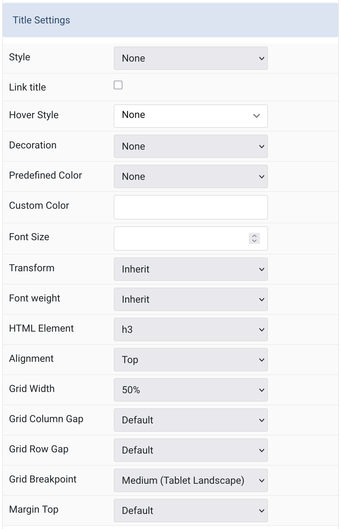
Title Settings Common settings for Title Style
| Setting | Description |
|---|---|
| Title Settings | |
| Style | Choose from a variety of title styles, including different font sizes and predefined styles. |
| Link Title | Link the title if a link exists. |
| Hover Style | Set the hover style for a linked title (requires “Link Title” to be enabled). |
| Decoration | Add a divider, bullet, or line to visually decorate the title. |
| Predefined Color | Select a predefined color for the title text. The “Background” color uses primary if no image is applied. |
| Custom Color | Customize the title color. Predefined color must be set to “None” to take effect. |
| Font Size | Set a custom font size for the title (overrides predefined styles). |
| Transform | Transform title text to uppercase, capitalized, or lowercase characters. |
| Font Weight | Change the weight of the title font: Light, Normal, Bold, etc. |
| HTML Element | Select the HTML element used for the title (e.g., h1–h6, div). |
| Alignment | Align the title to the top or left relative to the content. |
| Grid Width | Set how much horizontal space the title takes up in the grid layout. |
| Grid Column Gap | Set spacing between title and other grid columns. |
| Grid Row Gap | Set spacing between grid rows if stacked. |
| Grid Breakpoint | Set the responsive breakpoint from which grid items should stack. |
| Margin Top | Set the top margin when the title follows another content field. |
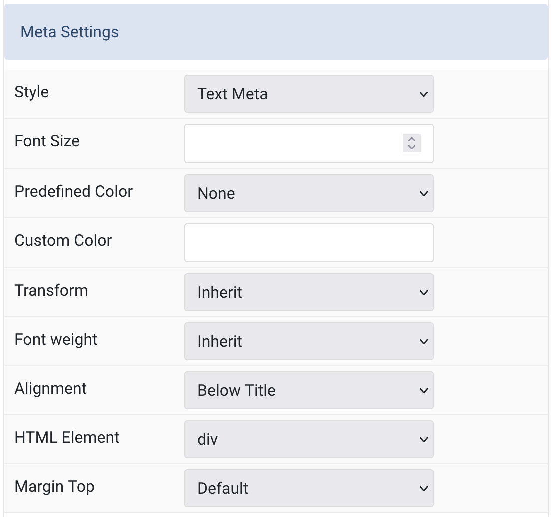
Meta Settings Common settings for Meta Style
| Settings | Description |
|---|---|
| Style | Select a predefined meta text style, including color, size and font-family. |
| Font Size | Customize the meta text font size |
| Predefined Color | Select the text color. |
| Custom Color | Customize the meta color. You need to set the predefined color to None before using the color customization. |
| Transform | The following options will transform text into uppercased, capitalized or lowercased characters. |
| Font weight | Add one of the following classes to modify the font weight of your text. |
| Alignment | Align the meta text. |
| HTML Element | Choose one of the elements to fit your semantic structure. |
| Margin Top | Set the top margin. Note that the margin will only apply if the content field immediately follows another content field. |
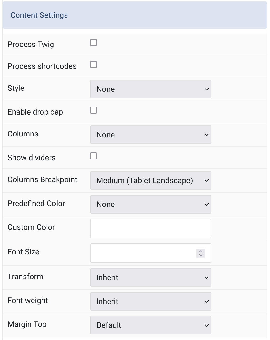
Content Settings Common settings for Content Style
| Settings | Description |
|---|---|
| Process Twig | Enable Twig template processing in the content. Twig will be processed before shortcodes. |
| Process shortcodes | Enable shortcode processing / filtering in the content. |
| Style | Select a predefined meta text style, including color, size and font-family. |
| Enable drop cap | Display the first letter of the paragraph as a large initial. |
| Columns | Set the number of list columns. |
| Show dividers | Show a divider between list columns. |
| Columns Breakpoint | Set the device width from which the list columns should apply. |
| Predefined Color | Select the text color. |
| Custom Color | Customize the content color instead using predefined text color. You need to set the predefined color to None before using the color customization. |
| Font Size | Customize the content text font size. |
| Transform | The following options will transform text into uppercased, capitalized or lowercased characters. |
| Font weight | Add one of the following classes to modify the font weight of your text. |
| Margin Top | Set the top margin. Note that the margin will only apply if the content field immediately follows another content field. |
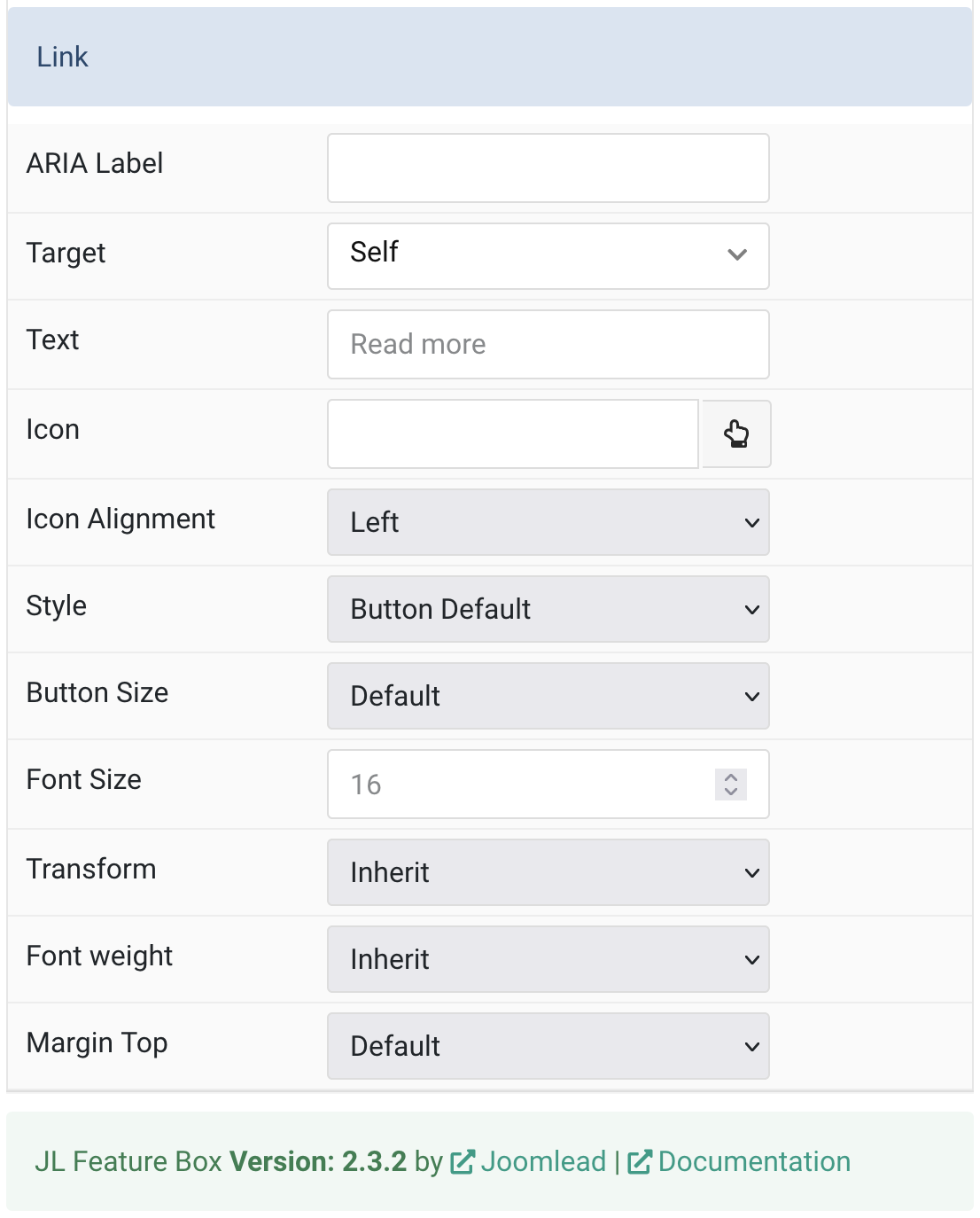
Link Settings Common settings for Link Style
| Settings | Description |
|---|---|
| ARIA Label | Enter a descriptive text label to make it accessible if the link has no visible text. |
| Target | Open the link in a same or new window. |
| Text | Specify the button label. |
| Icon | Pick an optional Font Awesome icon. |
| Icon Alignment | Choose the icon position. |
| Style | Set the button style. |
| Button Size | Set the button size. |
| Font Size | Enter the button font size. |
| Transform | The following options will transform text into uppercased, capitalized or lowercased characters. |
| Font weight | Add one of the following classes to modify the font weight of your text. |
| Margin Top | Set the top margin. Note that the margin will only apply if the content field immediately follows another content field. |
General, Parallax and Parallax Background tab
Please take a look the documentation here for more detail about these tabs settings

Comments