Grid Particle Documentation
# Gridcard Package contents
| Files | Description |
|---|---|
| jlgridcard.yaml | Contains the Grid Card particle settings. |
| jlgridcard.html.twig | The Twig file to pull information, settings. |
Installation Installing the particle on your website is a really simple process. You can refer to the document here to know more.
Requirements Gridcard requires Uikit 3 for Gantry 5 Atom to be installed and enabled in your theme layout settings.
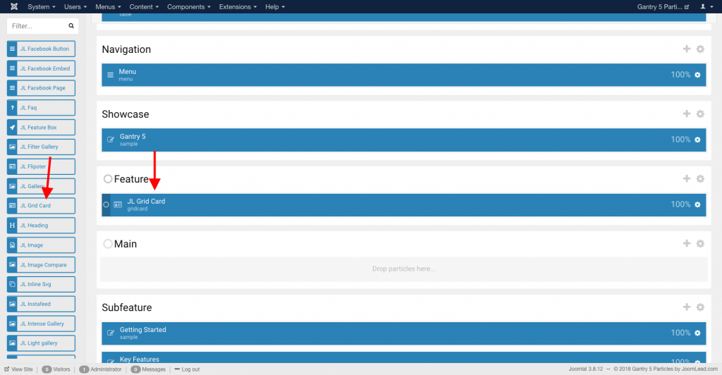
Go to Template/Theme Settings > select the Layout to add Grid particle (i.e: Home) -> Layout tab -> Drag and drop the Grid Particle from Particles panel (left corner) to the section you want to display the particle.
Settings
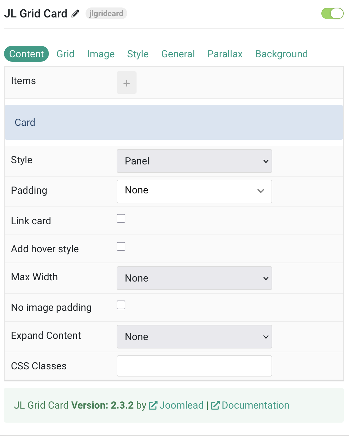
Tab Content
| Settings | Description |
|---|---|
| Items | List Grid items to show. You can add new items to the collection using the plus + icon |
Items You can add new items to the collection using the plus + icon
| Settings | Description |
|---|---|
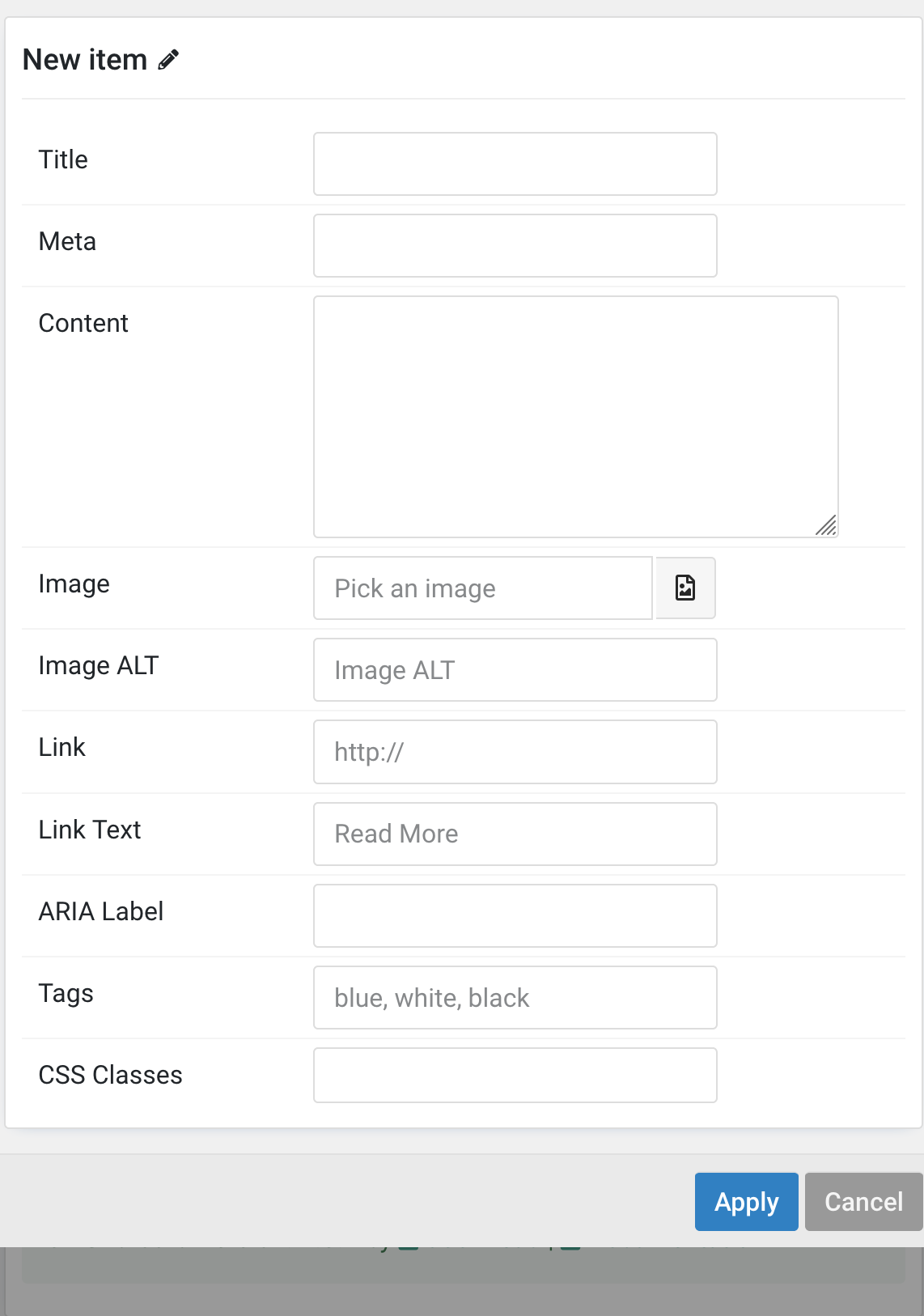
| Content Items | |
| Items | Create each item to appear in the content row. |
| Title | Customize the title. |
| Meta | Customize the meta. |
| Content | Customize the content. |
| Image | An image field with an image picker. |
| Image ALT | Enter the image’s alt attribute. |
| Link | Specify the button link. |
| Link Text | Specify the button label. |
| ARIA Label | Enter a descriptive text label to make it accessible if the link has no visible text. |
| Tags | Enter a comma-separated list of tags, for example, blue, white, black. |
| CSS Classes | Specify the CSS class name for the item. |
| Settings | Description |
|---|---|
| Card Settings | |
| Style | Select one of the boxed card, tile styles or a blank panel. |
| Padding | Set the padding for the boxed card or tile styles. |
| Link card | Link the whole card if a link exists. Default is false. |
| Add hover style | Add a hover style to the card link. |
| Max Width | Set the maximum width of the card. |
| No image padding | Align image without padding; images aligned left or right will extend to cover the whole space. Default is false. |
| Expand Content | Expand the height of the content to fill available space and push the link to the bottom. Options: None, Image, Content, Both. |
| CSS Classes | CSS class name for the particle. |
Tab Grid
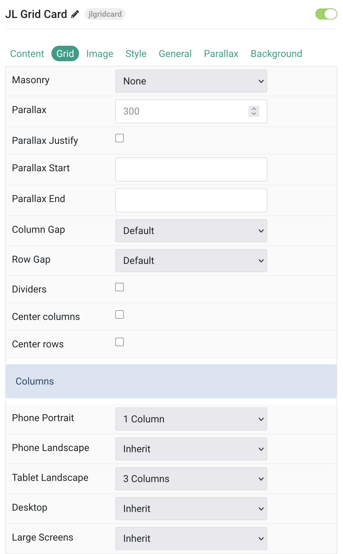
Grid Settings Common settings for Grid and Columns layout
| Settings | Description |
|---|---|
| Grid | |
| Masonry | Enable masonry layout(Pack or Next) on large screens and above. |
| Parallax | Defines the vertical parallax offset in pixels. Columns will move at different speeds while scrolling. |
| Parallax Justify | Justify columns at the bottom. |
| Parallax Start | The animation starts when the element enters the viewport. Optionally, set a start offset, e.g., 100px, 50vh, or 50vh + 50%. Percent values relate to the element’s height. |
| Parallax End | The animation ends when the element leaves the viewport. Optionally, set an end offset, e.g., 100px, 50vh, or 50vh + 50%. Percent values relate to the element’s height. |
| Column Gap | Sets the size of the gap between grid columns. |
| Row Gap | Sets the size of the gap between grid rows. |
| Center columns | Center grid columns horizontally. |
| Center rows | Center grid rows vertically. |
| Divider | Displays dividers between grid cells. |
| Columns Settings | Common settings for Grid columns layout. |
| Phone Portrait | Set the number of grid columns for each breakpoint. Inherit refers to the number of columns on the next smaller screen size. |
| Phone Landscape | |
| Tablet Landscape | |
| Desktop | |
| Large Screens | |
Columns/Filter Common settings for Filter
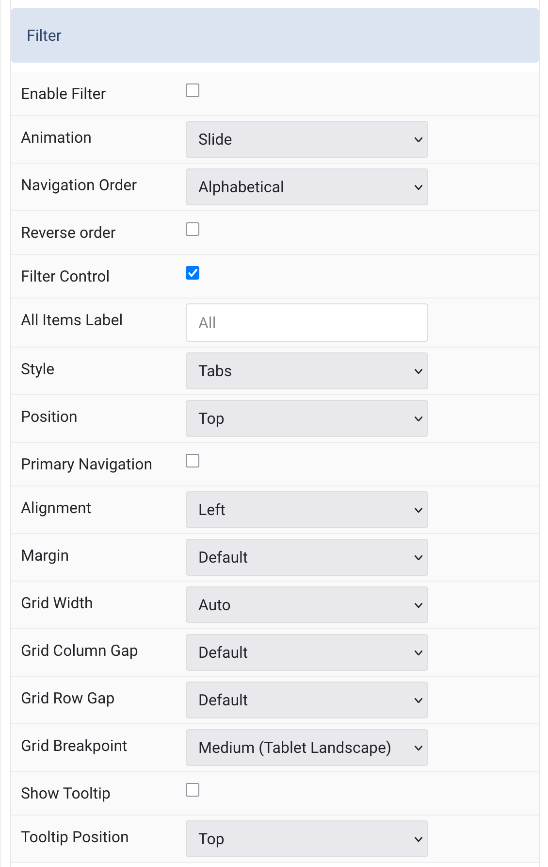
| Settings | Description |
|---|---|
| Filter | |
| Enable Filter | Enables filter navigation. |
| Filter Animation | Selects the animation applied to items when filtering. |
| Navigation Order | Orders the filter navigation alphabetically or defines a manual order. |
| All Items | Shows a control to filter all items. |
| Filter Text | Sets a custom label for the All tag. |
| Style | Selects the filter navigation style. Pill and Divider styles are only available for horizontal subnavs. |
| Position | Positions the filter navigation at the Top, Left, or Right. Larger styles can be applied to Left and Right positions. |
| Primary | The primary navigation is not available when using the Tab style with Top position. |
| Alignment | Aligns the filter controls. Alignment styles are only available for the Top filter position. |
| Margin | Sets the vertical margin. Margin styles are only available for the Top filter position. |
| Grid Width | Sets the width of the filter navigation. Choose from percentages, fixed sizes, or content-based widths. |
| Column Gap | Sets the gap between the filter navigation and the content. |
| Row Gap | Sets the gap between rows when items are stacked. |
| Breakpoint | Sets the screen size at which the filter navigation and grid stack. |
| Show Tooltip | Enable tooltips for filter navigation. |
| Tooltip Position | Set alignment of the tooltip (Top, Bottom, Left, Right, Corners). |
Tab Image
Image Settings Common settings for Image Style
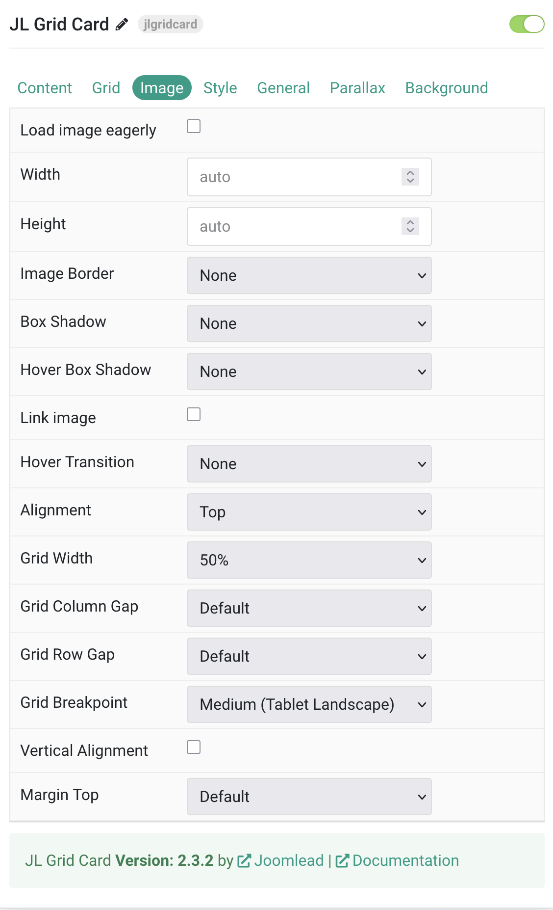
| Settings | Description |
|---|---|
| Load image eagerly | By default, images are loaded lazy. Enable eager loading for images in the initial viewport. |
| Width | Set the width of the image. |
| Height | Set the height of the image. |
| Image Border | Select the image’s border style. This option won’t have any effect unless the Card Style is set to Panel. |
| Box Shadow | Select the image’s box shadow size. This option won’t have any effect unless the Card Style is set to Panel. |
| Hover Box Shadow | Select the image’s box shadow size on hover. This option won’t have any effect unless the Card Style is set to Panel. |
| Link image | Link the image if a link exists. |
| Hover Transition | Set the hover transition for a linked image. |
| Image Alignment | Align the image to the top,left, right or place it between the title and the content. |
| Grid Width | Define the width of the image within the grid. Choose between percent and fixed widths or expand columns
to the width of their content. This option won’t have any effect unless Image Alignment is set to Left or Right. |
| Grid Column Gap | Set the size of the gap between the image and the content. This option won’t have any effect unless Image Alignment is set to Left or Right. |
| Grid Row Gap | Set the size of the gap if the grid items stack. This option won’t have any effect unless Image Alignment is set to Left or Right. |
| Grid Breakpoint | Set the breakpoint from which grid cells will stack. This option won’t have any effect unless Image Alignment is set to Left or Right. |
| Vertical Alignment | Vertically center grid cells. This option won’t have any effect unless Image Alignment is set to Left or Right. |
| Margin Top | Set the top margin. Note that the margin will only apply if the content field immediately follows
another content field. This option won’t have any effect unless Image Alignment is set to Bottom or Between. |
Tab Style
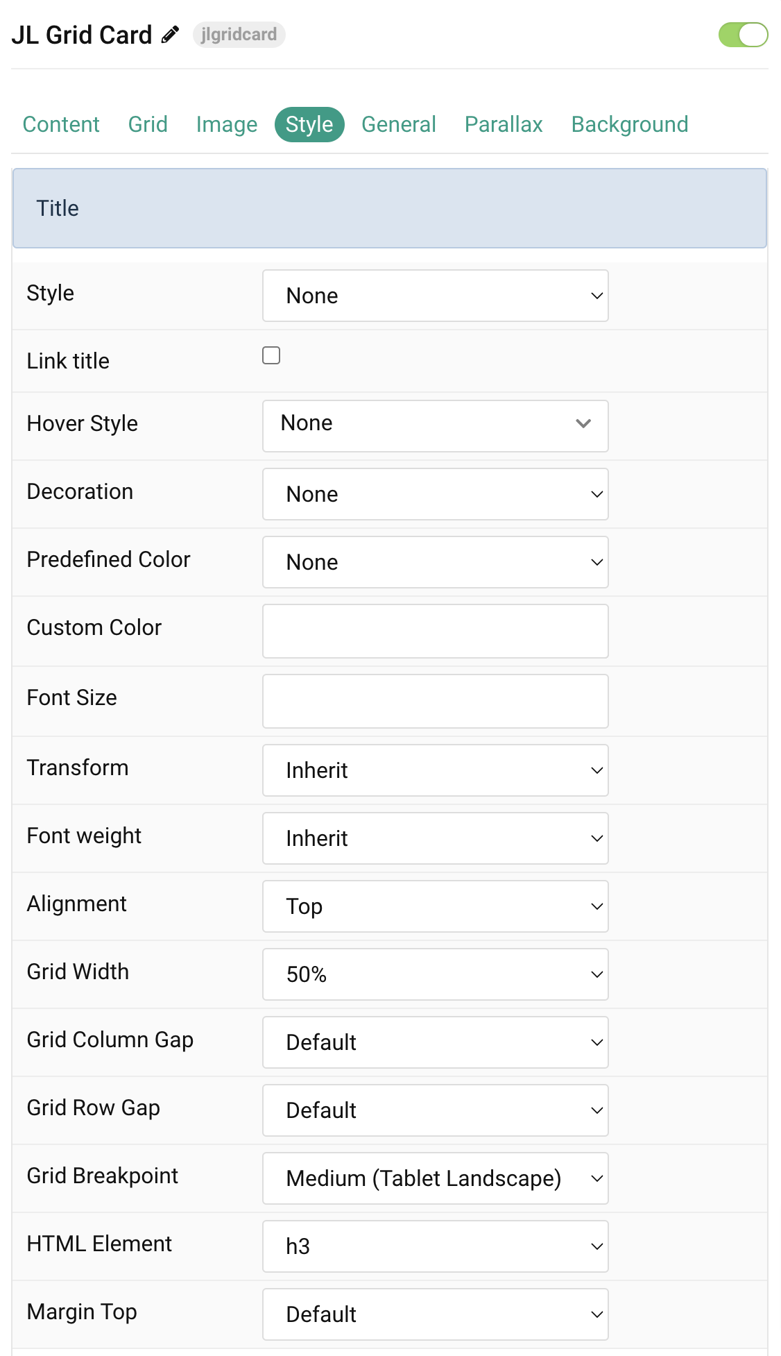
Title Settings Common settings for Title Style
| Settings | Description |
|---|---|
| Style | Heading styles differ in font-size but may also come with a predefined color, size and font. |
| Link title | Link the title if a link exists. |
| Hover Style | Set the hover style for a linked title. Enable link title to use this option. |
| Decoration | Decorate the headline with a divider, bullet or a line that is vertically centered to the heading. |
| Predefined Color | Select the text color. If the Background option is selected, styles that don’t apply a background image use the primary color instead. |
| Custom Color | Customize the title color instead using predefined title color mode. You need to set the predefined color to None to use the customize color option. |
| Font Size | Customize the title text font size. |
| Transform | The following options will transform text into uppercased, capitalized or lowercased characters. |
| Font weight | Add one of the following classes to modify the font weight of your text. |
| HTML Element | Choose one of the elements to fit your semantic structure. |
| Alignment | Align the title to the top or left in regards to the content. |
| Grid Width | Define the width of the title within the grid. Choose between percent and fixed widths or expand columns to the width of their content. |
| Grid Column Gap | Set the size of the gap between the image and the content. |
| Grid Row Gap | Set the size of the gap if the grid items stack. |
| Grid Breakpoint | Set the breakpoint from which grid cells will stack. |
| Margin Top | Set the top margin. |
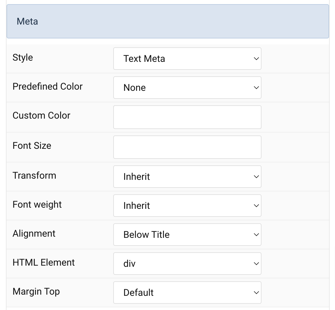
Meta Settings Common settings for Meta Style
| Settings | Description |
|---|---|
| Style | Select a predefined meta text style, including color, size and font-family. |
| Predefined Color | Select the predefined meta color. |
| Custom Color | Customize the meta color. Set Predefined Color for Meta to None before using this feature. |
| Font Size | Customize the title text font size. |
| Transform | The following options will transform text into uppercased, capitalized or lowercased characters. |
| Font weight | Add one of the following classes to modify the font weight of your text. |
| HTML Element | Choose one of the elements to fit your semantic structure. |
| Alignment | Align the meta text above/below the title or below the content. |
| Margin Top | Set the top margin. Note that the margin will only apply if the content field immediately follows another content field. |
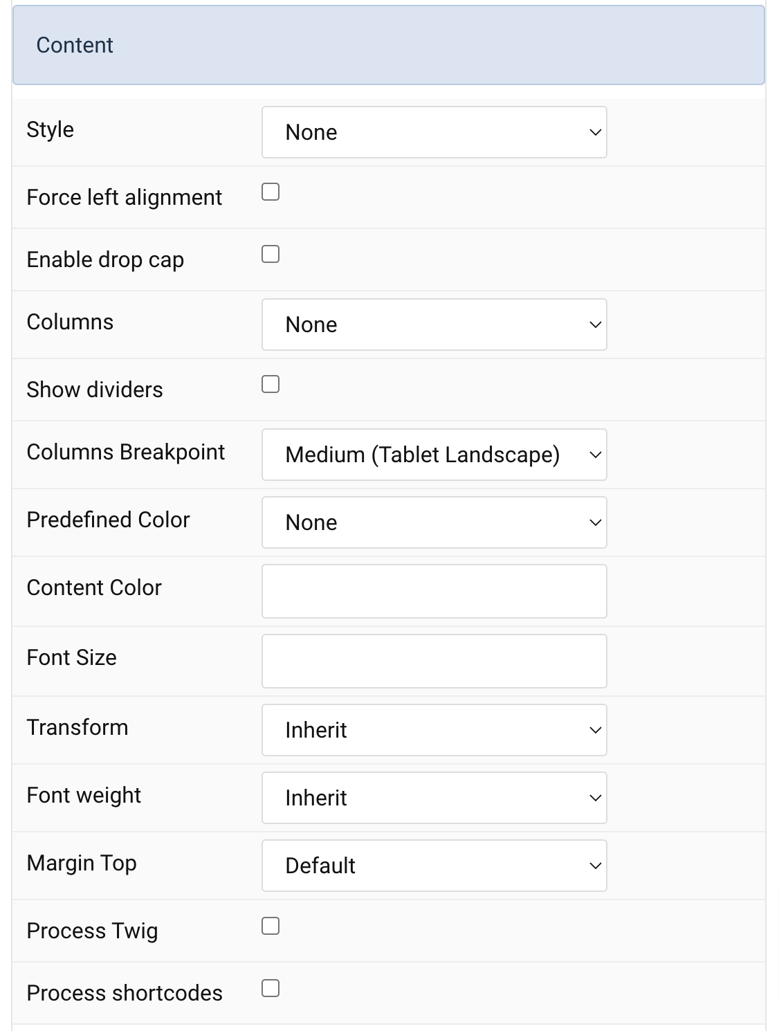
Content Settings Common settings for Content Style
| Settings | Description |
|---|---|
| Style | Select a predefined text style, including color, size and font-family. |
| Force left alignment | Force left alignment for the content if the text center/text right is set via general tab. |
| Enable drop cap | Display the first letter of the paragraph as a large initial. |
| Columns | Set the number of list columns. |
| Show dividers | Show a divider between list columns. |
| Columns Breakpoint | Set the device width from which the list columns should apply. |
| Predefined Color | Select the predefined meta color. |
| Customize Color | Customize the content color instead using predefined text color. You need to set the predefined color to None to use the customize color option. |
| Font Size | Customize the content text font size. |
| Transform | The following options will transform text into uppercased, capitalized or lowercased characters. |
| Font weight | Add one of the following classes to modify the font weight of your text. |
| Margin Top | Set the top margin. |
| Process Twig | Enable Twig template processing in the content. Twig will be processed before shortcodes. |
| Process shortcodes | Enable shortcode processing / filtering in the content. This useful when you want to load the Joomla module or WordPress shortcode inside the card content, example you can add a Joomla shortcode inside the card content like {loadmoduleid your_moduleId}, then just enable the Process shortcodes feature and done. This solution similar to How do you put a module inside an article? |
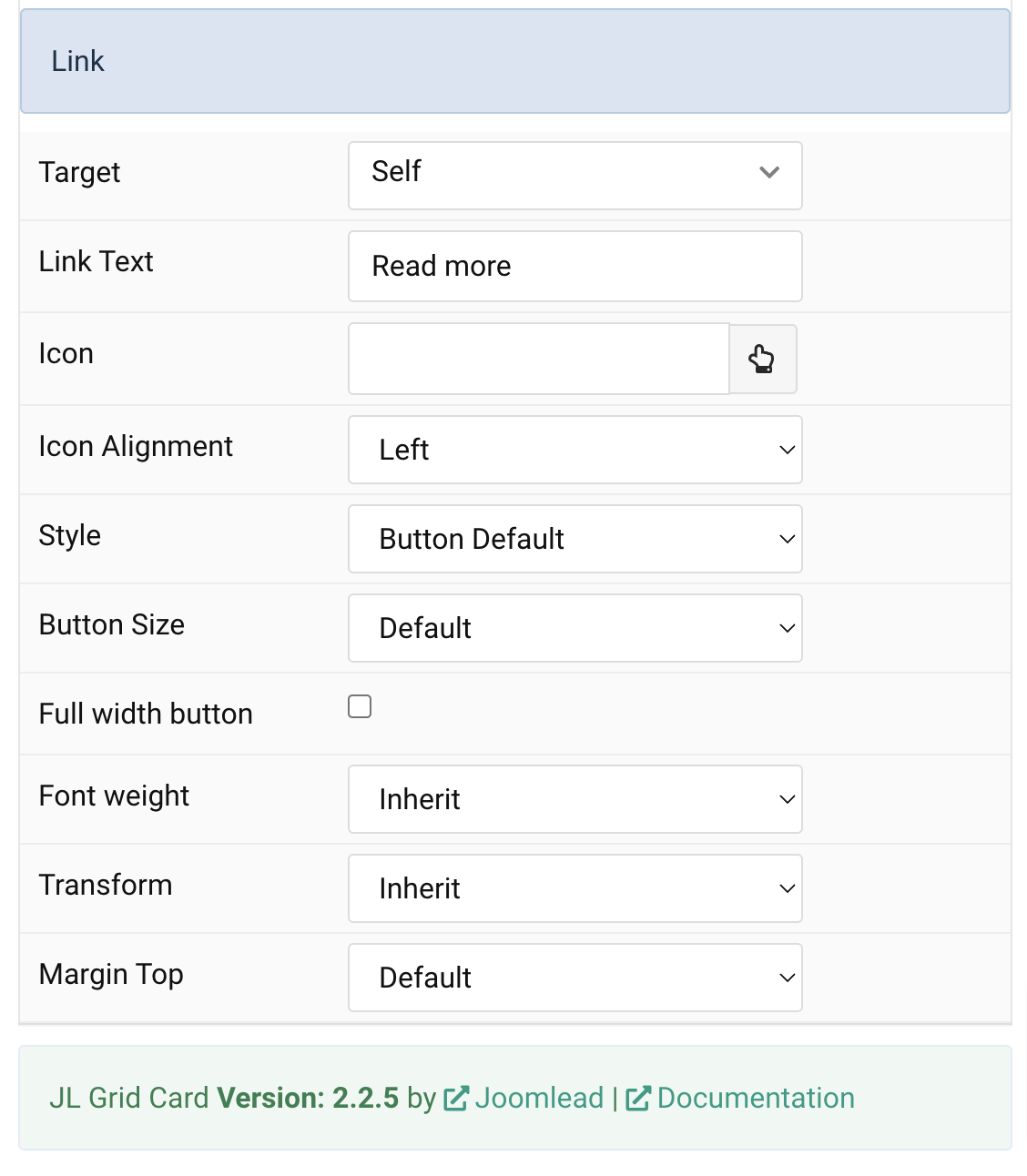
Link Settings Common settings for Link Style
| Settings | Description |
|---|---|
| Target | Target browser window when item is clicked. |
| Link Text | Specify the button label. |
| Icon | Pick an optional Font Awesome icon. |
| Icon Alignment | Choose the icon position. |
| Style | Set the button style. |
| Button Size | Set the button size. |
| Full width button | Set the fullwidth for button. |
| Font weight | Add one of the following classes to modify the font weight of your text. |
| Transform | The following options will transform text into uppercased, capitalized or lowercased characters. |
| Margin Top | Set the top margin. Note that the margin will only apply if the content field immediately follows another content field. |
General, Parallax and Parallax Background tab
Please take a look the documentation here for more detail about these tabs settings

Can Content Grid be set to pick content from a category?
Thank you
Sure, you can choose a special joomla category or wordpress category(if you use content grid wp).