JL Nav Particle
Defines different styles for list navigations. See Demo Page.
Installation Installing the particle on your website is a really simple process. You can refer to the document here to know more.
Requirements Nav particles require Uikit 3 for Gantry 5 Atom to be installed and enabled in your theme layout settings.
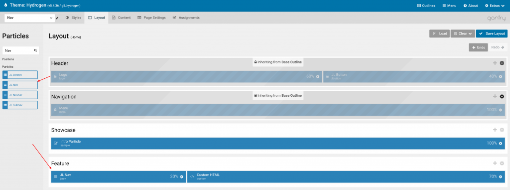
Go to Template/Theme Settings > select the Layout to add Nav particle (i.e: Home) -> Layout tab -> Drag and drop the JL Nav Particle from Particles panel (left corner) to the section you want to display the particle.
Settings
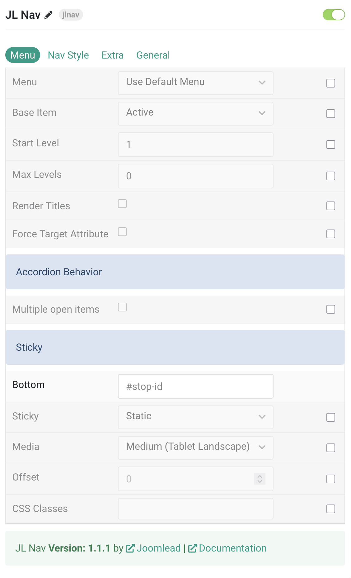
| Settings | Description |
|---|---|
| Menu | Select menu to be used with the particle. |
| Base Item | Select a menu item to always be used as the base for the menu display. |
| Start Level | Set the start level of the menu. |
| Max Levels | Set the maximum number of menu levels to display. |
| Render Titles | Renders the titles/tooltips of the Menu Items for accessibility. |
| Force Target Attribute | Adds target="_self" attribute to all menu links instead of omitting the default value. Fixes an issue with pinned tabs in Firefox where external links always open in a new tab. |
| Behavior | Common settings for the Subnav behavior. |
| Multiple open items | To display multiple subnav menu items at the same time without one collapsing when the other one is opened. |
| Sticky | Common settings for Sticky animation. |
| Bottom | Bind the sticky behavior to a specific element, so that it disappears after scrolling past that point of the page. |
| Sticky | Let the navbar stick at the top of the viewport while scrolling or only when scrolling up. |
| Media | Select the device size for sticky. |
| Offset | The offset the Sticky should be fixed to. |
| CSS Classes | CSS class name for the particle. |
Nav Style Tab
Card You can use the card style for the nav wrapper, or simply use the background customization options below.
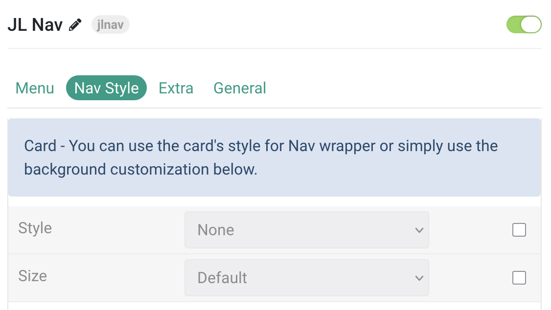
| Settings | Description |
|---|---|
| Style | Select one of the boxed card styles (Default, Primary, Secondary, Hover) or choose None for a blank card style. |
| Size | Define the card’s size by setting the padding between the card and its content. Options include Small, Default, and Large. |
Nav/Subnav Common style settings for the Nav, Subnav and Module.
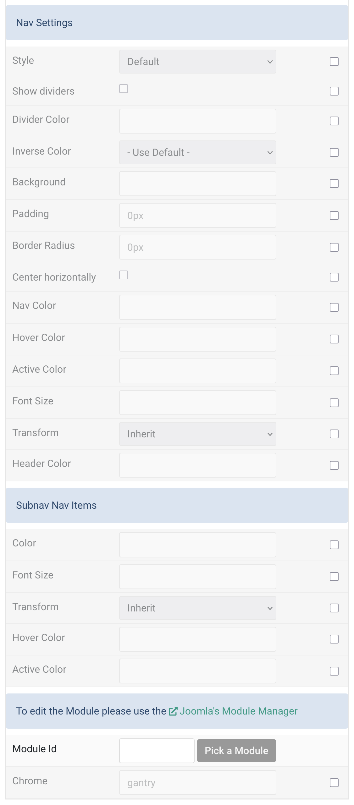
| Settings | Description |
|---|---|
| Nav Settings | |
| Style | Select a style for the nav: Default, Primary, or Secondary. |
| Show dividers | Toggle to show/hide dividers between nav items. |
| Divider Color | Customize the color of the nav item dividers. |
| Inverse Color | Set light or dark color mode for nav icons, buttons, and controls. |
| Background | Set a custom background color for the nav. |
| Padding | Set custom padding for the nav (e.g., 10px, 1rem). Leave empty to inherit card padding. |
| Border Radius | Set custom border radius for the nav (e.g., 6px, 0.5rem). |
| Center horizontally | Center the nav items horizontally if enabled. |
| Nav Color | Set the default text color for nav items. |
| Hover Color | Set the hover text color for nav items. |
| Active Color | Set the active state text color for nav items. |
| Font Size | Customize the nav item font size (e.g., 1rem, 16px). |
| Transform | Transform text: Inherit, Uppercase, Capitalize, or Lowercase. |
| Header Color | Customize the color of nav headers. |
| Subnav Items | |
| Color | Set the text color for subnav items. |
| Font Size | Customize subnav font size (e.g., 0.875rem, 14px). |
| Transform | Transform subnav text: Inherit, Uppercase, Capitalize, or Lowercase. |
| Hover Color | Set the hover color for subnav items. |
| Active Color | Set the active state color for subnav items. |
| Module Settings | |
| Module Id | Specify the Joomla module ID. Use the Module Manager to find it. |
| Chrome | Set the module chrome (e.g., gantry). Controls how the module is rendered. |
Extra Tab
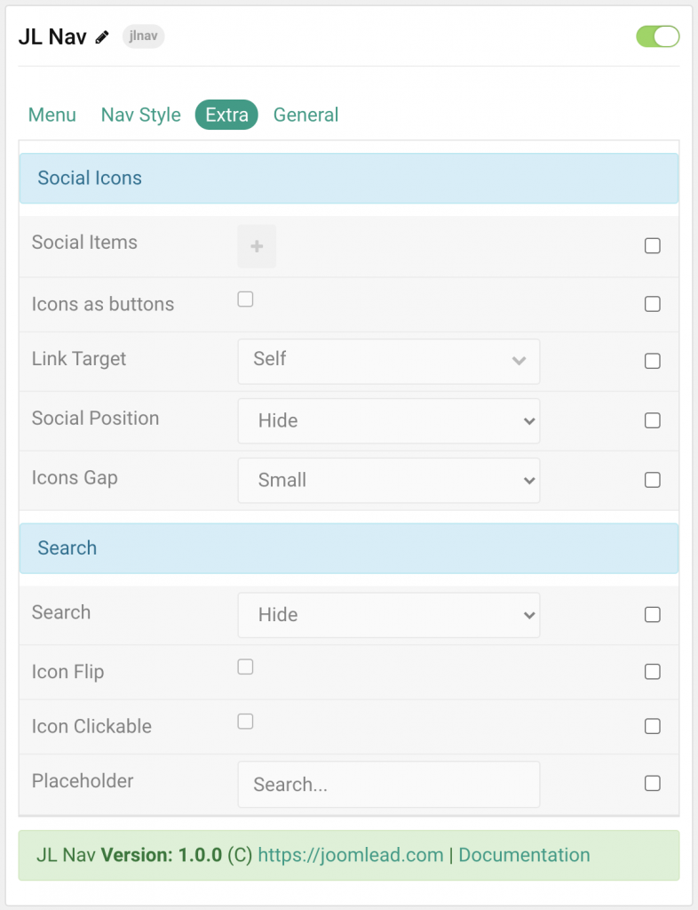
| Settings | Description |
|---|---|
| Social Icons | You can use the card’s style for Nav wrapper or simply use the background customization below. |
| Social Items | Create each item to appear in the list row. |
| Icons as buttons | Display the icons as buttons |
| Link Target | Open the link in a same or new window. |
| Social Position | Select the position for social icons. |
| Icon Gap | Set the size of the gap between the social icons. |
| Search | Common settings for search form. |
| Search | Select the position that will display the search. |
| Icon Flip | Display the icon to the right. |
| Placeholder | Customize the search placeholder. |
General, Parallax and Parallax Background tab
Please take a look the documentation here for more detail about these tabs settings

Comments