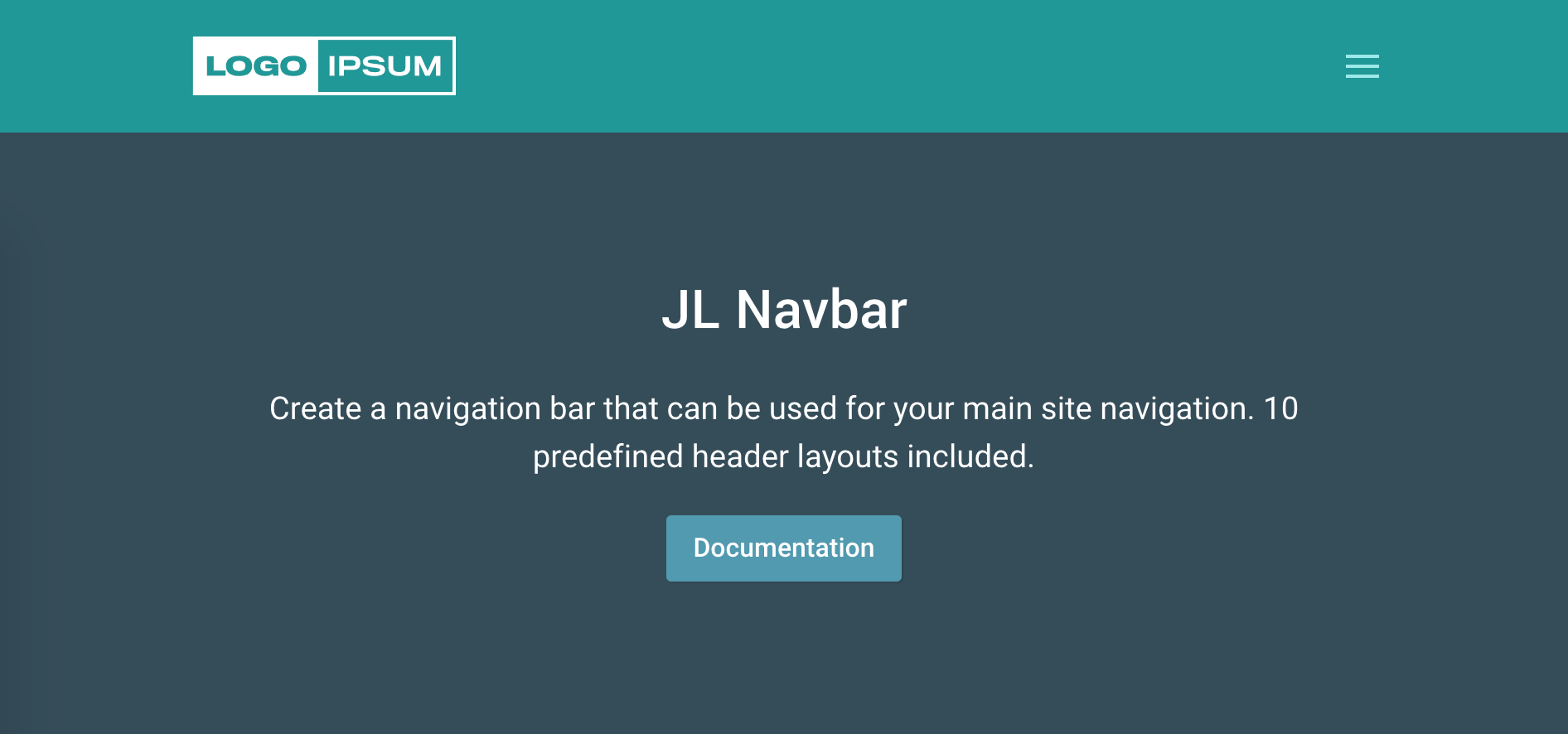
JL Navbar Particle
Installation Installing the particle on your website is a really simple process. You can refer to the document here to know more.
Requirements Navbar particles require Uikit 3 for Gantry 5 Atom to be installed and enabled in your theme layout settings.
Usage
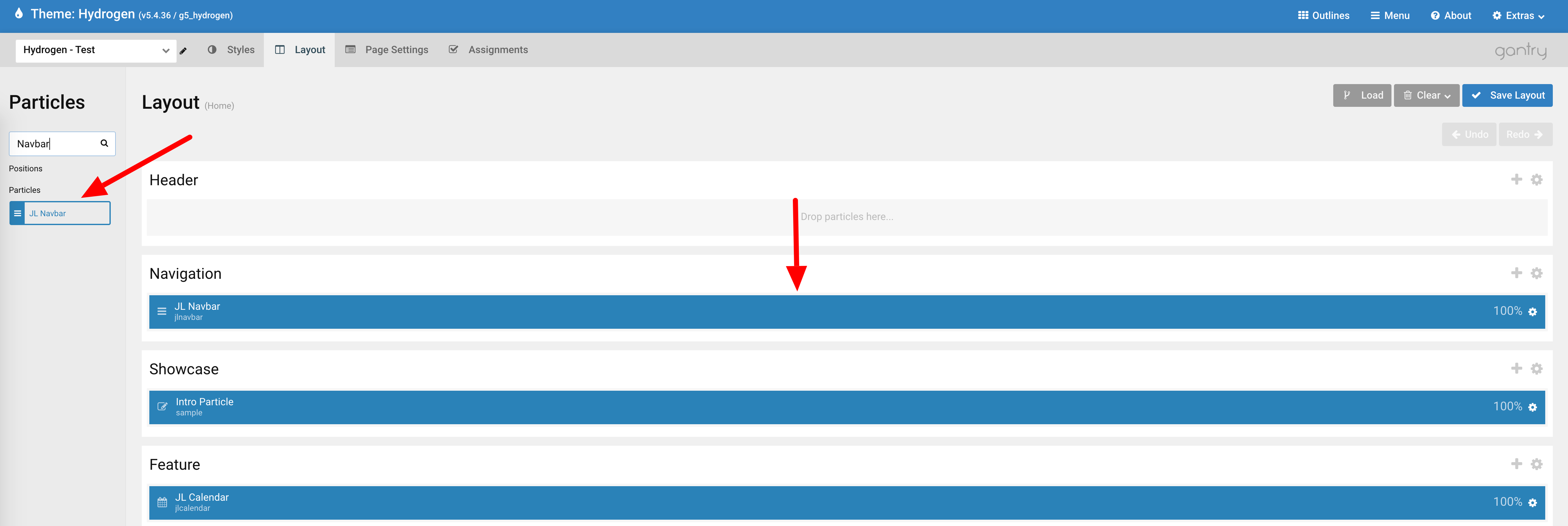
Step 1 Go to Template/Theme Settings > select the Layout to add Navbar particle (i.e: Choose Base Outline if you want to use the Navbar particle for the whole layout or Home if you want to use the Navbar for homepage only) -> Layout tab -> Drag and drop the JL Navbar Particle from Particles panel (left corner) to the section you want to display the particle.
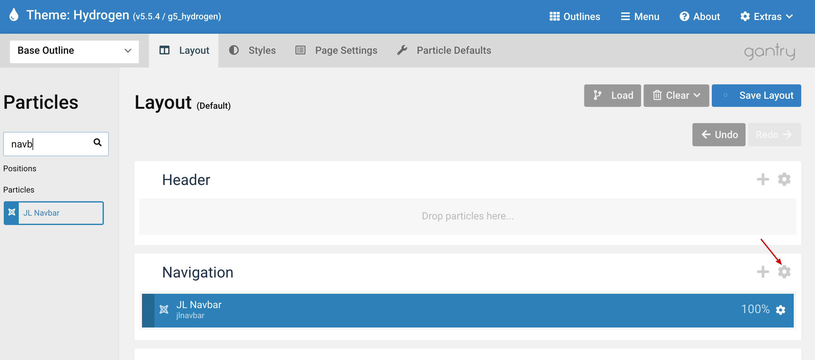
Step 2 Remove the Section layout container and unset the margin/padding for the content within the section.
We need to remove the section layout container so we can use the Max Width option which described here, remove the default padding/margin to ensure the same horizontal padding (left/right) across all sections.
Custom method
If your theme/template does not support section variations, you can use custom css classes by adding Gantry 5 core CSS Classes name: nomarginall nopaddingall
Open section settings by clicking the section icon settings
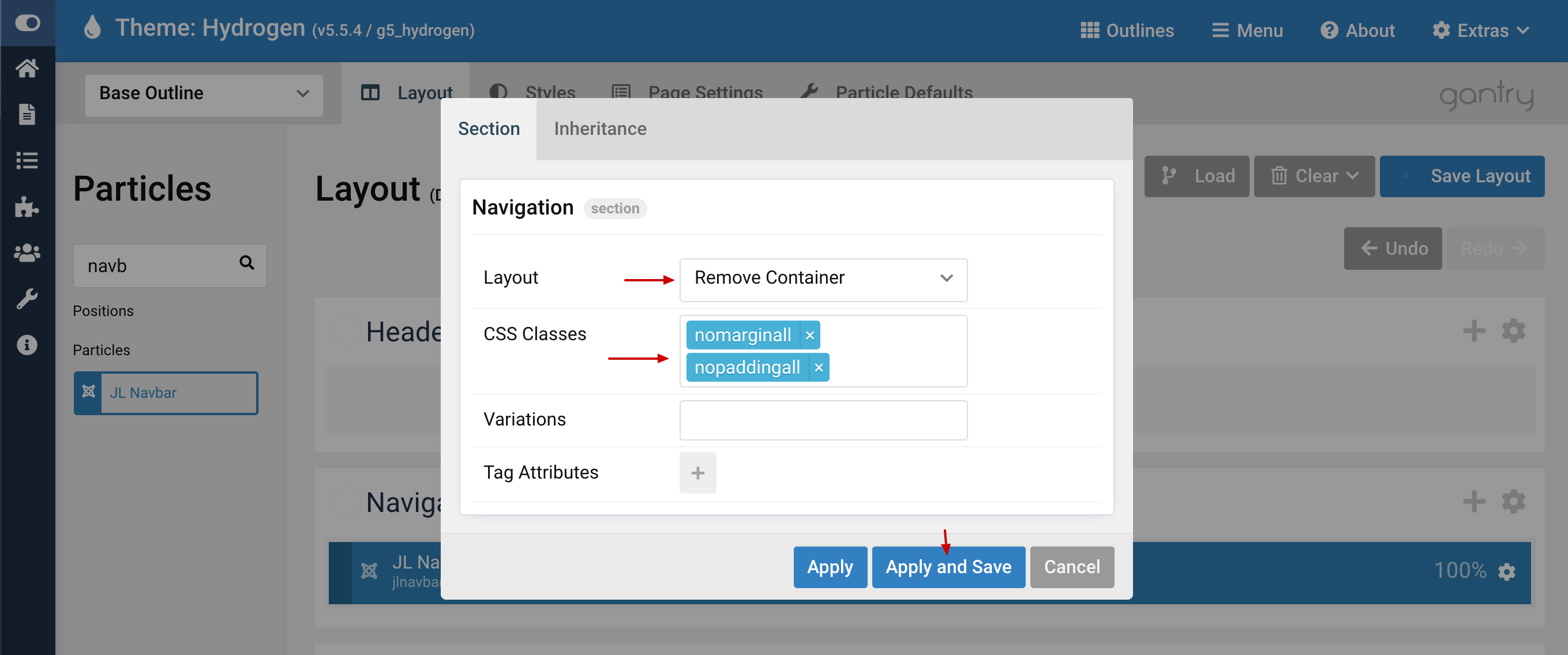
Add nomarginall nopaddingall css classe names into CSS Classes textbox. Hit Apply and Save
Section variations method
If your theme/template support section variations, you can choose the No Margin All and No Padding All from the selection list.
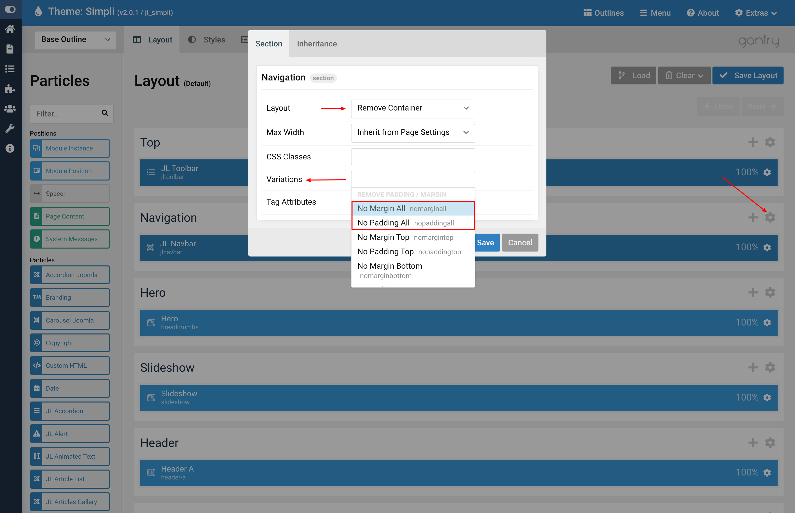
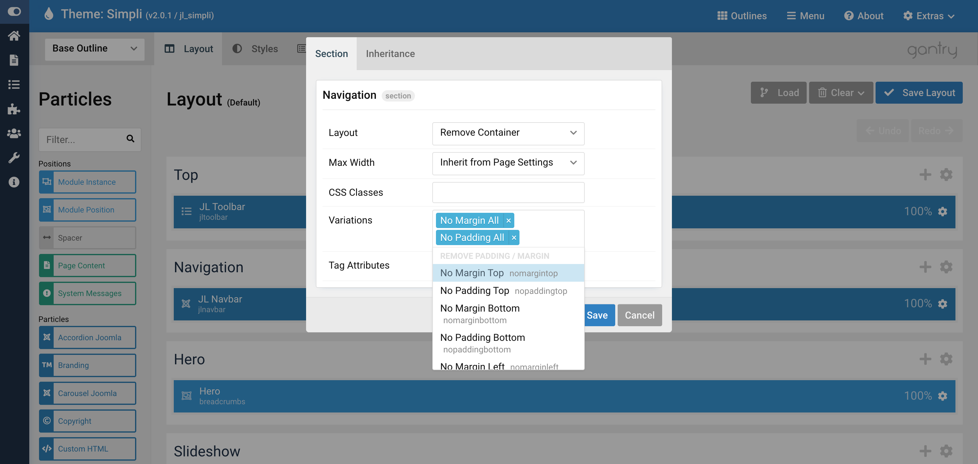
Click Apply and Save button.
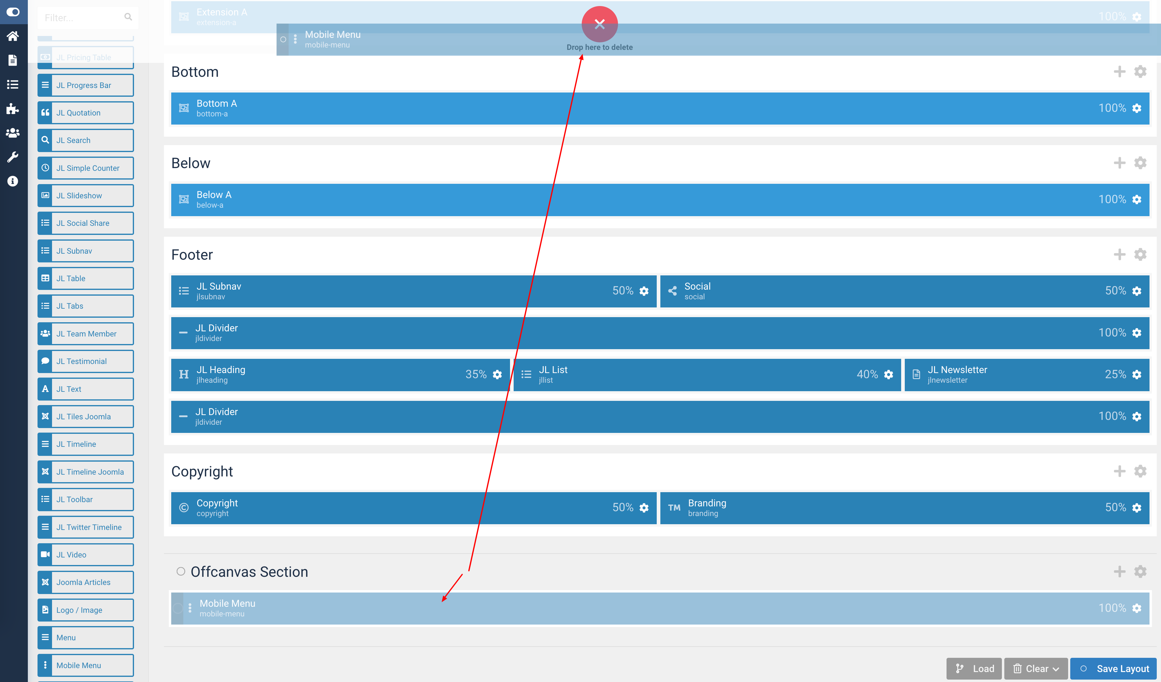
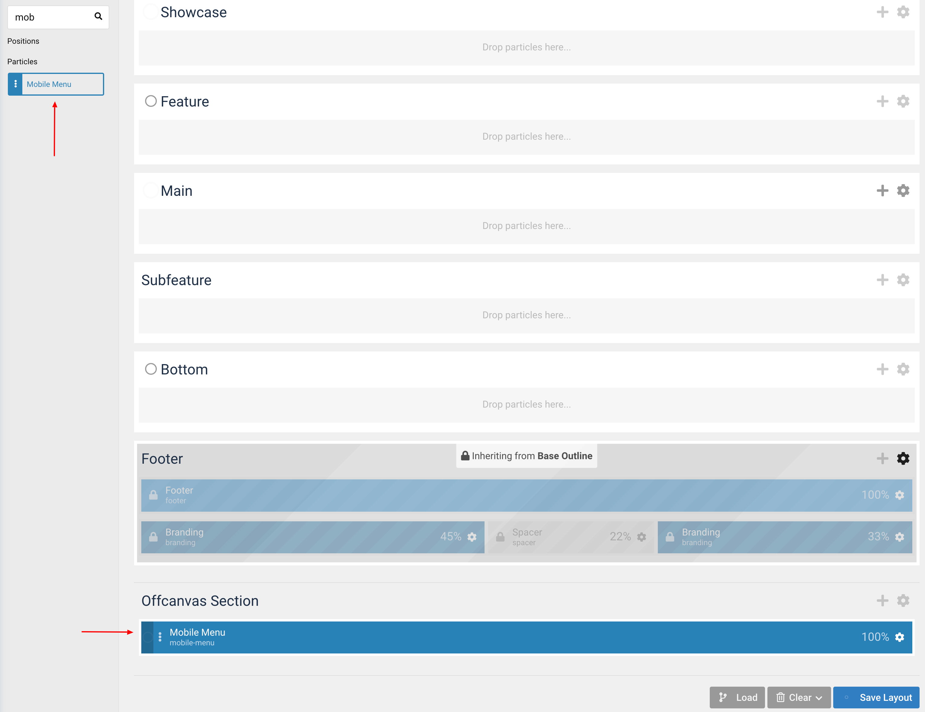
Step 3 Remove the default mobile canvas.
Gantry 5 based theme using Mobile Menu particle to handle the Menu canvas on mobile devices which assigned to the Offcanvas Section by default. This Particle is the container target where, on Mobile, the Menu will be injected.
You can remove this particle to avoid the menu conflict on mobile if any, the Navbar particle already supports three Mobile menu styles including OffCanvas, Modal and Dropdown.
Preview
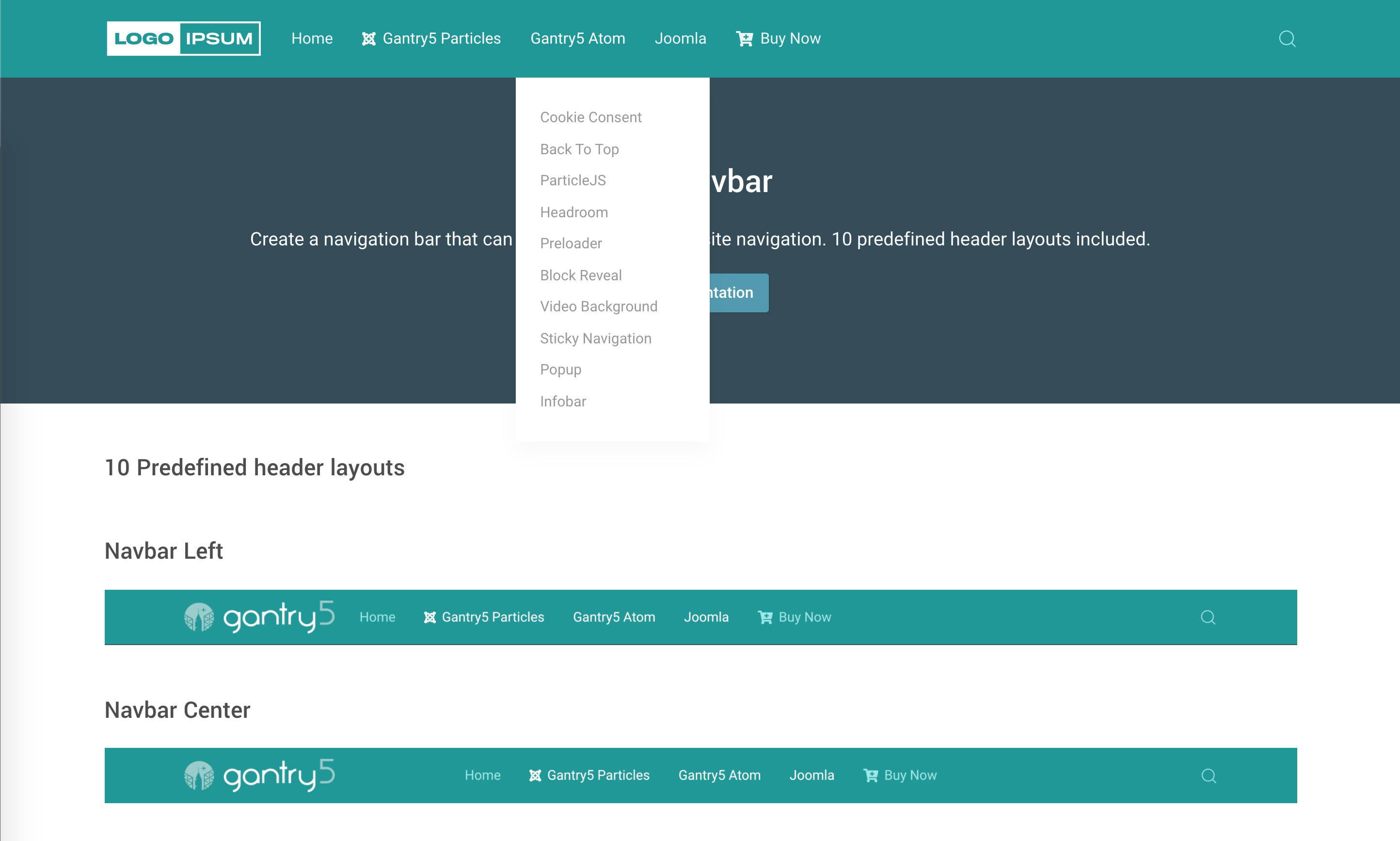
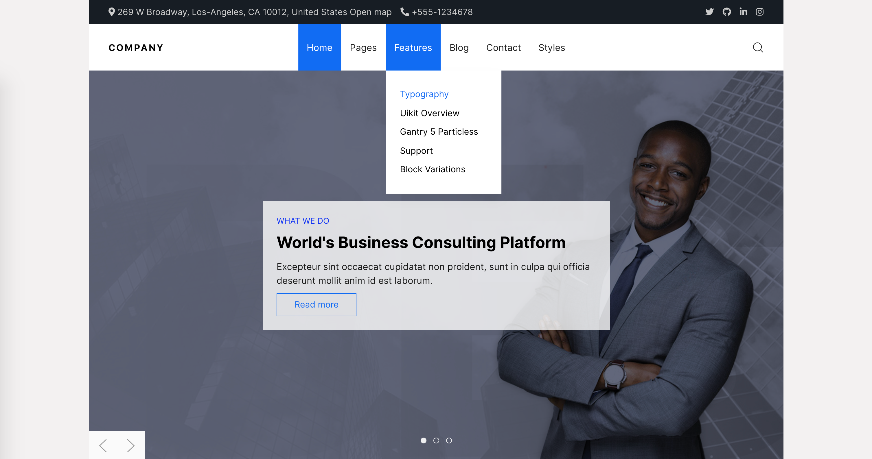
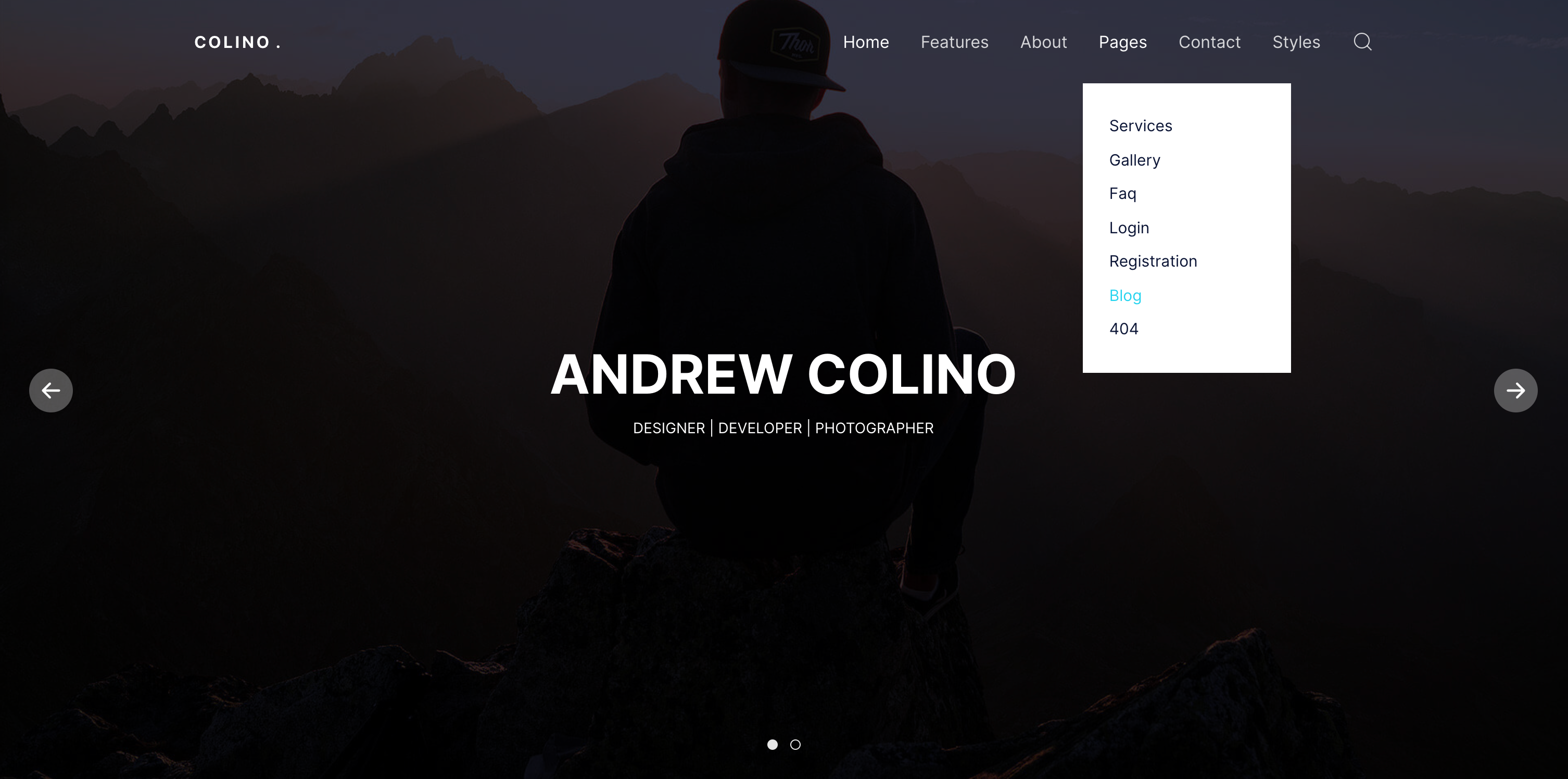
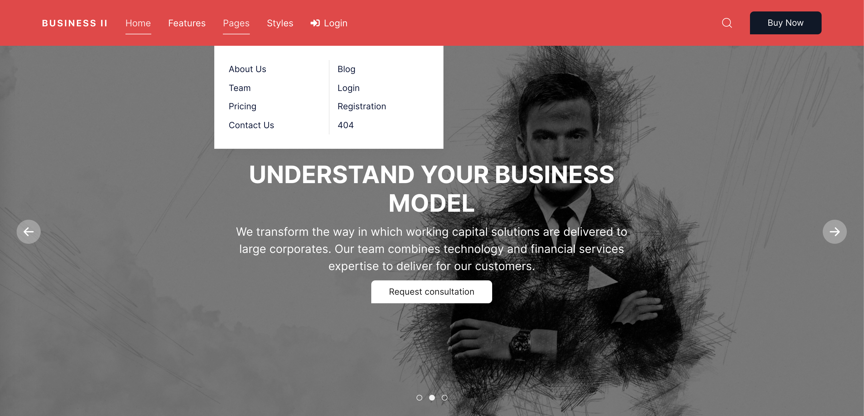
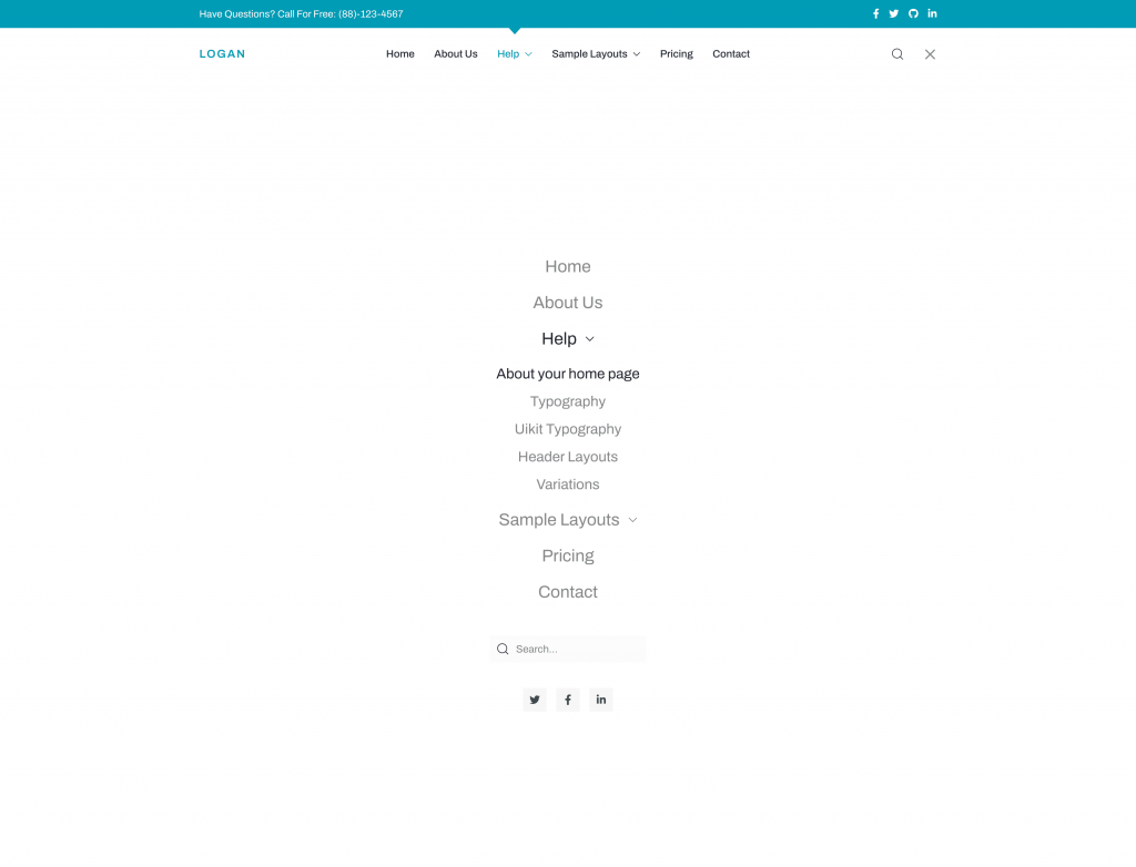
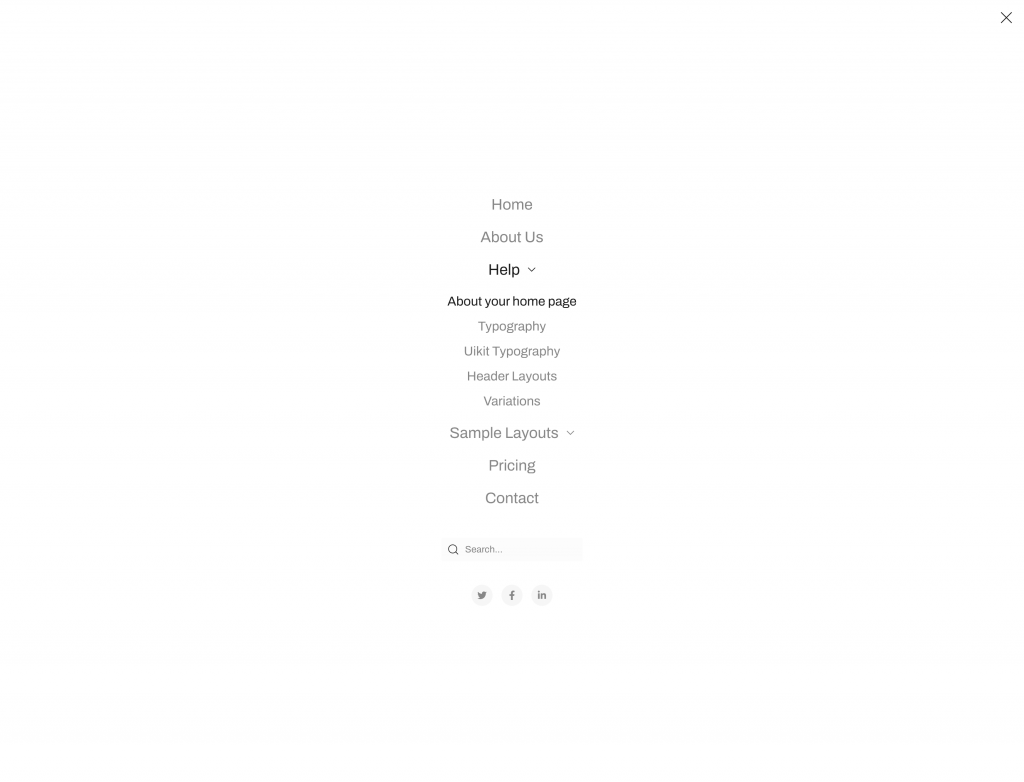
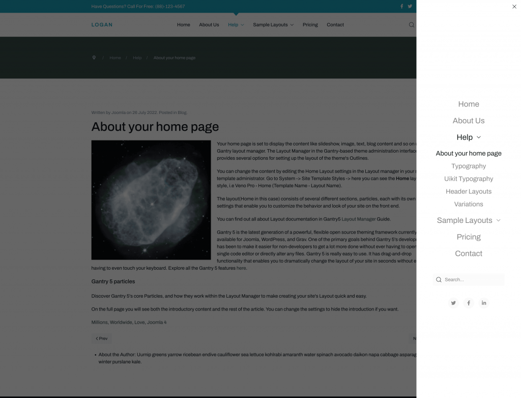
Mega menu
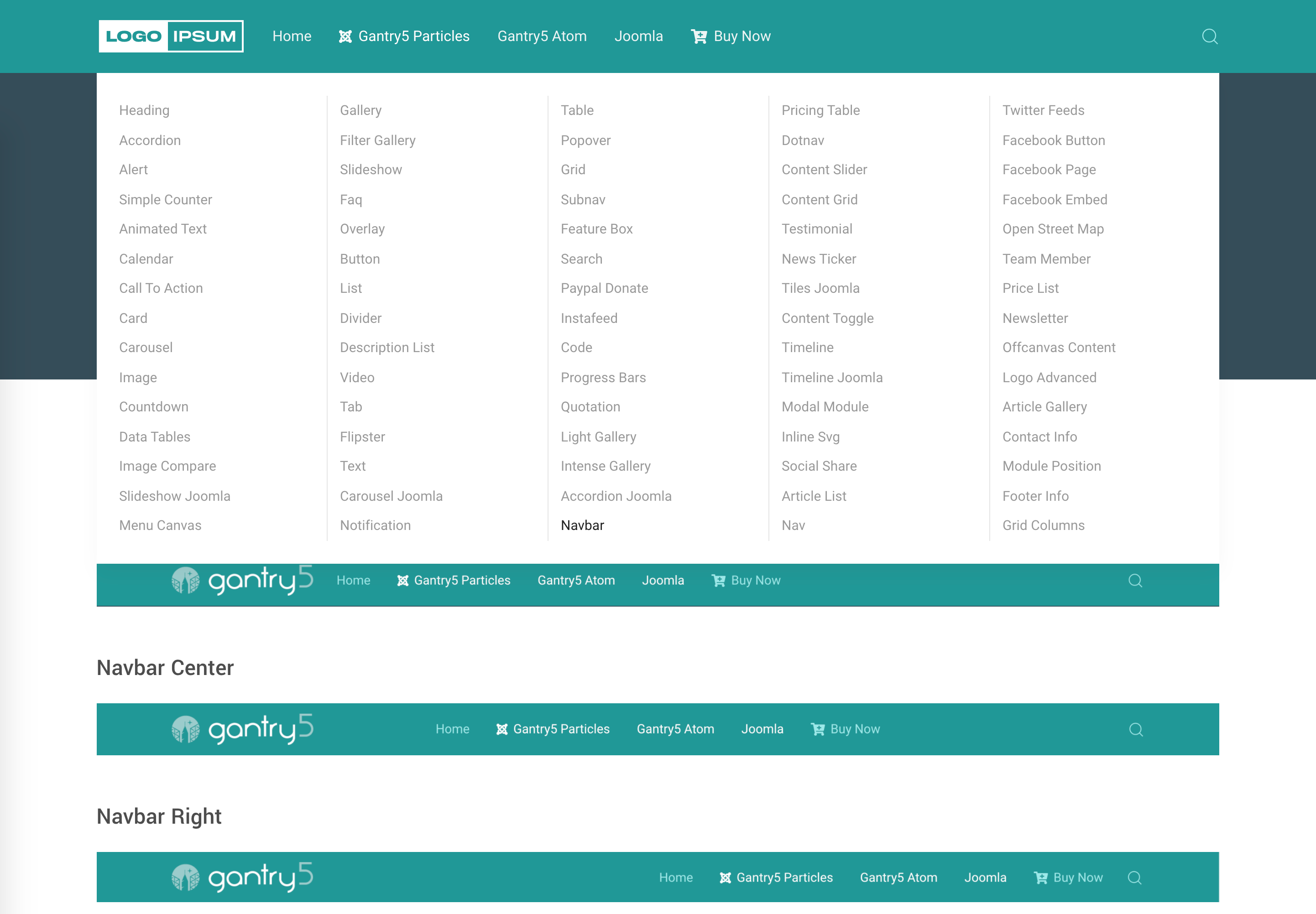
Mobile/Tablet
Included for the next JoomLead templates upgrade (Joomla 4) by default, here some screenshots:
Settings
Manage Navbar settings, customize styles and header layouts.
General Tab
Customize the logo and menu of your website.
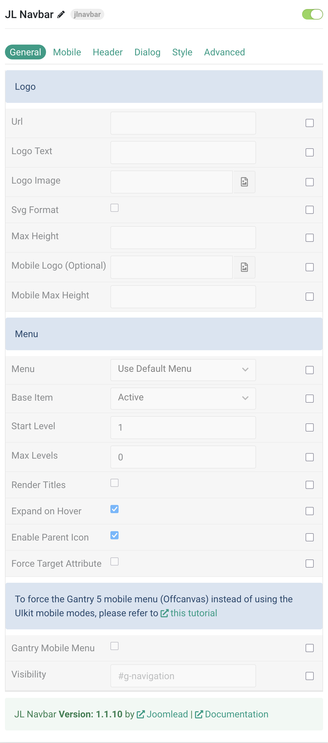
Logo Settings
| Settings | Description |
|---|---|
| Url | Custom Url for the logo. Leave empty to go to home page. |
| Logo Text | Type in the Logo Text that will be used in case no Logo Image from your media library has been picked. |
| Logo Image | Upload your logo in the png, jpg or SVG file format for best quality on all screens. |
| Svg Support | Inject inline SVG images into the page markup and style them with CSS. Use this option if you use svg format. |
| Maximum Height | Set the logo height |
| Mobile Logo (Optional) | Select an alternative logo, which will be used on small devices. |
| Mobile Max Height | Set the Mobile logo height. |
Menu Settings
| Settings | Description |
|---|---|
| Menu | Select menu to be used with the particle. |
| Base Item | Select a menu item to always be used as the base for the menu display. |
| Start Level | Set the start level of the menu. |
| Max Levels | Set the maximum number of menu levels to display. |
| Render Titles | Renders the titles/tooltips of the Menu Items for accessibility. |
| Expand on Hover | Allows to enable / disable the ability to expand menu items by hover or click only |
| Enable Parent Icon | Allows to enable / disable the parent Icon that included subnav items |
| Force Target Attribute | Adds target="_self" attribute to all menu links instead of omitting the default value. Fixes an issue with pinned tabs in Firefox where external links always open in a new tab. |
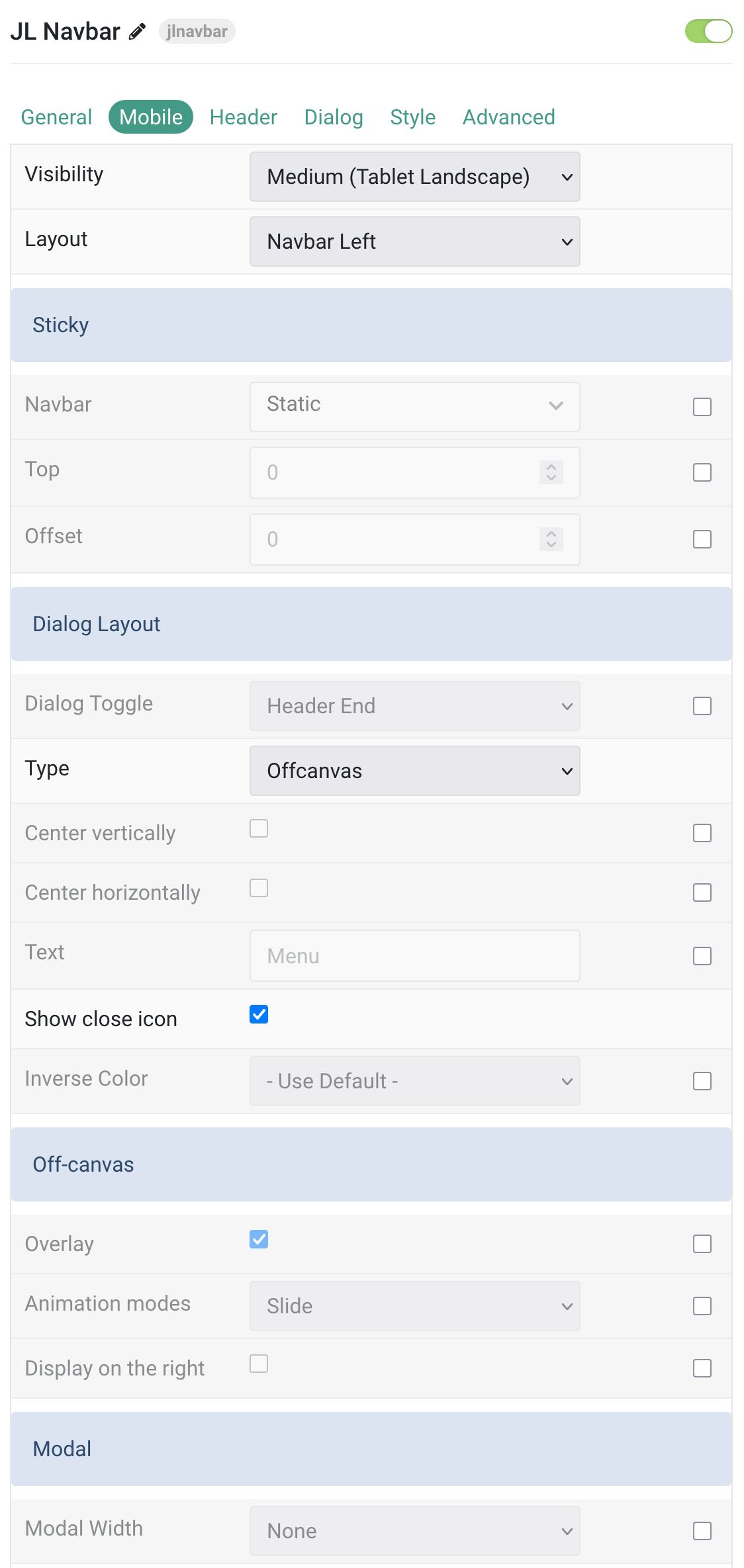
Mobile Tab
| Settings | Description |
|---|---|
| Mobile | Common settings for Mobile header. |
| Visibility | Select the device size where the default header will be replaced by the mobile header. |
| Layout | Select the layout for the logo-mobile, navbar-mobile and header-mobile positions. |
| Sticky | Let the navbar stick at the top of the viewport while scrolling or only when scrolling up. |
| Top | The top offset from where the element should be stick. |
| Offset | The offset the Sticky should be fixed to. |
| Dialog Layout | Common settings for the mobile Dialog Layout. |
| Dialog Toggle | Select the dialog position that will display the dialog (Navbar Start , Navbar End, Header Start, Header End). |
| Type | Select the menu type displayed in the mobile position. |
| Center vertically | Center the menu and the content vertically. |
| Center horizontally | Center the menu and the content horizontally. |
| Text | Show the text label Menu next to the hamburger icon. |
| Show close icon | Use this option to create a close button and enable its functionality. |
| Inverse Color | Set light or dark color mode for nav icon, buttons and controls. |
| Off-canvas | Common settings for Offcanvas animation. |
| Overlay | Use this option to add an overlay, blanking out the page, |
| Animation modes | Choose between Slide, Reveal and Push offcanvas animations. |
| Display on the right | Use this option to display the offcanvas bar on the right. |
| Modal | Select a Modal Width option to customize the content width. |
| Dropdown animation | Toggle dropdown animation on mobile. |
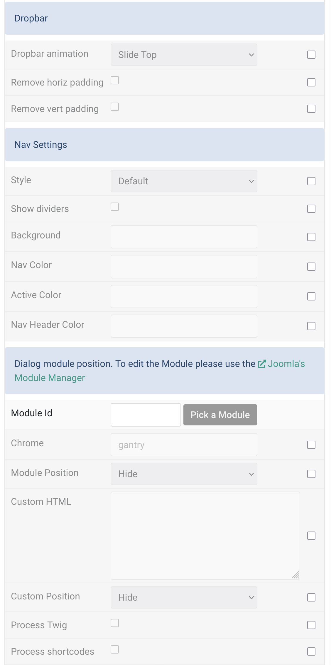
| Dropbar | Choose Dropbar animation for mobile navbar |
| Dropdown animation | Select the animation on how the dropbar appears below the navbar. |
| Remove horiz padding | Remove horizontal padding |
| Remove vert padding | Remove vertical padding |
| Nav Settings | Common settings for Nav |
| Style | Choose the Menu Style. |
| Show dividers | Show dividers between menu items. |
| Background | Customize the background color. |
| Nav Color | Customize the nav item color if needed. |
| Active Color | Customize the nav item hover/active color if needed. |
| Nav Header Color | Customize the Nav Header Color. |
| Dialog module position | Add custom Joomla Module or WordPress widget to the Mobile header navbar |
| Module Id | Pick a Joomla module (Joomla version only) |
| Chrome | Module Chrome |
| Module Position | Select the position where the module content will be displayed. Supported positions include: Navbar Start, Navbar End, Header Start, Header End, Dialog Start, Dialog End, and Logo End. |
| Custom html | Enter the custom html content. |
| Custom Position | Select the position where the custom html content will be displayed. Supported positions include: Navbar Start, Navbar End, Header Start, Header End, Dialog Start, Dialog End, and Logo End. |
| Process Twig | Enable Twig template processing in the content. Twig will be processed before shortcodes. |
| Process shortcodes | Enable shortcode processing / filtering in the content. |
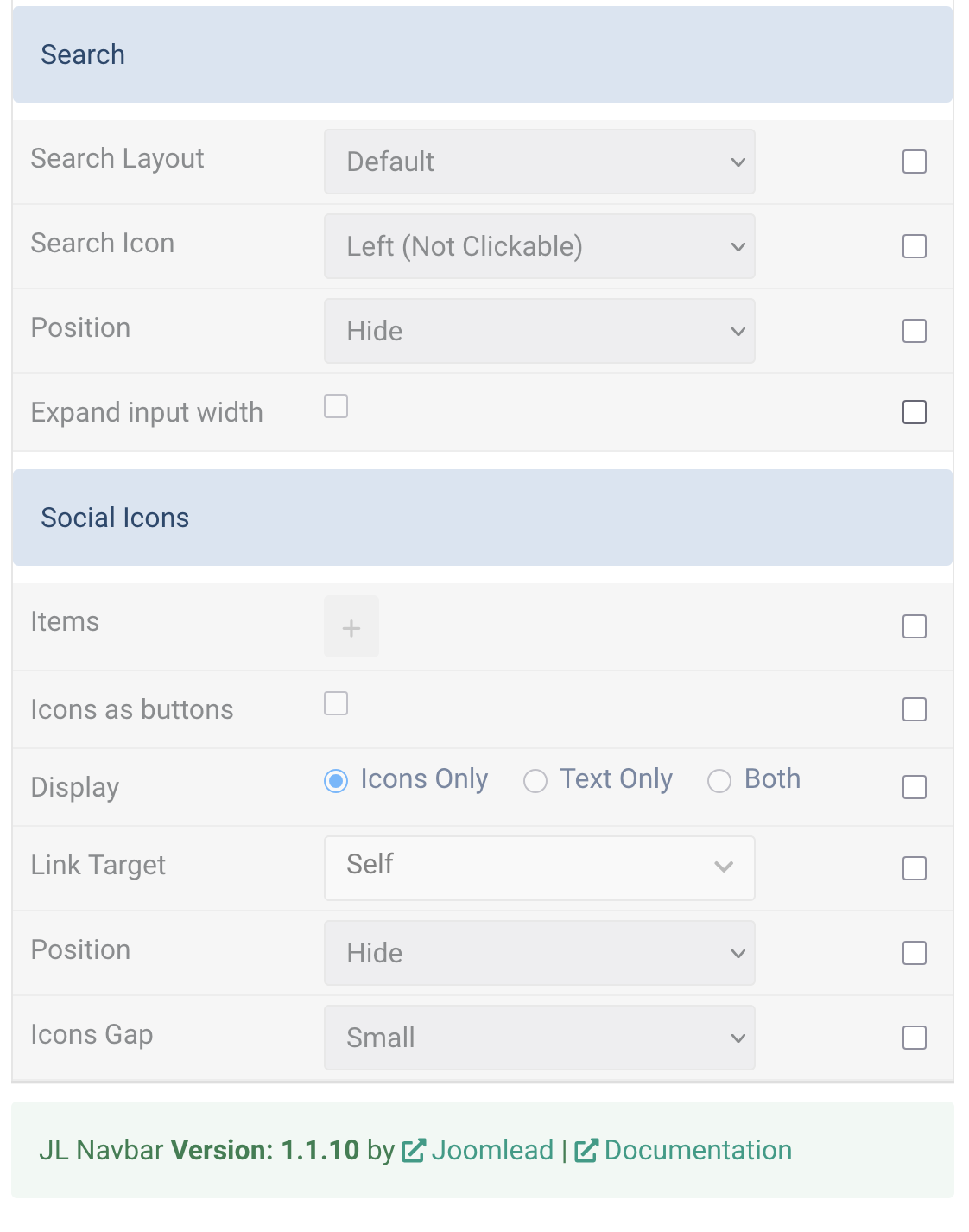
| Search | Add search form to header mobile layout |
| Search Layout | Select the search style. |
| Search Icon | Display a search icon on the left or right of the input field. The icon on the right can be clicked to submit the search. |
| Position | Select the position that will display the search. |
| Expand input width | Enable this option to expand the input width |
| Social Icons | You can add and choose to display the social icons in the mobile navbar or mobile dialog positions. |
| Items | Create each social item to appear in the list row. |
| Icons as buttons | Display the social icon link as a button. |
| Display | Option to display the social icon, link text only, or both. |
| Link Target | Open the link in a same or new window. |
| Position | Option to display the social icon, link text only, or both. |
| Display | Select the position that will display the social icons. |
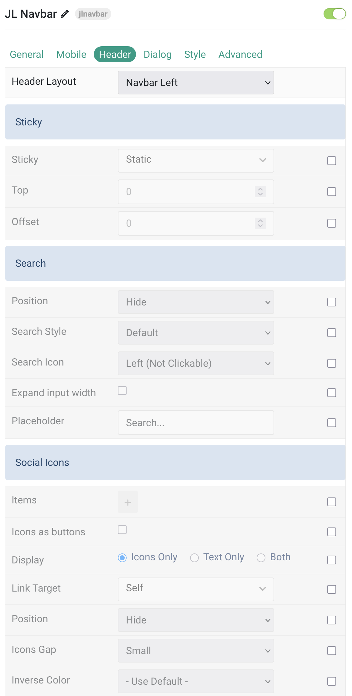
Header Tab
| Setting | Description |
|---|---|
| Header Layout | Prepared header layouts define the position of logo, navbar and header. |
| Sticky | Sticky settings for the navbar position behavior. |
| Sticky | Let the navbar stick at the top of the viewport while scrolling or only when scrolling up. |
| Top | The top offset from where the element should stick. |
| Offset | The offset the Sticky should be fixed to. |
| Search | Search settings for header layout. |
| Position | Select the position that will display the search. |
| Search Style | Select the search style (default, dropdown, modal). |
| Search Icon | Display a search icon on the left or right of the input field. |
| Expand Input Width | Enable this option to expand the search input width. |
| Placeholder | Customize the search placeholder text. |
| Social Icons | Settings for adding and displaying social icons in the header. |
| Items | Create each social item to appear in the list row. |
| Icons as Buttons | Display the social icon links as buttons. |
| Display | How to display social icons: icons only, text only, or both. |
| Link Target | Open the social links in the same or new window. |
| Position | Select the position that will display the social icons. |
| Icons Gap | Set the size of the gap between social icons. |
| Inverse Color | Set light or dark color mode for nav icon, buttons, and controls. |
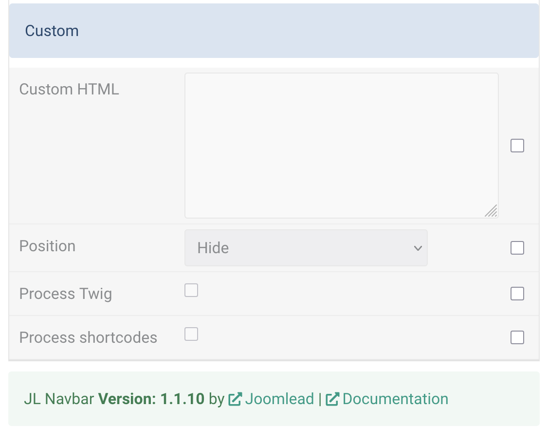
| Custom HTML | Add custom HTML content to the header. |
| HTML | Enter custom HTML content here. |
| Position | Select where the custom HTML will be displayed. |
| Process Twig | Enable Twig template processing in the content before shortcodes. |
| Process Shortcodes | Enable shortcode processing/filtering in the content. |
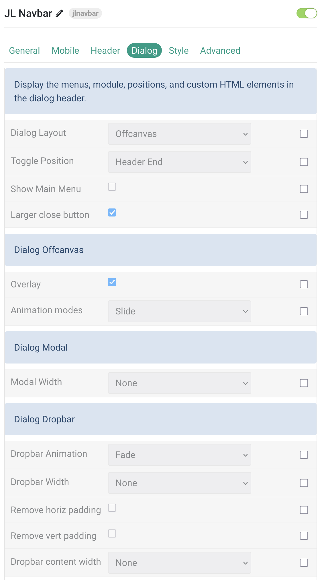
Dialog Tab
Setting the Dialog layout to display menus, modules, social icons, search form. Starting from version 1.1.10, the Header Layout types such as Toggle Offcanvas and Toggle Modal have been removed, as you can now assign positions directly to Dialog Start and Dialog End to display the toggle menu, using the Dialog layout to show the dialog with animations like Offcanvas, Modal, or Dropbar.

Dropbar mode
Modal mode
Offcanvas mode
| Setting | Description |
|---|---|
| Dialog Layout | Choose the dialog type: Offcanvas, Modal, or Dropbar. |
| Toggle Position | Select the position that will display the dialog toggle. |
| Show Main Menu | Enable to display the main menu in the dialog. |
| Larger Close Button | Enable a larger close button for better accessibility. |
| Dialog Offcanvas Settings | Settings specific to the offcanvas dialog layout. |
| Overlay | Add an overlay that blanks out the page behind the offcanvas dialog. |
| Animation Modes | Choose animation: Slide, Reveal, Push, or None. |
| Dialog Modal Settings | Settings specific to the modal dialog layout. |
| Modal Width | Set the width of the modal content. |
| Dialog Dropbar Settings | Settings specific to the dropbar dialog layout. |
| Dropbar Animation | Animation for dropbar appearance below the navbar. |
| Dropbar Width | Set the dropbar width when sliding in from sides. |
| Remove Horizontal Padding | Remove horizontal padding in the dialog. |
| Remove Vertical Padding | Remove vertical padding in the dialog. |
| Dropbar Content Width | Set the width of the dropbar content area. |
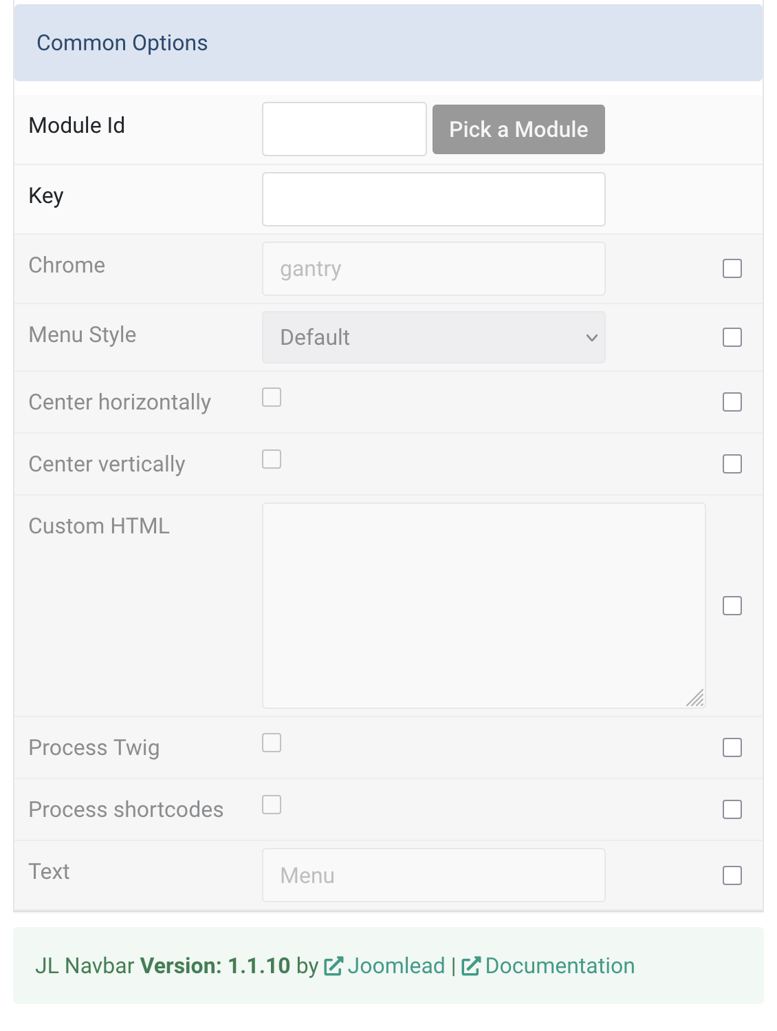
| Common Options | Settings common across dialog layouts. |
| Module Id | Enter a module ID to load in the dialog position. |
| Key | Position name for the dialog. |
| Chrome | Module chrome style for this position (default: gantry). |
| Menu Style | Select menu style: Default, Primary, or Secondary. |
| Center Horizontally | Center the navigation horizontally in the dialog. |
| Center Vertically | Center the navigation vertically in the dialog. |
| Custom HTML | Add custom HTML content inside the dialog. |
| Process Twig | Enable processing of Twig templates in custom content. |
| Process Shortcodes | Enable shortcode processing/filtering in custom content. |
| Menu Text | Show text next to the menu icon (e.g., “Menu”). |
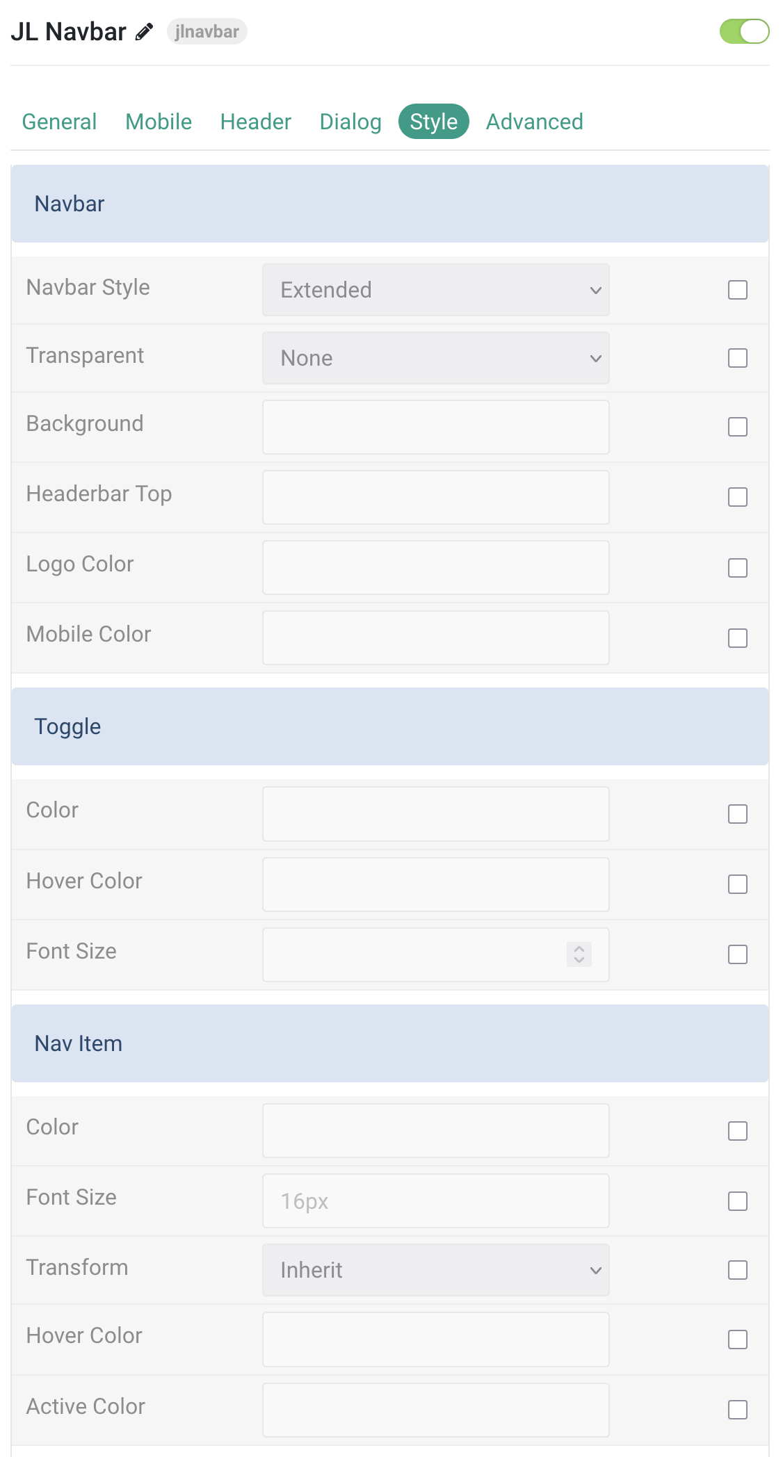
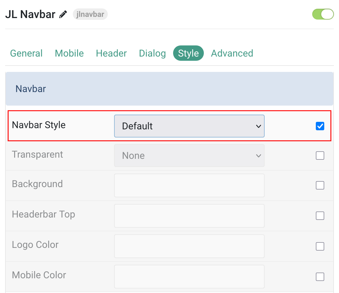
Style Tab
| Settings | Description |
|---|---|
| Navbar | Common settings for the main navigation bar. |
| Navbar Style | Select the menu navbar style. |
| Transparent | Make the header transparent and overlay the page background. |
| Background | Customize the navbar background color. |
| Headerbar Top | Customize the Headerbar top background color. |
| Logo Color | Customize the logo text color. |
| Mobile Color | Customize the mobile logo text color. |
| Toggle | Settings for the mobile menu toggle icon. |
| Color | Customize the toggle color. |
| Hover Color | Customize the toggle hover color. |
| Font Size | Customize the toggle text font size. |
| Nav Item | Settings for top-level nav items. |
| Color | Customize the nav item color. |
| Font Size | Customize the nav item font size (rem, em, px). |
| Transform | Transform nav item text to uppercase, capitalized, or lowercase. |
| Hover Color | Customize the nav item hover color. |
| Active Color | Customize the nav item active color. |
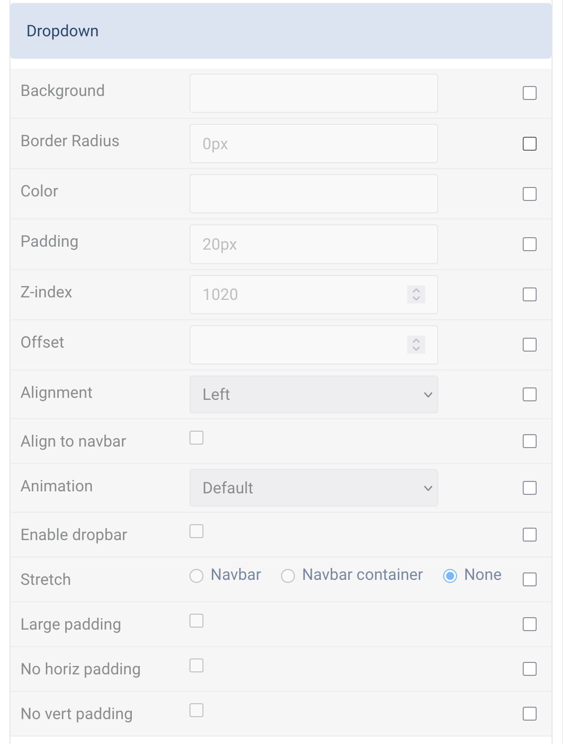
| Dropdown | Styling for dropdown menus. |
| Background | Customize the dropdown background color. |
| Border Radius | Customize the dropdown border radius (rem, em, px). |
| Color | Customize the dropdown text color. |
| Padding | Customize the dropdown padding. |
| Z-index | Customize the z-index for the dropdown layer. |
| Offset | Set the vertical offset between the dropdown and parent item (in px). |
| Alignment | Set horizontal alignment: left, center, or right. |
| Align to navbar | Align dropdown to the full width of the navbar. |
| Animation | Set dropdown animation effect (e.g., Slide Top, Scale Down, Reveal Right, etc.). |
| Enable dropbar | Display a dropbar below the navbar. |
| Stretch | Stretch dropdown to navbar or navbar container. |
| Large padding | Add large padding inside dropdown. |
| No horiz padding | Remove horizontal padding from dropdown. |
| No vert padding | Remove vertical padding from dropdown. |
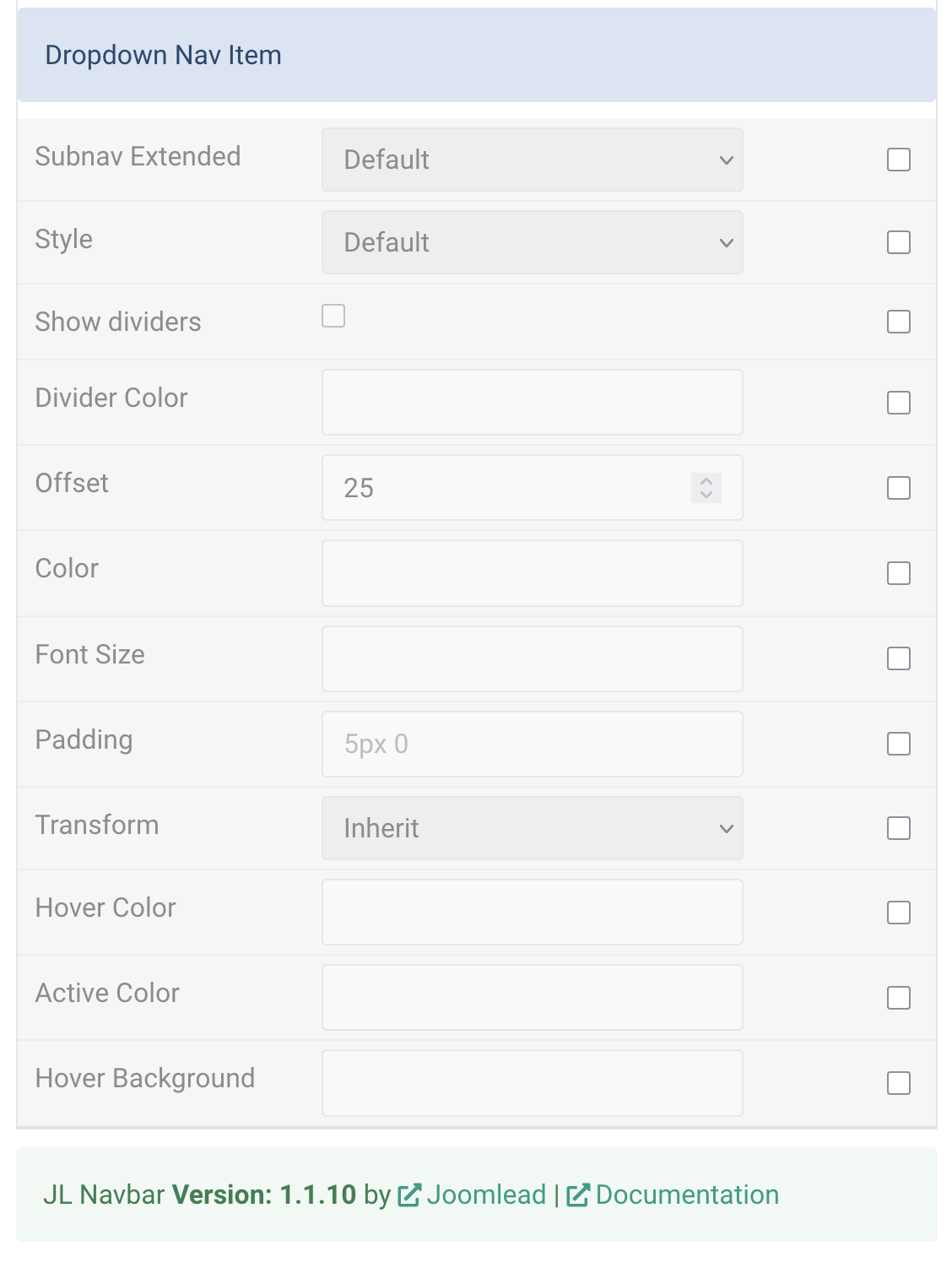
| Dropdown Nav Item | Settings for dropdown nav items. |
| Subnav Extended | Choose between Default, Collapsible (accordion), or Drop style. |
| Style | Set dropdown nav item style (e.g., Secondary). |
| Show dividers | Enable dividers between nav items in dropdown. |
| Divider Color | Customize divider color between nav items. |
| Offset | Set vertical offset between dropdown items and their parent (in px). |
| Color | Customize the dropdown nav item text color. |
| Font Size | Customize the dropdown nav item font size (rem, em, px). |
| Padding | Customize the dropdown nav item padding. |
| Transform | Transform dropdown nav text to uppercase, capitalized, or lowercase. |
| Hover Color | Customize hover color for dropdown nav items. |
| Active Color | Customize active color for dropdown nav items. |
| Hover Background | Set background color for hover/active dropdown nav items (secondary style only). |
Advanced Tab
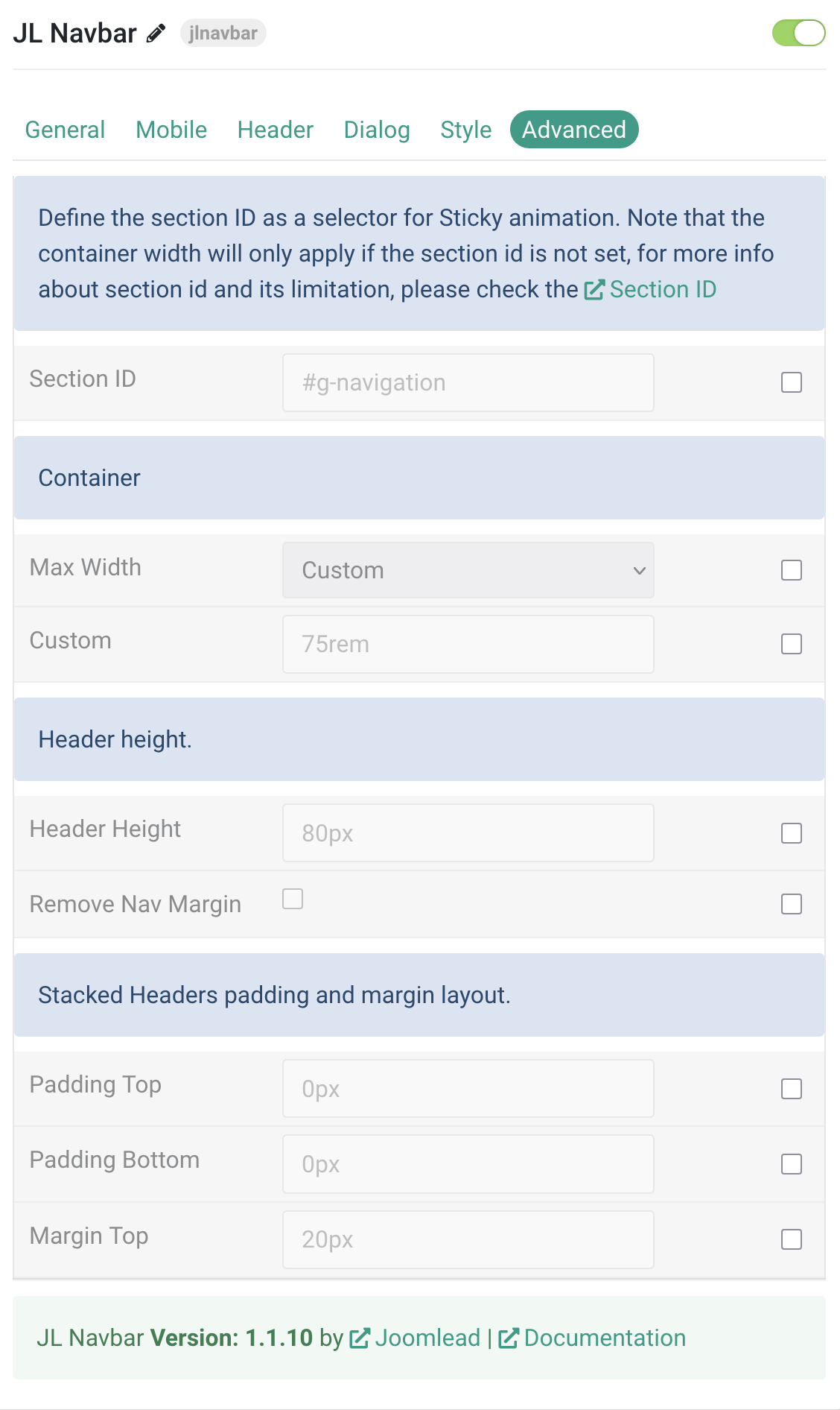
| Settings | Description |
|---|---|
| Section ID | |
| Section ID | Optional. Define the section ID as a selector for Sticky animation. Note: Container width only applies if section ID is not set. See Section ID for more info. |
| Container | |
| Max Width | Set the maximum content width. Options: None, Default, Small, Large, XLarge, Expand, Custom. |
| Custom | Define the container width within the section in rem, em, or px unit values. Example: 75rem. |
| Header Height | |
| Header Height | Define the navbar item height within the section in rem, em, or px. Example: 80px. |
| Remove Nav Margin | Enable to remove the default top margin of the navigation bar. |
| Stacked Header Layout | |
| Padding Top | Set top navigation padding for stacked header layouts in rem, em, px, or percentage values. Leave empty for default. |
| Padding Bottom | Set bottom navigation padding for stacked header layouts in rem, em, px, or percentage values. Leave empty for default. |
| Margin Top | Set top margin for stacked navigation layout in rem, em, px, or percentage values. Leave empty for default. |
Gantry 5 Mobile Menu
By default, the Navbar particle provides its own Offcanvas, Modal, or Dropbar style to present the menu on mobile devices. However, if you want to use the default Gantry 5 mobile menu, follow these steps:
1. In the Style tab, select Default for the Navbar Style. The ‘Extended’ style is not supported in this case.
2. In the Header tab, enable the Gantry Mobile Menu feature to force the use of the Gantry 5 mobile menu (Offcanvas) instead of the UIkit mobile modes.
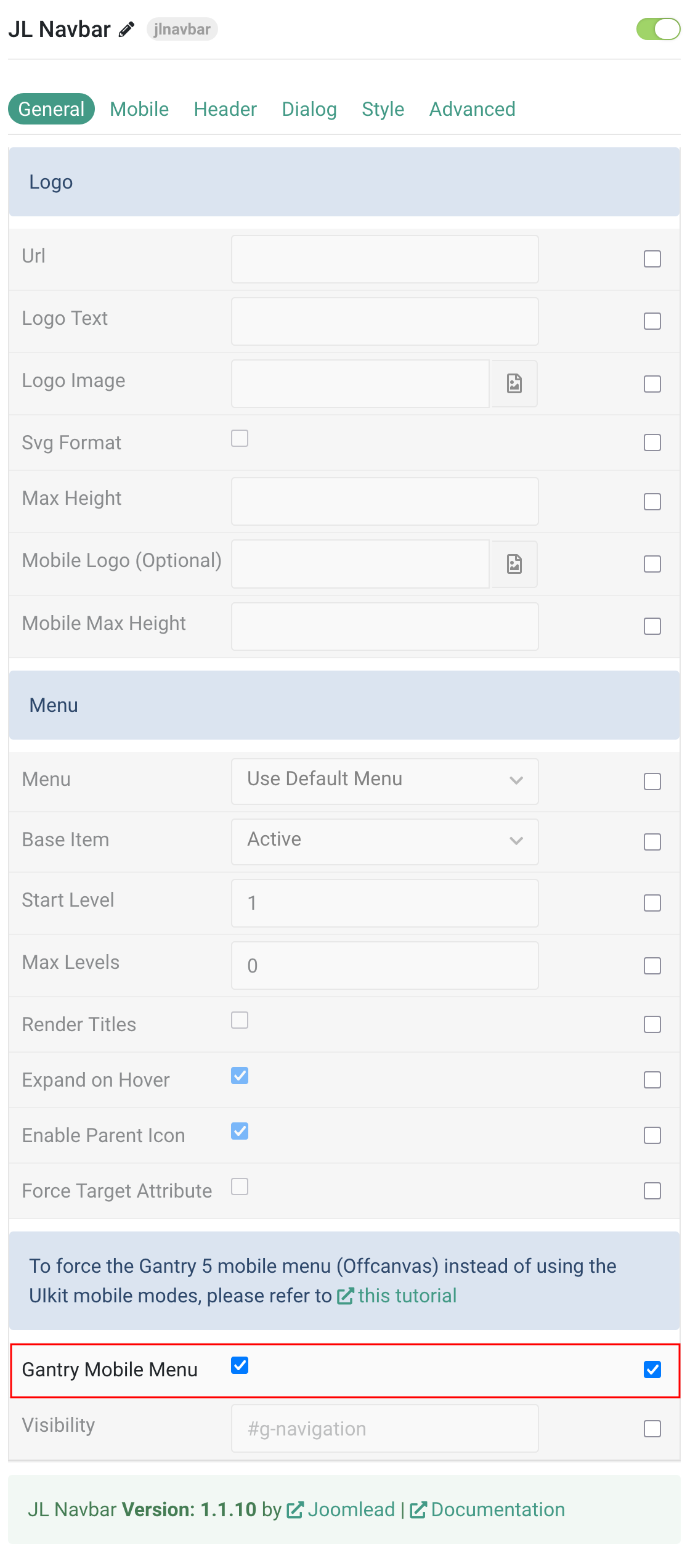
3. Ensure the Mobile Menu particle positioned in the Offcanvas Section
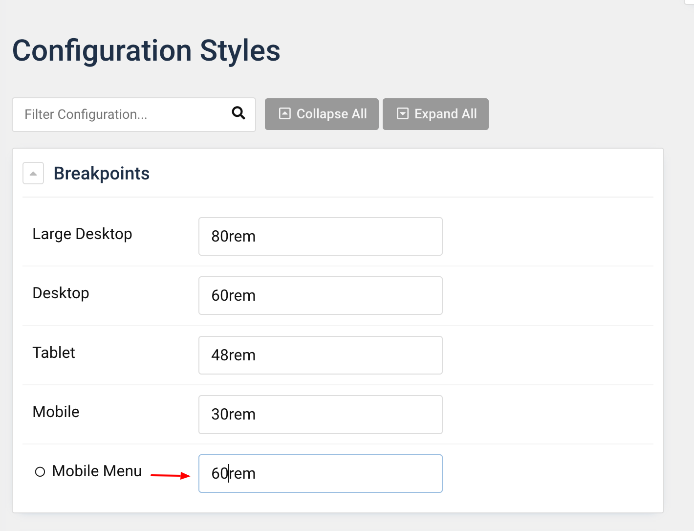
4. Increase the breakpoints for the Mobile Menu, for example: 60rem. You can also use px units, such as 960px or em>640px.
Here the demo with default Hydrogen theme
Section ID
Using Section ID method if:
- – Your theme using custom horizontal padding (keeping a small padding to the left and right).
- – You want to ensure the same horizontal padding (left/right) across all sections.
- – You want to use Sticky animation for the section widh custom horizontal padding.
Some themes using custom css class or variations name, i.e: section horizontal paddings to add a horizontal padding which adjusts to the viewport width for the content within the section. In this case, if you use the default sticky option, it will cause the section width issue when sticky animation is initialized.
To fix the issue, just define the section ID as a selector for Sticky animation. i.e: #g-navigation
| Settings | Description |
|---|---|
| Header Layout | 11 prepared header layouts. |
| Container | Common settings for Container width. |
Max Width |
Set the maximum width for the content within the section. Choose between the Default, Small, Large and X-Large to set a fixed max width. The Expand option expands the content to the full width of the section keeping a small padding to the left and right while the None option has no padding at all. You should choose the None option if you section using special horizontal padding css, i.e: section horizontal paddings, by this way the fixed width is inherited from the section itself and you can ensure the same horizontal padding across all sections. |
| Custom | Add custom width for the container width. |
| Header height. | Common settings for header height. |
| Header Height | Define navbar item height. |
| Remove Nav Margin | Remove the theme custom nav margin (Hydrogen) if you use Default menu style.. |
| Stacked Headers padding and margin layout. | Set the padding and margin for headerbar if you use Stacked Header Layout. |
General, Parallax and Parallax Background tab
Please take a look the documentation here for more detail about these tabs settings

Case Scenario:
You want the Navbar to be sticky on up (on all devices – important), but require the container to remain in place so that width of the navigation remains consistent down the page:
1) Place the JL Navbar in the Navigation section as usual
2) Do not apply any ‘sticky’ settings inside the JL NavBar Particle itself
3) Apply Extended menu setting
4) Set Container Max Width:None
4) Apply the following tag Attribute to the Navigation Section (not the Block)
Tag Attributes: jl-sticky -> show-on-up: true; animation: jl-animation-slide-top;
Bingo! Applied consistently to all devices, remember to set your required background colours in the Style tab of the Navbar Particle