Lightgallery Particle Documentation
# Lightgallery Package contents
| Files | Description |
|---|---|
| jllightgallery.yaml | Contains the Lightgallery particle settings. |
| jllightgallery.html.twig | The Twig file to pull information, settings. |
| lightgallery.min.css / lg-fb-comment-box.min.css lg-transitions.min.css |
Contains the Lightgallery CSS. |
| lg.eot, lg.svg, lg.ttf and lg.woff | Contains the Lightgallery fonts, these files located in css/fonts folder. |
| lightgallery | Contains the Light gallery JavaScript libraries (lightgallery.js / lg-hash.min.js lg-autoplay.min.js / lg-fullscreen.min.js lg-zoom.min.js / lg-share.min.js lg-thumbnail.min.js). |
Note By default, Lightgallery particle load the lightgallery core css/js (lightgallery.min.css and lightgallery.js) only. Other css/js plugins will be added by your particle settings to improve the page speed performance.
For example: If you enable Facebook comment plugin, the lg-fb-comment-box.min.css will be added on page load.
Installation Installing the particle on your website is a really simple process. You can refer to the document here to know more.
Requirements Lightgallery requires Uikit 3 for Gantry 5 Atom to be installed and enabled in your theme layout settings.
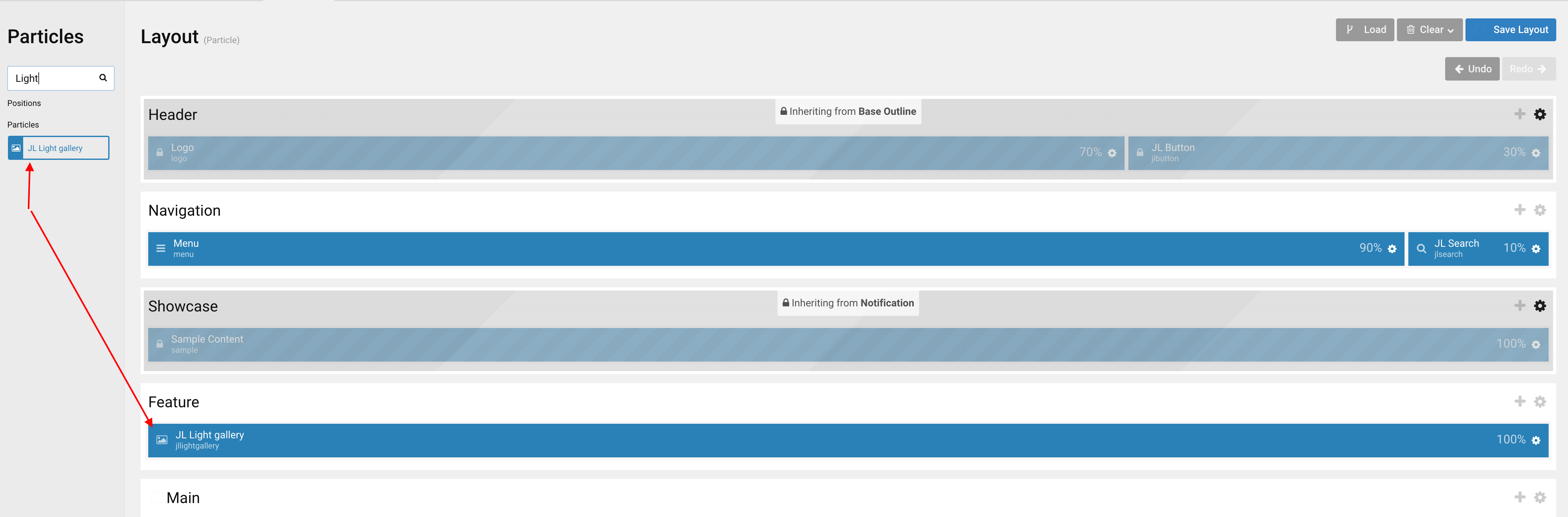
Go to Template/Theme Settings > select the Layout to add Light Gallery particle (i.e: Home) -> Layout tab -> Drag and drop the Light Gallery Particle from Particles panel (left corner) to the section you want to display the particle.
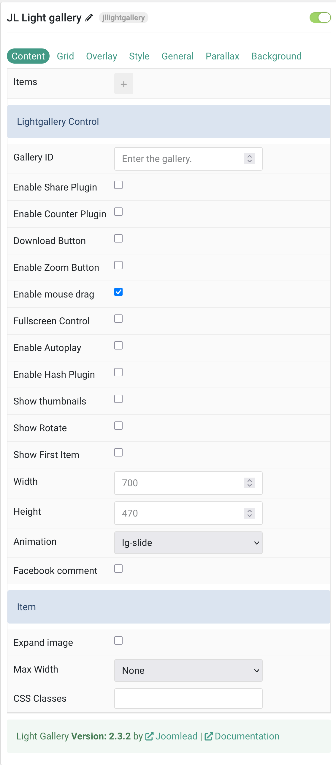
Settings
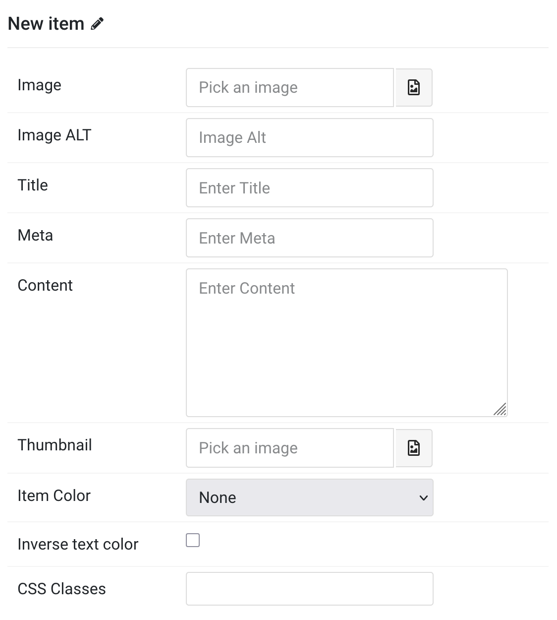
Items You can add new items to the collection using the plus + icon.
| Settings | Description |
|---|---|
| Image | An image field with an image picker. |
| Image ALT | Enter the image’s alt attribute. |
| Title | Customize the title. |
| Meta | Customize the meta. |
| Content | Customize the content. |
| Thumbnail | Select the image and use it as thumbnail image (optional). |
| Item Color | Set light or dark color mode for text, buttons and controls. |
| Inverse text color | Reverse the text colors when hovering over the item. |
| CSS Classes | Add custom CSS class names for this specific item. |
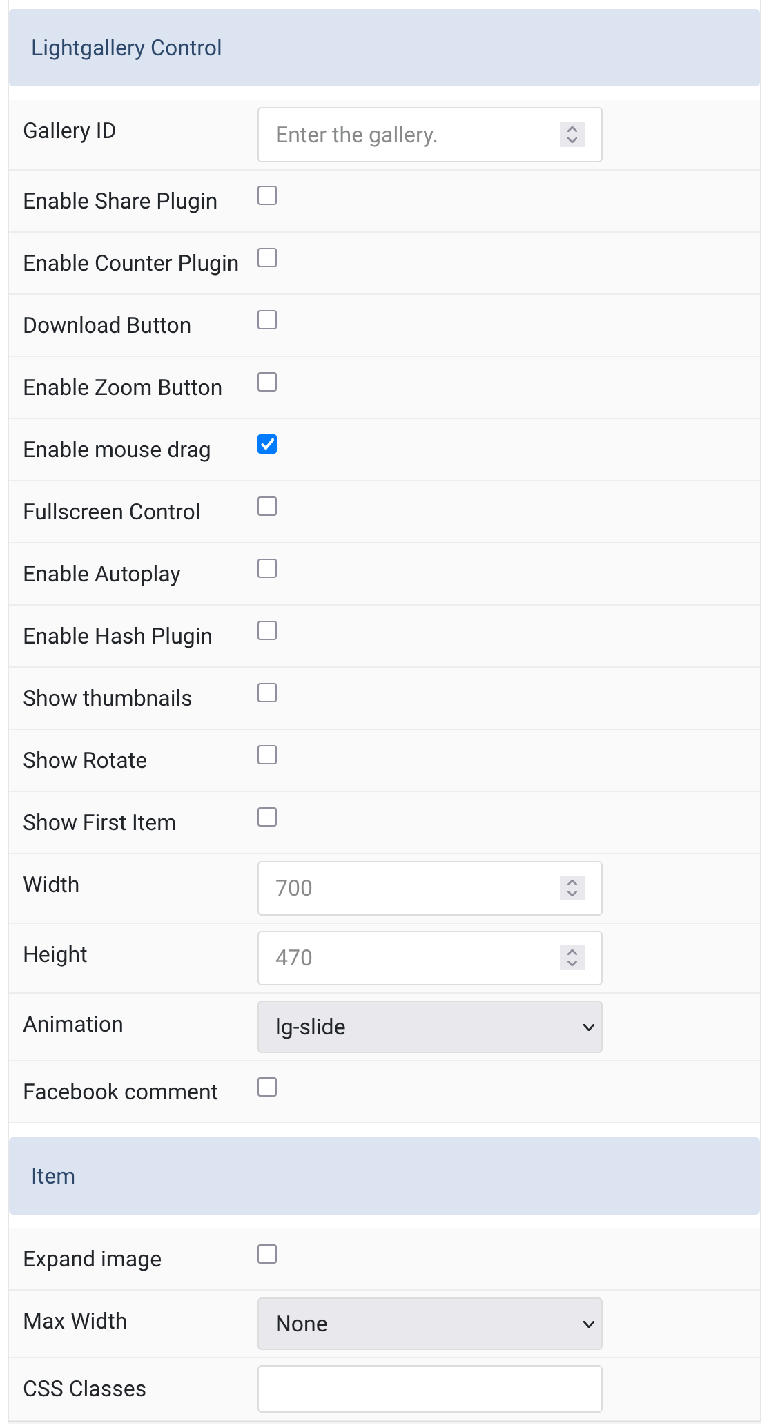
Lightgallery Control Common settings for Light Gallery control.
| Settings | Description |
|---|---|
| Gallery ID | Optional. Enter the Unique ID for gallery (Sequence Number). |
| Enable Share Plugin | Enable sharing functionality in the Lightgallery. |
| Enable Counter Plugin | Show total number of images and the index number of the currently displayed image. |
| Download Button | Enable a download button in the gallery toolbar. |
| Enable Zoom Button | Enable zoom functionality for gallery images. |
| Enable mouse drag | Enables desktop mouse drag support for gallery navigation. |
| Fullscreen Control | Enable fullscreen toggle control in the gallery. |
| Enable Autoplay | Automatically cycle through gallery items (requires Autoplay control to be enabled). |
| Enable Hash Plugin | Provide unique URL for each gallery image. |
| Show thumbnails | Display thumbnails for gallery navigation. |
| Show Rotate | Enable rotate functionality for images in the gallery. |
| Show First Item | Always display the first item in the gallery. |
| Width | Customize the width of the fixed-size gallery (default: full screen). |
| Height | Customize the height of the fixed-size gallery (default: full screen). |
| Animation | Select the animation effect used when switching gallery items. |
| Facebook comment | Enable Facebook comment plugin integration. |
| Expand image | Expand the height of the image to fill the available space in the item. |
| Max Width | Set the maximum width of the gallery item container. |
| CSS Classes | Custom CSS class name(s) for the particle. |
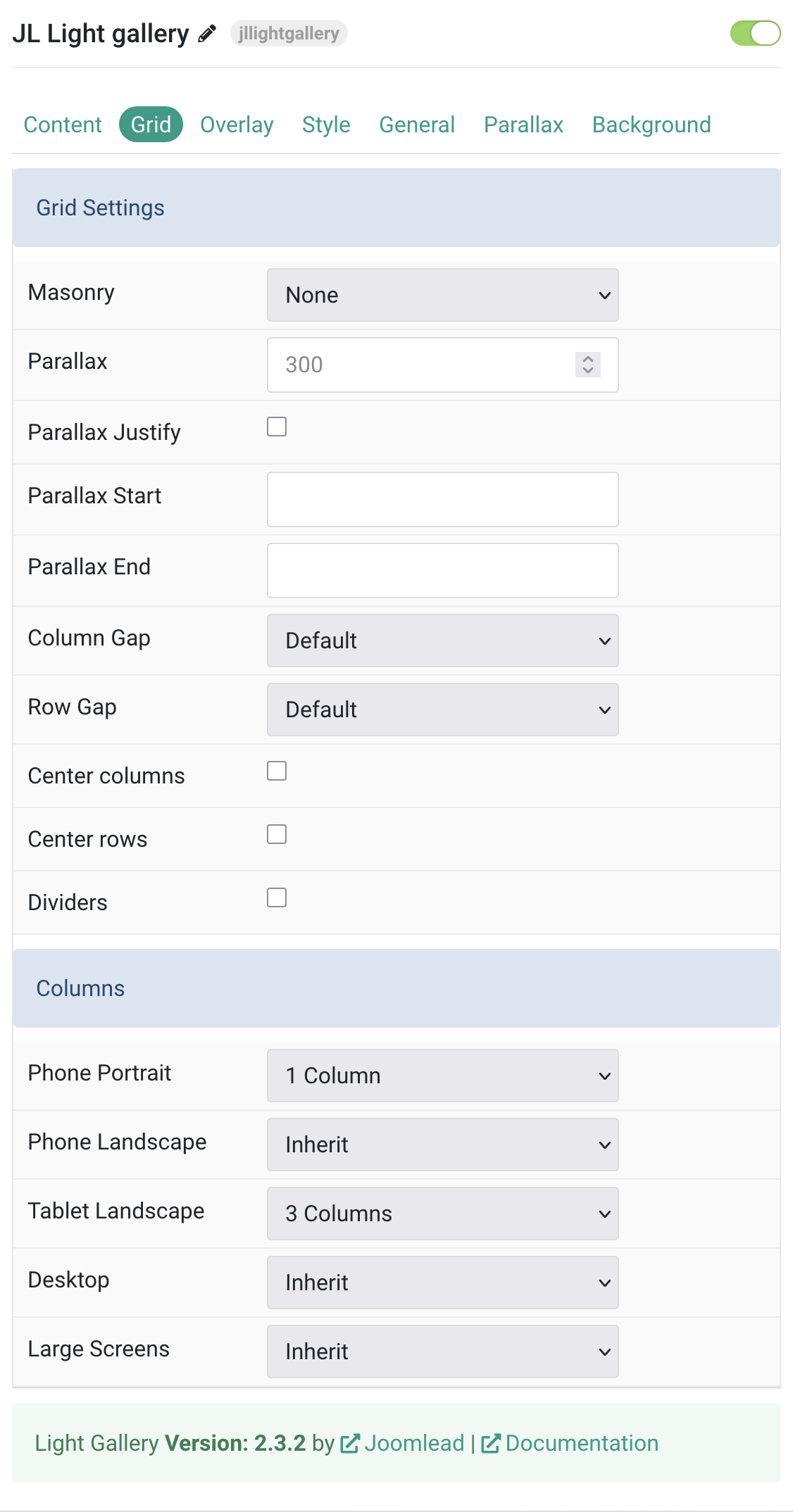
Grid Settings Common settings for grid layout
| Settings | Description |
|---|---|
| Grid Settings | Common settings for Grid . |
| Masonry | Use masonry layout: Pack or Next (gapless vertical alignment). |
| Parallax | The parallax effect moves single grid columns at different speeds while scrolling. Define the vertical parallax offset in pixels. |
| Parallax Justify | Justify columns at the bottom when parallax is enabled. |
| Parallax Start | Set a scroll offset to start the parallax effect, e.g. 100px, 50vh, etc. |
| Parallax End | Set a scroll offset to end the parallax effect, e.g. 100px, 50vh, etc. |
| Column Gap | Set the size of the gap between the grid columns. |
| Row Gap | Set the size of the gap between the grid rows. |
| Center columns | Center align the grid cell columns horizontally. |
| Center rows | Center align the grid rows vertically. |
| Dividers | Display dividers between grid cells. |
| Columns Settings | Common settings for Columns layout . |
| Phone Portrait | Set the number of grid columns for each breakpoint. Inherit refers to the number of columns on the next smaller screen size. |
| Phone Landscape | |
| Tablet Landscape | |
| Desktop | |
| Large Screens |
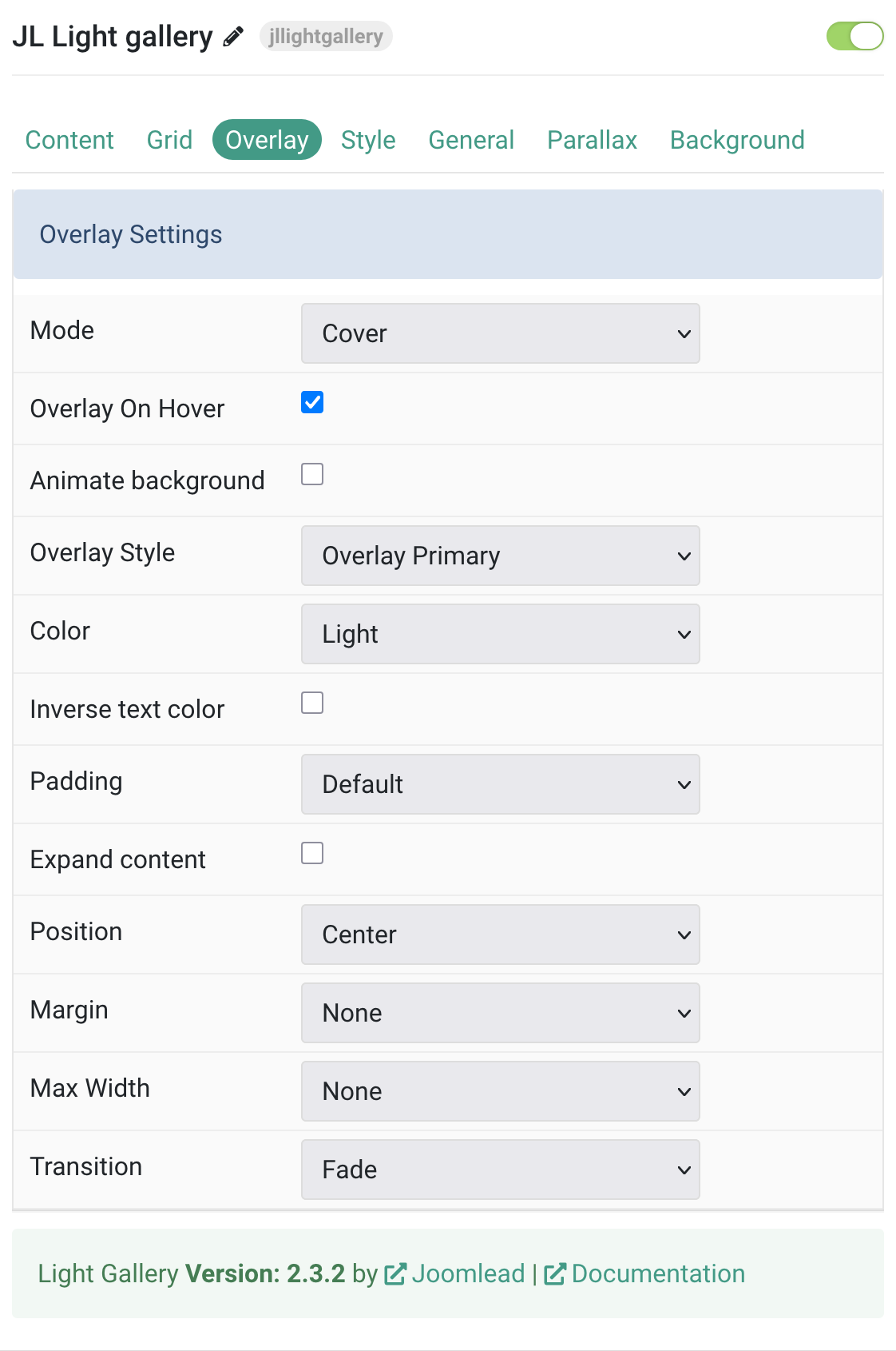
Tab Overlay
| Settings | Description |
|---|---|
| Overlay Settings | Common settings for Overlay. |
| Mode | Choose between Cover or Caption overlay modes. In cover mode, set text color manually. |
| Overlay On Hover | Display overlay content on hover. |
| Animate background | Animate the background on hover only. |
| Overlay Style | Select the style for the overlay appearance. |
| Color | Set light or dark mode for overlay text and controls. |
| Inverse text color | Invert text color on hover. |
| Padding | Set the space between overlay and its content. |
| Expand content | Expand content to fill the overlay, pushing the link to the bottom. |
| Position | Select the position for overlay or its content. |
| Margin | Apply margin between the overlay and image container (when style is selected). |
| Max Width | Set the maximum width of the overlay content area. |
| Transition | Select a transition animation for the overlay. |
Tab Style
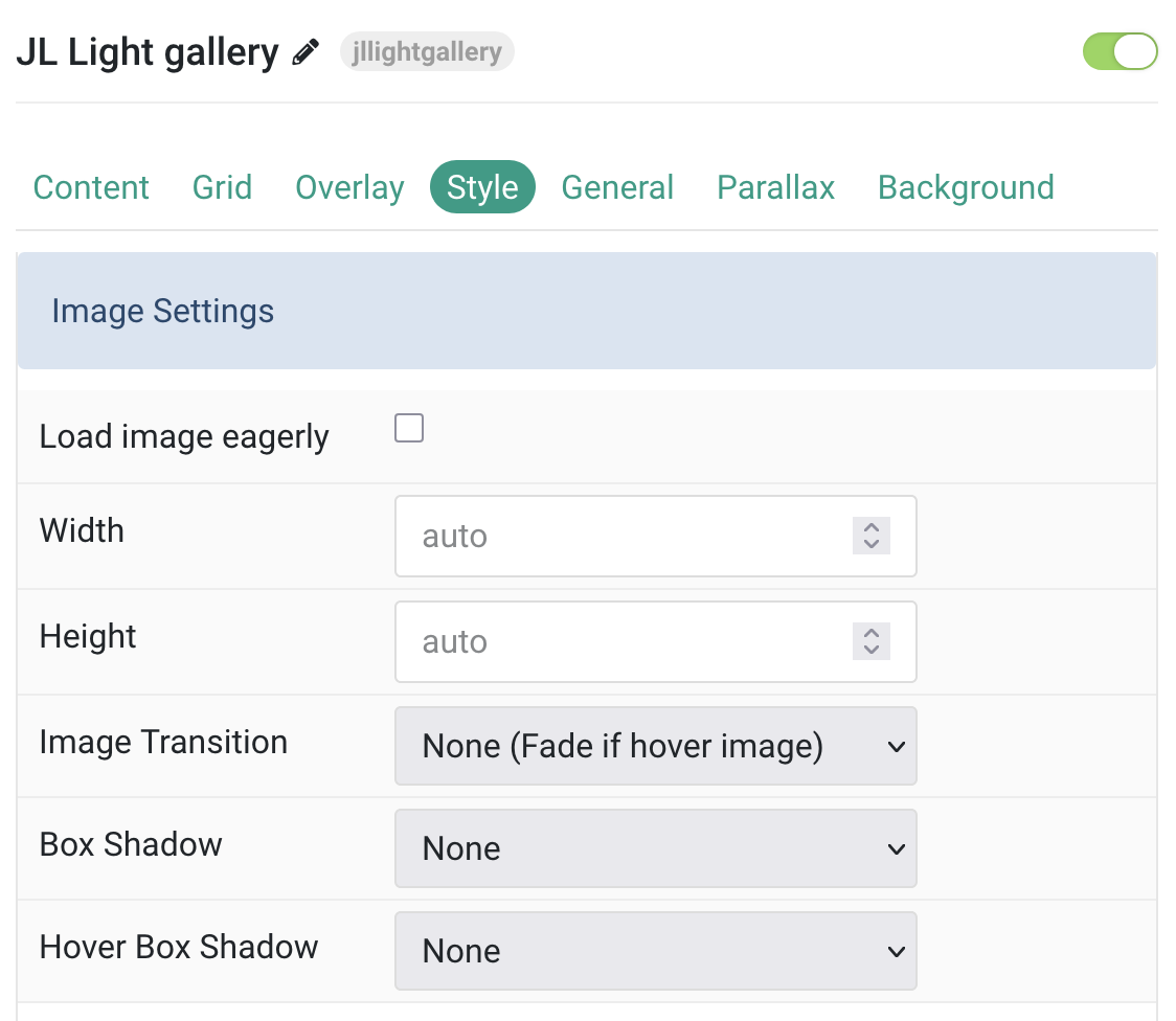
Image Settings Common settings for images.
| Settings | Description |
|---|---|
| Load image eagerly | By default, images are loaded lazily. Enable eager loading for images that appear in the initial viewport. |
| Width | Set the width of the image in pixels. Leave blank or set to auto for natural width. |
| Height | Set the height of the image in pixels. Leave blank or set to auto for natural height. |
| Image Transition | Select an image transition animation. If a hover image is used, the transition applies between both images. With None, the hover image simply fades in. |
| Box Shadow | Select a shadow size for the image. |
| Hover Box Shadow | Select a shadow size for the image when hovered. |
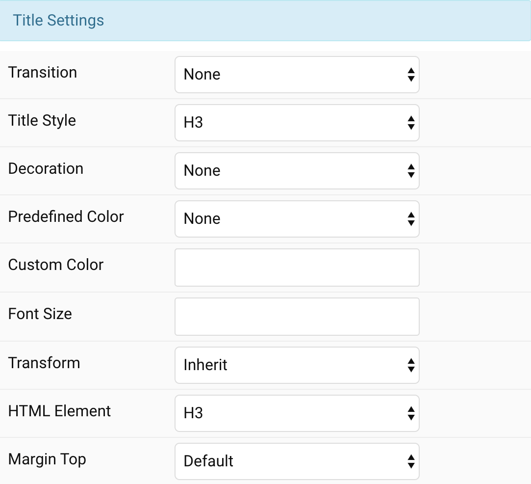
Title Settings Common settings for title.
| Settings | Description |
|---|---|
| Transition | Select a transition for the title when the overlay appears on hover. |
| Style | Heading styles differ in font-size but may also come with a predefined color, size and font. |
| Decoration | Decorate the headline with a divider, bullet or a line that is vertically centered to the heading. |
| Predefined Color | Select a predefined text color. |
| Custom Color | Customize the title color instead using predefined title color mode. You need to set the predefined color to None to use the customize color option. |
| Font Size | Customize the title text font size. |
| Transform | The following options will transform text into uppercased, capitalized or lowercased characters. |
| HTML Element | Choose one of the elements to fit your semantic structure. |
| Margin Top | Set the top margin. Note that the margin will only apply if the content field immediately follows another content field. |
Meta Settings Common settings for meta.
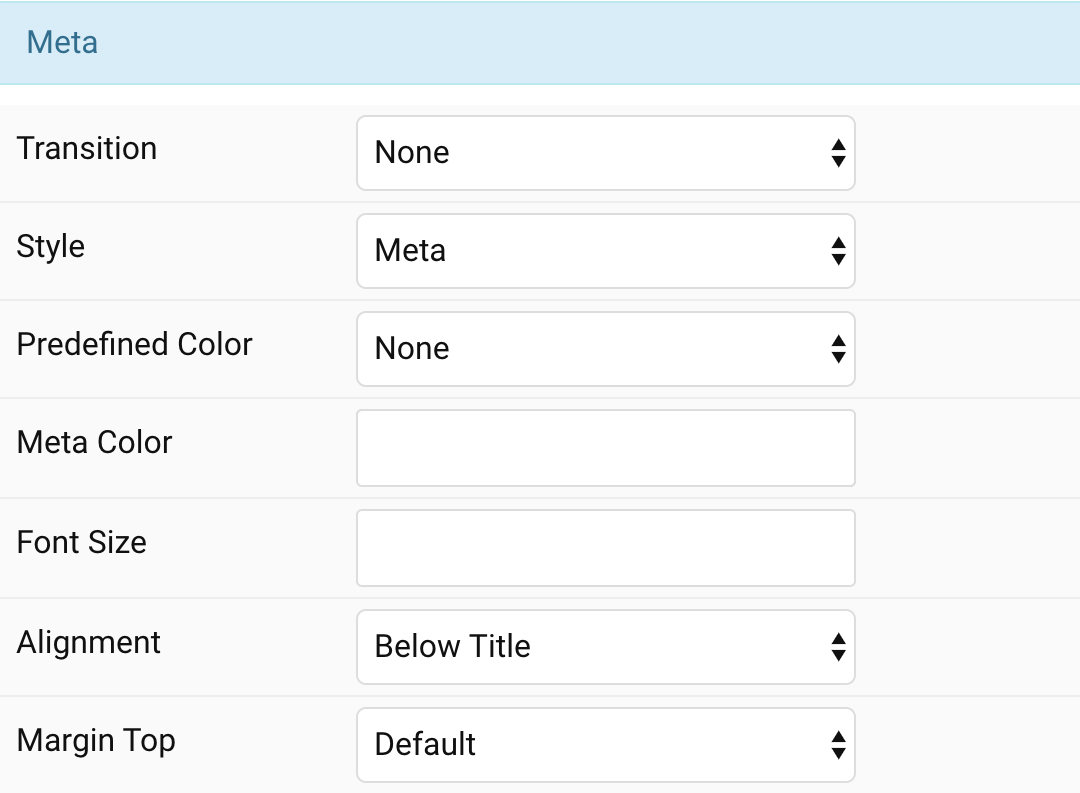
| Settings | Description |
|---|---|
| Transition | Select a transition for the meta text when the overlay appears on hover. |
| Style | Select a predefined meta text style, including color, size and font-family. |
| Predefined Color | Select the predefined meta color. |
| Custom Color | Customize the meta color. Set Predefined Color for Meta to None before using this feature. |
| Font Size | Customize the title text font size. |
| Transform | The following options will transform text into uppercased, capitalized or lowercased characters. |
| Alignment | Align the meta text above/below the title or below the content. |
| Margin Top | Set the top margin. Note that the margin will only apply if the content field immediately follows another content field. |
Content Settings Common settings for content.
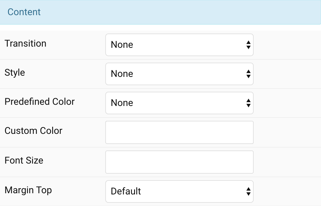
| Settings | Description |
|---|---|
| Transition | Select a transition for the content when the overlay appears on hover. |
| Style | Select a predefined text style, including color, size and font-family. |
| Predefined Color | Select the predefined meta color. |
| Content Color | Customize the content color instead using predefined text color. You need to set the predefined color to None to use the customize color option. |
| Font Size | Customize the content text font size. |
| Transform | The following options will transform text into uppercased, capitalized or lowercased characters. |
| Margin Top | Set the top margin. Note that the margin will only apply if the content field immediately follows another content field. |
General, Parallax and Parallax Background tab
Please take a look the documentation here for more detail about these tabs settings

Comments