Offcanvas Content particle documentation
# Offcanvas Content Package contents
| Files | Description |
|---|---|
| jloffcanvascontent.yaml | Contains the Offcanvas Content particle settings. |
| jloffcanvascontent.html.twig | The Twig file to pull information, settings. |
Installation Installing the particle on your website is a really simple process. You can refer to the document here to know more.
Requirements Offcanvas Content requires Uikit 3 for Gantry 5 Atom to be installed and enabled in your theme layout settings.
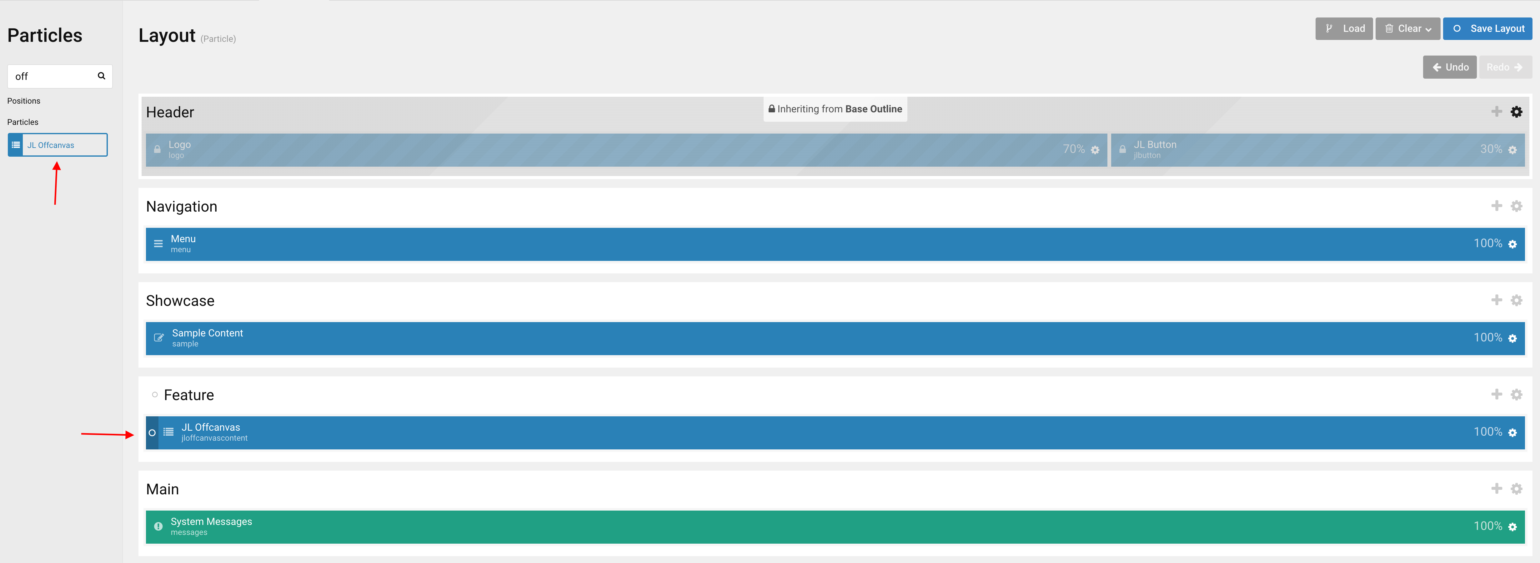
Go to Template/Theme Settings > select the Layout to add Offcanvas Content particle (i.e: Home) -> Layout tab -> Drag and drop the Offcanvas Content from Particles panel (left corner) to the section you want to display the particle.
Settings
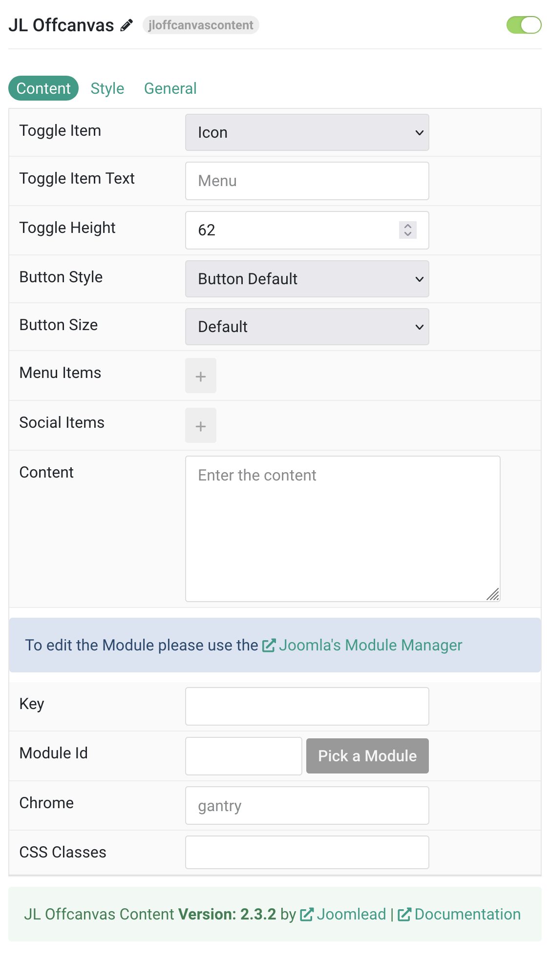
Tab Content
| Settings | Description |
|---|---|
| Toggle Item | Choose the toggle item between Button or Icon. |
| Toggle Item Text | Add the toggle item text, i.e: Menu |
| Toggle Height | Set the height of a Menu Toggle. |
| Button Style | Set the button style. Options include Default, Primary, Secondary, Danger, Text, Link, Link Muted, and Link Text. |
| Button Size | Set the button size. Available options: Small, Default, and Large. |
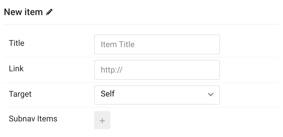
| Menu Items | Create each item to appear in the menu. You can add new items to the collection using the plus + icon. Each item includes Title, Link, Target, and optional Subnav Items. |
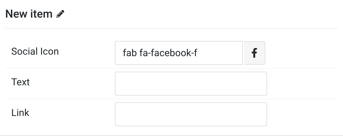
| Social Items | Create each item to appear in the list row. You can add new items to the collection using the plus + icon. Each item includes Social Icon, Text, and Link. |
| Content | Enter the content for the module. |
| Key | Position name. Must contain only letters, numbers, and hyphens. |
| Module Id | Enter module Id. Use the module picker to select an existing module. |
| Chrome | Module chrome setting, default: gantry |
| CSS Classes | CSS class name for the particle. |
Menu Items You can add new menu item to the collection using the plus + icon
Social Items You can add new social item to the collection using the plus + icon
Tab Style
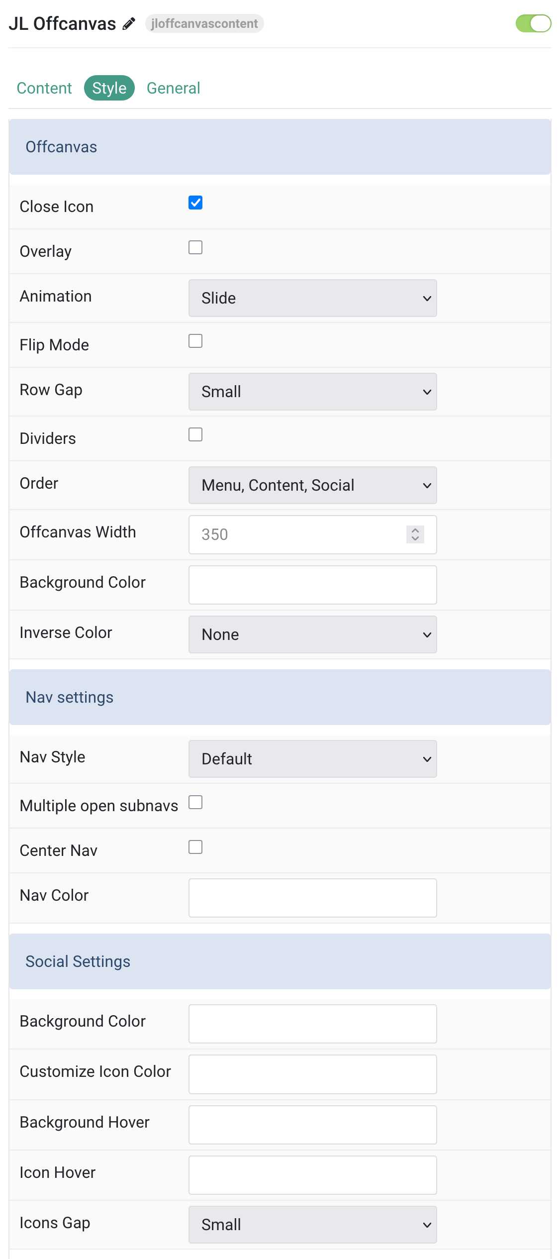
Offcanvas Settings Common settings for Offcanvas
| Settings | Description |
|---|---|
| Offcanvas | |
| Close Icon | Use this option to create a close button and enable its functionality. |
| Overlay | Use this option to add an overlay, blanking out the page. |
| Animation | You can actually choose between different animation modes for the off-canvas’ entrance. |
| Flip Mode | Use this option to adjust its alignment, so that it slides in from the right. |
| Row Gap | Set the size of the gap between the grid rows. |
| Dividers | Display dividers between grid cells. |
| Order | Define the order of the offcanvas contents. |
| Offcanvas Width | Customize the width for offcanvas bar, leave default if not needed. Minimum value: 220px. |
| Background Color | Customize the background color for offcanvas bar. |
| Inverse Color | Set light or dark color mode for nav icon, buttons and controls. |
Nav Settings Common settings for Nav
| Settings | Description |
|---|---|
| Nav Style | Select the nav style. Options: Default, Primary. |
| Multiple open subnavs | Allow multiple subnavigation items to be open simultaneously. |
| Center Nav | Use this option to center nav items. |
| Nav Color | Customize the nav item color if needed. |
Social Settings Common settings for Social
| Settings | Description |
|---|---|
| Background Color | Customize the background color for social icons. |
| Customize Icon Color | Customize the color for social icons. |
| Background Hover | Customize the background color on hover/active/focus for social icons. |
| Icon Hover | Customize the color on hover/active/focus for social icons. |
| Icons Gap | Set the size of the gap between the social icons. |
Content Settings Common settings for Content Style
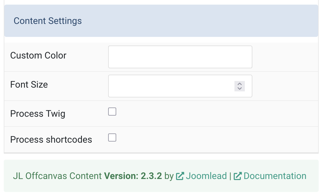
| Settings | Description |
|---|---|
| Custom Color | Customize the content color. |
| Font Size | Customize the content text font size. Minimum value: 0. |
| Process Twig | Enable Twig template processing in the content. Twig will be processed before shortcodes. |
| Process shortcodes | Enable shortcode processing / filtering in the content. |
General, Parallax and Parallax Background tab
Please take a look the documentation here for more detail about these tabs settings

Comments