Price List Particle documentation
# Price List Package contents
| Files | Description |
|---|---|
| jlpricelist.yaml | Contains the Price List particle settings. |
| jlpricelist.html.twig | The Twig file to pull information, settings. |
Installation Installing the particle on your website is a really simple process. You can refer to the document here to know more.
Requirements Price List requires Uikit 3 for Gantry 5 Atom to be installed and enabled in your theme layout settings.
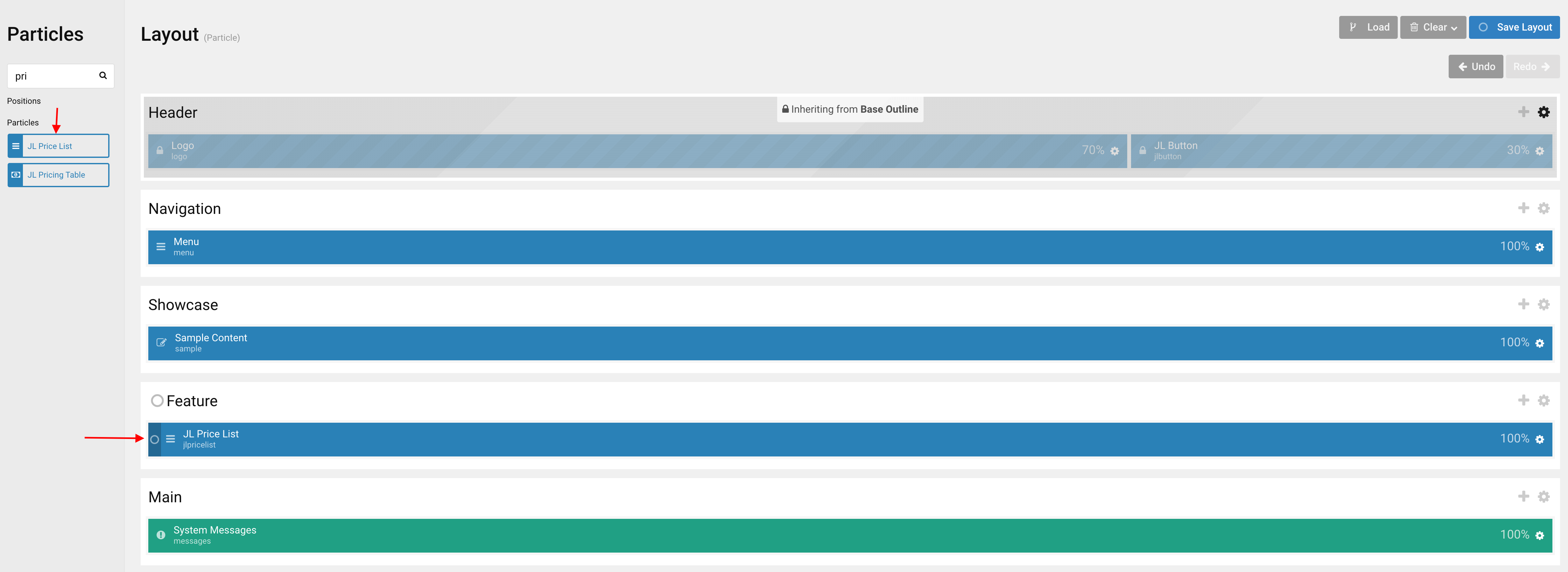
Go to Template/Theme Settings > select the Layout to add Price List particle (i.e: Home) -> Layout tab -> Drag and drop the Price List particle from Particles panel to the section you want to display the particle.
Settings
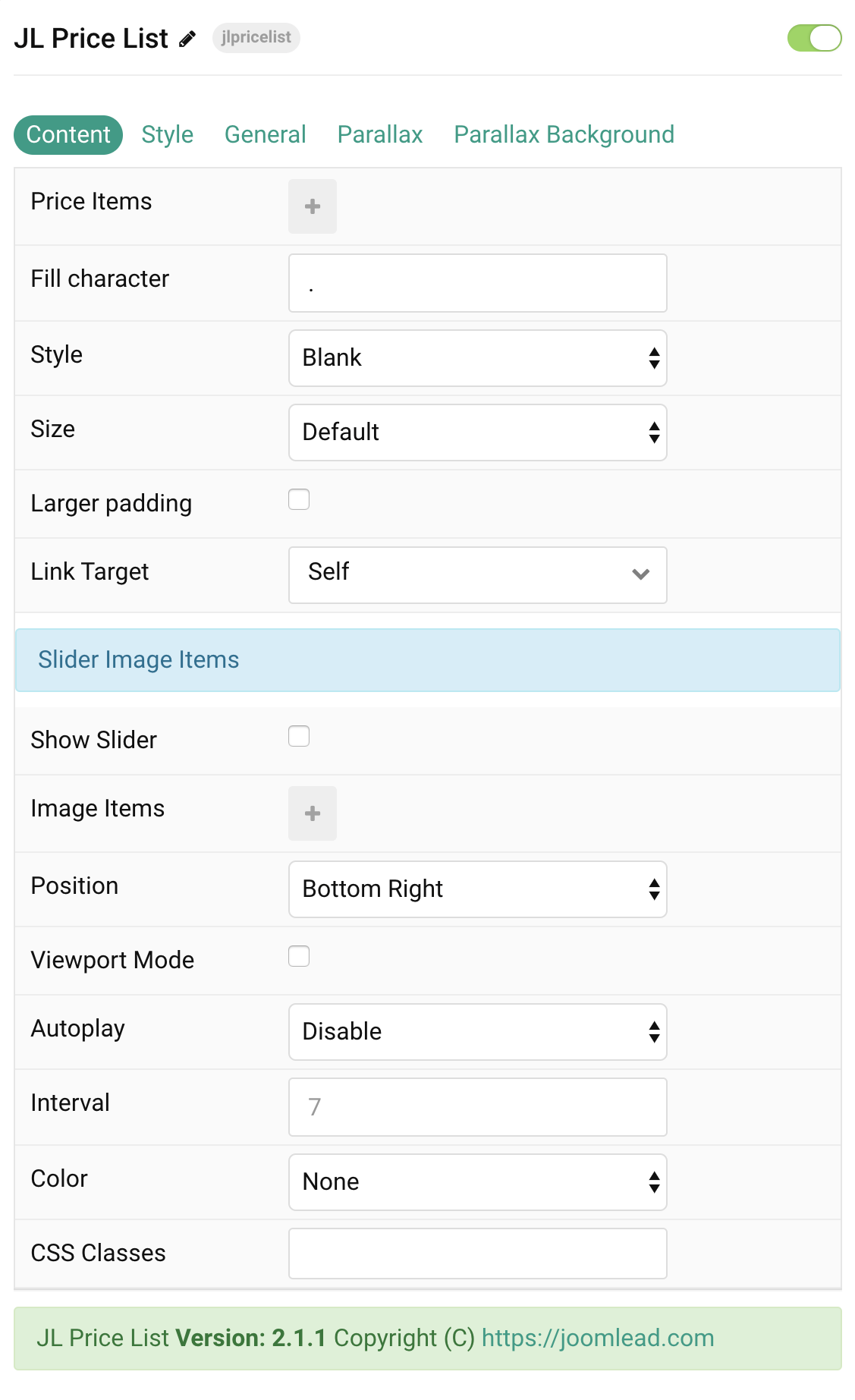
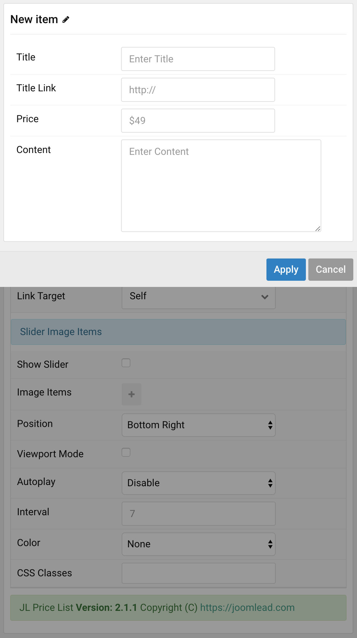
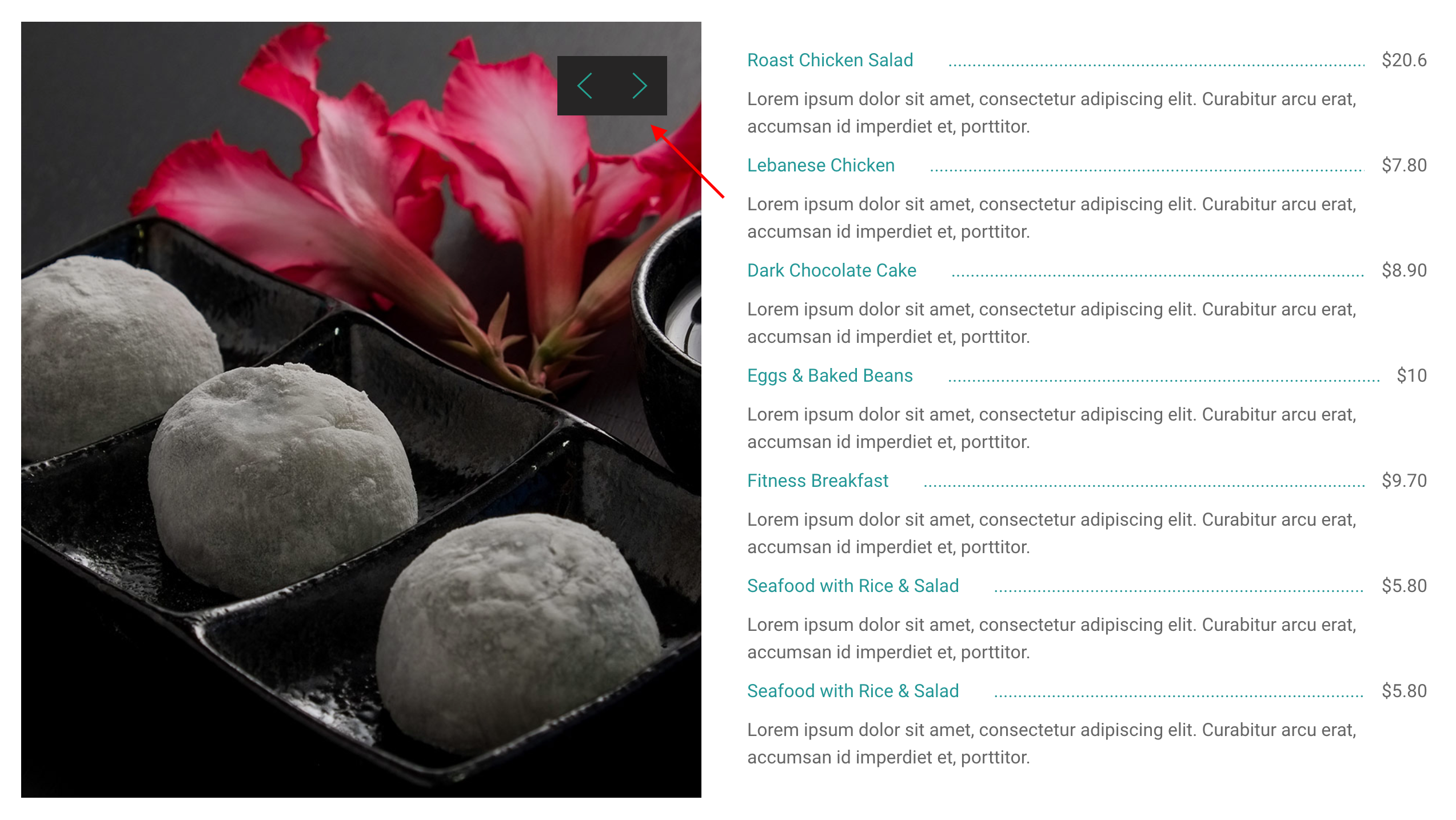
Price Items You can add new items to the collection using the plus + icon
| Settings | Description |
|---|---|
| Title | Customize the title. |
| Link | Specify the link for title. |
| Price | Customize the price. |
| Content | Customize the content. |
| Settings | Description |
|---|---|
| Fill character | To change the dot to any custom character |
| Style | Select one of the boxed card styles or a blank card. |
| Size | Define the card’s size by selecting the padding between the card and its content. |
| Larger padding | Add larger padding between list items. |
| Link Target | Open the link in a same or new window. |
| Slider Image Items | Common settings for Slider Image Items |
| Show slider | Check this option to enable slider image. |
| Image Items | Create each image to appear in the slider. You can add new items to the collection using the plus + icon |
| Position | Select the position of the slidenav. |
| Viewport Mode | Using viewport mode for Blank Price List style. |
| Autoplay | Enable autoplay for slider items. |
| Interval | Set the autoplay interval in seconds. Min 5 Max 15. |
| Color | Set light or dark color mode. |
| CSS Classes | CSS class name for the particle. |
Tab Style
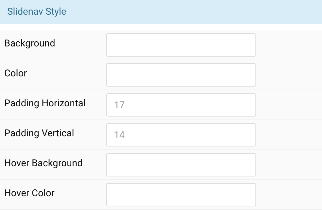
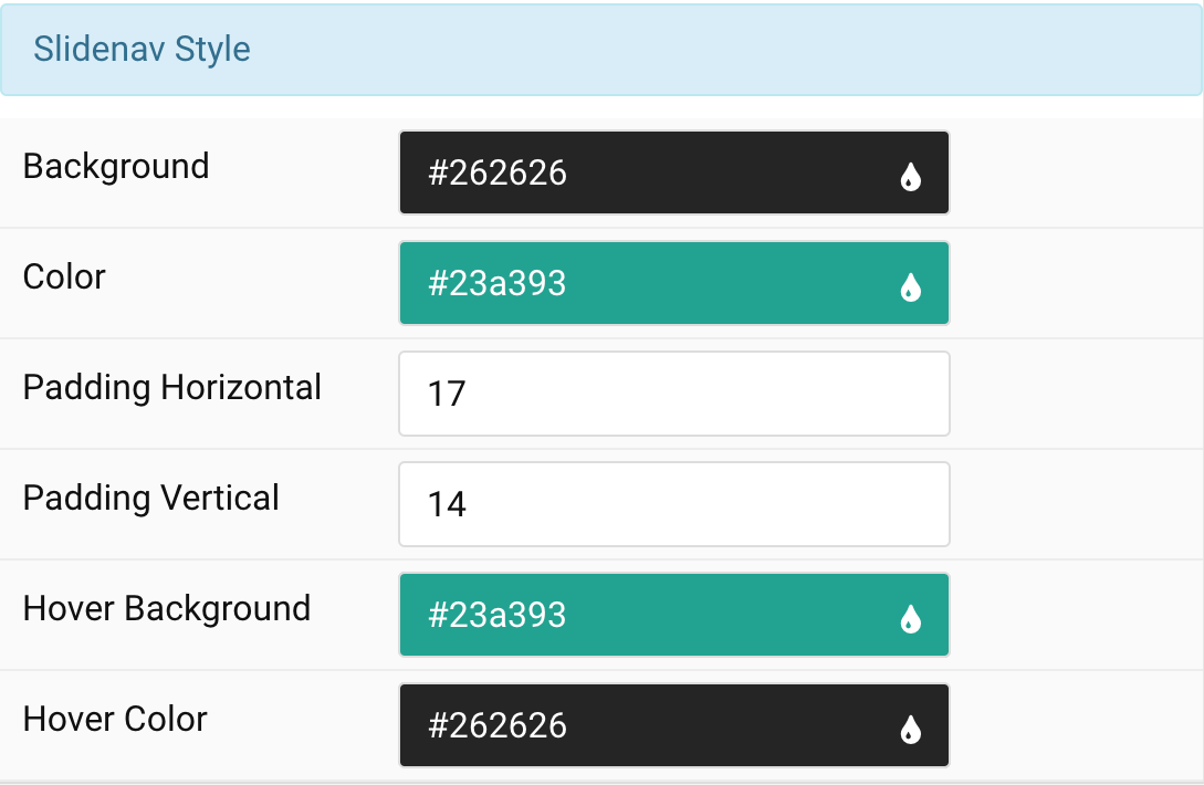
Slidenav Style Settings Customize the color for Slidenav Style
| Settings | Description |
|---|---|
| Background | Customize slidenav background color. |
| Color | Customize the slidenav color |
| Padding Horizontal | Customize the horiozontal padding for slidenav button icon. |
| Padding Vertical | Customize the vertical padding for slidenav button icon. |
| Hover Background | Customize the hover background color. |
| Hover Color | Customize the hover color for slidenav button (prev/next). |
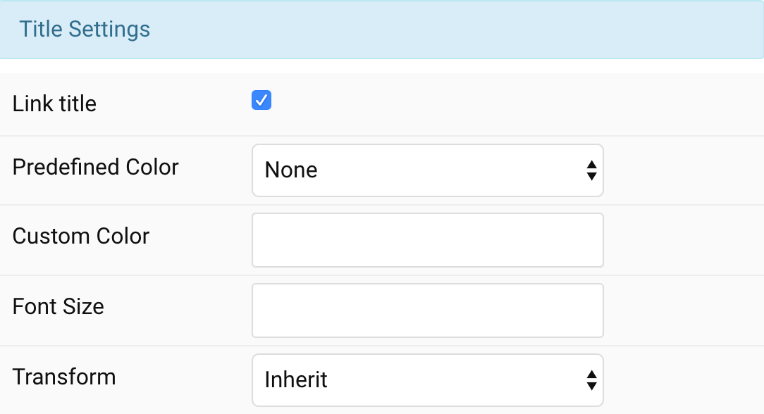
Title Settings Common settings for Title Style
| Settings | Description |
|---|---|
| Link title | Link the title if a link exists. |
| Predefined Color | Select a predefined text color. |
| Custom Color | Customize the title color. |
| Font Size | Customize the title text font size. |
| Transform | The following options will transform text into uppercased, capitalized or lowercased characters. |
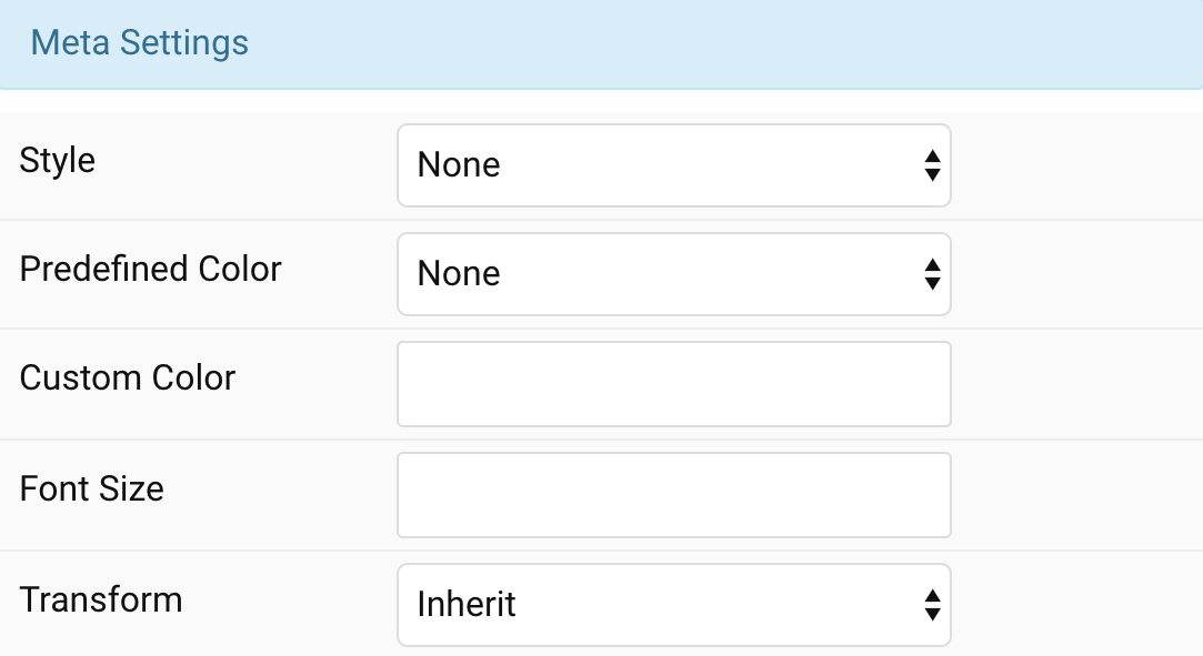
Meta Settings Common settings for Meta Style
| Settings | Description |
|---|---|
| Style | Select a predefined meta text style, including color, size and font-family. |
| Predefined Color | Select the predefined meta color. |
| Custom Color | Customize the meta color. Set Predefined Color for Meta to None before using this feature. |
| Font Size | Customize the meta text font size. |
| Transform | The following options will transform text into uppercased, capitalized or lowercased characters. |
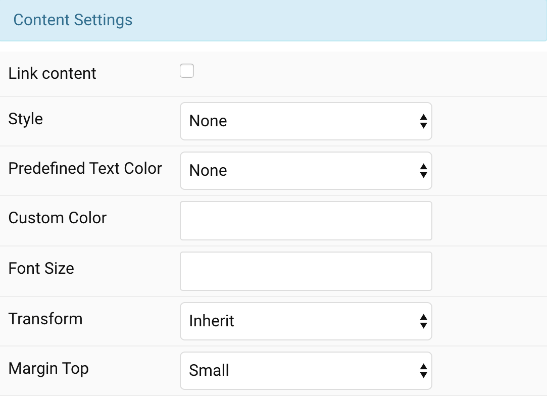
Content Settings Common settings for Content Style
| Settings | Description |
|---|---|
| Link content | Link the content if a link exists. |
| Style | Select a predefined text style, including color, size and font-family. |
| Predefined Color | Select the predefined meta color. |
| Content Color | Customize the content color instead using predefined text color. You need to set the predefined color to None to use the customize color option. |
| Font Size | Customize the content text font size. |
| Transform | The following options will transform text into uppercased, capitalized or lowercased characters. |
| Margin Top | Set the top margin. Note that the margin will only apply if the content field immediately follows another content field. |
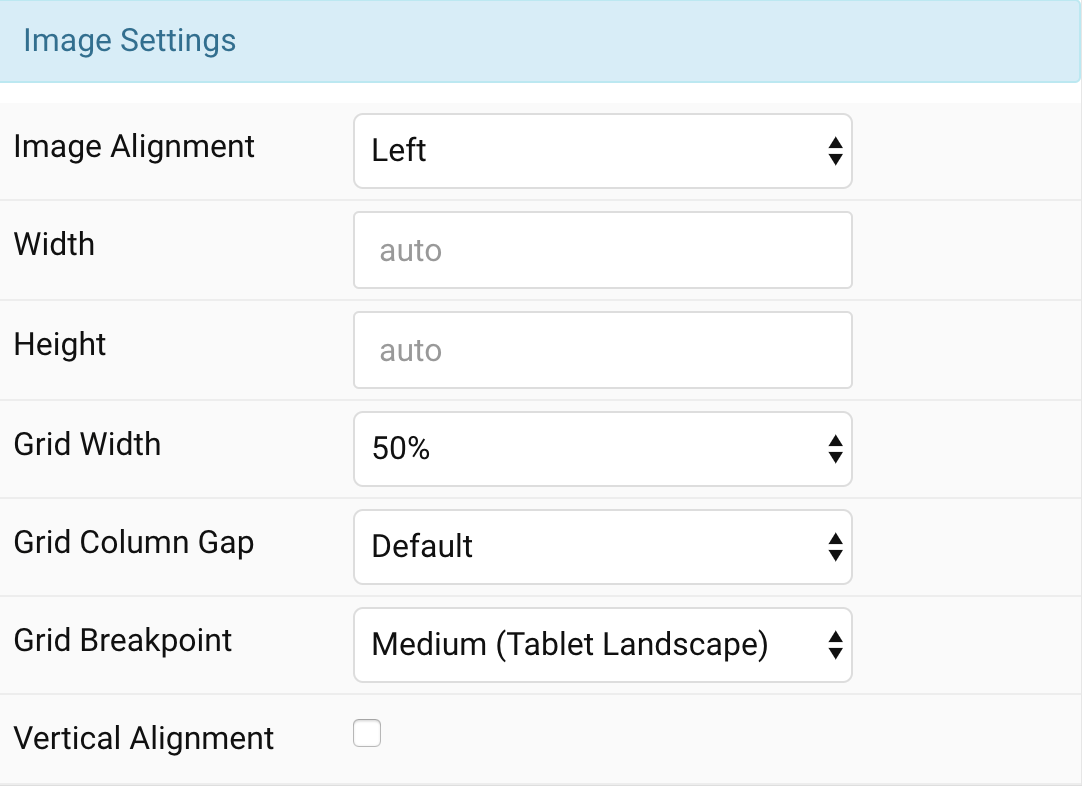
Image Settings Common settings for Image Style
| Settings | Description |
|---|---|
| Image Alignment | Align the image to the left, or right. |
| Width | Set the width of the image. |
| Height | Set the height of the image. |
| Grid Width | Define the width of the image within the grid. Choose between percent and fixed widths or expand columns to the width of their content. |
| Grid Column Gap | Set the size of the gap between the image and the content. |
| Grid Breakpoint | Set the breakpoint from which grid cells will stack. |
| Vertical Alignment | Vertically center grid cells. |
General, Parallax and Parallax Background tab
Please take a look the documentation here for more detail about these tabs settings

Comments