Tabs Particle Documentation
# Tab Package contents
| Files | Description |
|---|---|
| jltabs.yaml | Contains the Tab particle settings. |
| jltabs.html.twig | The Twig file to pull information, settings. |
Installation Installing the particle on your website is a really simple process. You can refer to the document here to know more.
Requirements Tabs particle requires Uikit 3 for Gantry 5 Atom to be installed and enabled in your theme layout settings.
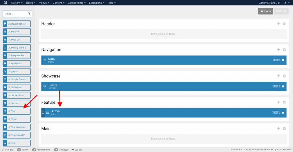
Go to Template/Theme Settings > select the Layout to add Tabs particle (i.e: Home) -> Layout tab -> Drag and drop the Tabs Particle from Particles panel (left corner) to the section you want to display the Tabs content.
Settings
Content Tab – Items
| Settings | Description |
|---|---|
| Items | List Tab items to display. You can add new items to the collection using the plus + icon |
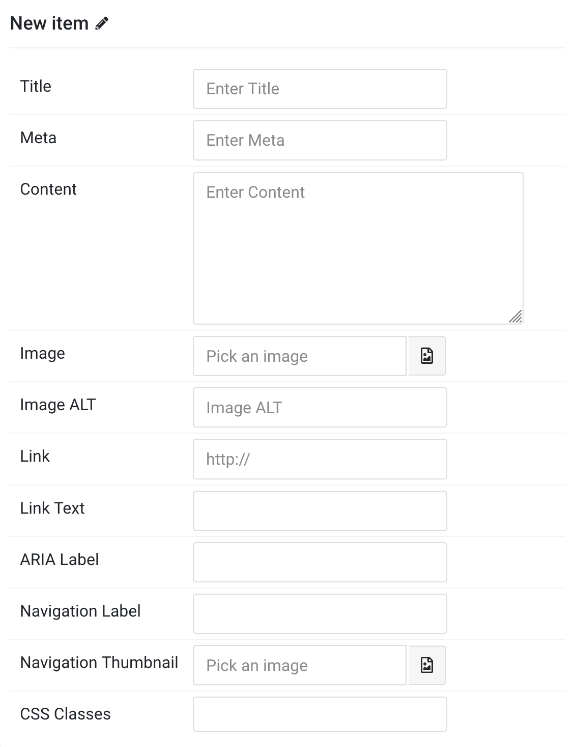
Items You can add new items to the collection using the plus + icon
| Settings | Description |
|---|---|
| Title | Customize the Title. |
| Meta | Customize the Meta. |
| Content | Enter your custom content here. |
| Image | An image field with an image picker. |
| Image ALT | Enter the image’s alt attribute. |
| Link | Specify the link for button. Note: Scroll smoothly added automatically to internal link that contains a URL fragment to add the smooth scrolling behavior. |
| Link Text | Specify the button label. |
| ARIA Label | Enter a descriptive text label to make it accessible if the link has no visible text. |
| Navigation Label | Specify the Navigation label. |
| Navigation Thumbnail | This option is only used if the thumbnail navigation is set. |
| CSS Classes | Specify the CSS class name for item. |
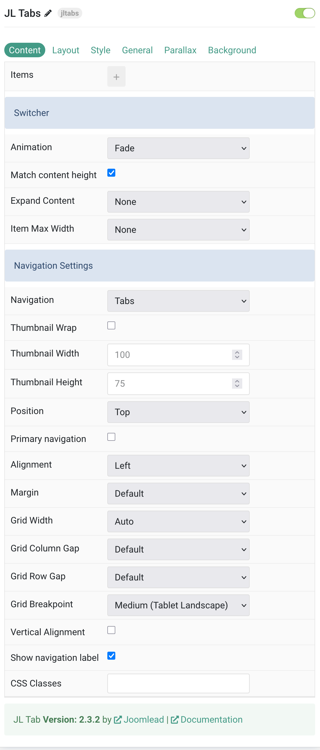
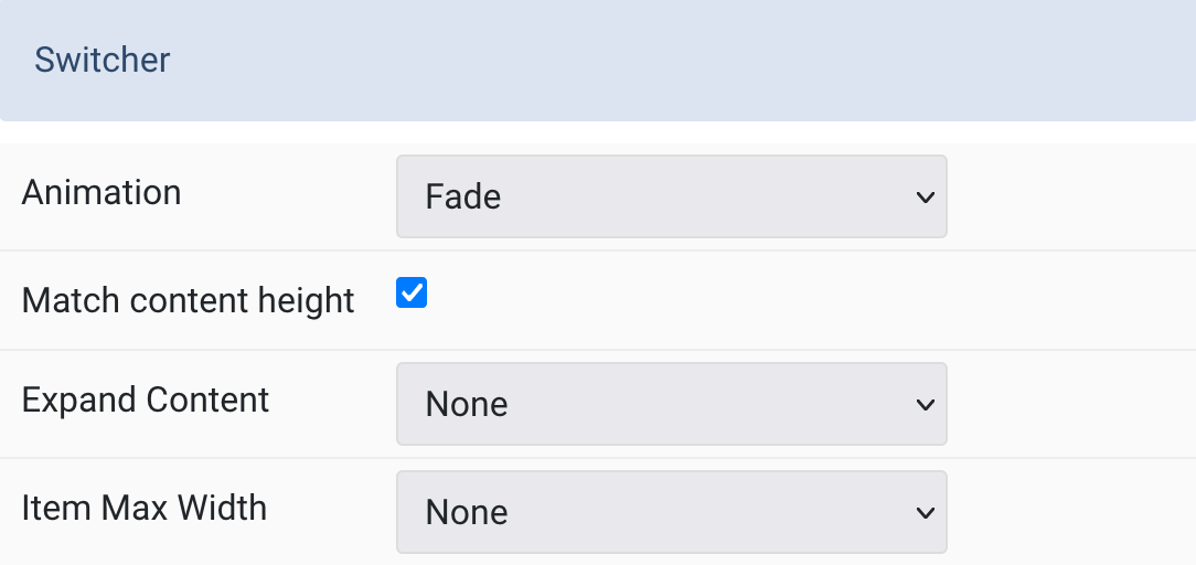
Switcher Common setting for switcher effect
| Settings | Description |
|---|---|
| Animation | Select transition animation between tabs. |
| Match content height | Make all tab contents the same height. |
| Expand Content | Control how content fills available space. |
| Item Max Width | Set maximum width for tab items. |
Navigation Common setting for the tab navigation.
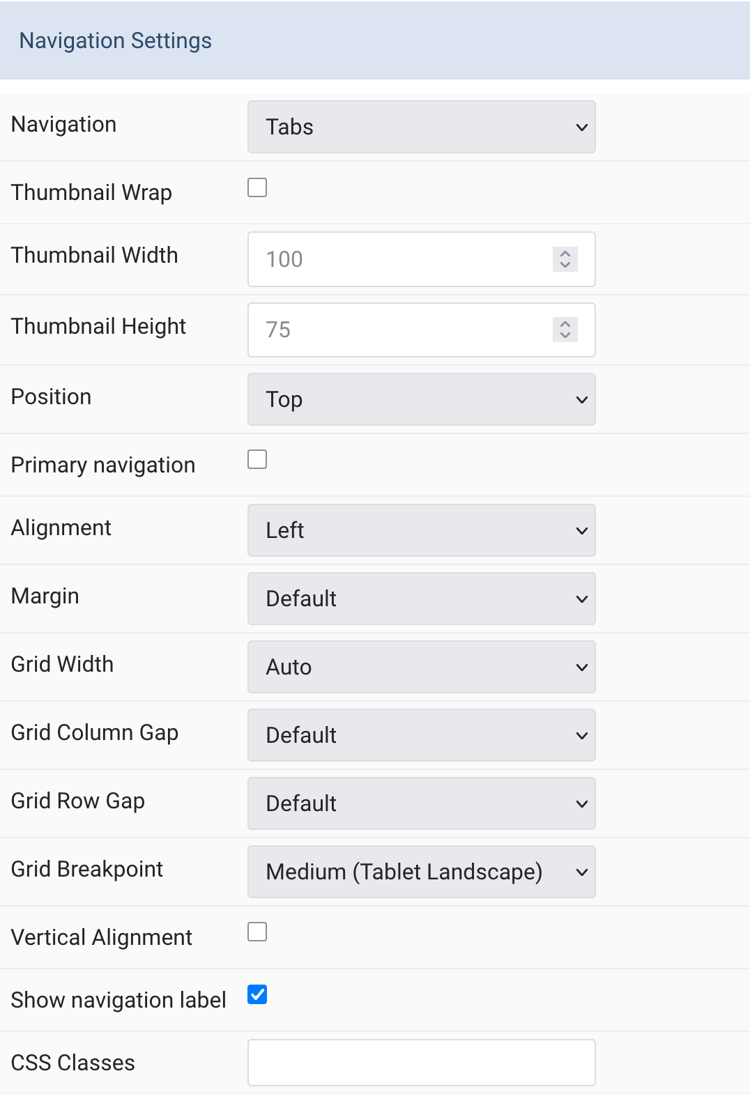
| Settings | Description |
|---|---|
| Navigation | Select navigation style. |
| Thumbnail Wrap | Control thumbnail line wrapping behavior. |
| Thumbnail Width | Set width for thumbnav images. |
| Thumbnail Height | Set height for thumbnav images. |
| Position | Choose navigation placement (top/bottom/left/right). |
| Primary navigation | Enable primary navigation styling. |
| Alignment | Align navigation items. |
| Margin | Set vertical spacing for navigation. |
| Grid Width | Control navigation column width. |
| Grid Column Gap | Set spacing between navigation and content. |
| Grid Row Gap | Set vertical spacing when stacked. |
| Grid Breakpoint | Set when layout switches to stacked. |
| Vertical Alignment | Center-align navigation and content. |
| Show navigation label | Display navigation label instead of title. |
| CSS Classes | Add custom CSS classes for the particle. |
Layout tab
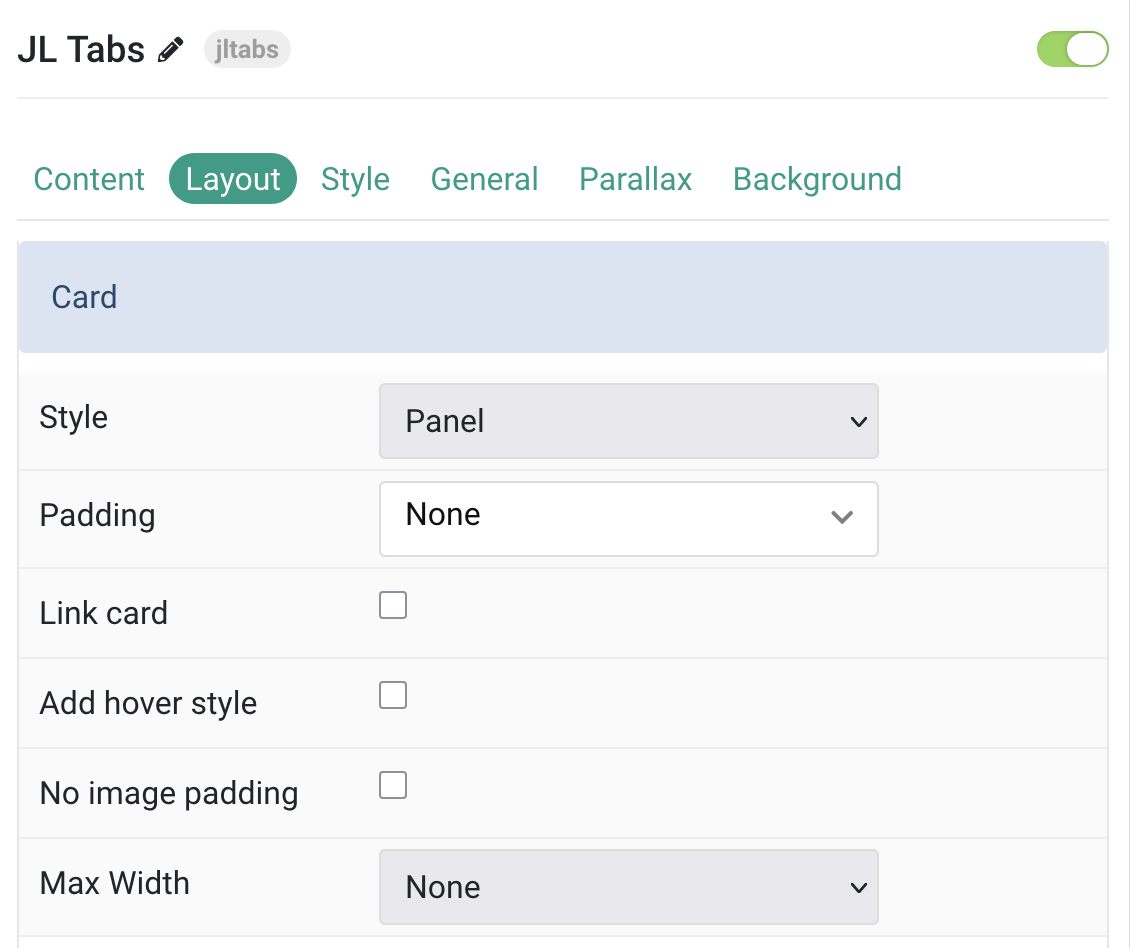
| Settings | Description |
|---|---|
| Card Settings | Common style settings for Card |
| Style | Select one of the boxed card, tile styles or a blank panel. |
| Padding | Set the padding |
| Link card | Link the whole card if a link exists. |
| Add hover style | Adds hover style to linked cards. |
| No image padding | Align image without padding. Top, left or right aligned images can be attached to the card’s edge. If left or right, image extends to full space. This option won’t have any effect IF the Style is set to Panel or Image Alignment is set to Between. |
| Max Width | Set the maximum width. |
Image Settings Common settings for Image Style
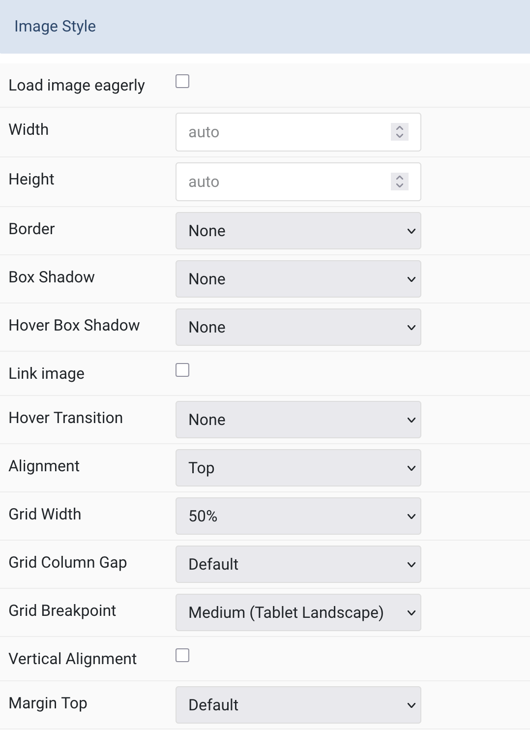
| Settings | Description |
|---|---|
| Load image eagerly | Enable eager loading for images in the initial viewport (default is lazy). |
| Width | Set the width of the image. |
| Height | Set the height of the image. |
| Border | Select the image’s border style. |
| Box Shadow | Select the image’s box shadow size. |
| Hover Box Shadow | Select the image’s box shadow size on hover. |
| Link image | Link the image if a link exists. |
| Hover Transition | Set the hover transition for a linked image. |
| Alignment | Align the image to top, bottom, left, right, or between title and content. |
| Grid Width | Define width of the image within the grid (only applies if aligned left/right). |
| Grid Column Gap | Set the size of the gap between image and content. |
| Grid Breakpoint | Set the breakpoint from which grid cells stack (for left/right alignments). |
| Vertical Alignment | Vertically center grid items (only for left/right alignment). |
| Margin Top | Set the top margin (only applies to Bottom or Between alignment). |
Thumbnav Settings Common settings for navigation Style.
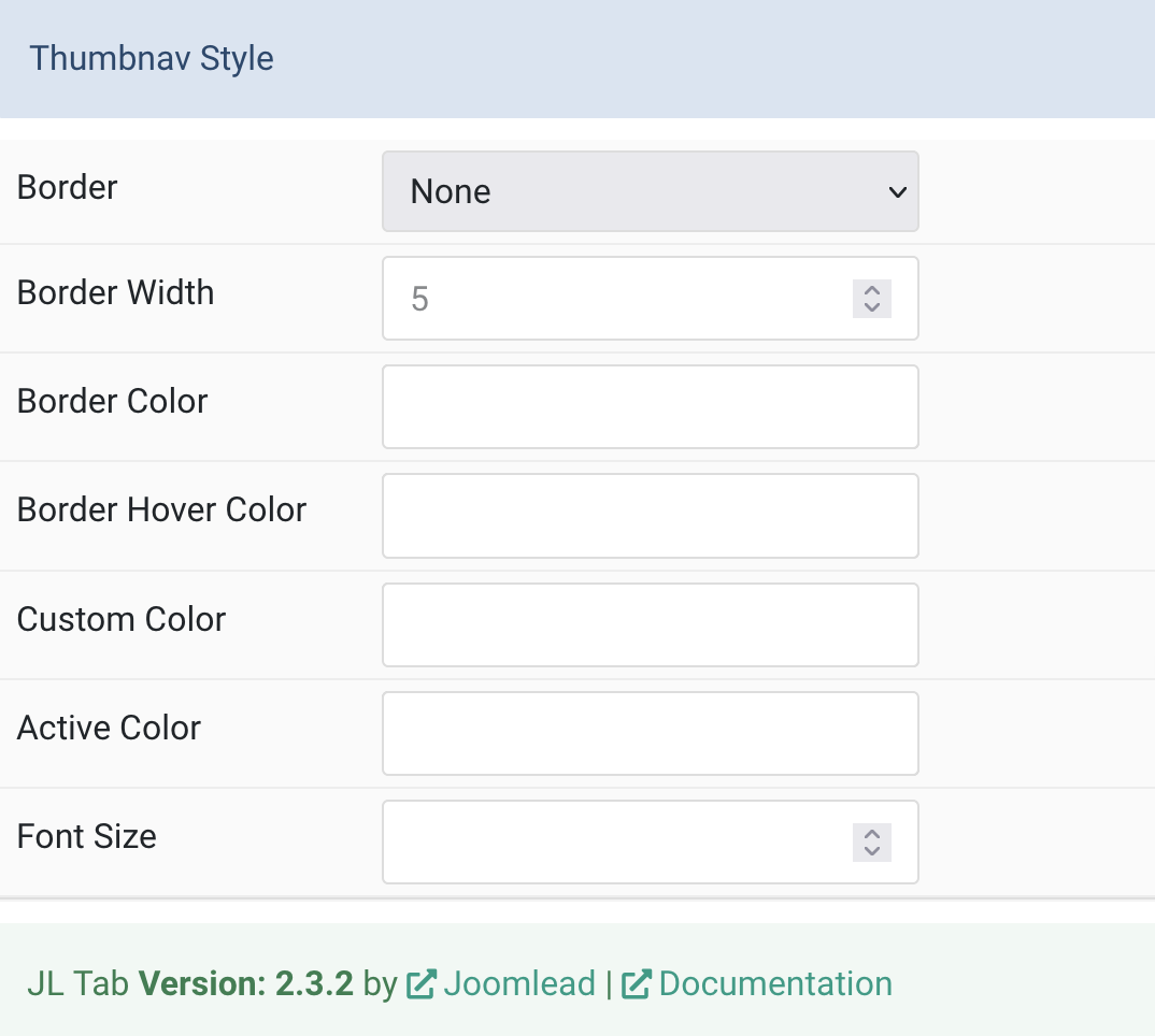
| Settings | Description |
|---|---|
| Border | Select the thumbnav image’s border style. |
| Border Width | Set the border width in pixels. |
| Border Color | Choose a border color. |
| Border Hover Color | Set the border color on hover. |
| Custom Color | Customize the title color (requires predefined color set to none). |
| Active Color | Customize the active title color. |
| Font Size | Customize the title text font size. |
Tab Style
Title Settings Common setting for Title
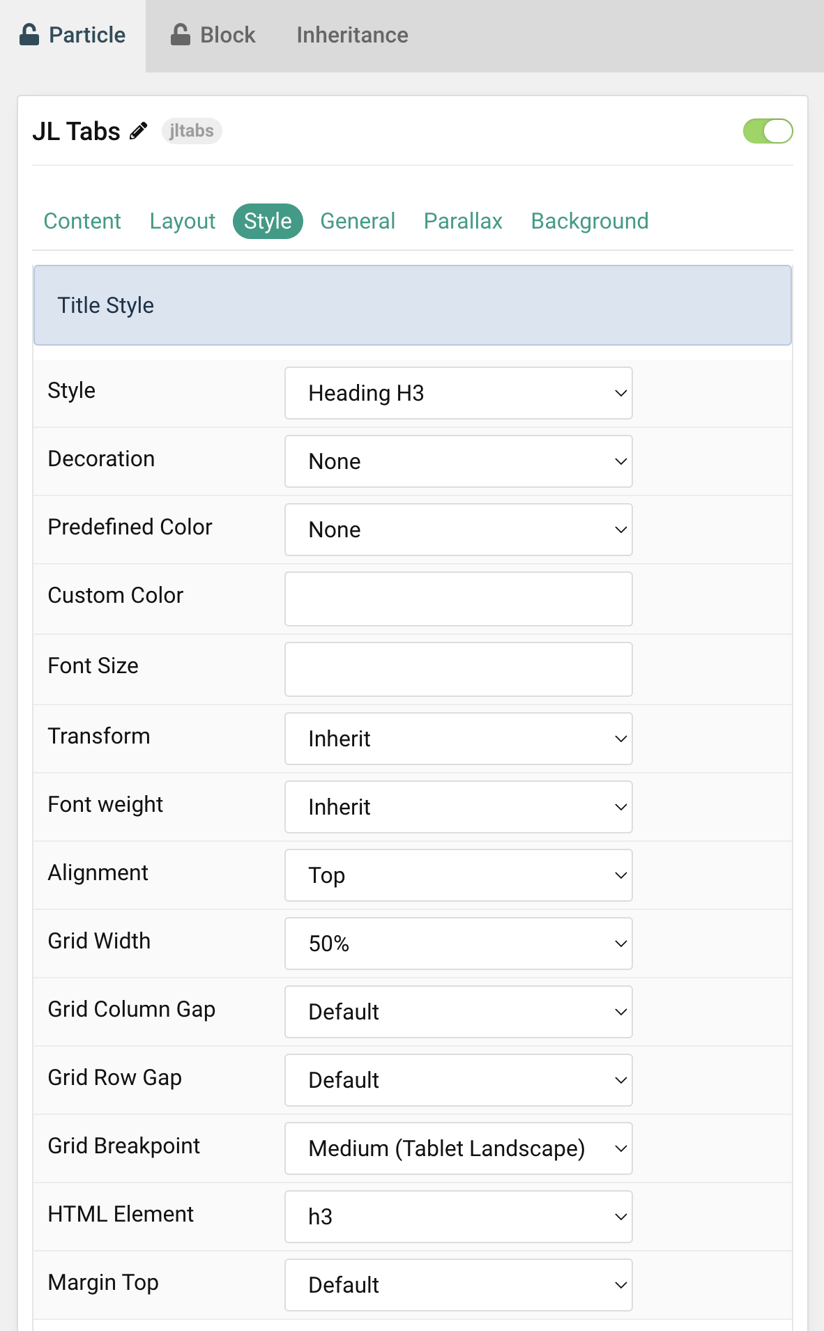
| Settings | Description |
|---|---|
| Style | Title styles differ in font-size but may also come with a predefined color, size and font. |
| Decoration | Decorate the headline with a divider, bullet or a line that is vertically centered to the heading. |
| Predefined Color | Select a predefined text color. |
| Custom Color | Customize the title color instead using predefined title color mode. You need to set the predefined color to None to use the customize color option. |
| Font Size | Customize the title text font size. |
| Transform | The following options will transform text into uppercased, capitalized or lowercased characters. |
| Font weight | Add one of the following classes to modify the font weight of your text. |
| HTML Element | Choose one of the elements to fit your semantic structure. |
| Alignment | Align the title to the top or left in regards to the content. |
| Grid Width | Define the width of the title within the grid. Choose between percent and fixed widths or expand columns to the width of their content. |
| Grid Column Gap | Set the size of the gap between the image and the content. |
| Grid Row Gap | Set the size of the gap if the grid items stack. |
| Grid Breakpoint | Set the breakpoint from which grid cells will stack. |
| HTML Element | Choose one of the elements to fit your semantic structure. |
| Margin Top | Set the top margin. Note that the margin will only apply if the content field immediately follows another content field. |
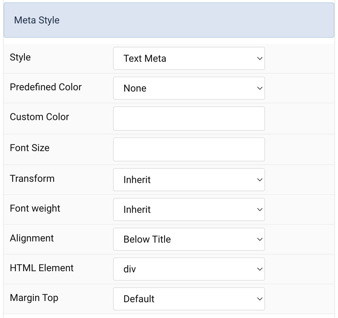
Meta Settings Common settings for Meta Style
| Settings | Description |
|---|---|
| Style | Select a predefined meta text style, including color, size and font-family. |
| Predefined Color | Select the predefined meta color. |
| Custom Color | Customize the meta color. Set Predefined Color for Meta to None before using this feature. |
| Font Size | Customize the title text font size. |
| Transform | The following options will transform text into uppercased, capitalized or lowercased characters. |
| Font weight | Add one of the following classes to modify the font weight of your text. |
| HTML Element | Choose one of the elements to fit your semantic structure. |
| Alignment | Align the meta text above/below the title or below the content. |
| Margin Top | Set the top margin. Note that the margin will only apply if the content field immediately follows another content field. |
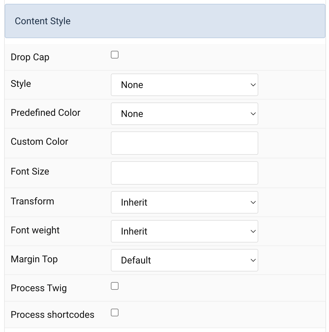
Content Settings Common settings for Content Style
| Settings | Description |
|---|---|
| Drop Cap | Display the first letter of the paragraph as large initial. |
| Style | Select a predefined text style, including color, size and font-family. |
| Predefined Color | Select the predefined meta color. |
| Content Color | Customize the content color instead using predefined text color. You need to set the predefined color to None to use the customize color option. |
| Font Size | Customize the content text font size. |
| Transform | The following options will transform text into uppercased, capitalized or lowercased characters. |
| Font weight | Add one of the following classes to modify the font weight of your text. |
| Margin Top | Set the top margin. Note that the margin will only apply if the content field immediately follows another content field. |
| Process Twig | Enable Twig template processing in the content. Twig will be processed before shortcodes. |
| Process shortcodes | Enable shortcode processing / filtering in the content. This useful when you want to load the Joomla module or WordPress shortcode inside the card content, example you can add a Joomla shortcode inside the card content like {loadmoduleid your_moduleId}, then just enable the Process shortcodes feature and done. This solution similar to How do you put a module inside an article? |
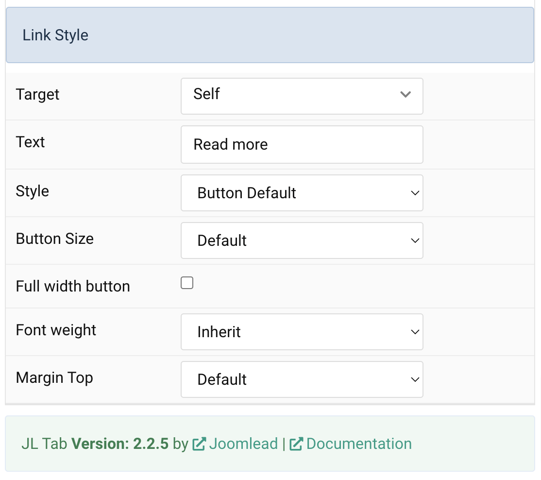
Link Settings Common settings for Link Style
| Settings | Description |
|---|---|
| Target | Target browser window when item is clicked. |
| Text | Enter the text for the link. |
| Style | Set the button style. |
| Button Size | Set the button size. |
| Full width button | Set the fullwidth for button. |
| Font weight | Add one of the following classes to modify the font weight of your text. |
| Margin Top | Set the top margin. |
General, Parallax and Parallax Background tab
Please take a look the documentation here for more detail about these tabs settings

Comments