JL Vertical Nav Particle
Installation Installing the particle on your website is a really simple process. You can refer to the document here to know more.
Requirements Vertical Nav particle requires Uikit 3 for Gantry 5 Atom to be installed and enabled in your theme layout settings.
Usage
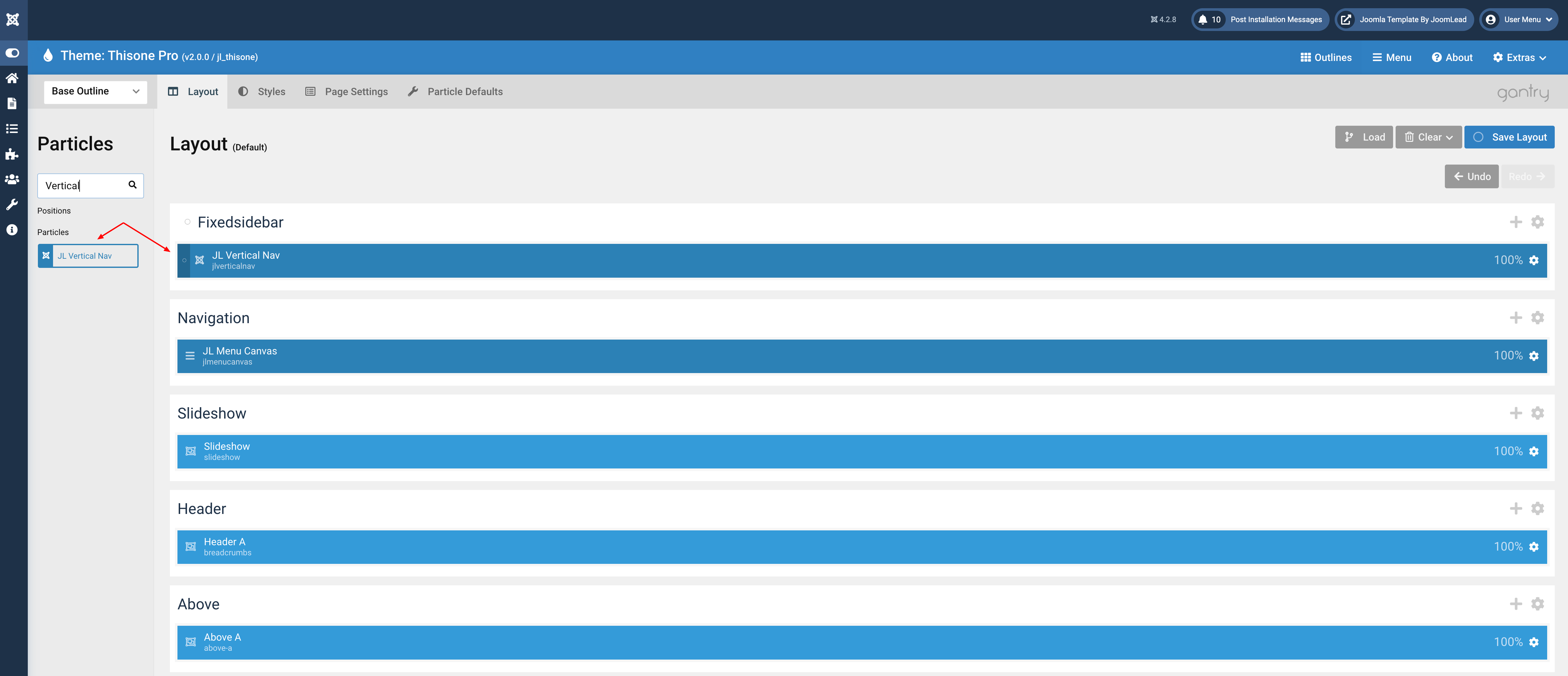
Step 1 Go to Template/Theme Settings > select the Layout to add Vertical Nav particle (i.e: Choose Base Outline if you want to use the Vertical Nav particle for the whole layout or Home if you want to use the Vertical Nav for homepage only) -> Layout tab -> Drag and drop the JL Vertical Nav from Particles panel (left corner) to the section you want to display the particle.
Step 2 Visibility
By default, the Vertical Nav is visible on all devices, we can set the visibility for the desktop only by clicking the section Setting icon -> Variations -> Select Visible Medium
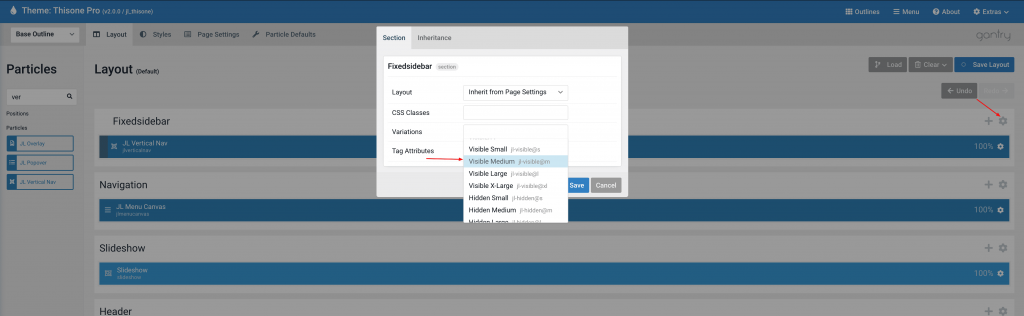
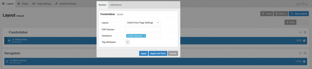
Click Apply and Save button.
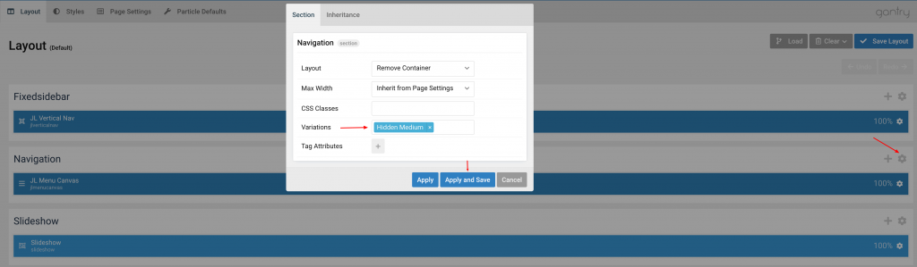
Step 3 Using Menucanvas as fallback Navbar on mobile devices.
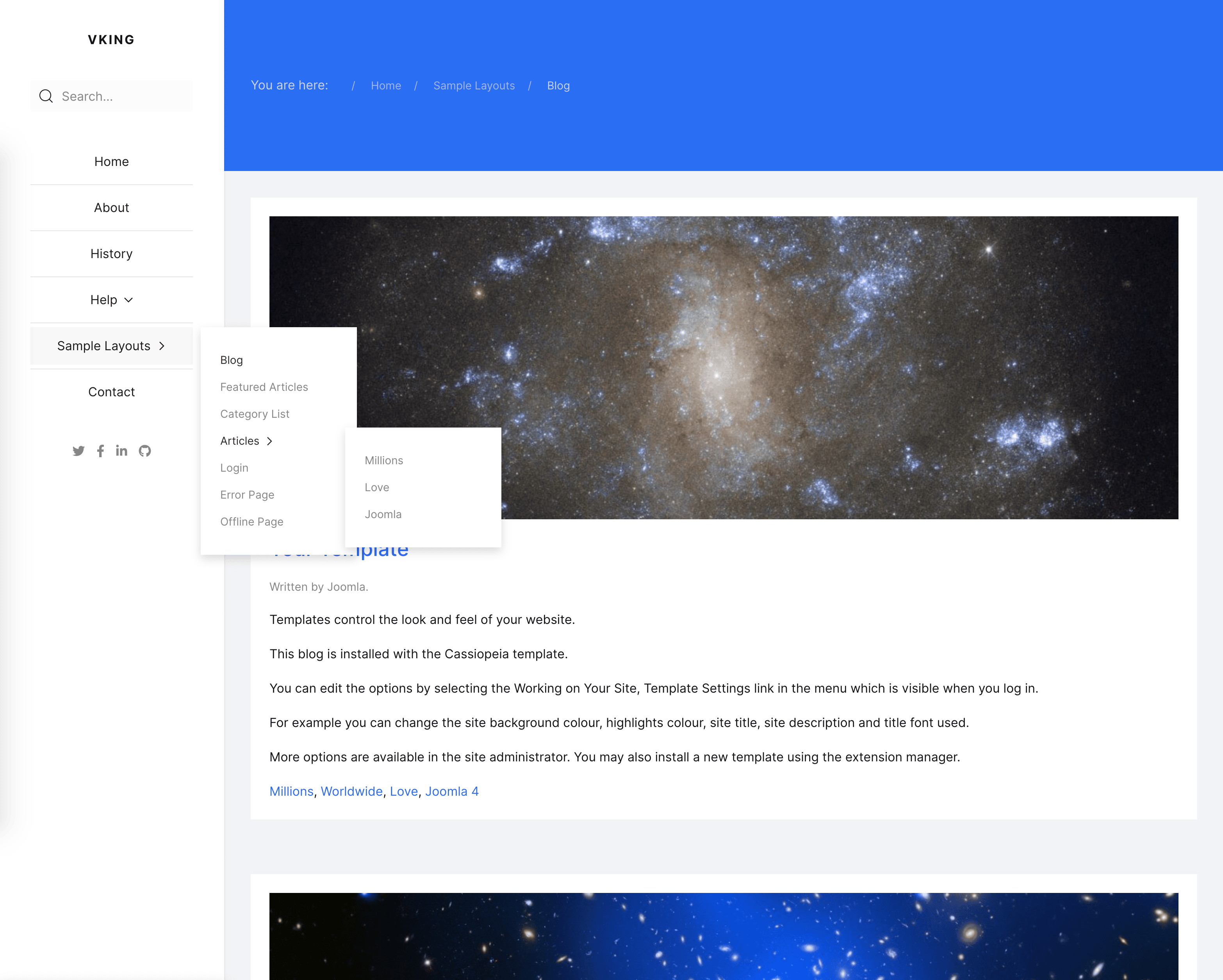
Drag and drop the JL Menu Canvas from Particles panel (left corner) to the section you want to display the particle(Navigation section for example).
Click the Navigation section Setting icon -> Variations -> Select Hidden Medium
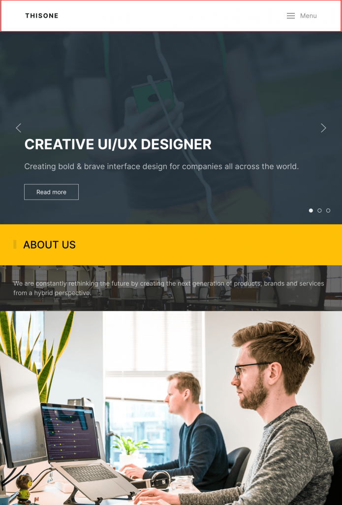
Here the preview screenshot on mobile/tablet devices after Vertical Nav disappears, the MenuCanvas will appear as fallback Navigation.
If you are not using JoomLead themes, you can use the default Gantry5 reponsive Utility Classes to show/hide the section/block, check it here Responsive Utility Classes
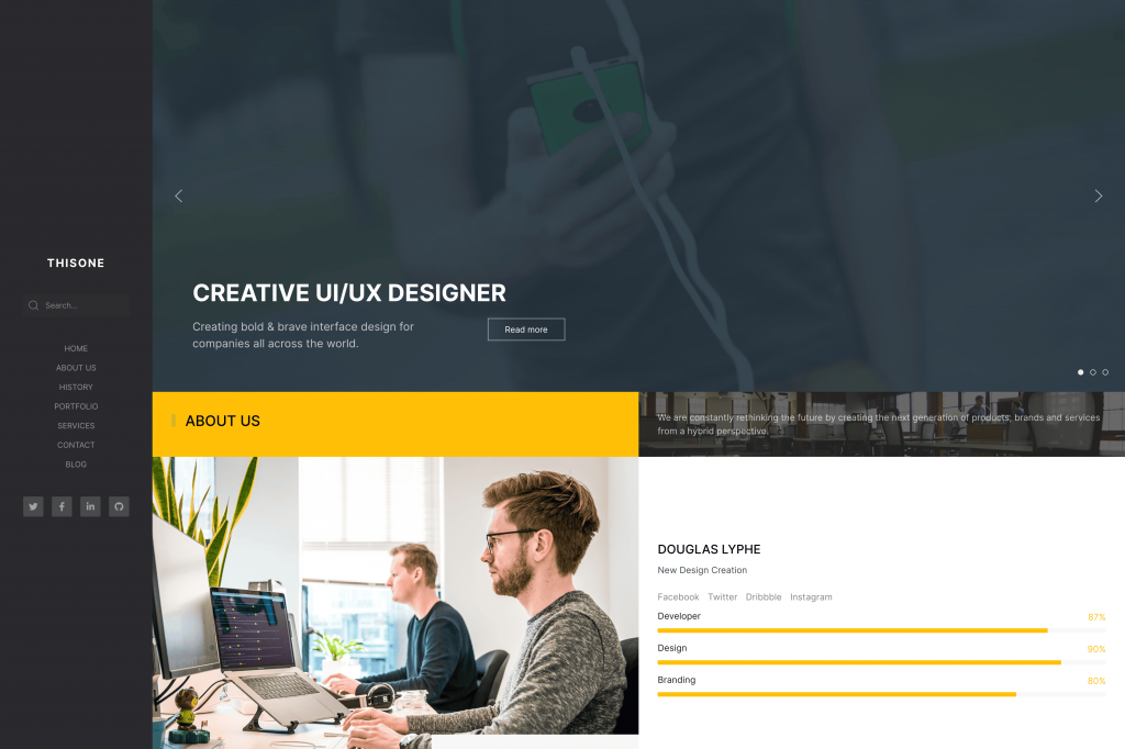
Preview
Settings
Manage Vertical Nav settings, customize logo, menu, nav styles.
Logo Tab
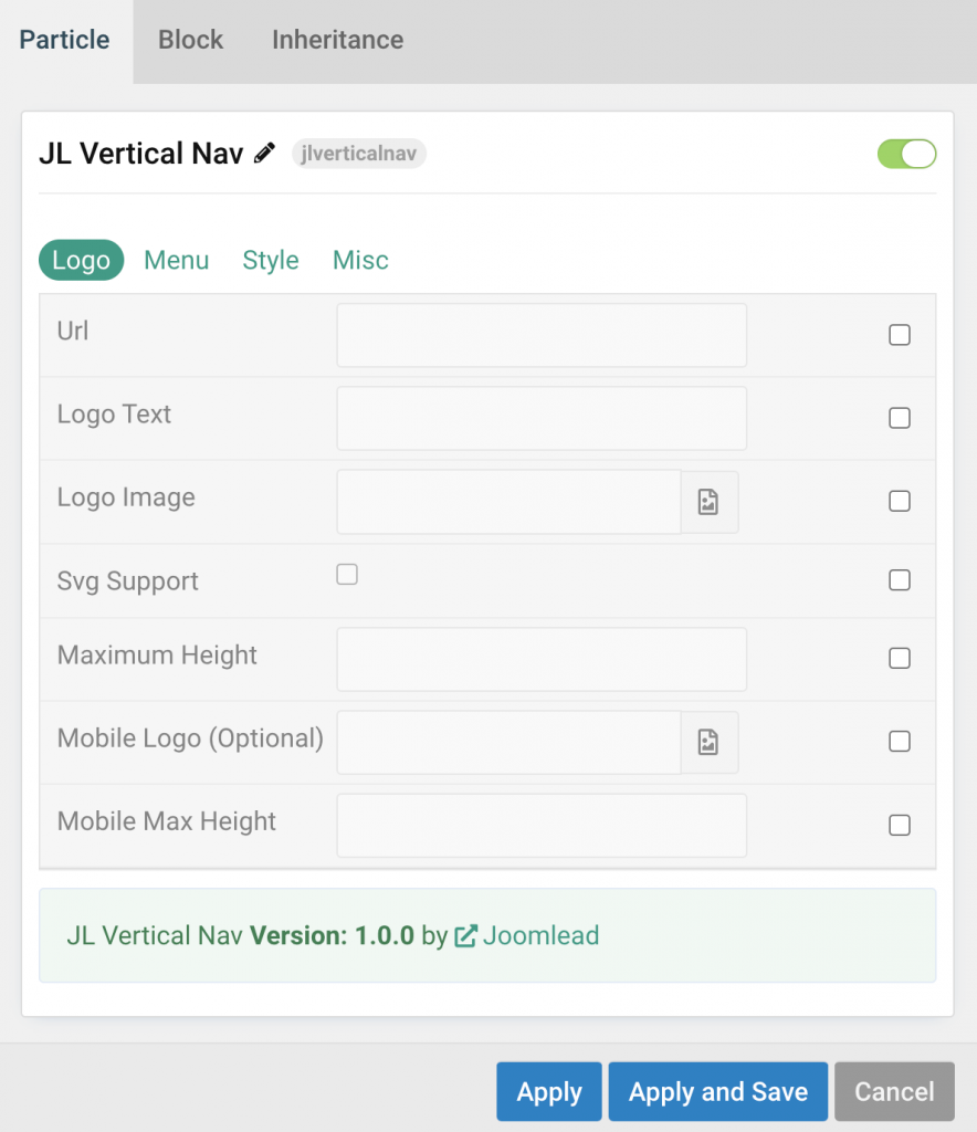
| Settings | Description |
|---|---|
| Url | Custom Url for the logo. Leave empty to go to home page. |
| Logo Text | Type in the Logo Text that will be used in case no Logo Image from your media library has been picked. |
| Logo Image | Upload your logo in the png, jpg or SVG file format for best quality on all screens. |
| Svg Support | Inject inline SVG images into the page markup and style them with CSS. Use this option if you use svg format. |
| Maximum Height | Set the logo height |
| Mobile Logo (Optional) | Select an alternative logo, which will be used on small devices. |
| Mobile Max Height | Set the Mobile logo height. |
Menu Tab
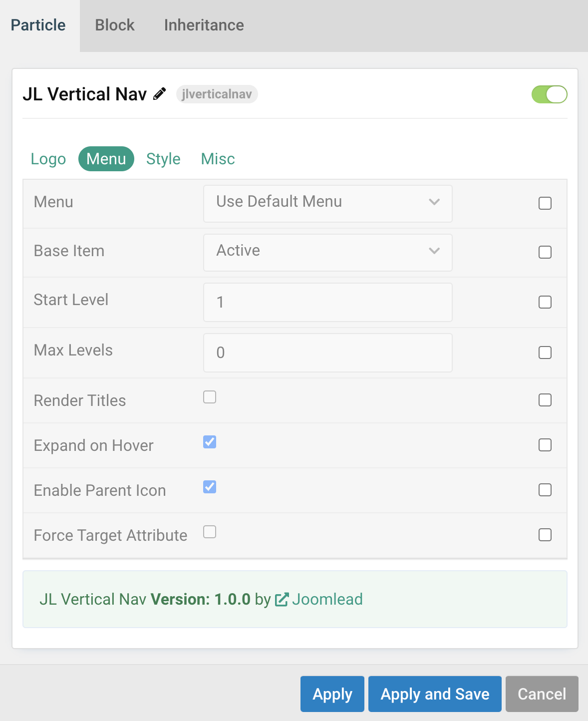
| Settings | Description |
|---|---|
| Menu | Select menu to be used with the particle. |
| Base Item | Select a menu item to always be used as the base for the menu display. |
| Start Level | Set the start level of the menu. |
| Max Levels | Set the maximum number of menu levels to display. |
| Render Titles | Renders the titles/tooltips of the Menu Items for accessibility. |
| Expand on Hover | Allows to enable / disable the ability to expand menu items by hover or click only |
| Enable Parent Icon | Allows to enable / disable the parent Icon that included subnav items |
| Force Target Attribute | Adds target="_self" attribute to all menu links instead of omitting the default value. Fixes an issue with pinned tabs in Firefox where external links always open in a new tab. |
Style Tab
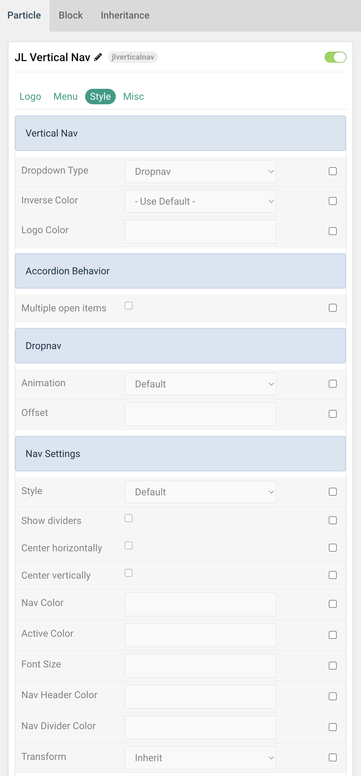
| Settings | Description |
|---|---|
| Dropdown Type | Select the vertical menu nav style. You can choose between Dropnav mode or Accordion mode top open the subnav menu items. |
| Inverse Color | Set light or dark color mode for nav icon, buttons and controls to improve the visibility of objects on dark backgrounds in a light style. |
| Logo Color | Customize the logo text color. |
| Accordion Behavior | Options for Accordion dropdown type. |
| Multiple open items | To display multiple subnav menu items at the same time without one collapsing when the other one is opened. |
| Dropnav Behavior | Options for Dropnav dropdown type. |
| Animation | Apply animations to the dropdown for Dropbar Type. |
| Offset | To define a custom offset between the dropdown and its parent item, add the offset option with a value in pixels. |
| Nav Settings | Common settings for Nav |
| Style | Choose the Nav Menu Style. |
| Show dividers | Show dividers between menu items. |
| Center horizontally | Center the menu and the content horizontally. |
| Center vertically | Center the menu and the content vertically. |
| Nav Color | Customize the nav item color if needed. |
| Active Color | Customize the nav item hover/active color if needed. |
| Font Size | Customize the subnav item font size in rem, em, px. |
| Nav Header Color | Customize the Nav Header Color. |
| Nav Divider Color | Customize the nav divider color if needed. |
| Transform | The following options will transform text into uppercased, capitalized or lowercased characters. |
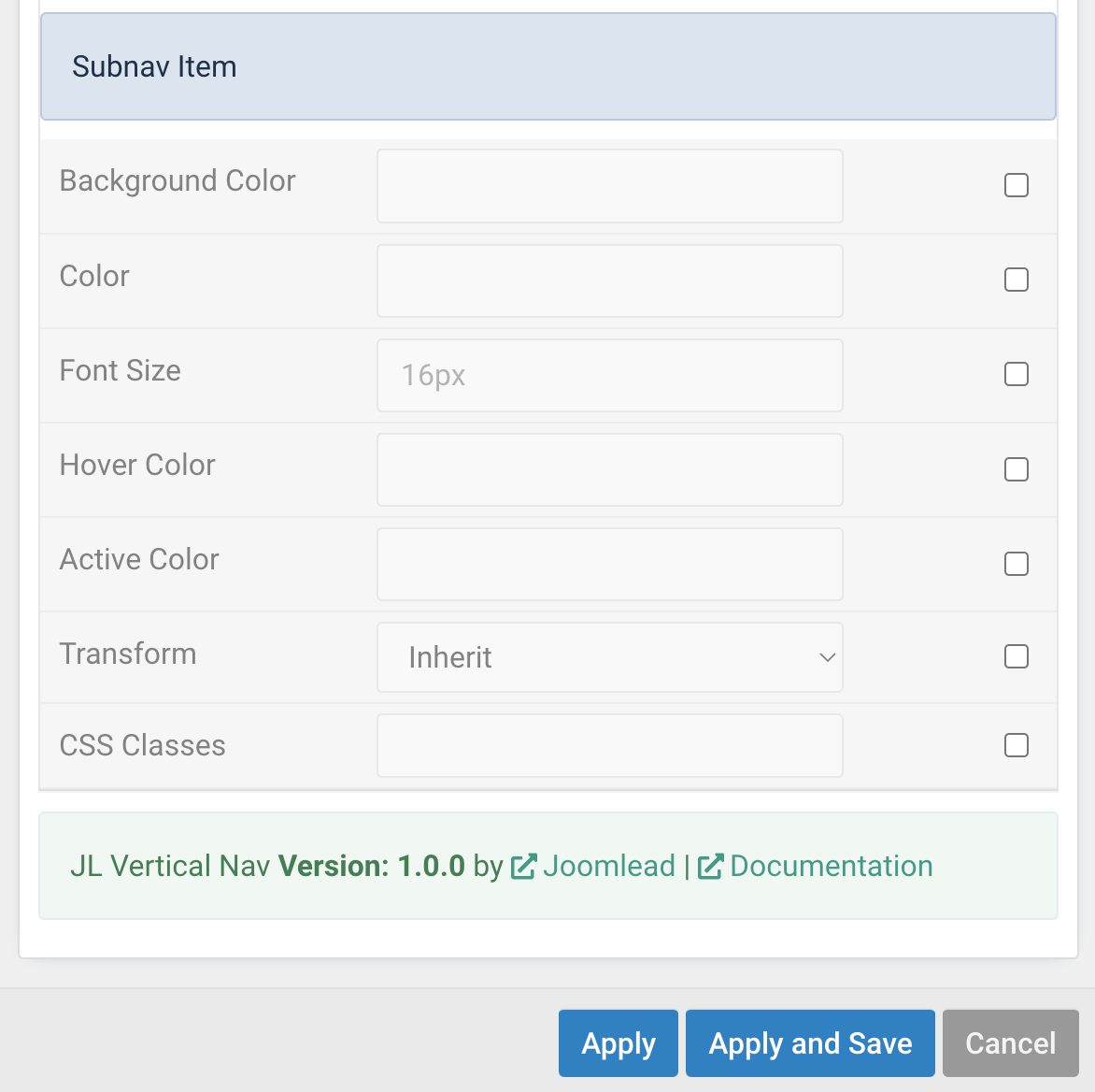
| SubNav Item | Common settings for Nav |
| Background Color | Customize the dropbar background color. |
| Color | Customize the subnav item color. |
| Font Size | Customize the subnav item font size in rem, em, px. |
| Hover Color | Customize the subnav item hover color. |
| Active Color | Customize the subnav item active color. |
| Transform | The following options will transform text into uppercased, capitalized or lowercased characters. |
| CSS Classes | Set a specific CSS class for custom styling. |
Misc Tab
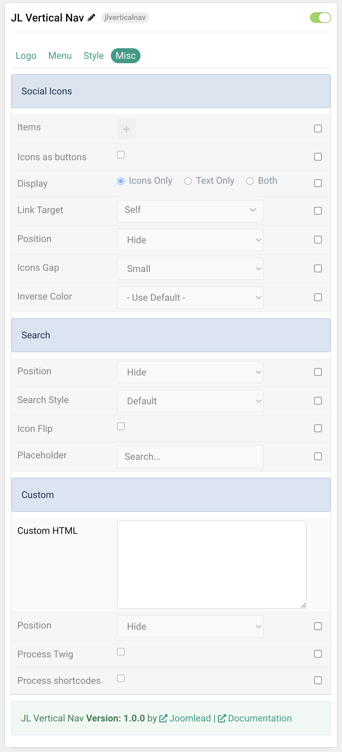
| Settings | Description |
|---|---|
| Social Icons | You can add and choose to display the social icons above/below the menu items or set it to the bottom of the Verical Nav layout. |
| Search | You can add and choose to display the search form above or below the menu items. |
| Custom Html | You can add custom html and choose to display the content to top/bottom/above menu or below the menu. |
General, Parallax and Parallax Background tab
Please take a look the documentation here for more detail about these tabs settings

Comments